Your Shopify store is getting traffic. People are clicking your ads, landing on your product pages, and then… leaving. No add to cart. No purchase. Just a bounce rate that makes you question everything.
What’s in This Article
Here is the thing most store owners miss: the problem is rarely your product. It is almost always your product page. The average Shopify store converts at 1.4%. The top 10% convert at 4-6%. That means the difference between a $15K month and a $60K month often has nothing to do with how much traffic you drive — it is about what happens when people arrive.
After auditing hundreds of Shopify stores inside eCommerce Circle, we see the same product page mistakes over and over. Fix these, and you will see conversion rates climb without spending an extra dollar on ads.
The Above-the-Fold Test Your Page Is Probably Failing
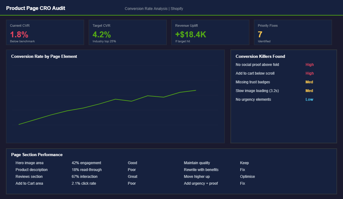
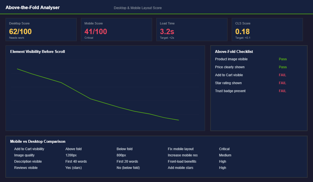
The most important real estate on your product page is what visitors see before they scroll. You have roughly 3 seconds to communicate three things: what this product is, why they should care, and what to do next. Most Shopify product pages fail at least two of these.
Open your top-selling product page on your phone right now. Before scrolling, can you see:
- A high-quality product image that shows the product clearly (not a lifestyle shot where you cannot tell what is being sold)
- The price displayed prominently (not hidden or requiring a variant selection to appear)
- A star rating or review count that builds immediate credibility
- The Add to Cart button visible without scrolling
- A one-line value proposition that tells the visitor why this product exists
If any of these are missing above the fold — especially on mobile, which accounts for 70%+ of most Shopify store traffic — you are losing sales before the page even loads fully.
Write Product Descriptions That Sell (Not Just Describe)
The number one product description mistake is listing features instead of benefits. “Made with organic jojoba oil” is a feature. “Stops your skin from feeling tight and dry within 48 hours” is a benefit. Your customer does not care about ingredients — they care about outcomes.
Structure your product description like this (and for a full copywriting framework, check our guide on product page copywriting that doubles conversion rates):
- Lead with the outcome. What will the customer experience after using this product? Put that first, in bold.
- Address the top 2-3 objections. If price is a concern, add a cost-per-use calculation. If trust is a concern, reference your review count or guarantee.
- Include social proof inline. Pull a one-line quote from a 5-star review and place it right in the description. “I have tried everything and this is the only thing that actually worked” — Sarah, Sydney.
- End with a clear call to action. Not just the Add to Cart button, but a reason to act now: limited stock, a bundle offer, or a first-order discount.
Social Proof: The Conversion Lever Most Stores Underuse
Reviews are not just nice to have — they are the single most influential element on a product page after the product image itself. Products with 50+ reviews convert at 2.5x the rate of products with fewer than 10 reviews. Yet most Shopify stores bury their reviews at the very bottom of the page where nobody scrolls.
Here is how to maximise social proof on your product pages:
- Show the star rating and review count above the fold. Use apps like Judge.me, Loox, or Okendo to display a star rating right below the product title.
- Feature photo reviews prominently. User-generated photos convert better than professional product shots because they show the product in real life.
- Pull the best review into the product description. Do not make customers scroll to the review section. Bring the proof to them.
- Add a “Most helpful review” section midway through the page. This catches visitors who are scanning rather than reading.
If you do not have enough reviews yet, prioritise getting them. Send a post-purchase email sequence via Klaviyo that asks for a review 7-10 days after delivery. Offer a small incentive (10% off next purchase) for photo reviews. Twenty good reviews is the minimum threshold where social proof starts meaningfully impacting conversion rates.
Mobile-First Is Not Optional (It Is Where Your Money Lives)
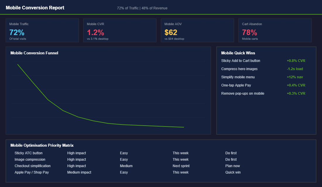
Over 70% of your Shopify traffic comes from mobile devices. But here is the painful part: mobile conversion rates are typically 40-60% lower than desktop. The gap is not because mobile shoppers are less interested — it is because most Shopify stores deliver a terrible mobile experience.
- Implement a sticky Add to Cart button. On mobile, the ATC button should follow the user as they scroll. This single change can increase mobile conversions by 0.5-1.0%.
- Compress your images aggressively. If your product page takes more than 2 seconds to load on 4G, you are losing 30%+ of visitors before they see anything. Use TinyPNG or Shopify native image compression.
- Enable accelerated checkout. Shop Pay, Apple Pay, and Google Pay let mobile users purchase with a single tap. Stores with accelerated checkout see 15-20% higher mobile conversion rates. For the complete mobile optimisation playbook, see our guide on mobile optimisation for Shopify.
- Kill pop-ups on mobile. That email capture pop-up that works fine on desktop is a conversion killer on a 6-inch screen. Use slide-ins or embedded forms instead.
Trust Signals That Remove the Risk of Buying From You
Your visitor has never touched your product, never met you, and has zero reason to trust you — yet you are asking them to hand over their credit card details. Every product page needs to actively overcome this trust deficit, and most Shopify stores do a terrible job of it.
The trust signals that move the needle most for Australian ecommerce stores:
- Money-back guarantee badge. A clearly visible 30-day (or longer) money-back guarantee reduces perceived risk more than almost any other element. Position it directly below or beside the Add to Cart button. Brands that display guarantees prominently see 15-20% higher conversion rates than those who bury the policy in their footer.
- Shipping and returns info above the fold. Australian shoppers are particularly sensitive to shipping costs and return policies. Display estimated delivery times, shipping costs (or free shipping thresholds), and your returns policy in a collapsible section right on the product page. Do not make people hunt for this information — uncertainty about shipping and returns is the second biggest reason for cart abandonment after price.
- Payment security badges. Show logos for Shopify Secure Checkout, SSL, and accepted payment methods (Visa, Mastercard, Afterpay, Zip). These feel basic, but eye-tracking studies show that payment badges near the Add to Cart button reduce checkout anxiety by 42%. Afterpay and Zip are especially important for Australian stores — buy-now-pay-later options can increase conversion rates by 20-30% for products priced between $50-$300 AUD.
- Real contact information. An Australian phone number, a physical address, and a business ABN signal legitimacy. Include these in your footer and consider adding a “Questions? Chat with us” element on product pages. Stores that offer live chat convert 10-15% higher than those that do not.
- Press mentions and certifications. If your product has been featured anywhere — a blog, a magazine, a podcast — show those logos. “As seen in” bars work because they borrow credibility from trusted publications. Even one or two recognisable logos can shift a visitor from “never heard of this brand” to “other people vouch for them.”
Page Speed: The Invisible Conversion Killer
If your product page takes more than 3 seconds to load, you have already lost 40% of your visitors before they see a single product image. And here is the kicker — most Shopify store owners have no idea their pages are slow because they are testing on fast Wi-Fi with cached browsers. Your customers are loading your pages on 4G in regional Australia, on ageing iPhones, during peak network congestion.
Run your top product page through Google PageSpeed Insights right now. If your mobile score is below 50, you are bleeding sales. Here are the fixes that make the biggest difference:
- Compress all product images. Most Shopify stores upload 3-5MB images straight from their camera. Resize to 2048px wide maximum and compress using TinyPNG or Shopify’s built-in image optimisation. Target under 200KB per image. This single fix often improves page load by 2-3 seconds.
- Audit your installed apps. Every Shopify app you install adds JavaScript to your storefront. The average Shopify store has 15-20 apps installed, but only uses 8-10 actively. Uninstall apps you are not using — and check that uninstalling actually removes their code (some apps leave scripts behind). For the full app audit framework, see our guide on the essential Shopify tech stack.
- Lazy load below-the-fold images. There is no reason to load your eighth product image before the visitor has even scrolled past the first. Most modern Shopify themes support lazy loading natively — enable it in your theme settings.
- Minimise custom code and third-party scripts. Custom fonts, tracking pixels, chat widgets, and social proof pop-ups all add weight. Load non-essential scripts after the page has rendered (defer or async) rather than blocking the initial paint.
Amazon famously calculated that every 100ms of added page load time costs them 1% in revenue. Your Shopify store is no different — the relationship between speed and conversion is direct and measurable. A store loading in 2 seconds will convert at roughly double the rate of the same store loading in 5 seconds. For a deeper technical breakdown, check our guide on Shopify site speed fixes.
The Product Page Audit Checklist: Score Your Pages in 10 Minutes
Theory is great, but you need a practical way to assess your product pages right now. Open your top five products by revenue and score each one against this checklist. Give yourself one point for each item that is present and properly implemented. Anything below 12 out of 15 needs immediate attention.
Above the fold (5 points): Clear product image visible without scrolling (1 point). Price displayed prominently (1 point). Star rating or review count visible (1 point). Add to Cart button visible without scrolling on mobile (1 point). One-line value proposition or benefit statement present (1 point).
Description and content (4 points): Description leads with benefits, not features (1 point). At least one customer review quote embedded in the description (1 point). Top 2-3 objections addressed directly (1 point). Clear CTA with urgency or incentive beyond the default Add to Cart (1 point).
Trust and social proof (3 points): Money-back guarantee badge visible near Add to Cart (1 point). Shipping info and returns policy accessible without leaving the page (1 point). At least 20 reviews with photos displayed on the page (1 point).
Technical performance (3 points): Page loads in under 3 seconds on mobile 4G — test with Google PageSpeed Insights (1 point). All images compressed under 200KB (1 point). Sticky Add to Cart enabled on mobile (1 point).
Run this audit quarterly on your top revenue pages. The first time you do it, most stores score between 7-9 out of 15. Getting to 12+ typically corresponds with a 0.5-1.0% conversion rate improvement — which on a store doing $50K/month in traffic translates to an extra $18,000-$36,000 per month in revenue.
Prioritise fixes by impact. Above-the-fold improvements deliver the fastest results because they affect every single visitor. Trust signals come second because they address the visitors who are already interested but need reassurance. Technical performance is third — it matters enormously but the fixes are often more complex and take longer to implement. If you want to systematically test which changes make the biggest difference, our guide on A/B testing for Shopify walks through the exact framework for running split tests that grow revenue.
For stores using Hotjar or Microsoft Clarity (both offer free tiers), record 50-100 sessions on your top product page and watch where visitors hesitate, scroll back, or abandon. Heatmap data is worth more than a hundred opinions — it shows you exactly where your page is losing people. Our heatmaps guide explains how to set this up and what patterns to look for.
The Compound Effect: Small CRO Wins Stack Up Fast
Here is where it gets exciting. CRO is not about finding one magic fix (which is exactly why A/B testing is so powerful) — it is about stacking small improvements that compound. If you fix your above-the-fold layout (+0.3% CVR), rewrite your product descriptions (+0.2% CVR), improve social proof placement (+0.4% CVR), and optimise for mobile (+0.5% CVR), you have just gone from 1.4% to 2.8%. That is double your conversion rate, which means double your revenue at the same ad spend.
At $50K/month in traffic, going from 1.4% to 2.8% conversion rate is an extra $50K/month in revenue. That is not theoretical — that is the maths. And it costs you nothing in additional ad spend.
Ready to Fix Your Product Pages?
Inside the eCommerce Circle, Platform optimisation is the fourth pillar of the More Orders Operating System. Your store is where traffic turns into money, and most stores leave enormous amounts on the table with fixable product page issues. If you want a fresh set of eyes on your product pages and a clear roadmap for improving your conversion rate, let’s talk.