You are running a Shopify store, your products are solid, your ads are driving traffic — but your collection pages are a graveyard of missed opportunities. Most store owners pour energy into product pages and completely neglect their collection pages. That is a costly mistake, because collection pages are often the highest-traffic pages on your entire site after the homepage.
What’s in This Article
Think about how people actually shop online. They do not land on your homepage and methodically click through to individual products. They search “women’s linen pants Australia” or click a Meta ad that takes them to a collection. Your collection page is their first real shopping experience — and if it is just a default Shopify grid with tiny product images and no guidance, you are losing sales before they even start browsing.
The best-performing Shopify stores treat collection pages as curated shopping experiences. They use smart filtering, strategic product ordering, compelling above-the-fold content, and SEO-optimised copy that ranks in Google. The result? Collection pages that convert at 4-8% compared to the typical 1-2%.
Above the Fold: What Visitors See First Matters Most
The first thing visitors see on your collection page sets the tone for their entire browsing experience. Most Shopify themes default to showing the collection title and jumping straight into the product grid. That is a wasted opportunity.
Add a collection banner with context. A lifestyle banner image at the top of each major collection page creates visual impact and communicates the lifestyle your products represent. Include a 1-2 sentence description that tells the visitor they are in the right place: “Lightweight, breathable linen pieces designed for Australian summers. Ethically made, effortlessly styled.” This reassures visitors who arrived from search or ads that they have found what they are looking for.
Show product count and sorting options prominently. Visitors want to know the scope of the collection (“42 products”) and control how they browse. Default to “Best Selling” or “Recommended” sorting — not “Newest” or “A-Z.” Your best sellers convert at the highest rate, so put them in front of visitors first.
Feature a “top picks” row. Above the main grid, add a horizontal row of 3-4 hero products with slightly larger images. These are your collection champions — the products with the highest conversion rates and best reviews. This gives visitors an immediate shortcut to your best products without requiring them to scroll through the entire grid.
Filtering and Navigation: Help People Find What They Want
Poor filtering is one of the top reasons visitors leave collection pages without clicking a single product. If someone is looking for a medium-sized black dress under $100, and your only filter option is “Sort by Price,” you have already lost them.
Implement relevant filters for your category. For apparel: size, colour, price range, style, and material. For home goods: room type, colour, price range, and dimensions. For food and beverage: dietary requirements, flavour, and pack size. Use Shopify Search & Discovery or apps like Smart Product Filter to build this out. The key is offering filters that match how your customers actually think about your products.
Use visual swatches for colour filters. Colour name labels are ambiguous — does “dusty rose” look pink or beige? Visual colour swatches let customers filter instantly by sight. This small UX improvement can increase filter usage by 30-40% and reduce bounce rates on collection pages.
Show active filters clearly. When a customer applies a filter, display it as a removable tag above the product grid. Show the filtered product count so they know how many options match their criteria. If the filter returns zero results, suggest broadening criteria instead of showing an empty page — “No exact matches found. Try removing the size filter to see 12 similar products.”
Product Cards: Small Details That Drive Big Clicks
Each product card in your collection grid is a mini sales pitch. The default Shopify product card — image, title, price — is a bare minimum. Here is how to make them work harder.
Use hover images. Show the product on a white background as the default, and swap to a lifestyle or model shot on hover. This gives visitors two perspectives without requiring them to click through to the product page. Most premium Shopify themes support this natively.
Add review stars and count. A product showing “4.8 stars (124 reviews)” gets significantly more clicks than the same product without social proof. Display star ratings directly on the collection card. If a product has zero reviews, prioritise getting reviews for it before featuring it prominently in collections.
Show colour variants as swatches. If a product comes in multiple colours, display small colour dots below the image. Each dot should swap the product image when hovered or tapped. This lets customers see their preferred colour without opening the product page, and it dramatically increases click-through rates for multi-colour products.
Add “Quick Add” buttons. For simple products (single variant or obvious default size), a “Quick Add to Cart” button on the collection card reduces friction by one full page load. This is especially effective on mobile where every tap counts. Stores that implement quick-add typically see a 10-15% increase in collection-to-cart rates.
SEO: Turn Collection Pages Into Traffic Magnets
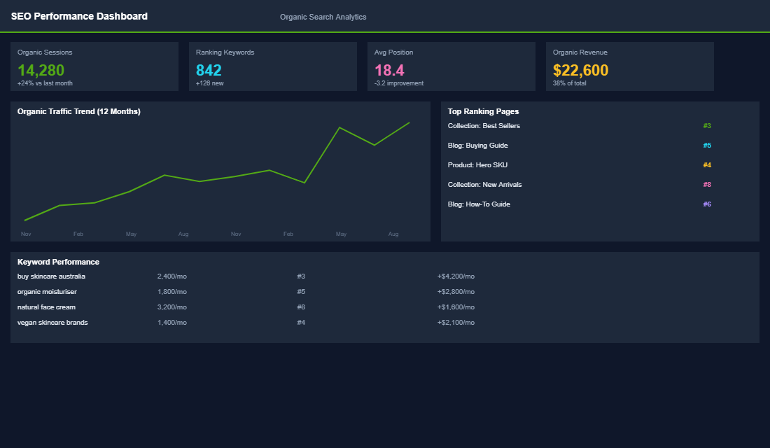
Collection pages are some of the most powerful SEO assets on your Shopify store — often more powerful than individual product pages. Why? Because collection pages target broader, higher-volume keywords that attract shoppers in research mode.
Target category-level keywords. Your “Linen Pants” collection page should target “linen pants Australia” or “women’s linen pants online.” These keywords have 5-10x more search volume than individual product names and attract visitors who are ready to browse and buy — they just need to find the right product.
Write 200-400 words of unique collection copy. Most Shopify stores leave the collection description blank or paste in a single sentence. Google needs content to understand what your page is about and rank it. Write a genuine, useful description that includes your target keywords naturally: what the collection includes, who it is for, key features, materials, and how to choose the right product. Place the bulk of this copy below the product grid so it does not push products below the fold.
Optimise your title tag and meta description. Your collection title tag should follow the format: “[Collection Name] — [Brand Benefit] | [Brand Name].” For example: “Women’s Linen Pants — Breathable Summer Style | Your Brand.” The meta description should include your target keyword and a compelling reason to click: “Shop our range of women’s linen pants. Ethically made in Australia. Free shipping over $100 AUD.”
Internal linking between collections. Link related collections together within your collection descriptions. “Love our linen pants? Browse our complete linen collection or pair them with our summer tops.” This distributes SEO authority across your collection pages and helps visitors discover more of your catalogue.
Mobile Optimisation: Where Most Sales Happen
Over 70% of your collection page traffic is mobile. If your collection pages are not optimised for thumb-friendly browsing on a phone, you are alienating the majority of your visitors.
- Use a 2-column grid on mobile. Single-column grids waste screen space and force excessive scrolling. Two-column grids show more products per screen while keeping images large enough to be compelling.
- Make filters accessible via a sticky button. A floating “Filter” button that opens a full-screen filter overlay works better than inline filters on mobile. It saves screen space and provides a cleaner browsing experience.
- Ensure touch targets are 44px minimum. Colour swatches, filter checkboxes, and buttons all need to be large enough for finger taps. Tiny touch targets lead to frustration and abandonment.
- Lazy-load images below the fold. Collection pages with 30+ products can be slow on mobile if all images load at once. Lazy loading keeps the initial page load fast while images appear as the customer scrolls.
Your Collection Pages Are Your Secret Weapon
Collection pages sit at the intersection of browsing, buying, and search visibility. Optimise them well and they become your highest-converting, highest-traffic pages. The improvements are not complicated — better above-the-fold content, smart filtering, enriched product cards, SEO copy, and mobile optimisation. Any Shopify store can implement these changes in a weekend, and most see measurable results within 2-4 weeks.
Inside the eCommerce Circle, collection page optimisation spans both our Platform and SEO pillars. It is one of the highest-impact improvements we work on with members because it affects both paid and organic traffic simultaneously. If your collection pages are using default Shopify settings and you know they could be doing more, our coaching can help you turn them into the conversion engines they should be.