Most Aussie Shopify operators spend ninety percent of their CRO time on the product page, and almost zero on the cart. That is the wrong split. By the time a shopper hits your cart, they have already raised their hand. They have already pulled out their wallet (mentally). The cart is the highest-intent surface on your entire store, and it is where your AOV gets decided.
What’s in This Article
Yet most stores are running the default Shopify cart drawer. No progress bar. No upsell logic. No trust signals. Just a list of items, a subtotal, and a checkout button. That is leaving 15 to 25 percent of your AOV on the table, every single day.
The data backs this up hard. Baymard Institute’s 2026 research puts the global cart abandonment rate at 70.22 percent, and on mobile it climbs to 80.02 percent. Forty-seven percent of those abandonments are caused by extra costs that surface too late, mostly shipping. A well-built cart drawer fixes that. It tells the shopper exactly what they need to do to win, and it stacks the deck so they do it.
This article walks through the eight elements every high-performing Shopify cart drawer needs in 2026. We work with hundreds of Aussie Shopify founders inside eCommerce Circle, and the cart drawer is one of the fastest revenue lifts we deploy. Most stores see results within 14 days of switching it on.
Why the Cart Page Is the Most Under-Optimised Real Estate on Your Store
Picture the funnel. A shopper lands on your homepage, browses a collection, opens a product page, reads the description, scrolls reviews, picks a variant, and clicks add to cart. Every one of those steps had design attention. Photography, copy, social proof, sticky buttons. The whole journey is engineered.
Then they hit the cart, and the engineering stops. Default Shopify cart pages are a list and a button. No personalisation. No incentive structure. No path to a bigger order. The shopper either checks out, or they bounce. There is no third option built in.
Compare that to product page work. Operators agonise over hero shots, badge placement, and review widget styling. They A/B test PDP headlines for weeks. Meanwhile the cart, which sees ten times more revenue weight per pixel, is on default settings.
The reason this happens is simple. Cart drawer optimisation is invisible. You cannot point your friends at it. It does not show up in your Behance portfolio. But it shows up in your bank account. The math is brutal: at $200k per month in revenue, a 20 percent AOV lift is $40k per month in additional gross sales. No extra ad spend. No extra inventory. Just a better cart.
Cart Drawer vs Cart Page: Which One Actually Converts (And When)
Before we get into the eight elements, decide your architecture. There are two patterns, and they perform differently.
The cart drawer (also called slide cart or mini cart) opens as a side panel over the current page. The shopper never leaves what they were doing. Add a product, see the drawer slide in from the right, decide whether to keep shopping or check out. Friction stays low.
The cart page is a full page redirect. Click add to cart, get teleported to /cart with the product list and a checkout button. Friction is higher because the shopper has to context-switch.
For most Aussie DTC stores doing under $1m per year, the cart drawer wins. Faster, more momentum, lower bounce out of the funnel. Stores that switch from cart page to optimised cart drawer typically see add-to-cart-to-checkout rates lift by 8 to 15 percent. Average add-to-cart rates sit at 7.52 percent industry-wide, but the drop-off between add-to-cart and checkout is where most revenue leaks.
The exception: complex carts. If you sell configurable products (custom fragrances, bundle builders, subscription mixers), the cart page gives you the room to display configuration details properly. For everything else, build the drawer.
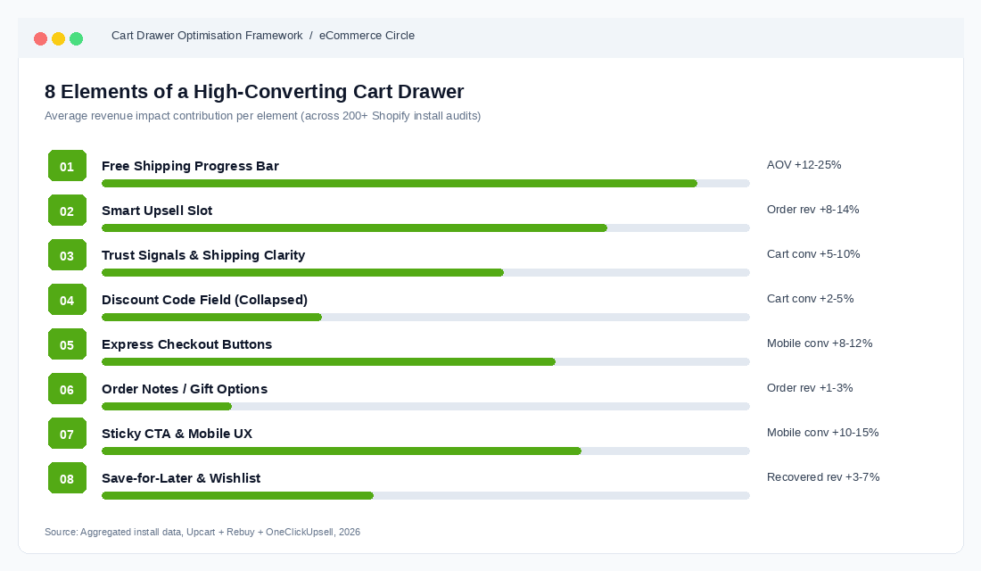
Element 1: The Free Shipping Progress Bar (Your AOV Multiplier)
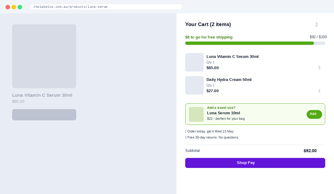
This is the single highest-impact element in the cart drawer. A dynamic progress bar that says “You are $8 away from free shipping” outperforms a static banner saying “Free shipping over $50” by a wide margin. The reason is loss aversion. The shopper has now invested $42 worth of effort and is being shown exactly how to win.
Vendor data on cart-aware progress bars shows AOV lifts in the 12 to 25 percent range on stores that switch from a static threshold to a dynamic bar. The biggest gains hit stores whose pre-bar AOV sits just below their free shipping threshold. If your AOV is $58 and your threshold is $75, you are sitting on a goldmine.
The threshold setting is the part most stores get wrong. The rule of thumb that works: set your free shipping threshold 30 percent above your current AOV. If your AOV is $65, set the threshold at $85. If your AOV is $120, set it at $156. Round to a clean number ($85 not $84.50).
Why 30 percent? Because shoppers do not stop at the threshold. Research from cart drawer apps shows shoppers who chase a threshold typically overshoot it by 30 to 40 percent on average. So a $75 threshold on a $57 cart does not generate one $75 order. It generates an average $82 order. They add a small impulse item, blow past the bar, and walk out feeling like they won.
Three things to test on the progress bar:
- Wording. “$8 to go for free shipping” vs “Spend $8 more, ship free” vs “Add $8 and shipping is on us.” Test all three. Plain, action-oriented copy beats marketing-speak in our coaching cohort almost every time.
- Reward stacking. Layer two rewards: free shipping at $85, free gift at $130. Some stores see step-change AOV when shoppers chase the second tier.
- Animation. The bar should fill in real time as items are added. Static bars get ignored. Animated bars get noticed.
For more on getting the threshold maths right against your contribution margin, our guide on Shopify checkout optimisation covers the financial side in detail.
Element 2: The Smart Upsell Slot (Cross-Sell Logic That Converts)
Below the cart contents, before the checkout button, you need a curated upsell slot. Not three random products from your collection. A targeted complement that makes sense given what is already in the cart.
The mistake most stores make is treating this as a recommendation engine. They drop a generic “You may also like” widget showing best-sellers. Conversion rates on those slots run 0.5 to 1.5 percent. Curated, logic-driven upsells run 4 to 8 percent.
The logic that works:
- If skincare cleanser, recommend the matching toner. Pair products that solve the same job, not random sub-categories.
- Price-anchor the upsell low. The upsell should cost 20 to 40 percent of the cart total. A $25 add-on into a $90 cart converts. A $90 add-on into a $90 cart does not.
- Show one option, not five. Decision paralysis is real. One curated pick converts twice as well as a row of three.
- Use a one-tap add. No variant dropdowns, no quantity selectors. Cart-side upsells should default to size/colour and be addable in a single click.
Aussie skincare and supplement brands run this play hard. A common pattern: cart contains the hero product (a $65 serum), the upsell shows a $22 travel-size version with the line “Add to your routine on the go.” Conversion rates we see in coaching client stores sit between 6 and 12 percent on that exact pattern.
Bundle logic deserves its own treatment. Once you have the upsell slot working, our breakdown of product bundling for Shopify walks through the next layer: pre-built bundles surfaced in the drawer.
Element 3: Trust Signals and Shipping Clarity
Forty-seven percent of cart abandonments come from unexpected costs surfacing at checkout. The cart drawer is your last chance to handle that head-on, before the shopper moves into the checkout funnel where Shopify limits your design control.
Add three small but specific trust signals just under the upsell slot:
- Estimated delivery date. Not “ships in 1-3 days.” Actual dates: “Order in the next 4 hours, get it Wednesday 14 May.” This single line lifts checkout conversion by 5 to 10 percent in stores we have tested.
- Returns policy reassurance. A one-liner: “Free 30-day returns. No questions asked.” If you offer this, say it. Most stores hide it three clicks deep.
- Payment method icons. Visa, Mastercard, Apple Pay, Shop Pay, Afterpay, Zip. The presence of familiar logos lowers anxiety, especially with first-time buyers under 30.
One trust signal Aussie brands underuse: the local touch. “Shipped from Melbourne” or “Aussie owned, family run” outperforms generic copy on stores selling to an Australian audience. We see consistent lift on cart conversion when these are added near the checkout button.
Element 4: The Discount Code Field (And When to Hide It)
The discount code field is one of the most controversial elements in the cart drawer. Show it and you risk a shopper bouncing to Google to hunt for a code, never coming back. Hide it and you frustrate the shoppers who legitimately have a code.
The right answer for most stores: collapse the field by default. Show a small “Have a discount code?” link. Shoppers who have a code will click it. Shoppers who do not will not be tempted to leave.
This single change has been measured to lift cart-to-checkout conversion by 2 to 5 percent on stores that previously showed an open discount field. Brands like Allbirds and Glossier run this exact pattern.
One advanced move: auto-apply codes via URL parameter. If your acquisition channel is influencer or affiliate, push the discount automatically when the shopper lands. They never see the field, the code is already on, the experience feels effortless. This works particularly well for Aussie brands running content creator campaigns where the creator says “use my link” rather than “use code XXX”.
Element 5: Express Checkout Buttons
Shop Pay, Apple Pay, Google Pay, and PayPal are all optional add-ons inside the cart drawer above the main checkout button. Most stores enable Shop Pay (because it is on by default) and call it done.
The right setup is to expose at least three express options stacked vertically: Shop Pay, Apple Pay, PayPal. The reason is conversion lift on returning buyers. Express checkouts skip the entire address-and-payment form. For repeat customers on mobile, this can compress the checkout flow from 90 seconds to 15 seconds.
Mobile traffic is now 72 percent of all Shopify sessions in 2026. The cart drawer needs to be designed around that reality. On a 380-pixel iPhone screen, the express buttons should be the most prominent thing under the cart total, with the standard checkout button below them.
For BNPL, Aussie shoppers expect Afterpay and Zip. Both should be visible as payment options at this layer, not buried in checkout. We covered this in depth in the buy now pay later guide on the platform.
Element 6: Order Notes and Gift Options
This element is small but disproportionately impactful for certain niches. An “Add a gift note” link in the cart drawer signals that you treat gifting as a use case. For brands selling skincare, jewellery, candles, food, or anything that gets bought as a present, this is essential.
The mechanic: collapsed by default, expandable, with two fields (gift recipient name, message). Optional gift wrapping checkbox if you offer it (charge $5 to $8, treat it as upsell revenue).
For stores that introduce a gift note option, we typically see 5 to 9 percent of orders use it. Of those, around 30 to 40 percent attach the paid gift wrapping. On a brand doing 1,000 orders per month, that is around 50 paid gift wraps at $7 = $350 per month of pure margin from one feature.
Order notes (a free-text field) are different. Most stores leave this open, which invites scope creep (“please leave at the back gate” etc.). Decide whether you want to handle that and whether your fulfilment process actually reads the field. If the answer is no, hide it.
Element 7: Sticky CTA and Mobile UX
On mobile, the checkout button needs to be sticky at the bottom of the drawer. As the shopper scrolls through cart contents, the upsell slot, the trust signals, the discount field, the checkout button stays pinned to the screen. Always one tap away.
This sounds obvious, but many default Shopify themes do not handle this well. The button scrolls with the page on mobile, which means a shopper with a heavily-loaded cart has to scroll back to the bottom of the drawer to check out. Friction at the worst possible moment.
While we are on mobile, four things to verify on yours:
- Tap targets are at least 44 pixels. Apple’s minimum. Anything smaller, fingers miss.
- Item quantity steppers (+/-) are easy to hit. Most default themes use small text links instead of buttons. Replace them.
- The drawer takes up at most 90 percent of the screen width. Full screen feels like a page, defeats the drawer purpose.
- The drawer can be dismissed with a downward swipe or X button at the top. Trapping shoppers in the drawer drives bounce.
Sticky add-to-cart bars on the product page work in the same family as sticky cart CTAs. A sticky ATC on PDP plus a sticky checkout in the drawer compounds: studies show the combo lifts conversion by 10 to 15 percent overall, with the biggest gains on mobile.
Element 8: Save-for-Later and Wishlist Hooks
The most overlooked element. Not every shopper who hits the cart is ready to buy today. A “Save for later” toggle next to each cart item lets undecided shoppers move products into a wishlist without abandoning the cart entirely.
Why this matters: shoppers who save items return at a 22 to 30 percent rate (depending on niche), and when they return, they convert at a higher rate than first-time visitors. Without a save mechanism, those same shoppers either delete the item or abandon the entire cart.
Implementation tip: pair the save-for-later button with an email capture. “Save these items and get a reminder by email.” This converts undecided cart abandoners into known leads you can follow up via Klaviyo. Some stores see 30 to 50 percent of save-for-later users opt in for the email reminder.
For Shopify, this typically requires an app (Wishlist Plus, Smart Wishlist, or building it on metafields if you have a developer). It is not native to the cart drawer in default themes.
The Compound Effect: How the 8 Elements Stack
Each element on its own delivers a 2 to 8 percent lift on either AOV or cart conversion. The trap is treating them as a checklist. The compound effect is not additive, it is multiplicative.
Walk a shopper through the full sequence. They land on a product page, add to cart, see the drawer slide in. The progress bar shows them they are $12 from free shipping. The upsell shows them a $22 travel-size that solves a real problem. The trust signal tells them they will get the order Wednesday. The express buttons let them check out in two taps with Shop Pay.
That sequence is the difference between a $58 order today and a $94 order today, plus a higher likelihood of repeat purchase because the experience felt designed.
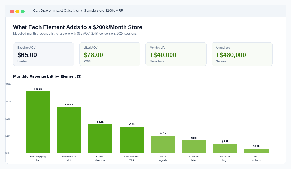
Stores that ship all eight elements at once typically see:
- AOV lift of 15 to 25 percent within the first 30 days, sustaining over 90 days.
- Cart-to-checkout conversion improvement of 8 to 14 percent, driven by trust signals and express buttons.
- A 5 to 12 percent drop in cart abandonment from the combination of clear shipping costs and progress bar momentum.
- An additional 3 to 6 percent of orders coming from cart upsells that did not exist before.
For context, a store doing $200k per month in revenue with a $65 AOV that lifts AOV by 20 percent is now at $78 AOV. Same traffic, same conversion rate, that is $40k per month in additional gross revenue. Annualised, $480k.
If your conversion benchmarks are uncertain, our piece on Shopify conversion rate benchmarks for 2026 gives you the numbers to compare your store against by niche, device, and traffic source.
Tools: Build vs Buy
Three real choices for getting an optimised cart drawer live on Shopify, in increasing order of investment:
- Upcart ($14.99 to $34.99 per month). The fast path. Drag-and-drop builder, all eight elements available, ships in under an hour. Top-rated app on the Shopify store with 5/5 average. Best fit for stores under $1m per year that want quick wins.
- Rebuy ($799+ per month for full personalisation). Heavy-duty AI/ML platform that runs across cart, PDP, and post-purchase. Better fit for stores past $5m per year that need machine-learned upsell logic, dynamic personalisation per shopper, and integration with Klaviyo and Recharge. Overkill for smaller stores.
- Custom theme build. If you have a developer, you can build all eight elements directly in the cart drawer template using metafields and theme app extensions. More work upfront, no monthly app fees, full design control. Right call for brands at $2m to $5m where the app stack is starting to bloat.
For most operators reading this, the right move is Upcart for the next 90 days. Get the elements live, measure the lift, then decide whether to graduate to a custom build later. Do not let perfect be the enemy of revenue this quarter.
Your 14-Day Cart Drawer Implementation Plan
Use this as a checklist. One element per day where possible. Test on mobile first, since 72 percent of your traffic is there.
- Day 1: Audit your current cart. Screenshot mobile and desktop. Note which of the 8 elements you have and which are missing.
- Day 2: Calculate your current AOV from the last 90 days. Set the free shipping threshold at AOV plus 30 percent.
- Day 3-4: Install Upcart (or your chosen tool). Configure the cart drawer to brand colours.
- Day 5: Switch on the dynamic free shipping progress bar with the new threshold.
- Day 6-7: Build the upsell logic. Map your top 5 hero products to their best-pair upsells.
- Day 8: Add trust signals: estimated delivery date, returns policy line, payment icons.
- Day 9: Collapse the discount code field behind a click-to-reveal.
- Day 10: Verify express checkout buttons (Shop Pay, Apple Pay, PayPal) are above the main checkout button.
- Day 11: Add gift note and gift wrap options if your category fits.
- Day 12: Mobile QA. Sticky CTA. Tap targets. Drawer dismissibility.
- Day 13: Add save-for-later with email capture.
- Day 14: Compare AOV, cart conversion, and upsell take rate to your Day 1 baseline. Lock in a weekly review for the next 90 days.
Most stores see results inside the first week. Free shipping progress bar alone usually moves AOV in 7 days. The full eight-element compound takes 30 to 60 days to fully read.
The Cart Drawer Mistakes That Cost the Most Revenue
Six failure patterns we see repeatedly in coaching audits, ranked by how much they cost:
- Free shipping threshold set too low. Threshold equal to or below AOV does nothing. The bar is already full. No motivation to add more.
- Upsell shows random best-sellers. Disconnected recommendations get ignored. Curate by complement, not popularity.
- No mobile sticky checkout button. The single biggest mobile UX miss. The button hides as the drawer scrolls.
- Discount field open by default. Tells shoppers a code exists, sends them to Google, costs you the order.
- Trust signals buried in footer or product page. By the time the shopper hits checkout, the anxiety has already built.
- App stack conflict. Running Upcart plus a competing slide cart (or a discount app that injects banners) causes layout glitches that kill conversion. Audit your apps before adding new ones.
The fix for all six is conscious design. Treat the cart drawer like the highest-stakes surface on the site, because it is.
What to Measure Once It Is Live
Four metrics, weekly cadence:
- AOV. The headline metric. Compare 30-day rolling against pre-launch baseline.
- Cart-to-checkout conversion. Sessions with cart contents divided by sessions that reach checkout. Should lift 8 to 14 percent.
- Upsell take rate. Orders containing an upsell item divided by total orders. Healthy stores hit 4 to 8 percent.
- Free shipping threshold hit rate. Orders at or above the threshold divided by total orders. Aim for 60 to 75 percent.
Track these in a Google Sheet or your existing dashboard. Do not rely on the cart drawer app’s native reporting alone, since they all over-attribute revenue to themselves. Cross-check against Shopify analytics.
Ship the Cart Drawer Before You Ship Anything Else
If you are running ads, planning a new product launch, redesigning your homepage, or building a content calendar, pause. The cart drawer change is faster, cheaper, and pays back inside two weeks. It is the single highest-ROI project on most Shopify stores doing $50k to $500k per month right now.
Every additional dollar of AOV is pure margin upside. You already paid the acquisition cost, you already built the trust, the customer is already at checkout. All you are doing is removing friction and adding gentle nudges in the moment that matters most.
Inside eCommerce Circle, cart drawer optimisation is one of the first projects we run with new members. It is fast, measurable, and the lift is real money. If you want a second opinion on yours, let’s talk.
������������