Walk into any Shopify store with a tired pop-up that says “Get 10% off your first order” and you are looking at the laziest piece of revenue infrastructure in the business. The pop-up is doing one of two things: capturing emails at 2% and quietly leaking 80% of the list it could have built, or annoying the buyers who were actually going to convert and dragging your bounce rate up with it.
What’s in This Article
Most Aussie founders treat the email pop-up as a set-and-forget app install. Add Klaviyo Forms or Privy, pick a template, drop in a discount code, move on. That is why the average ecommerce pop-up converts at 4.82% in 2026, and the top 10% of stores are sitting at 6.3% or higher. The gap between average and top quartile is hundreds of new subscribers a month, and tens of thousands of dollars in email revenue a year.
This playbook is the 6-trigger capture architecture we use with eCommerce Circle members to take a store from 2% opt-in to 8 to 12% without sacrificing user experience, brand, or compliance with the Australian Spam Act. By the end of this article you will have a complete framework for the trigger, the offer, the design, and the legal layer that sits underneath the whole thing.
The Capture Math: Why a 2% Opt-In Rate Is Quietly Costing You $40K a Year
Let us put numbers on the problem before we touch the tactics. Say your store does 30,000 monthly sessions, which is a fairly common shape for an Aussie DTC brand sitting between $80k and $200k a month in revenue. At a 2% opt-in rate, you are capturing 600 new email subscribers a month.
Bump that same traffic to a 6% opt-in rate (the median for a well-built pop-up architecture) and you are now capturing 1,800 new subscribers. That is 1,200 more list adds a month. If your welcome flow converts at 15% (the bottom of the range we cover in The Shopify Welcome Email Flow Playbook) at an AOV of $85, those extra subscribers are worth roughly $15,300 in new revenue every single month. Compound that over a year and the gap between a lazy pop-up and a real capture architecture is more than $180,000 in revenue you never see.
This is why the email pop-up is not a “nice to have” widget. It is the front door to your single highest-margin marketing channel. Treat it like the front door.
The 6-Trigger Capture Architecture (What Actually Sits On Your Site)
The mistake most stores make is running one pop-up against every visitor at every moment. One pop-up cannot serve a brand-new mobile visitor who just landed on a Meta ad, a returning shopper who is 45 seconds into reading a product page, and an exit-intent abandoner who is about to close the tab. Those are three different psychological states. They need three different prompts.
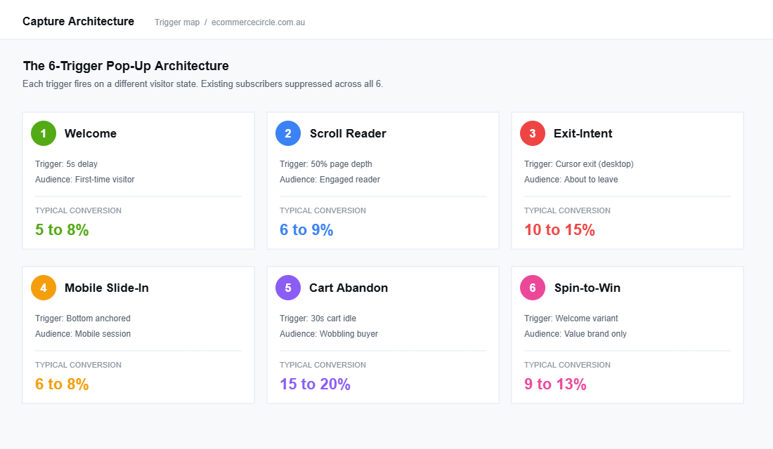
The 6-trigger architecture splits the page into a behavioural funnel. Each trigger picks up a different visitor state and offers the right exchange of value at the right moment. Suppress every trigger from anyone who has already opted in, so subscribers never see the same prompts twice.
- Trigger 1: The 5-Second Welcome. First-time visitors, time-based. The primary list builder.
- Trigger 2: The 50% Scroll Reader. Engaged readers on blog and collection pages. Catches the ones who skipped the welcome.
- Trigger 3: The Exit-Intent Recovery. Desktop only. Last-chance prompt for the abandoner.
- Trigger 4: The Mobile Slide-In. Bottom-up, non-blocking. Because 70 to 80% of your traffic is mobile.
- Trigger 5: The Cart Abandonment Pop-Up. Triggered on cart inactivity. The highest-converting prompt on the site.
- Trigger 6: The Gamified Spin-to-Win. Optional, brand-dependent. Conversion booster for value brands.
Layered together, these six triggers cover every meaningful visitor state. We will work through each one with specific timing, offer, and design notes.
Trigger 1: The 5-Second Welcome Pop-Up (60% of Your Capture)
This is the workhorse. Time-delayed, fires once per visitor, suppressed for existing subscribers and anyone who closed it in the last 30 days. The mistake most founders make is firing it at 0 seconds, which interrupts the buyer before they have even seen the homepage hero. The fix is a 5 to 7 second delay so the visitor gets a feel for the brand first.
The data is clear on timing. Pop-ups that fire immediately convert below 2% on average. Pop-ups that fire at 5 to 8 seconds, after the visitor has scrolled at least once, sit in the 5 to 8% range. The visitor needs a beat to decide “this brand looks like me” before you ask for their email address.
Design rules for the welcome pop-up:
- One field only. Email address. Do not ask for first name, phone, or birthday on the first prompt. Each extra field cuts conversion by 8 to 14%.
- Headline answers “why”. Not “Get 10% off”. Try “Get $15 off your first order plus first access to new drops” or “Join 12,000 Aussies who hear about restocks first”.
- Brand-on imagery. Use a real product or lifestyle shot, not a stock graphic. Frank Body and Who Gives A Crap both nail this. The pop-up should look like a content moment, not an ad.
- Two-step opt-in. Email on step one, SMS as an optional step two. This lifts SMS capture without dragging email conversion down.
Trigger 2: The 50% Scroll-Depth Reader Pop-Up
The welcome pop-up will get closed by 90% of your visitors. Of those, a good chunk will scroll deep into a product page or a blog post and signal real intent. The scroll trigger picks them up.
Scroll-triggered pop-ups (firing at 50 to 60% page depth) convert 30 to 40% better than time-only pop-ups, because they fire on someone who has already proven engagement. Set the trigger to 50% scroll on blog pages and 60% on product pages. Suppress it on the homepage so it does not double up with Trigger 1.
The angle on this one should be different to the welcome. The visitor has already seen the welcome offer and dismissed it. Hit them with a different hook: a content upgrade (the size guide, the ingredient deck, the styling lookbook) rather than the same discount. This is where you build the email list of the buyer who does not respond to discounting.
Trigger 3: The Exit-Intent Recovery Pop-Up (Desktop Only)
Exit-intent fires when the cursor moves toward the browser close button or address bar. It works on desktop, where mouse tracking is reliable. On mobile, exit-intent is broken: there is no cursor to track, so most “mobile exit-intent” features fire on scroll-up or tab switch, which is the wrong signal. Run exit-intent on desktop only.
Exit-intent pop-ups recover 10 to 15% of abandoning visitors when the offer is right. The offer should be stronger than your welcome pop-up because the visitor has already shown they were going to leave with nothing. Common patterns that work:
- Upgraded discount. Welcome offer is 10% off, exit-intent jumps to 15% off or free shipping plus 10% off.
- Time-bound urgency. A countdown timer (15 minutes) on an exit-intent pop-up lifts conversion to 14.4% from a baseline of 9.9%. Genuine urgency only. Do not lie.
- Bundle nudge. “Add a second item, save 20%” works for stores with strong AOV-lifting bundles.
Trigger 4: The Mobile Slide-In (Because 73% of Your Traffic Is Mobile)
If your store is on Shopify, your mobile traffic is somewhere between 65 and 85% of total sessions. Most stores still ship a full-screen mobile pop-up that blocks the page, takes three tries to close, and infuriates the buyer Google sent you. Worse, since 2017 Google has penalised intrusive interstitials on mobile, which can quietly cap your organic visibility.
The fix is a bottom-anchored slide-in. It covers about 30% of the screen, never blocks the product, and dismisses with a single tap. Bottom slide-ins outperform full-screen mobile overlays by 25 to 35% on opt-in rate, and they pass Google’s mobile usability checks.
Mobile pop-ups also convert better than desktop pop-ups on average (6.57% vs 3.77%) when the design respects the smaller screen. The implication is that your mobile experience is where the email list is actually getting built, not your desktop. Build for mobile first.
Trigger 5: The Cart Abandonment Pop-Up (17% Conversion, the Best Prompt on Your Site)
Cart abandonment pop-ups convert at an average of 17.12%, the highest of any pop-up type. They fire when a buyer has items in the cart and shows abandonment signals (cursor toward close, scroll back up, idle for 30 seconds on the cart page). The visitor has already qualified themselves. They want the product. They are wobbling on the purchase decision.
This pop-up needs a different psychology to the welcome. The visitor is past discovery. They need a reason to convert now, not a reason to subscribe. The right offer is usually one of three:
- Free shipping nudge. “Free shipping if you check out in the next 10 minutes.” Pairs with your free shipping threshold strategy.
- Risk reversal. “30-day no-questions returns. Try it, return it if it is not right.” Removes the friction that is actually causing the abandonment.
- Email capture with cart save. “We will hold your cart for 48 hours. Drop your email and we will send the link.” Best of both worlds: you do not discount, but you capture and trigger the abandoned cart flow.
This pop-up handles the in-session abandoner. The 7-email abandoned cart flow handles the rest. We mapped that whole sequence in The Shopify Abandoned Cart Recovery System.
Trigger 6: The Gamified Spin-to-Win (Use With Care)
Gamified pop-ups (spin-to-win, scratch-to-reveal, mystery discount) convert at an average of 13% (and 6 to 12% on opt-in rate specifically), which is two to three times the standard discount pop-up. The trade-off is brand. Spin-to-win cheapens the brand for any premium positioning. It works for value brands, gift brands, and “first-time visitor wants a deal” categories. It does not work for luxury, considered-purchase categories, or B2B.
If you run gamified, do it on the welcome trigger only, suppress it on the rest of the site, and rotate it off for major launches and editorial campaigns. Treat it as a list-building tool for the bottom of the funnel, not your default brand experience.
The Offer Architecture: Why “10% Off” Is Lazy
The single biggest lift we get on pop-up conversion is rarely a trigger change. It is an offer change. Most Shopify stores default to “10% off your first order”. That is the email-capture equivalent of beige. It does not segment, it does not differentiate, and it trains every new subscriber to expect a discount before they buy anything.
Test these offer angles in your A/B framework instead:
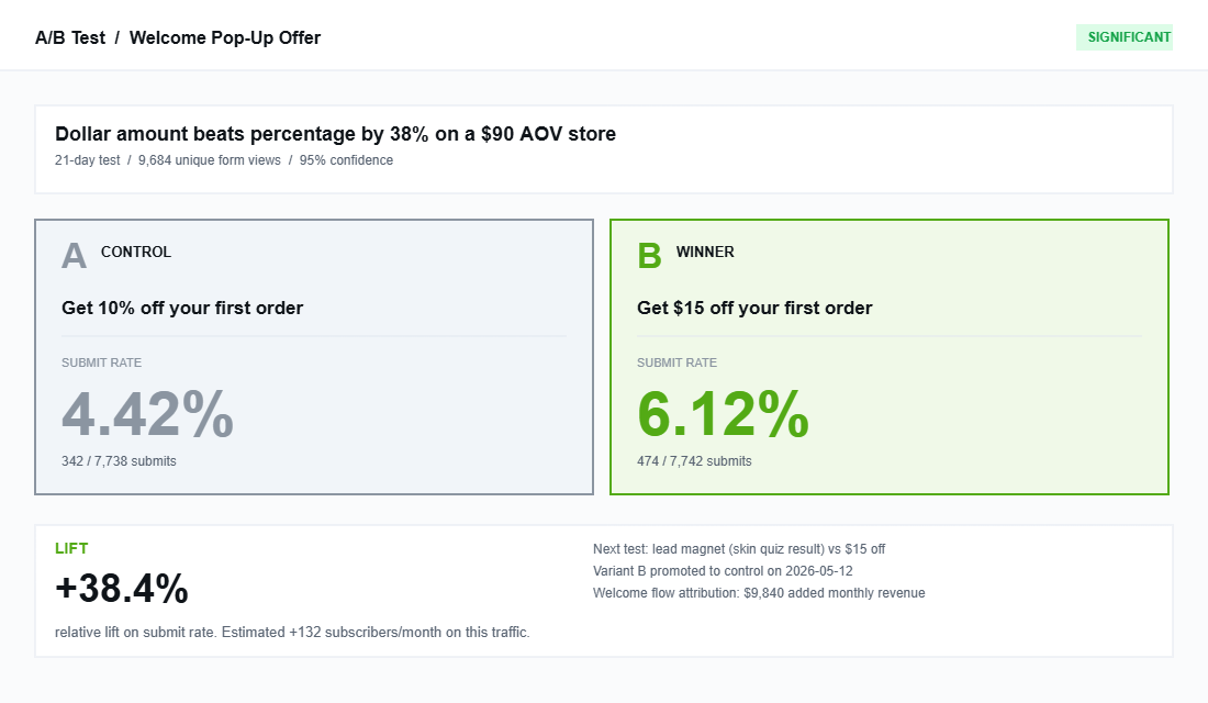
- Dollar amount, not percent. “$15 off your first order” reads as a bigger value than “10% off” once the cart is above $100. Specific numbers beat percentages.
- Bundle the offer with access. “10% off plus first access to restocks and new drops” outperforms “10% off” alone, because the access angle keeps a non-discount-led buyer on the list.
- Lead magnet over discount. A guide, a quiz result, a lookbook, a sizing tool. Adding a lead magnet lifts pop-up conversion to 7.73% on mobile and 4.7% on desktop. Skin care, supplement, fashion fit, and B2B all do well here.
- Cause-aligned. “5% of every first order goes to [charity]” works for brands with a real social mission. Do not fake this. Buyers smell it.
- Free product or sample. “Drop your email, get a free sample with your first order over $60.” High perceived value, low cost, builds the second purchase trigger naturally.
Pick one angle, run it for 30 days minimum, then test a second variant against it. Do not change the offer every week. Pop-up A/B tests need volume to be valid.
The Compliance Layer: Spam Act, Express Consent, and the $220K Risk
Most Aussie founders never think about this until they get a strongly worded email from ACMA. Australia’s Spam Act 2003 requires express consent before you send commercial email to anyone, and the Privacy Act 1988 governs how you store and use that data. Breaches start at fines of $220,000 per single violation and rise to $2.1 million for repeat offences. Worth getting right.
The pop-up itself is where you build the compliance foundation. Three things must be in place:
- Express consent at submit. The pop-up must make it clear the visitor is signing up to marketing emails (or SMS), not just “joining the newsletter” or “getting their discount”. Klaviyo Forms and OptiMonk both include consent language fields. Use them.
- Link to privacy policy and terms. A small line under the submit button: “By submitting you agree to our Privacy Policy and to receive marketing emails.” Linked, not just stated.
- One-click unsubscribe on every send. Not “log in to change preferences”. A direct unsubscribe link, no extra information required. The Spam Act is explicit about this.
Two more rules that founders forget. First, the business sending the email must be clearly identified, including your registered business name and a current physical or postal address (a PO box is fine). Second, an inferred-consent argument (“they bought from us last year”) is weak under Australian law if more than 6 months have passed and there is no explicit opt-in. When in doubt, get the express opt-in. The capture pop-up is exactly where you collect it.
The Tool Stack: Klaviyo Forms, OptiMonk, Privy, and When to Pick Each
For most Aussie Shopify stores under $5m a year, the right answer is Klaviyo Forms. It ships free with Klaviyo, it integrates natively with your email and SMS lists, and the trigger logic now supports time, scroll, exit-intent, and behavioural conditions. You do not need a second tool until your pop-up strategy is genuinely advanced.
Setup steps for a complete Klaviyo Forms architecture:
- Step 1. Build one form per trigger (welcome, scroll, exit, mobile, cart). Use Klaviyo’s “Targeting and behaviour” tab to set the trigger and the suppression rules.
- Step 2. Set every form to “Display only to people not in segment X” where X is your master “Email Subscribers” segment. This stops existing subscribers seeing the welcome offer.
- Step 3. Use form-level identifiers in the welcome flow so each capture source can be tagged. Subscribers from the cart pop-up get a different welcome sequence to subscribers from the homepage pop-up.
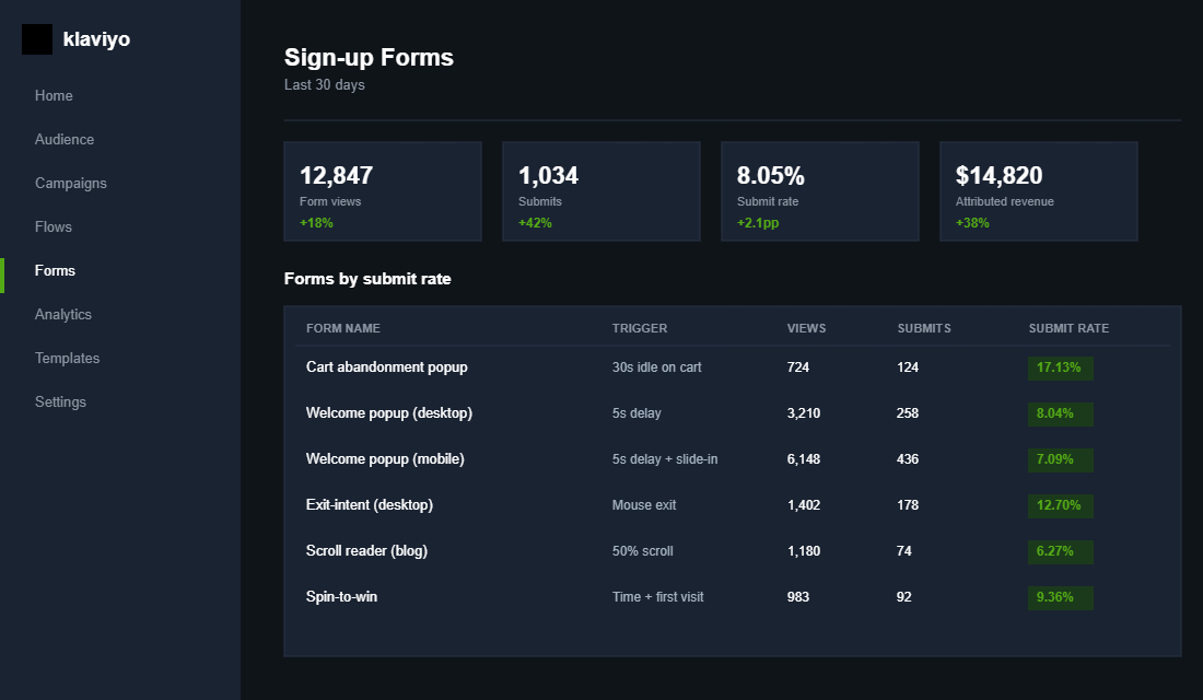
- Step 4. Track conversion at the form level. Klaviyo reports views, submits, and submit rate per form. Aim for 5%+ submit rate on the welcome form within 60 days.
Upgrade to OptiMonk or Wisepops when you need advanced personalisation (different pop-ups by traffic source, by collection visited, by cart value) and Klaviyo Forms starts feeling too rigid. That is usually a $3m+ revenue conversation. Privy is the simpler all-in-one option if you are not on Klaviyo for email, but most serious stores end up on Klaviyo anyway.
The Compound Effect: From 2% Capture to a 5-Figure Email Channel
Here is what happens when the 6-trigger architecture is properly deployed. The welcome pop-up captures the cold first-time visitor at 5 to 8%. The scroll trigger catches the engaged reader who skipped the welcome, adding 1 to 2 percentage points on top. The exit-intent pop-up reclaims another 1 to 2 percentage points from the desktop abandoner. The mobile slide-in lifts mobile capture to match desktop. The cart pop-up converts the in-session abandoner at 15 to 20%. Together you are looking at a blended opt-in rate of 8 to 12%.
That is the front of the funnel. The back of the funnel (welcome flow at 12 to 25%, then a properly built post-purchase sequence, then a segmented broadcast strategy) is what turns those captures into 25 to 35% of total store revenue. Email is the highest-margin channel you own. The pop-up is the door it walks through.
Stack-ranked, the order of operations for an Aussie founder going from “we have a Klaviyo pop-up that converts at 2%” to “we have a real capture architecture”:
- Week 1. Audit the existing pop-up. Pull the data: views, submits, submit rate. Identify whether you are below, at, or above the 4.82% average.
- Week 2. Rebuild the welcome pop-up. 5-second delay, one field, brand-on imagery, $-amount offer, compliance copy. Ship it.
- Week 3. Add the mobile slide-in and the scroll-trigger reader pop-up. Suppress them from existing subscribers.
- Week 4. Add desktop exit-intent and cart abandonment. Set the offers stronger than the welcome.
- Week 5 and beyond. A/B test offer angles every 30 days. Track submit rate per form. Tag capture source into the welcome flow.
This is a 30-day project, not a 30-minute app install. Done properly it is one of the highest-ROI things you will do this quarter, because every percentage point of lift compounds through the welcome flow, then the post-purchase flow, then the lifetime value of the customer.
A 12-Point Email Pop-Up Audit Checklist
Run this checklist on your store right now. If you score below 8 out of 12, you have meaningful revenue left on the table.
- Welcome pop-up has a 5 to 7 second delay (not immediate).
- Welcome pop-up captures email only on step one, optional SMS on step two.
- Offer is specific (dollar amount or stacked value), not a generic “10% off”.
- Welcome pop-up uses brand-on imagery, not stock or generic graphics.
- Existing subscribers are suppressed from the welcome pop-up.
- A scroll-trigger pop-up fires at 50 to 60% page depth on blog and PDP.
- An exit-intent pop-up is running on desktop with a stronger offer than the welcome.
- Mobile uses a bottom slide-in (not a full-screen interstitial).
- A cart abandonment pop-up fires on cart inactivity with a free-shipping or risk-reversal angle.
- Express consent language appears at the form’s submit button, linked to your Privacy Policy.
- Each form has its own welcome flow with a tagged source (so you can measure LTV per capture source).
- You review submit rate per form monthly and A/B test the offer every 30 days.
Score yourself honestly. We do this audit on every member store inside eCommerce Circle, and the most common score on the first audit is 4 to 6 out of 12. The good news is that the gap closes fast. Five focused weeks and the pop-up architecture is doing the work it should have been doing all along.
Inside eCommerce Circle, the email capture architecture is one of the first things we look at when a member joins, because it is the easiest revenue lift in the first 90 days. If you want a second opinion on yours, let’s talk.