Your customer cannot pick up your product. They cannot feel the weight of it, turn it over in their hands, or check the stitching. Every single buying decision on your Shopify store is made through photos, and most Aussie founders are losing sales to images that were shot in five minutes on a kitchen bench and never touched again.
What’s in This Article
The numbers here are brutal. Around 75% of online shoppers say they rely on product photos to make a purchase decision, and 83% of mobile shoppers rate image quality as more important than the product description itself. Your photos are not decoration. They are the sales conversation.
The good news: you do not need a $5,000 studio shoot to fix this. You need a repeatable system. This playbook gives you the exact 5-Shot System we work through with eCommerce Circle members, the smartphone studio setup that costs less than one agency invoice, and the editing pipeline that makes every product in your catalogue look like it belongs to a brand twice your size.
Why Photography Is the Highest-Leverage Asset on Your Product Page
Most founders treat photography as a one-off job they did when they launched. The data says it deserves a permanent line in your growth plan. An analysis of more than 500 online retailers by product experience platform Salsify found stores using professional-quality photography converted at rates up to 94% higher than competitors running amateur imagery. High-resolution images alone have been shown to lift conversion around 33% compared with low-quality versions of the same product.
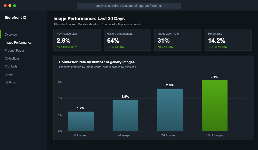
Image quantity matters as much as quality. When ASOS lifted its gallery from six images to twelve per product in 2024, mobile conversion jumped 18% within 90 days. More angles means fewer unanswered questions, and unanswered questions are where carts go to die.
Photography also protects your margin after the sale. Roughly 22% of ecommerce returns happen because the item looked different in person than it did in the photos, against an average return rate now sitting near 20% across the industry. Brands that upgrade their imagery see return rates fall by around 23%, because the customer who knows exactly what they ordered does not send it back. If you have read our product page conversion playbook, you already know the gallery is the first of the seven blocks that decide whether a visitor buys. This article is about making that block world class.
The 5-Shot System: Every Product, Every Time
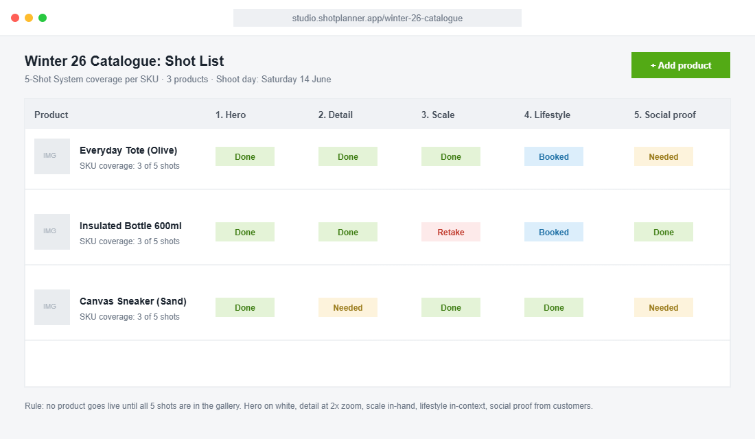
Random photos produce random results. The 5-Shot System gives every product in your catalogue the same five-image spine, answering the five questions every buyer silently asks. Shoot these five first, then add extras. No product goes live without all five.
Shot 1: The Hero (What is it?)
Clean, front-on, on a white or light neutral background, product filling about 85% of the frame. This is the image Google Shopping pulls, the image your collection grid shows, and the first thing every visitor sees. Shoot it straight, light it evenly, and keep the crop identical across your whole range so your collection pages look like a brand rather than a garage sale.
Shot 2: The Detail (Is it well made?)
A tight macro shot of the thing that justifies your price: the stitching, the seal on the lid, the weave of the fabric, the engraving. Quality is invisible in a hero shot. The detail shot is where a $90 product separates itself from the $30 lookalike on a marketplace. One detail shot per selling point, and put your best one second in the gallery.
Shot 3: The Scale Shot (How big is it really?)
Size confusion is one of the biggest drivers of “not what I expected” returns. Show the product in a hand, next to a familiar object, or on a body. Bellroy, the Melbourne accessories brand, does this better than almost anyone: every wallet is photographed mid-grip and loaded with a labelled number of cards, so the buyer knows exactly what fits before they spend a cent. Steal that idea shamelessly.
Shot 4: The Lifestyle Shot (Where does it live in my life?)
The product in its natural habitat: the bottle on a gym floor, the tote on a cafe chair, the candle on a bedside table at dusk. This shot sells the identity, not the object. July, the Melbourne luggage brand, pairs colour-blocked studio shots with cases gliding through airports and hotel lobbies, and that combination is exactly the model worth copying: clean studio consistency plus one aspirational scene.
Shot 5: The Social Proof Shot (Do people like me own this?)
A real customer photo, a creator shot, or a review screenshot rebuilt as a gallery tile. It looks deliberately less polished than your studio work, and that is the point. It reads as evidence, not advertising. Ask for photos in your post-purchase email flow and reward the best ones with a store credit. This shot also feeds your ads, your email, and the trust layer we covered in the trust signal architecture framework.
The Smartphone Studio That Costs Less Than One Pro Shoot
A professional product shoot in Sydney or Melbourne typically runs $1,500 to $5,000 once you count the photographer, studio hire and retouching. Worth it for your hero range twice a year. Completely unnecessary for the weekly grind of new variants, bundles and seasonal refreshes. For that, you build a permanent corner studio at home or in the warehouse.
Here is the full kit, all of it available on Amazon AU or at Kmart and Bunnings for under $300 total:
- Your current phone. Any iPhone from the 13 onward or equivalent Samsung or Pixel shoots 12MP+ images that are sharper than what most stores currently publish. Always shoot in the standard lens, never the wide.
- A light tent or sweep (about $60 to $120). A 60cm to 80cm LED lightbox gives you the even, shadow-soft white background that makes hero shots look professional. For bigger products, a roll of white card from Officeworks taped into a curve does the same job.
- A tripod with a phone mount (about $40 to $70). Locked framing is the secret to a consistent catalogue. Mark the tripod feet positions on the floor with gaffer tape so every future shoot matches the last one.
- Two LED panels or one ring light (about $60 to $100). Position at 45 degrees either side, slightly above product height. Never use the ceiling light and never use direct sunlight for hero shots; both create hard shadows that scream amateur.
- A grey card (about $15). One tap to white balance against it and your olive green stops photographing as brown. Colour accuracy is a returns-prevention tool, not a nice-to-have.
Camera settings: lock exposure and focus on the product, drop exposure slightly so highlights do not blow out, shoot in the highest resolution available, and take every shot twice (one square crop in mind, one portrait for Stories and ads). A full 5-Shot session for one product takes about 25 minutes once the corner is set up.
The AI Editing Pipeline: Photoroom in 5 Steps
Editing used to be the bottleneck. AI killed the bottleneck. Our pick for most founders is Photoroom, because it is built mobile-first, handles batch work, and publishes straight to Shopify on higher plans. The free plan covers 250 exports a month, Pro is about USD $8 a month, and the Max plan (about USD $27 a month) adds direct Shopify publishing. Set it up like this:
- Create a brand template first. Set your canvas to 2048 x 2048 pixels, square, with your standard background colour. Every hero shot you process inherits the same crop and padding, which is what makes a collection page look uniform.
- Batch process your hero shots. Upload the session, let the AI cut the background, then apply your template to all of them at once. Thirty SKUs takes minutes, not a weekend.
- Use AI backgrounds sparingly and honestly. Generated scenes are fine for mood, but never let AI redraw the product itself. The photo is a promise. Misleading renders create the exact returns problem you are trying to kill.
- Run the Retouch tool on dust and scuffs only. Clean the set, not the truth. Remove the lint on the fabric, keep the real texture.
- Export as high-quality JPG or PNG and let Shopify convert. Shopify’s CDN serves WebP and AVIF automatically, so your job is simply to upload sharp, well-lit originals at 2048px.
Image Specs That Keep Your Store Fast (and Google Happy)
Beautiful photos that take four seconds to load are a conversion tax. Slow galleries hit mobile shoppers hardest, and mobile is where most Aussie stores now take 70%+ of their traffic. The fix is a one-off audit plus a standard you never break again.
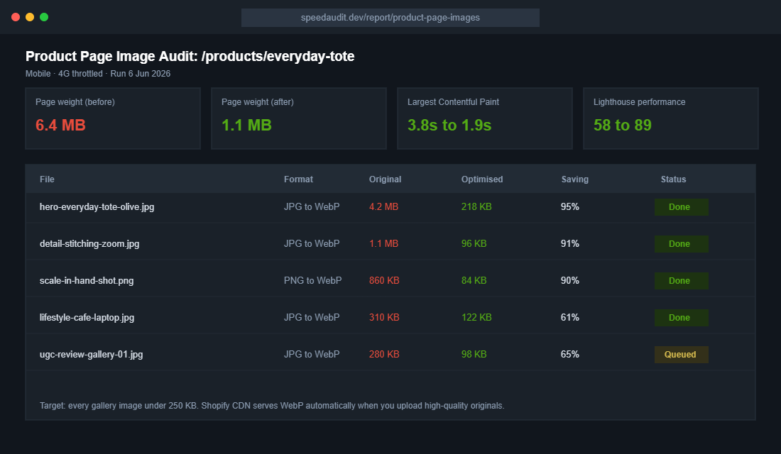
- Upload at 2048 x 2048 for square product shots. Big enough for pinch-zoom on retina screens, small enough that Shopify’s CDN keeps delivery lean.
- Keep source files under 1 MB before upload. Export JPGs at 80 to 85% quality. Nobody can see the difference, but your Largest Contentful Paint can.
- Name files like a human searching Google. “olive-canvas-tote-bag-hero.jpg” beats “IMG_4382-final-FINAL.jpg” for image SEO and for your own sanity in six months.
- Write alt text that describes the product, not the keyword list. “Olive green canvas tote bag held over the shoulder” helps shoppers using screen readers and gives Google Images real context. Shopify lets you set this per image in the media editor.
- Audit quarterly. Apps and page builders quietly bloat galleries over time. A 30-minute quarterly check keeps your product pages under 2 MB total.
Test Your Images Like You Test Your Ads
You already accept that ad creative needs testing. Product photos deserve the same discipline, because the gallery is the highest-traffic creative you own. The big retailers treat image order as a live experiment, and the ASOS result above (six images to twelve, 18% mobile conversion lift) came from exactly that mindset.
Start with your top five products by revenue. Test one variable at a time: hero on white versus hero in context, lifestyle shot second versus detail shot second, eight images versus twelve. Watch add-to-cart rate and gallery engagement in your analytics, give each test two to four weeks of data, and roll the winner across the catalogue. The full method, including sample size traps to avoid, is in our A/B testing playbook.
The Compound Effect: One Shoot, Five Channels
Here is where the system pays for itself. The 5-Shot session you run on Saturday morning does not just upgrade a product page. The hero shot fixes your Google Shopping feed and your collection grid. The detail and scale shots cut your “not as described” returns. The lifestyle shot becomes next month’s Meta ad creative and three organic posts. The social proof shot feeds your email flows and review widgets.
Better images lift conversion, which lowers your effective acquisition cost, which gives you margin to spend on the next shoot. Stores that treat photography as a quarterly operating rhythm rather than a launch-week panic build a visual moat that competitors quietly copying your product description can never replicate.
Gallery Order: The 12-Slot Architecture
Shooting the right images is half the job. Ordering them is the other half, because most mobile shoppers only swipe through the first three or four tiles before deciding whether to scroll down or bounce. Treat your gallery like a sales pitch with a deliberate running order, not a folder dump.
Here is the order that works for most product categories:
- Slot 1: Hero on white. Instant recognition, consistent grid.
- Slot 2: Your strongest detail shot. Justify the price within one swipe.
- Slot 3: Scale shot. Kill the size question before it forms.
- Slot 4: Lifestyle scene. Sell the identity once the facts are settled.
- Slots 5 to 7: Angles and features. Back, inside, base, close-ups of every functional selling point.
- Slot 8: Social proof. A real customer photo right where doubt usually creeps in.
- Slots 9 to 12: Variants, infographic tile and care notes. A simple annotated image listing dimensions and materials answers the questions your description buries.
That annotated infographic tile deserves a special mention. One image with the product photographed straight-on and four or five labelled callouts (capacity, weight, materials, warranty) consistently ranks among the most-zoomed tiles in session recordings. Buyers skim. Give the skimmers a single tile that closes them.
Variants, Video and 360s: When to Go Beyond Stills
Two rules for variants. First, every colour and finish gets its own hero shot, because a swatch chip is not a photo and shoppers do not trust their imagination with their own money. Second, when a customer selects a variant, the gallery must switch to that variant’s image. Shopify supports variant images natively, and leaving them unassigned is one of the most common gallery faults we see in store audits.
Beyond stills, the data gets interesting. Interactive formats like 360-degree spins, 3D models and augmented reality have been linked to conversion lifts up to 94% in industry studies, because they recreate the in-store inspection your customer cannot do online. Shopify supports 3D models and AR Quick Look out of the box, so a single GLB file per hero product turns an iPhone into a virtual showroom.
Video earns its slot too, but keep it honest and short. A 15 to 30 second clip showing the product being used, opened or packed beats a cinematic brand film on a product page. Shoot it on the same phone, in the same corner studio, right after the stills session while everything is lit. One session, one extra deliverable, zero extra setup.
If budget forces a choice, prioritise in this order: complete 5-Shot coverage across the catalogue first, variant heroes second, video on your top five products third, and 360s or 3D only once the basics are airtight everywhere. Fancy formats on three products never outperform disciplined fundamentals on thirty.
Your Product Photography Checklist
Save this and run it before any product goes live, and as a quarterly audit on your bestsellers:
- Coverage: all five shots present (hero, detail, scale, lifestyle, social proof), with 8 to 12 images on hero products.
- Consistency: identical crop, background and lighting across the collection. Tripod position marked, brand template applied.
- Honesty: colour balanced against a grey card, no AI redraws of the product, flaws like fabric texture left real.
- Speed: uploads at 2048px, source files under 1 MB, product page total under 2 MB, quarterly weight audit booked.
- SEO: descriptive file names, human alt text on every image.
- Proof: at least one genuine customer photo in the gallery, refreshed every quarter from your post-purchase flow.
- Testing: one live image test running on a top-five product at all times.
Run the audit this week. Pick your three bestselling products, score them against the checklist, and book one Saturday morning to close the gaps. Most founders find the entire reshoot and re-upload takes a single weekend, and the conversion lift starts showing in the next month’s numbers.
Inside eCommerce Circle, product presentation is one of the core pillars we work on with every member, because it touches conversion, returns and ad performance all at once. If you want a second opinion on your galleries, let’s talk.