Your store looks good. The photography is clean, the product is solid, the ads are bringing traffic. So why are so many people adding to cart and then vanishing? The uncomfortable answer is that most of them do not trust you yet. The latest Baymard Institute tracking puts the average documented cart abandonment rate at 70.19%, and a big slice of that is pure hesitation at the moment of payment.
What’s in This Article
Here is the part most operators get wrong. They treat trust as a vibe. A nice logo, a few stars, maybe a security badge slapped near the footer, and they assume the job is done. Trust is not a vibe. It is an architecture. It is a set of specific signals placed at the exact moments your shopper feels risk, and when those signals are missing the sale quietly dies.
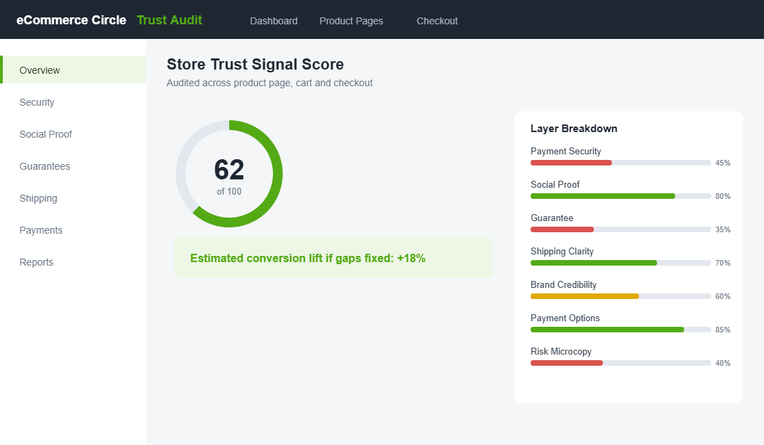
Consider this. In Australia, 68% of shoppers say they are less likely to buy if they have trust or security concerns at checkout. That is not a fringe minority. That is two thirds of your traffic deciding, often in under a second, whether your store feels safe enough to hand over a card. Below is the 7-layer trust signal architecture we use with eCommerce Circle members to systematically remove that hesitation and lift conversion.
Layer 1: Payment Security (The Card Field Is Where Sales Die)
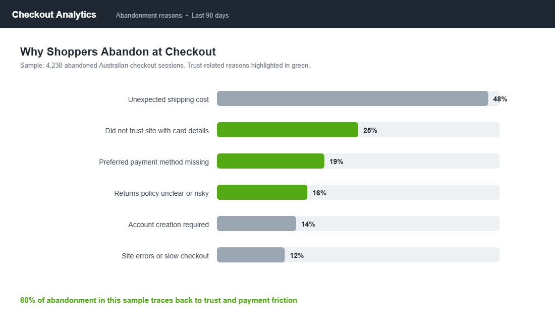
The single highest-anxiety moment in the entire journey is the instant a shopper is asked to type a card number. Baymard found that 25% of shoppers who abandon do so because they do not trust the site with their credit card information, and 18% specifically look for security indicators before entering payment details. If those indicators are not there, the brain fills the gap with doubt.
For lesser-known Aussie brands, this is make or break. Studies show that placing recognised security badges near the payment field can lift conversion by 15 to 30%, and in some controlled tests trust badges drove gains as high as 42%. The brand name does not carry the weight yet, so the signals have to.
Worth being clear on what counts here. The most powerful reassurance is not a generic graphic but a recognised name the shopper already trusts. A PayPal or Visa mark borrows the trust those companies have spent decades building. A vague “Secure Site” sticker you designed yourself does close to nothing, because it points back to the very brand the shopper is still unsure about. Borrow trust from names they know, and only use seals that are real.
Here is what to actually do:
- Show the padlock and “Secure checkout” microcopy directly above or beside the card field, not buried in the footer.
- Display recognised payment marks (Visa, Mastercard, Amex, PayPal, Apple Pay) at the point of payment, not just on the homepage.
- Use real, recognised seals only. A made-up “100% Safe” graphic does nothing. Shopify’s native checkout is already PCI compliant, so lean on that fact in your copy.
- Keep the checkout on your domain and visually consistent. A jarring design change at checkout reads as “am I still on the right site?”
If you have not pressure-tested this end to end, our Shopify checkout optimisation audit walks through the exact friction points worth fixing first.
Layer 2: Social Proof (Other People Are Your Best Salesperson)
Reviews are not a nice-to-have. They are the closest thing online retail has to a friend leaning over and saying “yeah, get it.” Around 93% of consumers read reviews before buying, and 88% trust them as much as a personal recommendation. When your product page has no reviews, you are asking a stranger to take a leap on faith alone.
The mistake is treating reviews as a star rating and nothing more. The shoppers who convert are reading the actual words, looking for someone like them, in their situation, who was happy. Depth beats volume.
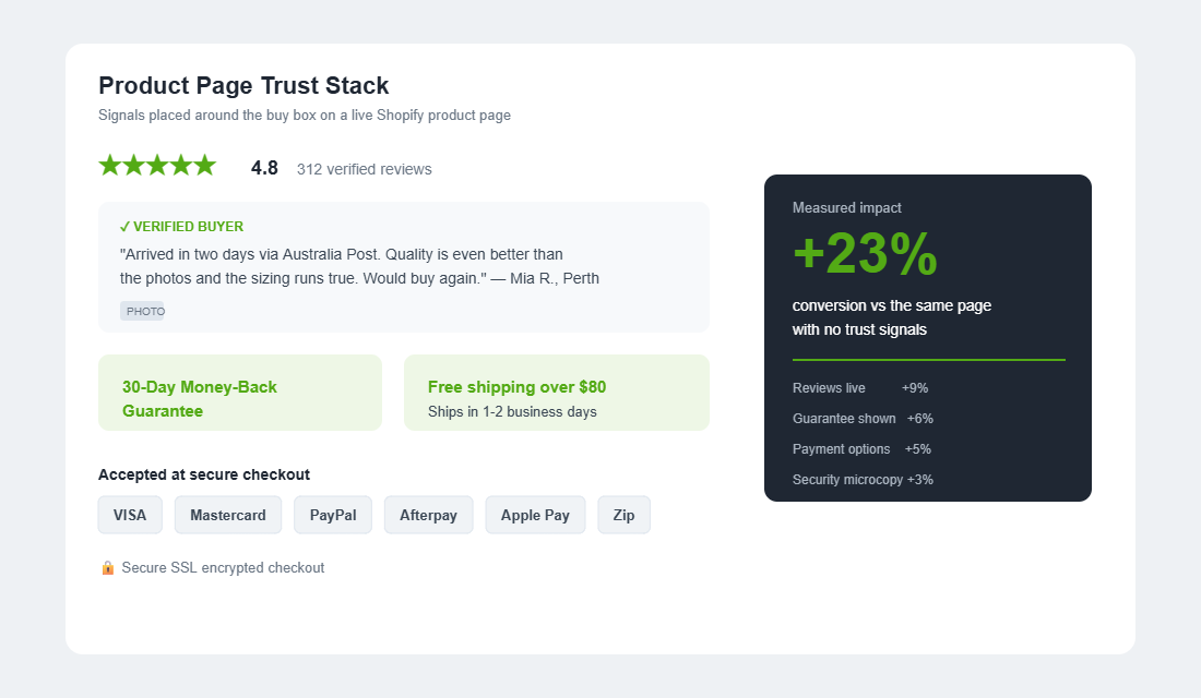
- Put the star rating near the product title, above the fold, so it is the first reassurance a shopper sees.
- Show photo reviews from real customers. User-generated images are the most trusted proof you can display, and they double as free content.
- Surface reviews that handle objections. If sizing is a worry, pin a review that says “runs true to size.”
- Respond to negative reviews publicly and calmly. A measured reply to a one-star is one of the strongest trust signals on the page.
A quick benchmark to aim for: a product page feels credible once it carries at least a handful of reviews, and conversion tends to climb as that count grows into the dozens. The first ten reviews on any product do the heaviest lifting, because they move a page from “nobody has tried this” to “plenty of people have, and they were happy.” Prioritise getting your best sellers past that threshold first.
Shoppers are getting sharper too. About 62% now worry about fake or AI-generated reviews, so verified-buyer badges and genuine photos matter more than ever. This layer plugs directly into your product page. Our 9-block PDP conversion framework shows exactly where social proof should sit relative to the buy box.
Layer 3: The Guarantee (Take the Risk Off Their Shoulders)
Every purchase carries an unspoken question: what if this is wrong for me? A guarantee answers it before it is even asked. The data here is hard to argue with. Case studies show that adding a visible 30-day money-back guarantee can lift conversions by 21 to 26%, and 92% of consumers say an easy return policy influences whether they buy at all.
Australian operators have an extra advantage. Consumer guarantees under Australian Consumer Law already protect your customers, so a clear returns promise is partly just telling shoppers what they are entitled to anyway. Make it loud instead of leaving it in the fine print.
The brands that nail this build the guarantee into their identity. Koala made a 120-night mattress trial central to its pitch, turning a high-anxiety purchase into a low-risk one. July, the Melbourne luggage brand, leans on a lifetime warranty so heavily that it becomes a reason to choose them over a cheaper bag. The guarantee is not a policy. It is a selling point.
- State the guarantee on the product page near the add-to-cart button, not just on a separate returns page.
- Use plain numbers. “30-day money-back guarantee” beats “satisfaction guaranteed.”
- Address the fear of returns being a hassle. 51% of buyers avoid retailers that do not offer free returns, so if you can offer them, say so.
- Do not panic about refund spikes. When one brand extended its guarantee from 90 days to a year, refunds rose only 3% while conversions climbed sharply.
Layer 4: Shipping and Delivery Clarity (Uncertainty Kills Carts)
Australians spent $82.6 billion online in 2025, up 14% year on year, and now make 24% of all retail purchases online. But geography is unforgiving here. A shopper in Perth ordering from a Sydney warehouse wants to know two things immediately: how much, and how long. Vague shipping is a trust leak.
When shoppers cannot see delivery cost and timing until the final checkout step, they assume the worst and bail. Unexpected shipping cost is consistently one of the top reasons carts get abandoned. The fix is radical transparency, early.
- Show the free-shipping threshold as a progress bar in the cart. “You are $12 away from free shipping” both reassures and lifts average order value.
- Put estimated delivery windows on the product page. “Ships in 1 to 2 business days, delivered via Australia Post” removes guesswork.
- Name your carrier. Australia Post and recognised couriers carry built-in trust that an anonymous “standard shipping” does not.
- Be honest about regional and remote timing. Under-promising and over-delivering builds repeat buyers.
There is a revenue angle here too. The free-shipping progress bar is one of the few trust signals that also lifts average order value, because it nudges shoppers to add one more item to hit the threshold. So this layer does double duty: it removes the cost anxiety that kills carts, and it quietly grows the orders that do go through. Few fixes give you both at once.
The cart is where this clarity earns its keep. Our cart drawer optimisation framework breaks down how to surface shipping reassurance without cluttering the buy flow.
Layer 5: Brand Credibility (Prove a Real Business Exists)
Anyone can spin up a Shopify store in a weekend, and shoppers know it. So they scan for evidence that a real, accountable business sits behind the storefront. The absence of that evidence is exactly what dropshipping-scam radar is tuned to detect, and your legitimate brand pays the price if it looks the same.
This layer is cheap to build and most stores neglect it. You do not need a glossy production. You need proof of life.
- Write a real About page with a founder photo and story. “Started in a garage in Brunswick in 2021” beats corporate filler every time.
- Publish a visible contact method. A real email, phone, or live chat tells shoppers someone will answer if something goes wrong.
- Display your ABN and physical location in the footer. For an Aussie audience, this is a quiet but powerful legitimacy marker.
- Show press logos, awards, or partnerships if you have them. Borrowed authority works when your own is still growing.
Think of this as the background check shoppers run without telling you. Pass it, and every other signal on the page gets more believable.
One practical move pays off here more than any badge. Add a short founder note or video, even thirty seconds shot on a phone, explaining why you started the brand and standing behind the product. Shoppers are wired to trust a face and a name far more than a faceless logo. For a smaller Aussie brand competing against imports, that human signal is often the cheapest edge you have, and the one big retailers cannot easily copy.
Layer 6: Payment Flexibility (Let Them Pay Their Way)
Trust is not only about safety. It is also about feeling understood. When a shopper reaches checkout and their preferred payment method is missing, 41% of Australians say they lose trust in the brand on the spot. That is a self-inflicted wound, because adding payment options is one of the easier fixes on this list.
The Australian payment mix has shifted hard. Digital wallets now lead, and 37% of Australians use buy-now-pay-later for online purchases, up 11% year on year. A store that only takes a raw card number feels dated and slightly risky by comparison.
- Offer Afterpay and Zip. For considered purchases, BNPL is often the difference between “later” and “now.”
- Enable Apple Pay, Google Pay and Shop Pay. Express wallets cut friction and signal that you are a modern, trusted store.
- Show BNPL instalment pricing on the product page. “Or 4 payments of $24.75 with Afterpay” reframes the price and reduces sticker shock.
- Keep PayPal available. Many shoppers trust PayPal’s buyer protection more than handing a card to a new brand.
Every payment logo at checkout doubles as a trust badge. Each one tells the shopper that a recognised, regulated company has agreed to work with you.
There is a second-order benefit most operators miss. Offering BNPL and wallets does not just rescue the shopper who would have bailed. It lifts average order value, because someone splitting a payment into four feels comfortable adding the extra item they were hesitating over. The same trust that closes the sale also grows the basket, which is why this layer pays for itself quickly.
Layer 7: Risk-Reversal Microcopy (The Words Right Next to the Button)
The final layer is the smallest and the most ignored. It is the handful of words sitting immediately around your add-to-cart and checkout buttons. This is the last thing a shopper reads before they commit, and it is prime real estate for removing the very last sliver of doubt.
Most stores leave this space empty or fill it with nothing useful. The brands that convert use it to whisper a reassurance at the exact moment of decision.
- Add a one-line guarantee under the buy button. “Free returns within 30 days. No questions asked.”
- Reinforce stock or shipping urgency honestly. “Order by 2pm for same-day dispatch” works because it is true and useful.
- Restate security at the checkout button. “Secure SSL encrypted checkout” costs nothing and calms nerves.
- Avoid fake urgency. A countdown timer that resets on refresh destroys trust faster than no timer at all.
Microcopy is the cheapest conversion lever you own. No developer, no app, no budget. Just the right ten words in the right place.
Where Each Signal Belongs (Map It to the Journey)
Knowing the seven layers is only half the job. The other half is placement, because a trust signal works only when it lands at the moment the matching fear appears. The right reassurance in the wrong spot is wasted. Map your signals to the journey and they start pulling their weight.
- Homepage and ads landing: The shopper is asking “is this a real, decent brand?” Lead with social proof, press logos, and a hint of your guarantee. This is where credibility opens the door.
- Product page: The fear is “is this right for me, and can I trust it?” Stack the star rating near the title, photo reviews mid-page, the guarantee by the buy button, and instalment pricing under the price.
- Cart and drawer: The worry shifts to cost and commitment. Surface the free-shipping progress bar, delivery timing, and a returns reminder so nothing feels like a trap.
- Checkout: Pure payment anxiety. This is where security microcopy, payment marks, and recognised wallets do the heavy lifting.
Notice that the same guarantee appears in three different places, worded slightly differently each time. That is deliberate. Repetition across the journey is not clutter when each mention answers the specific fear of that step. A shopper rarely reads every signal, so you place them where the relevant doubt is sharpest and let the journey do the convincing.
The Tool: Set Up Verified Reviews in Under an Hour
If you only build one layer this week, build social proof, because it compounds. The fastest path is a dedicated reviews app rather than relying on Shopify’s basic product reviews. Judge.me has a generous free plan and is one of the most widely used options, while Okendo is an Australian-founded platform that many of the bigger local brands run.
Here is the Judge.me setup, start to finish:
- Install from the Shopify App Store. Search “Judge.me Product Reviews” and add it to your store.
- Connect your theme. The app auto-places the review widget on product pages for Online Store 2.0 themes. Confirm the star rating appears near the title.
- Import existing reviews. If you have reviews on another platform or in a spreadsheet, use the CSV import so you do not start from zero.
- Turn on automatic review request emails. Set the delay to roughly 7 to 14 days after delivery, so the product has been used.
- Enable photo and video reviews. Offer a small incentive, like entry into a monthly draw, to encourage image uploads.
- Add the rich-snippet star rating. This makes star ratings show up in Google search results, lifting click-through before the shopper even lands.
Within a few weeks of consistent review requests, a typical store goes from a sparse product page to one backed by dozens of genuine voices. That is the difference between a shopper guessing and a shopper buying.
The Compound Effect: Why Trust Is a System, Not a Patch
Any one of these layers will nudge your conversion rate. The real gain comes from stacking them, because trust is cumulative. A shopper who sees strong reviews, a clear guarantee, recognised payment options and honest shipping does not just feel a little safer. They cross a threshold from “maybe” to “yes.”
This is why fixing one trust leak in isolation often disappoints. If your reviews are glowing but your checkout looks sketchy and your shipping is a mystery, the weakest link still sinks the sale. Shoppers do not average your signals. They anchor on the scariest one.
So work the whole architecture. Walk your own store on your phone, as a first-time buyer with a cold credit card, and ask at every step: what would make a stranger nervous here? Then place a signal exactly there. When you do this systematically, the 70% who normally abandon start becoming the customers who buy, and just as importantly, the ones who come back.
One more thing worth saying plainly. Trust signals are not a substitute for actually being trustworthy. Fast dispatch, honest product descriptions, and genuine support are what turn a first order into a second. The seven layers simply make sure shoppers can see that you are the real deal before they have any proof of their own. Get both right, the substance and the signals, and your conversion rate stops being a number you fight for and starts being a by-product of a brand people believe in.
Your Trust Signal Audit Checklist
Run this over your store today. Tick every box you already have, and the gaps become your priority list.
- Security: Padlock and “secure checkout” copy visible at the card field, recognised payment marks shown at payment.
- Social proof: Star rating near the product title, photo reviews live, verified-buyer badges on, replies to negative reviews.
- Guarantee: Plain-number money-back or returns promise stated near the add-to-cart button.
- Shipping clarity: Delivery cost and timing shown on the product page, free-shipping progress bar in the cart, carrier named.
- Brand credibility: Real About page with founder, visible contact method, ABN and location in the footer.
- Payment flexibility: Afterpay or Zip, Apple Pay or Shop Pay, PayPal, instalment pricing on the product page.
- Risk-reversal microcopy: One-line reassurance directly under the buy and checkout buttons, no fake urgency.
Inside eCommerce Circle, trust signal architecture is one of the core Platform pillars we work on with every member, because it lifts the conversion rate on traffic you are already paying for. If you want a second opinion on where your store is leaking trust, let’s talk.