Your product page is the only page on your Shopify store where someone decides to spend money. Every ad you run, every email you send, every dollar of agency retainer eventually lands a shopper here. And for most Aussie founders, this is the page they have looked at so many times they can no longer see it.
What’s in This Article
That is the problem. The typical Shopify store converts about 1.4% of visits into customers, while a genuinely good store sits at 2.5 to 3.5%, and the top 10% run at 4.7% or higher. The gap between 1.4% and 3.5% is not traffic. It is the product page. Two stores can pay the same cost per click and one prints money while the other quietly bleeds it, all because of what happens between the hero image and the buy button.
Here is the shift. A high-converting product page is not a design. It is a sequence of decisions, answered in the order a buyer asks them. Get the order right and conversion climbs 20 to 40% without spending another cent on ads. This is the 7-block system we use with founders inside eCommerce Circle to rebuild a product page that actually sells.
Why the Product Page Is the Highest-Impact Page You Own
Think about where your money goes. You pay to acquire a click, you pay an email platform to bring people back, you discount margin to close the sale. All of that spend funnels into one moment: a shopper standing on a product page, weighing up whether to trust you with their card.
The maths is brutal in your favour here. If you lift product page conversion from 2% to 2.6%, that is a 30% revenue increase on the exact same traffic and ad spend. No new agency, no new channel, no new creative. Just a page that answers questions in the right order.
And the stakes are real. 87% of customers say product content is the single most important factor when deciding whether to buy online. When that content is accurate and well structured, conversion can lift by as much as 78%. When it is thin, vague or buried, shoppers leave, and worse, 42% of buyers have returned a purchase in the past year because the product was not accurately described on the page. Every one of those returns started with a product page that did not do its job.
So before you touch your ad account again, audit this page. We break it into seven blocks, each one answering a specific question in the buyer’s head.
Block 1: The Above-the-Fold Decision
The first screen, before anyone scrolls, has to carry the entire sale on its shoulders. On mobile, where roughly 79% of Shopify traffic now comes from, you have a single phone-height window to communicate what this is, why it matters, what it costs, and how to buy it.
Most theme defaults waste this space. A pretty image, a product title, a price, and a buy button is the bare minimum, and it leaves money on the table. The above-the-fold block needs to do five jobs at once:
- Name the outcome, not just the product. “Vitamin C Serum” is a label. “Vitamin C Serum for brighter, more even skin in 4 weeks” is a reason to keep reading.
- Show the price and any value framing immediately. Hidden or delayed pricing creates anxiety. If you offer free shipping over a threshold, say it here.
- Make the buy button impossible to miss. High contrast, large tap target, fixed in place on mobile so it follows the shopper down the page.
- Surface one trust cue. A star rating with review count, a “10,000+ sold” line, or a key guarantee. One, not ten.
- Answer the delivery question. “Ships from Melbourne, delivered in 2 to 4 business days” removes the biggest silent objection in Australian ecommerce.
Go-To, the Aussie skincare brand, does this well. Their product pages lead with the outcome and the skin concern, not a clever product name, so a first-time visitor knows in two seconds whether they are in the right place. That clarity is worth more than any animation.
Block 2: The Image Stack That Sells
Shoppers cannot touch your product, so your images are doing the work their hands would do in a shop. This is not a gallery to fill. It is a sequence designed to remove doubt, and it is one of the highest-impact changes you can make. Using multiple angles and 3D or spin imagery can increase conversion by as much as 250% because it lets shoppers inspect the product the way they would in person.
The image stack has a job at every position. We sequence it like this:
- Shot 1: the hero. Clean, product-led, instantly recognisable. This is the thumbnail your ads and collection pages also use.
- Shot 2: in context. The product in a hand, on a body, in a kitchen. Scale and use case in one frame.
- Shot 3: the detail. Texture, stitching, finish, ingredients label. This kills the “is it cheap?” objection.
- Shot 4: the size and spec graphic. Dimensions, what is in the box, how it compares. This is where size and fit confusion gets solved, and that matters because fit issues drive around 70% of returns.
- Shot 5: social proof image. A real customer photo, ideally pulled from reviews, that signals “people like you bought this”.
Beard & Blade, the Australian grooming retailer, leans on clean detail shots and consistent framing across thousands of SKUs, which is what makes a large catalogue feel trustworthy rather than chaotic. Consistency in the image stack is its own trust signal.
Block 3: The Benefit-Led Description
Here is where most founders write for themselves instead of the buyer. They list features, specs and brand story, then wonder why the page feels flat. The description block has one job: translate what the product is into what it does for the person reading.
The structure that works is simple and you can apply it to any product:
- Lead with the transformation. One or two sentences on the outcome the buyer gets. Storytelling that frames that outcome can lift perceived value dramatically, so the first line earns its keep.
- Three to five benefit bullets, each with a feature attached. “Lasts 12 hours (3000mAh battery)” beats either half alone. Bullet-led content consistently outperforms paragraph walls.
- A short “how to use” or “what to expect” block. This reduces post-purchase confusion and the returns that follow.
- The honest spec table. Materials, dimensions, ingredients, care. Accurate product data alone can lift conversion up to 30% because it removes the fear of a wrong purchase.
Write it the way you would explain the product to a mate who asked “is this any good?”. Short sentences. Plain words. No filler. If a line does not help the buyer decide, cut it.
Block 4: The Objection-Killer Zone
Every shopper arrives with a list of silent objections. Will it fit? When will it arrive? What if I hate it? Is this brand legit? The pages that convert do not hope these questions go away. They answer them on the page, near the buy button, before the shopper has to go looking.
This block is usually the weakest one we find in an audit, and it is the cheapest to fix. Build it from the actual questions your support inbox already answers every day:
- Shipping and delivery. Dispatch location, delivery window, free shipping threshold, express option. Australian buyers care intensely about this.
- Returns and guarantee. A clear, generous returns promise removes the single biggest reason for hesitation. Say it plainly: “30-day returns, no questions asked”.
- Sizing and fit. A real size guide, fit notes, or a “runs small, size up” line. This directly attacks the 70% of returns caused by fit.
- An FAQ accordion. Five to eight real questions, answered honestly. This is the block that quietly closes the careful buyer.
Most of this also doubles as trust architecture. If you want to go deeper on stacking credibility cues across the page, we broke the full system down in the Shopify Trust Signal Architecture framework.
Block 5: Social Proof That Is Specific
Generic five-star ratings have lost their power. Shoppers have learned to discount them. What converts now is specific, recent, and visual proof from people who look like the buyer. The numbers back it hard: shoppers who engage with user-generated content on a product page convert 144% more often and generate 162% higher revenue per visitor, according to Bazaarvoice’s 2025 Shopper Experience Index.
Video is the strongest format of all. 76% of consumers rank video as the most trustworthy form of user content, well ahead of images and text, and product pages with verified UGC galleries typically deliver a 10 to 25% conversion lift versus studio-only photography. Video reviews specifically can add 5 to 9% to your add-to-cart rate.
Build the social proof block like this:
- Lead with a review that handles an objection. A quote that says “I was worried about sizing but it fit perfectly” does more than ten generic raves.
- Show customer photos and video, not just stars. Real faces and real homes signal authenticity.
- Display review count and recency. “412 reviews, last one 2 days ago” proves the brand is alive and selling.
- Let shoppers filter by skin type, size, or use case so they find proof from someone like them.
A specific review that answers a real objection is worth more than a hundred five-star clicks with no words attached.
Block 6: The Smart Upsell That Lifts Order Value
Conversion is only half the game. The same product page that turns a browser into a buyer should also lift how much that buyer spends, and the product page is the most natural place to do it because intent is already high. Done badly, upsells feel pushy and hurt conversion. Done well, they feel like genuine help.
The rules we use:
- Bundle the obvious companion. A razor with blades and balm. A serum with the moisturiser that pairs with it. Frame it as “complete the routine”, not “buy more”.
- Show the bundle saving in dollars. “Save $14 versus buying separately” converts better than a percentage.
- Keep upsells below the buy decision, never above it. Do not let a cross-sell distract from the primary add-to-cart.
- Use a post-purchase upsell for the rest. Once the card is charged, a one-click add carries no conversion risk at all.
This block is where average order value quietly compounds. We mapped the full set of levers, including bundling, thresholds and post-purchase offers, in the Shopify Average Order Value Playbook.
Block 7: The Mobile-First Build
Four out of five of your shoppers are on a phone, yet most product pages are still designed on a desktop and checked on mobile as an afterthought. That is backwards, and it costs you. Mobile conversion rates already run 30 to 40% lower than desktop, so a clumsy mobile build widens a gap that is already working against you.
A mobile-first product page is not a shrunk-down desktop page. It is reordered for a thumb:
- Sticky add-to-cart bar. The buy button follows the shopper down the entire page. This single change often lifts add-to-cart by double digits.
- Collapsible sections. Description, shipping, and FAQ as tap-to-open accordions so the page does not feel like an endless scroll.
- Tap-friendly image swiping. The gallery should swipe like an app, not require pinching.
- Fast load. Every extra second of load time bleeds conversion. Compress images, lazy-load below the fold, and cut the apps you do not need.
The Tool: Set Up a Reviews and UGC Engine in an Afternoon
Blocks 5 and 6 both depend on a steady flow of customer reviews, photos and video. You cannot fake that, but you can systemise collecting it. The tool we point Aussie founders to most often is Okendo, a reviews and UGC platform that was founded in Australia and integrates cleanly with Shopify and Klaviyo. Judge.me and Loox are solid lower-cost alternatives if you are earlier stage.
Here is the setup, start to finish:
- Install and connect. Add Okendo from the Shopify App Store and connect your store. Match the widget colours to your brand, including the green accent if you use one.
- Turn on photo and video reviews. In the review form settings, enable media uploads and add a small incentive, such as a discount on the next order, for reviews that include a photo or clip.
- Set the review request timing. Trigger the request a few days after estimated delivery, not at dispatch, so the customer has actually used the product.
- Add the review widget to the product page. Place the star summary up near the title in Block 1 and the full gallery lower down in Block 5.
- Pipe reviews into Klaviyo. Use the integration to drop review content into your email flows, so proof compounds across the whole customer journey.
Within a few weeks you will have a renewable supply of the exact social proof that lifts conversion 144%. The system collects it for you while you sleep.
The Compound Effect: Why the Blocks Beat the Tactics
Here is the part most founders miss. None of these seven blocks is a silver bullet on its own. A great image stack on a page with no objection handling still leaks buyers. Brilliant reviews under a weak above-the-fold never get seen. The power is in the sequence.
Walk it in the buyer’s order. Block 1 earns the scroll. Block 2 makes the product real. Block 3 turns features into reasons. Block 4 removes the fear. Block 5 proves other people were right to trust you. Block 6 lifts the basket. Block 7 makes all of it work on the device 79% of people are actually holding.
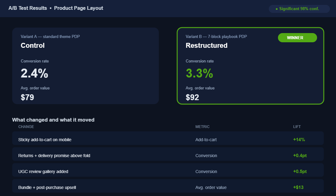
When we rebuilt a skincare client’s product page block by block, conversion moved from 2.4% to 3.3% and average order value lifted from $79 to $92. That is not one heroic change. That is seven small, correct decisions stacked in the right order, each one compounding on the last. On the same traffic, that combination lifted revenue by more than 50%.
The blocks also feed the rest of your store. A product page that answers objections reduces returns. A page that earns trust improves email and ad performance, because the traffic you send converts. The product page is not an island. It is the conversion hub the whole business runs through, which is exactly why it deserves more attention than your next ad creative. If you want to see how it connects to the wider buyer flow, the Customer Journey Mapping Playbook shows where the product page sits in the full picture.
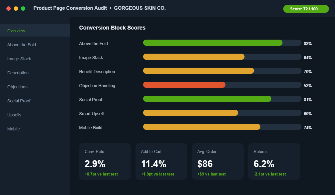
Your Product Page Audit Checklist
Open your best-selling product page on your phone right now and run it against this. Score each block out of 10. Anything under 7 is where your next conversion lift is hiding.
- Block 1, Above the fold: Outcome-led title, visible price, delivery promise, one trust cue, sticky buy button. ___/10
- Block 2, Image stack: Hero, in-context, detail, size graphic, and customer photo, in that order. ___/10
- Block 3, Description: Leads with transformation, benefit bullets with features, spec table. ___/10
- Block 4, Objection killers: Shipping, returns, sizing, and an honest FAQ near the buy button. ___/10
- Block 5, Social proof: Specific reviews, customer photo and video, count and recency, filterable. ___/10
- Block 6, Smart upsell: Relevant bundle with dollar saving, placed below the buy decision. ___/10
- Block 7, Mobile build: Sticky cart, collapsible sections, swipeable gallery, fast load. ___/10
Add it up. Most stores we audit land between 40 and 55 out of 70 on their first pass. Closing the gap to 60-plus is usually worth a 20 to 40% conversion lift, and it costs you a focused afternoon, not a new ad budget.
Stop Guessing: A/B Test Your Product Page
Every change in this playbook is a strong bet. But the only way to know what your customers actually respond to is to test it, because the brand down the road and your store can want opposite things. The good news: you no longer need a developer or an enterprise budget to run a clean test on Shopify.
- Test one block at a time. Change the hero image, or the button copy, or the placement of reviews, but not all three at once. If everything moves, you learn nothing about what worked.
- Wait for real significance. A test usually needs a few hundred conversions per variant before the result means anything. Calling a winner after 30 sales is how founders fool themselves and ship the worse version.
- Use the right tool. Intelligems, Shoplift and Visually all run native Shopify A/B tests without slowing your theme. Intelligems also tests pricing and shipping thresholds, which is where some of the biggest profit lifts hide.
Not sure where to start? The highest-leverage tests are almost always above the fold: the main image, the headline, and the primary call-to-action button. These get seen by 100% of visitors, so a 5% lift there outweighs a 20% lift on something only a third of people scroll to. Test the elements everyone sees before you fiddle with the ones they never reach.
Aim to always have one test running. A store that tests its product page every fortnight compounds small wins into a conversion rate competitors cannot copy, because they only ever see the finished page, not the 20 experiments behind it. And remember the page does not work in isolation: the collection pages feeding traffic to it set the expectation a great product page then has to keep.
Where to Start This Week
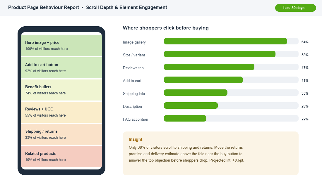
Do not try to rebuild all seven blocks at once. Pull up your behaviour data, find the block with the lowest score and the most traffic touching it, and fix that one first. For most founders it is Block 4, the objection-killer zone, because it is the cheapest to fix and the most neglected. Then test, measure, and move to the next block.
Inside eCommerce Circle, the product page is one of the core pillars we work on with every member, because it is the page where all the other work either pays off or quietly disappears. If you want a second opinion on yours, let’s talk.