You spend thousands of dollars a month driving traffic to your Shopify store, and most of it does not land on a product page first. It lands on a collection page. The “Shop All Skincare” page, the “New Arrivals” page, the “Womens Dresses” page. For most Aussie brands, that page is the single biggest silent leak in the funnel.
What’s in This Article
Here is the uncomfortable part. Category-style pages show up in the top organic results for roughly 72% of broad product searches, based on an Ahrefs analysis of 50,000 ecommerce queries. So when someone searches “merino base layer” or “organic dog food”, they are far more likely to land on a collection than on a single product. That is high-intent browsing traffic, and it is hitting the page most founders never touch.
We see the same thing in nearly every store audit. Founders pour energy into the product page and the ad creative, then leave the collection page on whatever the theme shipped with. Twelve products in a grid, no merchandising logic, sold-out items floating near the top, filters that barely work. Fix that page and you lift add-to-cart rate across the entire store, because almost every visitor passes through it on the way to buying.
Why Your Collection Page Is the Most Valuable Page You Own
Think about how a shopper actually moves through your store. They click an ad or a search result, they browse a collection, they tap into one or two products, then they decide. The collection page sits right in the middle of that journey, and it does two jobs at once. It has to convince the visitor you sell the thing they want, and it has to get them to tap into a product fast.
The data backs up how much this page matters. Category page visitors view more pages per session than product-page visitors, which tells you they are still comparing and narrowing. They convert at a lower rate per visit, but they make up a much larger share of your traffic, so small percentage gains here move real revenue. Retailers who get their categorisation and merchandising right see around 30% higher add-to-cart rates and measurably lower bounce from these pages.
The problem is that this page is chronically under-optimised. After benchmarking 50 top-grossing US ecommerce sites, the Baymard Institute found the average store needs around 35 changes to perfect its product list, filtering and sorting experience. These are multi-million dollar brands, and they are still leaving the browsing experience half-built. That is your opening.
Here is why the upside is so big. A single product page might convert 3 to 5 times better per visit than collection traffic, but only a fraction of your visitors ever land directly on a PDP. The collection page is the gate the rest of them pass through. Every shopper you nudge from “just browsing” to “tapped into a product” gets handed to your best-converting page in better shape. You are not replacing the product page, you are feeding it warmer traffic. That is why a two-point lift here outearns almost any tweak you could make further down the funnel.
Lever 1: Map Collections to How Buyers Search, Not How You Store Stock
The most common collection mistake has nothing to do with design. It is structural. Merchandising teams organise products the way the business thinks: by supplier, by season, by the order stock arrived in the warehouse. Buyers do not search that way. They search by use case, by attribute, and by occasion.
If you sell skincare, your customer is not searching “Range B Autumn Drop”. They are searching “moisturiser for oily skin” or “vitamin C serum”. If those collections do not exist on your store, you are handing that traffic and that intent straight to a competitor who built them. Category pages rank and convert for the way buyers actually think.
Build collections around the language your customers use. The fastest source of that language is your own data: site search queries, the words customers use in reviews and support tickets, and the search terms in your Google and Meta reporting. Then create intent-led collections to match.
- By use case or concern. “For Sensitive Skin”, “For Cold-Weather Camping”, “Office to Dinner”.
- By attribute. “Under $50”, “100% Linen”, “Australian Made”, “Vegan”.
- By occasion or recipient. “Gifts for Him”, “Wedding Guest”, “First Home”.
- By stage. “Bestsellers”, “New In”, “Last Chance”. These catch shoppers who do not yet know what they want.
Aussie linen brand Bed Threads is a clean example. Instead of forcing you into one giant “Sheets” page, it lets you shop by colour and by bundle, which is exactly how a customer styling a bedroom actually thinks. The collection structure mirrors the decision, not the warehouse.
Lever 2: Win the Above-the-Fold in the First Three Seconds
The top of the collection page has one job: confirm the shopper is in the right place and get them scrolling into products. Most themes waste it with a giant banner that pushes the actual products below the fold on mobile, where the majority of your traffic now lives.
Keep the hero tight. A short collection title, one or two lines of context, and then product cards visible without scrolling. On mobile that often means the first row of products should peek above the fold so the shopper instantly knows there is more to see.
- Lead with a one-line value statement. Not “Welcome to our store”. Something like “Australian-made merino, built for the backcountry”. Context plus credibility in a single line.
- Set a deliberate default sort order. The theme default is usually “Featured” or “Manually”, which on a neglected store means chaos. Default to bestselling or to a curated order you control.
- Add a short SEO description, but place it low. A 60 to 100 word category description helps you rank for the way buyers search, but it should sit at the bottom of the page, not above your products.
- Show the result count. “84 products” reassures the shopper there is real selection without making them guess.
The mobile point is not optional. With the bulk of Shopify traffic on phones, anything that pushes products down the screen costs you. If you have not pressure-tested this page on a phone, read our Shopify mobile conversion playbook next, because the collection grid is where mobile leaks hardest.
Lever 3: Treat the Product Card as the Unit of the Page
A collection page is really just a grid of product cards. The card is the decision unit. Get the card right and you lift the click-through to product pages, which is the metric that actually feeds your add-to-cart rate. Get it wrong and even a perfectly structured collection underperforms.
The biggest quick win on most Aussie stores is the hover-image swap on desktop and a second image on mobile. Showing a second angle, the product on a model, or a lifestyle shot gives the shopper a reason to engage without leaving the grid. Short category videos and richer imagery measurably increase time on page and conversion.
- Two images per card. A clean primary shot plus a secondary lifestyle or alternate angle on hover or swipe.
- Star ratings on the card. If you have reviews, surface the rating and count. Social proof at the browsing stage moves clicks, not just the product page.
- Honest urgency. “Only 3 left” or “Selling fast” works when it is true. A badge that lies trains shoppers to ignore every badge you ever show.
- Price clarity. Show the price, any sale price, and a Buy Now Pay Later line if you offer it. Afterpay is an Australian habit, and seeing “4 payments of $24” on the card removes a hesitation early.
- Quick add or quick view. For simple products, let shoppers add to cart from the grid. Fewer taps, more carts.
Keep the card consistent. Mismatched image dimensions and ragged crops make a collection look amateur and slow the eye down. One image ratio, one card layout, applied across every product.
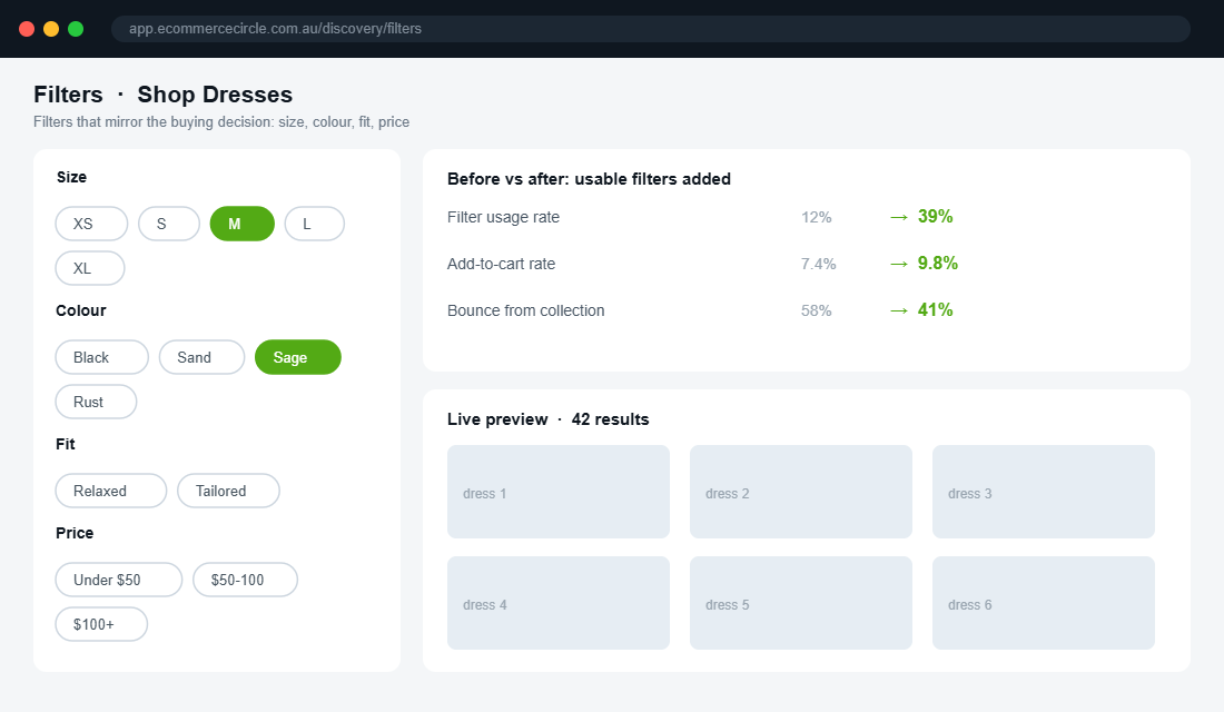
Lever 4: Filtering and Sorting That Actually Narrows the Choice
Filtering is where most stores quietly lose patient, high-intent shoppers. Only around 60% of websites offer a genuinely good filtering experience, and 42% of ecommerce sites lack category-specific filters entirely. If your “Dresses” page only lets you filter by price, you are forcing the shopper to scroll through 200 products to find the one in their size and colour. Most will not.
Good filters mirror the decisions a buyer actually makes in your category. For apparel that means size, colour, and fit. For supplements it might be goal, format, and dietary tag. The filters should map to real product data, and the moment a shopper applies one, the page should respond.
- Filter by what the customer cares about. Size and colour for fashion, not just “Type” and “Price”.
- Never show zero results. Grey out or hide filter combinations that return nothing. A dead end is a lost sale.
- Keep filters sticky on mobile. A persistent filter button as the shopper scrolls beats forcing them back to the top.
- Sort options that mean something. Bestselling, newest, price low to high, and price high to low cover most needs. Skip the options nobody uses.
This is deep enough to deserve its own work. If filtering is your weak point, our Shopify collection filtering playbook goes lever by lever on getting it right. The headline is simple though: filtering is not a nice-to-have, it is how a browsing shopper becomes a buying one.
Lever 5: Merchandise the Grid Like a Retailer, Not a Database
This is the lever that separates a real store from a template. Your collection grid should be merchandised on purpose, the way a shop floor is laid out by someone who knows what sells. Left to the default, Shopify orders products manually or alphabetically, which means your hero products can be buried on page three while a sold-out item sits up top.
The core moves are pin, boost, and bury. Pin your proven winners and best-margin products to the top rows. Boost newer products you want to give a run. Bury or auto-hide anything out of stock so the shopper never taps into a dead end. The 80/20 rule applies hard here: a handful of products carry most collections, so make sure those are the first thing every shopper sees.
- Pin your heroes. Put your highest-converting, best-margin products in the first two rows where almost every shopper looks.
- Push sold-out to the back. Automatically demote or hide out-of-stock items. Nothing kills momentum like tapping a product you cannot buy.
- Sequence for the journey. Lead with an accessible hero, follow with bestsellers, then breadth. The first screen should feel like your best foot forward.
- Merchandise by collection, not globally. The best seller in “Gifts Under $50” is different from the hero of “New Arrivals”. Set rules per collection.
Aussie brand The Oodie does this well, curating themed collections and leading with proven sellers rather than dumping the full catalogue in upload order. The grid feels chosen, and a chosen grid converts better than a raw one.
Lever 6: Set Up Merchandising With Shopify Search & Discovery
You do not need an expensive app to start merchandising. Shopify’s own Search & Discovery app is free, native, and handles pinning, boosting, burying and filters. Here is the setup we run with members who are starting from the theme default.
- Install the app. In your Shopify admin, open the App Store, search “Search & Discovery”, and click Install. It is free and made by Shopify, so there is no theme risk.
- Open the Merchandising tab. Select the collection you want to work on, starting with your highest-traffic one.
- Set the product order. Drag your hero and best-margin products into the top rows, or apply a rule like “bestselling” or “highest revenue” so the grid orders itself by performance.
- Demote out-of-stock products. Turn on the setting that pushes sold-out items to the bottom so dead ends never sit above the fold.
- Build your filters. In the Filters tab, add filters based on your product options and metafields, such as size, colour, material or goal. Remove the generic ones nobody uses.
- Improve search synonyms. Add synonyms so “jumper” finds “knitwear” and “trackies” finds “joggers”. Aussie shoppers use Aussie words, and your search index should too.
That gets you most of the way for free. When you outgrow it, apps like Boost AI Search & Discovery add visual merchandising, AI-ranked results and richer filtering. Start native, prove the lift, then upgrade when the volume justifies it.
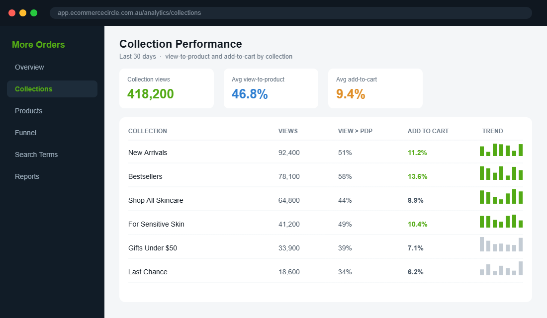
Track the Two Numbers That Tell You It Is Working
Optimising blind is guessing. Before you start pulling levers, grab a baseline so you can prove the lift. You only need two numbers per collection, and Shopify gives you both.
- Collection view-to-product rate. Of the people who view the collection, what share tap into a product page? This tells you whether your grid, cards and merchandising are doing their job. If most viewers never reach a PDP, the page is the problem, not the products.
- Collection add-to-cart rate. Of the people who view the collection, what share end up adding to cart in that session? This is the bottom-line number, and it is the one that moves revenue when it climbs.
Pull these from Shopify’s analytics or your reporting tool, write them down per collection, then make one change at a time and watch the number move. A/B testing is still the gold standard, but even a clean before-and-after on your top three collections will show you which levers earn their keep. Treat the collection page like any other conversion surface: measured, tested, and improved on purpose.
The Compound Effect: Why These Six Levers Work as a System
None of these levers is dramatic on its own. The power is in stacking them. Map collections to real search intent and you pull in more qualified browsers. Win the above-the-fold and more of them keep scrolling. Sharpen the product card and more of them tap into a product. Fix filtering and the patient buyers find their match. Merchandise the grid and your best products get the eyeballs they deserve.
Run the maths. If your collection pages currently send 8% of viewers into the cart and you lift that to 10%, that is a 25% increase in add-to-cart from the same traffic. Because nearly every visitor touches a collection page, that gain compounds across every product, every campaign, and every channel feeding the store. You did not spend an extra dollar on ads. You just stopped leaking the traffic you already paid for.
This is also the cheapest CRO work you will ever do. The product page gets all the attention, but it only sees the shoppers who made it through the collection. Optimise the page that feeds the funnel and everything downstream gets easier. While you are at it, your store navigation is what funnels people into these collections in the first place, so the two work hand in hand.
One more thing the data makes clear: this is not a one-and-done job. Buyer language shifts, your range changes, and what sold last season is not what sells this one. The brands that win the browsing stage treat their top collections like living shop windows, re-merchandising the grid every few weeks and pruning collections that no longer match how people search. It takes an hour a fortnight once the structure is in place, and it keeps your best products in front of the people you already paid to attract.
Your Collection Page Audit Checklist
Open your highest-traffic collection on your phone right now and run it against this list. Every “no” is a lever to pull.
- Intent match. Do your collections match the words customers actually search, not just your internal ranges?
- Above-the-fold. Are products visible without scrolling on mobile, with a tight one-line hero?
- Default sort. Is the grid ordered by something deliberate, not the theme default?
- Product card. Two images, star ratings, clear price and BNPL, and a quick-add where it fits?
- Filtering. Can a shopper narrow by the attributes that matter, with no zero-result dead ends?
- Merchandising. Are heroes pinned to the top and sold-out items pushed to the bottom?
- Description. Is there a short SEO description placed below the products?
- Speed. Does the page load fast and the grid respond instantly to filters?
Score yourself out of eight. Most stores we audit start at three or four. Getting to seven or eight is a weekend of work with the free Shopify app, and it lifts the page almost every visitor in your store walks through.
Inside eCommerce Circle, the collection page is one of the first surfaces we optimise with every member, because it is the cheapest add-to-cart lift in the store. If you want a second opinion on yours, let’s talk.