You have poured money into ads. You have rewritten your product pages three times. You have tested hero images until your eyes hurt. And yet the one element that every single visitor touches, the menu sitting across the top of your store, was set up once during your theme install and never looked at again.
What’s in This Article
Here is the uncomfortable part. Most Aussie founders build their navigation by mirroring their Shopify admin: every collection gets a link, dumped into a dropdown in the order they happened to create them. That is not navigation. That is a filing cabinet with the drawers left open.
Baymard Institute found that 67% of mobile sites have navigation rated as mediocre or worse. The brands that win treat the menu as a merchandising surface, not an afterthought. This playbook is the 6-part system we use to turn a confusing menu into a quiet revenue lever.
Why Your Menu Is the Most-Ignored Conversion Lever You Own
Think about the journey. A shopper clicks your ad, lands on a page, and within a few seconds decides whether your store is worth their time. The header is the first thing they orient to. If they cannot work out where to go, they bounce, and you paid for that click.
This matters more in Australia than most founders realise. Mobile now drives over 60% of Aussie ecommerce sessions, yet mobile still converts at roughly half the desktop rate. A big chunk of that gap is navigation: a menu that works on a wide screen falls apart under a thumb.
Baymard also found that 38% of mobile sites have a category structure that is too deep, too shallow, or full of overlaps. The cost is brutal. When a shopper cannot find a product, they do not assume it is buried. They assume you do not sell it, leave, and never come back. That is one lost sale today and every future sale that customer would have made.
Search and navigation are partners, not rivals. Roughly 69% of online shoppers say search is their most common way to find products, and 73% of mobile users reach for the search bar. But search only helps people who already know what they want. Navigation is how you sell to the 80% who are still browsing. (We go deep on the other half of this in the Shopify Site Search Playbook.)
Part 1: Get Your Category Depth Right (The 3-Click Rule)
The single best test of a menu is this: can a shopper reach any product in three taps or fewer from the homepage? If your answer is no, that is where your money is leaking.
Baymard’s testing showed that overly deep hierarchies, where users click through 5 to 7 levels before they see a single product, cause frequent abandonment. People give up before they ever reach a product grid. The opposite problem, cramming forty links into one flat list, overwhelms shoppers and hides your best sellers.
Here is how to fix your taxonomy:
- Cap your top level at 5 to 7 items. These are the categories a stranger would expect, not your internal naming. “Shop by Concern” beats “Range B”.
- Make top-level categories mutually exclusive. If a product could sit in three of your menu items, your structure is overlapping and shoppers will second-guess every click.
- Kill intermediary pages. Do not make people land on a page that just lists more subcategories. Send them straight to a product grid they can filter.
- Lead with demand. Order categories by what actually sells, not alphabetically and not by what you wish sold.
Once a shopper lands on a collection, the next job is helping them narrow down fast. That is a separate discipline covered in the Shopify Collection Filtering Playbook.
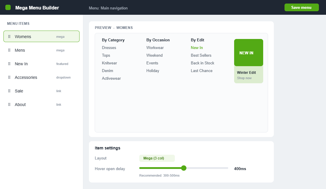
Part 2: Build a Mega Menu That Merchandises, Not Just Lists
Around 88% of the top US ecommerce sites use hover-based mega menus, and there is a reason. A mega menu lets a shopper jump from a broad category to a specific subcategory in one move, while seeing the full range of options at a glance. Done well, it is the difference between a directory and a storefront.
The mistake is treating the mega menu as a bigger list. The opportunity is treating it as merchandising real estate:
- Add a featured tile. Reserve one column for a “New In” or best-seller image that links to a hero collection. Imagery lifts clickthrough far more than another text link.
- Group logically, label plainly. Use clear column headers (“By Category”, “By Brand”, “By Occasion”) so the eye can scan instead of read.
- Steer to margin. Put your highest-margin and signature collections where the eye lands first, not at the bottom of column four.
- Fix the hover delay. Baymard found 60% of sites fail to set the recommended 300 to 500ms hover delay, which causes menus to flicker open and shut as the cursor crosses them. It is a tiny setting that quietly frustrates every desktop visitor.
Look at how category leaders handle scale. A high-volume catalogue brand like Culture Kings splits its mega menu by both category and brand, so a sneaker shopper and a label-loyal shopper each find their path immediately. A tighter-range brand like The Oodie does the opposite: a short, benefit-led menu that never makes you think. The lesson is to match menu complexity to catalogue size, not to copy whoever you admire.
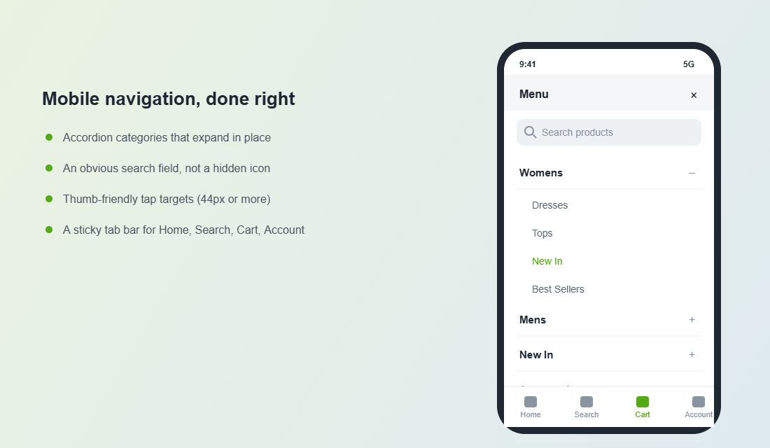
Part 3: Nail Mobile Navigation (Where Most Stores Quietly Lose)
This is the part that separates a polished store from an amateur one. With 67% of mobile sites rated mediocre on navigation, getting this right is a genuine edge, especially when mobile is the majority of your Aussie traffic.
The cardinal rule: your mobile menu should not be your desktop mega menu squeezed into a hamburger. It needs its own design.
- Use an accordion drawer. Top-level categories expand in place rather than firing the shopper to a new screen for every tap. It keeps their place and their patience.
- Design for the thumb. Keep primary actions in the lower two-thirds of the screen where thumbs naturally reach. Buttons need to be at least 44 by 44 pixels.
- Make search obvious. Surface the search bar inside the menu, not as a tiny icon a shopper has to hunt for.
- Add a sticky bottom tab bar. A persistent bar with Home, Search, Cart and Account gives shoppers one-tap access to the things they use most.
Remember the broader numbers: mobile drives roughly 80% of visits but only about 65% of transactions in Australia. That gap is your opportunity. Every friction point you remove from the mobile menu pulls those two figures closer together.
Part 4: Make the Header Do More Than Point
Your header is prime real estate that appears on every page. It should earn its space by doing more than holding a logo and a few links.
- A persistent search field. Given that 73% of mobile users search, an open search bar beats a hidden icon. Reduce the taps between intent and result.
- One announcement message. Use the promo bar for a single clear message, free shipping threshold or a current offer, not three rotating ones that nobody reads.
- A sticky header on scroll. Keep the menu and cart within reach as shoppers move down long collection and product pages.
- Visible cart state. Show the item count and make the cart one tap away, so a browsing shopper can always see their progress.
Part 5: Add Merchandising Hooks That Pull Browsers Deeper
A menu is not just a way out of the homepage. It is a chance to put your best foot forward before a shopper has chosen a direction. The brands that convert well use the menu to merchandise actively.
- Feature a hero collection. Point a menu tile at the collection that carries your brand, the one you would show a stranger first.
- Surface “New In” and best-sellers. These two links consistently earn high clickthrough because they answer the two questions browsers ask: what is fresh, and what is proven.
- Run seasonal entry points. Swap in EOFY, gifting or summer edits at the right time of year rather than burying them in a generic “Sale” link.
- Link to high-intent category pages. Your category pages can rank and convert at the same time, which is why menu structure and SEO go hand in hand. The Shopify Collection Page SEO Playbook shows how to make those pages pull double duty.
Part 6: Measure It, Then Improve It
Navigation is not a set-and-forget job. The good news is that menus throw off data you can act on, if you bother to look.
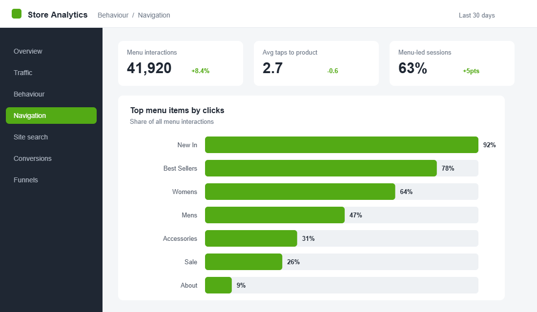
- Click distribution. In GA4, track which menu items get clicked. You will usually find two or three links carry almost all the traffic. That tells you what to promote and what to cut.
- Category page exits. A high exit rate from a collection page often means the menu sent people somewhere that did not match their expectation.
- Search usage. A spike in searches for a term you do not have in your menu is a direct signal to add it.
- Session recordings and heatmaps. Free tools like Microsoft Clarity let you watch real Aussie shoppers fumble through your menu on mobile. It is humbling and it is the fastest way to find what to fix.
The Tool: Set Up a Proper Mega Menu in an Afternoon
Shopify’s built-in navigation is fine for a simple store, but it cannot do images, columns or true mega menus without theme code. If you want merchandising power without a developer, Globo Mega Menu (4.9 stars across more than 1,300 reviews, with a free plan) is a reliable starting point. Here is how to set it up cleanly:
- Plan on paper first. Write your 5 to 7 top-level categories and their subcategories before you touch the app. Structure beats styling.
- Install and connect your menu. Add Globo Mega Menu from the Shopify App Store and link it to your existing Online Store navigation so you are not rebuilding from scratch.
- Choose a layout per item. Set high-volume categories to a multi-column mega layout and simple items to a basic dropdown. Not everything needs the full treatment.
- Add a featured image tile. Drop a “New In” or hero collection image into one column of your busiest menu item.
- Set the hover delay. Configure a 300 to 500ms open delay so the menu does not flicker as the cursor passes.
- Build the mobile view separately. Use the app’s mobile settings to create an accordion drawer rather than letting it inherit the desktop layout.
- Test on a real phone. Preview on your own mobile, walk the 3-click rule, and fix anything that takes more than three taps to reach a product.
How the Six Parts Compound
None of these parts is dramatic on its own. Tightening your category depth might lift findability a little. A featured tile might earn a few more clicks. A sticky search bar shaves a tap. Individually, small.
Together they change the economics of your store. A shopper who finds the right collection in two taps instead of five sees more product, adds more to cart, and is far less likely to bounce back to the ad they came from. You are not buying more traffic. You are wasting less of the traffic you already paid for, and you are doing it on every visit, every day, with no extra ad spend.
That is why navigation sits in the Platform pillar of the More Orders Operating System. It is infrastructure. Fix it once properly and it quietly compounds for years.
Your 6-Point Navigation Audit
Run your store against this checklist this week. If you cannot tick a box with confidence, that is your next job.
- 1. Depth. Can a shopper reach any product in 3 taps or fewer, with 5 to 7 clear top-level categories?
- 2. Mega menu. Does your busiest category use columns, a featured image and demand-ordered links, with a 300 to 500ms hover delay?
- 3. Mobile. Is your mobile menu a purpose-built accordion drawer with thumb-friendly, 44px-plus tap targets?
- 4. Header. Are search, a single promo message, a sticky header and a visible cart all present?
- 5. Merchandising. Does the menu actively feature a hero collection, New In and best-sellers?
- 6. Measurement. Are you tracking menu click distribution and watching real session recordings on mobile?
Inside eCommerce Circle, navigation is one of the core Platform pillars we work on with every member, because it touches every visitor and costs nothing extra to get right. If you want a second opinion on yours, let’s talk.