You are paying $40, $60, sometimes $90 to land a single shopper on a collection page. They click your Meta ad, the page loads, and they are staring at a wall of 200 products with no fast way to narrow it down. Thirty seconds later they are gone. Not because your range is wrong, but because you made them do the sorting work themselves.
What’s in This Article
This is the quiet conversion leak most Aussie DTC founders never look at. You obsess over the product page and the checkout, and you should. But the collection page is where browsing shoppers decide whether your store is worth their patience. Faceted filtering can lift conversion by around 20% compared with old hierarchy-style navigation, yet Baymard Institute found that 58% of desktop sites and 78% of mobile sites still run a mediocre or worse product list experience.
The gap is brutal. In Baymard’s testing, shoppers on sites with mediocre filtering abandoned at 67 to 90% when trying to find a specific type of product. On sites with even a slightly optimised filter toolset, abandonment dropped to 17 to 33% for the exact same task. Same traffic, same products, wildly different revenue. This playbook walks through the 5-layer system we use with eCommerce Circle members to turn collection pages into self-serve buying engines.
Filtering Is a Conversion Lever, Not a UX Nicety
Founders treat filters as housekeeping. Something the theme handles by default, tucked in a sidebar, never touched again. That mindset costs you orders every single day, because filtering is how high-intent shoppers tell you exactly what they want.
Think about the difference in intent. A shopper who lands on your “Dresses” collection and ticks “Size 12”, “Black”, and “Under $120” is not browsing. She has declared her budget, her size, and her preference in three clicks. That is a buying signal as strong as anything you will ever get. Shoppers who engage with site search and filtering convert at roughly 2 to 3 times the rate of passive browsers, and around 30% of visitors reach for these tools the moment they arrive.
The job of your filters is to honour that intent instantly. Every extra second of scrolling, every irrelevant product she has to skip past, is friction working against a customer who already wants to buy. Get this right and you are not adding a feature. You are removing the reasons your warmest traffic leaves.
Layer 1: Build Filters Around How Customers Shop, Not Your Back End
The most common filtering mistake is mirroring your internal taxonomy instead of the customer’s mental model. Your warehouse might organise stock by supplier or SKU prefix. Your customer thinks in terms of size, colour, price, occasion, and fit. Filter by the language in her head, not the structure in your admin.
Start with the attributes a shopper can see on the product card and would reasonably want to narrow by. Baymard found that 38% of sites fail to offer filters for information that is already visible in the list, which is a direct cause of abandonment. If your cards show colour and price, you must let people filter by colour and price. Anything less feels broken.
Here is the baseline filter set for most Aussie DTC stores:
- Price range. The single most used filter in apparel and homewares. Offer sensible bands, not a fiddly slider alone.
- Size. Non-negotiable for fashion and footwear. Filtering to in-stock sizes only is even better.
- Colour. Use swatches where you can, and group messy variant names into clean parent colours.
- Occasion or use case. “Wedding guest”, “gym”, “everyday”. Occasion-based filters have been linked to up to 15% higher conversion because they match how people actually buy.
- Material, fit, or feature. Whatever genuinely matters in your category: organic cotton, arch support, waterproof, vegan.
Two rules separate good filtering from frustrating filtering. First, let shoppers combine multiple values, like three different colours at once. Baymard found 15% of sites still do not allow this, forcing customers to filter one value at a time. Second, never show a filter that returns zero products. A dead-end filter is worse than no filter at all.
Layer 2: Power Your Filters With Clean Product Data
Filters are only as good as the data behind them. You can design the perfect filter set, but if half your products are missing a colour tag or have material entered three different ways, the filter will hide products that should appear and surface ones that should not. This is where most stores quietly break.
On Shopify you have three sources of filterable data, and you want to use them deliberately:
- Product options and variants. Size and colour live here. Keep your option names consistent across the catalogue. “Navy” and “Navy Blue” should never both exist.
- Standard Product Taxonomy. When you assign a Shopify category, it auto-creates standard metafield definitions for attributes like material and age group. This is the fastest way to get rich, consistent filters without manual tagging.
- Metafields. For anything custom, like “arch support” or “occasion”, use product metafields. Shopify supports filtering on single line text, boolean, integer, and decimal metafield types.
Before you touch any app settings, run a data hygiene pass. Export your products to a spreadsheet and look for blanks, duplicates, and inconsistent spelling in every field you intend to filter on. A founder doing $80k a month will often find 10 to 20% of products missing at least one key attribute. Every one of those is a product that vanishes the moment a shopper applies that filter.
Make this a standing habit, not a one-off. Tighten your data first, because no filtering app can save you from a messy catalogue. If you want the wider context on how product data feeds discovery, our Shopify site search playbook covers the search side of the same problem.
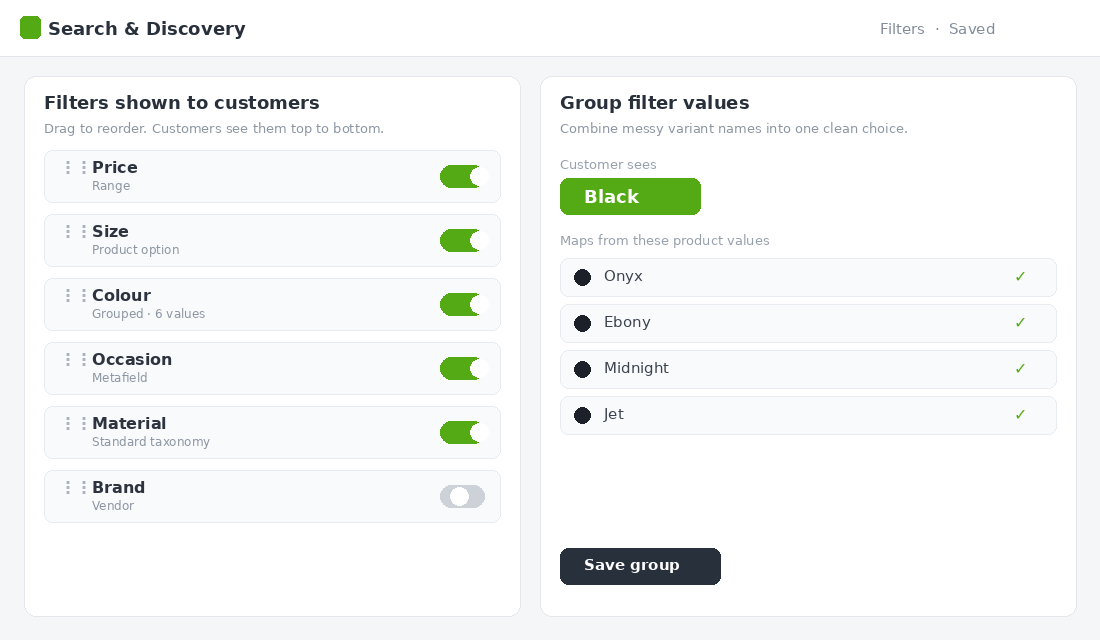
Layer 3: Set Up Native Filters With Shopify Search and Discovery
You do not need a paid app to do this well. Shopify’s free Search and Discovery app handles filters, merchandising, synonyms, and recommendations natively, and for most stores under roughly $200k a month it is all you need. Here is the setup sequence we use.
- Install Search and Discovery from the Shopify App Store. It is free and built by Shopify, so there are no transaction fees or theme conflicts.
- Open the Filters tab and add filters from your available sources: Category, Product type, Tag, Vendor, Price, and any product option or metafield.
- Group messy values. Combine “Onyx”, “Ebony”, and “Midnight” into a single “Black” filter value so customers see clean choices, not your internal naming.
- Order filters by importance. Put Price and Size at the top for fashion. Drag the rarely used filters to the bottom.
- Preview on mobile and desktop, apply combinations yourself, and confirm no filter returns an empty result before you publish.
If you outgrow the native app, the usual next steps for high-catalogue Aussie brands are Boost AI Search and Filter or Searchanise, which add visual swatches, filter-level analytics, and faster reindexing. Do not jump to a paid app until you have wrung everything out of the free one. Most founders never need to.
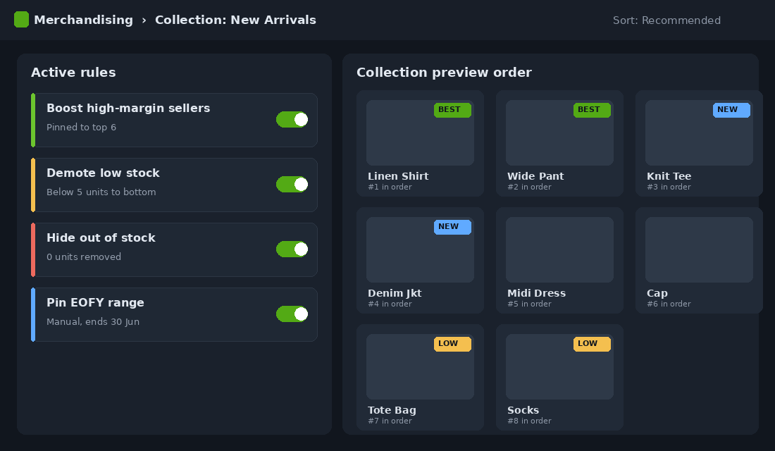
Layer 4: Use Merchandising Rules to Control What Shows First
Filtering decides what a shopper can narrow to. Merchandising decides what they see before they narrow anything. This is the layer almost every store ignores, and it is where the real margin lives. The default sort order on most collections is “best selling” or “manually” set once and forgotten. That is leaving money on the table.
Merchandising rules let you take control of product order inside each collection. Use them with intent:
- Boost your hero products. Pin the items with the best conversion rate and margin to the top of the collection. These are your closers. Give them the prime real estate.
- Demote or hide out-of-stock products. Nothing kills momentum like a sold-out top row. Push low and zero stock to the bottom automatically.
- Surface new arrivals strategically. Fresh stock at the top keeps repeat visitors engaged, but balance it against proven sellers.
- Pin seasonal lines. During EOFY or a campaign, manually lift the relevant range so it greets every shopper.
Shopify Search and Discovery includes product boosts and merchandising controls in the free app, so you can do this without code. Set a rule of thumb: review the top row of your three biggest collections every fortnight. Ask one question. If a stranger landed here from an ad, would these first six products make them want to keep looking? If not, fix the order. This pairs naturally with smart navigation, which we cover in the Shopify mega menu framework.
Layer 5: Win on Mobile, Where Most of Your Traffic Lives
The majority of your store’s sessions are on a phone, and mobile filtering is exactly where most sites fall apart. Baymard rated 78% of mobile product list experiences as mediocre or worse, a far higher failure rate than desktop. The screen is smaller, the thumbs are clumsier, and a clunky filter drawer sends shoppers straight back to Instagram.
Mobile filtering has its own rulebook. Get these five details right:
- Sticky filter button. Keep a clear “Filter” button fixed at the bottom or top of the screen so it is always one tap away as the shopper scrolls.
- Apply once, not per tap. Let shoppers select several values inside the drawer, then hit one “Apply” button. Re-rendering after every tap feels broken and burns data.
- Live product count. Show the number of matching products on the Apply button, so “Show 24 results” reassures them their choices are working.
- Visible applied filters. Once the drawer closes, display the active filters as little removable chips at the top of the results.
- Easy clear. A one-tap “Clear all” prevents the dead-end frustration of being stuck in a filter that shows nothing.
Test this on a real phone, not just the desktop preview shrunk down. Walk through the journey as a customer would: tap into a collection, open filters, narrow to something specific, and see how many taps it takes to get to a product you would buy. If it feels like work, your shoppers feel it too. The same mobile-first discipline applies across your store, which is why we treat the collection page design as a whole system, not a single setting.
Measure Filtering Like the Revenue Channel It Is
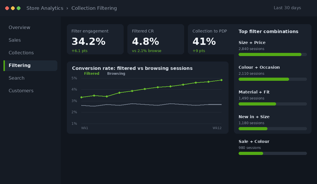
You cannot improve what you do not watch. Most founders have no idea how their filters perform because they never set up the tracking. Fix that, then check these five numbers on the first Monday of each month.
- Filter engagement rate. The share of collection visitors who apply at least one filter. If it is under 10%, your filters are buried or unhelpful.
- Filtered-session conversion rate. Compare it against unfiltered sessions. A healthy store sees filtered sessions convert well above the browse average.
- Collection-to-product click rate. The percentage of collection viewers who click through to a product page. Filtering should push this up.
- Zero-results rate. How often a filter combination returns nothing. Anything above a few percent means broken data or missing stock.
- Most-used filter combinations. The patterns here are free market research. If hundreds filter to “linen” plus “white”, that is a collection or campaign waiting to be built.
Set up filter tracking as events in GA4 so each metric has a real number behind it. Treat the monthly review as seriously as you treat your ad reporting, because the dollars hiding in these numbers are just as real.
Four Filtering Mistakes That Quietly Cost You Sales
Even founders who set up filters often undo their own work with a handful of avoidable errors. Watch for these four, because each one sends warm traffic away without ever showing up in a report.
- Too many filters. Fifteen filter categories paralyse more than they help. Lead with the five or six attributes shoppers actually use, and tuck the rest away. Choice overload is real, and on a phone it is fatal.
- Filters that scroll the page away. When a shopper applies a filter and the page jumps back to the top, she loses her place and her patience. Results should refresh in place, with her scroll position respected.
- Hiding the filter on mobile. If the only way to filter is a tiny icon next to “Sort”, most thumbs will never find it. Make the filter entry point obvious and persistent.
- Set and forget. A filter set built when you had 40 products will not serve a catalogue of 400. Revisit your filters whenever your range grows, your categories shift, or a season turns.
None of these are technical problems. They are attention problems. The brands that win at filtering are simply the ones who keep looking at it, the same way they keep looking at their ad accounts and their email flows.
The Compound Effect: Why This Beats Another Ad Test
Here is why filtering deserves a fortnight of your attention more than your next creative test. Picture a brand doing $2 million a year, with roughly half of sessions touching a collection page. Lift the conversion of that browsing traffic by even 15%, well inside the 20% range that faceted navigation has delivered, and you are looking at a six-figure revenue swing with zero extra ad spend.
Now stack the layers. Clean data means fewer dead ends. Native filters mean shoppers self-select in seconds. Merchandising rules mean the first thing every visitor sees is a proven seller in stock. Mobile polish means your biggest traffic source stops bouncing. Each layer is a small gain. Together they compound into a collection page that quietly sells while you sleep.
The best part is that this is a one-time build with ongoing payoff. Unlike ads, where the meter resets every morning, a well-filtered store keeps converting better month after month for the cost of a fortnightly review. That is the definition of a high-impact fix.
Your 10-Point Collection Filtering Audit
Run this checklist against your three highest-traffic collections this week. Every box you cannot tick is a leak you can plug.
- Every attribute visible on a product card has a matching filter.
- Shoppers can combine multiple values within a single filter.
- No filter ever returns a zero-results dead end.
- Variant colour names are grouped into clean parent colours.
- Product data is consistent, with no blanks or duplicate spellings in filtered fields.
- Price and Size sit at the top of the filter list for fashion.
- Out-of-stock products are demoted or hidden via merchandising rules.
- Hero products are boosted to the top of key collections.
- Mobile uses a sticky filter button, an Apply button with a live count, and removable filter chips.
- Filter engagement and filtered conversion are tracked in GA4 and reviewed monthly.
Work top to bottom. Most founders find three or four quick wins in the first hour, and those alone are usually worth more than a week of ad tweaking.
Turn Browsers Into Buyers
Your collection pages are doing more selling than you give them credit for, and right now most of them are doing it with one hand tied behind their back. Filtering and merchandising are not glamorous, but they sit directly between your ad spend and your add-to-cart rate. Tighten these five layers and you make every dollar of traffic work harder, without raising your budget by a cent.
Inside eCommerce Circle, store experience and conversion architecture is one of the core pillars we work on with every member. If you want a second opinion on how your collection pages are converting, let’s talk.