Your collection pages are probably the most visited pages on your entire Shopify store — yet they receive the least optimisation attention. Most store owners obsess over their homepage and product pages while leaving collection pages on default theme settings. This is a massive missed opportunity.
What’s in This Article
Collection pages serve a critical function: they help shoppers find the right product. A well-optimised collection page acts like a helpful shop assistant, guiding customers through your range and making it easy to discover products that match their needs. A poorly optimised one feels like wandering through a warehouse with no signs.
The metrics tell the story. Most Shopify stores see collection page click-through rates of 20-25% — meaning 75-80% of visitors leave without clicking a single product. By implementing the changes in this guide, we consistently see that number jump to 35-45%. That is nearly double the product page visits from the same traffic, which flows directly into more add-to-carts and more sales.
Product Card Design: The First Click Trigger
Your product cards — the individual tiles in your collection grid — are the most important design element on the page. Each card needs to provide enough information for the shopper to decide whether to click through, without overwhelming them with detail.
The essential elements on every product card are: a high-quality product image (square or portrait aspect ratio, consistent across all products), the product name (descriptive but concise), the price (visible without hovering), star rating (if you have reviews), and colour swatches (if applicable). These five elements give shoppers everything they need to make a click decision.
The most impactful addition to product cards is colour swatches. When customers can see available colours directly on the collection page, they are more likely to find a colour they want and click through. Swatches increase collection page click-through by 15-20% in our testing.
Add hover-to-reveal second images. When a customer hovers over (desktop) or taps (mobile) a product card, show a different angle or lifestyle shot. This gives shoppers more information without cluttering the card, and the interaction creates engagement that makes clicking through feel natural.
Use badges strategically. “Bestseller,” “New,” “Sale,” and “Low Stock” badges on product cards draw attention to specific products and create urgency. But do not badge everything — if every product has a badge, none of them stand out. Limit badges to 15-20% of products.
Grid Layout: Finding the Right Density
The number of columns in your product grid directly affects how many products shoppers see and how large each product image appears. This is a genuine trade-off: more columns mean more products visible but smaller images.
The optimal grid for most Shopify stores is 3 columns on desktop and 2 columns on mobile. Four columns on desktop makes product images too small for customers to evaluate — they need to see the product clearly before they will click. Two columns on desktop wastes screen real estate and requires too much scrolling. Three columns hits the sweet spot of product visibility and image size.
On mobile, 2 columns is the standard. One column wastes too much screen space and requires excessive scrolling. Two columns show 4-6 products on the initial screen, giving customers enough variety to start engaging. Make sure your mobile grid has adequate spacing between cards — tightly packed cards feel cluttered and increase accidental taps.
Show at least 24-48 products per page before pagination or infinite scroll. Showing only 12 products per page means customers have to click “Next” repeatedly, which most will not do. Infinite scroll (products load automatically as you scroll down) performs better than traditional pagination for most stores because it reduces friction.
Filters and Sorting: Helping Customers Find What They Want
Customers who use filters convert at 2x the rate of those who do not. This makes intuitive sense — filtering is an act of intent. A customer who filters by “Size Medium” and “Blue” knows what they want and is close to purchasing. Your job is to make filtering easy, fast, and effective.
The essential filters for most Shopify stores are: size, colour, price range, and product type. For apparel, add fit (regular, slim, oversized) and fabric type. For skincare, add skin type and concern. For homeware, add room and style. Match your filters to the decision criteria your customers actually use.
On mobile, filters should be accessible via a prominent “Filter” button that opens a slide-out panel. Do not hide filters in a hamburger menu or at the bottom of the page. The filter button should be sticky — visible as the customer scrolls through the collection. Active filters should display as removable chips at the top of the product grid so customers can see what they have selected and adjust easily.
For sort options, the defaults should be: “Featured” (your curated default order), “Price: Low to High,” “Price: High to Low,” “Newest,” and “Bestselling.” Put “Featured” first because this is where your merchandising decisions live — you want your best products showing first by default.
Collection Page SEO: Capturing High-Intent Search Traffic
Collection pages are SEO goldmines that most stores ignore. When someone searches “organic cotton t-shirts Australia” or “best skincare gift sets,” they have high purchase intent. Your collection pages can rank for these searches and capture traffic that converts at 3-5x your site average.
The key to collection page SEO is unique, keyword-rich content. Most Shopify collection pages have no text content — just a heading and product grid. Google needs text content to understand what the page is about and rank it appropriately.
Add a collection description of 150-300 words at the top of each collection page. Write it as a brief buying guide: what the collection contains, who it is for, what makes your products special, and a few key product highlights. Include your target keyword naturally in the H1 heading, the description, and the meta title/description.
Optimise your collection page meta titles using the format: “[Primary Keyword] | [Brand Name] – [Modifier].” For example: “Organic Cotton T-Shirts for Women | Your Brand – Australian Made.” Keep it under 60 characters. The meta description should include a compelling reason to click: “Shop our collection of 100% organic cotton t-shirts. Australian made, ethically sourced. Free shipping over $100.”
Internal linking strengthens collection page authority. Link to your key collections from relevant blog posts, from your homepage, and from other collection pages. A “You Might Also Like” section at the bottom of collection pages linking to related collections helps both user navigation and SEO.
Merchandising: Curating the Right Product Order
The order of products in your collection matters more than most store owners realise. The first 6-8 products (visible without scrolling) receive 60-70% of all clicks. If those first products are not your best performers, you are leaving sales on the table.
Manually curate the order of your top collections. Put your bestsellers, highest-converting products, and newest arrivals in the first two rows. Move out-of-stock, low-rated, or slow-moving products further down. Some Shopify apps (like Bestsellers reSort or Merchandising for Shopify) can automate this based on sales data.
Never let out-of-stock products sit at the top of a collection. They create a frustrating experience and waste prime real estate. Either push them to the bottom automatically or hide them entirely (with a “Notify Me” option on the product page for customers who search directly).
The Compound Effect of Collection Page Excellence
When you optimise your collection pages for click-through, filtering, SEO, and merchandising, the improvements compound across your entire sales funnel. More visitors click through to product pages, which means more add-to-carts, which means more checkouts. The SEO improvements drive additional organic traffic that did not exist before. Better filtering reduces bounce rates and increases the percentage of visitors who find products that match their needs.
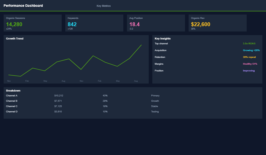
One eCommerce Circle member implemented these collection page optimisations and saw their click-through rate to product pages jump from 22% to 38% — a 73% improvement. Combined with collection page SEO that brought in an additional 5,200 organic visits per month, their collection pages went from passive product listings to active revenue drivers. Total additional revenue attributable to collection page optimisation: $12,400 per month.
Collection page optimisation sits at the intersection of CRO and SEO inside the eCommerce Circle. We help members audit their collection pages, implement design improvements, and build the SEO foundation that captures high-intent search traffic. If your collection pages are running on default settings, there is almost certainly a significant opportunity waiting. Let us take a look together.