Here is an uncomfortable number. In 2025, 94.8% of the top one million home pages on the web had detectable failures against WCAG, the standard that decides whether a site actually works for people with disability. That is not a fringe problem. That is almost every store online, and yours is probably in the pile.
What’s in This Article
Most Aussie founders treat accessibility as an enterprise compliance chore, something for banks and government portals. So they bolt on an “accessibility widget”, tick a box, and move on. The trouble is that overlay widgets are now the thing being sued over, not the thing that protects you. In 2024, 25% of the ADA web accessibility lawsuits in the United States specifically named an accessibility overlay as a barrier.
Meanwhile 5.5 million Australians, one in five people, live with disability. They shop, they have budgets, and when your product page traps a keyboard user or hides your “Add to cart” button behind unreadable contrast, they leave and buy from someone else. The good news: the fixes that make your store accessible are the same fixes that lift conversion for every visitor. This is the playbook.
What WCAG Actually Means (In Plain English)
WCAG stands for the Web Content Accessibility Guidelines. The version regulators care about is WCAG 2.1, and the level almost every law references is AA. You do not need to memorise 78 success criteria. You need the four principles behind them, known as POUR.
- Perceivable. People can see or hear your content. Text has enough contrast, images have alt text, video has captions.
- Operable. People can use your store with a keyboard alone, not just a mouse. Nothing traps them, and focus is always visible.
- Understandable. Labels, error messages and navigation behave predictably. A form tells you exactly what went wrong.
- Robust. Your markup works with assistive tech like screen readers, now and as browsers change.
That is the whole game. When the European Accessibility Act came into force on 28 June 2025, it adopted WCAG 2.1 AA in full for ecommerce sites selling into the EU, covering product listings, carts and checkout. If you ship to Europe, that clock has already started.
The Real Cost of Getting This Wrong
Two costs sit behind an inaccessible store. The obvious one is legal. The quieter one is revenue you never see leave.
On the legal side, the case law is a decade deep. In 2008, US retailer Target settled a class action brought by the National Federation of the Blind for 6 million US dollars plus legal fees, because blind customers could not complete a purchase. In 2019, the Supreme Court let stand a ruling against Domino’s Pizza, confirming that a company’s website and app fall under disability law even when the physical store is fine.
The volume is climbing too. There were 3,188 ADA website lawsuits filed in the United States in 2024, and ecommerce stores were the target in 77% of them. Two thirds were against businesses turning over less than 25 million US dollars. Small does not mean safe.
In Australia the mechanism is the Disability Discrimination Act 1992, which the Human Rights Commission has repeatedly confirmed applies to websites. We have not seen the American wave of litigation here yet, but any brand shipping to the EU or the US is already exposed to those regimes. It is the same compliance mindset as your privacy obligations: cheaper to build in than to bolt on after a complaint.
The Overlay Trap: Why “Accessibility Widgets” Backfire
When founders finally take accessibility seriously, the first instinct is to install an app that promises instant compliance. A floating icon appears, you can change font size and contrast, and a badge says you are protected. Skip it.
These overlays sit on top of your theme and try to patch problems at runtime with JavaScript. They routinely break screen readers, fight with the user’s own assistive settings, and miss the structural issues entirely. That is why 1,023 of the 2024 US lawsuits, a full quarter, cited an overlay as part of the problem. Blind advocacy groups now publish public statements against them.
An overlay is a smoke alarm that also starts fires. The only fix that holds up is doing the work in the theme itself. That sounds like more effort. In practice it is a focused audit and a handful of changes, most of which you control from the Shopify theme editor and your product admin.
The 6-Point Shopify Accessibility Audit
Here is the exact audit we run on a Shopify store. Work through these six in order. Each one maps to the failures that show up most often, and to the ones plaintiffs cite most.
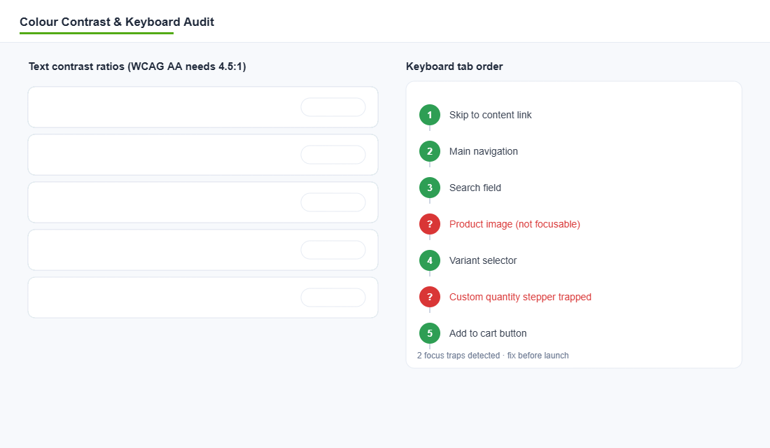
- Colour contrast. Body text needs a 4.5 to 1 ratio against its background, large text 3 to 1. Low contrast is the single most common failure on the web, found on 79.1% of home pages. Check your sale prices, placeholder text, and any white text sitting on brand colour.
- Alt text on images. Every product photo and informative image needs a short description. Decorative images get empty alt so screen readers skip them. Missing alt text is a top-three failure and a top-three lawsuit trigger.
- Keyboard operability. Unplug your mouse. Tab through the whole page. You must be able to reach and use navigation, variant pickers, quantity steppers, the cart and checkout, with a visible focus outline at every step.
- Form labels and errors. Every field in your newsletter popup, contact form and checkout needs a real label, not just grey placeholder text. Error messages must say what is wrong and how to fix it.
- Heading structure. One H1 per page, then headings that step down in order. Screen reader users navigate by headings. Jumping from H1 straight to H4 breaks that map.
- Focus and motion. Visible focus states on every interactive element. Respect reduced-motion settings so autoplaying carousels and parallax do not trigger nausea or seizures.
Save this as a pre-launch gate. Nothing ships until all six pass. It takes about 30 minutes to run once you know where to look.
Fixing It Inside Your Shopify Theme
The reason accessibility feels hard is that people imagine rebuilding the site. You are not. Modern Shopify hands you most of the levers already.
Start with your theme. Shopify’s free Dawn theme and the Online Store 2.0 themes built on it ship with accessible foundations: semantic markup, skip-to-content links and sensible focus states. If you are on an old vintage theme or a heavily hacked build, that is often where the structural failures live. A theme audit here pays for itself.
- Fix contrast in the theme editor. Most themes expose colour settings for buttons, text and backgrounds. Nudge your button and price colours until they clear 4.5 to 1. Keep a contrast checker open while you do it.
- Add alt text in bulk. In Shopify admin, open each product, click the image, and fill the “Alt text” field. For big catalogues, use a bulk editor or a metafield export so you are not doing it one product at a time forever.
- Audit your app stack. Every review widget, popup, upsell and cart drawer injects its own markup. These third-party apps are a common source of unlabelled buttons and keyboard traps. Test each one with the keyboard, and drop the ones that fail.
- Label your custom sections. If a developer hardcoded a hero or a custom quantity stepper, that is where focus traps hide. Have them add proper ARIA labels and keyboard handlers.
Two of those, contrast and app stack, overlap directly with your site speed and conversion work, which is why accessibility is rarely a standalone project. It rides along with the tuning you should be doing anyway.
The Tools That Do the Heavy Lifting
You do not need to eyeball this. Two free tools catch the majority of issues in minutes.
axe DevTools is the industry standard, built by Deque. Setup takes two minutes:
- Install the axe DevTools extension in Chrome from the Chrome Web Store.
- Open your store, right click, choose Inspect, and select the axe DevTools tab.
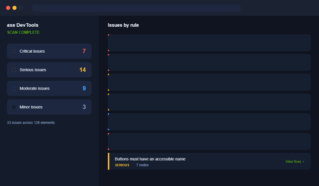
- Click “Scan all of my page”. You get issues grouped by severity with the exact element and a plain-English fix for each.
- Run it separately on your home page, a collection page, a product page, the cart and checkout. They fail in different ways.
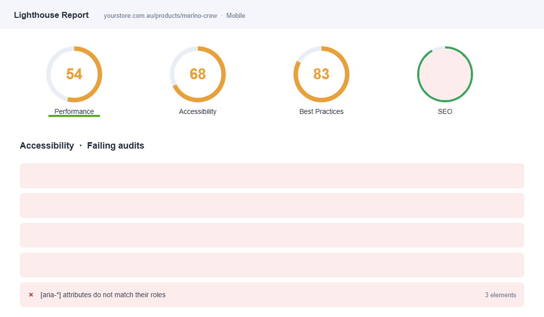
Lighthouse is already inside Chrome. Open Inspect, click the Lighthouse tab, tick Accessibility, and run it. It scores the page out of 100 and lists the failing audits. Treat anything under 90 as work to do, and remember the score only catches automated issues, so pair it with a real keyboard test.
Run both on mobile as well as desktop. Most Aussie store traffic is on a phone, and touch targets and focus behave differently on small screens.
Stopping It From Breaking Again: Accessibility Governance
Here is the pattern almost every store falls into. You run the audit, you fix the contrast, you add the alt text, and six weeks later a new app injects an inaccessible popup and a staff member uploads forty product images with no alt attributes. Accessibility is not a project you finish. It is a standard you hold.
Put one check in your weekly rhythm
Run an automated scan on your homepage, a collection page, a product page and checkout every Monday. axe DevTools or WAVE takes about four minutes across those four templates. Automated tools only catch roughly 30% to 40% of real WCAG issues, so this is a smoke alarm, not a certificate — but it catches the regressions that matter fastest.
Gate every new app and theme change
Before you install any app that renders on the storefront, check three things: can you reach its controls with the Tab key, can you dismiss it with Escape, and does it announce itself to a screen reader. If the answer to any is no, that app is a liability wearing a conversion-rate promise. Same rule applies when you upgrade a theme — bake this into the checklist in the Shopify theme upgrade playbook so you are not re-auditing from scratch every time.
Make alt text part of the product upload SOP
Nobody retro-fits alt text on 800 SKUs willingly. Write it into the product-creation checklist instead: describe what the image shows and why it matters to a buyer, keep it under about 125 characters, and never start with “image of”. Your merchandiser writing it once at upload costs thirty seconds. Fixing it later costs a fortnight.
Test with real people at least twice a year
Automated tools will never tell you that your size selector is technically accessible but practically unusable. Two 45-minute sessions with a screen reader user will surface more real problems than a month of scanning. In Australia, Vision Australia and Centre for Accessibility Australia both run paid user testing, and it typically costs $1,500 to $4,000 for a small round.
Publish an accessibility statement
A short page stating your target standard, what you have done, what is still in progress, and how someone can report a barrier does two useful things. It gives a frustrated customer a path that is not a complaint to the Australian Human Rights Commission, and it demonstrates good faith if anyone ever does escalate. Ten minutes of writing, meaningful risk reduction.
Hold the standard for two quarters and accessibility stops being remediation work. It becomes part of how your product pages get built — which is the only version of this that actually sticks.
Why This Compounds Into Four Wins
Here is the part most founders miss. Accessibility is not a cost centre. Every fix on that six-point list pays you back in more than one place.
- Alt text is also SEO. Search engines read the same descriptions screen readers do, so your product images start earning image-search traffic.
- Clear contrast and labels lift conversion for everyone, especially the shopper squinting one-handed on a train in glare. Accessible forms produce fewer errors and less abandonment.
- Clean heading structure and semantic markup help both screen readers and Google understand your page, which supports the SEO work you are already paying for.
- Legal exposure drops toward zero in Australia, the US and the EU at once, from one focused effort.
That is the compounding effect. You run one audit, make a dozen changes in the theme editor and product admin, and you improve accessibility, SEO, conversion and legal safety in the same afternoon. Very few projects give you four wins for one input.
The one in five Australians with disability are not a niche. They are a large, underserved market that most of your competitors have locked out by accident. Being the store that simply works is a real advantage, and right now it is a cheap one to claim.
Inside eCommerce Circle, Platform work like this is one of the core pillars we run through with every member, because it sits right at the intersection of conversion, SEO and risk. If you want a second opinion on where your store stands, let’s talk.