Most Aussie Shopify founders are quietly burning thirty to fifty percent of their Meta ad spend in the gap between the ad click and the add-to-cart button. The leak is not the ad. The leak is where the ad lands.
What’s in This Article
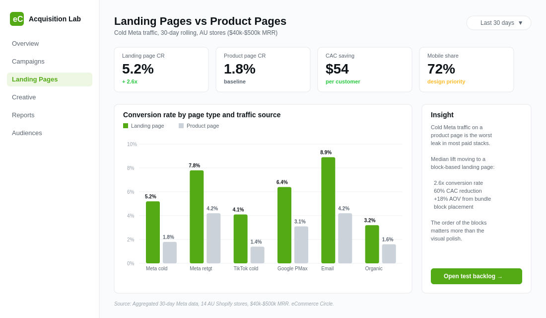
If your hero campaign points to a Shopify product page, you are sending a stranger to a page that was built for an existing customer who already knows your brand. That mismatch shows up in the numbers. Product pages convert cold paid traffic at 1.8 to 2.5 percent. A purpose-built landing page for the same offer converts at 4 to 7 percent. That is not a rounding error. That is the difference between a campaign that scales and a campaign that quietly stalls at $30k a month.
The brands who break through that ceiling do not buy more traffic. They build better landing pages. Inside eCommerce Circle, the landing page architecture is one of the first audits we run when a member is spending over $20k a month on Meta and not getting linear ROAS lift. The fix is almost always the same: eight specific blocks, stacked in the right order, scoped tight to a single offer, and stripped of every navigational temptation.
Here is the framework.
Why Your Product Page Is the Wrong Place to Send a Cold Click
A standard Shopify product page is designed for the warmest traffic you have. The header sits there with a full mega menu pointing to ten collections. The breadcrumbs invite the visitor to wander upstream. The “you might also like” block at the bottom encourages comparison shopping. Reviews load lazily below the fold. The buy box sits competing with twenty other interactions on the page.
For a returning customer who already trusts you, that is fine. They came in via direct or branded search. They know what they want. The cognitive load of choice helps them, not hurts them.
For a cold Meta click, every one of those elements is a leak. Cold traffic has three things working against it: zero trust, no context, and no urgency. They were scrolling Reels when your ad caught their eye. They tapped because the creative hooked them, not because they were shopping. If the page they land on does not pick up the conversation the ad started, they bounce. Studies show 74 percent of visitor attention sits above the fold and you have about five seconds to communicate value before they leave.
The math gets ugly fast. If your Meta CPC is $1.80 and your PDP converts cold traffic at 2 percent, your CAC sits at $90. Drop a proper landing page in front of that same traffic at 5 percent conversion and your CAC falls to $36. Same ad. Same audience. Same creative. Sixty percent CAC reduction from a single page swap. That is the size of the prize most Aussie founders are leaving on the table.
The other thing to understand: this is mobile-first or nothing. Between 70 and 80 percent of DTC Meta traffic comes in on a phone. If your landing page is not engineered for a 390 pixel viewport with a thumb hovering over the back button, you are designing for the wrong device.
The 8-Block Landing Page Architecture
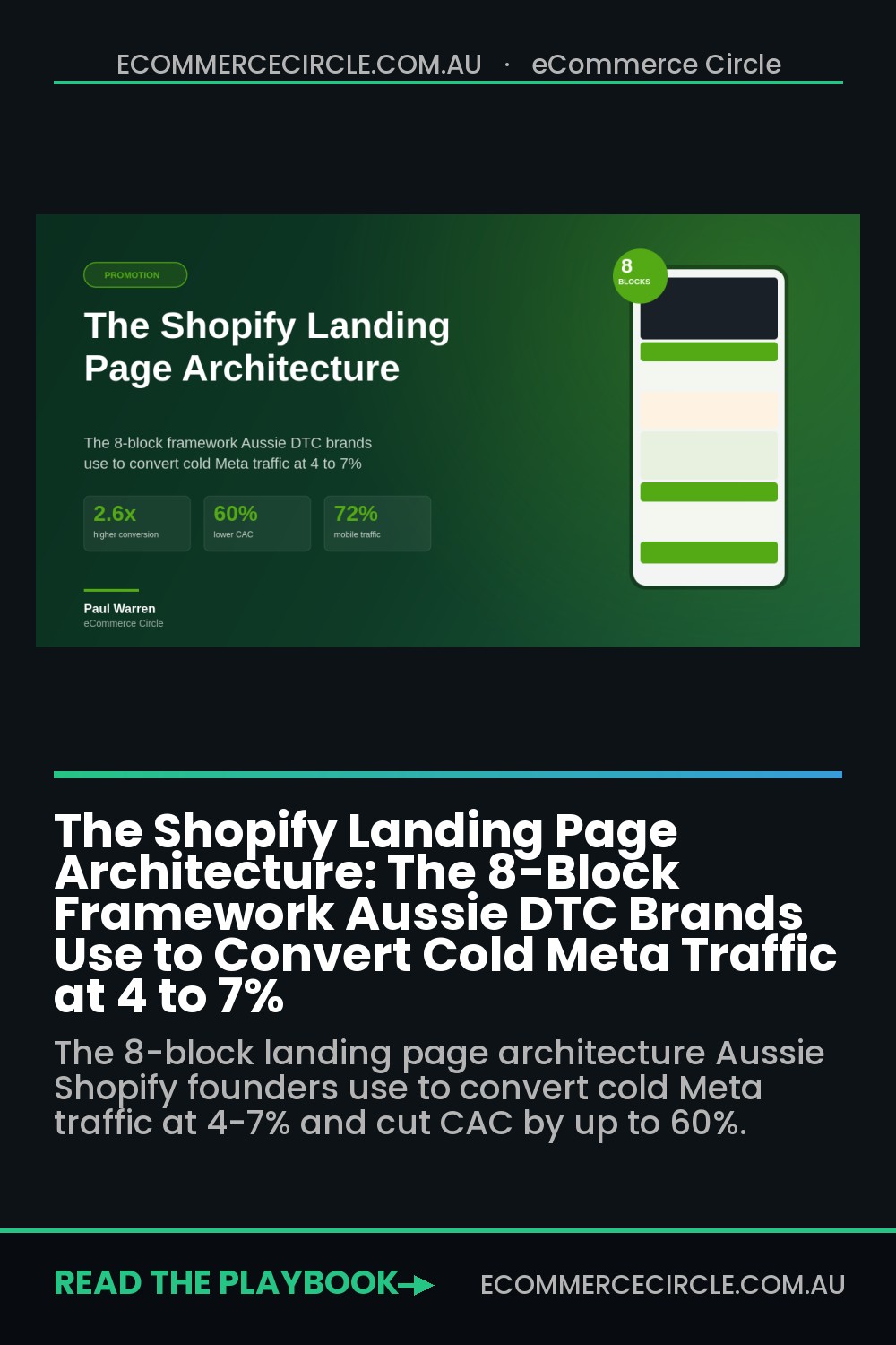
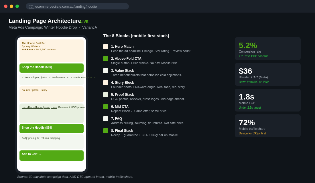
Every high-converting Meta landing page we have ever built for an Aussie Shopify brand uses some version of these eight blocks, in this order. Lock the order. Vary the contents.
Block 1: The Hero Match (Ad-to-Page Continuity)
The hero block must echo the ad word for word and visually one for one. If the ad creative says “the hoodie that survives Sydney winter and Bali summer,” the landing page H1 says exactly that. If the ad shows a model in a specific colourway, that exact colourway is the hero image.
This is called message match. Brands break it constantly. They write a beautiful ad, then point it at a generic homepage with a totally different hero. The visitor’s brain registers a mismatch in the first half second and trust drops to zero. Match the ad. Repeat the ad. Visually mirror the ad.
Add one specific outcome metric in the hero subhead. “Worn by 14,000 Aussies. 4.9 stars across 2,100 reviews.” Numbers signal proof faster than adjectives.
Block 2: The Above-the-Fold CTA
The primary CTA button sits above the fold on mobile. Visible without a single scroll. The button copy is specific, not generic. “Shop the Hoodie ($89)” beats “Buy Now” because it reduces uncertainty. Show the price on the button. Show what they get.
Single CTA only. Landing pages with one clear action convert up to 266 percent better than pages with multiple competing CTAs. That means no “Browse the Collection” link, no header navigation, no “View All Products” button. One door. One offer. One next step.
Block 3: The Three-Point Value Stack
Directly below the fold, three benefit-led bullets with icons. Not features. Benefits. “Free shipping over $99.” “Free returns up to 60 days.” “Made in Melbourne, not Shenzhen.” Pick the three objections cold traffic actually has, in order of frequency, and demolish them visually.
This is where most stores try to be clever and end up generic. “Premium materials.” “Best in class.” Vague language signals you have not thought about your buyer. Specific language signals you have. Aussie shoppers respond to specifics like “shipped from Brookvale” and “GST included” because they have been burned by overseas drop-shippers.
Block 4: The Story or Founder Block
Cold traffic needs to know who is behind the brand. A short founder photo plus a 60 word origin story does more for trust than any badge collection ever will.
The format that converts: “We started [brand] in 2026 because [specific problem the founder personally had]. After [moment of struggle], we built [the product] to solve it. Today we ship to [number] customers across Australia.” Six sentences. Real face. Real story.
Brands like Frank Body and Who Gives A Crap built nine-figure businesses partly on the back of founder-led storytelling. Cold traffic does not buy products. It buys reassurance that the people on the other side are real.
Block 5: The Proof Stack (Reviews + UGC)
This block sits in the middle of the page and does the heavy lifting. The components: a star rating with review count, three or four hand-picked customer photos with quote overlays, and at least one before/after or in-use shot if the product allows for it.
Critical detail: real photos beat studio shots on cold landing pages. UGC outperforms polished imagery in this position by 30 to 50 percent in our tests. The visual signal “people like me bought this” is more powerful than “this looks expensive.”
If you have press hits, this is where they go. Logos of publications that mentioned you, sized small, placed just below the UGC. Vogue, Broadsheet, news.com.au logos lift conversion an average of 8 to 12 percent for premium positioning brands.
Block 6: The Mid-Page CTA
Repeat the CTA from Block 2. Same copy. Same price. Same colour. Visitors who scrolled this far are deeper in consideration. Give them a way to convert without scrolling back up. Skip this block and you force the high-intent visitor to do extra work. They will not.
Block 7: The Objection Demolition (FAQ)
Five to seven questions, expandable. The questions are not the safe ones from your customer service inbox. They are the actual concerns a cold buyer has. “Is this just dropshipped from overseas?” “What if it does not fit?” “Why is this $89 when I can get something similar on Temu for $20?”
Address the elephant. Pricing, sourcing, comparison to cheap alternatives, returns policy, shipping speed. If you do not answer the question on the page, the visitor opens a second tab and starts comparing. Once they leave, they are gone.
Block 8: The Final Stack and CTA
The closing block has three elements: a quick recap of the offer (product, price, what is included), a final social proof anchor (best-selling stat or guarantee), and the same CTA button one more time.
The guarantee matters here. “60-day return policy, no questions asked” or “Free express shipping over $99” sits adjacent to the final CTA. Risk reversal in the moment of decision is the single highest-impact line on the page.
Optional but powerful: a sticky add-to-cart bar that follows the user as they scroll. It eliminates the scroll-back tax entirely on mobile.
Message Match: The Bridge That Most Founders Drop
The eight blocks fail if the ad-to-page bridge is broken. Message match is the discipline of making every landing page feel like a continuation of the ad it serves, not a tangent away from it.
The rule we use: if the visitor cannot tell within two seconds that this page is “the same thing” as the ad they tapped, the page fails the bridge test.
Tactically:
- The H1 should echo the ad headline within 80 percent of the same words.
- The hero image should be from the same shoot, ideally the same frame, as the ad creative.
- The offer should match exactly. If the ad promised “20 percent off your first order,” the page shows 20 percent off, not “save big on first orders.”
- The tone should match. Funny ad to a corporate page is a hard exit. Premium ad to a Comic Sans page is the same exit.
For brands running multiple creative concepts, this means multiple landing pages. One ad set, one page. Page builders like Replo and PageFly make this fast: duplicate, swap hero, swap headline, publish. Twenty minutes per variant once your template is locked.
Mobile-First Architecture: The 390-Pixel Reality
If you design your landing page on a 27-inch iMac, you have already lost. The bottom-left corner of your decisioning is whether this looks good on a phone, in landscape mode, at 50 percent battery, on a Brookvale tram, with one thumb.
Specific mobile rules we apply:
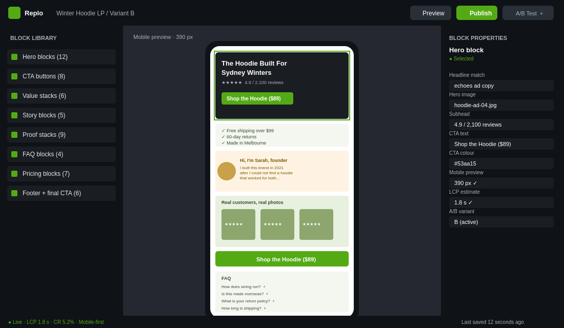
- Hero image takes no more than 60 percent of the above-the-fold real estate. The H1, subhead, and primary CTA must be visible without scrolling on an iPhone 14.
- Button tap targets are at least 48 by 48 pixels. Anything smaller fails Apple and Google accessibility standards and gets thumb-fumbled by users.
- Page weight stays under 1.5 megabytes. Every image lazy-loads below the fold. If your Largest Contentful Paint is over 2.5 seconds, you lose 15 to 30 percent of clicks before the page is even visible.
- Forms collapse to single-column. Two-column forms double the cognitive load and add another scroll.
- Sticky add-to-cart bar appears after 30 percent scroll depth and stays visible. This single element lifts mobile conversion 10 to 18 percent in our tests because it eliminates the moment of friction at the buying decision.
We covered the load speed side of this in The Shopify Page Speed Audit. Landing page speed is non-negotiable. Sub-2-second LCP on mobile or your CAC inflates regardless of how good the creative or the offer is.
The Tooling Decision: Native, Replo, PageFly, or Shogun
You do not need to build a custom dev project to ship landing pages. Most Aussie Shopify brands at our member level use one of three builders.
- Native Shopify pages with a custom template. Free, lives inside your theme, no extra app cost. Best for brands shipping one or two evergreen landing pages and willing to lean on a developer for the initial build. Trade-off: slower to iterate without a designer comfortable in Liquid.
- Replo. Built specifically for performance ecommerce. 1,000+ conversion-tested templates, built-in A/B testing, native Shopify integration, fast page load. The choice for brands running 5+ landing pages and serious about iteration speed. Pricing starts around USD $99 a month. The A/B testing alone saves the cost.
- PageFly. More affordable, broader template library, gentler learning curve. Great for brands shipping their first landing page and not ready to commit to a higher monthly. Free tier exists, paid plans start around USD $24 a month. Some performance trade-offs compared to Replo on page weight.
- Shogun. Heavier, more enterprise-friendly, slower to load by default. We rarely recommend it for sub-$5M Aussie brands. It is over-engineered for the job.
Whichever tool you pick, the rule is the same: pick one and stop shopping. The tool is not the lever. The architecture is the lever.
The Testing Roadmap
Once your first landing page is live, the testing sequence matters. Optimising the wrong block first wastes weeks of traffic. The order that compounds fastest:
- Week 1 to 2: Hero block. Test headline variants. Try benefit-led, outcome-led, and question-based hooks. The headline alone can swing conversion 20 to 40 percent.
- Week 3 to 4: Primary CTA copy. “Shop the Hoodie ($89)” versus “Get Yours Now” versus “Add to Cart $89.” Specificity tends to win, but you have to test it on your audience.
- Week 5 to 6: Proof stack composition. Studio shots versus UGC versus before/after layouts. Reorder the block. Move it higher in the page.
- Week 7 to 8: Offer structure. Free shipping threshold versus first-order discount versus bundle stack. This is where the biggest conversion swings live.
- Week 9 onwards: FAQ content and order. Surface the right objections in the right order. Read your Klaviyo reply threads and your customer service tickets for the actual language.
We covered the testing prioritisation logic in The Shopify CRO Test Backlog. Apply the same PIE framework here: Potential, Importance, Ease. Hero block usually wins on all three early on.
The brands that compound this discipline see 25 to 40 percent annual conversion lift from landing page testing alone, on top of the initial 2x to 3x lift from moving off the PDP.
The Numbers That Compound
The compound effect of getting this right is bigger than any single tactic.
Take a brand spending $50k a month on Meta. Average CPC at $1.80, sending traffic to a product page converting cold at 2 percent. That spend buys roughly 27,777 clicks and 555 customers. CAC sits at $90.
Move the same traffic to a properly architected landing page at 5 percent conversion. Same spend, same clicks, but now 1,389 customers. CAC drops to $36. You have 834 extra customers a month for zero additional ad spend.
If your average order value is $120 and your contribution margin is 55 percent, those 834 incremental customers represent $55,044 in extra contribution margin a month. Annualised, that is roughly $660,000 of extra profit from a page rebuild that costs you a Replo subscription and three days of design work.
This is why every Connect call we run with a member spending serious money on Meta ends up touching the landing page question within the first 20 minutes. It is the single highest-impact asset in the paid acquisition stack, and it is the one most Aussie founders have never built.
We unpacked the broader leak-detection framework in The Shopify Conversion Funnel Audit. Landing page is one of the five stages, but it is the stage with the most untapped lift for any brand running serious paid traffic.
The 8-Block Build Checklist (Copy This)
Before you publish your next landing page, run it against this list:
- Hero block matches the ad headline within 80 percent of the same words
- Hero image is from the same shoot or frame as the ad creative
- Primary CTA is visible above the fold on a 390-pixel mobile viewport
- CTA copy includes the price or specific outcome, not generic “Buy Now”
- Three benefit-led bullets demolish the top three cold-traffic objections
- Founder or origin story is 60 to 80 words, with a real face
- UGC and review block sits in the middle third of the page
- Press logos appear below UGC if you have them, otherwise omit
- Mid-page CTA repeats the same offer and price as Block 2
- FAQ block addresses the real objections, not the safe ones
- Closing block includes recap, guarantee, and final CTA
- Sticky add-to-cart bar appears at 30 percent scroll depth on mobile
- Page LCP is under 2.5 seconds on mobile
- Header navigation is removed or reduced to logo only
- All page weight is under 1.5 megabytes
- One offer per page, one CTA per page
If you can tick every box, you have a page that converts cold traffic at the rate it deserves to. If you cannot, that is your test backlog for the next two weeks.
When the Landing Page Wins and the Ad Account Still Loses
You build the eight blocks. Conversion rate on the landing page goes from 2.1% to 5.4%. You are thrilled. Then you check the ad account and blended ROAS has not moved.
This happens more than anyone admits, and there are three usual causes. Work them in this order.
You improved conversion rate by narrowing traffic. If the landing page went live at the same time as a creative refresh or an audience change, you are not measuring the page. Hold everything else still for at least a fortnight when you launch a new landing page, and compare against the product page on the same campaigns.
The page converts but the AOV collapsed. Single-product landing pages routinely lift conversion rate 40 to 100% while dropping AOV 20 to 30%, because you have removed every path to a second item. Net effect on revenue per session can be flat or negative. The fix is a bundle option or a post-purchase upsell rather than restoring site navigation, which will just leak traffic back out.
You are looking at platform ROAS instead of the business. With iOS attribution what it is, Meta’s reported ROAS and your actual contribution have drifted a long way apart. Judge landing pages on blended MER — total revenue divided by total ad spend — and on new customer CAC pulled from Shopify’s customer reports. Those two numbers cannot be gamed by attribution windows.
A landing page that lifts conversion 2x and lifts blended MER by 15% is a genuine win. One that lifts conversion 2x while MER stays flat has moved shoppers around without adding profit, and it needs the AOV problem solved before it earns more budget.
The Post-Click Speed Budget for Cold Traffic
Cold Meta traffic is the least patient traffic you will ever buy. These people did not search for you, they were interrupted, and their commitment to waiting for your page is close to zero.
The number that matters is Largest Contentful Paint on a mid-range Android over a 4G connection, not what PageSpeed Insights tells you on a simulated desktop. Your budget: LCP under 2.5 seconds, and the hero image and headline visible under 1.8. Every additional second past 3 seconds costs you a meaningful share of the traffic you just paid for, and the loss compounds because Meta’s algorithm optimises away from creative that produces bounces.
Three things blow this budget on nearly every landing page built in a page builder:
- An unoptimised hero image. Serve it as WebP, size it for the actual container, and set fetchpriority high. A 1.2MB hero JPEG is the single most common cause of a 4-second LCP.
- A hero video. Autoplaying video above the fold looks premium and destroys mobile LCP. Use a poster image and load the video on interaction, or below the fold.
- Review widget scripts. Judge.me, Okendo, Loox and Yotpo all inject scripts that render-block if you let them. Lazy-load the review block — it sits in Block 5, well below the fold, and nothing above it should wait on it.
Test on a real device, throttled, in an incognito window, and test the actual ad URL with its UTM parameters attached. Page builders behave differently with query strings than they do on a clean load, and the version your customer sees is the one with the parameters. The full method is in the page speed audit.
Offer-to-Page Fit: The Variable Nobody Tests
Founders test headlines, hero images, button colours and CTA copy, and leave the offer completely untouched. That is backwards. The offer is the variable that moves the page most and it is usually the one that has never been questioned.
Four offer structures are worth testing against each other on cold traffic, and they perform very differently by category:
- Straight discount (15% off first order). Easiest to run, worst for margin, trains customers to wait. Works when your product is understood and the barrier is price.
- Bundle value (buy two, get the third at 50%). Protects margin and lifts AOV, which is exactly the problem single-product landing pages create. Usually the strongest option for consumables and apparel.
- Risk reversal (60-day wear-it-and-return-it guarantee). No margin cost at all if your return rate is under control, and it converts hardest in categories where the objection is “will this work for me” rather than price.
- Free gift over threshold — sets a floor under AOV and costs you the gift’s COGS rather than a percentage of revenue.
Run one offer per landing page variant, hold creative constant, and give each variant at least 100 conversions before you decide. Offer tests routinely produce 20 to 50% swings in conversion rate, which is an order of magnitude more than any headline test will give you.
And check the offer against your contribution margin before you run it, not after. A 20% discount on a product with a 55% gross margin costs you more than a third of your contribution on every order. If that offer lifts conversion 25%, you have worked harder for less money.
Final Thought
The brands winning paid acquisition in 2026 are not winning on creative alone. They are winning because every dollar of Meta spend gets to land on a page that was built for the cold visitor it is selling to. The 8-block architecture is not novel. It is just disciplined. Strip the noise, match the message, demolish the objections, and ask for the sale once, clearly, twice on the page.
Most Aussie Shopify founders will keep sending paid traffic to product pages because it is what they did last year. The ones who build the landing page muscle are the ones who break through $1M, $3M, and $10M without their ad spend running away from them.
Inside eCommerce Circle, landing page architecture is one of the first things we audit with members spending over $20k a month on paid. If you want a second set of eyes on yours, let’s talk.
Related reading: our Meta ads creative testing framework.