You open Meta Ads Manager and it claims 4.1x ROAS. You open Google Ads and it claims 6.2x. You open Klaviyo and it claims another 38% of revenue. Add it up and your platforms have collectively sold about 180% of what actually landed in your Shopify dashboard.
What’s in This Article
Then you open Xero and see the real number. Revenue is up 9%, spend is up 22%, and nobody can tell you which channel caused which dollar.
This is the measurement problem almost every Aussie brand between 40k and 500k AUD a month is living with right now. Australians spent 82.6 billion AUD online in 2025, up 14% year on year, and the average online basket actually shrank to 96 AUD according to the Australia Post eCommerce Report 2026. More orders, smaller baskets, more channels, less signal. Click-based attribution was built for a web that no longer exists, and stacking three broken dashboards on top of each other does not produce one working one.
Media mix modelling is the answer big advertisers have used for forty years, and it has finally come down-market. Brands running a properly calibrated model typically find 10 to 30% efficiency gains inside the first year, and even a basic one tends to add at least 6.5% more annual sales purely by moving existing budget to better places. Same money. Better allocation.
Why Your Attribution Dashboard and Your Bank Statement Disagree
Every ad platform is scoring its own exam. Meta counts a sale if someone saw an ad in the last seven days. Google counts the same sale if there was a branded search click. Klaviyo counts it again if the buyer opened an email that week. None of them are lying. They are all measuring the same purchase from a different angle and none of them are asking the only question that matters.
That question is: would this sale have happened anyway?
A returning customer who already had your product in mind, searched your brand name, clicked the ad at the top and bought is not an incremental sale. It is a sale you paid a toll on. Multiply that across a retargeting audience of 40,000 people and you have a channel showing 7x ROAS that is, in truth, mostly harvesting demand your other channels created.
Media mix modelling attacks the problem from the opposite direction. Instead of following individual users, it looks at your whole business at a weekly level and asks a statistical question: when spend on this channel went up, what happened to total revenue, after stripping out seasonality, promotions, price changes, stock outs and everything else that moves the number?
What a Media Mix Model Actually Does
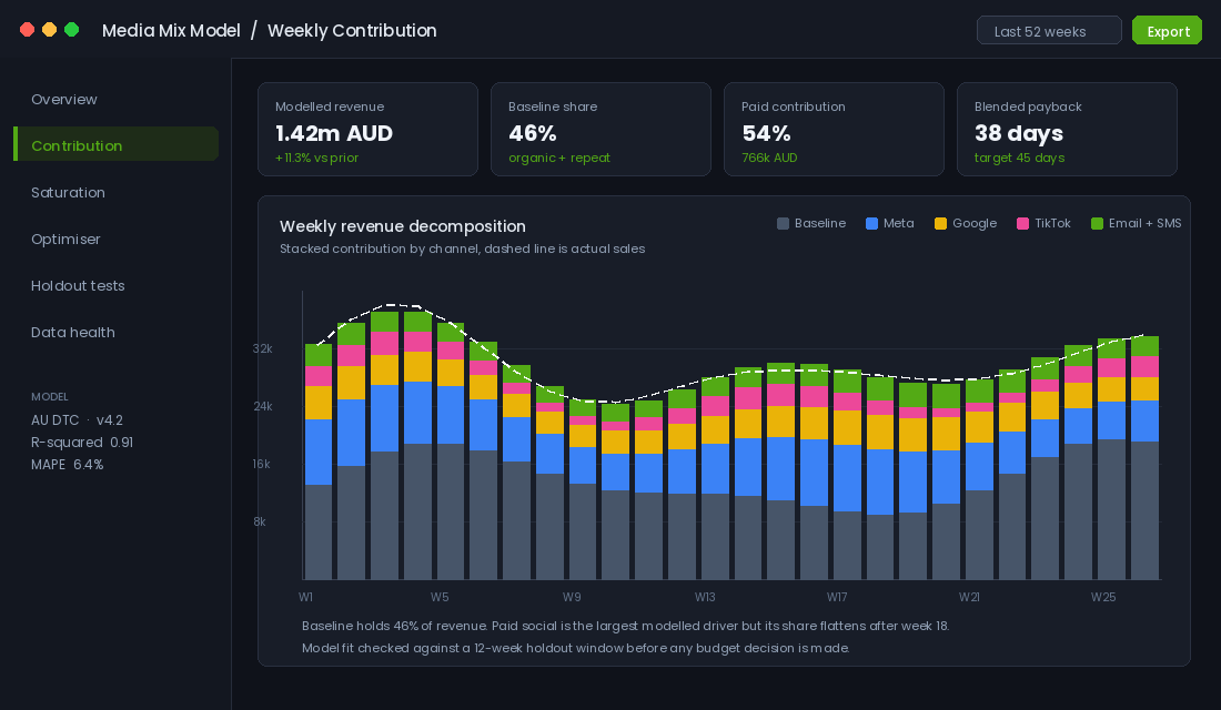
Strip away the jargon and a media mix model is a regression. It takes 52 to 104 weeks of your history, lines up everything that could plausibly move revenue, and fits a curve that explains what happened.
The output has three parts you actually care about:
- Baseline. The revenue you would have earned with zero paid media that week. Brand equity, repeat customers, organic search, word of mouth. For most healthy Aussie DTC brands this sits somewhere between 35 and 55% of total revenue, and if yours is under 25% you have an acquisition treadmill, not a brand.
- Channel contribution. How much of the remaining revenue each channel genuinely caused. This is almost always lower than what the platform reports, and the gap is biggest on retargeting and branded search.
- Response curves. The shape of diminishing returns for each channel, which tells you what the next thousand dollars will earn rather than what the average dollar earned.
That third one is where the money is. Average ROAS is a rear-view mirror. Marginal return is a steering wheel. If you want the full breakdown of why that distinction reshapes a media plan, we covered it in the marginal ROAS playbook.
Just as important is what a model does not do. It will not tell you which creative to kill. It will not tell you which audience to build. It will not replace daily campaign management. It operates at the level of channel and week, and it answers exactly one question well: where should the next dollar of budget go?
The Data Panel: Get This Right or Nothing Else Matters
Most failed models fail here, not in the maths. You need one clean spreadsheet with one row per week and roughly fourteen columns. Build it before you touch any modelling tool.
- Week commencing date. Pick Monday and never change it. Mixing week definitions is the fastest way to poison a model.
- Total revenue. Net of refunds and cancellations, from Shopify, not from an ad platform.
- Total orders and sessions. Useful as sanity checks and as a stock-out detector.
- Spend by channel. One column each for Meta prospecting, Meta retargeting, Google Search brand, Google Search generic, Performance Max, TikTok, and any other line above roughly 500 AUD a week. Anything smaller gets grouped as “other paid”.
- Email and SMS sends. Volume of campaign sends, not revenue. Revenue is an output, not an input.
- Promotion depth. A single number for the average discount percentage running that week. Skip this and your model will credit your ads for every sale event you ever ran.
- Price index. Average selling price relative to your baseline. Price changes move revenue and a model that cannot see them will misattribute the effect.
- Stock availability. Percentage of your top twenty SKUs in stock. A stock-out week looks exactly like an ad failure week to a naive model.
- Seasonality flags. Binary columns for BFCM, Boxing Day, EOFY, Mother’s Day, Father’s Day, Click Frenzy, Afterpay Day.
- Non-paid events. PR hits, a big influencer post, a viral moment, a retail partnership launch.
Two rules. First, use spend as the input, not impressions or clicks. Spend is what you control and what you are trying to allocate. Second, use local currency and local weeks. If you sell into New Zealand and the United States as well, either model each market separately or add a currency-normalised column. Mixing markets in one model produces averages that describe no market you actually operate in.
How much history do you need? Meta’s own guidance for its open-source tool is a minimum of two years of weekly data and a ratio of at least ten observations for every variable in the model. If you have eighteen months and eight channels, you are already stretching. Fewer variables, wider confidence intervals, and more humility about the output.
Adstock and Saturation: The Two Curves That Change How You Budget
Two concepts do most of the heavy lifting inside any media mix model, and you should understand both even if you never open a line of code.
Adstock is memory. An ad someone saw on Tuesday can drive a purchase three weeks later. The model estimates a decay rate for each channel: how much of this week’s impact carries into next week. Brand video on YouTube might carry 60% of its effect forward. A retargeting ad might carry almost none. If your consideration window is long, and for anything over about 150 AUD in Australia it usually is, adstock explains why cutting spend feels harmless for a fortnight and then hurts.
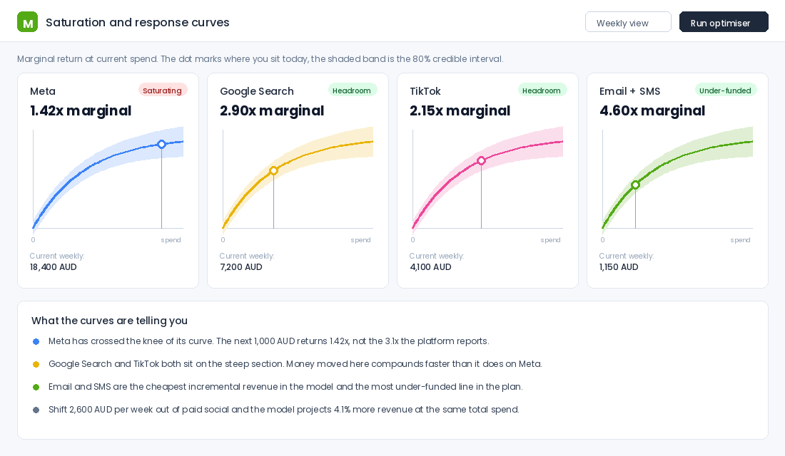
Saturation is the ceiling. Every channel has a point where extra spend buys progressively worse audiences. Below the knee of the curve, an extra 1,000 AUD might return 3x. Above it, the same 1,000 AUD returns 1.2x, even though your reported blended ROAS barely moves because the average is dragged along by all the efficient spend underneath.
This is why brands can scale spend 40% and see revenue rise 12% while every dashboard still shows “healthy” ROAS. The average looks fine. The margin at the edge is terrible.
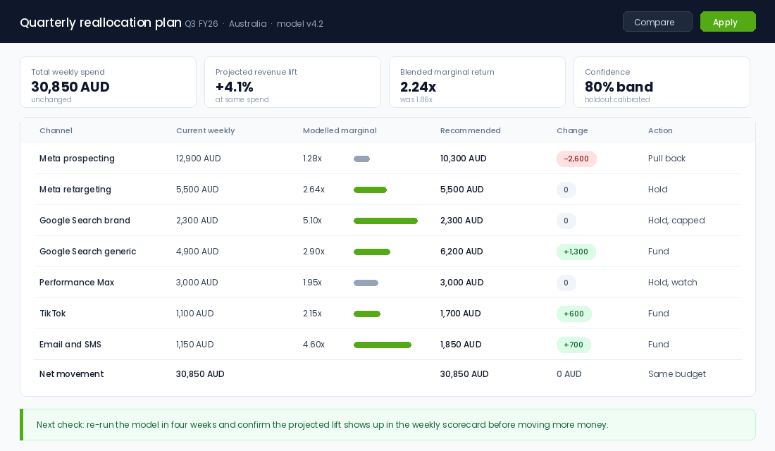
Practically, the model gives you a marginal return number per channel. Anything above your break-even multiple deserves more money. Anything below it is a candidate to be pulled back. Anything close to break-even gets held and watched. That is the entire decision framework, and it works whether you have three channels or twelve. If you have not yet set your break-even multiple properly, start with the marketing efficiency ratio framework before you model anything.
Calibrate With Holdouts or You Are Just Reading Correlations
Here is the honest limitation of every media mix model: it can only see correlation. If you have always increased Meta spend in November, the model cannot easily separate “Meta works” from “November works”. Two variables that move together are indistinguishable to a regression unless you deliberately break the pattern.
The fix is a geo holdout. You turn a channel off, or scale it hard, in a set of matched postcodes or states for a fixed window, then compare against the rest of the country. Australia is unusually well suited to this. New South Wales and Victoria are large enough to give you statistical power, and Queensland, South Australia and Western Australia make credible control groups when weighted properly.
A basic calibration test looks like this:
- Pick one channel with a suspicious model result. Retargeting and branded search are the usual suspects.
- Split Australia into a test group (say WA plus SA) and a control group (the rest).
- Turn the channel off in the test group for four full weeks. Two weeks is not enough to clear adstock.
- Measure revenue per capita in test versus control against the four weeks before the test.
- Feed the measured lift back into the model as a prior, so the model is anchored to something you actually observed.
This step is what separates a model you can bet budget on from an expensive spreadsheet. The measurement industry now calls the combination of modelling plus experiments the triangulation approach, and the efficiency gains quoted at the top of this article are specifically for calibrated models. Uncalibrated ones perform meaningfully worse. Our full incrementality testing playbook walks through the test design in detail.
Choosing Your Path: Robyn, a Paid Platform, or a Spreadsheet
There are three realistic routes and the right one depends almost entirely on your monthly media spend.
Under about 30k AUD a month in media: the spreadsheet model
You do not have enough spend variance for a statistical model to learn much, and paying for software would be a poor use of the budget. Build the fourteen-column panel anyway. Then run deliberate spend tests: hold one channel flat for six weeks, move another up 30% for six weeks, and read the difference in total revenue rather than platform-reported revenue. It is crude, it is slow, and it beats trusting three conflicting dashboards.
30k to 150k AUD a month: Meta Robyn, run in-house or with an analyst
Robyn is Meta’s open-source modelling framework. It is free, it is well documented, and a competent analyst can stand one up in two to three weeks. Google’s Meridian is the other open-source option and leans towards Google and YouTube-heavy media plans, though it needs Python 3.11 or 3.12 and a GPU to run comfortably.
A realistic Robyn setup runs like this:
- Install R and the package. Install R 4.3 or later, then run
install.packages("Robyn"). Add the Nevergrad optimiser via reticulate, which Robyn uses to search for model candidates. - Export your panel. Pull weekly Shopify revenue and orders, then weekly spend by channel from Meta, Google, TikTok and anywhere else. A simple Google Sheet joined by week commencing date is fine. Save it as CSV.
- Define your variables. Set your dependent variable to revenue, list your paid channels as paid media spend, and register discount depth, price index, stock availability and your holiday flags as context variables.
- Set adstock and saturation windows. Use Robyn’s Weibull adstock for channels with long consideration and geometric for direct response. Leave the saturation priors wide on the first run.
- Run the model and read the Pareto front. Robyn returns a set of candidate models, not one answer. Discard anything where a channel’s contribution has the wrong sign or where fit error is above roughly 10%.
- Calibrate. Feed in the results of any geo holdout you have run. This is the step most people skip and it is the step that makes the output trustworthy.
- Run the budget allocator. Robyn will output a recommended spend split at your current total budget and at plus or minus 20%. That output is your reallocation plan.
Budget three to four weeks of analyst time for the first build, then about half a day a month to refresh it.
Above roughly 150k AUD a month: buy it
At that spend, an allocation error of a few percent costs more than the software. Recast sits at the accessible end at roughly 1,500 to 4,000 USD a month and is purpose-built for DTC. Lifesight publishes a DTC plan around 3,490 EUR a month. Prescient AI targets brands spending over 100,000 USD a month and refreshes models daily. Broadly, mid-market MMM software for a single-market, mostly digital stack runs 30,000 to 80,000 USD a year, which is a fraction of the 50,000 USD-plus consulting projects that used to be the only option.
Two Brands That Reallocated Instead of Spending More
Represent Clothing used a media mix model heading into Black Friday and found paid social was underfunded rather than saturated, which is the opposite of what most brands assume. They increased paid social spend on the strength of the model and grew media-driven sales by 44% across the period. The insight was not “spend more”. It was “spend more here, and here is the curve that says why”.
Bondi Sands took the opposite kind of bet. The Aussie tanning and sunscreen brand put roughly 75% of its annual marketing budget behind becoming the official sunscreen partner of the Australian Open. On a last-click dashboard that decision is indefensible. Measured properly, brand awareness lifted 8 points, consideration moved from 17% to 25%, and category sales tripled year on year. That is a baseline effect, and baseline is exactly the thing click attribution cannot see and a mix model can.
Both stories make the same point from different directions. The brands that win at allocation are not the ones with the biggest budget. They are the ones who know the shape of their curves.
The Four Numbers That Should Change Your Spend
When the model finishes, ignore the ninety-page appendix. Four numbers drive every decision.
- Baseline share. If baseline is climbing quarter on quarter, your brand is compounding and you can afford to be patient with upper-funnel spend. If it is falling while revenue holds, you are renting growth from paid media and the rent goes up every year.
- Marginal return by channel. Rank every line by what the next dollar earns. Anything under your break-even multiple is a source of funds, not a growth channel.
- The gap between modelled and platform-reported contribution. A channel reporting 6x and modelling 1.3x is not performing, it is claiming credit. That gap is your single most valuable finding.
- The confidence band. A marginal return of 2.4x with a band from 0.9x to 4.1x is not a decision, it is a hypothesis. Move small, test, and re-run.
Where It All Compounds: The Quarterly Reallocation Rhythm
A model that produces a beautiful chart and no decision is worthless. The value shows up when it becomes a rhythm.
Once a quarter, sit down with the model output and your profit and loss. Rank channels by marginal return. Move no more than 15% of total budget in a single quarter, because bigger swings destroy the very variation the next model needs to learn from. Write down what you expect to happen, in a number, before you move a dollar. Then check four weeks later whether it happened.
Here is why the rhythm matters more than the model. Quarter one you find that branded search was overcredited and move 8% of budget to generic search. Revenue rises 3% on flat spend. Quarter two you find email and SMS is your cheapest incremental revenue and it has been chronically underfunded, so you invest in list growth. Quarter three, with better data and one holdout test behind you, the confidence bands narrow and you can move with more conviction.
Three percent, then four, then five, on the same budget, compounds into a materially different business by the end of the year. Meanwhile your competitor is still refreshing Ads Manager and wondering why the numbers do not tie out.
What to Do in the 90 Days Before Your Model Is Trustworthy
Nobody gets a usable media mix model in week one. Most brands need two to three years of weekly data, or at minimum 104 observations, before the coefficients stop swinging wildly every refresh. That is a long wait if you are trying to make budget decisions this quarter. Here is what to run in the meantime so the model is worth something the day it is ready.
- Fix your data spine first. Weekly spend, impressions and revenue by channel, exported the same way every week, into the same sheet. A model trained on messy inputs will confidently produce a wrong answer. Supermetrics or a simple scheduled export beats a heroic monthly rebuild.
- Run one geo holdout a quarter. Turn a channel off in one state for four weeks and compare against a matched control. It is blunt, but a single clean holdout gives you a real incrementality read you can use to calibrate the model later. Our incrementality playbook covers designing one that actually holds up.
- Track MER weekly as your interim guardrail. Total revenue divided by total ad spend cuts through platform self-reporting entirely. Most Australian DTC brands operate somewhere between 3x and 5x blended MER depending on margin. It will not tell you where to move budget, but it will tell you immediately when something is going wrong.
- Log every external event. Price changes, stockouts, a PR hit, an EOFY sale, a competitor launch. These are the variables that will otherwise get misattributed to whatever channel happened to be spending that week. A dated notes column costs nothing and saves the model.
Do this for three quarters and by the time you have enough history, the model has clean inputs and two or three calibration points to check itself against. Skip it and you will spend your first modelling quarter arguing about whether the output is believable.
Your Media Mix Review Checklist
Run this before every quarterly budget decision. Copy it into a doc and tick the boxes.
- Panel refreshed. Weekly revenue, spend by channel, discount depth, price index, stock availability and event flags are current through last completed week.
- Data health checked. No missing weeks, no channel with fewer than eight weeks of spend, no unexplained revenue spikes left unflagged.
- Model fit accepted. Error against a holdout window under roughly 10%, and no channel showing a negative contribution without a real explanation.
- Calibration current. At least one geo holdout run in the last two quarters, with results fed back in as a prior.
- Marginal returns ranked. Every channel above 500 AUD a week has a marginal return number and a confidence band next to it.
- Gap analysis done. Modelled contribution compared against platform-reported contribution for every channel, with the three biggest gaps written down.
- Reallocation capped. Total budget movement this quarter is under 15%, and every moved dollar has a written expected outcome.
- Review booked. A four-week check-in is in the calendar to compare the projected lift against the weekly scorecard.
You do not need a data science team to start. You need one clean spreadsheet, the discipline to log promotions and stock outs every week, and the willingness to turn a channel off in Western Australia for a month to find out what it is really worth.
The brands pulling away in Australia right now are not the ones with better creative. They are the ones who stopped arguing with their dashboards and started measuring the whole business at once.
Inside eCommerce Circle, measurement and budget allocation is one of the core pillars we work on with every member. If you want a second opinion on where your next dollar should go, let’s talk.