You are spending hours every week answering customer questions that could be answered in 30 seconds if your product pages were built properly. “What size should I get?” “Does this come in other colours?” “How long does shipping take?” Every one of these questions is a sale at risk – because most customers who have questions will not bother asking. They will just leave.
What’s in This Article
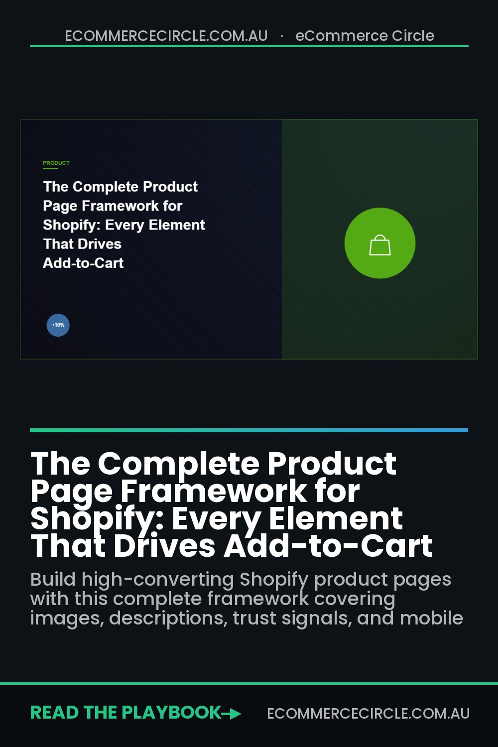
A product page that answers every question before it is asked converts at 2-3x the rate of one that leaves customers guessing. Here is the complete framework for building product pages that sell – covering everything from layout structure to the specific elements that drive clicks on the “Add to Cart” button.
Above the Fold: The First 3 Seconds
Your product page has 3 seconds to convince a visitor to keep scrolling. Everything above the fold must work hard:
Product images. Your hero image should show the product in context – being worn, being used, or styled in a real environment. Not a flat lay on a white background. Your image gallery should include 5-8 images minimum: hero lifestyle shot, multiple angles, close-up details, size reference (product next to a common object or on a model with measurements listed), and at least one customer photo or UGC image.
Product title. Descriptive and keyword-rich. “Women’s Organic Cotton Crew Neck Tee – Sage Green” is better than “The Essential Tee” because it tells the customer (and Google) exactly what this product is. Include the key differentiator in the title if possible.
Price and payment options. Show the price prominently. If you offer buy-now-pay-later (Afterpay, Klarna), show the instalment amount right next to the price: “$89.00 or 4 payments of $22.25.” This reframes the purchase decision from $89 to $22 – which feels much more accessible.
Variant selection. If your product has sizes, colours, or other variants, make the selection obvious and visual. Use colour swatches (not dropdown menus) for colour options. Include a “Size Guide” link directly next to the size selector – do not make customers hunt for it.
The Trust Strip: Social Proof Above the Fold
Between your product images and the main description, add a trust strip – a compact row of credibility signals:
- Star rating and review count. “4.8 stars – 247 reviews” directly below the product title. This is the single most influential element on a product page after the images. Products with visible reviews convert at 270% higher rates than those without.
- Key badges. Free shipping threshold, returns policy, and a key product benefit – all in a compact icon row. “Free Shipping Over $100 | 30-Day Returns | 100% Organic Cotton.” These answer the three biggest purchase anxieties: cost, risk, and quality.
- Urgency indicators. If genuinely applicable, show stock levels (“Only 4 left in this size”), recent purchases (“12 people bought this today”), or limited-time offers. Do not fake these – customers can tell, and it destroys trust.
Product Description: Benefits Over Features
Most product descriptions read like a spec sheet. “100% organic cotton. Machine washable. Available in 5 colours.” These are features. Customers do not buy features – they buy the benefits those features deliver.
Rewrite every product description using this framework: lead with the benefit, then support with the feature.
“Feel comfortable all day long – our organic cotton is softer than conventional cotton and gets better with every wash.” Compare that to “Made from 100% organic cotton.” Same feature, completely different emotional impact.
Structure your description in three sections:
- Opening paragraph (2-3 sentences). Paint a picture of the customer’s life with this product. Address their primary desire or pain point. “Tired of tees that stretch out after one wash? Our organic cotton crew neck holds its shape through 100+ washes, so you can reach for it every week without it looking tired.”
- Bullet point benefits (4-6 points). Each bullet leads with a benefit and follows with the supporting feature. Use bold text for the benefit so scanners can quickly absorb the key points.
- Technical details (collapsible). Materials, dimensions, care instructions, and specifications in a collapsible accordion. Customers who need these details can find them easily. Customers who do not are not overwhelmed by technical information.
Below the Fold: The Decision Reinforcement Zone
Customers who scroll below the fold are interested but not yet convinced. This section needs to eliminate remaining objections:
Customer reviews section. Display your most recent and most helpful reviews prominently. Include photo reviews at the top – these are 10x more persuasive than text-only reviews. Allow filtering by rating and sorting by most recent. If you have very few reviews, prioritise collecting them before spending money driving traffic to this page.
FAQ accordion. Answer the 5-8 most common questions about this specific product. Shipping times, returns process, sizing advice, care instructions, and comparison to similar products. Every question you answer here is a customer you save from bouncing to Google (where they might find a competitor).
Complementary products section. “Complete the Look” or “Frequently Bought Together” with 3-4 related products. This drives cross-sells and increases AOV. Position it as helpful curation, not an upsell – “Customers who bought this also loved…” feels different from “You might also like…”
Mobile Product Page Optimisation
70% of your traffic is mobile, but most product pages are designed desktop-first and merely shrunk for mobile. Mobile needs specific attention:
- Sticky add-to-cart button. As the customer scrolls down the page, the “Add to Cart” button should remain visible at the bottom of the screen. This eliminates the need to scroll back up to purchase – reducing friction at the critical moment of decision.
- Swipeable image gallery. Ensure images are swipeable with clear indicators showing how many images are available. The first image should load in under 1 second. Use progressive loading for the rest.
- Thumb-friendly variant selection. Size and colour selectors should be large enough to tap accurately. Minimum touch target: 44px by 44px. Dropdown menus are frustrating on mobile – use tappable buttons or swatches instead.
- Collapsible sections by default. On mobile, long pages feel overwhelming. Collapse the description, shipping info, reviews, and FAQ into expandable accordions. Show the first 2-3 lines of the description with a “Read More” toggle.
The Compound Effect of Product Page Excellence
Your product page is the single highest-leverage page on your entire site. Every visitor who lands there is already interested – your job is not to attract them (your ads and SEO did that) but to convert them. A 1% improvement in product page conversion rate across your store can mean tens of thousands in additional annual revenue from existing traffic.
One eCommerce Circle member redesigned their top 5 product pages using this framework – better images, benefit-led descriptions, trust badges, and a sticky mobile CTA. Conversion rate on those pages improved from 2.1% to 3.8%. On 8,000 monthly visitors to those pages, that translated to an extra 136 orders per month – $12,240 in additional monthly revenue without spending a single extra dollar on traffic.
The best product page is one where the customer never needs to contact you with a question. Every answer is already there, presented in the right order, at the right moment in their decision process.
Audit Your Top Pages This Week
Pull up your top 5 product pages by traffic volume. For each one, check: do you have 5+ high-quality images? Is the description benefit-led? Are reviews visible? Is there a size guide? Does the mobile experience have a sticky cart button? Fix the gaps on these five pages first – they account for the majority of your revenue and deserve the most attention.
The Above-the-Fold Test: What Must Be Visible Before a Single Scroll
Most of the add-to-cart decision is made in the first screen, before anyone scrolls. On mobile that is a tiny window, so every pixel above the fold has to earn its place. If a shopper cannot answer “what is it, why should I care, and how much” in three seconds, you have already lost a chunk of them.
- Product title and a one-line benefit. Not just the name. Tell them what it does for them.
- Price, plus any BNPL line. Afterpay and Zip are expected by Aussie shoppers now. Show the per-instalment price.
- A hero image that shows the product in use, not just on a white background.
- The add-to-cart button, visible without scrolling, in a colour that stands out from the rest of the page.
- A star rating and review count, even a small one. Instant credibility.
Open your own top product page on a phone and screenshot the first view. If any of those five elements are missing or pushed below the fold, that is your first fix. For the full block-by-block layout that ties this together, work through our Shopify product page playbook.
Mobile Product Pages: Where Most Aussie Stores Lose the Sale
Roughly 70 to 75% of Aussie ecommerce traffic is on mobile, yet most product pages are still designed on a desktop and checked on mobile as an afterthought. That is backwards. Design for the phone first, then let the desktop breathe.
The two silent killers on mobile are slow load and clumsy variant selectors. Every extra second of load time drops conversion by around 7%, so a page that takes four seconds instead of two is leaking real money. Tight, swipeable image galleries and large tap targets for size and colour do the rest. If your pages feel sluggish, start with our site speed playbook before you touch anything else.
Social Proof Placement: Where Reviews Actually Change Minds
Reviews do not just belong at the bottom of the page where almost nobody scrolls. The best converting pages sprinkle proof at the exact moments doubt creeps in: a star rating up top, a few photo reviews near the add-to-cart button, and a focused block of detailed reviews lower down for the researchers.
Photo and video reviews convert far harder than text alone, often lifting conversion on the page by 5 to 15% when shown near the buy button. Aussie shoppers in particular want to see the product on real people and in real homes, not just studio shots. Build a steady stream of this content with our product reviews playbook, then place it where it does the most work.
Treat your product page as a system, not a template. Above-the-fold clarity earns the scroll, mobile speed keeps them moving, and well-placed proof closes the gap between interested and buying. Change one element at a time, measure the add-to-cart rate, and keep what wins.
Inside the eCommerce Circle, product page optimisation is one of the first CRO wins we chase with every member. We audit your top pages, identify the conversion killers, and implement the changes that turn browsers into buyers – because traffic without conversion is just an expensive vanity metric.
Your product page is your best salesperson. Make sure it is doing its job.
Inside eCommerce Circle, product page optimisation is one of the core pillars we work on with every member. If you want a second opinion on yours, let’s talk.