Most Shopify brands obsess over the wrong page. They pour every spare dollar into Meta ads, tweak the homepage for the hundredth time, and argue about the hero image like it’s the thing holding their growth back. Meanwhile, the page that actually decides whether a visitor becomes a customer is quietly under-performing, and nobody’s looking.
What’s in This Article
That page is your product page. And if you’re an Australian Shopify brand doing anywhere between $20K and $500K a month, it’s almost certainly leaking revenue in ways you can’t see from the dashboard.
Baymard Institute’s large-scale usability research found that the average ecommerce product detail page has a long list of critical usability issues, and that fixing even a handful of them can lift conversion rate by 35% or more. On a store doing $50K a month, that’s not a rounding error. That’s an extra $17K in monthly revenue, every month, from work you do once.
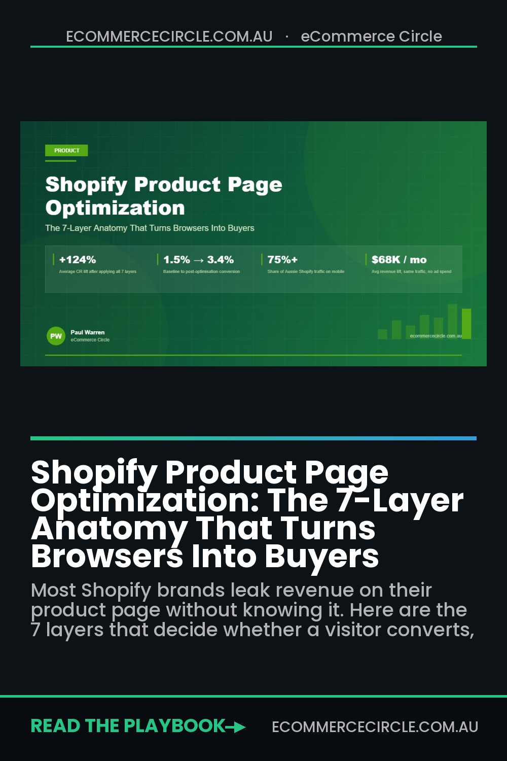
This is the article I wish every brand owner inside our coaching program read before they spent another dollar on ads. It’s the 7-layer anatomy of a Shopify product page that actually converts, built from the patterns we see across hundreds of Aussie brands we’ve audited. No fluff. No generic “add a video and call it done” advice. Just the layers that move the metric.
Why Your Product Page Is the Highest-ROI Page in Your Funnel
Think about the full path a paid-ad visitor takes on your site. They click your ad, land on the product page, and within about 3 seconds they’ve made a subconscious decision about whether they trust you. If they do, they start reading. If they don’t, they bounce, and you’ve just paid for a visitor who told their friend your brand looked “a bit sus”.
Most Shopify product pages in Australia are built from a theme demo, populated with a few bullet points, three phone photos, and whatever app the agency installed last year. They look fine. They convert at 1.2%. The owner assumes that’s just what ecommerce is.
It isn’t. A serious product page built on the 7 layers below should convert somewhere between 3% and 6% on cold traffic, and 8% to 15% on warm traffic. That’s not a theoretical ceiling. That’s what the top 10% of Shopify stores in any category are doing right now, and the gap between them and the average store is almost always the product page.
Here’s the mental model. Every visitor who lands on your product page is silently asking seven questions. They don’t ask them out loud. They don’t ask them sequentially. But they need every one answered before they’ll hand over their credit card:
- What is this, and is it for me? (the Hero layer)
- What does it look like in real life? (the Visual layer)
- Can I trust this brand? (the Trust layer)
- Will it actually do what I want? (the Copy layer)
- Which version do I pick, and how do I buy it? (the Decision layer)
- What happens if I hate it? (the Risk-Reversal layer)
- Does this work on my phone while I’m on the train? (the Mobile layer)
Answer all seven well and conversion goes up. Miss one and conversion leaks. Let’s break them down.
Layer 1: The Hero Layer (The First 3 Seconds Decide Everything)
The top of your product page, what a visitor sees before they scroll, is the most expensive real estate you own. Everything above the fold has to do one job: tell the visitor exactly what the product is, who it’s for, and why they’d want it, without making them think.
Most Shopify brands waste this real estate. The title is usually a SKU name (“Classic Tee V2 Charcoal”), the price is floating with no anchoring, and the only image is a flat studio shot against a white background. That’s not a hero section. That’s a spec sheet.
A proper hero layer includes five non-negotiable elements in the viewport before the fold:
- A benefit-led product title. “Merino Base Layer for Aussie Winters” beats “Classic Tee V2 Charcoal” every time. The product name can be a subtitle if you insist on keeping it.
- A one-line value proposition. Sitting under the title, in slightly lighter type. This is the thing that makes the visitor say “ah, that’s for me”. Example: “Stays warm in 5-degree mornings, breathes in 25-degree afternoons, machine washable.”
- The price with a visible value anchor. “$89” floating alone is weaker than “$89 (or 4 payments of $22.25 with Afterpay)” or “$89, was $119”. You’re not lying, you’re contextualising.
- A star rating with review count. Not a star rating alone. “4.8 stars from 1,247 Aussie customers” is social proof. “4.8 stars” with no number might be made up.
- A clearly visible Add to Cart button in brand colour. Not grey. Not bordered. Not “Select Options” unless that’s unavoidable. The button should be the most visible thing on the page.
If you want to see whether your hero layer is doing its job, load your product page in an incognito window, scroll to the top, and show it to a mate who doesn’t know your brand. Give them 5 seconds. Then cover the screen and ask them what the product is, who it’s for, and how much it costs. If they can’t answer all three, your hero layer is broken. Nothing else on the page matters yet.
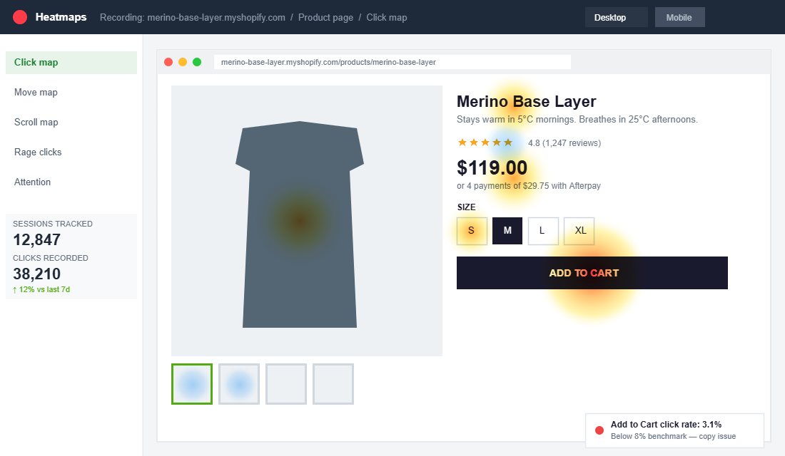
We use heatmap tools like Hotjar and Microsoft Clarity with almost every brand in our program to see exactly where visitors stop scrolling, where they click, and where they rage-click (the dead zone where users tap something that isn’t actually a button). If your heatmap shows a big heat cluster on your product title but the click-through to Add to Cart is under 8%, your hero copy is getting attention but not closing. That’s a copy problem, not a design problem.
Layer 2: The Visual Layer (Photography, Video, and Lifestyle Context)
Online, visuals carry the weight that a physical store would handle through touch and demonstration. A customer in a Melbourne boutique can feel the fabric, try it on, and ask the shop assistant how it washes. Your product page has none of that. Your photography and video have to do it all.
A strong visual layer has four types of imagery, and almost every Shopify brand we audit is missing at least two of them:
- The hero shot. Clean, high-resolution, on-white or on-brand background. This is the one most brands nail. It exists to identify the product.
- Detail shots. Close-ups of texture, stitching, zips, materials, the bottom of the sole, the inside of the lid, the label. These answer the “is this actually quality” question.
- Lifestyle / in-use shots. The product being worn, held, used, or eaten by real humans in the real context your buyer will use it in. If you sell a surfboard, show it in the water at Bells Beach, not propped against a studio wall.
- Scale shots. Something that shows how big it actually is. “19cm tall” is a number. A hand holding it next to a coffee cup is a fact.
Then there’s video. According to Wyzowl’s annual video marketing research, 82% of consumers say they’ve been convinced to buy a product after watching a brand’s video, and 89% of marketers report video gives them a positive ROI. Product video on the product page is one of the highest-ROI changes you can make. And it doesn’t need to be a cinematic ad with drone shots over the Gold Coast. A 20-second phone video of someone opening the packaging, showing the texture, and explaining one feature is better than no video at all.
Shopify’s native media gallery handles video natively now, which means no more apps, no more embed codes, no more slow-loading iframes. Just drop an MP4 into the product media and it’ll autoplay muted on the gallery. Brands that do this consistently see a measurable lift in time-on-page and in add-to-cart rate.
One word on photography quality. You do not need a $15K commercial shoot. You need consistent lighting, a plain background for studio shots, and a human (not a mannequin) for lifestyle shots. Under-lit, phone-snapped photos will tank your conversion rate faster than any copy mistake. If you’re selling a $120 product, your photography has to make the visitor feel like they’re buying a $120 product.
Layer 3: The Trust Layer (Reviews, Badges, and Social Proof)
Nearly every visitor to your Shopify store is meeting your brand for the first time. They’ve never heard of you. They have no reason to trust that the product will arrive, that it’ll match the photos, or that you’ll help them if something goes wrong. The trust layer is how you close that gap.
PowerReviews’ consumer research consistently finds that around 95% of shoppers read reviews before buying, and products without reviews convert at roughly half the rate of products with at least five reviews. On a product doing 500 sessions a week, that difference is not optional.
A proper trust layer on a Shopify product page has:
- A review block with star rating, review count, and filters. Filters for “verified buyer”, “photo reviews”, and star rating are the difference between a review widget that works and one that looks like furniture. Tools like Judge.me, Okendo, Loox and Yotpo all do this natively.
- Photo and video reviews. Text-only reviews carry weight. User-generated photos carry twice as much. Reviews with a real customer photo are among the most trusted forms of content on your entire site.
- Trust badges. “Australian owned”, “Free shipping over $X”, “30-day returns”, “Secure checkout”. One compact row, not a cluttered sidebar of 12 icons. Overloading badges actually lowers trust because it starts to look like overcompensation.
- Press mentions or brand logos. If you’ve been in Broadsheet, The Sydney Morning Herald, or any trade publication, put the logos somewhere visible. “As featured in” carries credibility that your own copy can’t.
- A short brand story block. Two to three sentences, ideally with a founder photo. Aussies trust brands with a face. Faceless dropshippers are what they’re trying to avoid.
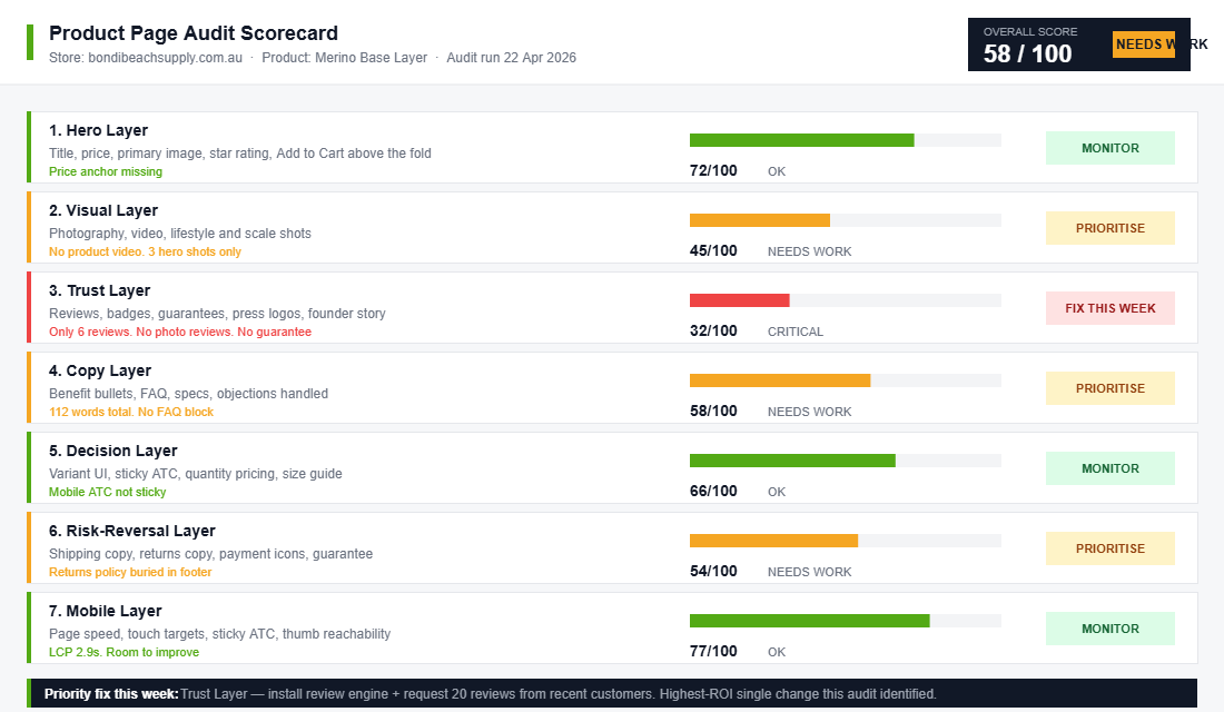
The single biggest mistake we see with reviews is treating them as a set-and-forget app install. Reviews need a system behind them: a post-purchase email sequence that asks for reviews at the right moment, an incentive for photo reviews, and a response process for negative ones. We cover the full playbook in our review engine guide, but the short version is: if your product has fewer than 20 reviews, fixing the review engine is probably the single highest-ROI change you can make right now.
Layer 4: The Copy Layer (Benefit-Led Bullets, Features, and the Buyer’s Real Questions)
Copy on a Shopify product page is where most brands go from “good enough” to “we’re leaving money on the table”. Generic paragraphs describing the product in marketing-speak get skimmed, or worse, ignored. The visitor lands, looks at the photos, looks at the price, and bounces because they haven’t found a single line of copy that says “yes, this solves your specific problem”.
Good product page copy follows a predictable structure:
- A 2-3 sentence lead paragraph that reframes the problem your product solves and positions the product as the clean solution. This is not the place for “Our mission is to…”. It’s the place for “Tired of your base layer smelling like a PE changeroom by lunchtime? We built this one with antimicrobial merino that doesn’t.”
- 3-5 benefit-led bullets. Each bullet leads with a bolded benefit, followed by the feature that delivers it. “Stays warm at 5°C” is a benefit. “100% merino wool” is a feature. You want both, in that order.
- A features table or spec block. For logical buyers who want the data. Dimensions, materials, weight, care instructions, compatibility. Clean, scannable, and separate from the emotional copy.
- An FAQ block handling the top 5 objections. “Will this fit an adult size 12?”, “How long does shipping take to Perth?”, “Can I return it if I don’t like it?”. Every brand knows the 5-8 questions that come through their inbox every week. Put the answers on the page.
- A “how to use” or “who it’s for” section when the product has any learning curve. This is especially important for skincare, supplements, tools, and anything with multiple use cases.
The trick with product copy is writing to a specific person, not to “the market”. If you’ve done the work on your customer avatar, you should be able to name the exact person you’re writing to, what keeps them up at 2am, and what language they’d use to describe the problem. If you don’t have a clear avatar, your copy will read as generic because it will be generic.
One specific tactical note: the average Shopify product page has about 100-150 words of copy. The high-converting ones typically have 400-800 words, broken into scannable chunks with headings, bullets, and visuals interspersed. More copy isn’t always better, but on a considered purchase ($50 and up), under-explaining is the more common failure mode.
Layer 5: The Decision Layer (Variants, Stock Cues, and Sticky Add-to-Cart)
A visitor who’s read your copy and likes what they see now has to make a decision: which variant, how many, and whether to buy now or “think about it”. The decision layer is how you help them over that last hump.
The variant picker is where a surprising amount of revenue leaks. On any product with more than one SKU (size, colour, flavour, scent), the variant UI has to be obvious, touch-friendly, and visually clear about what’s available. Specifically:
- Use swatches, not dropdowns, for colour. A colour name in a dropdown forces the visitor to click, read, process, and sometimes backtrack. A row of visual swatches handles the decision in one glance.
- Use buttons, not dropdowns, for size. Size buttons laid out in a row let the visitor see what exists, what’s in stock, and what’s sold out. Greyed-out buttons for sold-out sizes signal scarcity without being pushy.
- Show a size guide in a slide-out drawer, not a new page. Every time you force a user to open a new tab, you risk losing them to their inbox or a notification.
- Show stock level when it’s low but real. “Only 3 left in this size” is powerful when it’s true and visible. It’s counterproductive when it’s a manipulative widget that always shows “Only 2 left”.
Then there’s the add-to-cart button itself. On desktop, the button should always be visible in the viewport, either in the original location or as a floating bar once the user scrolls past it. On mobile, a sticky add-to-cart bar at the bottom of the screen is non-negotiable for any brand over $20K a month. Google’s research on mobile ecommerce consistently finds that sticky CTAs lift add-to-cart rate by double digits because the user never has to scroll to find the action.
One more tactical piece that most brands miss: quantity pricing. If you sell consumables, supplements, or anything people re-order, showing a small “buy 2 save 10%, buy 3 save 15%” block next to the quantity selector often lifts average order value by 15-30% with no change to your ad spend. It’s the simplest form of product bundling, and it works because it’s served at the moment the buyer is already leaning in.
Layer 6: The Risk-Reversal Layer (Shipping, Returns, and the Final Objections)
By the time a visitor has read your copy, looked at your reviews, and picked a variant, they’re 80% sold. What’s holding them back is the last 20%: “what if it doesn’t fit”, “what if it takes 3 weeks to arrive”, “what if I hate it”. The risk-reversal layer removes those objections without the visitor having to click away to find the shipping page.
A solid risk-reversal layer, usually placed directly under the add-to-cart button, includes:
- Shipping timelines in plain English. “Ships from Melbourne within 24 hours. Delivered in 2-4 business days anywhere in Australia.” Not “See shipping page for details”.
- Free shipping threshold. “Free shipping on orders over $99” is a tiny line that both closes the sale and nudges AOV upward. Your free shipping threshold is one of the most profitable levers you own, and it deserves to be visible on the product page, not hidden in the footer.
- Returns policy in one sentence. “30-day no-questions-asked returns. We cover the return postage.” Spelled out. Not a link to legal fine print.
- Guarantee or warranty. “Lifetime warranty on all stitching” or “Love it or your money back, no questions” dramatically reduces perceived risk for the first-time buyer.
- Payment options. Visible logos for Afterpay, Zip, PayPal, Apple Pay, and the major cards. Aussies overwhelmingly use Afterpay for considered purchases, and not showing it is one of the most common missed opportunities we see in audits.
Risk-reversal copy has to be specific and trustworthy. “Easy returns” is hollow. “Return within 30 days with the prepaid label we include in every box” is concrete. The more concrete, the more it reassures.
Layer 7: The Mobile Layer (Because 75%+ of Your Traffic Is on a Phone)
Statista’s latest retail ecommerce research puts mobile’s share of total ecommerce sales at around 60%, and for most Aussie Shopify brands in our program, mobile traffic share sits between 70% and 85%. Yet most brands design their product page on a 27-inch Retina display and check it on mobile as an afterthought.
That’s backwards. If mobile is three-quarters of your traffic, mobile is the primary design canvas. Desktop is the exception, not the rule.
The mobile layer isn’t a separate set of elements, it’s a filter you run every other layer through. Specifically:
- Page weight under 2MB ideally, under 3MB maximum. Every image compressed, every app audited. Google’s research shows that 53% of mobile users abandon a page that takes more than 3 seconds to load.
- Touch targets at least 44×44 pixels. That’s Apple’s Human Interface Guideline and it’s not optional. Tiny swatches and tiny quantity selectors mean mis-taps, frustration, and abandonment.
- One-thumb scrolling. The whole page has to work when held in one hand on a commute. Critical content (price, add to cart, reviews) should never require zooming in.
- Sticky mobile add-to-cart bar. Non-negotiable. Always visible once the user scrolls past the hero.
- Fast-loading video. Use a compressed MP4 hosted on Shopify’s CDN, not a 40MB master file. Video that takes 6 seconds to start playing is worse than no video at all.
- Native share buttons that actually work. Aussies share products in group chats constantly. A broken share button kills word-of-mouth.
The easiest way to find your mobile gaps is to put your own product page on someone else’s phone, preferably someone outside your business. Watch them interact with it for 2 minutes. Note every moment they squint, zoom, scroll past the action, or look confused. Every one of those moments is a revenue leak.
Use Google’s PageSpeed Insights and Shopify’s Web Performance dashboard to quantify the mobile load time, and aim for a Largest Contentful Paint under 2.5 seconds. Anything over 4 seconds is costing you measurable revenue on every ad click.
The Compound Effect: How 7 Layers Stack Into a Conversion Machine
Here’s the part most brands miss. They’ll read an article like this, pick one layer (“great, I’ll add a video”), implement it, and expect a 20% lift in conversion rate. When they get 2%, they conclude the advice doesn’t work.
The 7 layers aren’t independent tactics. They compound. A visitor’s trust is built by the sum of what they see. A well-written benefit bullet matters more when the photography makes the product look premium. A sticky add-to-cart matters more when the reviews block gave them confidence two screens ago. Skip one layer and the others carry less weight.
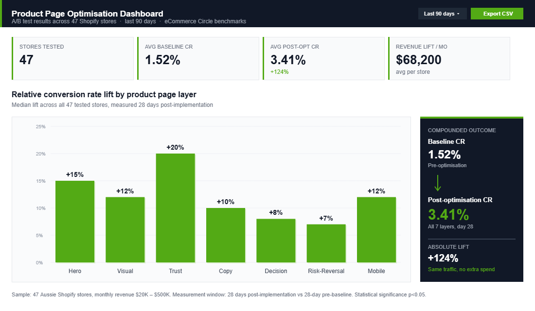
Here’s what that looks like in numbers. Imagine a product currently converting at 1.5%. You do the work on all 7 layers, not perfectly, just reasonably. You’d typically see something like this:
- Hero layer fixed: +15% relative lift on add-to-cart rate.
- Visual layer upgraded: +12% relative lift.
- Trust layer (reviews + badges): +20% relative lift.
- Copy layer rewritten: +10% relative lift.
- Decision layer (variants + sticky CTA): +8% relative lift.
- Risk-reversal layer: +7% relative lift.
- Mobile layer: +12% relative lift on mobile traffic.
Not all of those stack multiplicatively, but a 1.5% baseline compounding through those layers commonly lands somewhere between 3% and 4.5%. On a store doing 50,000 sessions a month at a $90 AOV, that’s the difference between $67,500 monthly revenue and $135,000 monthly revenue. From work you do once.
This is also why product page work pays back faster than almost any other improvement. Ads compound with budget. SEO compounds over 6-12 months. A product page redesign compounds from the next session onwards, with no extra spend, on traffic you’re already paying for.
The same logic applies downstream. Product page lifts cascade into checkout completion rates, which cascade into repeat purchase economics, which cascade into how much you can afford to spend acquiring the next customer. The product page isn’t a page. It’s a lever.
How to Actually Execute This (Without Burning 3 Weeks)
If you’re reading this and thinking “okay, but where do I start”, here’s the 5-day execution sequence we use inside our coaching program:
- Hero layer fixed: +15% relative lift on add-to-cart rate.
- Visual layer upgraded: +12% relative lift.
- Day 3, Content. Shoot the missing photos, record the short product video, rewrite the hero copy, request 20 reviews from recent customers.
- Day 4, Build. Update the product page in Shopify. Swap in the new images, rewrite the copy, install or configure your reviews app, add the sticky mobile CTA. Most Australian brands can land 80% of these changes in a single afternoon on a theme like Dawn or Impulse.
- Day 5, Measure. Turn on heatmap recording for 7 days. Compare add-to-cart rate and checkout-start rate to the previous 30-day baseline in Shopify Analytics. Expect at minimum a 15-25% relative lift within 14 days if the work was done properly. If you see no movement, the fix was cosmetic, not structural, and you need to go back to the audit.
The goal is not a perfect page. It is a page that compounds. Product pages are not a one-off project, they are a rolling optimisation loop. Every 90 days, revisit the layers. New reviews come in. New photos become available. Copy gets sharper. The brands in our program that hit 4%+ conversion consistently are not doing anything magical, they are running this loop on every top product, forever.
The Bottom Line
Your product page is the highest-ROI real estate in your business. It decides whether the visitor you paid for becomes a customer, whether that customer spends $60 or $120, and whether they come back. Most Aussie Shopify brands are leaving 30-50% of their potential revenue on the floor because they have never audited the page through the 7-layer lens.
Inside the eCommerce Circle, product page optimisation is one of the first pillars we work on with every new member, because it unlocks the ad spend, the email marketing, the SEO, and everything else. If you fix the page, you give every other channel more oxygen. If you do not, you are pouring traffic into a bucket with holes in it.
If you are an Australian Shopify brand doing $20K-$500K a month and you want a set of expert eyes on your product page, let us talk. We run a free 7-layer audit for every brand that comes into the program, and that audit alone usually surfaces more revenue than the cost of the program for the next 12 months.