You have spent the last three months optimising. New hero image. Faster product page. A fresh round of ad creative. The conversion rate barely moved, and you cannot work out why.
What’s in This Article
Here is the uncomfortable truth: most founders optimise pages, not journeys. They treat the store like a stack of disconnected screens instead of one continuous experience a real person moves through. That gap is expensive. Across more than 48 studies, Baymard Institute puts the average cart abandonment rate at 70.19%. Seven in ten people who add to cart walk away, and a page-by-page mindset will never show you where they go.
A customer journey map fixes that. It lays the whole path end to end, from the first time someone sees your brand to the moment they tell a mate about it, so you can see exactly where the leaks are and fix the one that actually costs you money. This is the playbook we run with members inside eCommerce Circle, broken into five stages you can audit this week.
Stop Optimising Pages. Start Mapping the Journey.
A journey map is not a sitemap. A sitemap lists what exists. A journey map shows how a customer feels, what they are trying to do, and where they fall out, at every step. When you put the stages side by side, the biggest leak stops being a guess and becomes obvious.
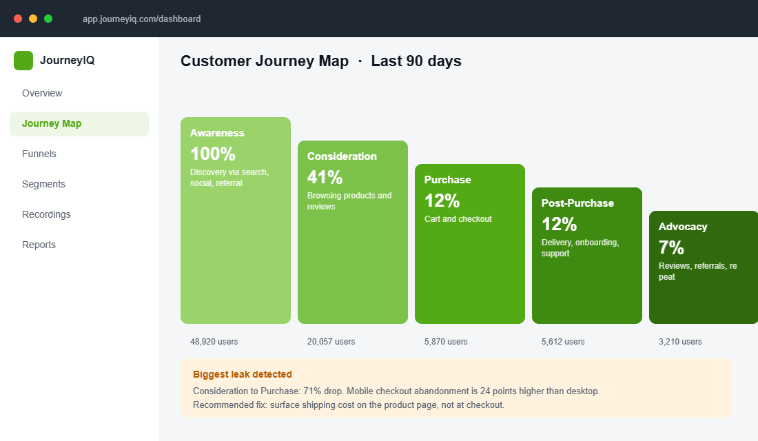
The five stages every Shopify store shares are Awareness, Consideration, Purchase, Post-Purchase and Advocacy. Map the percentage of people who survive each one, and you will almost always find a single stage doing the most damage. Fix that before you touch anything else.
Stage 1: Awareness (Where They First Meet You)
Awareness is messier than it used to be. The latest Australia Post eCommerce Report has Australians spending a record $82.6 billion online in the past year, up 14%, with more than 80% of households shopping online. They are not arriving from one channel. Aussie shoppers now use an average of 4.8 touchpoints for product discovery, and roughly 60% use social media to find products.
Map every real entry point: organic search, paid social, an influencer mention, a friend’s referral, your email list. For each one, write down what the person already believes and what they are looking for. Someone landing from a TikTok review needs a very different first screen than someone Googling your brand name with intent to buy.
The mistake here is sending all that varied traffic to one generic page. If you do not know who your highest-value visitors actually are, start with the fundamentals in our guide to building customer avatars that drive sales, then match each entry point to the avatar most likely to use it.
Stage 2: Consideration (The Research Loop)
Almost nobody buys on the first visit. Google’s research describes a 7-11-4 pattern: before a purchase decision, the average buyer spends around 7 hours consuming content, across 11 touchpoints, in 4 different locations. Your store is one stop on a long loop of comparison, reviews and second-guessing.
This is where reviews, comparison content, size guides, FAQs and social proof do the heavy lifting. The job of this stage is to answer every objection before it becomes a reason to leave. The fastest way to find those objections is to listen to your actual customers, which is exactly what our voice of customer research system is built for.
Pay special attention to the people who consider and then leave without buying. Interviewing them surfaces the exact friction your analytics cannot see. The structured approach in our win/loss research playbook turns those lost shoppers into a roadmap of fixes.
Stage 3: Purchase (Where Most of the Money Leaks)
For most stores, this is the bleeding wound. The 70% abandonment average is bad enough, but it hides a sharper problem: cart abandonment on mobile runs at 85.65%, against 69.75% on desktop. If most of your traffic is mobile, and for Aussie DTC brands it usually is, your real checkout problem is far worse than a blended number suggests.
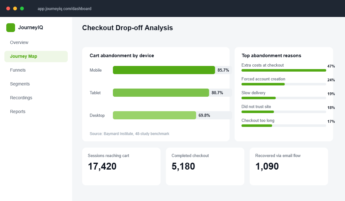
The reasons are not mysterious. Baymard found 47% of shoppers abandon because of extra costs (shipping, taxes and fees) appearing at checkout, with forced account creation and a slow or long checkout close behind. Every one of those is fixable: show shipping on the product page, offer guest checkout, strip fields out of the form, and turn on accelerated wallets. Shopify reports that Shop Pay users are 77% more likely to make an additional purchase, so a faster checkout pays off twice.
Stage 4: Post-Purchase (The Stage Nobody Maps)
The order confirmation is not the finish line. With the average Australian online transaction now around $96, roughly $10 lower than in 2020, no brand survives on single purchases. The money is in the second order, and that decision is made during delivery, unboxing and the first support interaction.
Map this stage like any other. What does the shipping confirmation say? Is there a clear way to track the parcel? What is the first email they get after delivery? A weak post-purchase experience quietly caps your repeat rate while you keep buying expensive new traffic to replace customers you already won.
Stage 5: Advocacy (Turning Buyers Into a Growth Engine)
The final stage is where good brands compound. When customers review, refer and re-buy, your acquisition cost effectively drops. The numbers back the effort: after mapping its journey to connect online and in-store, Nordstrom hit a 60% conversion rate from reservation to purchase, while Sephora lifted loyalty engagement by 45% and average order value by 25% through journey-led personalisation and rewards.
You do not need their budget to copy the logic. Trigger a review request at the moment the product has been used, not the moment it ships. Make referral the obvious next step after a five-star review. Map the path from first purchase to second, and you turn buyers into a channel of their own.
How to Build Your Map in an Afternoon
You do not need a consultant or a six-figure platform. You need two free tools and a few hours. Microsoft Clarity shows you what people actually do, and Google Analytics 4 shows you where they drop.
- Install Microsoft Clarity. Create a free account at clarity.microsoft.com, add the Microsoft Clarity app from the Shopify App Store, and connect your project ID. It starts recording within minutes.
- Watch ten session recordings per stage. Filter for sessions that reached cart but did not buy. You will see hesitation, rage clicks and dead ends your reports never show.
- Open heatmaps on your key pages. Check how far people scroll on your product and cart pages, and whether they ever reach your trust signals.
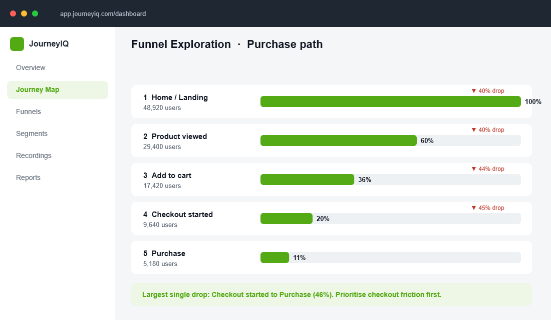
- Build a funnel exploration in GA4. Use the steps Home, Product viewed, Add to cart, Checkout started, Purchase, and read the drop-off between each one.
- Mark your single biggest leak. The stage with the steepest drop is your first project. Everything else waits.
The Compound Effect: Why the Map Beats Random Tweaks
Here is what changes when you work the journey instead of guessing at pages. A 10% improvement at each stage does not add up, it multiplies. Lift awareness traffic quality, consideration trust, checkout completion and repeat rate by a little each, and the combined effect on revenue is far larger than any single hero-image test.
This is why journey-led operators pull away from the pack. Organisations that act on customer behaviour insights outperform competitors by around 85% on sales growth. They are not smarter. They simply stopped optimising in the dark and started fixing the leaks they could see.
The Data Stack That Turns a Whiteboard Map Into a Real One
A journey map built from what you assume customers do is a nice workshop artefact and a poor decision-making tool. The version that changes your revenue is built from four data sources that most Shopify stores already have sitting idle.
GA4 for the shape of the journey. Build a funnel exploration with five steps: session_start, view_item, add_to_cart, begin_checkout, purchase. That gives you the drop-off percentage between every stage. Then break it by device and by first-user channel. You are looking for the step where one segment falls off a cliff while the others hold. Typical Australian DTC benchmarks: view_item to add_to_cart around 8 to 12%, add_to_cart to begin_checkout 45 to 60%, begin_checkout to purchase 55 to 70%. Anything more than 15 percentage points below those is your first target.
Hotjar or Microsoft Clarity for the texture. The funnel tells you where. Session recordings tell you why. Filter recordings to sessions that hit add_to_cart and did not purchase, and watch fifteen of them. That is usually enough. You are watching for rage clicks, repeated scrolling back to the same section, and the moment someone opens a new tab — which almost always means they left to check shipping cost, a review, or a discount code. Clarity is free and good enough for most stores.
Klaviyo for the post-purchase stages. Stages four and five are invisible in GA4 because they play out over months. Klaviyo’s cohort reports will tell you your repeat purchase rate by acquisition month and your time-to-second-order. For most Aussie DTC brands the second order lands 45 to 90 days after the first, and that window is where your post-purchase flows need to fire.
A two-question post-purchase survey for the parts data cannot see. On the thank-you page or in the day-three email, ask: “What nearly stopped you buying?” and “What were you using before this?” Twenty responses will surface objections you have never considered, and they map directly onto stage two. This is the cheapest research in ecommerce and almost nobody runs it. It pairs naturally with deeper voice of customer research once you know which stage to dig into.
The Friction Scorecard: How to Decide What to Fix First
Here is where most journey mapping exercises die. You finish the map, you have identified nineteen points of friction, and the team has no idea which one to touch on Monday. So nothing gets touched, and the map goes in a drive folder nobody opens again.
Score every friction point you found on three dimensions, one to five each:
- Volume — how many people hit this friction point each month? A 40% drop-off on a page that gets 300 sessions matters less than a 6% drop on a page that gets 40,000.
- Value — what is the revenue attached to fixing it? Friction at checkout is worth more per fix than friction at awareness, because those shoppers have already declared intent.
- Ease — can you fix it this week with theme settings and copy, or does it need a developer and a sprint?
Multiply the three. Sort descending. Work the top five, and do not let anyone add to the list until those five are shipped and measured.
What you will find almost every time is that the highest-scoring items are unglamorous. Shipping cost shown earlier. A size guide that opens without leaving the page. Delivery timeframes stated in days rather than “fast dispatch.” Payment options visible before checkout. These are the fixes that move the numbers, and they are boring, which is exactly why they sit unfixed while the team debates a homepage redesign.
Worked Example: A $2M Aussie Apparel Brand
Imagine you run a womenswear brand doing $2M a year, 78% of traffic on mobile, sitting at a 1.6% conversion rate. You want to get to 2.1%, which at your current traffic is roughly another $600K a year.
You map the journey and the GA4 funnel shows view_item to add_to_cart running at 9% — fine — but add_to_cart to begin_checkout at 31%, well below the 45 to 60% band. That is your leak, and it is worth about $340K on its own.
You watch twenty session recordings of shoppers who added to cart and left. Fourteen of them scrolled back up to the product page after opening the cart. Six opened a new tab. Your post-purchase survey has three responses mentioning “wasn’t sure it would fit.”
The map has now told you something no page-level audit would have. The friction is not on the product page and it is not in the cart. It is that shoppers reach the cart and realise they never resolved the sizing question, so they go back to check — and the return trip is where you lose them. The fix is not a new cart design. It is a size confidence layer earlier in stage two: fit notes in reviews, a model height and size worn on every image, and a returns promise stated in the add-to-cart area rather than the footer.
That is the entire argument for mapping. A page-by-page audit would have sent you to redesign the cart. The journey shows you the problem was created two stages earlier.
Re-Map Every Quarter, Not Every Redesign
Journeys drift. Your traffic mix changes, a new channel starts performing, a competitor changes what shoppers expect at stage two, and the map you built in March is describing a customer who no longer exists by September.
Put a two-hour re-map in the calendar every quarter. Pull the same GA4 funnel, watch ten fresh recordings, read the last quarter’s survey responses. You are looking for one thing: has the biggest leak moved? If it has, your top five priorities change with it.
Brands that run this cadence tend to compound 20 to 30% conversion improvement over a year, not because any single fix was clever, but because they are always working on the current biggest problem rather than last quarter’s. Feed the output straight into a prioritised CRO backlog and the map stops being a document and starts being an operating rhythm.
Your 5-Stage Journey Audit Checklist
Block two hours this week and run your store through this. Answer honestly at every stage.
- Awareness. Have I mapped every real entry point and matched each to the right avatar and first screen?
- Consideration. Does each product page answer the top five objections before they become reasons to leave?
- Purchase. Is shipping shown before checkout, is guest checkout on, and have I tested the flow on a real phone?
- Post-Purchase. Is there a deliberate sequence from confirmation to delivery to first re-order prompt?
- Advocacy. Is there a clear, timed path from happy customer to review, referral and second purchase?
- The leak. Have I identified the single stage with the steepest drop, and is it my next project?
Inside eCommerce Circle, customer journey mapping is one of the core pillars we work on with every member, because it points your effort at the fix that actually moves revenue. If you want a second opinion on yours, let’s talk.