You spent thousands of dollars and months of testing to get a shopper to click “Add to Cart”. Then your cart drawer slides out, shows them a list of products and a checkout button, and does absolutely nothing else. No nudge. No reason to add one more thing. No reassurance. It is the single highest-intent moment in your entire funnel, and most Shopify stores treat it like a receipt.
What’s in This Article
Here is the brutal context. The average cart abandonment rate sits at 70.19% across more than 50 studies, and on mobile it climbs to a punishing 80%. Roughly seven in ten people who add to cart will leave without buying. Most founders respond by pouring more money into ads to refill the top of the funnel. The smarter move is to fix the leak at the exact point where intent is highest.
That point is your slide cart. A well-built cart drawer can lift average order value by 15 to 25% without a single extra dollar of ad spend, because you are working with people who have already decided to buy. This is the playbook we use with Aussie DTC founders to turn the cart drawer from a dead-end into a second storefront.
Why Your Cart Drawer Is the Most Under-Worked Page in Your Store
Think about who sees your slide cart. Not browsers. Not bouncers. Every single person who has picked a product, chosen a variant, and committed to the idea of paying you. That is the warmest traffic you will ever speak to, and it costs you nothing to reach them again.
Yet the default Shopify cart drawer that ships with most themes does the bare minimum. It lists line items, shows a subtotal, and offers a checkout button. No progress toward a goal. No complementary product. No trust signal to quiet the last-second doubt that sends 48% of shoppers running when they smell unexpected costs.
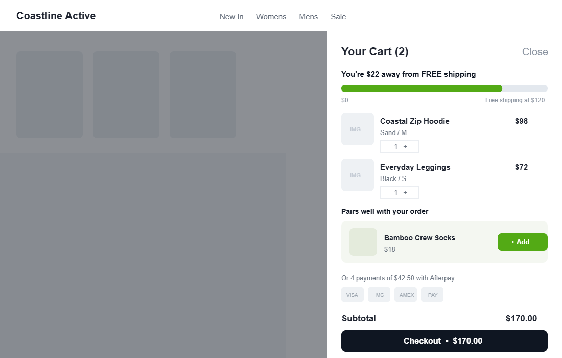
The fix is to treat the drawer as a sequence of small, deliberate jobs. We break a high-converting slide cart into six layers. Get them working together and the same traffic spends more, more often. The screenshot below shows what the finished article looks like.
Layer 1: The Free Shipping Progress Bar (Your Highest-ROI Addition)
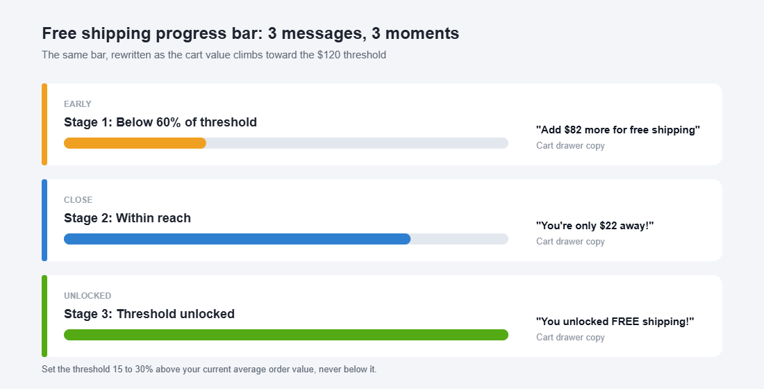
If you add one thing to your cart drawer this week, make it a free shipping progress bar. The number one reason people abandon, named by 48% of shoppers, is extra costs like shipping and tax appearing too late. A progress bar flips that anxiety into a goal: instead of dreading the postage line, the shopper is chasing a reward.
Stores that add a free shipping bar typically see a 10 to 20% lift in average order value. The mechanism is simple. Someone with $98 in the cart and a $120 threshold has a concrete, low-effort reason to add a $22 item rather than abandon over postage.
Two rules make or break it. First, set your threshold 15 to 30% above your current average order value, never below it. If your AOV is 90 dollars, a threshold around 110 to 120 dollars pulls orders up. Set it at 60 dollars and you just gave away shipping on orders people would have placed anyway. Get the maths right by reading our free shipping threshold playbook alongside this one.
Second, change the message as the cart grows. The copy that works below 60% of the threshold is not the copy that works at the finish line.
- Early (below 60%). “Add $82 more for free shipping.” Plain and informative.
- Close (within reach). “You’re only $22 away!” Urgent and personal.
- Unlocked (at 100%). “You unlocked FREE shipping!” Celebrate it so they feel the win.
Layer 2: The In-Cart Upsell (Cross-Sell at the Moment of Commitment)
When you show a relevant cross-sell in the cart, 20 to 35% of customers add the extra item. Even a conservative per-offer acceptance rate of 2 to 5% compounds fast across thousands of carts. The cart drawer is where someone is reaching for their wallet, so a well-chosen suggestion feels like help, not a pitch.
The difference between a cart upsell that lifts AOV and one that annoys people comes down to three rules.
- Make it complementary, not competitive. Socks with shoes, a care spray with leather, gift wrap in December. Never show a second hoodie to someone who just added a hoodie.
- Keep it cheap relative to the cart. Aim for an add-on under roughly 30% of the cart value. A $18 add to a $98 order is an easy yes. A $90 add is a second decision.
- Show one, maybe two. Never a wall. A single smart recommendation converts better than a grid that turns the drawer into a category page.
Apps like Rebuy and UpCart use purchase data to surface the right add-on automatically, which beats hand-picking one product for every line item. For the after-checkout version of this play, where acceptance climbs to 3 to 8% with zero abandonment risk, see our post-purchase upsell playbook.
Layer 3: Trust Signals That Kill Last-Second Doubt
Eighteen percent of shoppers abandon because they do not trust the site with their card details, and a chunk more bail because the total felt risky or unclear. The cart drawer is your last chance to answer the quiet question every buyer asks: “Am I safe handing these people my money?”
You do not need a wall of badges. A few honest signals, placed near the checkout button, do the work.
- Payment method icons. Visa, Mastercard, Amex, PayPal. Familiar logos signal a normal, safe checkout.
- Buy now, pay later messaging. “Or 4 payments of $42.50 with Afterpay.” For Australian shoppers, Afterpay and Zip are now a default expectation, not a nice-to-have.
- A one-line returns promise. “Free 30-day returns” removes the fear of being stuck with the wrong size.
- A delivery estimate. “Ships from Melbourne in 1 to 2 business days” beats silence on shipping speed.
Layer 4: Friction Removers That Make the Next Step Obvious
Every extra tap between the cart and a completed order is a chance to lose the sale. Two of the top five abandonment reasons are pure friction: a checkout that is too long (22%) and being forced to create an account (26%). Your drawer should remove steps, not add them.
- Offer express checkout. Shop Pay, Apple Pay, Google Pay and PayPal buttons let returning shoppers pay in a couple of taps. Shop Pay alone is one of the highest-converting checkouts on the planet.
- Let people edit in the drawer. Quantity steppers and a remove button inside the cart stop shoppers bouncing back to the product page to fix one thing.
- Keep the checkout button sticky. On a full cart, the primary call to action should stay visible without scrolling, with the subtotal right beside it.
- Never force account creation. Guest checkout first, account offered after. The login wall is one of the most expensive mistakes in ecommerce.
Layer 5: Urgency and Scarcity That Does Not Lie
Honest urgency moves people who are on the fence. Dishonest urgency burns trust and, increasingly, breaks Australian Consumer Law. The line is simple: only show urgency that is true.
- Real low-stock counts. “Only 3 left in Sand / M” works when it reflects actual inventory. A fake countdown that resets on refresh does not.
- Genuine shipping cutoffs. “Order in the next 2 hours for same-day dispatch” is powerful during EOFY and BFCM when delivery timing actually matters.
- Seasonal honesty. If a line is selling out before a sale ends, say so. If it is not, do not invent pressure.
Layer 6: Mobile-First, Because That Is Where the Money Leaks
Mobile cart abandonment runs at 80% against 66% on desktop. That gap is mostly design. A drawer that looks tidy on a 27-inch monitor can be a thumb-stretching mess on a phone, and the phone is where most of your traffic lives.
- Put the checkout button in thumb reach. Bottom of the screen, full width, always visible.
- Use a full-height drawer on mobile. A cramped half-panel makes upsells and trust signals invisible.
- Size tap targets properly. Quantity steppers and the add-on button need room so people are not fat-fingering the wrong control.
The cart is part of the same mobile conversion system as the rest of your store. If you have not tightened the page before it, our product page playbook is the natural next read.
The Compound Effect: A Cart That Actually Sells
Any one of these layers helps. Stacked, they compound, because they catch different shoppers at different moments. Walk one cart through the system.
A shopper adds a 98 dollar hoodie. The progress bar tells them they are 22 dollars from free shipping, so they add 18 dollar socks to chase it. They are now at 116 dollars, the upsell tempted them, and the Afterpay line removed the price sting. The sticky checkout button and Shop Pay get them through in two taps with no account wall. One cart, lifted from 98 to 116 dollars, with trust and friction handled along the way.
Now run that across every cart for a month. A 15 to 25% AOV lift on the traffic you already pay for drops almost entirely to contribution. That is why we treat the cart drawer as one of the highest-impact projects on the whole store, not a theme afterthought.
Your Slide Cart Audit Checklist
Open your own store on your phone, add a product, and run this list against your cart drawer right now.
- Free shipping progress bar present, with a threshold set 15 to 30% above AOV
- Progress message changes across early, close and unlocked states
- One complementary upsell, priced under 30% of the cart, easy to add
- Payment icons plus Afterpay or Zip messaging near the checkout button
- One-line returns promise and a dispatch or delivery estimate
- Express checkout buttons (Shop Pay, Apple Pay, PayPal) visible
- Quantity edit and remove available inside the drawer
- Sticky, full-width checkout button with subtotal beside it
- No forced account creation before checkout
- Only honest urgency, tied to real stock or real cutoffs
- Full-height drawer and thumb-reachable controls on mobile
If you tick fewer than eight of these, your cart drawer is leaving order value on the table every single day.
How to Build It: UpCart Setup in 5 Steps
You can hard-code most of this into a custom theme, but for the majority of Aussie founders a purpose-built slide cart app is faster and easier to test. UpCart is a popular, well-supported option. Here is the setup path.
- Install and enable the drawer. Add UpCart from the Shopify App Store, then turn on the app embed in your theme so the slide cart replaces your default drawer.
- Set your free shipping bar. Enter a threshold 15 to 30% above your AOV and write the three-stage messages: early, close and unlocked.
- Add one upsell module. Configure a complementary product or a smart recommendation, capped at one or two suggestions.
- Switch on trust and express checkout. Enable payment icons, your returns line, Afterpay messaging, and the accelerated checkout buttons.
- Test on mobile, then watch the numbers. Place a test order on your phone, then track AOV and cart-to-checkout rate for two to four weeks before you judge the result.
Give it a fair window. Cart behaviour varies week to week, so judge the change across a few hundred orders, not a quiet Tuesday.
The Bottom Line
Your cart drawer is the warmest audience you will ever address, and most stores waste it on a list and a button. Add the six layers, audit it on your own phone, and you turn a dead-end into a second storefront that quietly lifts every order.
Inside eCommerce Circle, the slide cart is one of the core conversion pillars we work on with every member. If you want a second opinion on yours, let’s talk.