Here is an uncomfortable truth most founders avoid: you can have the best ad creative in your category, a hooky landing angle and a healthy media budget, and still lose the sale in the last ten seconds. The product page is where it happens. It is the most visited, most decisive page on your store, and for most Aussie brands it is also the most neglected.
What’s in This Article
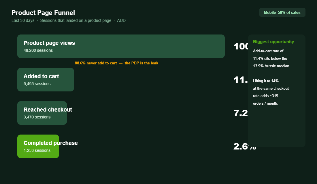
The average Shopify store converts somewhere between 1.4% and 1.8% of its visitors. The top 20% sit above 3.2%, and the top 10% clear 4.7%. The gap between those numbers is rarely the traffic. It is almost always what happens once a shopper lands on the product page and starts asking silent questions you never hear: Is this for me? Can I trust it? What happens if it is wrong? Will it get here in time?
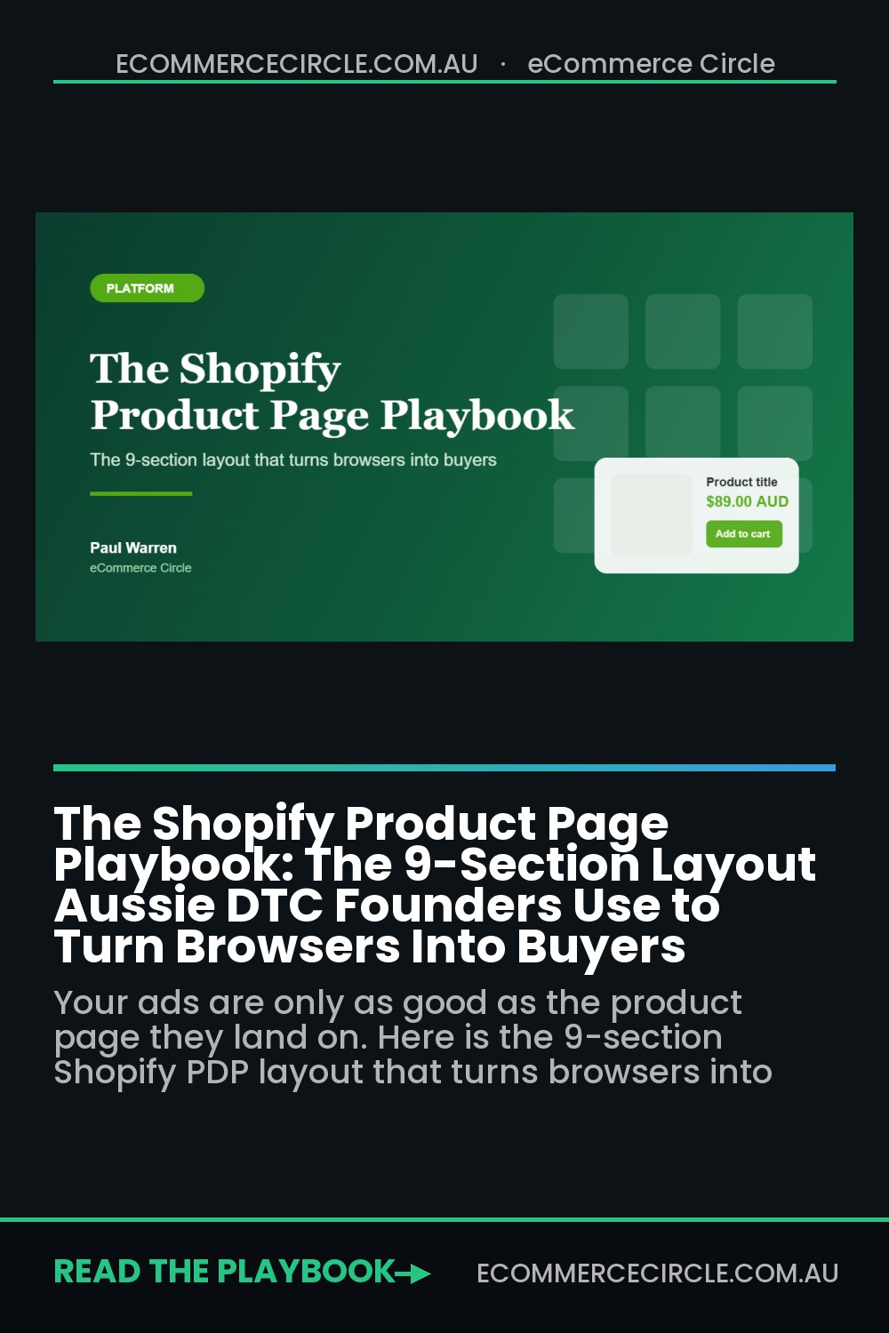
A great product page answers every one of those questions before the shopper has to think them. This playbook breaks the page into nine sections, top to bottom, with the exact things each one needs to do. Work through them in order and you will find leaks you did not know you had.
Section 1: Above the Fold (Pass the 5-Second Test)
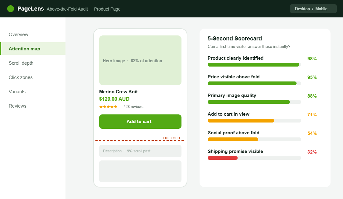
The first screen a shopper sees, before any scrolling, has one job: make them want to keep going. We call it the 5-second test. Show the page to someone who has never seen your brand, give them five seconds, then hide it. If they cannot tell you what the product is, what it costs and what makes it worth buying, the page is failing where it matters most.
Five things should be visible without scrolling on every product page: a strong primary image, the product name in plain language, the price in AUD, a star rating with review count, and the add to cart button. That is the non-negotiable above-the-fold set. Everything else can wait.
The Oodie does this as well as anyone in Australia. Land on a product and you immediately get the hero image, the price, a stack of reviews and a bundle offer, all before you scroll. Nothing is hidden, nothing is clever. The shopper knows exactly where they are and what to do next.
Section 2: The Image Gallery (Show, Do Not Tell)
Online, your photography is the product. Shoppers cannot touch it, weigh it or try it on, so the gallery is doing the work a physical shelf would do in store. This is the single highest-impact investment on the page, and the data backs it up. Listings with five or more images convert around 60% higher than single-image listings.
A complete gallery is not five photos of the same angle. It is a sequence that answers questions in order:
- The hero shot. Clean, well-lit, the product as the star.
- Lifestyle in context. The product being used by someone who looks like your customer.
- Scale and detail. Close-ups of texture, stitching or finish, plus something for size reference.
- The “what you get” shot. Everything in the box, so there are no surprises on delivery.
- A short video. Product pages with video can see conversion lift of up to 65% over images alone, and shoppers spend roughly twice as long on the page.
That video point is worth dwelling on. Brands that add product video often see returns fall 12% to 18% within six months, because the buyer understood what they were getting. Hismile leans on before-and-after video for exactly this reason, and Frank Body fills its galleries with real customer photos so the product never looks staged.
Section 3: Title, Price and Variants (Kill the Confusion)
Clever product names cost you sales. “The Cloudwalker” means nothing to a first-time visitor. “The Cloudwalker Merino Crew Knit” tells them what it is in a glance. Lead with clarity, keep the brand-y name as a secondary line if you must.
Price needs the same honesty. Show the full price in AUD, and if there is a discount, show the original next to it so the saving is real and visible. The fastest way to lose trust is a price that changes between the product page and the cart. If shipping is free over a threshold, say so right here, not three pages later.
Variants are where a lot of pages quietly leak. If a shopper has to guess which size is in stock, or taps a colour and the image does not change, you have introduced doubt. Selected variants should update the gallery, show stock status, and never let someone add to cart without choosing. A confused shopper does not ask for help. They leave.
Section 4: The Add to Cart Zone (Make It Impossible to Miss)
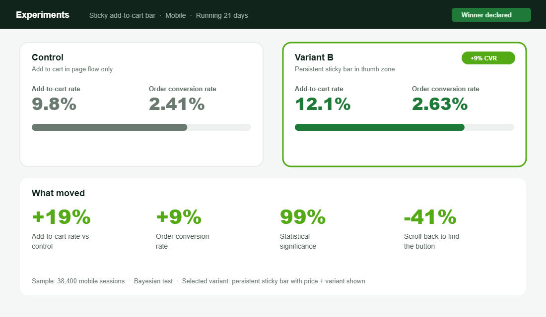
On mobile, a shopper scrolls past your add to cart button within two to three seconds, and once it is gone they have to remember it exists and scroll back to find it. That friction is invisible to you and expensive in aggregate. The fix is a sticky add to cart bar that stays in the thumb zone as the page scrolls.
This is one of the most reliably profitable changes you can make to a Shopify store. Across tests, a persistent sticky bar lifts add to cart rates by around 19% and reduces scroll-back abandonment by roughly 41%. A/B tests routinely show a 9% lift in order conversion at high statistical significance. That is found money for a change that takes an afternoon.
Do it properly. The sticky bar should show the product name, the selected variant and the price, so the shopper confirms they are adding the right thing. Keep the button full width or generously padded, and keep the label simple. “Add to cart” beats anything cute.
Section 5: The Description That Handles Objections
Most descriptions read like a spec sheet written by the supplier. Nobody buys from a spec sheet. The job of the description is to handle the objections that stop a sale, in the order the shopper is thinking them.
Lead with the benefit, then back it with the spec. “Warm enough for a Melbourne winter without the bulk” lands harder than “230gsm merino”. Use the spec as proof, not as the headline. Then make it scannable: short paragraphs, a few bolded lead-ins, and a clean specifications block lower down for the detail-hunters.
The smartest brands mine their support inbox and reviews for the real objections and answer them directly on the page. If ten people asked whether it shrinks in the wash, that answer belongs in the description, not buried in an FAQ. Every objection you resolve on the page is a sale you do not lose to hesitation.
A simple structure works for almost any product. Open with one or two sentences on the core benefit and who it is for. Follow with three to five bolded benefit lines, each with a sentence of proof. Then a short “good to know” block that pre-empts the common objections: sizing, care, materials, compatibility. Finish with the full specifications for the shoppers who want them. Same skeleton, every product, so your team can write a strong page in twenty minutes instead of staring at a blank box.
Section 6: Social Proof in the Right Place
Reviews are not a section you add at the bottom and forget. They are the single most persuasive thing on the page. Products with five or more reviews convert around 270% better than products with none, and on higher-priced items past the $100 mark that lift can reach 380%.
Placement matters as much as having them. Put the star rating and review count near the title, above the fold, so the shopper sees the proof before they decide to keep reading. Then carry photo reviews into the gallery and a fuller review block lower down. We go deeper on building this in the Shopify Product Reviews Playbook, but the principle is simple: proof should appear at the moment doubt does.
One warning. Never fake it. Australian Consumer Law takes a dim view of fabricated reviews, and shoppers smell them instantly. Real photos from real customers outperform polished studio shots anyway, so there is no upside to inventing anything.
Section 7: Trust, Shipping and Risk Reversal
By the time a shopper is hovering over add to cart, the questions turn practical. When will it arrive? What if it does not fit? Is my card safe? Leave these unanswered and the shopper goes off to find the answers, which usually means they do not come back.
Answer them on the page, near the button:
- Shipping promise. A clear delivery estimate (“Ships from Sydney in 1 to 2 business days”) removes the biggest source of hesitation.
- Returns made easy. A short, confident returns line lowers the risk of saying yes. Treat returns as a retention tool, not a cost.
- Payment reassurance. Show the payment options shoppers expect, including Afterpay and the major cards.
- A guarantee where it fits. A simple satisfaction or fit guarantee can be the nudge that closes a first-time buyer.
July, the Aussie luggage brand, does risk reversal well by making the shipping and warranty promise impossible to miss on the product page. When the purchase is high-consideration, that reassurance is doing as much work as the photography.
Section 8: Mobile and Speed (Where the Sale Actually Happens)
Around 58% of online purchases now happen on a phone, and roughly 73% of all ecommerce traffic is mobile. In Australia, mobile transactions grew nearly 29% year on year as part of the $82.6 billion Aussies spent online in 2025. If your product page is designed on a desktop and never properly tested on a phone, you are optimising the minority experience.
Build the page mobile-first. Tap targets in the thumb zone, the sticky add to cart bar always present, images that load fast and a description that does not become a wall of text on a small screen. Then test the real thing on a real phone, ideally on mobile data, not just your office wifi.
Speed is part of the page, not separate from it. A heavy gallery and a stack of apps can push your product page past the point where impatient mobile shoppers wait. If your pages feel sluggish, work through the Shopify Site Speed Playbook before you add another widget. Every second of load time is shoppers quietly leaving.
There is a local nuance worth remembering. A large share of Aussie mobile shopping happens in spare moments, on the couch at night or on the commute, often on patchy connections. That shopper will not pinch and zoom to read tiny text, and will not wait eight seconds for a gallery to load. Designing for that distracted, thumb-driven, sometimes-slow context is not a downgrade from the desktop experience. For most stores it is the main event.
Section 9: The Post-Add Moment (Do Not Waste It)
The moment a shopper adds to cart is the highest-intent moment on your store, and most brands waste it with a silent redirect to checkout. Use a slide-out cart that confirms the add, shows progress to a free shipping threshold, and offers one genuinely relevant complement.
Keep the offer honest. A real complement to what they just chose lifts average order value without feeling like a shakedown. If you use urgency here or anywhere on the page, it has to be true. Fake countdown timers and invented stock counts erode the trust you spent the whole page building. We cover the line between honest urgency and the kind that backfires in the Shopify Urgency and Scarcity Playbook.
The Compound Effect: Why the Whole Page Matters
None of these nine sections is a silver bullet on its own. The magic is that they compound. A stronger gallery lifts add to cart rate. A sticky button captures the intent that gallery created. Reviews near the title remove the doubt that would have stalled the decision. A clear shipping promise closes the gap at the button. Each fix is worth a few percent, and a few percent stacked across nine sections is the difference between a 1.6% store and a 3.2% store.
Run the numbers on your own funnel. If your product pages convert visitors to add to cart at 11% and you lift that to 14% at the same checkout rate, that is hundreds of extra orders a month on the same traffic and the same ad spend. That is the upside hiding in a page most founders set up once and never revisit.
It also changes the maths on everything upstream. A product page that converts better means you can pay more to acquire a customer than your competitors can, which means you can outbid them on Meta and Google and still keep your margin. Conversion on the product page is not just a CRO win. It is what lets the whole growth engine run hotter without breaking. Fix the page first, then scale the traffic into it.
Your Tool Setup: Reviews on the Page in an Afternoon
If your product pages are thin on social proof, fix that first, because it is the highest-impact section. Judge.me is the most popular reviews app for Shopify, it is affordable, and it plays nicely with Aussie stores. Here is the setup:
- Install from the Shopify App Store. Search Judge.me, add it, and connect your store.
- Import existing reviews. If you have reviews on another app, a Google Sheet or AliExpress-era imports, bring them in so you start with proof, not an empty block.
- Place the rating widget near the title. Add the star-rating badge just under the product name so it sits above the fold, and the full review widget lower on the page.
- Turn on photo reviews and review requests. Set the automatic post-purchase email to ask for a review with a photo, timed to land after delivery.
- Sync to Google. Connect the Google integration so your star ratings can show in search and Shopping results.
Once reviews are live, the next afternoon job is a sticky add to cart bar, either from your theme settings or a lightweight app. Two changes, one weekend, and you have addressed the two sections that move conversion the most.
The 9-Section Product Page Audit
Open your best-selling product on your phone and score each section honestly. Anything you cannot tick is a leak worth fixing this week.
- 1. Above the fold. Product, price, rating, image and add to cart all visible without scrolling.
- 2. Image gallery. Five or more images, including lifestyle, scale and a short video.
- 3. Title, price and variants. Plain-language title, honest AUD pricing, variants that update the gallery and stock.
- 4. Add to cart zone. Sticky bar on mobile showing product, variant and price.
- 5. Description. Benefit-led, scannable, answers the top objections from your inbox.
- 6. Social proof. Star rating near the title, photo reviews in the gallery, full reviews below.
- 7. Trust and risk reversal. Shipping estimate, returns line, payment options, guarantee.
- 8. Mobile and speed. Designed mobile-first, tested on a real phone, fast to load.
- 9. Post-add moment. Slide-out cart with shipping progress and one honest complement.
Inside eCommerce Circle, the product page is one of the core pillars we work on with every member, because it is the page where ad spend either turns into orders or quietly disappears. If you want a second opinion on yours, let’s talk.