You have rewritten your product pages three times. You have tested four hero images on the homepage. You check your Meta ads dashboard more often than the weather. And the page that one in three shoppers calls the most important part of your entire website? You wrote it in twenty minutes, two years ago, and have not looked at it since.
What’s in This Article
That page is your About page. Research collated by BusinessDasher found 31% of consumers rate the About page as the most important element on a website, and 44% will leave a site entirely if they cannot work out who is behind it. Yet on most Aussie Shopify stores the About page is three paragraphs of vague mission-speak, a stock photo, and no reason to keep shopping.
Here is what most founders miss: nobody lands on your About page by accident. The visitor who clicks “Our Story” in your footer is a high-intent sceptic. They like your product enough to check whether you are a real business or a dropshipper with a Canva logo. That moment decides the sale. This playbook gives you the 5-block system to win it.
Why Your About Page Punches Far Above Its Traffic
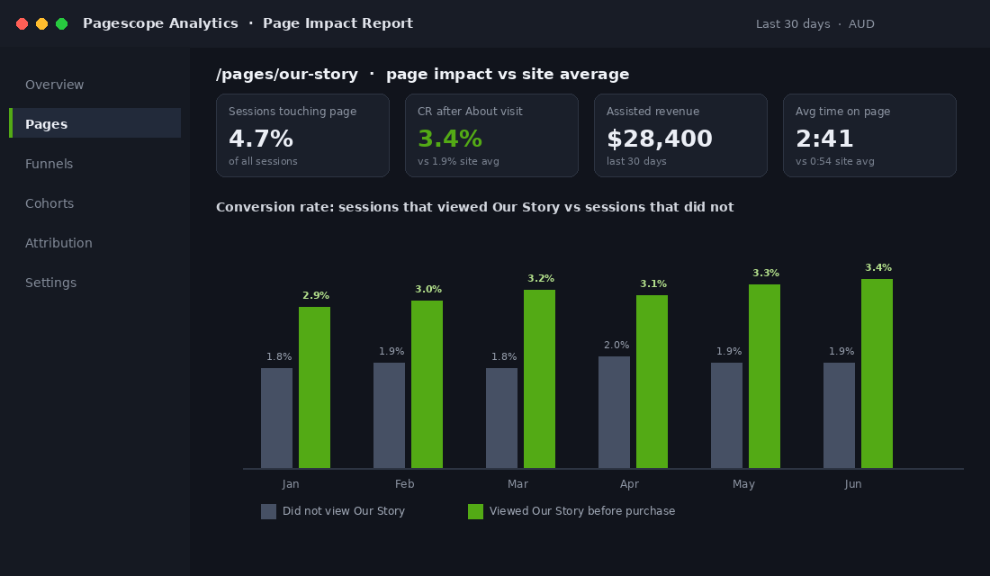
Open GA4 and your About page will rarely crack the top five pages by sessions. That number hides what the page actually does, because the people who visit it are disproportionately the people deciding whether to buy from you for the first time.
The evidence that story converts is not soft. In the famous Significant Objects experiment, journalists Rob Walker and Joshua Glenn bought $128.74 worth of op-shop trinkets, paired each one with a short story written by a professional writer, and resold the lot on eBay for $3,612.51. Same objects, nothing changed but the narrative, and the value multiplied roughly 28 times.
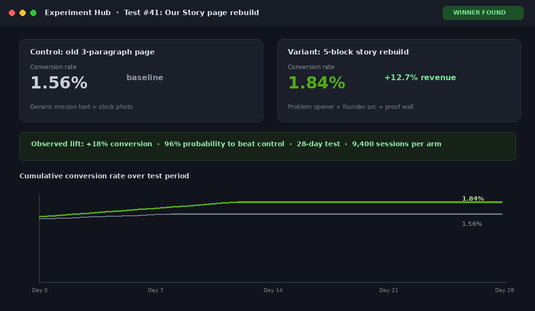
It shows up in commercial data too. Headstream’s brand storytelling research found that when people love a brand’s story, 55% are more likely to buy in future, 44% will share the story, and 15% will buy immediately. And a CRO case study by ConversionTeam measured what happened when brand storytelling was added to a client’s pages: conversion lifted 18%, from 1.56% to 1.84%, and revenue rose 12.7%.
Stackla’s survey of 2,042 consumers puts a number on the trust side: 88% say authenticity is a deciding factor in which brands they support. Your About page is the one URL on your store whose entire job is authenticity. Treat it like a conversion asset, not an afterthought.
Block 1: Open With Their Problem, Not Your Biography
The worst About pages open with “Founded in 2019, we are a passionate team dedicated to quality.” Nobody cares yet. The reader arrived asking a silent question: is this brand for someone like me? Answer that first.
Your opening 100 words should name the frustration that made you start the business, in the customer’s own language. A skincare founder opens with breakouts that flared every time she tried a new “miracle” product. A dog gear founder opens with leads that snapped at the worst possible moment on a Saturday morning walk. The reader should nod twice before they learn your name.
- Lead with the problem. One or two sentences describing the exact frustration your customer recognises.
- Make the enemy specific. Flimsy products, greenwashed claims, sizes designed for somebody else’s body. Naming the villain positions you against it.
- Delay the company history. Founding dates and warehouse moves belong in the middle of the page, never the top.
If you have done customer research, mine it for phrasing. The words buyers use in reviews and surveys are the words that should open this page. Our founder-led customer interview playbook shows you how to collect that language in a week.
Block 2: Tell the Founder Story as an Arc, Not a Timeline
Once the reader sees themselves in the problem, they want to know why you, of all people, decided to fix it. This is the founder story, and the structure matters more than the writing. Use a three-beat arc: the spark, the struggle, the belief.
- The spark. The specific moment the idea arrived. Not “we saw a gap in the market”. The actual kitchen bench, garage, or hospital waiting room where it happened.
- The struggle. The first ugly prototype, the supplier who ghosted you, the market stall where you sold three units. Struggle is what makes the story believable, and believability is what 88% of consumers say they are filtering for.
- The belief. The one-sentence conviction that drives the business. This line should be quotable on its own.
Melbourne’s Frank Body is the masterclass. The founders started in 2013 with $5,000 and a coffee scrub idea sparked by cafe customers asking for used grounds to use on their skin. That origin story, told in a cheeky first-person voice, became the backbone of a brand that grew to global scale. The story is not decoration. It is the product’s reason to exist.
Who Gives A Crap, also Melbourne-born, opens its story with co-founder Simon Griffiths sitting on a toilet in a draughty warehouse for a crowdfunding livestream in 2012, refusing to move until the first production run was funded. He raised the money in 50 hours. You remember that story years after reading it, which is precisely the point.
Write yours in first person, 150 to 250 words, with at least three concrete details (a suburb, a dollar figure, a date). Put a real photo of the founder beside it. Sprout Social’s research found 70% of consumers feel more connected to brands whose leaders are visible, and 65% say a visible founder makes it feel like real people run the business. Faceless brands leave that connection on the table.
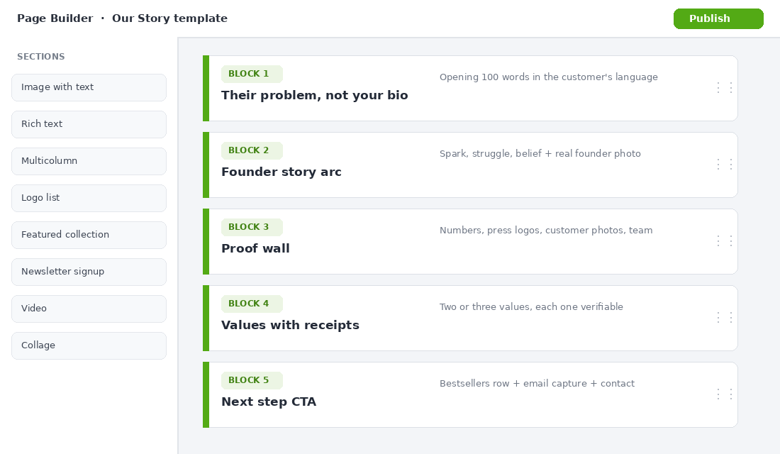
Block 3: Stack the Proof They Came Looking For
Remember who reads this page: a sceptic doing due diligence. After the story warms them up, give them the evidence that you are exactly what you claim. This block is a scannable proof wall, not prose.
- Numbers with nouns. “12,000+ Aussie customers”, “4.8 stars across 2,300 reviews”, “48,000 orders shipped from our Brisbane warehouse”. Round numbers feel made up; oddly specific numbers feel audited.
- Press and stockist logos. Two or three recognisable names beat a wall of twelve nobody knows.
- Real customer photos. UGC pulled from reviews or Instagram, with permission. Stackla’s data shows consumers rank genuine customer content as the most trusted content a brand can show.
- Certifications that cost you something. B Corp, Australian Made, cruelty-free accreditation. Badges anyone can screenshot carry no weight; audited ones do.
- A face-to-name team section. Even if the team is you, your sister, and a part-time packer. Real names and real photos are the strongest anti-dropshipper signal you can publish.
This block does the same job your product page reviews do, one level up: it de-risks the brand rather than the product. If you have not built your proof assets yet, start with our trust signal architecture framework and feed the strongest pieces into this page.
Block 4: Show What You Stand For (Receipts, Not Adjectives)
Every About page claims values. Almost none proves them. “We care about quality and sustainability” is wallpaper. The fix is a simple rule: every value gets a receipt.
Who Gives A Crap does not say it cares about sanitation. It says it donates 50% of profits to water and sanitation projects, publishes the running donation total, and links the impact reports. The value is verifiable, so the reader believes every other claim on the page more readily. That is the halo effect you are after.
- “Made to last” becomes a two-year warranty and a repairs program you actually run.
- “Sustainable” becomes the exact packaging materials, where they are made, and what happens to returns.
- “Australian” becomes which parts of the operation happen here: design in Fremantle, sewing in Marrickville, warehousing in Geelong.
Pick two or three values maximum. A list of seven reads like a corporate slide. Two values with receipts will do more for conversion than a manifesto, and they give your email and ad copy a consistent backbone, the same way your brand storytelling system should run through every channel.
“But My Story Is Boring”: The Fix for Founders Who Think They Have Nothing to Tell
Plenty of founders read the Frank Body example and think: I did not start in a cafe with a viral idea. I just saw products I thought I could do better, and started. That feels like no story at all. It is not. It just needs reframing.
The story is never the founding event. The story is the standard. Why did the existing options annoy you enough to act? What did you refuse to compromise on that everyone else compromises on? What do you reject that competitors accept? Those answers exist in every real business, including yours.
- The obsession angle. “I sampled 31 fabric weights before settling on this one” is a story. Count the things you tested, rejected, and reworked, then publish the count.
- The customer angle. If the business pivoted because of one customer conversation, that conversation is your spark. Tell it with the customer’s first name.
- The refusal angle. “We could double our margin by switching to the supplier every competitor uses. We will not, and here is why.” Refusals are the most credible form of positioning.
One honest paragraph built on any of these angles outperforms a fabricated lightning-bolt moment. Shoppers have read a thousand “it all started in my garage” pages. They have rarely read a founder who tells them exactly what they refuse to ship.
Block 5: Close With a Next Step, Because Dead Ends Kill Sales
Here is the most common About page mistake on Shopify stores: the page just ends. The reader finishes your story, feels warmer about the brand than at any other point in their session, and gets a footer. All that goodwill evaporates into a back-button.
The bottom of your About page is prime real estate for a soft conversion. You are not asking a cold visitor to buy; you are giving a warmed-up visitor somewhere obvious to go next.
- Bestsellers row. “Start with the products 12,000 customers rate highest.” Three or four products, straight into shopping.
- Quiz or guided start. If you run a recommendation quiz, this is its highest-intent entry point outside the homepage.
- Email capture with a story-flavoured hook. “Get the behind-the-scenes letter we send 40,000 subscribers each month” converts better here than a generic 10% popup, because the reader has just consumed your story.
- One human contact line. A real email address and a first name. Remember, 44% of visitors bail when they cannot find contact information.
Pick one primary CTA and one secondary. Five buttons is no decision at all. Then wire the page into your analytics so you can see, in GA4, the conversion rate of sessions that touched the About page versus those that did not. That single comparison usually settles the “is it worth my time” question inside a fortnight.
Building It on Shopify: The 30-Minute Native Setup
You do not need an app or a developer for a high-converting About page. Every Online Store 2.0 theme (Dawn and its descendants) lets you build a sectioned About page in the theme editor. Here is the five-step setup:
- Create the template. In the Shopify admin go to Online Store, then Themes, then Customize. In the page selector choose Pages, then Create template. Name it “about” so it stays reusable.
- Stack your five blocks as sections. Use Image with text for the problem opener and founder story, a Multicolumn or Logo list section for proof, Rich text for values, and Featured collection for the bestsellers close.
- Add real photography. Founder portrait, workspace, product in production. Compress images under 300KB each so the page stays fast on mobile.
- Assign the template. Go to Online Store, then Pages, open your About page, and set the template to your new “about” template in the right-hand sidebar.
- Link it twice. Main navigation (“Our Story” outperforms “About” in most menus) and the footer. Then add it to your post-purchase email flow so new customers meet the brand properly.
If you want richer layouts (timelines, parallax founder photos, embedded video) PageFly’s free plan handles one custom page and drags-and-drops the lot. But ship the native version first. A finished page this week beats a perfect page in August.
The Four Mistakes That Flatten About Pages
- Writing it for yourself. If the first sentence contains “we”, “our journey”, or a founding year, you are journaling, not selling. Open with the customer.
- Stock photography. One stock handshake undoes every authenticity claim on the page. A slightly awkward real photo of you in the warehouse converts better than a polished fake.
- The wall of text. Five hundred unbroken words gets scrolled past. Break the page into the five blocks with subheadings, images, and white space so a skimmer still absorbs the story beats.
- Set and forget. Your numbers, team, and milestones change every quarter. Diarise a 20-minute refresh twice a year, the same way you would re-shoot a hero image when it fatigues.
The Compound Effect: One Page, Working Every Channel
Built properly, the About page stops being a destination and becomes infrastructure. The founder story becomes email two of your welcome flow, where story-led sends routinely pull some of the highest engagement in the sequence. The proof wall becomes your retargeting ad angles. The values-with-receipts section becomes your PR pitch and your wholesale one-pager.
Run the numbers on a store doing $150k a month at a 2% conversion rate. If the 4 or 5% of sessions that touch a rebuilt About page convert at even a modest premium because the sceptics stop bouncing, and the same story assets lift your welcome flow and ad creative, a realistic blended gain of 0.1 to 0.2 points of conversion is worth roughly $90,000 to $180,000 a year. For a page you can rebuild in an afternoon, that is one of the best hourly rates in your business. It is the same compounding logic that makes your homepage architecture worth getting right.
Your 10-Point About Page Checklist
- Opening 100 words name the customer’s problem, not your founding year
- Founder story follows the spark, struggle, belief arc with three concrete details
- Real founder photo with a face, not a logo
- Proof wall: specific numbers, two or three press or stockist logos, real customer photos
- Team section with real names, even if the team is two people
- Two or three values, each with a verifiable receipt
- One primary CTA (bestsellers or quiz) and one secondary (email capture)
- Human contact details visible without hunting
- Linked from main nav as “Our Story”, the footer, and your welcome flow
- Diarised refresh every six months with updated numbers
Inside eCommerce Circle, brand and story sit at the heart of the Product pillar we work on with every member. If you want a second opinion on the page your sceptics are reading right now, let’s talk.