Most Shopify founders are chasing the wrong number. They obsess over a single conversion rate sitting in the corner of their dashboard, then panic when it dips from 2.4% to 2.1% on a Tuesday. Or they read a LinkedIn post claiming “good Shopify stores convert at 5%” and feel like they are failing.
What’s in This Article
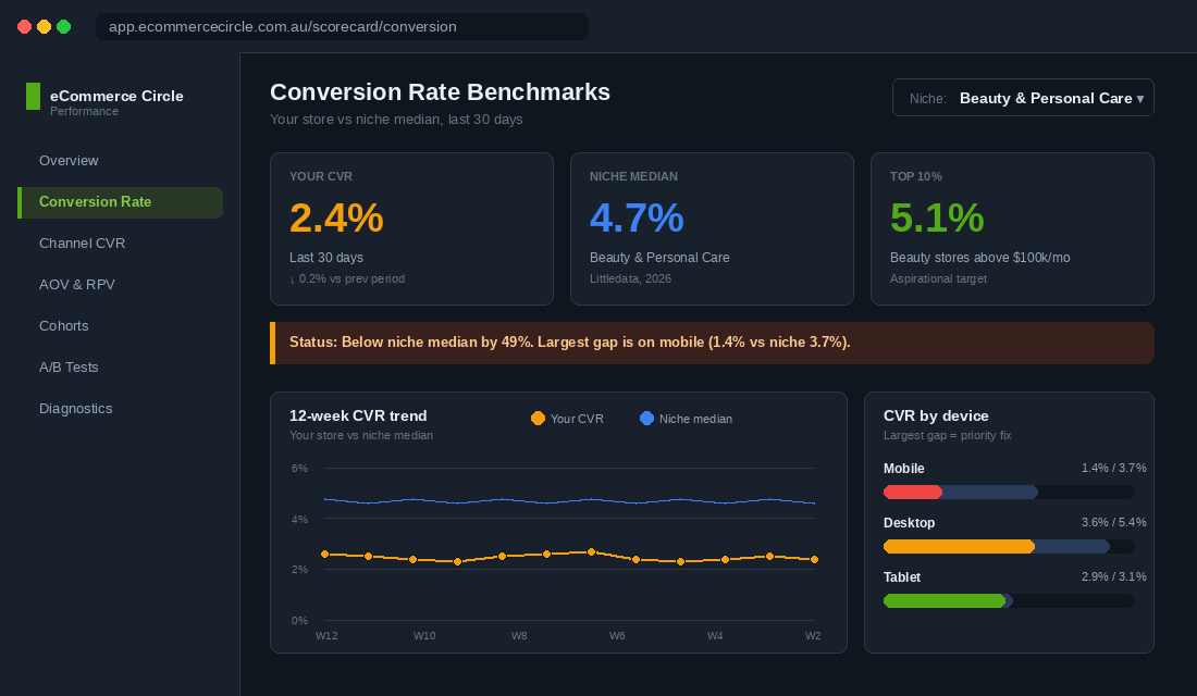
Here is the reality. The platform-wide average Shopify conversion rate in 2026 is 1.4%. The top 20% of stores hit between 3.1% and 3.5%. The top 10% hit 4.7%. Almost none of those numbers tell you anything about whether your store is performing well, because conversion rate is a relative game.
A health and beauty store converting at 3% is decent. A luxury furniture store converting at 3% is exceptional. A food and beverage store converting at 3% is underperforming by half. The benchmark you should be measuring against depends on three things: your niche, your device mix, and your traffic source mix. This article gives you the 2026 numbers for all three, plus the five levers that move the needle once you know where you stand.
The Real Average (and Why 1.4% Is a Useless Benchmark)
Littledata’s 2026 Shopify dataset puts the platform average at 1.4%. If you are above 1.4%, you are above average. If you are below, you are below.
That is technically true and practically useless. Averages drag in everything: dropshipping stores selling $9 phone cases at 8% conversion, six-figure-AOV furniture brands at 0.6%, brand-new launches with zero retargeting, mature DTC brands with returning-customer engines doing the heavy lifting. The 1.4% number is a starting point, not a target.
A more useful frame: the top 20% of Shopify stores convert between 3.1% and 3.5%. The top 10% sit above 4.7%. If you are running an established brand with traffic mix above 50% returning visitors, you should be aiming for top 20%. If you are 18 months in with mostly cold paid traffic, the average is your starting line and 2.5% is your six-month target.
The first move when looking at your own conversion rate is not to celebrate or panic. It is to slice it: by device, by traffic source, by new vs returning, by product page vs category page. Whichever slice is below benchmark is where the work is.
Conversion Rate by Niche (the 2026 Numbers)
This is where benchmarks earn their keep. Conversion rate is heavily inversely correlated with average order value and purchase complexity. The cheaper and more habitual the product, the higher the conversion rate. The pricier and more considered, the lower.
Here are the 2026 Shopify and broader ecommerce niche benchmarks every founder should know:
- Food and beverage: 4.5% to 6.2% (top 10%: above 6.2%). Habitual repeat purchases, low price points, urgency around freshness. Highest converting niche on the platform.
- Beauty and personal care: 4.5% to 4.94% (top performers: above 5%). Strong repurchase cycles, gift potential, mid AOV.
- Health and wellness: 3.0% to 3.5%. Subscription-friendly, supplement-heavy, conversion lifted by reviews and clinical claims.
- Multi-brand retail: 3.93%. Aggregated catalogues with broad appeal and recognised brand names.
- Fashion and apparel: 2.5% to 3.1%. Sizing friction, returns drag, but high traffic volume.
- Electronics and tech: 1.4% to 2.3%. Considered purchase, comparison shopping, longer customer journey.
- Luxury and premium: 1.0% to 1.5%. High AOV, low frequency, conversion happens over multiple sessions.
Two patterns to notice. First, anything sub-$60 AOV tends to convert above 4%. Stores selling over $200 AOV typically sit below 1%. Second, the gap between average and top 10% is consistent across every niche: roughly 2x to 3x. Your competitive edge is not “convert at 5%”. It is “convert at 2x your niche median”.
If you sell across multiple categories (say, a multi-brand pet retailer carrying food, toys, and bedding), pull the conversion rate by collection. The food collection should convert higher than bedding. If they are flat, your category page or filter UX is masking real intent signals.
Mobile vs Desktop: The 70/30 Trap
Mobile is where the traffic is. Desktop is where the conversion is. That single sentence explains half the conversion rate problems on Shopify stores in 2026.
The numbers from Littledata’s Shopify dataset:
- Mobile average: 1.2%
- Desktop average: 1.9%
- Mobile top 10%: 3.9%
- Desktop top 10%: 6.5%
- Tablet average: 3.1% (yes, higher than both mobile and desktop)
Around 70% of Shopify traffic now comes from mobile. If your mobile conversion rate is 50% lower than desktop, you are leaving money on the table proportional to that gap, multiplied by your mobile traffic share. A store doing $100k a month with a 1.0% mobile CVR and a 2.0% desktop CVR has a much bigger optimisation opportunity than one doing the same total revenue with 1.8% mobile and 1.9% desktop.
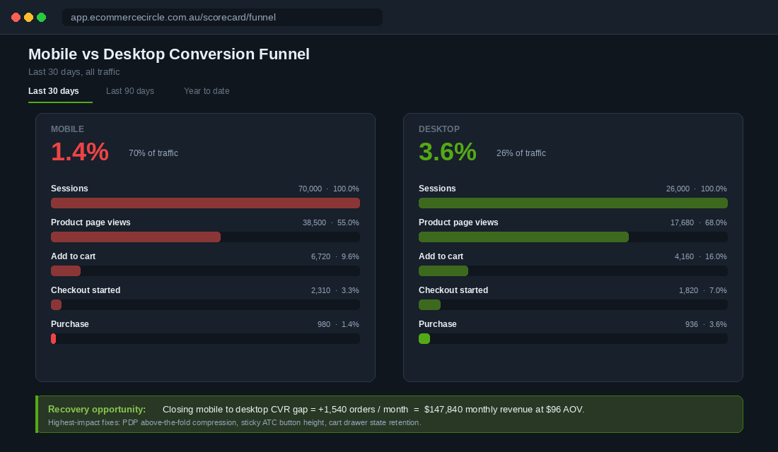
The 2026 mobile gap closing trend is real but uneven. Tablet users actually convert at 3.1% on average, suggesting that the gap is not about screen size. It is about context. Mobile shoppers are often discovering, comparing, saving for later, then returning on desktop or tablet to buy. Treat your mobile experience as a discovery and add-to-wishlist tool first, a checkout machine second.
The biggest mobile conversion killers we see when auditing stores:
- Sticky add-to-cart buttons that hide the price or critical product info
- Variant pickers that force three taps before showing a price
- Trust signals (reviews, shipping promise, returns) buried below the fold
- Cart drawers that re-render and lose state when an upsell is added
- Checkout redirects that knock out Apple Pay because of a Shopify app interfering with the load order
A clean mobile audit recovers between 10% and 25% of dropped revenue without changing a single line of copy. Most of the work is on the homepage and PDP. The 9-section structure we use across our coaching members compresses well on mobile and is covered in our breakdown of Shopify homepage design.
Traffic Source Benchmarks: Where the Good Visitors Hide
This is where conversion rate analysis gets really interesting. Traffic source is the strongest predictor of conversion rate after niche. Here are the 2026 channel benchmarks worth memorising:
- Email: 5.3% to 7%. Owned-list traffic always converts highest. Klaviyo flows in particular sit at 7% to 10% for well-segmented lists.
- Referral: 5.4%. Word-of-mouth, affiliate, and partnership traffic. Tiny volumes, world-class CVR.
- Direct or branded search: 4.5% to 5.5%. Returning customers and brand searchers.
- Organic search: 2.5% to 3.5%. Intent-driven but mixed quality.
- Paid search: 2.0% to 3.0%. Brand search lifts this significantly. Non-brand prospecting drops it.
- Paid social: 1.5%. The cold-traffic channel. Lower CVR but higher volume potential.
- Organic social: below 1%. Discovery-mode visitors, not buyers.
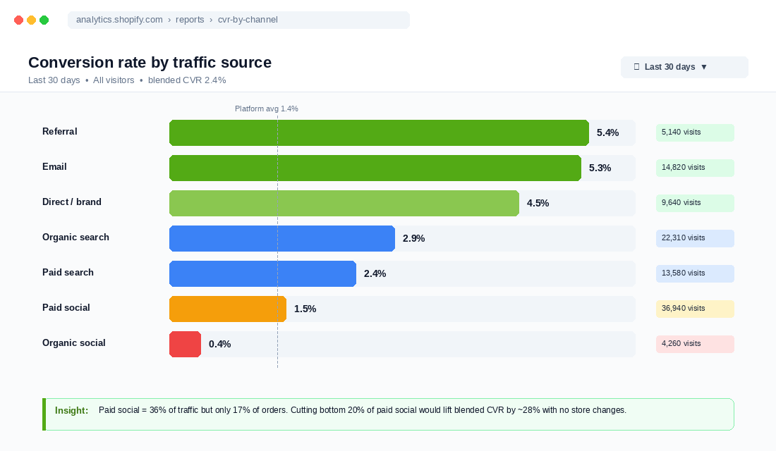
If your overall conversion rate is 1.6% and you are 80% reliant on paid social, you are actually performing at benchmark. If your overall conversion rate is 1.6% and your traffic mix is 60% email, you have a problem.
The trap most operators fall into: comparing their blended CVR to platform averages without isolating channel. We have seen brands rebuild their entire homepage to “lift CVR” when the actual issue was a single Meta campaign sending 30% of their traffic at a 0.4% CVR. Cut the campaign, blended CVR jumps overnight.
Friction also varies by source. Email opens land on a known product page with a known offer, so the journey is short. Paid social lands on a product page that has to do triple duty: educate, build trust, sell. The same store needs different versions of the same page to handle each source.
The AOV vs CVR Trade-Off: The Price-Point Math
There is a simple formula every Shopify founder should commit to memory:
Revenue per visit = CVR × AOV
This means a 1.5% CVR at $200 AOV ($3.00 RPV) is identical revenue per visit to a 5.0% CVR at $60 AOV ($3.00 RPV). Conversion rate by itself tells you almost nothing about whether your store is making money.
Some of the highest-performing stores we work with run intentionally low CVRs because they have lifted AOV through bundles, upsells, subscriptions, and tiered pricing. A premium skincare brand we coach introduced a starter set bundle and saw CVR drop from 3.2% to 2.7%. AOV jumped from $89 to $134. Net revenue per visit went up 26%. The conversion rate report would have flagged a regression. The revenue-per-visit report told the truth.
The right framing for any conversion test:
- Did CVR move?
- Did AOV move?
- Did revenue per visit move?
- Did contribution margin per visit move?
Test number four is the only one that matters in the long run. For more on the financial discipline behind this, see our breakdown of Marketing Efficiency Ratio for Shopify.
Five Levers That Beat the Niche Average
Once you know where your store sits against benchmark, here are the five levers that actually move the needle. In order of impact for most $40k to $500k a month brands:
Lever 1: Fix the mobile homepage
Most homepage redesigns we audit improve desktop and unintentionally regress mobile. Designers default to laptop-first, then squash to mobile. The result is a homepage where the most important above-the-fold content (offer, social proof, hero CTA) gets pushed below a hero image that occupies 100% of a phone screen.
Reverse the design order. Build mobile first, then expand to desktop. Aim to fit the offer, primary CTA, and at least one trust signal in the first 600 vertical pixels on a 390-wide screen. That single change is worth 8% to 15% on mobile CVR.
Lever 2: Rebuild the product page anatomy
Above-the-fold on mobile does 80% of the conversion work on a PDP. Every existing PDP we audit has at least three fixable issues in that zone. Common ones: variant picker that hides price, reviews badge that scrolls below fold, generic shipping copy instead of specific (“Ships today if ordered by 2pm AEST”), and a feature image that is product-only with no scale or lifestyle reference.
Run a Microsoft Clarity session recording for an hour next time you watch the rugby. Note every time someone scrolls up after scrolling down. That is them looking for missing information.
Lever 3: Fix one paid social audience
If your paid traffic is dragging down blended CVR, the fix is rarely at the store level. It is at the audience level. Cut the worst-performing 20% of campaigns and watch blended CVR climb without a single store change.
Specifically, look for campaigns where the click-to-add-to-cart rate is below 4%. That is a sign the click is not qualified. The audience is too broad, the creative is misaligned with the landing page, or the offer is not a fit. Pause, do not optimise.
Lever 4: Run one revenue-per-visitor A/B test per fortnight
Not five tests at once. One test at a time, run to 95% significance, on a high-traffic page. Most stores can compound 15% to 30% RPV gains over a year by doing this consistently. We break down the testing framework in A/B Testing for Shopify.
Test order, in priority: PDP above-the-fold, cart drawer copy, homepage hero, product collection sort default, checkout customisation. Skip footer tests, social proof placement above 70% scroll depth, and anything that needs less than 4,000 conversions per variant.
Lever 5: Build the email engine
If email is the highest-converting traffic source on your store, the cheapest CVR lift is sending more email to better-segmented lists. Most brands we audit are sending 30% to 50% fewer campaigns than they should be.
A brand doing $200k a month should be sending 8 to 12 campaigns per month, not 2 to 3. The campaigns do not need to be elaborate. Plain-text from-the-founder messages routinely outperform polished templates. The volume and segmentation matter more than the design.
The Compound Effect: Why a 0.5% CVR Lift Doubles Profit
Here is the part most founders miss. Conversion rate gains compound through the entire P&L because acquisition cost is fixed at the click level. If you spend $1.20 to send a visitor to your store, that $1.20 is paid whether they convert or not.
Walk this through with real numbers. A $200k a month store with:
- 100,000 monthly visits
- 2.0% CVR
- $100 AOV
- 30% gross margin
- 25% net margin after ad spend at $30 CAC
Lift CVR from 2.0% to 2.5% (a 25% relative improvement). New numbers:
- 2,500 orders instead of 2,000
- $250k revenue instead of $200k
- Same $60k ad spend (clicks unchanged)
- Effective CAC drops from $30 to $24
- Net margin jumps from 25% to roughly 32%
Net profit roughly doubles from $50k a month to $80k a month for a 0.5 percentage point CVR lift. That is the compounding effect. This is also why we spend more time on conversion rate work inside eCommerce Circle than on any other growth area.
Two case studies anchor the math. Twillory partnered with a CRO agency on a 90-day full-funnel rollout (homepage, PDP, cart, checkout) and added $455k in monthly revenue, projecting to $5.4m annually. FlutterHabit ran site-wide A/B testing combined with bundling and saw a 49% CVR lift adding $2.4m in annual revenue. These are the kinds of numbers that change the trajectory of a brand. They do not come from a single “hack”. They come from a 12-month program of disciplined testing.
The Conversion Rate Scorecard (Your Weekly 15-Minute Review)
Here is the scorecard we hand every coaching member. Run through it every Friday afternoon. Takes 15 minutes once you know where the data lives:
- Blended CVR for last 7 days vs prior 28-day average
- Mobile CVR vs desktop CVR (gap should narrow over time)
- CVR by traffic source (flag any source 25%+ below its 90-day baseline)
- CVR by top 5 product pages (flag any below 1.5%)
- New vs returning customer CVR (returning should be 3 to 5x new)
- AOV trend (should grow alongside CVR over time)
- Revenue per visitor (the single number that unifies CVR and AOV)
- One A/B test result (pass, fail, or inconclusive)
- One mobile UX issue identified for next week’s sprint
- One traffic source decision (scale, optimise, or kill)
Most founders spend 90% of their analytics time looking at metrics that do not move with their decisions. This list inverts that. Every line connects to a decision you can make next week.
Save this scorecard in a Notion or Airtable doc. Fill it out the same time every Friday. The discipline of doing this 50 weeks a year is worth more than any single optimisation.
The Tool Stack That Makes This Easier
You do not need a $500 a month analytics stack to run this. Here is the minimum viable setup that gets you to top-10% reporting:
- Native Shopify analytics: free, gets you blended CVR by device and channel. Limit: cannot slice CVR by audience or campaign granularity.
- Microsoft Clarity: free heatmaps and session recordings. Use it weekly to find one mobile UX issue.
- Klaviyo: free up to 500 contacts, paid above. Owned-list revenue and email CVR by flow.
- Triple Whale or Polar Analytics: $129 to $499 a month depending on revenue. Adds blended ad attribution, post-purchase survey integration, customer journey reporting. Worth it once paid spend exceeds $20k a month.
- Littledata: $39 to $359 a month. Useful purely for the benchmark API. You can pull your niche-matched percentile every month and stop wondering if you are above average.
Setup priority for a brand under $50k a month: Native Shopify + Microsoft Clarity + Klaviyo. Add Triple Whale once paid spend exceeds $20k a month. Add Littledata when you want to settle internal arguments about whether the store is performing.
One tool we deliberately do not start with: a fancy CDP or attribution platform. They are powerful but the data discipline they require is rarely in place at $50k a month. Get the basics right first.
How to Use This Today
Pick one number from this article and write it on a sticky note next to your monitor. The right number depends on where you are.
- If you are below platform average (1.4%), focus on traffic source mix. Cut bad sources first.
- If you are at platform average, focus on mobile gap. Audit the homepage and PDP above-the-fold zone.
- If you are at top 20% (3% to 3.5%), focus on AOV and revenue per visit. CVR has diminishing returns past this point.
- If you are at top 10% (above 4.7%), focus on retention. Your acquisition is dialled, repeat-customer revenue is the next compounding lever.
Australian Shopify Context: Where Local Stores Stack Up
The Littledata and global ecommerce benchmarks above are a useful baseline, but Australian Shopify stores operate in a distinct market with specific patterns worth understanding.
Australian mobile conversion rates are lower than global averages. Aussie consumers are heavy mobile browsers but more likely to switch to desktop or tablet to complete a purchase — particularly for orders above $100 AUD. This means your mobile-to-desktop attribution gap may be larger than what you see in global benchmarks. If GA4 is showing 65% mobile traffic at 0.9% CVR and 35% desktop at 2.8% CVR, that is not unusual in the Australian market. The fix is a faster, simpler mobile checkout (Shop Pay and Afterpay both significantly lift Aussie mobile conversion) rather than assuming your store is broken.
BNPL adoption lifts AOV and CVR simultaneously. Australia has one of the highest Buy Now Pay Later adoption rates in the world. Afterpay alone has over 3.6 million active customers in Australia. Shopify stores that surface Afterpay, Zip, and Klarna options at the product page level — not just at checkout — see 15–25% higher AOV and measurably better conversion for orders between $80–$400 AUD. If your store is not prominently displaying BNPL options on product pages, this is a quick win. See our guide to Buy Now Pay Later on Shopify for the full setup and display strategy.
Shipping threshold placement is critical. Australian consumers are accustomed to paying for shipping but highly sensitive to the threshold. The sweet spot for free shipping thresholds on Australian Shopify stores is 15–25% above your current AOV — enough to lift AOV without blocking conversion entirely. Too low (free shipping from $0) and you erode margins. Too high (free shipping from $200 when your AOV is $65) and the cart abandonment rate spikes. Our analysis of free shipping strategy for Shopify covers exactly how to set this number for your margin structure.
The Australian holiday calendar shifts conversion seasonality. If you are comparing your conversion rate month-over-month using US or UK benchmarks, the seasonality will mislead you. Australia’s peak conversion periods are: EOFY (June), Black Friday/Cyber Monday (November), Christmas (December), and the back-to-school period (January). Conversion rates often dip in February–March and July–August as consumer discretionary spending contracts. Benchmark your CVR against the same period last year — not against a global monthly average — to get a true read on whether you are improving.
Inside eCommerce Circle, conversion rate diagnosis is one of the first things we run on every member’s store. We slice it by niche, device, source, and AOV cohort, then build a 90-day optimisation roadmap from the gaps. If you want a second opinion on yours, let’s talk.