Open your store on your phone and look at your homepage the way a first time visitor does. You have about one second before they decide whether to keep going or hit back. Now ask yourself the brutal question: in that second, does your homepage actually say what you sell, who it is for, and why it beats the alternative? For most Aussie stores, the honest answer is no.
What’s in This Article
The homepage is the most fought over page in the business and the most misunderstood. Every team wants their banner on it. So it slowly turns into a noticeboard, a slideshow of competing messages that says everything and therefore nothing. Meanwhile the data is unforgiving. Baymard’s 2025 benchmark found that 67% of mobile sites and 58% of desktop sites have mediocre or poor homepage and navigation UX. That is most of your competitors, and probably you.
Here is the reframe that fixes it. Your homepage is not a sales page. It is a signpost. Its only job is to earn the second click. Get that one idea right and everything else on this page falls into place. This is the system we use with Aussie founders to turn a cluttered front door into a page that quietly routes shoppers to the products they came for.
Your Homepage Is a Signpost, Not a Sales Page
Most founders judge their homepage by whether it looks impressive. The visitor judges it by whether it helps them find what they want in seconds. Those are different jobs, and the second one wins every time.
Think about how traffic actually behaves. A chunk of your visitors land on the homepage from your brand name, your social bio link, or a returning visit. They are not ready to be sold to. They are orienting. The homepage that converts is the one that answers their first three silent questions fast: what is this, is it for me, and where do I go next. The average ecommerce store converts at roughly 2.5 to 3%, and a homepage that creates friction at that orientation stage quietly drags the whole number down.
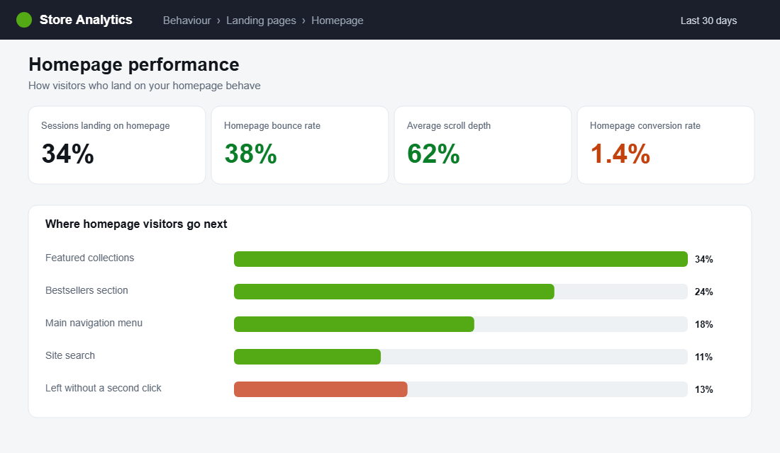
So measure your homepage like a signpost. The metric that matters is not how long someone stares at it. It is whether they take a second click toward a collection, a product, or search. If a big share of homepage visitors leave without that second click, the signpost is broken, no matter how good the photography is.
The 50 Millisecond First Impression
Research shows it takes the human eye about 50 milliseconds to form an aesthetic judgement of a website. Visitors then spend roughly 80% of their attention on content above the fold. Your hero section is doing the heavy lifting whether you planned it or not, so plan it.
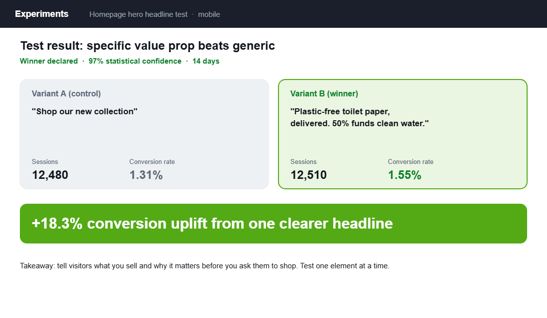
The most common hero mistake is a beautiful image with a vague headline like “Shop the new collection”. That tells a first time visitor nothing. A strong hero answers the value proposition question directly. Look at Who Gives A Crap, the Aussie brand that turned toilet paper into a household name. Their homepage leads with a clear promise, plastic free product that funds clean water, wrapped in playful copy and bold imagery. You know exactly what they sell and why it matters before you scroll.
- One headline, one promise. State what you sell and the single biggest reason to care. Specific beats clever. “Plastic free toilet paper, delivered” outperforms “Reimagine your everyday”.
- One primary call to action. Give the eye one obvious next step, usually “Shop bestsellers” or a hero collection. Competing buttons split attention and kill momentum.
- Show the product or the result. A real product shot or the outcome it delivers beats an abstract lifestyle image that could belong to any brand.
- Keep the hero light and fast. A huge autoplay video that delays the first paint can sink you before the message lands. Load light, then enrich.
This is the single highest-impact element on the page, which makes it the best place to test. One headline change is often worth more than a month of new traffic.
The Homepage Stack That Converts
A high converting homepage is not a random pile of sections. It is a deliberate sequence, where each block answers one question and then hands the visitor to the next. Here is the stack that works, top to bottom.
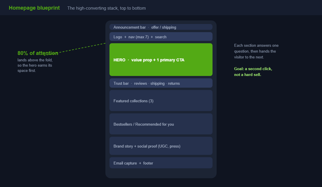
- Announcement bar. One message only. Free shipping threshold, a current offer, or a key shipping cutoff. Not three rotating ones.
- Header, navigation and search. Logo, a clean menu, and a visible search bar. This is the orientation layer.
- Hero. Value proposition headline plus one primary call to action, as covered above.
- Trust bar. A slim row right under the hero: star rating, shipping promise, easy returns, secure checkout. It removes doubt before it forms.
- Featured collections. Two or three clear paths into the catalogue for your main shopper types.
- Bestsellers or recommended products. Show real products people can click and buy now.
- Brand story and social proof. A short why, plus reviews, user content or press. This is where trust deepens.
- Email capture and footer. Catch the visitors who are not ready to buy with a reason to join the list.
Notice what is not on the list: a five slide carousel, four competing promotions, and a wall of text about your founding story above the fold. Cut anything that does not move the visitor toward a product.
Navigation: Make the Next Click Obvious
If the homepage is the signpost, navigation is the road network. Get it wrong and even motivated buyers give up. Research shows 65% of online shoppers cite ease of navigation as a top factor in their purchase decisions, so this is not a design nicety. It is revenue.
- Keep primary navigation to seven items or fewer. Nielsen Norman Group’s guidance holds up. Too many top level choices create decision paralysis. Group the rest into logical menus.
- Use the words your customer uses. Plain labels like “Men”, “Women” or “Gifts” beat clever internal category names every time.
- Make search prominent. Shoppers who search convert at a much higher rate because they already know what they want. Do not bury the search icon.
- Mirror the menu in your hero paths. The collections you feature on the homepage should match how people think, so the signpost and the road network agree.
Once a visitor clicks into a category, the next page has to carry the momentum. The way your collection page is structured decides whether that interest turns into a product view, which is exactly what we break down in the Shopify collection page playbook.
Trust Signals: Earn the Right to Sell
First time visitors do not know you. Stanford research found that 75% of consumers judge a business’s credibility based on its website design, and Baymard reports that 17% of shoppers abandon carts simply because they do not trust the site with their card details. Trust is not a footer afterthought. It belongs on the homepage.
Frank Body, another Aussie success story, built a brand worth tens of millions partly by leaning hard into real customer content. Their site is saturated with user generated photos and reviews, so social proof is not a separate section, it is woven through the experience. You do not need their budget to borrow the principle.
- Lead with real reviews. An aggregate star rating near the hero, with genuine review snippets further down.
- Make promises concrete. “Free shipping over a set amount”, “30 day returns”, “Ships from Melbourne in 24 hours”. Specifics reassure, vague claims do not.
- Show real people using the product. User generated content outperforms polished studio shots for trust because it looks like proof, not advertising.
- Add recognisable signals. Press logos, certifications, or a founder note add human credibility without slowing the page.
Bestsellers and Personalisation: Don’t Make Them Hunt
One of the easiest homepage wins is simply putting real, clickable products in front of people instead of forcing them to dig. A “Bestsellers” or “Most loved” row gives undecided visitors a starting point, and it doubles as social proof, because popularity signals quality.
Personalisation takes it further. Dynamic sections like “Recommended for you” or “Recently viewed” make the store feel tailored, and the impact is real. One brand lifted sales by 12% through AI driven product recommendations alone. On Shopify you can start simple with a bestsellers section and layer in recommendation apps as you grow.
When a shopper clicks one of those products, the product page has to close the loop. If your homepage does its job but your product pages leak, you have just paid to deliver a warm visitor to a dead end. We map the full layout in the Shopify product page playbook.
Build It Mobile First, Because Your Customers Are
In Australia, 77% of site visits and 68% of orders now happen on smartphones. Your homepage is a mobile homepage first and a desktop one second, yet most stores are still designed on a big screen and checked on mobile as an afterthought. Flip that.
- Design the mobile hero first. The headline and primary call to action must fit and read clearly on a phone without pinching or scrolling.
- Stack with intent. On mobile your sections become one long column, so the order matters even more. Lead with value, then products, then story.
- Make tap targets generous. Buttons and menu items need room for thumbs. Cramped controls cost you taps and patience.
- Watch the load on real conditions. Test on mobile data, not office wifi, because a heavy homepage punishes the exact visitors you have the most of.
The homepage is only the entry point to the mobile journey. If you want the full screen by screen view of where phones leak sales, we cover it in the Shopify mobile conversion playbook.
The Compound Effect: A Better Front Door Lifts Everything Behind It
Here is why the homepage is worth this much attention. It sits at the top of almost every journey, so a small lift there flows into every page below it. A clearer hero sends more visitors into collections. Better navigation turns more of those into product views. Stronger trust signals push more product views into add to carts.
Each improvement multiplies the next, because conversion is a chain of steps and the homepage is step one. Lift the second click rate from the homepage and you have just increased the pool of visitors flowing into every downstream page, without spending another dollar on traffic. That is the compounding nature of a signpost done well.
It also makes your paid traffic cheaper to convert and your SEO traffic stickier, so the same homepage work pays into acquisition, conversion and retention at once. That is rare leverage, and it is sitting on the page you probably touch the least.
Your Homepage Conversion Audit
Run this checklist on your store this week, on your phone. Be honest. If you cannot tick a line, that is your next job.
- Five second test. Show your homepage to someone new for five seconds. Can they say what you sell and who it is for?
- Hero clarity. One specific value proposition headline and one primary call to action, visible without scrolling on mobile.
- Trust bar. Reviews, shipping promise and returns visible high on the page.
- Navigation. Seven or fewer top level items, plain labels, and a visible search bar.
- Real products. A bestsellers or recommended row with clickable, buyable products above the brand story.
- Social proof. Genuine reviews or user content on the page, not just in the footer.
- Mobile load and layout. Test on mobile data. Hero fits, sections stack in the right order, tap targets are comfortable.
- The second click. Check your analytics. Is a healthy share of homepage visitors taking a second click toward a product?
Five Homepage Mistakes That Quietly Cost You Sales
Most underperforming homepages are not missing good ideas. They are buried under bad habits that crept in over time. These are the five we see most often when we audit Aussie stores, and each one is fixable this week.
- The rotating carousel. Auto rotating hero sliders feel productive because they let everyone have a slide. In reality most shoppers only see the first one, the slides compete for attention, and the extra images slow the page. Pick your single strongest message and commit to it.
- Too many competing promotions. A discount banner, a new arrivals banner, a loyalty banner and a shipping banner all shouting at once cancel each other out. One clear priority converts better than four loud ones.
- A hero that says nothing. A gorgeous lifestyle photo with the words “Welcome” or “Discover more” wastes your most valuable space. If the hero does not name what you sell and why it is better, it is decoration, not a signpost.
- Hidden search. Burying the search function behind a tiny icon hurts your highest intent visitors, the ones who already know what they want and convert at far higher rates. Make it visible.
- Generic stock imagery. Stock photos that could belong to any brand erode trust instantly. Real product shots and real customer content tell the visitor this is a genuine business, not a drop shipping front.
None of these require a redesign. They require subtraction. The fastest homepage wins almost always come from removing clutter, not adding more sections.
How Often Should You Update Your Homepage?
A homepage is not a set and forget asset, but it is also not something to rebuild on a whim. The trick is to separate the parts that should move from the parts that should stay still.
Your core structure, the hero value proposition, the trust bar, the navigation, should stay stable. These are the elements visitors learn to rely on, and constant change resets that familiarity. Treat them as foundations and only alter them based on test results, not boredom.
The seasonal layer, on the other hand, should move with your calendar. Swap the announcement bar and featured collections for sales windows, new launches, EOFY, and the lead up to Black Friday and Christmas. A practical rhythm is a light refresh of the seasonal layer every four to six weeks, a review of bestsellers monthly so the products on display match what is actually selling, and a structural test only when your data points to a specific weakness. That cadence keeps the page current without destabilising what already works.
The Numbers That Tell You Your Homepage Is Working
Opinions about homepages are cheap. Data settles the argument. Four numbers tell you whether your front door is doing its job, and all four live in GA4 or a heatmap tool like Hotjar or Microsoft Clarity (which is free).
Homepage bounce rate. For DTC stores, 35 to 50% is normal for homepage traffic. Above 55% means your hero is not matching what visitors expected when they clicked, especially from paid traffic.
Hero click-through rate. What percentage of homepage visitors click your primary hero CTA? A healthy hero pulls 10 to 15%. Under 5% and your headline or offer is not earning the click.
Scroll depth. If fewer than half your visitors reach 50% of the page, everything below that line is invisible. Move your bestsellers and social proof up, or cut sections until the page earns the scroll.
Homepage-to-product-page rate. The one that matters most. Around 40 to 50% of homepage sessions should reach a collection or product page. If yours sits under 30%, your navigation and merchandising are leaking buyers before they see a single product. Run the fixes in this playbook, then confirm the lift with a proper A/B test rather than trusting a before-and-after eyeball. And if you want to see exactly where visitors stall, our heatmap playbook shows you how to watch real sessions and find the leaks in an afternoon.
The Bottom Line
Stop treating your homepage like a billboard and start treating it like a signpost. Say what you sell and why it matters in the hero, prove you are trustworthy, put real products within a click, and build the whole thing for the phone your customer is actually holding. Do that and you lift the entry point to every journey on your store.
Inside eCommerce Circle, homepage and conversion architecture is one of the core Platform pillars we work on with every member, because it sets the ceiling for everything downstream. If you want a second opinion on whether your front door is earning that second click, let’s talk.