Most Aussie founders spend their week fighting for traffic. They tweak Meta campaigns at 11pm, rewrite subject lines, argue with an agency about ROAS. Then they take that hard-won, expensive traffic and drop it onto a product page they last touched the week they launched the store.
What’s in This Article
That page is where the sale is actually won or lost. The global average ecommerce conversion rate sits at roughly 1.9 to 2 percent, which means for every 100 people who land on your product page, around 98 leave without buying. You do not fix that number in the ad account. You fix it on the page.
Here is the shift. The brands quietly compounding in Australia are not running smarter ads than you. They have built product pages that answer every objection before the shopper can raise it, load fast enough to hold a distracted phone user, and stack proof at the exact moment doubt creeps in. This is the 5-part system they use, and you can audit your own page against it before lunch.
Start With Your Money Page, Not All of Them
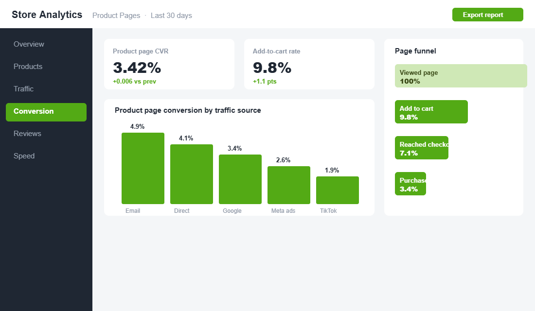
Before you touch anything, resist the urge to fix every product page at once. Most stores have one or two products that carry the business, the hero SKU your ads point at and your bestseller drives. Open Shopify Analytics, sort your products by revenue over the last 90 days, and start with the page that already makes you the most money.
The maths is simple. A one-point conversion lift on a page doing 40 percent of your revenue is worth more than perfecting ten pages that each do 2 percent. Fix the money page first, prove the lift, then roll the same template out across the catalogue. This is how you turn a week of work into a number you can actually see in the dashboard, rather than busywork spread thin across 200 products nobody visits.
One more filter: check which of those top pages gets the most paid traffic. A page you are actively paying to send shoppers to is leaking real ad dollars every day it stays broken, so it jumps to the front of the queue.
Part 1: The Above-the-Fold Decision
Within the first three to five seconds on your product page, a shopper has already decided whether this is worth their attention. Everything they need for that snap judgement has to be visible without scrolling: a clear product title, a hero image that shows the product properly, the price, and an add-to-cart button that is impossible to miss.
Most Aussie stores get at least one of these wrong. The title is a vague brand-speak phrase instead of what the thing actually is. The price sits below the fold. The add-to-cart button is the same muted grey as the theme default and melts into the page. Each one adds a half-second of friction, and on mobile a half-second is all it takes to lose someone.
- Lead with a plain-language title. “Merino Crew Knit, Charcoal” beats “The Essential.” Say what it is first, then let the brand voice live in the description where it belongs.
- Make the price and offer obvious. If you run free shipping over a threshold, say it right here (“Free shipping over $80”). With 24 percent of all Australian retail spend now happening online, shoppers compare on total landed cost, not the sticker price.
- Give the add-to-cart button one job and one colour. High contrast, your accent colour, full width on mobile. Prominent, well-worded CTAs can convert up to 42 percent more visitors than generic ones, so this button is not the place to be subtle.
Two more elements earn their place above the fold when they apply. If your product has variants, make the selector obvious and pre-select the most popular option so the button is live on arrival. And if stock is genuinely limited, a quiet “Only 4 left” can nudge a fence-sitter, but only when it is true. Fake urgency is the fastest way to burn the trust the rest of the page is trying to build.
Look at how Koala handles it. Their product pages put the essentials up top and back the add-to-cart with instant reassurance, a 120-night trial and fast dispatch, so the decision feels low-risk before you have scrolled a single inch. That is the whole game above the fold: make saying yes feel safe.
Part 2: A Gallery That Removes Risk
Online, the shopper cannot touch the product. Your image gallery is doing the job that picking something up off a shelf does in a physical store. Treat it as your best salesperson, not a box you tick with one white-background render.
A gallery that actually sells mixes four types of image, in this order:
- A clean hero shot on white so the product reads instantly in search and on the collection page.
- Lifestyle shots showing the product in a real Australian home, hand, or wardrobe, so the shopper gets scale and context.
- A detail shot of texture, stitching, or finish, the things a customer would inspect up close in a store.
- An objection-killer that pre-empts the “how big is it really” question with dimensions, or a person holding it for scale.
Then add motion. Embedding video on a page can lift conversions by as much as 86 percent, and when a 3D or spin view is offered, 82 percent of shoppers use it. A 15-second clip of the product being worn, packed, or poured answers more questions than three paragraphs of copy ever will.
July, the Aussie luggage brand, leans hard on this. Their product pages show the case being packed, wheeled and dropped, plus a customiser so you see your exact colour and monogram before you buy. You are never guessing what arrives. And you do not need a studio to copy the idea. A phone, a window for light and a plain wall will out-perform generic stock renders every time, because real beats polished when polished looks like everyone else.
Part 3: Description Copy That Closes
Most product descriptions list features. Winning descriptions handle objections. Before you write a single word, list the three reasons a ready-to-buy shopper hesitates on this specific product, then answer each one on the page in plain English.
The structure that consistently works:
- Open with the benefit. One or two sentences on what the product does for them, not what it is made of. The materials come later.
- Give a scannable spec block. Materials, dimensions, care, and what is in the box. A shopper who is close to buying wants to confirm the details fast, not hunt for them.
- Add a mini FAQ. Kill the top objections directly: sizing, delivery time to metro and regional Australia, returns, and whether it suits their particular use case.
This matters because the objection you do not answer becomes a support ticket at best and an abandoned cart at worst. Handling delivery and returns questions on the page also feeds the rest of your customer experience. If you have not tightened that side up yet, the way we think about it in the Shopify Returns Playbook pairs directly with this.
Here is the exercise that makes this concrete. For your hero product, write the three sentences a hesitant buyer says in their head, then draft the one line that answers each. “I am not sure it will fit” becomes a sizing guide and a true-to-size note. “What if I do not like it” becomes your returns window stated plainly. “Will it arrive in time” becomes real dispatch and delivery estimates for metro and regional Australia. Answer those three on the page and you have removed most of the reasons a ready buyer walks away.
One rule above all: write for the skimmer first. Most readers scan the headings, bold phrases and the spec block before they read a single full sentence. If your key points only exist inside long paragraphs, most shoppers will never see them.
Part 4: Social Proof Where Doubt Lives
Reviews are not a nice-to-have section buried at the bottom of the page. They are the single most persuasive asset you own, because they come from someone with nothing to sell. Around 99.9 percent of shoppers read reviews before buying, and products with 11 to 30 reviews convert roughly 68 percent higher than products with none. The reviews are doing the convincing your own copy never can.
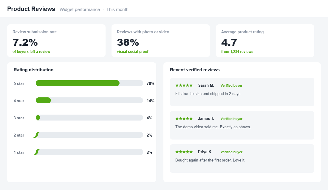
Placement is everything. The same reviews in three different spots do three different jobs:
- Star rating and count under the title. Proof should be visible before the shopper scrolls, so trust is established in the first glance.
- Photo and video reviews in or below the gallery. Visual reviews show the product in a real context that a studio shot cannot fake, which is exactly what a nervous buyer wants to see.
- Objection-matched reviews near the description. A “runs true to size” review sitting right beside the sizing FAQ closes the exact doubt the shopper is having in that moment.
If you only do one thing this week, install a review app. Judge.me (a strong free tier, popular with Aussie stores) or Loox (visual-first) both set up in minutes:
- Install the app from the Shopify App Store and connect it to your store.
- Turn on automatic review-request emails set to send 7 to 14 days after delivery, so the product has actually arrived before you ask.
- Offer a small incentive for a photo review, such as a discount on the next order. Loox merchants see review submission rates above 7 percent, with 25 to 50 percent including a photo or video, well above the 2 to 3 percent that text-only requests manage.
- Add the star rating widget under the title and the full review gallery lower down the page.
- Enable rich snippets so your star rating can show in Google results and lift your click-through before the shopper even lands.
Do not panic about the occasional four-star review either. A page of nothing but perfect five-star ratings reads as fake, and shoppers know it. A handful of honest “great product, delivery took a few days” reviews actually lifts trust, because it proves the rest are real. Respond to the critical ones publicly and briefly, and you turn a small negative into proof that a real business stands behind the product.
Beauty brands like Frank Body built their reputation on this. Their product pages are wall-to-wall real customer photos, and that user-generated content does more selling than any hero image could. Proof from a stranger who bought it beats a promise from the brand that sells it.
Part 5: Speed and the Mobile Reality
You can have the best gallery, copy and reviews in the country and still lose the sale if the page takes four seconds to load on a phone on a train. Over 70 percent of ecommerce visits now happen on mobile, and in Australia phones drive roughly half of all store traffic. This is not a desktop decision any more.
The numbers are brutal. Conversion drops by about 0.3 percentage points for every extra second of load time, and pages that load in one to two seconds convert around three times better than pages that crawl in at five. Speed is not a technical nicety. It is a conversion lever with a direct dollar value.
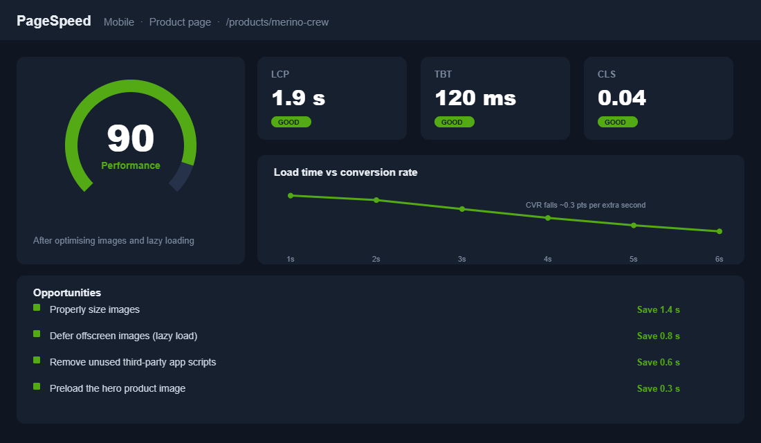
The usual culprits, in the order they cost you the most:
- Oversized hero images. Compress and correctly size them. This is almost always the single biggest win on a Shopify product page.
- App bloat. Every review, upsell and pop-up app injects scripts that add weight. Audit the stack (the Shopify App Stack Audit Playbook walks through exactly how) and cut anything not earning its place.
- No lazy loading. Images below the fold should load as the shopper scrolls, not all at once on arrival.
On mobile specifically, three moves matter most: make the add-to-cart button sticky so it follows the shopper down the page, keep the first screen tight (title, price, one image, buy button), and test on a real phone on mobile data, not just your desktop preview on office wifi. The gap between those two experiences is where a lot of hidden losses live.
How the Five Parts Compound
None of these five levers is dramatic on its own. A clearer title lifts conversion a little. A stronger gallery lifts it a little more. Reviews, faster load, a sticky mobile button: each adds a fraction. But they multiply rather than add, and that is where the real money is.
Take a page converting at 2 percent. A sharper above-the-fold nudges it to 2.3. A stronger gallery with video takes it to 2.7. Reviews placed at the point of doubt push it to 3.1. Shaving two seconds off the mobile load gets you to 3.4. That is a 70 percent lift in orders from the exact same traffic, without spending another dollar on ads. On a store doing $80,000 a month, that is the difference between treading water and hiring your first team member.
This is why the product page is the highest-impact screen in your store. Every other P you work on, your ads, your email, your SEO, funnels into this one page. Fix the page and every channel gets more efficient at once. Once it converts, sending more traffic to it and lifting average order value with a smart cross-sell offer both pay back far faster.
There is a second reason to care. Every point of conversion you win on the product page lowers your effective cost per acquisition across every channel at once. Cheaper Meta traffic, cheaper Google traffic, more margin to reinvest. The page is not just a conversion lever, it is the multiplier that decides how far every marketing dollar stretches. That is an advantage you own outright, no platform, algorithm or agency required.
Your Product Page Audit Checklist
Open your best-selling product on your phone right now and score it against these ten. Anything you cannot tick is a job for this week.
- Title says plainly what the product is
- Price and shipping offer visible without scrolling
- Add-to-cart button is high-contrast and full-width on mobile
- Hero image plus at least four supporting images
- At least one video or spin view
- Benefit-led opening line, not a spec dump
- Scannable spec block covering materials, dimensions and care
- Mini FAQ answering sizing, delivery and returns
- Star rating and review count under the title
- Page loads in under three seconds on mobile data
Score 8 or more and your page is pulling its weight. Come in under 6 and you are leaking sales you have already paid to acquire. The good news is that most of these fixes take an afternoon, not a redesign.
Inside eCommerce Circle, the product page is one of the first things we pull apart with every member, because it is usually where the fastest wins are hiding. If you want a second set of eyes on yours, let’s talk.