Most Aussie Shopify founders treat the product page like a brochure. They write a paragraph of copy, drop in three flat-lay images, hit publish, and then wonder why the add-to-cart rate sits at 4% while top stores in their category run at 12 to 20%. The product is fine. The traffic is fine. The page is the leak.
What’s in This Article
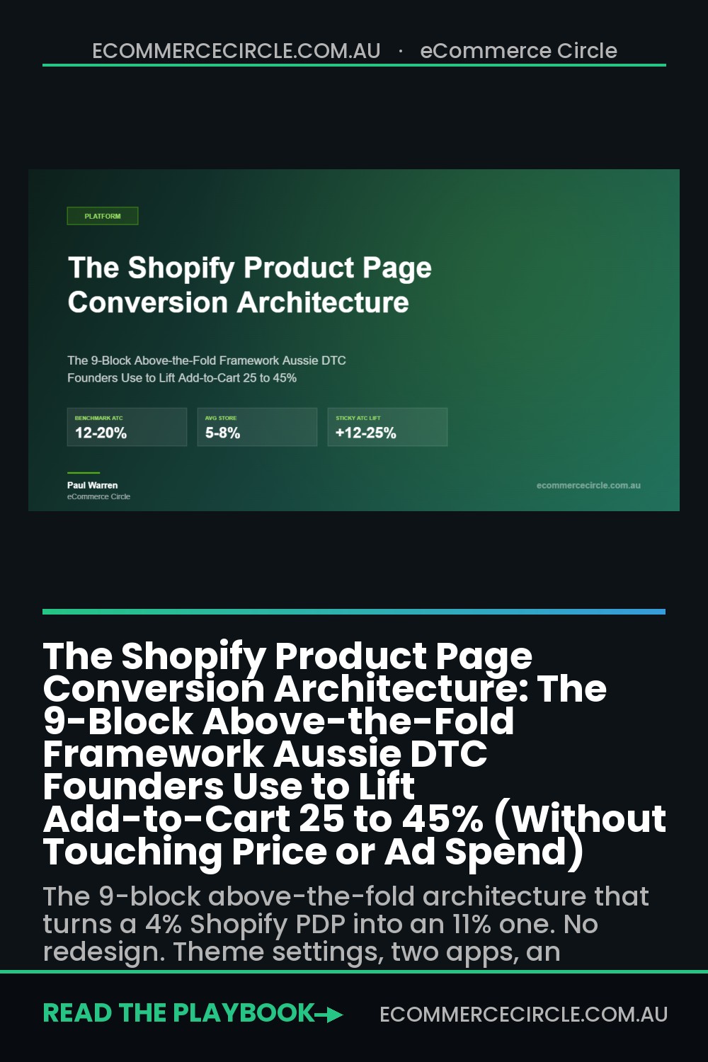
The average Shopify product page converts visitors to add-to-cart at 5 to 8%. Best-in-class PDPs convert at 12 to 20%, which is two to three times the rate, on the same ad spend, the same traffic, the same product. That gap is not a copywriting problem and it is not a discount problem. It is an architecture problem.
This is the 9-block above-the-fold framework we use with members of the eCommerce Circle workshop to rebuild PDPs that quietly lose money. Every block has a job. Every block is measurable. And every block is a setting in your theme, an app in your stack, or a piece of copy on the page. Nothing here requires a redesign or a developer week. It requires a checklist and an afternoon.
Why most Shopify PDPs leak 20 to 40% of their add-to-cart potential
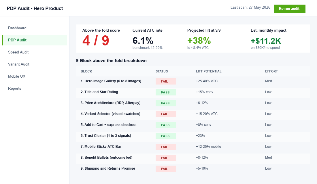
When we audit a PDP at Insiteful or inside the workshop, we score it against nine specific elements above the fold. Most stores tick three or four. The leak shows up in three places.
First, the image gallery. Stores with six or more product images see 20 to 30% higher engagement than stores with two or three. One brand we audited went from a single product photo to six (lifestyle, scale, detail, ingredient panel, UGC, packaging) and lifted ATC by 23% in 14 days, without changing copy or price.
Second, variant selection. Baymard Institute found that 17% of cart abandonments are directly tied to confusing or frustrating option selection. Replacing default Shopify dropdowns with visual swatches lifts ATC 15 to 20% on its own. That is one app, one afternoon, one settings change.
Third, the mobile experience. Over 70% of Shopify traffic in Australia is mobile, but mobile conversion still lags desktop by 30 to 50% on average. The number one mobile PDP fix, the sticky add-to-cart bar, is sitting in your theme settings right now waiting to be turned on. It adds 12 to 25% to mobile conversion. Most Aussie stores have not switched it on.
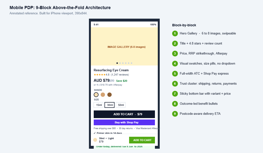
Below is the architecture we use to fix all three at once. Above the fold, in order, on every product on every store.
Block 1: The Hero Image Gallery (six to eight images, in this exact order)
This is the single highest-impact block on the PDP and it is the one most Aussie founders under-invest in. Frank Body, the Melbourne skincare brand, uses 8 to 12 images per product page. Sand and Sky runs 7 to 10. Koh, the Bondi-founded cleaner brand, leans into UGC inside the gallery itself. They do this because images are the closest thing to letting a customer hold the product.
Stores that upgrade from one or two photos to six to eight see add-to-cart improvements of 25 to 40%. That is one of the largest documented lifts of any PDP change, and it costs the price of a product shoot.
The order matters more than most people think. Here is the gallery sequence we recommend:
- Hero pack shot. Clean white background, product centred, taken at the angle the customer would hold it.
- Lifestyle shot. Product in use, in context. Show who buys this and where it lives.
- Scale shot. Product in a hand, next to a coffee cup, on a benchtop. Size is the number one returns driver.
- Detail or texture close-up. Stitching, finish, ingredient pour, fabric weave. Reduces buyer doubt.
- Ingredient panel, spec sheet, or label. The “I want to read the small print” shot. Skincare, supplements, electronics all need this.
- UGC or customer photo. Real customer with the product. Frank Body has built an empire on this single slot.
- Packaging shot. The unboxing. Especially important for gifting, premium, or luxury products.
- Video. 15 to 30 seconds, autoplaying on mute, captioned. Product video adds another 10 to 30% on top of static images.
On mobile, the gallery should be swipeable with visible page indicators (the little dots underneath). On desktop, a vertical thumbnail strip on the left of the hero image lets the customer jump straight to the shot they want. Both layouts ship native in Shopify’s free Dawn and Sense themes.
Block 2: Title and Star Rating (the credibility anchor)
The product title is the first piece of text the customer reads. Most Aussie stores get it almost right and lose the last 10%. Two rules.
Rule one: include the use case or benefit in the title, not just the product name. “Resurfacing Eye Cream” beats “Eye Cream”. “Hi-Vis Riding Jacket – Waterproof” beats “Riding Jacket”. The customer is scrolling fast and the title carries half the work of explaining what this product does.
Rule two: place the star rating immediately under the title, with the review count visible. Stores with 50 or more reviews convert roughly 15% higher than stores with none. The number matters as much as the stars. “4.8 out of 5 (1,247 reviews)” beats “4.8 stars” because the count itself is a trust signal.
Tool stack here is simple. Judge.me, Loox, Stamped, and Klaviyo Reviews all ship a star widget block you drop into the Online Store 2.0 theme. Click. Save. Done. The star block must link down to the reviews section so customers can click and read. Hidden reviews are wasted reviews.
One more lever. If you have a “Featured In” or “As Seen On” press strip (mX, body+soul, news.com.au, Vogue), put one logo directly under the star rating. Press logos near the title lift trust in a way that badges in the footer never do.
Block 3: Price Architecture (anchor, RRP, discount hierarchy)
Most Aussie PDPs show one price and move on. That leaves money on the table. The price block is where you set the value perception for the entire page.
The price hierarchy we recommend:
- Current price in large bold text. AUD shown clearly, not just $.
- RRP or compare-at price struck through next to it, in lighter weight. This creates the anchor.
- Savings callout below. “Save $24” or “20% off” in brand green or red.
- Afterpay or Zip messaging. “Or 4 payments of $19.99 with Afterpay” sits directly below the price.
The Afterpay line is often missing on Aussie PDPs and it should not be. Buy-now-pay-later messaging at the price block lifts conversion 6 to 12% on AOVs above $80. It is a free trust signal that says, this brand is mainstream enough to be on Afterpay.
One trap to avoid. Do not show a fake RRP that is wildly inflated. ACCC has been increasingly active on this since the 2023 enforcement push and a struck-through price that does not reflect a real prior sale price is a legal risk. Use compare-at honestly or do not use it at all.
Block 4: Variant Selector (swatches, image switching, no dropdowns)
This is the single most-broken block on Aussie Shopify stores and the one with the cleanest ROI fix.
The default Shopify variant picker is a dropdown. Dropdowns hide options, force a tap on mobile, and add cognitive friction for every visitor. Replacing dropdowns with visual swatches and tappable buttons lifts add-to-cart by 15 to 20%. Image switching on variant selection (when a customer taps “Sage Green” and the gallery instantly shows the sage version) reduces returns by 8 to 12% on top of that.
Build the variant block like this:
- Colour or finish: circle swatches with a small label underneath. Show all options, never hide.
- Size: tappable pill buttons in a row. “S M L XL XXL”. Bigger than 44px square so the thumb can hit them on mobile.
- Out of stock variants: show them, do not hide them. Grey out with a strikethrough. Add a “Notify me when back in stock” capture.
- Inline size guide: a “Size Guide” link next to the size row that opens a modal, never a new page.
- Image switching: the gallery should reflect the active variant. Sage Green selected, sage gallery shown.
Apps that handle this cleanly include Variant Image Wizard, UR:Variant Image Picker, and Color Swatch King. If you are already on Theme 2.0 (Dawn 9.0 and up), most of this ships native and you just need to switch the variant style in theme settings. We covered the deeper logic in our Shopify Variant Strategy Playbook if you want the full breakdown of how to structure variants before you even reach the picker.
Block 5: Quantity and the Add to Cart Button
The Add to Cart button is the single most-tested element in ecommerce. Three rules that consistently hold.
One: make it big. Minimum 48px tall on mobile, full-width inside the product info column. Customers should not have to hunt for it.
Two: make it the brightest, most contrasted element on the page. If your brand colour is muted, use a brand accent that pops. Black on white converts well. Brand green (#53aa15 for us) on white converts well. Beige on cream does not.
Three: write the right words. “Add to Cart” is the default. “Add to Bag” works for fashion. “Add to My Order” works for considered purchase. What does not work is “Buy”, “Order Now”, “Get Yours”. Stick close to the convention. The customer should not have to read the button to know what it does.
Place a quantity selector (minus, number, plus) immediately to the left of the ATC, but keep the ATC dominant in size. Skip the quantity selector entirely on products that almost no one buys in multiples. On consumables (skincare, supplements, coffee) keep it visible: 8 to 12% of orders include a quantity above one when it is shown, and effectively zero when it is hidden.
One more lever. Add an express checkout button (Shop Pay, Apple Pay, Google Pay) immediately under the ATC. Express checkout buttons convert at 1.7 to 3x the rate of the standard checkout because returning customers skip eight form fields. Shopify Plus stores see Shop Pay tap-through rates above 25% on the PDP alone.
Block 6: Trust Signal Cluster (one to three max, not seven)
Trust badges are one of the most misunderstood blocks on the PDP. The intuition is “more is better”. The data says the opposite.
Baymard Institute research across 147 ecommerce sites found pages with one to three trust signal types converted 23% better than pages with no trust signals. But pages with seven or more trust signal types converted 8% worse than pages with one to three. More badges, less trust. The visual noise dilutes the credibility of any single signal.
The trust signal cluster we recommend, directly under the Add to Cart button:
- Free shipping over $X. The number one Aussie buyer expectation. Lead with it.
- Returns or guarantee policy. “30 day money back” or “Easy returns” with a tiny icon.
- Payment methods accepted. Visa, Mastercard, Amex, PayPal, Afterpay, Zip in greyscale icons. Not five glittery badges.
That is it. Three signals. Quiet, useful, real. The customer should be able to scan them in under two seconds. If you have a sustainability certification, a B Corp badge, or a charity partnership, those go further down the page in their own section, not in this cluster.
Block 7: Mobile Sticky ATC Bar (the +12 to 25% mobile lever)
This is the single highest-ROI Platform fix for Aussie DTC stores in 2026 and most have not turned it on.
On mobile, customers scroll 40 to 60% further past the original Add to Cart button than they do on desktop. They land, scroll, read, read more, look at reviews, scroll back, scroll forward, and somewhere in that flow the buy button has disappeared. A sticky ATC bar pinned to the bottom of the mobile viewport solves that. It carries the product variant, the price, and the buy button on every scroll position.
Documented lifts:
- 8 to 15% conversion lift on desktop.
- 12 to 25% conversion lift on mobile.
- 10 to 14% reduction in product page bounce rate.
- Zipify mobile split test showed +10% add-to-carts and +9% conversion on the same traffic.
Tool stack: STKY Sticky Add to Cart Bar, Ultimate Sticky Add to Cart, or Essential Cart Drawer all do the job for $5 to $20 a month. Several Theme 2.0 themes (Impulse, Symmetry, Dawn 11.0+) ship sticky ATC native. Check your theme settings first. There is a fair chance the feature is sitting there free, waiting to be enabled.
One important rule. The sticky bar should appear only after the main ATC button has scrolled out of view. Showing it from the top of the page creates redundancy and clutter. Most apps default to this behaviour. Double-check it on your phone before going live.
Block 8: Benefit Bullets (three to four outcomes, not features)
This block sits directly under the Add to Cart and above the long-form description. It is three or four short bullets, ideally with a small icon to the left, each one a single sentence.
The rule: every bullet is an outcome, not a feature. “Made with hyaluronic acid” is a feature. “Plumps skin in 14 days, clinically tested” is an outcome. Customers buy outcomes.
A good outcome bullet stack for a skincare PDP looks like:
- Visibly firmer skin in 14 days. Backed by 8-week consumer trial (n=82).
- Suitable for sensitive skin. Dermatologically tested, fragrance free.
- Australian made and owned. Cruelty free, vegan, recyclable packaging.
- 30 day money back guarantee. Try it risk free.
Four bullets is the sweet spot. Three is fine. Five gets crowded. Six is a wall of bullets and the eye glazes over.
If your benefit bullets sound generic, the fix is upstream. Run a quick win-loss survey to your last 100 buyers, ask “what nearly stopped you from buying” and “what tipped you over”, and the benefit copy writes itself. We use a 3-question post-purchase survey for exactly this in the workshop.
Block 9: Shipping and Returns Promise (the silent objection killer)
This is the block most Aussie stores treat as an afterthought, buried in the footer or hidden behind a “Shipping” link in the header. Bring it above the fold.
Australian buyers carry a specific anxiety around shipping. We are a big country, regional delivery is slow, and most Aussie shoppers have been burned by a 14-day delivery that arrived in 28. The PDP needs to answer three silent questions before the customer scrolls past the buy box:
- When will it arrive. “Order today, delivered Tue 9 June” with a postcode-aware ETA if possible.
- What does shipping cost. Free over $X, flat $Y under that. No surprises at checkout.
- What happens if it does not fit, work, or arrive. “30 day returns. Free return shipping over $80.”
This block answers all three in a single compact strip directly under the benefit bullets. Add a small truck icon, a small box icon, a small clock icon. Three lines, one row, done.
Postcode-aware ETA is the upgrade most worth doing. Apps like Shipsi, Estimated Delivery Date by Trinix, or a native Theme 2.0 estimated-delivery block can show “Delivered to 2026 Sydney by Tue 9 June” based on the user’s postcode and a courier API. Specificity converts. “5 to 7 business days” is vague. “Tue 9 June” is bookable.
The Compound Effect: how 9 blocks stack to 30 to 45% more ATC
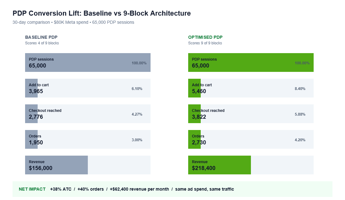
None of these blocks on their own moves the needle by 40%. The compound effect is the point. Stack two or three and you see 10 to 15%. Stack all nine and the data from our workshop audits, plus the published Baymard and Zipify research, converges on a 30 to 45% improvement in add-to-cart rate over a baseline PDP.
The maths is straightforward. If your current ATC rate is 6% and you take it to 8.4% (a 40% lift), and your checkout conversion holds at 50% (standard for a clean checkout), your overall site conversion goes from 3.0% to 4.2%. On $80,000 of monthly Meta traffic, that is roughly $11,200 of additional monthly revenue. From an afternoon of theme settings and one or two apps.
The other compound effect is on ad spend efficiency. A higher-converting PDP means your CAC falls without changing creative, audience, or budget. Meta’s algorithm learns faster on a page that converts more often, and the auction price drops as your ROAS climbs. A clean PDP is the most underrated ad lever in DTC.
One caveat. None of this matters if the page does not load. A PDP that loads in 1.2 seconds converts roughly 40% better than the same PDP loading in 4.5 seconds. If your mobile Lighthouse score is under 50, fix that first. We covered the full speed framework in our Shopify Speed Optimisation Playbook. Speed is the floor. The 9-block architecture is the ceiling.
The 30-Minute PDP Audit Checklist
Run this on your hero product right now. Open it on your phone. Score each block out of one. The page that scores 9 of 9 is the page that converts at 12 to 20%. Most pages we see score 4 to 5.
- Block 1 (Gallery): Six or more images including hero, lifestyle, scale, detail, ingredient, UGC, packaging, video?
- Block 2 (Title and rating): Title includes benefit, star rating directly under, review count visible, links to reviews section?
- Block 3 (Price): Price, struck-through RRP, savings callout, Afterpay or Zip messaging, all in one stack?
- Block 4 (Variants): Visual swatches, image switching on selection, out-of-stock variants visible with notify-me, inline size guide?
- Block 5 (ATC): Button over 48px tall, full-width, high contrast, with Shop Pay or Apple Pay express button below?
- Block 6 (Trust cluster): Exactly one to three trust signals (shipping promise, returns, payment icons) directly under ATC?
- Block 7 (Sticky ATC): Sticky bar enabled on mobile, appears after main ATC scrolls off, includes variant and price?
- Block 8 (Benefit bullets): Three or four outcome-led bullets with icons, written in plain language?
- Block 9 (Shipping and returns): Postcode-aware ETA, shipping cost, returns window, all visible above the fold?
If you score under 6, you have at least 20% more add-to-cart sitting in this page. Fix the lowest-effort blocks first (sticky ATC, swatches, trust cluster). Those three alone consistently deliver 15 to 20% before you touch images or copy.
What this looks like in practice
Frank Body’s PDPs run nine images, swatch-based variant selectors, sticky mobile ATC, Klaviyo Reviews with a thousand-plus reviews per hero SKU, and a benefit-led title structure. Their above-the-fold scores 9 of 9. That is not an accident. It is the architecture compounding.
Sand and Sky uses postcode-aware ETA, layered trust cluster, ingredient close-up shots, and Afterpay messaging directly under price. Koh leans hard on the UGC slot inside the gallery and treats reviews as the hero proof. Different categories, same architecture.
You do not need to copy these brands. You need to copy the structure. Nine blocks, above the fold, in the order shown. Audit on Monday, deploy on Tuesday, measure on Friday. That is the cadence we use inside the workshop and it is the cadence that turns a 4% ATC page into an 11% one.
Where most founders stall (and how to get past it)
The hardest part of this work is not the apps or the theme settings. It is the discipline of doing nine small things instead of one big redesign. Most founders look at a PDP they are not happy with, decide the whole theme needs to be replaced, hire an agency, lose 12 weeks, and ship a worse page. Do not do that.
Pick the lowest-scoring block from the audit. Spend two hours on it. Ship. Measure for a week. Move to the next block. By week four you have stacked four meaningful improvements, the compound is visible in your reports, and you have not paid an agency to redesign anything. This is the operator path, not the designer path, and it is the one that compounds.
One last thing. The PDP is the page that closes the sale. Most Aussie brands obsess over the homepage and the collection page and treat the PDP as the page that just renders the product. That is backwards. Optimise the PDP first. Send your homepage traffic to a great PDP and your homepage layout matters less. Send your homepage traffic to a leaky PDP and no amount of mega menu polish will save you. The order of optimisation, for a brand under $5m a year in revenue, is almost always: PDP, checkout, then everything else.
Inside eCommerce Circle, the PDP is one of the core pillars we audit with every workshop member. If you want a second opinion on yours, let’s talk.