A shopper lands on your store ready to buy. They like two or three of your products, but they cannot work out which one is right for them. So they do what everyone does when a store fails to help them decide. They open a new tab, start comparing on their own, get distracted, and never come back. You did not lose that sale to a competitor. You lost it to indecision.
What’s in This Article
This is the quiet killer of considered purchases. The more your products are worth, and the more they differ, the more your shopper needs to compare before they commit. Yet most Shopify stores leave them to do that work alone, scrolling between product pages, holding specs in their head, slowly talking themselves out of buying anything at all.
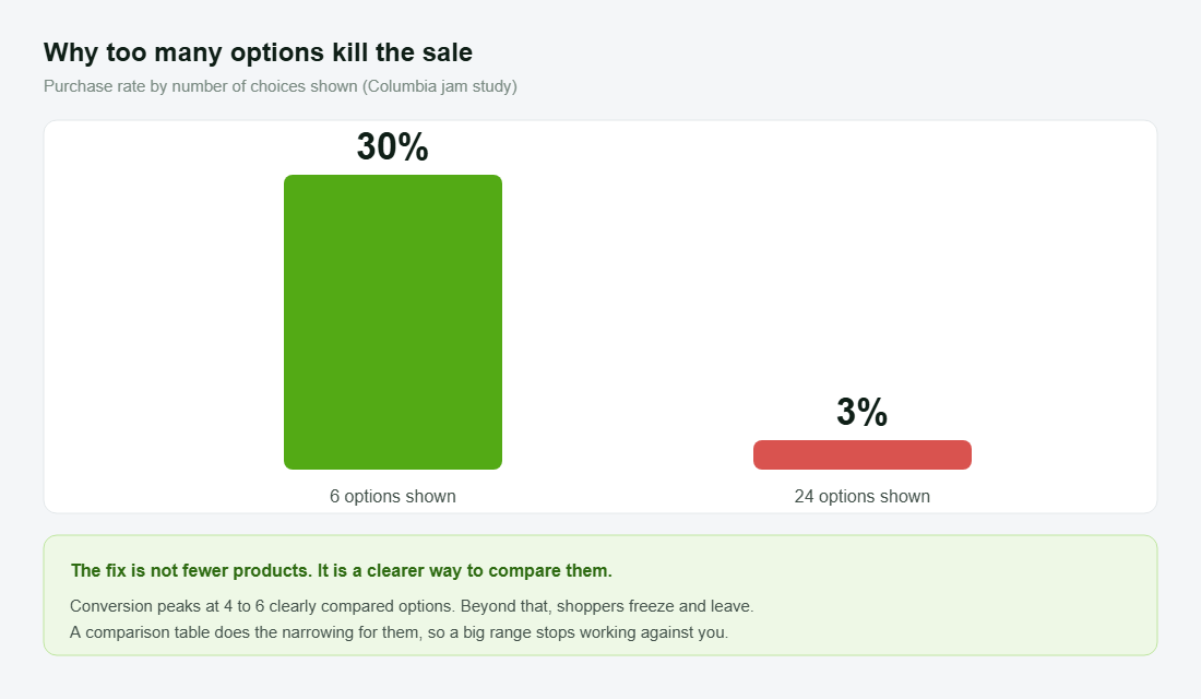
The research on this is brutal. In the famous Columbia University study, shoppers shown 24 options bought just 3% of the time, while those shown 6 converted at 30%, a tenfold difference driven purely by how the choice was framed. Conversion peaks when people compare four to six clear options and collapses beyond that. This playbook is the five-part system for doing the comparing for your customer, so a wide range becomes a strength instead of the thing that freezes them.
The hidden moment where considered purchases die
Every considered purchase has a comparison step, whether you build for it or not. The shopper will compare your products against each other and against the competition. The only question is whether they do it on your store, with your framing, or in five other tabs where you have no control.
Choice overload is not a soft idea, it is measured and consistent. A meta-analysis of close to 100 studies found that too many options reduces satisfaction, increases regret, and lowers the chance the shopper buys anything at all. A 2024 study across 1.6 million users found that as recommendations piled up, conversions fell, and 64% of that drop came from people simply not clicking on anything. Overwhelmed shoppers do not pick the safe option. They leave.
There is a device angle too. Desktop converts at around 3.2% versus 2.8% on mobile, and a big reason is that a larger screen makes products easier to compare side by side. If you sell anything that needs weighing up, your mobile shoppers are fighting a comparison problem on the worst possible screen for it. Solve the comparison, and you lift the channel where most of your traffic actually sits. The same friction that hurts your product pages hurts your collection pages, which is why the Collection Page Playbook and this one work best together.
It helps to think about who this shopper actually is. They are not a tyre-kicker. They have already decided they want to buy from your category, and probably from you. They are deep in the funnel, close to the money, and stuck on one question: which one. That makes them the most valuable visitor on your store to win and the most painful to lose. Every dollar you spent getting them here is riding on whether the next thirty seconds make the choice clear or leave them guessing.
Part 1: Know which products actually need comparing
Not every product needs a comparison table. A single-SKU candle does not. The system pays off where shoppers face a genuine choice between similar options of yours and the stakes feel high enough to deliberate.
Map your catalogue for comparison need before you build anything. The products that earn a table are the ones where:
- You sell a range of the same thing. Three mattresses, four backpacks, a tiered supplement line. The shopper wants one, and has to choose which.
- The price is high enough to cause hesitation. The more it costs, the more research the shopper does before committing, and the more a clear comparison shortens that loop.
- The differences are real but hard to feel. Firmness, capacity, weight, ingredients. Specs the shopper cannot judge by looking at a photo.
- Wrong-choice regret drives returns. If people send things back because they picked the wrong model, comparison is also a returns fix, not just a conversion one.
This mapping keeps you focused. You are not building tables everywhere. You are building them at the exact decision points where shoppers currently stall and leave.
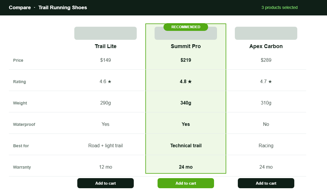
Part 2: Build the table the shopper would build themselves
The best comparison table is the one your customer would make if they had the patience and the data. Your job is to do that work for them, accurately and without spin. Pick the handful of attributes that genuinely drive the decision and lay them out so the differences are obvious at a glance.
Strong comparison tables share a structure:
- Decision-driving rows only. Price, the one or two specs that matter most, the use case, warranty, rating. Cut anything that does not change the choice. A cluttered table recreates the overwhelm you are trying to remove.
- Plain-English values. “Best for technical trails” beats a raw number the shopper cannot interpret. Translate specs into meaning.
- A clear visual winner per use case. Highlight the recommended option, and ideally label who each product is for, so nobody leaves empty-handed.
- A buy action in every column. Once they have decided, let them act in one tap from the table itself. Do not send them back to hunt for the right product page.
This pairs directly with how you have structured your range. If your variants and models are a mess, the table will be too, so get the Variant Strategy Playbook sorted first, then build the comparison on top of a clean foundation.
Part 3: Put the comparison where the decision happens
A comparison table buried on a separate page nobody visits is wasted work. The comparison has to appear at the moment of hesitation, in the places shoppers are already deciding.
Place it deliberately:
- On the product page. A “compare with similar” block on the PDP catches the shopper mid-doubt, exactly when they are about to open another tab. This is the highest-value placement.
- On the collection page. Let shoppers tick two or three products and compare them side by side without leaving the grid. It turns browsing into deciding.
- In a dedicated buying guide. For your biggest categories, a standalone “which one is right for you” page does double duty as a sales tool and a search magnet.
- Built for mobile first. Since comparison is hardest on small screens and that is where most traffic lives, a horizontally scrollable or stacked mobile table is not optional. It is the whole point.
The principle is simple. Meet the shopper at the decision, on the page they are already on, on the device they are already using.
Part 4: Guide the choice, do not just list specs
A table that lists specs without a point of view still leaves the shopper to do the hard part: deciding what matters. The brands that win at comparison take a position. They guide the choice rather than just presenting it.
Guidance turns a table into a recommendation:
- Label each option by who it suits. “Best for beginners”, “best for heavy daily use”, “best value”. You are matching a person to a product, not listing parts.
- Make a clear recommendation. A confident “most people should start here” removes the burden of choice. Shoppers are relieved when you decide for them.
- Use reviews as comparison data. Ratings and verified feedback per option let the crowd weigh in. Social proof inside a comparison is persuasive, which is why it pairs with the Product Reviews Playbook.
- Pre-empt the trade-off question. Name the obvious “but is it worth paying more” tension and answer it in a line, so the shopper does not leave to find the answer elsewhere.
The two best-known Aussie examples of this are worth studying. Koala built a brand on making mattress choice simple, guiding buyers between models by sleep style and firmness instead of dumping specs on them. July does the same with luggage, walking shoppers through carry-on versus checked and model differences so the decision feels obvious. Neither leaves the customer to work it out alone.
Part 5: Turn the comparison into content that captures research traffic
The comparison work you do on-site has a second life as content. Considered-purchase shoppers search before they buy, typing “best trail running shoes Australia” or “which Koala mattress is right for me” into Google and increasingly into AI assistants. If your store answers that question better than anyone, you capture the buyer at the research stage instead of fighting for them at the end.
Build a buying guide for each of your major categories and let it do the heavy lifting:
- Answer the real question they are asking. “Which one should I buy” is the search, so structure the guide around use cases and a clear recommendation, not a feature dump.
- Embed the comparison table. The same table from your product pages belongs here too, so a researcher can decide and buy in one place rather than leaving to compare elsewhere.
- Write for the considered shopper, not the algorithm. High-consideration categories need depth, trust signals and genuine guidance. Earn the click and the trust, and the ranking tends to follow.
- Link the guide into the journey. Point to it from the relevant collection and product pages, and point it back to the products, so it sits inside the buying flow instead of off to the side.
This turns a conversion tool into an acquisition channel. The buying guide pulls in the shopper at the top of their research, the comparison table helps them decide, and the buy button is right there when they do. One asset, working the whole funnel.
Setting it up in Shopify without a developer
Shopify has no native side-by-side comparison, so you will use an app, and you do not need a developer to do it. Bear Specs and Compare is a solid, widely used option that builds comparison tables from your existing product data, with plans starting around 7 dollars a month. Here is the order to set it up so it earns its place:
- Pull your specs into metafields first. Store the attributes you compare (weight, capacity, firmness, ingredients) as Shopify metafields or metaobjects so the table fills automatically and stays accurate when products change.
- Build one table for your highest-stakes category. Start where comparison need is greatest. Add only the decision-driving rows you mapped in Part 1, not every spec you have.
- Place the compare block on the product and collection pages. Add it to the PDP as a “compare similar” section and enable tick-to-compare on the collection grid.
- Style it to match your theme and check it on mobile. Match your brand colours, then test on a phone, since that is where comparison is hardest and most of your traffic lives.
- Highlight a recommended column. Set the visual winner and add the “best for” labels so the table guides rather than just informs.
Set it up once on your biggest category, prove the lift, then roll it out to the next. The point is not the specific app. Several do the job well. The point is that every part of this system is available to you today for the price of a couple of coffees a month.
There is a margin angle worth naming too. A shopper who chooses the right product the first time is far less likely to send it back. Wrong-choice regret is one of the most expensive return reasons in any considered category, because the product was not faulty, it just was not the right fit for that person. Good comparison cuts those returns at the source. You are not only converting more shoppers, you are converting them into the right product, which protects both the sale and the second purchase down the track. For the operational side of all this, your Product Page Playbook and comparison system should be built together.
How the five parts compound
Each part helps on its own. Together they form a decision engine. Mapping comparison need points you at the right products. The table does the homework for the shopper. Smart placement catches them at the moment of doubt. Guidance removes the burden of choosing. And the buying-guide content pulls in researchers before they ever reach a competitor.
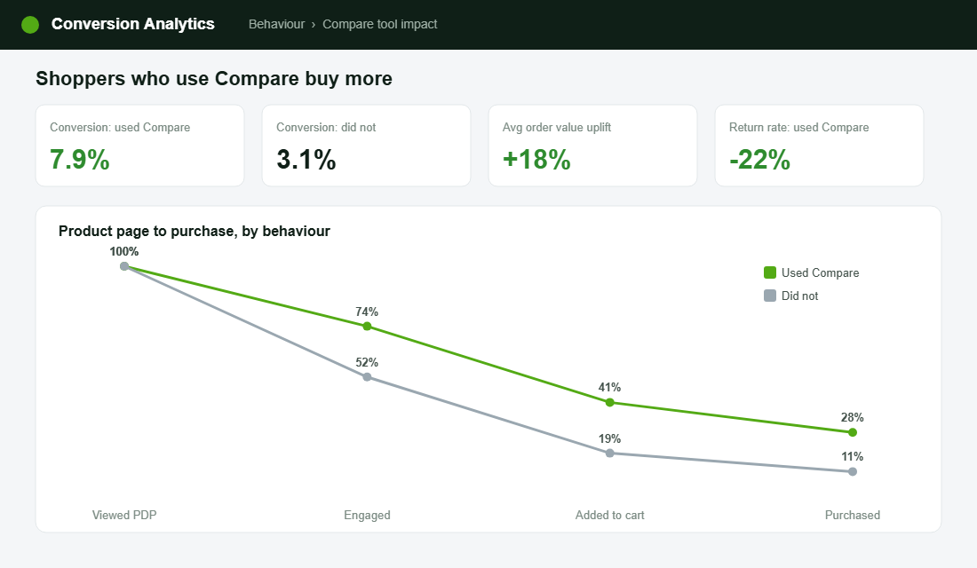
The maths is compelling. If shoppers who compare on your store convert at roughly double the rate of those who do not, and a meaningful slice of your traffic faces a genuine choice, then helping them decide is one of the highest-return changes you can make. It needs no extra ad spend. It simply stops you losing the buyers you already attracted to indecision and open tabs.
A confused shopper does not buy the safe option. They buy nothing. Make the choice easy, and you convert the exact customers who currently slip away.
The comparison mistakes quietly costing you sales
The same avoidable errors show up across stores. None of them look broken, which is why they go unfixed.
- No comparison at all. A range of similar products and no way to weigh them up. The shopper does it elsewhere and rarely returns.
- The everything table. Twenty rows of specs that recreate the overwhelm. More data is not more clarity.
- Specs with no meaning. Numbers the shopper cannot interpret and no plain-English translation of what they mean for them.
- No recommendation. A neutral table that still forces the shopper to decide what matters. Take a position.
- Desktop-only thinking. A table that falls apart on mobile, where comparison is hardest and most of your shoppers are.
Fixing these costs almost nothing and needs no new traffic. It is purely about converting the considered shoppers you are already paying to attract.
Your product comparison checklist
Run this against your store this week. Any line you cannot tick is a considered shopper you are losing to indecision.
- Comparison need mapped. You know exactly which categories and products warrant a table, and which do not.
- Decision-driving table. Four to six attributes that actually change the choice, in plain English, no clutter.
- Placed at the decision. Compare block live on product and collection pages, not buried on a forgotten page.
- Mobile-first. The table works cleanly on a phone, where comparison is hardest.
- Guided, not neutral. A recommended option, “best for” labels, and reviews inside the comparison.
- Buying guide content. A “which one is right for you” page for your biggest categories, capturing research traffic.
Inside eCommerce Circle, helping shoppers choose with confidence is one of the Product pillars we work on with the founders we coach, because it converts the customers you have already paid to attract. If you want a second opinion on how your store handles product choice, let’s talk.