Open Shopify Analytics right now and tell me your conversion rate. Your blended ROAS. Your email revenue as a percentage of total revenue. Your repeat purchase rate. If you cannot answer at least three of those without looking, you are flying blind.
What’s in This Article
Most Shopify store owners fall into one of two camps: they either ignore their data entirely (gut-feel entrepreneurs) or they drown in it (checking hourly ROAS like it is a stock ticker). Both approaches are costing you money.
What you need is a simple weekly dashboard that takes 15 minutes every Monday morning and tells you exactly whether your business is healthy, growing, or heading for trouble. Here is exactly what to track and why.
The 8 Numbers That Actually Matter
Forget vanity metrics like Instagram followers and page views. These eight numbers tell you everything you need to know about the health of your Shopify store:
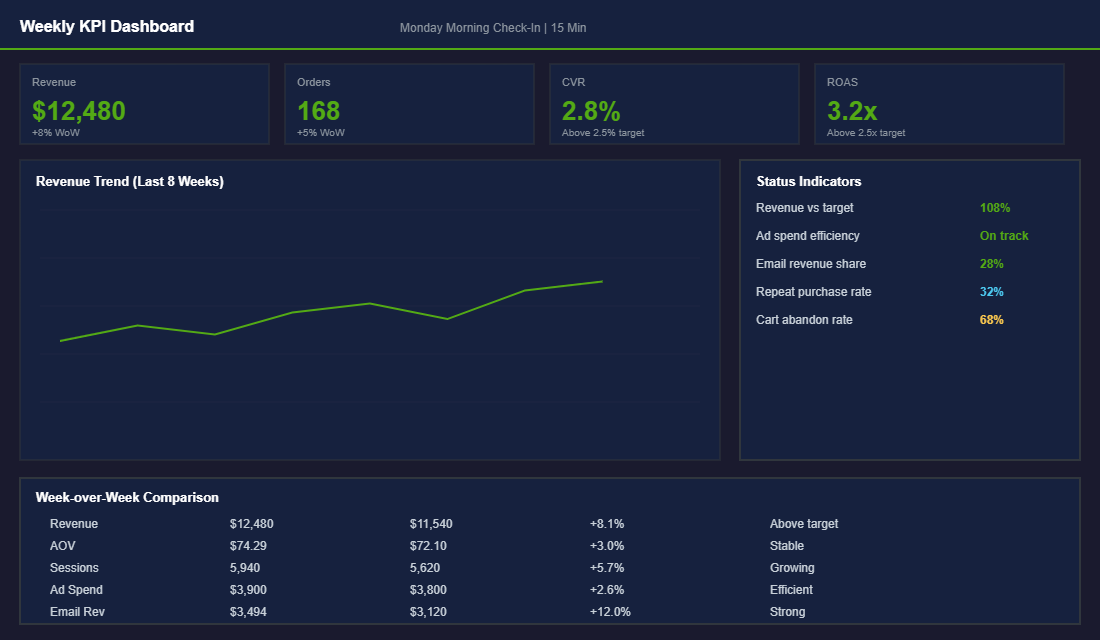
- 1. Total Revenue (week-over-week). Not just the number, but the trend. Is it growing, flat, or declining? A single bad week is noise. Three consecutive declining weeks is a signal that needs attention.
- 2. Average Order Value (AOV). This tells you how effectively your product mix, bundles, and upsells are working. A rising AOV means you are extracting more value per transaction. Benchmark: $65-90 AUD for most product-based Shopify stores. If your AOV is below $60, bundling and threshold-based offers can move it quickly — our product bundling guide covers the tactics that work.
- 3. Conversion Rate. The percentage of visitors who buy. This is your store’s efficiency metric. Benchmark: 2.0-3.5% is healthy for an Australian Shopify store. Below 1.5% means your product pages need work.
- 4. Customer Acquisition Cost (CPA). What you are paying to acquire each new customer across all paid channels. Divide total ad spend by total new customer orders. If this number is climbing, you need to either improve your creative or diversify your acquisition channels.
- 5. Return on Ad Spend (ROAS). Revenue generated per dollar of ad spend. Track blended ROAS (all channels combined), not just platform-reported ROAS. Benchmark: 2.5-3.5x blended ROAS for a healthy Shopify brand.
- 6. Email Revenue Percentage. What percentage of total revenue comes from email (Klaviyo flows + campaigns). If this is below 20%, your email engine is underperforming. Target: 25-40% of total revenue. See our guide on the 5 Klaviyo flows every store needs if your email is underweight.
- 7. Cart Abandonment Rate. The percentage of add-to-carts that do not convert to purchases. Industry average is 70%. If yours is above 75%, there is friction in your checkout that needs fixing.
- 8. Repeat Purchase Rate. The percentage of customers who buy more than once. Benchmark: 28-35% for a healthy DTC brand. Below 20% means your retention strategy needs serious work.
How to Read Your Conversion Funnel (And Find the Leaks)
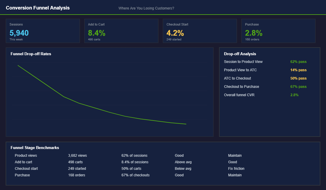
Your conversion funnel shows you exactly where customers are dropping off. Think of it as a diagnostic tool — it does not tell you what is wrong, but it tells you where to look. Here is how to read it:
- Sessions to Product View (target: 55-65%). If less than half your visitors are viewing a product page, your homepage or collection pages are not directing traffic effectively. Your navigation, hero banner, or collection layout needs work.
- Product View to Add to Cart (target: 10-15%). If people are viewing products but not adding to cart, your product pages are the issue. Images, descriptions, pricing, reviews, or trust signals need improvement. Running a heatmap analysis at this stage shows you exactly where visitors lose interest on the page.
- Add to Cart to Checkout (target: 50-65%). A big drop here usually means shipping cost shock, required account creation, or a confusing checkout process. Enable guest checkout, show shipping costs earlier, and simplify the checkout to two steps maximum.
- Checkout to Purchase (target: 60-75%). If people start checkout but do not finish, payment friction is the likely cause. Make sure you offer Shop Pay, Apple Pay, Google Pay, and Afterpay/Zip for Australian customers. Our checkout optimisation guide walks through the 7 highest-impact fixes.
Channel Attribution: Know Where Your Revenue Actually Comes From
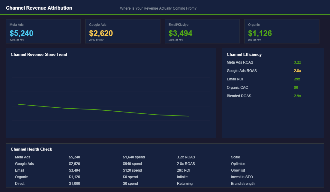
Platform-reported ROAS is a liar. Meta says your ads did $20K. Google says another $15K. Klaviyo claims $12K. Add those up and you get $47K, but your actual Shopify revenue was only $35K. Every platform over-attributes because they all want credit for the same sale. For a deep dive on solving this problem, see our guide on ecommerce marketing attribution.
You need to look at blended metrics to get the real picture. Here is the simple approach:
- Blended ROAS: Total Shopify revenue divided by total ad spend across all platforms. This is the only ROAS number that matters.
- Channel revenue share: What percentage of total revenue does each channel drive? A healthy mix looks like: Paid Ads 35-45%, Email 25-35%, Organic 10-15%, Direct 10-15%.
- New vs returning customer revenue: Shopify shows this in Analytics. If over 70% of revenue comes from new customers, your retention is weak. Healthy brands see 35-50% from returning customers.
Check these numbers weekly. If your paid ad share is climbing above 50% while email stays flat, you are becoming too dependent on paid traffic. If organic is declining, your SEO needs attention. The trends matter more than any single week’s numbers.
The 15-Minute Monday Morning Routine
Here is how to make this sustainable. Every Monday morning, before you do anything else:
- Minutes 1-3: Open Shopify Analytics. Check total revenue, orders, AOV, and conversion rate vs last week. Note any significant changes.
- Minutes 4-6: Open Meta Ads Manager and Google Ads. Check spend, ROAS, and CPA for each channel. Calculate your blended ROAS.
- Minutes 7-9: Open Klaviyo. Check email revenue as a percentage of total, flow performance, and list growth. Flag any flows that are underperforming.
- Minutes 10-12: Check your conversion funnel in Shopify Analytics. Look for any stage where the drop-off rate has increased vs last week.
- Minutes 13-15: Write down one action item. Not five. One specific thing you will do this week to improve the weakest number on your dashboard.
That is it. Fifteen minutes, eight numbers, one action item. Do this consistently and you will be more informed about your business than 90% of Shopify store owners.
Setting Up Your Dashboard in Practice
You do not need expensive BI tools to build an effective weekly dashboard. A simple Google Sheet or Notion doc works perfectly for most Shopify stores under $500K per year. Create a tab for each month, with weekly rows and columns for each of your eight key metrics. Manually input the numbers each Monday — the act of typing them in forces you to actually look at and process each number, which builds intuition over time.
For stores scaling past $500K, tools like Triple Whale ($129/month), Lifetimely ($49/month), or Polar Analytics (from $99/month) pull your Shopify, Meta, Google, and Klaviyo data into a single dashboard automatically. Triple Whale is particularly strong for attribution — its pixel gives you a more accurate picture of which channels are actually driving purchases than any platform’s self-reported data. Lifetimely excels at cohort analysis and LTV tracking, which becomes critical once retention is a focus.
Make sure your GA4 setup is solid before layering on additional tools. If your foundational analytics are misconfigured — and they are on roughly 60% of Shopify stores we audit — then every tool built on top of that data will give you misleading numbers. Get the foundations right first.
Whichever tool you use, the dashboard itself is not the goal — the weekly habit is. A perfect dashboard that you check once a month is less valuable than a basic spreadsheet you review every Monday without fail.
Red Flags: When Your Numbers Are Screaming for Attention
Certain metric combinations signal urgent problems that need immediate action. Learn to recognise these patterns.
Rising CPA + flat or declining ROAS. Your paid acquisition is getting less efficient. This usually means creative fatigue (your ads have been running too long), audience saturation (you have exhausted your best segments), or increased competition in your niche. The fix: refresh your ad creative, test new audiences, or shift budget to higher-performing channels. If your Meta CPA has increased more than 20% over 4 weeks, treat it as urgent — check out our Meta Ads campaign structure guide for a reset framework.
High traffic + low conversion rate. You are getting visitors but they are not buying. This points to a disconnect between your ads and your landing pages, poor product page experience, or pricing issues. Pull up your product page audit checklist and work through it. Most conversion rate issues live on the product page — weak images, thin descriptions, missing social proof, or unclear value propositions.
Declining repeat purchase rate. If your repeat rate drops below 25% for more than 4 consecutive weeks, your retention engine is breaking. Check your post-purchase email flows — are they still triggering correctly? Has your product quality slipped? Have you changed your returns policy? A 5-percentage-point drop in repeat rate on a store doing $80K per month can represent $15K-$20K in lost annual revenue from the customers you already acquired.
Email revenue dropping below 20% of total. This means you are over-reliant on paid traffic and your owned channels are underperforming. Audit your Klaviyo flows — welcome series, abandoned cart, post-purchase, and win-back. Often the issue is that a flow has been paused accidentally, or your list has grown stale and needs re-engagement.
Monthly Deep Dives: Going Beyond the Weekly Check
Your Monday dashboard is the pulse check. Once a month, carve out 60-90 minutes for a deeper analysis. This is where you look at trends across 4-8 weeks rather than week-over-week noise.
In your monthly review, pull cohort data: how are customers acquired in each month performing? Are January customers spending more or less than November customers over their first 90 days? This tells you whether your acquisition quality is improving or declining — a metric that weekly ROAS cannot capture.
Review your product-level profitability. Which SKUs have the best margin after accounting for ad spend and returns? Which products are driving high return rates that eat into your profit? Shopify’s Product Analytics report gives you units sold and revenue, but you need to layer in your COGS and ad attribution data to see true contribution margin. The products with the highest revenue are not always the most profitable — and that distinction matters enormously as you scale.
Benchmark Your Numbers Before You Panic (or Celebrate)
A 1.8% conversion rate means nothing in isolation. Against the right benchmark, it tells you exactly where you sit and what to fix next. Without one, you will either panic over a number that is perfectly normal or celebrate a number that is quietly costing you money.
Here are the ranges we see across hundreds of Aussie Shopify founders:
- Conversion rate: 1.4% to 3.2% sitewide. Under 1% usually points to a traffic quality or trust problem, not a button colour problem. Over 3.5% on low traffic often means you are under-investing in acquisition.
- Email revenue: 25% to 35% of total revenue. If email sits under 20%, your flows are underbuilt and you are over-paying Meta for revenue Klaviyo would have captured for cents.
- Repeat purchase rate: 25% to 30% over 12 months. Under 20% and you are renting customers instead of keeping them, which makes every ad dollar work twice as hard.
- Cart abandonment: around 70% is normal. Worry at 85%, celebrate at 60%. Most founders treat the global average as a personal failure. It is not.
- AOV: track the trend, not the headline number. A 10% AOV lift flows almost straight through to contribution margin because you have already paid for the click.
The point of benchmarks is triage. They tell you which number deserves your next month of effort and which ones can wait. If you want a single metric that rolls conversion, AOV and margin into one decision-ready figure, read our breakdown of the Profit-Per-Visitor framework.
The Tools That Cut Reporting From 3 Hours to 15 Minutes
You do not need a paid analytics stack on day one. Shopify Analytics plus a properly configured GA4 property covers the eight numbers above for free. Pipe GA4 into Looker Studio and you have a shareable weekly dashboard that costs nothing but an afternoon of setup.
Once you pass roughly $80k to $100k a month, consolidation starts paying for itself. Tools like Triple Whale and Polar Analytics pull Shopify, Meta, Google and Klaviyo into one view, so your Monday routine stops being a tab-juggling exercise. Lifetimely is worth a look earlier than that if cohort LTV is the question keeping you up at night.
One rule: never buy a dashboard tool to avoid learning your numbers. The tool speeds up a habit you already have. It cannot create the habit for you.
Turn the Dashboard Into Decisions: The If-This-Then-That Layer
A dashboard you look at but never act on is just expensive wallpaper. The owners who get real value from their weekly check pair every metric with a pre-agreed decision rule, so a moving number triggers an action instead of a worry. Here are the rules we set with eCommerce Circle members:
- Conversion rate drops more than 15% week-on-week: before touching ad spend, run a test order on mobile. In our experience, roughly half of sudden conversion drops are a broken checkout step, an app conflict, or a shipping rate error, not a demand problem. Tools like Hotjar or Microsoft Clarity will show you session recordings of the failure within minutes.
- Blended CAC rises two weeks in a row while AOV stays flat: freeze budget increases and audit your top three ad sets. Scaling into rising CAC is how stores turn a good month into a loss-making quarter.
- Returning customer revenue falls below 25-30% of total: your retention engine is stalling. Check your email and SMS flows are actually sending; a surprising number of “growth problems” are a paused Klaviyo flow nobody noticed. Our SMS marketing guide covers the five automations that should be running around the clock.
- Return rate creeps above 15% (or 25% in apparel): that is margin leaking silently. The fix is usually on the product page, not in the warehouse; see our returns reduction playbook for the five-stage framework.
- Inventory cover under 6 weeks on a top-five SKU: reorder now, not after the weekend. Stockouts on hero products typically cost 2-3x more in lost momentum than the holding cost of ordering early, because paid campaigns keep spending while the money page cannot convert.
Write these rules down once, agree them with whoever runs your marketing, and your Monday 15 minutes becomes a genuine operating rhythm: numbers in, decisions out. That is the difference between reporting and managing.
Run Your Store on Data, Not Gut Feel
The brands that track their metrics weekly make better decisions. Not because they are smarter, but because they catch problems early and double down on what is working. A small conversion rate improvement here, a margin fix there, a better email flow — these compound into dramatic results over 3-6 months.
Inside eCommerce Circle, we review these metrics with every member during our coaching calls. The members who do their Monday morning dashboard check consistently are the ones who hit their revenue targets. It is not a coincidence.
Inside the eCommerce Circle, Performance is the seventh pillar of the More Orders Operating System. We help every member build their dashboard, understand what the numbers mean, and make the right decisions every week. If you are tired of guessing and want to run your Shopify store on data, let’s talk.