You’re spending good money on Meta Ads. Traffic is coming in. People are landing on your Shopify store.
What’s in This Article
But they’re not buying.
If that sounds familiar, you’re not alone. We’ve audited over 300 Australian Shopify stores inside the eCommerce Circle. And the same conversion killers show up again and again.
The good news? Most of them are surprisingly easy to fix once you know what to look for.
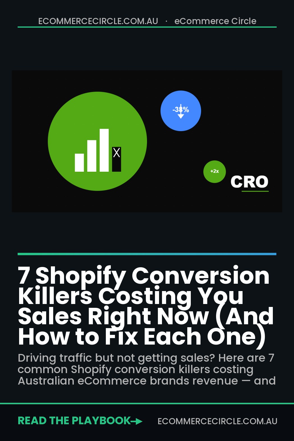
Here are the seven biggest ones — and exactly how to fix each.
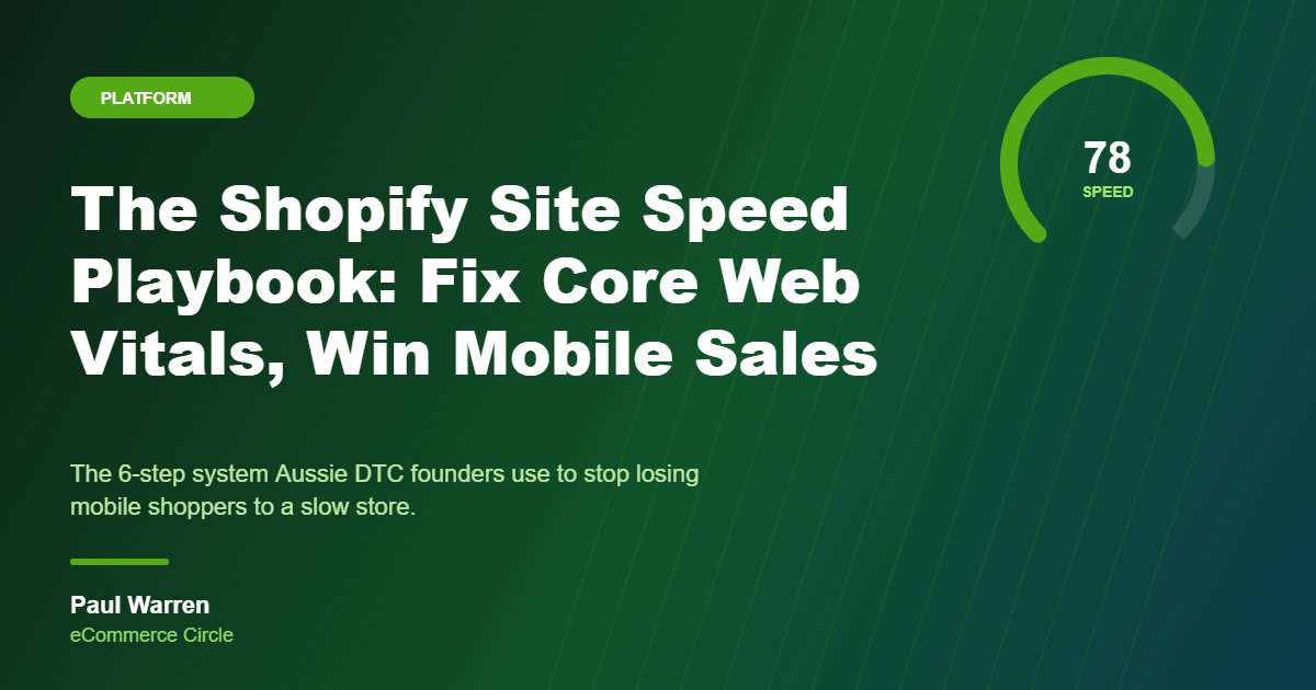
1. Your Site Loads Like It’s on Dial-Up

This is the silent killer.
Every additional second of load time can reduce your conversion rate by up to 7%. And most Shopify stores we audit are loaded with oversized hero images, unused apps running scripts in the background, and bloated theme code.
The worst part? You probably don’t even notice it because you’ve seen your own store a thousand times. But a first-time visitor on a mobile phone in regional Australia? They’re gone in under three seconds.
How to check: Run your store through Google PageSpeed Insights. You’ll get a mobile and desktop performance score out of 100, along with specific recommendations.
Most Shopify stores we see score between 25-45 on mobile. You want to be above 60 at minimum.
How to fix it:
- Compress every image before uploading. Use TinyIMG or Crush.pics — both integrate directly with Shopify.
- Audit your installed apps. Every app adds JavaScript to your theme. If you’re not actively using it, delete it. (Disabling isn’t enough — the code often stays.)
- Enable lazy loading for images below the fold so they only load when the customer scrolls down.
- Switch to a lightweight theme if yours is more than two years old. A conversion-optimised framework like the Store Converter Kit is built for both speed and sales.
Even a 1-second improvement in load time can lift conversions by 5-10%. That’s thousands of dollars per month for most stores.
2. Your Product Page Copy Is a List of Features (Not Benefits)
Here’s what most Shopify product descriptions look like:
“100% organic cotton. Available in S-XXL. Machine washable.”
That’s a spec sheet. Not a sales page.
Your product page is your best salesperson. If the copy doesn’t make someone feel something — if it doesn’t connect the product to a real outcome in their life — they’ll click away.
The fix: Lead with the benefit. Then back it up with the feature.
Instead of “100% organic cotton,” try:
“Soft enough for sensitive skin — made from certified organic cotton that gets softer with every wash.”
See the difference? One tells you what it’s made of. The other tells you how it’ll feel.
A great product description structure looks like this:
- Opening hook: One sentence that speaks to the customer’s desire or pain point.
- The benefit story: 2-3 sentences about the outcome they’ll experience.
- The proof: Materials, certifications, or social proof that back up the claim.
- The specs: Dimensions, ingredients, care instructions — the practical stuff.
This structure works whether you sell skincare, pet products, or premium camping gear.
3. Zero Trust Signals Above the Fold
When a new visitor lands on your product page, they’re silently asking one question:
“Can I trust this brand?”
If your star ratings, reviews, guarantees, and payment badges are buried below the fold — or worse, not on the page at all — you’re losing first-time buyers before they even read your description.
Australians are particularly cautious about buying from brands they haven’t heard of. We see this pattern constantly in our audits.
What to place above the fold on every product page:
- Star rating + review count directly beneath the product title. “4.8 stars from 312 reviews” is one of the most powerful conversion elements you can add.
- A trust bar between the price and the add-to-cart button. Include icons for: free shipping (or your threshold), your return/exchange policy, and secure checkout.
- Payment icons — Afterpay, Zip, Shop Pay, Apple Pay. Showing payment flexibility reduces purchase hesitation, especially on higher-priced items.
One of our Circle members added a simple trust bar with three icons and saw a 12% lift in add-to-cart rate within two weeks. It took 15 minutes to implement.
4. Surprise Costs at Checkout
Cart abandonment in Australia sits around 70%. And the number one reason? Unexpected costs.
A customer adds a $49 product to their cart. They get to checkout and see a $12.95 shipping fee they didn’t know about. Now the product “feels” like $62. That’s a 26% price increase at the worst possible moment in the buying journey.
They leave. And they don’t come back.
How to fix this:
- Be upfront about shipping on your product pages. Either show the cost clearly or offer free shipping above a threshold (e.g., “Free shipping on orders over $75”).
- Add a free shipping progress bar to your cart drawer. “You’re $26 away from free shipping!” is a proven way to both reduce abandonment and increase average order value.
- Enable Shopify’s one-page checkout. Fewer steps = fewer drop-off points.
- Offer express payment options — Shop Pay, Apple Pay, Google Pay, and Afterpay. The fewer fields a customer has to fill in, the more likely they are to complete the purchase.
Pro tip: If your margins support it, bake shipping costs into your product prices and offer “free shipping” across the board. The psychology of free shipping is incredibly powerful — even when customers logically know the cost is built in.
5. No Reason to Buy Right Now
Without urgency, most shoppers will “come back later.”
They won’t.
Studies show that 97% of first-time visitors leave without purchasing. If your product pages feel static — no limited stock indicators, no time-bound offers, no momentum — you’re giving visitors permission to procrastinate.
What works (without being sleazy):
- Show real stock levels when inventory is low: “Only 4 left in stock.” This works because it’s true — and it creates natural urgency.
- Run genuine limited-time offers with countdown timers. But only if the deadline is real. Fake urgency gets spotted instantly and kills trust.
- Display recent purchases: “Sarah from Melbourne just bought this 2 hours ago.” Social proof + urgency in one hit.
- Use seasonal hooks: “Order by Friday for delivery before Easter.” Time-bound relevance gives people a concrete reason to act today.
The key principle here: honest urgency builds trust. Manufactured urgency destroys it. Australian shoppers are savvy — they can smell fake scarcity from a mile away.
6. Your Mobile Experience Is an Afterthought
Over 65% of Australian eCommerce traffic now comes from mobile devices. For some niches — especially fashion, beauty, and food — it’s closer to 80%.
Yet most Shopify stores are still designed desktop-first. The mobile experience is an afterthought: tiny tap targets, product images you can’t zoom properly, and add-to-cart buttons you have to scroll to find.
Do this right now: Open your store on your phone. Go through the entire purchase flow — from homepage to product page to checkout. Time yourself.
If anything frustrates you, it’s frustrating your customers ten times more.
The mobile CRO checklist:
- Sticky add-to-cart button that follows the customer as they scroll. This is non-negotiable in 2026.
- Swipeable product images with pinch-to-zoom. Customers want to inspect your product up close before buying.
- Thumb-friendly navigation. Key actions should be reachable with one thumb. If your menu requires stretching to the top corner of the screen, it’s costing you sales.
- Simplified mobile forms. Auto-detect city from postcode. Use number keyboards for phone fields. Every micro-frustration adds up.
We had one Circle member redesign just their mobile product page layout — sticky add-to-cart, larger images, trust bar moved up — and their mobile conversion rate jumped 18% in the first month.
7. Nothing Happens After “Add to Cart”
Most stores treat the add-to-cart moment as the finish line.
It’s not. It’s the starting gate.
When someone adds a product to their cart, they’ve shown buying intent. This is your highest-leverage moment to increase order value — and most stores completely waste it by redirecting to a blank cart page with nothing but a checkout button.
What to do instead:
- Use a slide-out cart drawer (not a separate cart page). This keeps the customer on the product page and reduces friction.
- Add a “Frequently Bought Together” section inside the cart drawer. If someone adds a face serum, show the matching moisturiser. Keep it to 1-2 relevant suggestions.
- Include a free shipping progress bar. “You’re $31 away from free shipping — add another item?” This consistently increases AOV by 15-25% when implemented well.
- Add a cart note or gift message option. Small touches like this reduce purchase anxiety and make the experience feel premium.
The difference between a $45 average order value and a $62 average order value often comes down to what happens in the 10 seconds after someone clicks “Add to Cart.”
Where to Start
You don’t need to fix all seven at once. In fact, trying to will probably overwhelm you.
Instead, pick the one that resonated most while you were reading this. The one where you thought, “Yeah, that’s definitely us.”
Fix that one this week. Measure the impact over 14 days. Then move to the next.
Small, consistent improvements to your conversion rate compound into serious revenue growth. A store converting at 1.2% instead of 0.8% — on the same traffic — is making 50% more revenue. Without spending an extra cent on ads.
Inside the eCommerce Circle, we use our proprietary Conversion Blueprint — a 600+ point CRO audit — to identify exactly where your Shopify store is leaking sales. We’ve helped over 300 Australian brands plug these gaps and scale with confidence.
If you’re tired of driving traffic that doesn’t convert, we’d love to help.