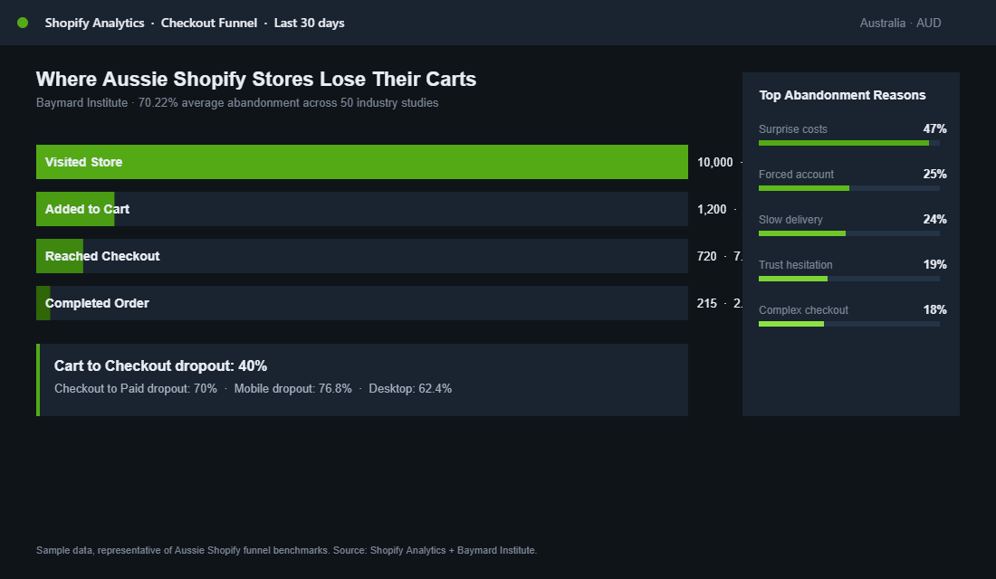
Most Aussie Shopify founders spend their lives obsessing over Meta ROAS and homepage hero design, then quietly leak 70% of their hard-won traffic at the one screen that matters most. The checkout. Baymard Institute pegs the average cart abandonment rate at 70.22% across 50 industry studies, and mobile sits even higher at 76.8%. That is not a “good enough” number. That is a brand-shaped hole in your P&L.
What’s in This Article
The cruel part is that most checkout drop-off has nothing to do with the product, the price, or the brand. It is friction. Surprise costs. Forced account creation. A clumsy mobile form. A trust signal missing at the wrong moment. The shopper was ready to buy, then your checkout gave them a reason to leave.
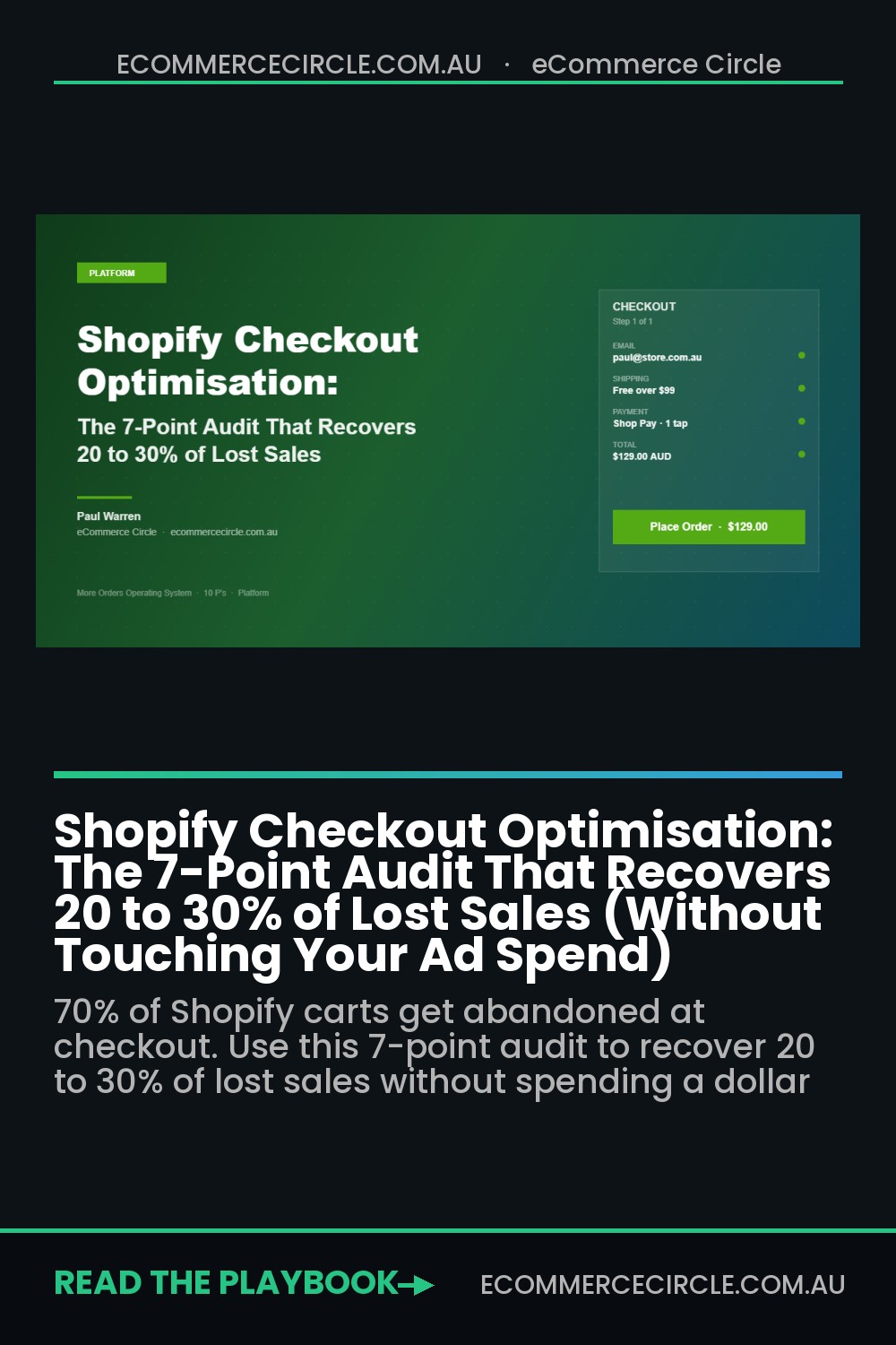
Working with hundreds of Aussie Shopify founders, the pattern is the same. The fastest revenue lift in their business is rarely a new ad creative or a new email flow. It is fixing the seven leaks at checkout. Done properly, this audit recovers 20 to 30% of lost sales without spending another dollar on ads. Here is the playbook.
Why Checkout Optimisation Beats Almost Every Other Lever
Picture two stores. Both do $200k a month. Both have the same traffic and the same ad spend. Store A converts at 1.4% (the Shopify average) with a 70% checkout abandonment rate. Store B converts at 2.1% because it fixed its checkout. Same inputs. Store B does $300k. That is $1.2m a year of pure margin, sitting inside the existing funnel.
The math is even more brutal at scale. The Baymard data shows that 47% of shoppers abandon because of unexpected extra costs (shipping, taxes, fees). Another 25% bail when forced to create an account. 18% leave because the checkout is too complicated. These are not edge cases. These are the top three reasons your customers walk away, and every one of them is fixable inside the Shopify admin.
Before you read the audit, run your own numbers. Check Shopify Analytics for the “Online store conversion rate” funnel: sessions to reached checkout, reached checkout to converted. If that second number is below 50%, you have a checkout problem, not a traffic problem. Spending more on ads is the most expensive way to fix it.
Audit Point 1: Kill the Surprise Cost
If 47% of abandonment is caused by unexpected costs at the final step, the fix is obvious. Stop hiding them. The shopper should know what they are paying for shipping, GST, and any handling fees long before they click “Checkout”.
- Show shipping on the product page. A line like “Free shipping over $99 within Australia. Express available.” resets expectations before the cart even opens.
- Use a shipping calculator in the cart drawer. Apps like Shopify’s native rates or Shipping Bar give a postcode-based estimate before checkout.
- Pre-set a sensible free shipping threshold. For most Aussie brands it sits 30 to 40% above your average order value. We covered the maths in our Shopify free shipping threshold strategy piece.
- Show GST as included. Australian shoppers expect tax-inclusive pricing. If your prices look low and then jump 10% at checkout, you have built your own abandonment trigger.
One Aussie skincare brand we worked with shifted from “shipping calculated at checkout” to a clear “$10 flat shipping, free over $80” banner on the product page. Checkout conversion lifted 14% in 21 days. No ad spend involved. Just honesty earlier in the journey.
Audit Point 2: Enable Guest Checkout and Stack Express Payments
25% of shoppers walk when you force them to create an account. The fix is a 30-second toggle. In Shopify admin, go to Settings, Checkout, and set “Customer accounts” to “Optional” or use the new “Accounts are optional with a one-click sign-in” setting. Guest checkout should be the default, not a hidden option.
Then layer your express payment buttons properly. Enabling Shop Pay, Apple Pay, Google Pay, and PayPal as accelerated options can lift checkout conversion by up to 19% according to Shopify’s own data. The mechanic is simple. A returning shopper with Shop Pay completes checkout in 4 seconds. A new shopper using Apple Pay never touches a form. You have eliminated the typing, the address autofill, the card entry, and the trust hesitation in one move.
- Order matters. Put Shop Pay first on Australian stores, since it has the highest local penetration. Apple Pay second on mobile-heavy stores.
- Do not over-stack. Three or four express options is plenty. Six creates choice paralysis.
- Check the dynamic checkout buttons setting on each product. If you have disabled it on the product page, customers cannot use express payment to skip the cart.
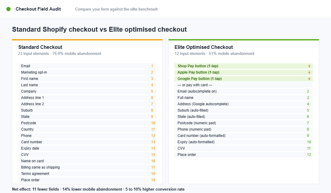
Audit Point 3: Slash Form Fields and Use Smart Validation
The average Shopify checkout asks the shopper to fill in or confirm 23 separate elements. Email, first name, last name, company, address line 1, address line 2, suburb, state, postcode, country, phone, card number, expiry, CVV, name on card. Then a marketing checkbox. Then a terms checkbox. By field 15 the shopper has had enough.
Top-performing checkouts cut this to 12 to 14 fields by doing three things well:
- Address autocomplete. Use Shopify’s native Google address autocomplete (on by default for Shopify Plus, available via apps like Address AutoComplete for Standard plans). Typing “12 Bourke” should auto-fill the rest.
- Inline validation, not page-level errors. The “your postcode does not match your suburb” message should appear next to the field, the moment the user moves on, not after a failed submit.
- Hide the company field by default. Most B2C brands do not need it. In Shopify admin, set the “Company name” field to “Hidden” under Checkout customisation.
If you are on Shopify Plus, Checkout Extensibility gives you the ability to add custom UI extensions or apply Functions logic without touching legacy checkout.liquid code. For Standard merchants, the native checkout customiser inside Settings, Checkout now offers 90% of the layout, branding, and field control you need. The era of “you can’t change anything below the cart button” is over.
Audit Point 4: Trust Signals at the Right Moment
19% of abandoners say they did not trust the site with their card details. That is a trust failure, not a product failure. The fix is to put trust signals exactly where the hesitation happens, which is the payment step.
- Security badges. A small “Secure SSL checkout” lock icon next to the payment fields. Native Shopify checkout shows this by default. Make sure your custom theme has not stripped it.
- Money-back guarantee on the order summary. “30-day money-back guarantee, no questions asked” placed in the right-hand summary rail works harder than the same line buried in your FAQ.
- Star rating reinforcement. If you have 4.8 stars from 2,000+ reviews, show that number on the checkout, not just the product page. Reviews are most persuasive when the wallet is open.
- Shipping reassurance. “Ships from Sydney in 1 business day. Tracked and insured.” Three short benefit phrases beat one paragraph.
One Aussie homewares brand added a single line of social proof to their checkout: “Trusted by 47,000+ Australian homes”. Conversion lifted 7%. The line was already true. It just had not been visible at the moment the shopper needed reassurance.
Audit Point 5: Design Mobile-First or Stop Bothering
Mobile sits at 76.8% checkout abandonment, while desktop sits at 62.4%. The gap is enormous, and yet most Shopify themes are still designed desktop-first with mobile retrofitted. If 70% of your traffic is on a phone, that is backwards.
- Use the one-page checkout layout. Shopify’s “One-page checkout” (rolled out across all stores by mid-2024) collapses the old three-step flow into a single scroll. Adoption typically lifts mobile completion by 5 to 8%.
- Test thumb reach. The “Place order” button must sit in the bottom third of the screen on iPhone, where the thumb actually lives. If you have to stretch, you lose conversions.
- Show the keyboard the right type. Email field should trigger the email keyboard. Phone field should trigger the number pad. Postcode field should trigger numeric. This is a one-line input type fix in Liquid that most themes get wrong.
- Audit on a real device, not Chrome DevTools. Emulators lie. Pick up an iPhone 13 or a mid-range Samsung and try to buy from your own store. If it is annoying, fix it today.
If your cart drawer is doing the heavy lifting before the checkout step, the same mobile rules apply. The cart drawer optimisation framework covers what to include and what to ruthlessly remove.
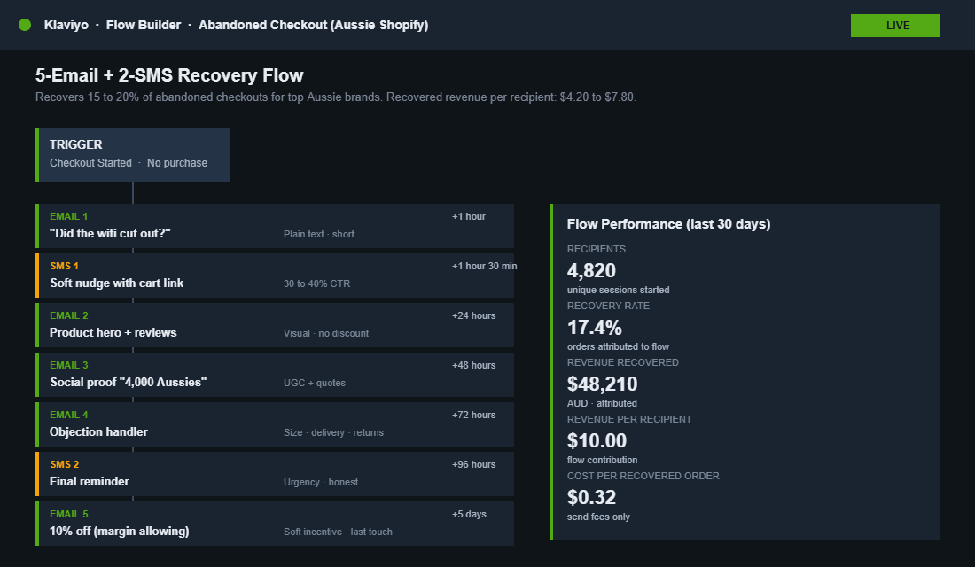
Audit Point 6: Recover Abandoned Checkouts with a 5-Email Klaviyo Flow
Even with a world-class checkout you will still lose 50 to 60% of shoppers who reach it. The good news is that abandoned checkout flows recover 10 to 15% of those lost orders when set up properly. Elite Aussie brands push 15 to 20%. At your average order value, that is six figures a year sitting inside Klaviyo waiting to be claimed.
The flow we run with members looks like this:
- Email 1, 1 hour after abandonment. Plain text. Subject: “Did the wifi cut out?” One paragraph, one link back to the cart.
- Email 2, 24 hours later. Visual. Hero image of the product, reviews block, free shipping reminder if relevant. No discount yet.
- Email 3, 48 hours later. Social proof. “Here is why 4,000 other Aussies grabbed this.” User-generated photos and a few quote-style reviews.
- Email 4, 72 hours later. Objection handler. Address the 3 most common reasons people hesitate on this product. Size, fit, delivery time, returns.
- Email 5, 5 days later. Soft incentive if your margins allow. 10% off or a bonus add-on. Only if the previous four did not convert.
Two non-obvious wins. First, make sure your Klaviyo deliverability is clean, or none of this matters. Second, layer SMS into the same flow at the 1-hour and 24-hour marks. SMS sees 30 to 40% click-through, where email sits at 4 to 6%.
Audit Point 7: Migrate to Checkout Extensibility Before the Deadline
If you are still on the legacy checkout.liquid system, you are working against a hard clock. Shopify deprecated checkout.liquid for Plus stores in August 2025 and Standard stores follow in August 2026. Shopify Scripts shut down June 30, 2026. After those dates, your custom checkout code stops running, your discount logic breaks, and your branding falls back to defaults.
The new Checkout Extensibility framework is not just a forced migration. It is faster, more secure, and a lot more flexible. You get native checkout UI extensions, branded fonts and colours via the Branding API, Shopify Functions for shipping and discount logic, and a checkout that is hosted on Shopify’s own infrastructure. Page weight drops, conversion goes up, and you stop maintaining brittle Liquid hacks.
- Audit your current checkout.liquid. Any custom code, third-party app injection, or Script Editor logic needs a migration plan.
- Pick a migration partner if your build is non-trivial. Custom B2B logic, multi-currency rules, and tier-based discounts all need rework.
- Test the new branding controls. Most brands underestimate how much customisation is available. Logo, colour palette, fonts, and order-summary layout are all now native settings.
The Compound Effect: Why 7 Small Wins Beat One Big Bet
Run the numbers on this audit. Surprise-cost transparency lifts checkout conversion 5 to 10%. Guest checkout plus express payments adds another 10 to 15%. Form field reduction adds 3 to 5%. Trust signals add 2 to 5%. Mobile-first design adds 5 to 10%. A 5-email recovery flow recovers 10 to 15% of the remainder.
Stack those together and you are not chasing one big breakthrough. You are compounding seven independent wins that each take less than a day to ship. A store doing $200k a month becomes a store doing $260 to $280k. The math holds at $50k and at $1m.
This is also why checkout work outperforms ad spend on a return basis. A 20% lift in checkout conversion is a 20% lift on every channel feeding the funnel. It is a multiplier across Meta, Google, organic, email, and direct traffic at the same time. There is no other lever in Shopify that does that.
Your Next 7 Days
You do not need to fix all seven audit points at once. Pick the leak you can confirm in the data. Open Shopify Analytics, look at your reached-checkout to converted ratio, and start with the audit point that maps to it. If checkout-to-paid is under 50%, start with surprise costs and guest checkout. If mobile is dragging the whole funnel down, start with the mobile-first audit.
The brands that win in 2026 are not the ones with the cleverest creative or the biggest budget. They are the ones who treat checkout as the highest-value real estate in the store. It is the one place your shopper is actively trying to give you money. Do not give them a reason to walk away.
Inside eCommerce Circle, checkout optimisation is one of the core pillars we work on with every member. If you want a second opinion on yours, let’s talk.
���