Your revenue has been flat for three quarters. Traffic is holding, the ads are still running, and every month the story in the team meeting gets a little more comfortable: “we’ve probably maxed out Australia.”
What’s in This Article
It is the most expensive sentence in Australian ecommerce. Because if you believe it, you stop fixing the funnel and start funding an expansion. New market, new warehouse, new currency, new problems. And if the ceiling was never real, you have just doubled the cost of a conversion problem you could have fixed in a quarter.
Here is the awkward part. Australians spent a record 82.6 billion dollars online in 2025, up 14% year on year, across 9.8 million households. That is not a market running out of room. If your growth stalled while the market grew 14%, the ceiling is almost certainly yours, not the country’s.
The five tests below take about 30 minutes with your Shopify reports, a free Google Trends tab and a calculator. They tell you which of four problems you actually have, so you spend the next quarter fixing the right one.
Why “We’ve Maxed Out Australia” Is a Story, Not a Number
Every founder who says it means the same thing: growth got harder, so the market must be full. But “harder” and “full” are different diagnoses with completely different price tags.
Harder is usually cost. Australia is a Tier 1 advertising market with a small, expensive audience, and Meta CPMs here have lifted roughly 20% year on year to about 21.50 dollars, with average CPC around 1.47 dollars. Your acquisition got 20% more expensive without a single thing changing about demand. That feels identical to saturation from inside the P&L, and it is not the same thing at all.
Full is penetration. Full means the people who would ever buy your product have already bought it, and the ones left cost more than they are worth. Almost no Australian brand under 20 million dollars a year is actually there. Most are three postcodes and one channel deep in a category with millions of buyers.
The diagnostic below forces the argument out of opinion and into numbers. Run all five tests before you spend a dollar on a new market.
Test 1: Size the Market You Can Actually Serve
Forget total addressable market. TAM is a fundraising number. You want serviceable market: households in Australia who buy your category, can afford your price, and can receive your product at a shipping cost that leaves you a profit.
Build it from the top down in four lines. Australia has roughly 11 million households and a population of about 27.2 million. Then narrow it:
- Start with households, not people. Most DTC purchases are household purchases. 11 million is your ceiling of ceilings.
- Apply category incidence. What share of households buy your category in a year? Bed linen might be 25%. Premium dog supplements might be 4%. Use your own survey data, or the honest low end of a range.
- Apply the price filter. If you sit in the top quartile of category pricing, you are not selling to every category buyer. Cut to the share of households with the income to buy at your price point.
- Apply the delivery filter. If a 12kg parcel to Darwin costs you 42 dollars, remote Australia is not in your serviceable market at current pricing. Cut it out honestly.
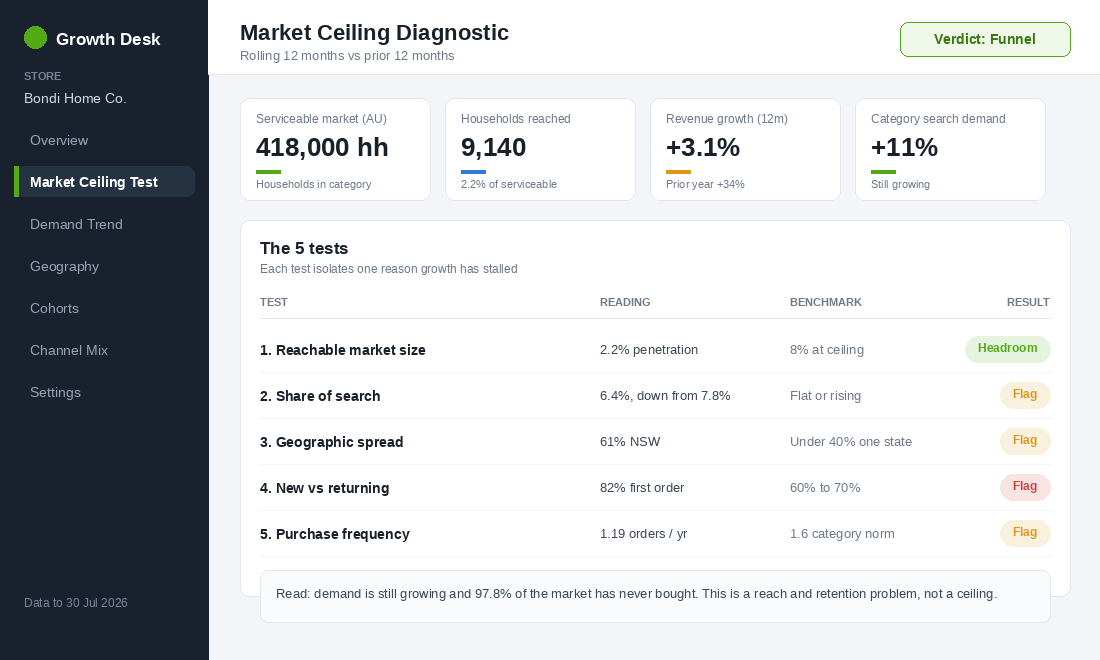
Now divide your unique customers from the last 24 months by that number. That is your penetration. In the dashboard above, the store has reached 9,140 households out of 418,000 serviceable, which is 2.2%. Nobody is capped at 2.2%.
As a rough guide from the stores we work with: under 5% penetration means you have a reach problem, 5% to 15% means you are a real contender and growth needs sharper positioning, and above 20% of a genuinely narrow serviceable market is the only place a ceiling argument starts to hold water.
One caution on the market data you will read online. Australia Post puts online at 24% of retail spend in its category set, while ABS retail trade figures put online at about 12.7% of all retail turnover as at June 2025, up from 6.3% in 2019. Both are right. They count different baskets. Pick one definition, write it down, and never mix them in the same model.
Test 2: Share of Search, the Leading Indicator Most Aussie Brands Ignore
Penetration tells you how much room exists. Share of search tells you whether you are still taking your slice of it, and it moves before your revenue does.
The method comes from Les Binet’s work presented at the IPA’s EffWorks conference: share of search behaves as a predictive measure of market share. Later analysis across 30 case studies in 12 categories found share of search accounted for around 83% of a brand’s market share, and in some categories it moved up to 12 months ahead of it. For a Shopify founder that is a free early warning system.
Here is the exact build in Google Trends, which is free and goes back to 2004:
- Open Google Trends and set the region to Australia and the window to the past five years.
- Enter your brand name as the first search term. Add your four largest competitors as the remaining terms.
- Download the CSV. Each row is a week, each column is one brand’s relative interest.
- In your spreadsheet, add a column for the row total, then calculate your brand’s value divided by that total. That percentage is your share of search.
- Chart it monthly against your revenue growth rate. Then chart the row total on its own, because that line is category demand.
Two lines, three possible readings. Category total rising while your share falls means competitors are taking your demand, which is a brand and offer problem. Category total falling while your share holds means the category is contracting and you are defending well. Both falling is the only combination that supports a genuine market story, and it is rare.
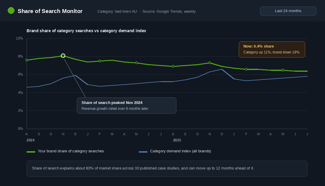
Add one more layer with Google Ads Keyword Planner. Set the location to Australia, enter your top 20 category keywords, and read the 12 month trend. If searches for “linen sheet set” are up and your branded searches are flat, demand is walking past your store to someone else’s. That is a positioning fix, not an expansion project.
Test 3: The Penetration Map, Because Most “National” Brands Are Two Cities Deep
This is the test that most often ends the ceiling conversation on the spot. Export your customers from Shopify with their shipping state and postcode, then compare each state’s share of your customers with its share of Australian households.
NSW is roughly a third of Australian households and Victoria about a quarter. Queensland is a fifth. If 83% of your customers sit in NSW and Victoria, you are not a national brand that has run out of room. You are a two city brand with Queensland, WA and SA completely untouched.
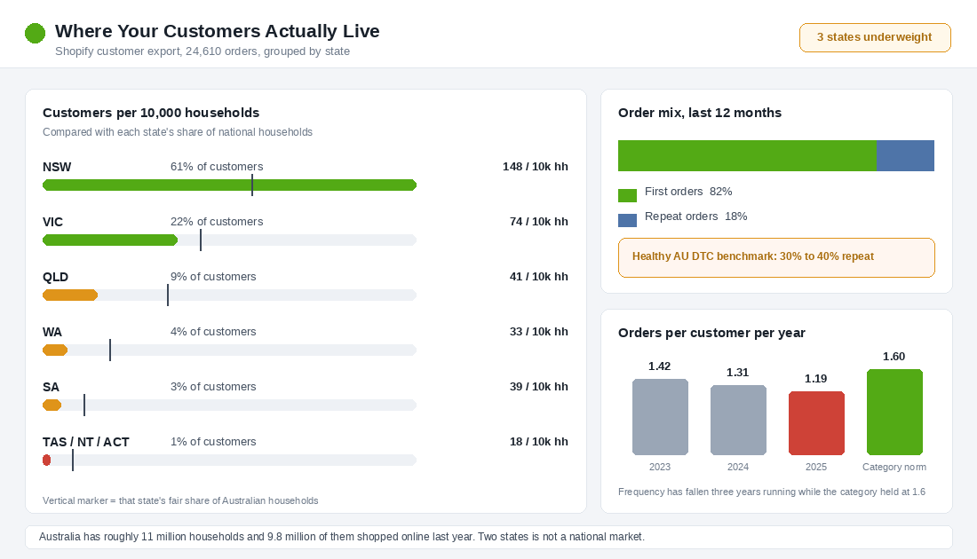
Work the gap deliberately rather than hoping broad targeting fixes it:
- Check delivery speed by state first. If Perth is a five day promise and Sydney is two, your WA conversion rate is a shipping problem wearing a demand costume.
- Run state level campaigns with local creative. Queensland summer is not Melbourne summer. Same product, different hook, different hero image.
- Check your own search data. If Brisbane traffic converts below the site average, look at the landing page and the shipping table before you blame the market.
- Look at pickup and stockist gaps. Sometimes the fastest way into a new state is one good retail partner who already has the foot traffic.
Test 4: New Versus Returning, the Ceiling That Is Really a Leak
Now split your last 12 months of orders into first orders and repeat orders. A healthy Australian DTC store in a repeatable category runs 30% to 40% of orders from returning customers. If you are at 18%, you do not have a market ceiling. You have a bucket with a hole in it.
The maths is brutal and worth doing on the back of an envelope. At 18% repeat you need to buy almost every dollar of revenue. Lift repeat orders to 32% and you have added roughly 17% more revenue on the same acquisition spend, which is the same profit effect as cutting your CPM by a fifth. One of those you control.
This is also where the Australia Post data gets uncomfortable. Households now shop across an average of 16 brands a year, and average baskets are about 10 dollars smaller than they were in 2020. Your customers are not leaving the category. They are spreading their spend across more stores in smaller chunks, and the brands winning that fight are the ones with a reason to come back inside 90 days. Our 90 day cohort framework is the fastest way to see whether your second order window is closing or widening.
Test 5: The Frequency Test, or How Often They Should Be Buying
Test 4 asks whether they come back. Test 5 asks whether they come back often enough. Divide total orders by unique customers for each of the last three years. You want the trend, not the number.
Then set the number against a consumption reality check. If your protein powder lasts 30 days and your average customer buys 1.4 times a year, they are buying from someone else for the other ten months. If your candles burn for six weeks and frequency is 1.2, same story. The category norm is not a benchmark you look up, it is a calculation from your own product’s usage cycle.
When frequency falls three years running while the category holds, the problem is almost always one of four things: no replenishment trigger, no reason to buy the second product in the range, price so high the purchase becomes considered, or a post purchase experience that gave nobody a reason to remember you.
Reading the Scorecard: Four Verdicts
Line up the five results and you land on one of four verdicts. This is the whole point of the exercise, because each verdict points at a different quarter of work.
- Funnel problem. Low penetration, stable share of search, weak repeat rate. Demand exists and you are not converting or keeping it. Fix conversion and retention. This is where most stores land.
- Brand problem. Low penetration, falling share of search, category demand growing. People are searching for the category and typing a competitor’s name. Fix positioning, creative and price perception.
- Geography or channel problem. Decent penetration in two states, almost nothing elsewhere, healthy repeat rate. The model works. It just has not travelled. Fix distribution before you touch the product.
- Real ceiling. High penetration of a genuinely narrow serviceable market, category demand flat or falling, healthy repeat and frequency. You are running out of Australians who want this. Now, and only now, expansion is the right conversation.
If the Ceiling Is Real, You Have Three Moves
Say the tests come back honest and you are genuinely near the top of your market. There are three ways out, and the order you attempt them matters.
Move one: sell the same product to a new country. Melbourne’s Who Gives A Crap is the clean Australian example. The brand launched into the US and UK and now runs those markets and Australia at roughly a third of revenue each, using separate Shopify stores per region rather than bolting everything onto one storefront, as documented in Shopify’s own case study. Same product, three markets, one ceiling problem solved three times over. If this is your path, work through the Shopify Markets expansion sequence before you spend on the first international ad.
Move two: sell more to the same customer. Koala started as a mattress brand in 2015, added sofas in 2018, and now sells beds, seating, storage, kids furniture and homewares. Group revenue hit 276.3 million dollars in FY25, up 42% on the prior year. The mattress market did not get bigger. Koala got wider inside the same customer’s house. Our five filter test for a second product line exists so this move is a decision, not a hunch.
Move three: sell the same product through a new channel. Wholesale, marketplaces, retail, corporate. Who Gives A Crap’s growth in the UK came alongside listings with Waitrose and Ocado, and in the US with Whole Foods and Erewhon. Retail did not cannibalise the DTC business, it reached the households that were never going to buy toilet paper from an Instagram ad.
Attempt them in cost order. Channel is usually cheapest, range is next, and a new country is the most expensive because it multiplies your operational surface area before it multiplies your revenue.
How the Five Tests Compound
Run individually, these are five interesting numbers. Run together, they form a growth model you can defend in front of your accountant.
Penetration sets the size of the prize. Share of search tells you whether you are winning or losing your slice of it. The penetration map tells you where the untouched prize sits. Repeat rate and frequency tell you how much each new customer is worth once you get them, which sets what you can afford to pay for the next one.
Work an example. A store at 2.2% penetration, 18% repeat and 1.19 orders per customer per year has three levers, not one. Lift repeat to 32%, push frequency to 1.5, and open two underweight states, and you have not found a new market. You have roughly doubled the business inside the one you already have, with acquisition spend held flat. That is the compounding that expansion budgets get spent chasing while it sits unclaimed at home.
And when the numbers do eventually say the ceiling is real, you will go into expansion with a repeat rate and a frequency number that make the new market profitable instead of exporting a leaky funnel to a harder country.
Proving the Ceiling Moved: The Three Numbers to Watch After You Act
Diagnosis is only half the job. Once you pick your move, you need to know within a quarter whether it worked, because the failure mode here is spending twelve months on an international launch that was never going to clear the ceiling.
Number one: share of search, measured monthly. Your branded search volume divided by total category search volume in your market. It is the closest thing ecommerce has to a leading indicator, and it typically moves 3 to 6 months ahead of revenue. Pull it from Google Trends for direction and Google Keyword Planner or Ahrefs for absolute volume. If you have made a genuine brand move and share of search is flat two quarters later, the money went somewhere that was not demand creation.
Number two: penetration in your weakest strong market. Not national numbers, which hide everything. Take the state or metro where you rank third and track orders per 10,000 population quarterly. Most Aussie brands that believe they are national are really two cities deep, and going from 8 orders per 10,000 in Perth to 14 is a bigger revenue event than a 5% conversion lift nationally. Shopify’s customer report grouped by shipping region gives you the raw numbers in about ten minutes.
Number three: first-purchase cohort size, not total revenue. New customers acquired per month, tracked as a 3-month rolling average to smooth out promotional spikes. Revenue can hold flat while your new-customer count quietly falls 20%, which is a ceiling forming under a returning-customer cushion. By the time revenue reflects it, you have lost two quarters. GA4 and Shopify’s cohort view both surface this, and it belongs on your dashboard permanently.
The 90-Day Read
- Share of search up, new cohorts up. The move is working. Keep funding it for another two quarters before you judge the revenue line.
- Share of search up, cohorts flat. Demand is being created and lost. Your problem moved from market to funnel, so switch projects.
- Both flat. Either the move was too small to register, or you diagnosed the wrong constraint. Re-run the five tests before spending more.
- Penetration up in one region only. You have found a repeatable play. Copy it into the next region rather than inventing a new one.
Put these three on the same page you already check every week rather than in a separate deck nobody opens. The weekly scorecard is the right home for them. And if the verdict came back “funnel” rather than “ceiling”, run an incrementality test before you scale spend, because a ceiling and inefficient media look identical on a blended ROAS report.
The 30 Minute Market Ceiling Audit
Block out half an hour this week and work through it in this order. Write the answer next to each line so the whole thing fits on one page.
- Serviceable market. Households, times category incidence, times price filter, times delivery filter. One number.
- Penetration. Unique customers in 24 months divided by that number. Under 5% ends the ceiling debate immediately.
- Share of search. Google Trends, five years, Australia, you plus four competitors. Your share now versus 24 months ago.
- Category demand. The total of those same search lines. Rising, flat or falling.
- State spread. Percentage of customers by state versus that state’s share of households. Flag anything under half its fair share.
- Repeat rate. Returning orders as a percentage of total orders, last 12 months. Target 30% to 40%.
- Frequency. Orders divided by unique customers for each of the last three years, against your product’s usage cycle.
- Verdict. Funnel, brand, geography or ceiling. Then pick the one project that matches it and do nothing else for a quarter.
The founders who grow through a flat patch are rarely the ones with the best ads. They are the ones who diagnosed the flat patch correctly while everyone else was guessing.
Inside eCommerce Circle, working out whether the ceiling is real is one of the first things we do with every member, because it decides what the next 12 months get spent on. If you want a second opinion on your numbers, let’s talk.