Here is the metric most Aussie Shopify founders track to “measure” their customer value, and here is why it is quietly lying to them. They take the average order value, multiply it by the repeat purchase rate, multiply that by gross margin, and call the result LTV. The number looks confident on a slide. It is also wrong by 40 to 70% almost every time.
What’s in This Article
The problem is averaging. A $90 AOV is the mean of a customer who spent $30 once and a customer who spent $150 four times. A 27% repeat purchase rate is the average across customers acquired through Meta cold ads at 40% off and customers acquired through referral at full price. Those two buyers behave like different species, and when you blend them you get a number that describes nobody.
This is what cohort analysis fixes. Instead of asking “what is the average customer worth?” you ask “what is the customer acquired in March 2026, through Meta, with a 20% discount, worth at day 90 and day 365?” The answer is a curve, not a single number. Once you can read that curve, you can spend $20K more on the cohorts that pay back and $20K less on the ones that do not. That single shift is the difference between a brand that scales profitably and a brand that hits $2M and stalls.
What a Cohort Actually Is (And Why “Repeat Rate” Hides the Truth)
A cohort is a group of customers who share a starting event. In ecommerce, the most useful starting event is “first purchase in month X”. Every customer who made their first order in March 2026 is in the March cohort, and you track that group forever.
You watch how many of them order again in month two, month three, all the way out to month 24. That curve is the truth about your business.
Here are the benchmarks worth burning into your brain. Across 156,000 DTC stores measured by Bsandco, the average repeat purchase rate sits at 18.8%. On Shopify specifically the median is closer to 27%.
Top quartile DTC brands hit 40% or higher. The category split matters more than most founders realise: consumables (supplements, skincare, food) typically run 35 to 50%, fashion sits at 20 to 30%, beauty hits 30 to 45%, and luxury jewellery collapses to under 10%.
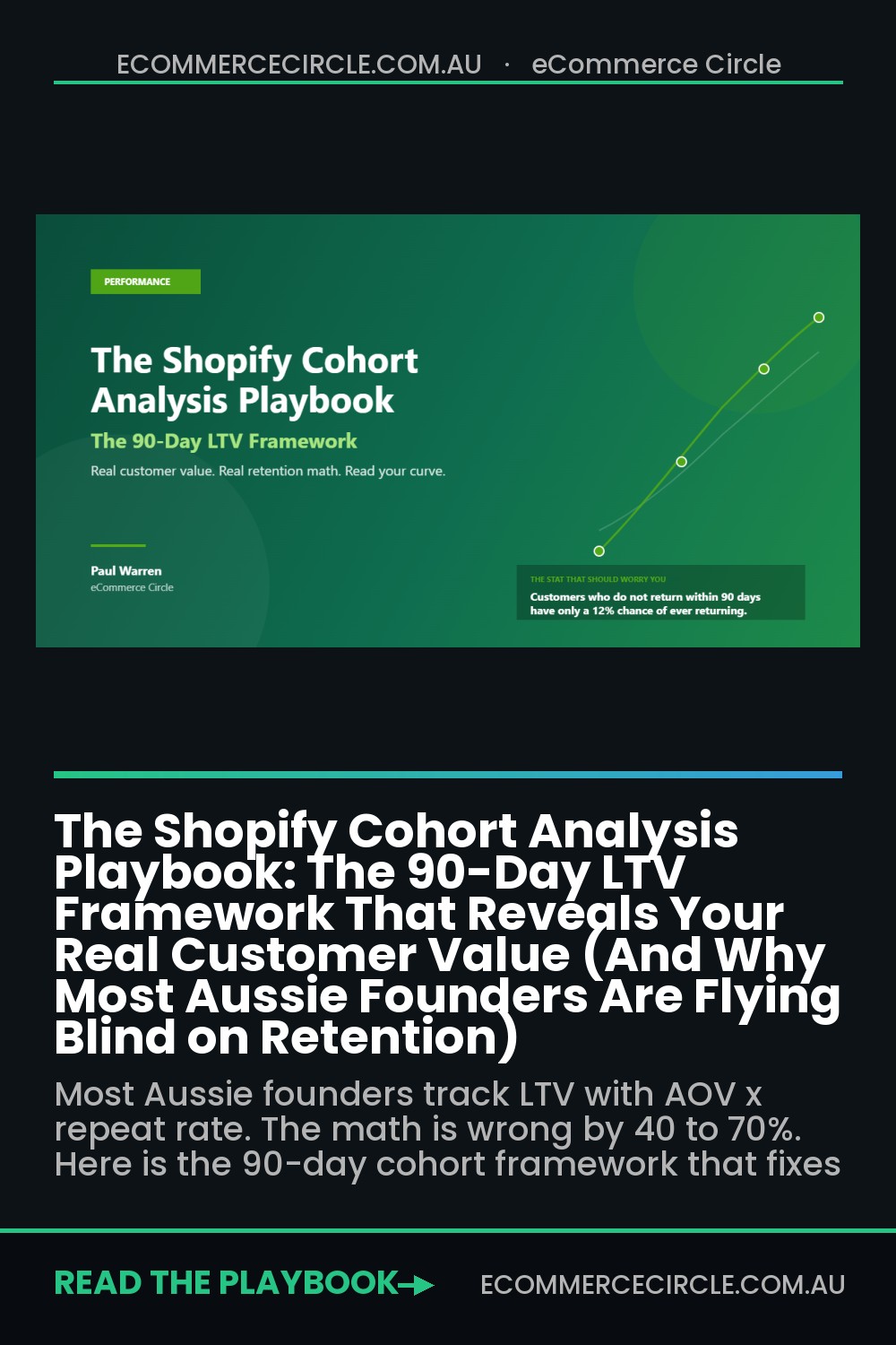
Here is the metric that should genuinely terrify you if you are not measuring it. Customers who do not return within 90 days have only a 12% chance of ever returning. Of the customers who do reorder, 50% do it within 30 days and 76% do it within 90. Your retention battle is won or lost in the first quarter after the first order, and a blended annual repeat rate cannot show you that window.
Cohort analysis exposes the window. It also exposes which acquisition channels lie to you. A Meta campaign can look like a hero at the click level (low CPA, high ROAS in week one) and a villain at the cohort level (those customers churn at day 60 and never come back). You need both views to make a real decision.
The 4 Cohort Views Every Shopify Founder Needs (Not Just the Default One)
Most Shopify founders who do cohort analysis stop at the acquisition-month view. That is the entry point. The real value sits in three other slices that almost nobody runs. Here are the four cuts to set up in your reporting tool of choice, in order of how much money each one will save you.
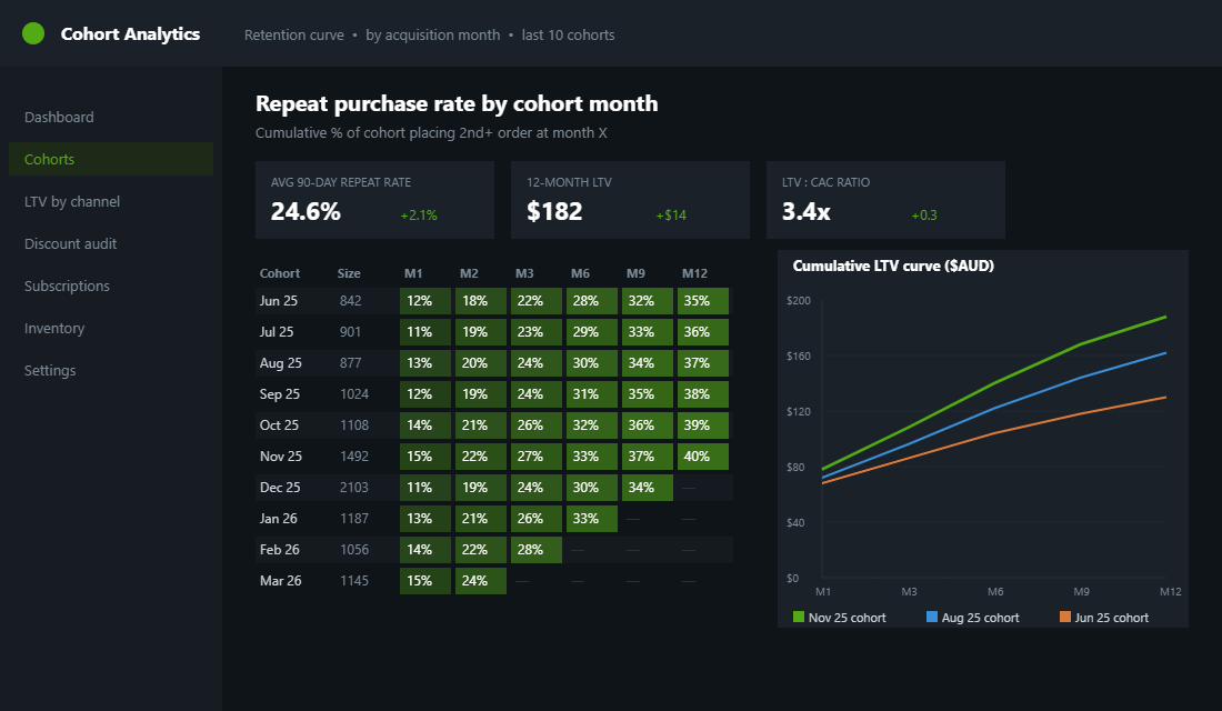
- 1. Cohort by acquisition month. The baseline. Did this month’s cohort start hotter or colder than last month’s? Are repeat curves bending up or down across cohorts? This tells you whether your overall business is getting healthier, regardless of new-customer revenue noise.
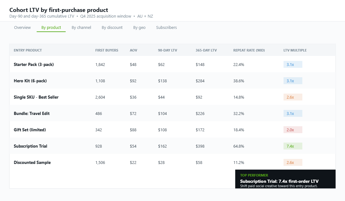
- 2. Cohort by first-purchase product. Which entry product produces the highest LTV at day 90, 180, and 365? If you sell a $40 starter pack and a $90 hero kit, the starter pack might look cheaper but the hero kit cohort often pays back 2 to 3 times more over 12 months. This determines what product you should be running ads to.
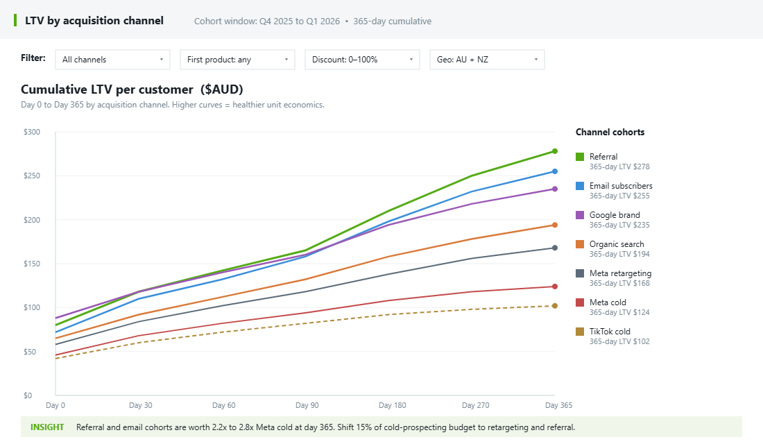
- 3. Cohort by acquisition channel. Meta cold, Meta retargeting, Google brand, Google non-brand, TikTok, organic, referral, email. Each channel produces a different LTV curve. Referred customers spend 11% more on the first order and have roughly 2x the lifetime value of paid-acquired customers, but if you only watch CAC you would never see that.
- 4. Cohort by discount level at first purchase. Customers who buy at 0% off versus 10% off versus 20% off versus 30% off. The 30%-off cohort almost always reorders at lower rates and lower AOV. This is the single most ignored cut in DTC and the easiest one to act on. It is also the math behind every “stop running sitewide sales” argument worth listening to.
You do not need all four on day one. Start with cohort by acquisition month for two months to see your baseline, then add discount level next, then channel, then first product. Each new cut you can read will change at least one spend decision you are making.
The 90-Day LTV Formula (The Math That Replaces “AOV x Repeat Rate”)
Here is the cohort-based LTV calculation you should be running, monthly, for every acquisition cohort. It looks intimidating the first time you see it. It takes about twenty minutes to set up in a spreadsheet and then it runs itself.
For a single cohort acquired in month M, the cumulative revenue at day N is the sum of every order placed by every customer in that cohort between day 0 and day N, divided by the cohort size. So if your March cohort had 1,000 first-time buyers, and across those 1,000 customers there were 1,000 first orders totalling $90,000, plus 180 second orders totalling $20,000, plus 50 third orders totalling $6,000 by day 90, your day-90 cumulative LTV for that cohort is $116,000 divided by 1,000, or $116.
That $116 is now comparable across cohorts. If your April cohort is at $128 by day 90, you are getting healthier. If it is at $98, something has broken.
Either you ran a deeper discount, attracted a colder audience, or shifted your product mix toward weaker repeat performers. Cohort math tells you the direction. Your channel and discount cuts tell you the cause.
One thing to apply once you have the revenue curve. Multiply by your gross margin (typically 55 to 75% for consumer brands, 35 to 50% for apparel) to get cumulative gross profit per customer. Subtract your blended CAC.
That number tells you whether each cohort is actually profitable, not just “earning revenue”. A cohort doing $116 in 90-day revenue at 60% margin minus a $42 CAC is contributing $27.60 per customer, before fulfillment and overhead. That is your real unit economics.
Shopify research published in 2026 puts the ideal LTV-to-CAC ratio at 3:1. Average DTC platform CAC sits in the $68 to $78 USD range, and Australian DTC brands typically run 20 to 35% higher acquisition costs than their US equivalents. Run your cohorts. If your 12-month LTV is not at least 3x your CAC for your largest acquisition channel, you have a unit economics problem dressed up as a growth story.
Reading the Curve: What Good, Bad, and Great Cohorts Look Like
Once you have your cohort table built, you need to know how to read it. Here is the simple visual taxonomy. Print this and stick it above your desk.
The healthy curve. Each cohort row starts at 100% and decays, but the decay is slow and the curve bends upward over time as repeat purchases accumulate. By month 12, cumulative LTV has roughly doubled the first-purchase value. Cohorts get progressively better the further down the table you read, meaning your March cohort outperforms your January cohort at the same age. This is the curve of a brand getting better at acquisition and retention simultaneously.
The flat curve. Cohorts decay quickly through months 1 to 3, then plateau with almost no repeat purchases beyond month 6. Cumulative LTV barely moves past the first-purchase value. This is a transactional brand.
You are acquiring customers, not building a customer base. Either your product does not justify a second purchase, your post-purchase experience is broken, or your category genuinely is one-and-done (fine for some products, fatal pricing for most).
The smile curve. Cohorts dip in months 2 to 4, then start reordering at higher rates in months 6 to 12, often driven by replenishment cycles. Total LTV at month 12 is 2.5 to 4 times the first-purchase value. This is the dream for consumables, beauty, supplements, and pet brands. If you sell a product with a natural replenishment window, you should be aiming for this shape.
The deteriorating curve. Each new cohort is weaker than the one before it at the same age. This is the warning sign no founder wants to see. Either your acquisition quality is dropping (you are scaling into colder audiences with higher discounts) or your product and experience are getting worse.
Both are fixable. Both require you to see the cohort table to even notice.
The 3 Levers You Can Actually Pull (Not All Cohorts Are Created Equal)
Once you can read your cohort table, you have three levers. Almost every retention initiative in ecommerce is some variation of these. Pick the lever your cohorts say is broken, not the one a podcast told you to fix.
- Lever 1: Improve acquisition quality. If your cohort by channel shows that paid social cohorts pay back at 1.4x while referred cohorts pay back at 3.2x, the problem is not retention. It is that you are buying the wrong customers. Action: shift more spend toward retargeting, branded search, and referral. Pull back the bottom 20% of cold prospecting audiences. Raise the floor on the discount you offer first-time buyers. Every 5% improvement in retention rate lifts LTV by 25 to 30%, but every 10% improvement in acquisition quality lifts the entire curve from day 1.
- Lever 2: Win the second purchase. 50% of repeat purchasers buy again within 30 days. 76% within 90. If your day-90 repeat rate is sitting under 25%, the bleed is happening in the first three months. Action: invest in your post-purchase email flow, a thank-you series, an education sequence, a smart cross-sell at day 14, a replenishment reminder at day 30 to 45 depending on category. See our welcome flow playbook for the exact email architecture that lifts second-purchase rates 15 to 25%.
- Lever 3: Compound the loyal cohort. The customers who do return repeatedly are worth disproportionately more. Loyalty participants make 67% more purchases, show 2.5x higher repeat rates, and generate 115% more revenue per customer than non-participants. Action: identify your top 10% by order frequency and revenue, then build a dedicated retention program around them. Our top 10% customer strategy covers the segmentation logic and the four campaigns that move the needle.
One critical caveat. Do not pull all three levers at once. Pick the one your cohort table flags as the biggest leak, run one quarter of focused work on it, then re-read the table.
If your cohorts shift, you have proof. If they do not, you misread the diagnosis. This is why running a structured funnel audit before you act matters: it stops you from spending a quarter optimising the wrong thing.
How Who Gives A Crap Built a Subscription Empire Using Cohort Data
Who Gives A Crap, the Melbourne-founded toilet paper brand, treats cohort analysis as a core operating discipline. Their team analyses every acquisition cohort separately, watching what they call “Percent of Customers Reordering” by month. The metric tracks the percentage of customers in each cohort who reorder in a given month after their first purchase. Where most brands look at blended retention, the WGAC team watches every cohort curve get stronger over time.
Two specific things they do that most Aussie brands do not. First, they identify “subscribers in disguise”, customers who order at near-perfect cadence (every 4 to 8 weeks) without ever signing up to a subscription. Cohort analysis surfaces this group because their reorder pattern is too regular to be random. The team then tailors the experience and offers to convert that ad-hoc behaviour into a formal subscription, which lifts LTV by an average of 54% compared to one-off buyers.
Second, they use cohort curves to forecast inventory. A brand selling a consumable can predict next quarter’s revenue with surprising accuracy once they know how each cohort decays, because most of next quarter’s orders come from existing cohorts continuing their reorder cadence, not new acquisitions. WGAC reportedly forecasts inventory at the cohort level, which is one reason they avoided the stockout disasters that hit so many Aussie consumer brands during 2020 to 2022 supply chain chaos.
The lesson is not that you need to build the same scale of analytics infrastructure on day one. It is that the fundamental question, “how is this month’s cohort performing relative to last month’s at the same age?”, is answerable in a Google Sheet for a $50K/month brand and in Polar Analytics for a $5M/year brand. The discipline is what compounds, not the tool.
The Tool Stack: Native Shopify, Lifetimely, Polar, or Triple Whale
You do not need to spend $1,000 a month to start running cohort analysis. Here is the realistic tool ladder by stage, so you stop overpaying for analytics you cannot operationalise.
- Stage 1 (under $50K/month revenue): Native Shopify reports + Google Sheets. Shopify’s “Customers over time” and “Repeat customer rate” reports are usable. Export your orders, build a pivot table in Sheets with cohort month as rows and purchase month as columns, populate the cells with cumulative revenue per customer. This is free. It takes a Saturday afternoon to build. It is enough for the first six months.
- Stage 2 ($50K to $500K/month revenue): Lifetimely or Reorder. Lifetimely is a Shopify-native app costing roughly $99 to $399/month depending on order volume. It does cohort retention curves, profit by channel, and product-level LTV out of the box. Setup is 30 minutes. The trade-off: cohort filtering is limited compared to enterprise tools, and attribution accuracy is rough on multi-channel brands.
- Stage 3 ($500K/month and above): Polar Analytics or Triple Whale. Both run roughly $400 to $2,000+/month. Polar is the stronger cohort tool, with customisable cohort analysis by product, collection, channel, geography, and any custom dimension, plus integration with Klaviyo segments. Triple Whale is stronger on real-time attribution and ad performance. If retention and LTV are your priority, Polar wins. If paid media optimisation is the bottleneck, Triple Whale wins. Most $5M+ brands eventually run both.
One warning. Do not buy a $500/month analytics tool before you can read a cohort table. Most founders skip the spreadsheet stage, install Triple Whale, get overwhelmed by 47 dashboards, and never actually change a decision. The order matters: build the discipline first with a manual table, then upgrade the tool when the manual table becomes the bottleneck. Our LTV deep dive covers the underlying math you should be running before you outsource any of it to an app.
The 90-Day Cohort Implementation Framework
Here is the exact 90-day rollout we run with brands joining the eCommerce Circle workshop when cohort analysis is the missing piece. It is split into four phases, designed to be done by a founder or a single analyst, not a team of three.
- Days 1 to 14: Build the baseline table. Export 24 months of orders from Shopify. Pivot in Sheets: rows = first-order month, columns = months since first order, cells = cumulative revenue per customer. You now have your cohort baseline. Identify the 3 strongest and 3 weakest cohorts. Note any obvious explanation (a discount campaign, a viral moment, a stockout). Document the working repeat rate at day 30, day 90, and day 365 for the average cohort.
- Days 15 to 30: Layer the channel and discount cuts. Tag each customer with the channel they came from (use Shopify customer tags or a tool like Triple Whale) and the discount they used on first purchase. Rebuild the cohort table with channel and discount filters. You will almost certainly find at least one channel and one discount level that is destroying LTV. Stop spending money there next month.
- Days 31 to 60: Run the second-purchase intervention. Identify which weak cohort has the most fixable problem. Build a targeted post-purchase email or SMS flow for that segment. Test it for 30 days. Measure the day-30 and day-60 repeat rate against the prior cohort. If it lifts by 3 percentage points or more, you have proof the lever works. Scale it.
- Days 61 to 90: Operationalise the rhythm. Schedule a monthly 30-minute cohort review on the first Friday of every month. Read the new month’s cohort. Compare against the rolling average of the previous 6 cohorts. Pick one action to test for the next month. Add cohort metrics (90-day LTV, repeat rate, LTV-to-CAC by channel) to your weekly numbers review. The discipline is what compounds.
By day 90, you should have a working cohort table, two LTV-destroying behaviours identified and fixed, and a monthly rhythm that surfaces the next opportunity. Most Aussie founders running this process see a 10 to 15% lift in LTV-to-CAC ratio in the first quarter, mostly from killing the worst-performing acquisition cohorts rather than improving retention. The retention work compounds over the following two quarters.
The Cohort Review Template (Print This)
Use this every month. Five questions, fifteen minutes. The point is to make cohort analysis a rhythm, not a one-off project.
- 1. Cohort health. Is this month’s new cohort starting hotter (higher AOV, more first orders) or colder than the trailing 3-month average? Why? Note any obvious driver (campaign, discount, stockout).
- 2. 90-day curve check. What is the day-90 cumulative LTV for the cohort 90 days ago? Is it above or below your 6-month rolling average? If below by more than 10%, dig in.
- 3. Channel cohort. Which channel produced the best 90-day LTV last quarter? Which produced the worst? Are you increasing spend on the winner and decreasing on the loser?
- 4. Discount cohort. What share of last quarter’s new customers came in at 20%+ off? What is their day-90 LTV versus full-price acquired customers? Is the gap widening or narrowing?
- 5. One action. What is the single highest-impact retention or acquisition action you will take next month, based on this review? Write it down. Review it next month.
Why Your Black Friday Cohort Will Look Worse (and How to Plan for It Now)
It is late September, which makes this the right time to read your cohort table with peak season in mind. Every year, founders look at their November cohort in February and panic. The repeat rate is lower than any other month. The 90-day LTV is flat. Something must be broken.
Usually nothing is broken. Peak-season cohorts are simply made of different people. A large share are gift buyers who were shopping for someone else, and deal hunters who came for the discount rather than the brand. Both groups naturally repeat less. It is common for a Black Friday cohort to show a 90-day repeat rate 20-40% lower than a normal month, and for its first order to be less profitable because it was bought at a discount.
That does not make peak-season customers bad customers. It means you need to judge them on their own curve and treat them differently. Three moves make the biggest difference:
- Tag the cohort at checkout. Add a “BFCM 2026” customer tag in Shopify or a Klaviyo property for every November order. Without it, these customers blend into your list and you lose the ability to compare them later.
- Split gift buyers from self-buyers. Use a “Is this a gift?” checkbox or a gift-note field. Gift buyers need a different second-order message (“Loved giving it? Here is one for you”) than people who bought for themselves.
- Start the second-order push earlier. For peak-season buyers, send the first cross-sell or replenishment prompt around day 21 rather than day 30-45. Their attention fades faster once January hits.
Then set realistic targets before the season starts. If your normal 90-day repeat rate is 25%, plan for 15-18% from the November cohort and put a specific win-back sequence in place for day 60 onwards. Our win-back email sequence guide covers the timing and offers that work best on lapsed customers.
If you run subscriptions, peak season brings a second risk: gifted or discounted subscriptions that cancel after the first or second shipment. Build a save flow before November so every cancellation gets a skip, pause or swap option first. The subscription save flow playbook shows how brands typically keep 20-30% of customers who start the cancel process.
Plan this way and your February cohort review becomes a calm check against expectations instead of a fire drill.
The Compound Effect: Why Cohort Discipline Beats Tactical Wins
Here is the part that takes most founders 18 months to internalise. Cohort analysis is not a tactic, it is an operating system. A welcome flow, a loyalty program, a discount strategy, a paid social budget allocation, an inventory forecast: every one of these decisions sits on top of a cohort assumption.
Most founders make those decisions on instinct or on the strongest podcast they listened to last week. Founders who run cohort discipline make them on data that matches their actual customer base.
The compound effect is brutal in either direction. A brand running blind for two years with a deteriorating cohort curve will hit a revenue wall around $2M and not understand why. A brand running monthly cohort reviews for two years will know exactly which channel, product, and customer segment to lean into, and will scale past $5M with healthier unit economics than competitors twice their size.
The difference is not talent. It is whether you can read the curve.
Inside eCommerce Circle, cohort analysis is one of the core pillars we work on with every member. If you want a second opinion on yours, let’s talk.