Most Shopify founders I talk to can tell me exactly what they did in revenue last month. Ask them what happened last week and the answer gets vague. “Felt a bit quiet Tuesday.” “I think Meta was expensive.” “We had a good Saturday.”
What’s in This Article
That gap is where money goes missing. A month is long enough for a broken shipping rate, a creative that stopped working, or a supplier price rise to eat twenty or thirty thousand dollars before anyone notices. By the time it shows up in the monthly P and L, the damage is done and the cause is four weeks cold.
The founders who compound past a million a year almost all share one boring habit. Same day, same time, same numbers, every single week. Not a dashboard they glance at. A scorecard they read out loud. Australian online spending hit 82.6 billion dollars in 2025, up 14% year on year, and the average basket size has actually shrunk to 96 dollars. Growth is available, but it is thinner per order than it used to be. You cannot run thin margins on gut feel.
Why the Monthly Report Is Already Too Late
Monthly reporting was built for accountants, not operators. It answers “what happened” beautifully and “what should I do on Monday” not at all.
Think about the maths. If your conversion rate slips from 2.8% to 2.4% and you do not catch it for four weeks, on 60,000 sessions a month at a 105 dollar average order value that is roughly 25,000 dollars of revenue you never see. Nothing broke loudly. A theme update pushed the add to cart button below the fold on mobile. That is it.
Weekly cadence changes the shape of the problem. You are not trying to be more accurate. You are trying to be faster. A weekly number that is 90% right and read on Monday beats a monthly number that is 100% right and read on the 14th.
The second thing weekly cadence gives you is pattern recognition. One bad week is noise. Three bad weeks in the same metric is a system problem. You cannot see that pattern if you only look twelve times a year.
The 12 Numbers That Actually Belong on a Weekly Scorecard
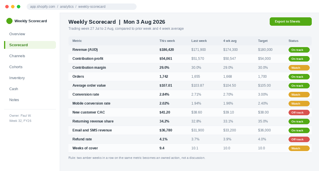
Twelve is the number because twelve fits on one screen and can be read in under three minutes. Most founders either track four numbers (too shallow to diagnose anything) or forty (nobody reads forty).
Group them into four blocks of three. Demand, conversion, profit, and durability. Each block answers a different question.
Block 1: Demand (are enough of the right people arriving?)
- Sessions. Total for the week, split new versus returning. The split matters more than the total. Rising sessions with a falling new share usually means you are just retargeting the same pool harder.
- New customer acquisition cost. Total paid media spend divided by first time buyers, not by all orders. Blending returning customers into CAC is the single most common way Aussie founders talk themselves into overspending.
- Email and SMS revenue. Owned channel revenue in dollars and as a share of total. The 2026 Klaviyo benchmark data puts the average email contribution at around 19% of total revenue. Under 15% and you have an owned channel problem, not a traffic problem.
Block 2: Conversion (are they buying once they arrive?)
- Site conversion rate. The Shopify platform average sits near 1.4%, established stores run 2.5 to 3%, and anything above 3.2% puts you in the top 20% of merchants. Know which of those you are before you decide 2.6% is a crisis.
- Mobile conversion rate, tracked separately. This is the one almost nobody isolates. Mobile drives 65 to 75% of sessions for most Aussie stores but converts at 1.8 to 2.5% against 3.5 to 4% on desktop. A blended number hides a mobile problem for months.
- Average order value. Watch it alongside orders. AOV up while orders fall is usually discount withdrawal. Orders up while AOV falls is usually a promotion cannibalising your full price sales.
Block 3: Profit (is the revenue worth having?)
- Contribution profit in dollars. Revenue minus cost of goods, inbound freight, outbound shipping, payment fees, and paid media. This is the number that pays your wages. We break the full calculation down in the contribution margin playbook.
- Contribution margin percentage. The dollar figure tells you if you had a good week. The percentage tells you whether the good week was earned or bought.
- Refund and return rate. Refunds lag sales by two to four weeks, so plot it against the week the order was placed, not the week the refund was processed. Otherwise a big sales week looks like a returns spike a fortnight later.
Block 4: Durability (will this still be a business in a year?)
- Returning customer revenue share. The share of weekly revenue from people who have bought before. Australian households now shop across an average of 16 brands a year, so loyalty has to be earned every single order.
- Repeat purchase rate. DTC averages land around 25 to 30%, with consumables reaching 40 to 55% and fashion closer to 25 to 32%. If yours is drifting down while revenue climbs, you are renting growth from paid media.
- Weeks of stock cover on your top ten SKUs. Not total inventory value. Weeks of cover on the products that actually pay the bills. Every founder who has stocked out of a hero product in November learns this one the expensive way.
Notice what is not on the list. Not ROAS on its own. Not impressions. Not follower count. Not bounce rate. They are diagnostic numbers you pull after the scorecard flags something, not numbers you review every week by default.
Where Each Number Comes From (And How to Stop Rebuilding It Every Monday)
The reason most weekly scorecards die after five weeks is not discipline. It is that pulling the numbers takes ninety minutes and the founder quietly decides it is not worth it. Fix the collection problem and the habit survives.
Here is where each block lives:
- Shopify Analytics. Sessions, conversion rate by device, AOV, orders, returning customer rate. Build one custom report, set the date range to “last week”, and save it. Shopify remembers the view.
- Klaviyo or your ESP. Attributed revenue for the week, split flows versus campaigns. Worth noting that flows generate roughly 41% of email revenue from only 5.3% of sends, so if your flow share is low that is your first fix.
- Ad platforms. Spend only. Take spend from the platform and take orders from Shopify. Never take both from the platform or you will double count.
- Your inventory system or a Shopify export. Units on hand for your top ten SKUs, divided by the trailing four week sales rate.
Setting up a profit view in Lifetimely (about 25 minutes)
If you want contribution profit calculated for you rather than maintained in a spreadsheet, Lifetimely Profit Analytics is the most practical starting point for Australian stores. It is free up to 50 orders a month and the first paid tier starts around 149 US dollars a month, and usefully it only bumps you up a tier if you exceed your order limit two months running, so a BFCM spike does not punish you.
- Install and connect Shopify. Let it backfill at least 12 months of order history. Do not start the scorecard until the backfill finishes or your first four weeks of comparisons will be wrong.
- Load cost of goods per variant. Bulk upload a CSV rather than typing them in. Include landed cost, not supplier invoice cost, so freight and duty are inside the number.
- Add your shipping and handling cost. Use your actual blended cost per order from the last quarter, not the carrier rate card. Pick and pack labour counts.
- Enter transaction fees. Shopify Payments plus any Afterpay, Zip or PayPal surcharges. These vary by mix, so use the trailing quarter blend.
- Connect ad accounts for spend only. Meta, Google, TikTok. You are using the platform for spend, not for attribution.
- Add fixed operating costs. Rent, wages, software, 3PL minimums. This turns contribution profit into something close to real net profit.
- Save a weekly view and set a Monday email. The report should land in your inbox before you sit down, not after.
A spreadsheet works fine too. The rule is that whoever owns the scorecard spends less than 15 minutes assembling it. Past 15 minutes, it will not survive a busy quarter.
The 45 Minute Monday Meeting That Runs the Whole Thing
A scorecard without a meeting is a spreadsheet nobody opens. The meeting is what converts numbers into decisions.
Run it Monday morning, same time every week, 45 minutes hard stop. If you are solo, run it with yourself and write the notes anyway. Writing forces honesty in a way that thinking does not.
- Minutes 0 to 5: read the scorecard. Out loud, no commentary. Just the twelve numbers and their status. No explaining yet.
- Minutes 5 to 15: flag only. Anything amber or red gets named and assigned to one person. No solving. This is the discipline most teams break in week two.
- Minutes 15 to 35: solve the top two. Only the two most expensive flags. Everything else gets a note and waits. Two problems solved properly beats six discussed vaguely.
- Minutes 35 to 42: last week’s actions. Did the thing you committed to last Monday actually happen? Yes or no. Not “in progress”.
- Minutes 42 to 45: one thing for the week. The single most important action, with a name and a due date on it.
The two hardest rules are the ones about not solving in the first fifteen minutes and only taking two problems. Founders hate both. They are also the reason the meeting stays at 45 minutes instead of drifting to two hours and then quietly dying.
The Decision Rules That Stop You Reacting to Noise
Weekly data is noisy. Without rules you will chase every wobble and change three things at once, which means you learn nothing. Four rules solve it.
- Compare to the four week average, not last week. Last week might have been a public holiday, a sale, or rain in Melbourne. The rolling average absorbs that.
- The two amber rule. One amber week is noise and gets a note. Two consecutive amber weeks on the same metric becomes an owned action with a date. This single rule prevents both panic and drift.
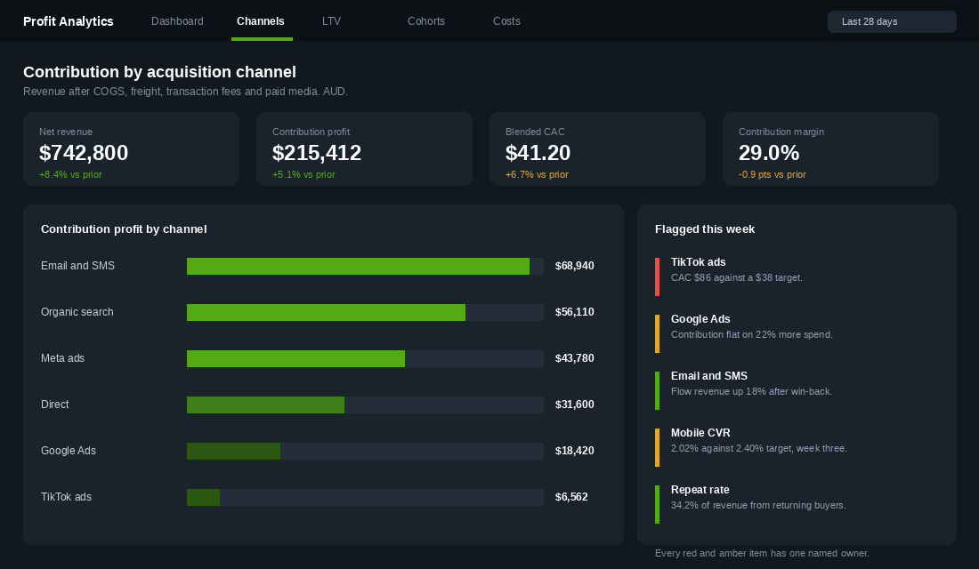
- One owner per flag. Not the team. A person. Shared ownership of a number means nobody owns it.
- Change one thing at a time per metric. If mobile conversion is amber and you change the hero image, the shipping bar and the cart drawer in the same week, you will never know which one worked.
Set your traffic lights before you need them, not in the moment. Green is at or above target. Amber is within 10% below target. Red is more than 10% below target, or any movement in cash or stock cover that threatens the next order with your supplier.
Setting thresholds in advance is the part that keeps you honest. It is remarkably easy to decide, in the moment, that 2.3% conversion is “actually fine given the week we had”.
What Belongs on a Monthly Review Instead
Some numbers move too slowly to be useful weekly. Reviewing them every Monday creates false urgency and wastes the meeting.
Move these to a monthly session:
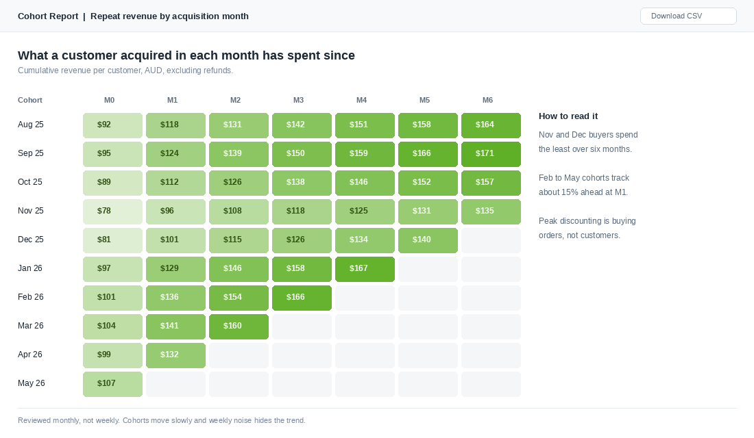
- Cohort performance. What customers acquired in each month have spent since. This is the truest read on whether your growth is durable, and it is meaningless week to week. Our cohort analysis playbook covers how to build the grid.
- Customer lifetime value by channel. A customer acquired through organic search and one acquired through a 40% off code are not the same asset, and it takes months for the gap to show.
- Product level profitability. Which SKUs actually make money after returns and freight, ranked.
- Full cash position and forecast. Against inventory commitments for the next quarter.
The cohort grid is where the uncomfortable truths live. Nearly every Australian brand I look at finds that their November and December cohorts have the lowest lifetime value in the year, because peak discounting attracts people who were buying a price, not a brand.
Two Australian Brands and What Their Numbers Told Them Early
Melbourne luggage brand July is the cleanest local example of measuring the right window. When they ran out of home advertising, they did not just look at direct sales attribution. They tracked direct website traffic, which rose 27%, new customers up 7%, sales orders up 8%, and brand awareness up 159%. Judge that campaign on last click ROAS alone and you kill it. Judge it on the right set of numbers and you find out it worked.
July also survived the moment their category disappeared in 2020, when travel stopped and revenue fell by around 95%. Businesses that come back from that do not do it on instinct. They do it because they can see, week by week, which parts of the business still have a pulse.
Showpo is the other one worth studying. Jane Lu built it from a garage to roughly 30 million US dollars in annual revenue with about 35% of sales coming from outside Australia. Running an international mix like that without weekly channel level numbers is not possible. Your Australian week and your American week can move in opposite directions and a blended monthly figure will show you a flat line while both halves are on fire.
The pattern across both is the same. It is not that they had better data than you. It is that they looked at it more often, and they had decided in advance what would make them act.
The Three Ways This Habit Usually Dies
I have watched this fail enough times to predict it. There are three failure modes and each has a fix.
- It becomes a status meeting. People start reporting what they did instead of what the numbers say. Fix: the first five minutes are numbers only, and the scorecard is displayed on screen the entire time.
- The numbers stop being trusted. Someone spots a discrepancy, the meeting becomes an argument about data, and confidence evaporates. Fix: write down the definition and source of each metric once, and never change a definition mid quarter. An imperfect definition applied consistently is far more useful than a perfect one that keeps moving.
- It gets skipped during a busy month. Usually October or November, exactly when you need it most. Fix: the meeting is calendar locked and the scorecard gets sent whether the meeting happens or not. Peak week is when a two percentage point margin slip costs the most.
There is a fourth, quieter failure. The founder keeps the scorecard entirely to themselves. It works for a while, then becomes a bottleneck, because nobody else in the business can tell a good week from a bad one without asking you.
What Good Looks Like: Benchmarks for the Twelve Numbers
A number on its own tells you nothing. A 2.1% conversion rate is either a problem or a win depending on what you sell and where the traffic came from. The first six weeks of running a scorecard are frustrating for exactly this reason: you have data and no context.
Here are working ranges for Australian DTC brands. Use them as a starting reference, then replace them with your own trailing 12 week averages as soon as you have them. Your own history beats any industry benchmark.
- Site conversion rate: 1.5 to 3.0% is the broad range for most Aussie DTC stores. Apparel and beauty tend to run higher, considered purchases over $200 run lower. Mobile typically converts at 50 to 70% of desktop, so check them separately or the blended number hides the problem.
- Add to cart rate: 6 to 10%. If add-to-cart is healthy and conversion is not, the leak is in cart or checkout, not on the product page.
- Cart abandonment: around 70% is the long-running ecommerce average. Anything above 80% points at unexpected shipping cost, a forced account creation step, or a slow checkout.
- Email revenue share: 20 to 30% of total revenue from email and SMS combined is a healthy target. Under 15% usually means your flows are not built out rather than your list being too small.
- Repeat purchase rate (90 day): 15 to 25% for consumables, 8 to 15% for considered goods. This number moves slowly, so judge it monthly rather than weekly.
- Contribution margin: hold above 40%, and above 50% if you are scaling paid. Below 35% you cannot afford to buy growth.
- CAC payback: under 90 days if you are self-funded. Anything longer and you are financing growth out of working capital, which is where most cash crunches start. The CAC payback framework works through how to calculate it properly.
- Refund and return rate: 5 to 10% for most categories, 20 to 30% for apparel with sizing. Track it weekly because it moves fast after a range change or a supplier switch.
One warning about benchmarks. Chasing an industry average is a good way to make a worse decision than doing nothing. If your conversion rate is 1.4% against a 2% benchmark, the useful question is not “how do I get to 2%” but “what changed in my own last twelve weeks”. Blended attribution across Meta, Google and email will also make your channel numbers look wrong in ways that no benchmark explains. If your reported channel ROAS and your actual revenue keep disagreeing, the incrementality playbook is the right next read.
Running the Scorecard When It Is Just You
The 45 minute Monday meeting assumes a team. Plenty of Aussie stores doing $500K to $1.5M are one founder, a VA and an agency. The scorecard still works. It just runs differently.
Cut it to 20 minutes and change the format. There is no round table when there is nobody at the table. Instead, work through three questions in writing.
Which number moved outside its band? Set a band for each of the twelve, usually plus or minus 15% of your trailing 12 week average. Anything inside the band gets no attention at all. This is the single most valuable rule for a solo founder, because your default is to look at all twelve numbers and feel vaguely anxious about all of them.
Do I know why, or am I guessing? Write one sentence. If the honest answer is a guess, that becomes the week’s one investigation. Not three investigations. One.
What is the one thing I am changing this week? Solo founders lose more to scattered effort than to bad decisions. One change, run for a full week, measured next Monday.
Automate the data collection so the 20 minutes is thinking, not spreadsheet work. Lifetimely or Triple Whale will email you a daily and weekly profit summary. Klaviyo will send a weekly performance digest. GA4 supports scheduled emailed reports from any exploration. Set all three to land Sunday night so the numbers are waiting when you sit down Monday. Founders who rebuild the sheet by hand every week abandon the habit inside two months, without exception.
Write the review somewhere permanent. A single running doc, newest week at the top, three or four lines a week. Twelve weeks in you will have something no dashboard can give you: a record of what you thought was happening at the time, next to what actually happened. That is where the real learning sits, and it is also the document that makes your first ops hire useful in week one instead of week six. Pair it with the weekly metrics dashboard if you want a starting template rather than a blank page.
How the Twelve Numbers Compound
None of these twelve numbers is impressive on its own. Any decent analytics tool will show you conversion rate. The compounding comes from three things happening at once.
Speed of detection. Weekly review cuts your average time to spot a problem from about three weeks to about four days. On a store doing 180,000 dollars a month, catching a 15% conversion drop seventeen days earlier is roughly 15,000 dollars recovered from a single incident.
Quality of decisions. When contribution profit sits next to revenue on the same line of sight, you stop celebrating revenue that costs more than it earns. With cart abandonment sitting at 70.22% across the industry, the temptation is always to buy more traffic. The scorecard keeps pointing you back at the leak instead.
Organisational memory. After a year you have 52 weeks of context. You know what a normal July looks like, what happens the week after an EDM drop, how long a new creative takes to bed in. That memory is what lets you tell the difference between a wobble and a trend, and it is the thing no consultant can hand you.
Retention is where it shows up first. Once returning revenue share and repeat purchase rate are visible every Monday, founders start actually working on them. It is very hard to ignore a number that stares at you 52 times a year. If your repeat rate is the flag, the timing work in the replenishment window playbook is the natural next move.
Your First Scorecard, Built This Week
Do not build the perfect version. Build the version that exists.
- Open a spreadsheet. One column per week, one row per metric, twelve rows.
- Fill in the last four weeks from Shopify Analytics and your ESP. This gives you your baseline and your first four week average.
- Set a target for each of the twelve. Use your own four week average as the starting target, not an industry benchmark. You are competing with last month’s you.
- Write the definition of each metric in a second tab. Where it comes from, what is included, who pulls it.
- Book the meeting. Monday, 45 minutes, recurring, in the calendar right now.
- Run it four times before you judge it. The first two feel pointless. The third one usually catches something.
By week six you will have caught something that would have cost you real money. By week twenty you will not be able to imagine running the business without it. That is the whole return on 45 minutes a week.
A scorecard is only as trustworthy as the reporting underneath it. If GA4 is still a mess, the only five GA4 reports you need to check will tell you which handful of reports are actually worth your Monday morning.
Inside eCommerce Circle, the weekly scorecard is one of the first things we build with every member, because almost every other decision gets easier once the numbers are in front of you. If you want a second opinion on which twelve numbers matter for your store, let’s talk.