You know your best state. Every founder does. You glance at the Shopify report, see New South Wales sitting on top, and file it away as settled. New South Wales is the big one. Victoria is second. Everything else is a rounding error you deal with when the shipping bill arrives.
What’s in This Article
That reading is costing you money, and it is costing you money in a very specific way. A state ranking sorted by raw orders is really just a population ranking with your logo on it. New South Wales tops your list because 8.5 million people live there, not because your brand has done anything clever. You have not learned where your demand is strong. You have learned where Australia is crowded.
Meanwhile the numbers underneath are moving. Australians spent a record 82.6 billion dollars online in 2025, up 14% year on year, across 9.8 million households, according to the Australia Post eCommerce Report 2026. Regional Australia grew online shopping 18% since 2019 against 16% for metro. The single highest suburb for delivery volume in the country is not in Sydney. It is Toowoomba, followed by Mackay, then Point Cook in Melbourne’s west. Your competitors are not fighting you for those customers yet, because they are reading the same lazy state report you are.
This article is the six-layer system for reading geography properly. It costs nothing to run. The data is already sitting in your Shopify admin.
Why Your State Report Is Quietly Lying to You
Here is the trap. New South Wales accounts for roughly 28.5 billion dollars of online spend, about one in every three dollars spent online in Australia. So when New South Wales delivers a third of your revenue, you conclude you are performing exactly as expected. You are. That is the problem. Performing exactly as expected means you have no edge there and no idea whether you could have one.
The useful question is not “where do most of my orders come from”. It is “where do I punch above my weight, and why”. A brand doing 604 orders from a region of 486,000 people is behaving very differently to a brand doing 288 orders from a region of 467,000 people, even though both look like healthy chunks of the pie chart. One has found something. The other has a hole.
Three things make this worth your Tuesday morning right now. Basket sizes are shrinking, with the average online transaction at 96 dollars, roughly 10 dollars lower than 2020. Households are spreading spend across 16 different brands a year and making four more purchases than they did last year. And 41% of households now shop online at least fortnightly. Frequency is up, loyalty is thinner, and the customer who buys from you in Bendigo is one bad delivery experience away from buying the same category from someone else. Geography is where that fight is won.
Layer 1: Pull the Three Reports That Show Where Demand Actually Lives
You do not need a new app for this. Shopify’s native reporting will get you 90% of the way, and the last 10% is a spreadsheet.
Report one: sales by billing location. In your Shopify admin, go to Analytics > Reports, then under Sales open Sales by billing location. Set the date range to the last 12 months so seasonality does not distort it. This gives you the state-level view, which is your starting point rather than your answer.
Report two: the same report, broken to postcode. This is the step almost nobody takes. In the top right of that report, click Edit columns. Under Billing address, tick Billing postal code. Under Customer, tick Customer name. Now export to CSV. You have just turned a four-row summary into a genuine demand map with every postcode that has ever ordered from you.
Report three: sessions by location. Under Behaviour, pull sessions by location and export it the same way. Orders alone cannot tell you whether a region is a traffic problem or a conversion problem. Traffic plus orders can.
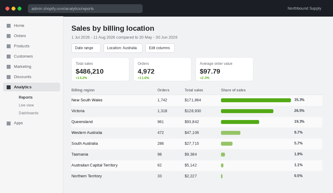
One caution on billing versus shipping. Billing location is the cleaner signal for who your customer is. Shipping location is the cleaner signal for what your freight actually costs. Gift-heavy categories will show a real gap between the two, and that gap is itself worth knowing. If more than 15% of your orders ship to a different state from the billing address, you have a gifting business hiding inside your brand.
Layer 2: Build a Penetration Index Instead of a League Table
This is the layer that turns data into a decision. Take your postcode export and roll it up to SA4 regions, the Australian Bureau of Statistics geography that splits the country into 100-odd areas of roughly comparable size. Then calculate one number for each region:
- Orders per 10,000 residents. Your orders in that region, divided by its population, times 10,000.
- Index it to your national average. Set your own national rate to 100. A region running at double your national rate scores 200. A region at half scores 50.
Now you have a map that population no longer distorts. Every region gets scored on how well your brand actually resonates there, not how many people happen to live there. The population figures are free from the ABS regional population release, and you only need to rebuild this once a year.
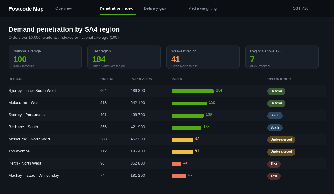
Sort the list and four groups fall out. Read them in this order:
- Index above 140: defend. Something is working here. Word of mouth, a stockist, a local community, a founder connection. Find out what it is before you spend a dollar elsewhere, because it is your cheapest repeatable pattern.
- Index 110 to 140: scale. Proven demand with room left. These are your first geo-weighted media targets.
- Index 70 to 110: under-served. Population is there, demand is average, and something is capping you. Usually delivery, sometimes awareness.
- Index below 70: test or ignore. Either you have never marketed there, or the category genuinely does not fit. One cheap test tells you which.
The high-index regions are the ones founders consistently underrate. If Geelong is indexing at 180, that is not luck, that is a signal about who your customer is. Go and interview six of those customers. That work sits right next to the kind of segmentation thinking we cover in our RFM customer segmentation playbook, except the grouping variable is a map rather than a spend tier.
Layer 3: Read the Delivery Gap Sitting Under Your Weak Regions
Most under-served regions are not a marketing problem. They are a freight problem wearing a marketing costume.
Delivery drives the purchase decision harder than founders like to admit. 73% of shoppers say a good delivery experience makes them more likely to shop online, 69% want a wide range of delivery options at checkout, and 32% would switch retailers for out-of-home collection options like parcel lockers. That last number is the one to sit with. Nearly a third of your market will change brands over a collection option, and out-of-home collection matters most in exactly the regional areas where home delivery windows are widest.
Look at how this plays out for a brand with real logistics investment. Koala delivers bulky items inside tight windows to Australian capital cities, and has pushed toward one and two-hour delivery in Sydney and Melbourne. For most regional and rural addresses, the published window is 1 to 15 business days. That is not a criticism of Koala, it is physics and inventory economics. Showpo’s operations lead Paul Waddy has described the same structural wall from the other side: two-thirds of Australia’s population lives within a day’s drive of Sydney and Melbourne, and duplicating inventory into Perth and Adelaide is an enormous outlay.
So run the diagnostic on your own numbers. For each under-served region, pull three figures:
- Median delivery days. Order placed to delivered, not dispatched. Your 3PL or Australia Post reporting has this.
- Effective shipping cost as a share of order value. If Perth customers pay 14 dollars on a 96 dollar basket and Sydney customers pay nothing, you have priced yourself out of Western Australia without deciding to.
- Checkout abandonment by region. If a region converts well to cart and badly at checkout, the shipping page is your answer.
When two of the three look bad, the region is not cold. It is blocked. The fix is a delivery decision, not an ad budget, and it is worth reading alongside our delivery promise playbook before you touch anything at checkout.
Layer 4: Find the Growth Corridors Before Your Competitors Do
A penetration index tells you about today. Population movement tells you about the next three years, and Australia is moving fast in very specific directions.
Melton, about 45 minutes from Melbourne, was the fastest-growing local government area in the country in 2024-25, adding 12,673 people for growth of 5.8%. Neighbouring Wyndham, which contains Point Cook, was close behind on absolute gains. Point Cook is already the third-highest suburb in Australia for delivery volume. Six of the ten fastest-growing LGAs nationally were in Western Australia. None of that is in your Shopify data yet, because the customers have not arrived.
Overlay growth on penetration and you get four practical calls:
- High growth, high index. Your best land. Increase share of voice now while acquisition costs are still soft.
- High growth, low index. The most interesting square on the board. Demand is arriving and you have no position. This is where a cheap geo test earns its keep.
- Low growth, high index. Protect it. Retention and referral work harder here than acquisition.
- Low growth, low index. Leave it alone. Spend the money in the other three squares.
Outer growth corridors have a second advantage worth naming. They are typically younger, more likely to be family households, and further from physical retail. Distance from a shopping centre is one of the strongest structural drivers of online purchase frequency in this country, and it is the reason regional and outer-metro shoppers behave less like convenience buyers and more like people who rely on ecommerce.
Layer 5: Geo-Weight Your Media, Then Prove It With a Holdout
Most Australian Shopify brands run national campaigns with no geographic weighting whatsoever, then wonder why their blended cost per acquisition sits stubbornly flat. Meta and Google will both happily spend your budget where impressions are cheapest, not where your penetration index says you should win.
Start narrow and specific:
- Build one prospecting campaign per opportunity tier, not per state. Your “scale” regions and your “test” regions should never share a budget, because they need different frequencies and different creative.
- Match the creative to the geography. A regional Queensland audience responds to different delivery messaging than inner Melbourne. If your free shipping threshold genuinely covers them, say so in the ad, not on a policy page they will never open.
- Use radius targeting around your high-index postcodes for lookalike seeds rather than seeding from your whole customer file. A lookalike built from your top 500 customers in a 180-index region is a sharper audience than one built from everyone who has ever bought.
Then prove it, because geography is one of the very few areas of ecommerce where you can run a genuinely clean experiment. Hold out matched regions, spend in the test regions, and measure the difference in total orders rather than platform-attributed orders. It sidesteps the attribution mess entirely.
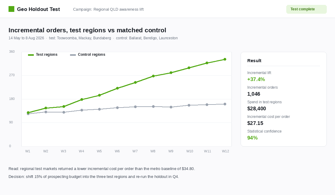
Match your test and control regions on population, median household income and your existing penetration index, run for at least eight weeks, and judge the result on incremental cost per order against your national baseline. If regional test markets come back cheaper than metro, that is a budget reallocation you can defend to anyone. The full method is in our geo holdout incrementality guide.
Layer 6: Build a Regional Offer That Is Not an Apology
Most brands treat regional customers as an exception to be managed. A surcharge, a longer window, a line of fine print. The brands winning those postcodes treat them as a segment with its own offer.
Four moves, in order of how quickly they pay back:
- Set an honest delivery window by postcode. Show “4 to 6 business days to Mackay” rather than a national “3 to 10 days”. Specific and slower beats vague and optimistic every time, and it cuts the where-is-my-order tickets that eat your support hours.
- Offer parcel locker and collection points at checkout. Given a third of shoppers would switch retailers for out-of-home collection, this is close to free revenue for brands already shipping with Australia Post.
- Set a regional free shipping threshold rather than a national one. If your national threshold is 99 dollars and freight to regional Western Australia costs 16 dollars, a 129 dollar regional threshold protects contribution while still giving those customers a reachable goal. Test it before you assume it suppresses orders.
- Consider a second fulfilment node only after the first three. Splitting stock is the expensive answer and it is rarely the first one. We walk through when the maths actually works in the second fulfilment node test.
Koala’s founder Dany Milham made a point years ago that has aged well: brands constantly fight for a better bottom line on delivery and miss that the customer experience is the thing compounding. You do not have to run boats to Perth to apply that. You do have to stop treating half the country as a freight liability.
How the Six Layers Compound
Any one of these layers is mildly interesting on its own. Run together, they change how you allocate every dollar.
The penetration index tells you where your brand already resonates, so you stop paying to acquire customers in regions you have already won and start paying attention to why you won them. The delivery gap analysis tells you which weak regions are actually blocked, so you fix a shipping table instead of buying more impressions into a checkout that rejects those customers. The growth corridor overlay tells you where to plant a flag before the acquisition cost catches up with the population. Geo-weighted media puts money against those conclusions, and the holdout proves whether the money worked.
The compounding bit is that geography is stable. A creative test decays in six weeks. A postcode that indexes at 180 will still index near 180 next quarter, because the underlying reason is demographic, structural or cultural. You are building on ground that does not move.
And the cost of entry is a CSV export and two hours. In a market where the average basket is 96 dollars and shrinking, and customers are spreading spend across 16 brands a year, finding the regions where you are already someone’s default is worth considerably more than another round of ad creative.
Your Quarterly Postcode Map Review
Put this in the calendar once a quarter. It takes an afternoon and it should produce exactly three decisions.
- Export. Sales by billing location with billing postal code, last 12 months. Sessions by location, same period.
- Roll up. Map postcodes to SA4 regions and calculate orders per 10,000 residents for each.
- Index. Set your national rate to 100 and score every region against it.
- Classify. Sort into defend, scale, under-served and test using the thresholds above.
- Diagnose the blocked regions. Median delivery days, shipping cost as a share of basket, checkout abandonment. Two out of three bad means fix logistics before media.
- Overlay growth. Check the latest ABS regional population release for corridors you have no position in.
- Decide three things. One region to defend and learn from, one to scale media into, one to test with a holdout.
- Set the review date. Twelve weeks out, judged on incremental cost per order by region, not blended.
Three decisions per quarter is twelve geographic bets a year, each one measured. That is a meaningful growth programme built entirely from data you already own and are currently ignoring.
The brands that will own regional Australia over the next five years are not the ones with the biggest budgets. They are the ones who worked out, early and cheaply, that Toowoomba was worth more to them than another 10,000 impressions in Bondi.
Inside eCommerce Circle, knowing exactly where your demand lives is one of the core pillars we work on with every member, because it changes media, freight and range decisions all at once. If you want a second opinion on your own postcode map, let’s talk.