Your product page has two salespeople working on it. One is the copy. The other is the image gallery. Most Aussie founders spend three weeks agonising over the copy and forty minutes uploading whatever the photographer sent back.
What’s in This Article
That is backwards. Baymard Institute’s product page research found that roughly 56% of shoppers’ first action on a product page is to inspect the images. Not read the headline. Not scan the bullet points. They go straight to the gallery, swipe, and decide whether they are still interested before a single word of your copy has been read.
The same research found that 40% of ecommerce sites have image galleries that make shoppers miss images entirely. So you have a channel that carries the majority of the buying decision, and roughly half the market is either under-shooting it or burying it. That gap is where the margin is.
Here is the thing nobody tells you when you book a photographer. A good shoot is not an art project. It is a checklist. There are nine specific images that answer the nine specific questions standing between a browser and a buyer, and once you have that list written down, every shoot day gets faster, cheaper and more consistent.
Why Your Gallery Is Doing More Work Than Your Copy
Think about how you actually shop on your phone. You tap through from an ad, the hero image loads, and your thumb starts swiping. If image two is the same product from a slightly different angle, you stop. If image two answers a question you had, you keep going.
Every swipe is a micro-commitment. Shoppers who make it deep into a gallery are qualifying themselves. They are not idly browsing, they are checking whether this thing solves their problem. That is why gallery depth correlates so tightly with add to cart rate.
The other half of the equation is returns. Australian ecommerce return rates now sit between 20% and 30% on average, climbing toward 40% in apparel, and more than half of those returns come down to size and fit. A return is not just a refund. It is the shipping out, the shipping back, the pick and pack labour, the restocking, and the item that may never resell at full price.
Better imagery has been shown to cut return rates by around 23%, purely because the customer’s expectation matched what arrived in the box. On a store doing $200k a month at a 25% return rate, shaving that to 19% is a meaningful number that shows up in your P&L within one cycle.
So the gallery is not decoration. It is the hardest-working conversion asset on the page and your cheapest returns-reduction lever at the same time. Treat it like an asset with a spec, not a creative whim.
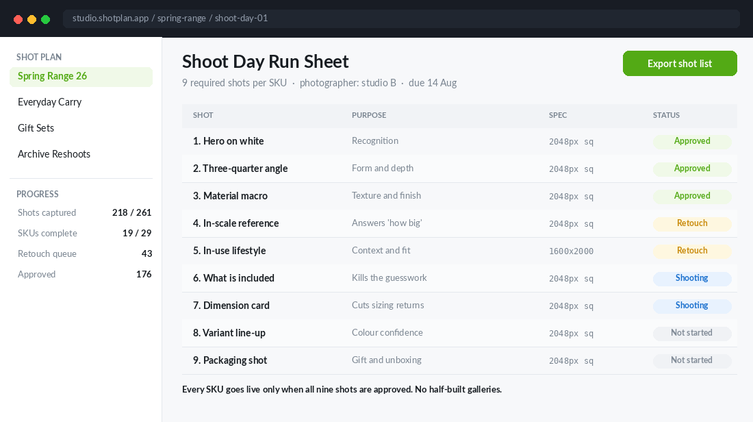
Shots 1 to 3: The Recognition Set
These three answer the first question a shopper has, which is simply “what is this thing”. They are the least interesting shots to produce and the most damaging to get wrong.
- Shot 1: The hero on a clean background. Product straight on, filling roughly 80% of the frame, on white or a very light neutral. Nothing else in the shot. This is the image that appears in collection pages, Google Shopping, Meta catalogue ads and your abandoned cart emails, so it has to read clearly at 200 pixels wide on a phone.
- Shot 2: The three-quarter angle. Rotate the product 30 to 45 degrees so the shopper sees depth, thickness and side profile. Flat products look thinner than they are on a straight-on shot. This is the image that stops people assuming your bag is a slim envelope when it holds a laptop.
- Shot 3: The material macro. Get in close on the fabric weave, the stitching, the grain, the finish. Buyers cannot touch your product, so the macro shot is the closest substitute you have for the tactile check they would do in a shop.
One practical note on shot 1. Do not crop tight. Leave consistent breathing room around every hero across your whole range, because inconsistent product scale on a collection page makes a considered brand look like a dropshipper. Set the framing rule once, write it into the shot list, and every future shoot inherits it.
If you want the full architecture the gallery sits inside, we broke it down in the Shopify product page playbook. The gallery is section one of nine, and it carries more weight than the eight below it.
Shots 4 to 6: The Objection Set
This is where most Australian stores stop shooting and start losing sales. The recognition set tells someone what the product is. The objection set tells them whether it will work for them.
- Shot 4: The in-scale reference. Put the product next to something universally understood. A hand, a phone, a laptop, a standard mug, a person. Bellroy, the Melbourne carry brand, built its reputation partly on this: it measures bag capacity by literally filling the bag and measuring the fill volume, then shows you exactly what fits inside. “How big is it actually” is the single most common unanswered question in ecommerce, and one photo kills it.
- Shot 5: The in-use lifestyle shot. The product doing its job, in a setting your customer recognises. Not a moody art-directed scene where the product is a blurry background element. The product should still be the subject, it just has context around it now.
- Shot 6: The what-is-included flat lay. Every component, laid out, from directly above. Cables, adaptors, dust bag, care card, spare buttons, instructions. This single shot removes the “is the stand included” question from your inbox and stops the disappointment that turns into a return.
Shot 5 is where fashion and homewares brands leave the most money on the table. If you sell apparel, state the model’s height and the size they are wearing directly in the image or caption. Australian shoppers are conditioned to look for it, and its absence forces the size-bracketing behaviour where someone orders three sizes and returns two.
Shots 7 to 9: The Confidence Set
The last three are the ones almost nobody shoots, which is exactly why they work. They are the difference between a shopper who is interested and a shopper who is ready.
- Shot 7: The dimension card. A clean graphic showing height, width, depth and weight, with the numbers overlaid on a simple product silhouette. This is a design job, not a photography job, and it can be built once as a template then reused across every SKU in ten minutes each. It is the single highest-impact shot for reducing sizing returns.
- Shot 8: The variant line-up. All colourways or sizes in one frame, shot under identical lighting. Shoppers comparing “is the sage more grey or more green” cannot do it by tapping between swatches on separate images. Show them side by side and the decision gets made.
- Shot 9: The packaging shot. What arrives at the door. This does two jobs: it sells the gift-giving use case, and it sets the unboxing expectation so nobody is disappointed by a plain satchel.
Shot 7 deserves special attention because of the maths. If size and fit drive more than half of returns, and your dimension card removes even a quarter of those, you have moved your return rate two to three percentage points on a single template you built once. Very few tactics in ecommerce have that ratio of effort to outcome.
The Order Matters More Than You Think
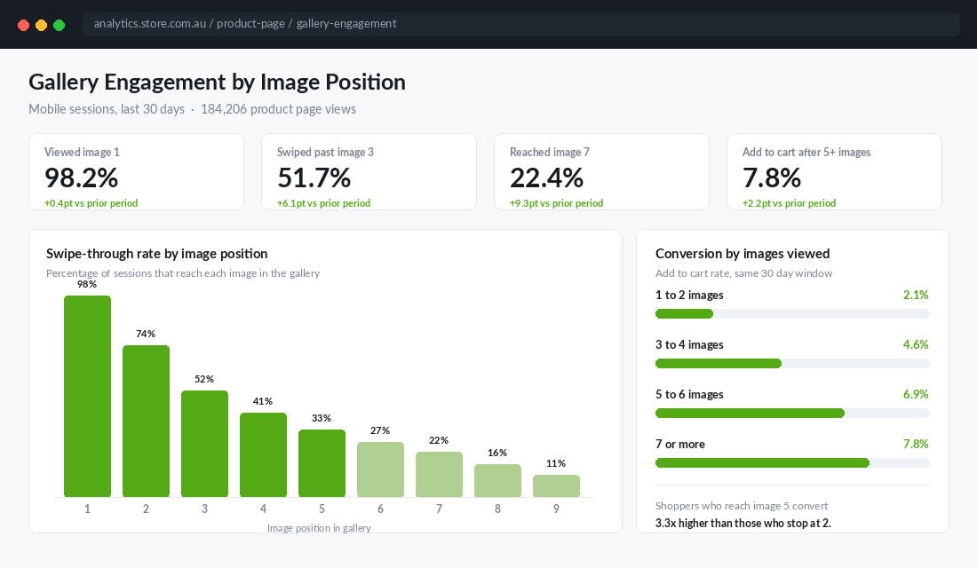
Having nine shots is only half the job. Sequencing them badly wastes the good ones, because gallery drop-off is steep. Roughly half of mobile shoppers never swipe past image three, and only about one in five reaches image seven.
Which means your three most persuasive images must be in positions one, two and three. Not your prettiest. Your most persuasive.
For most stores the winning order looks like this:
- Hero on clean background (recognition, matches the ad they clicked)
- In-use lifestyle (context and desire, the emotional hook)
- In-scale reference (kills the biggest objection early)
- Three-quarter angle
- Material macro
- Dimension card
- What is included
- Variant line-up
- Packaging
Notice that the objection-killers get promoted into the top three and the recognition shots slide down. That is deliberate. By image three the shopper already knows what the product looks like from the ad and the hero. What they do not know is whether it is the right size for them.
Test the order on your top five SKUs before rolling it out. Run it for two weeks against your existing sequence and watch add to cart rate rather than conversion rate, because add to cart is the metric the gallery actually influences. Everything after that is checkout’s problem.
The Technical Spec That Stops Your Gallery Slowing the Page
Nine images per SKU sounds like a page-speed disaster. It is not, as long as you set the spec once and hold the line.
- Working size: 2048 by 2048 pixels, square. Shopify supports up to 5000 by 5000 and a 20 MB ceiling, but 2048 square is the practical sweet spot. It gives you clean zoom without shipping a print-resolution file to a phone on 4G in regional Australia.
- File weight: 200 KB to 500 KB per image. That is Shopify’s own recommended range. Anything above 1 MB is a hero image that is actively costing you sales on mobile.
- Format: upload JPEG or PNG and let Shopify serve WebP. Shopify automatically converts and serves WebP to browsers that support it. You do not need to convert manually, you just need to stop uploading uncompressed PNGs straight out of the retoucher.
- Only the first image loads eagerly. Images two through nine should lazy load. Most modern Shopify themes handle this, but check it, because a theme that eagerly loads all nine will tank your Largest Contentful Paint.
- Alt text on every image, describing the shot. “Charcoal canvas weekender bag shown next to a 15 inch laptop for scale” beats “bag-3.jpg” for both accessibility and image search.
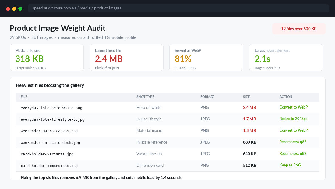
The tool to set this up properly is TinyIMG, a Shopify app that compresses your existing media library in bulk and keeps new uploads in spec automatically. Setup takes about fifteen minutes:
- Install it from the Shopify App Store and let the initial scan run across your media library.
- Open the compression settings and set quality to 82. Below 78 you start seeing artefacts on fabric and gradients, above 88 you are shipping weight for no visible gain.
- Turn on automatic compression for new uploads so future shoots never regress.
- Run the bulk compression on your top 30 SKUs first, then check those product pages in PageSpeed Insights on mobile before doing the rest.
- Use the alt text tool to bulk-fill any images currently missing alt attributes, then go back and hand-write alt text for your top sellers.
Always keep a backup of your originals outside Shopify before you bulk compress. Compression is not reversible, and you will want the full-resolution files the next time you build a lookbook or a retail display.
Shooting Nine Images Per SKU Without Blowing the Budget
The objection I hear most from founders is cost. Nine shots across thirty SKUs is 270 images, and if you are paying per image that is a frightening quote.
The fix is to stop buying photography per image and start buying it per day. A competent Australian product photographer with a studio runs roughly $900 to $1,800 per day. With a tight shot list and a prepared product table, a well-run day gets through 12 to 18 SKUs of the recognition and confidence sets. Two studio days and one lifestyle day covers a thirty-SKU range.
What makes the difference is preparation, not budget. Run the shoot like this:
- Send the shot list 48 hours ahead. Nine named shots, framing rules, output spec. A photographer who knows the deliverables shoots twice as fast as one discovering them on the day.
- Steam, lint-roll and prep everything the night before. Studio time spent fixing creases is the most expensive ironing you will ever do.
- Batch by shot type, not by SKU. Shoot every hero, then reset the lighting once and shoot every three-quarter, then every macro. Relighting between products is where the day disappears.
- Build shots 7 and 8 in-house. The dimension card and the variant line-up are template work. Build them once in Canva or Figma, then a VA fills in the numbers per SKU. Neither needs studio time.
- Shoot stills and video in the same session. You are already lit and styled. Capturing the video assets at the same time roughly halves the marginal cost, and product pages with video convert materially better. We covered the six video types worth capturing in the product video playbook.
One more discipline that saves real money: do not shoot everything. Apply the shot list in full to the SKUs that carry your revenue, and run an abbreviated four-shot version on the long tail. If you have not yet worked out which products deserve the investment, the range planning framework is the place to start.
The Shot List Checklist You Can Use Tomorrow
Copy this into a shared sheet, add a column per SKU, and tick cells. That is the entire system.
- 1. Hero on clean background. Straight on, 80% frame fill, white or light neutral, consistent framing across the range.
- 2. Three-quarter angle. 30 to 45 degree rotation, shows depth and side profile.
- 3. Material macro. Close on weave, stitching, grain or finish.
- 4. In-scale reference. Beside a hand, phone, laptop or person. Answers “how big is it”.
- 5. In-use lifestyle. Product doing its job in a recognisable setting. Model height and size worn stated for apparel.
- 6. What is included. Overhead flat lay of every component in the box.
- 7. Dimension card. Height, width, depth, weight overlaid on a silhouette. Template built once.
- 8. Variant line-up. All colourways or sizes in one frame, identical lighting.
- 9. Packaging shot. What arrives at the door.
Add four control columns next to the nine: captured, retouched, compressed to spec, alt text written. A SKU does not go live until all four are ticked. That rule alone will do more for your gallery quality than any equipment upgrade.
Why the Nine Compound
Read individually, each shot looks like a small improvement. The reason this works is that they stack in three different directions at once.
Forward, they lift add to cart. More images answered means more swipes, more swipes means more qualified shoppers, and the gap between a shopper who views two images and one who views five is the difference between roughly 2% and 7% add to cart. Same traffic, same product, same price.
Backwards, they cut returns. The in-scale shot, the dimension card and the what-is-included flat lay exist purely to make the parcel match the expectation. Every return you prevent is full margin recovered, not discounted margin, and it saves the freight both ways.
Sideways, they feed everything else. Your Meta catalogue, your Google Shopping feed, your email campaigns, your retargeting creative and your marketplace listings all pull from the same nine assets. Shoot once properly and you have fed five channels for a year. Shoot lazily and every channel inherits the same weak hero.
That is the compounding piece. A store with a nine-shot standard is not 10% better than a store with three photos. It converts more, refunds less, and produces better ad creative from the same shoot budget, month after month, on every product it launches from here on.
Pick your five best-selling SKUs. Count how many of the nine you actually have. Most founders find they have three or four, and the missing ones are always shots 4, 6 and 7, the exact three that answer the objections costing them the sale.
Inside eCommerce Circle, product imagery is one of the core pillars we work on with every member, because it is one of the few levers that lifts conversion and cuts returns in the same move. If you want a second opinion on your gallery, let’s talk.