You send the designer a Slack message: “Need 5 ads for the Black Friday sale, can you have them by Thursday?” Thursday arrives. The ads are fine.
What’s in This Article
They’re on brand, they look sharp, and none of them are what you had in your head. So you send back a page of notes, the designer does round two, then round three, and by the following Tuesday you’re launching ads you’re lukewarm about, three days later than planned.
Here’s the uncomfortable part. That wasn’t a design problem. It was a brief problem. Your designer, your UGC creator, your email freelancer and your agency can only build what you tell them. When the brief lives in your head, every round of revisions is you slowly downloading your own thinking into someone else’s.
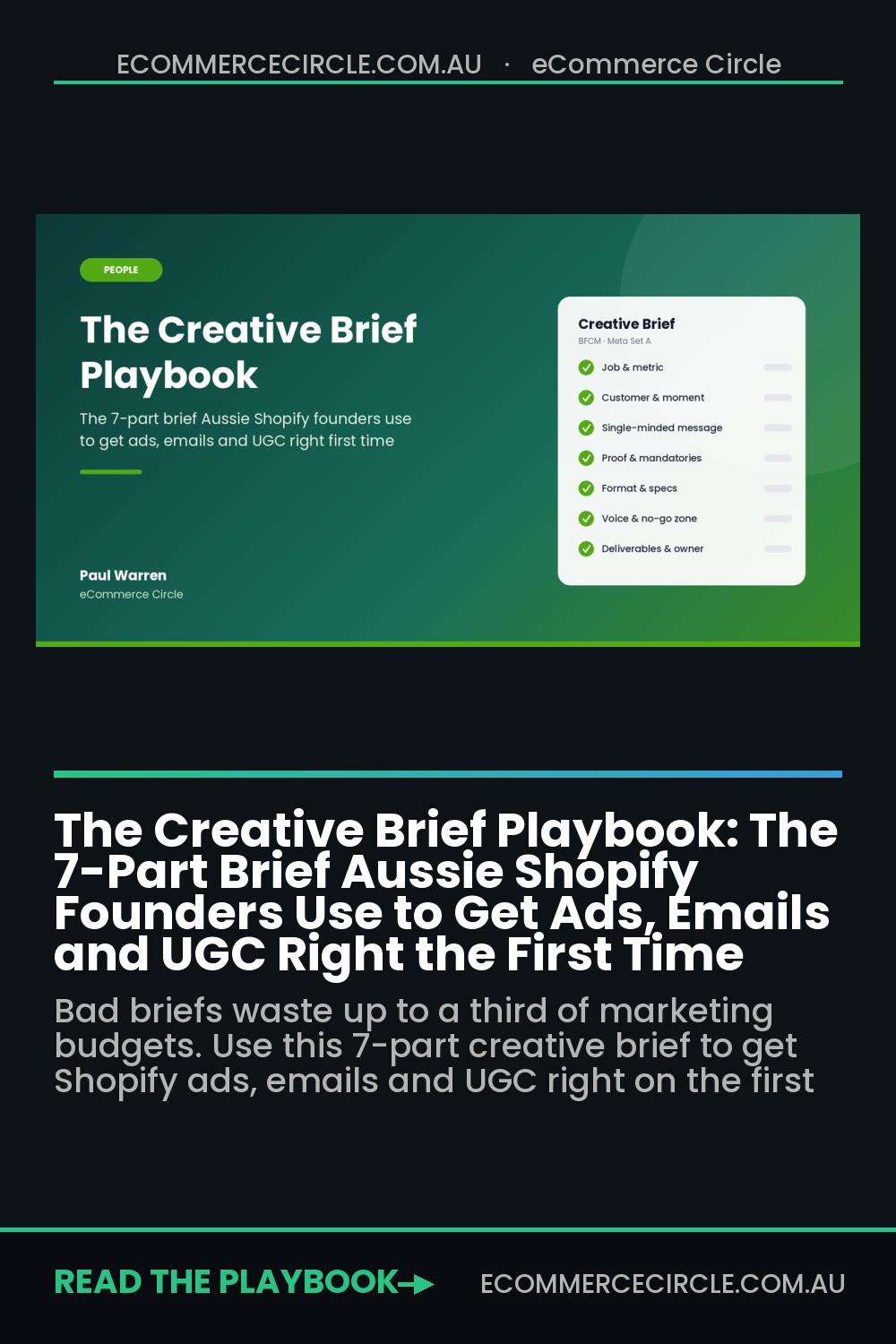
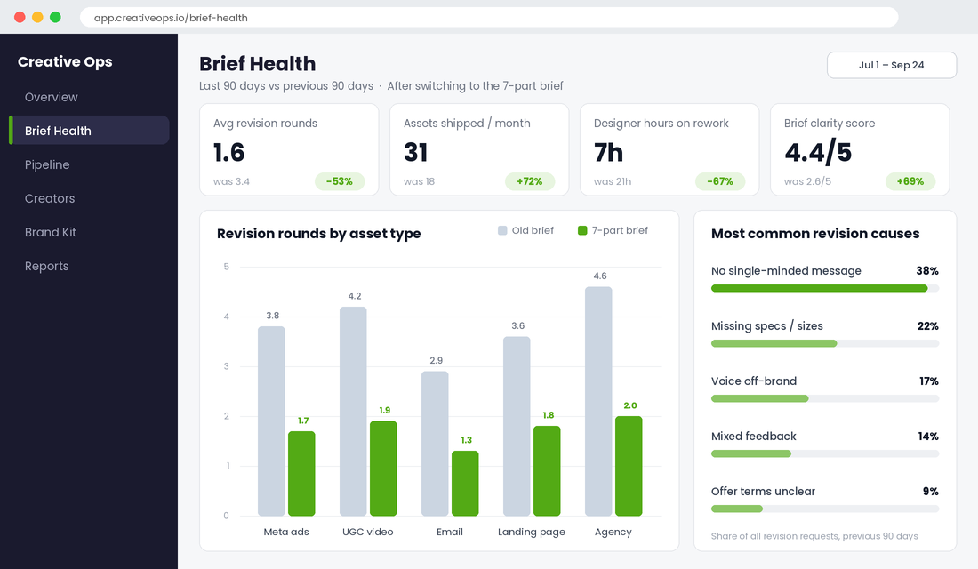
The brands that get great creative on the first or second round don’t have better designers. They have a better brief. One page, seven parts, filled in before anyone opens Canva or Figma.
This playbook gives you that exact brief, the variations for ads, UGC, email and agencies, and the system to run it through BFCM. It sits in People, the P in the More Orders Operating System that covers how you get great work out of the humans around you.
Why Your Creative Keeps Coming Back Wrong (It’s the Brief, Not the Designer)
The biggest study ever done on briefing was started by two Australian strategists, Matt Davies and Pieter-Paul von Weiler. The BetterBriefs Project surveyed more than 1,700 marketers and agency people across 70+ countries, and the gap it found is brutal:
- 80% of marketers think they write good briefs. Only 10% of agencies agree.
- 78% of marketers think their briefs give clear strategic direction. Only 5% of agencies agree.
- Agencies say most briefs lack focus (83%), clarity (79%) and inspiration (65%).
- Up to one third of marketing budgets is wasted through poor briefs and misdirected work, according to the IPA-backed research reported by Marketing Mag.
The Australian detail is the one that should sting. Half of local marketers have never been trained to write a brief. And if trained marketers at big brands get this wrong, a Shopify founder who went from making product to running a creative team in three years has no chance of getting it right by instinct.
This matters more than it used to because creative is now the main lever you control. Nielsen’s analysis of nearly 500 campaigns found creative drove 47% of sales lift, more than reach, brand or targeting.
Meta’s own data science team told its 2023 Performance Marketing Summit that 56% of auction outcomes come down to creative. With Advantage+ doing the targeting for you, the brief is where your advantage now lives.
The Real Cost of a Vague Brief in a Small Shopify Team
Most founders never add up what a bad brief costs, because the cost is spread across Slack threads and late nights. Let’s add it up.
Say you brief 20 creative assets a month: ads, emails, a landing page banner, a few UGC videos. If a vague brief adds just one extra revision round per asset, and each round costs your designer 45 minutes plus 15 minutes of your time writing notes, that’s 20 hours a month gone. At a $75/hour freelancer rate, that’s around $1,125 a month in design time alone, before you count your own hours or the days each campaign launches late.
Now scale that across the business. Asana’s Anatomy of Work research found the average knowledge worker loses 209 hours a year to duplicated work. In a five-person Shopify team, rework is one of the biggest hidden payroll costs you have.
The bigger cost is the ads you never get to test. Motion’s 2026 Creative Benchmarks, which analysed $1.29 billion in Meta spend across 578,750 ads, found only about 5% of creatives become winners, and those winners soak up around 55% of total spend.
Finding winners is a volume game. Every week you lose to revision rounds is a week of tests you didn’t run.
A good brief doesn’t slow you down. It’s the thing that lets you ship more creative with the same people.
The 7-Part Shopify Creative Brief (Copy This Structure)
Every brief you send, whether it’s for a Meta ad, a Klaviyo email, a UGC video or a full campaign, should answer these seven questions. Keep it to one page. If it won’t fit on one page, you haven’t decided what you want yet.
1. The Job and the One Metric
Start with what this piece of creative has to do and how you’ll judge it. Not “make some ads for the sale”.
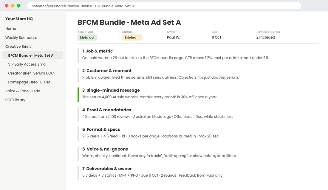
Instead: “Get cold 25 to 44 year old women to click through to the Black Friday bundle page. We’ll judge it on click-through rate above 1.2% and cost per add-to-cart under $9.” One job, one metric. If the creative has three jobs, it’ll do none of them well.
2. The Customer and Their Moment
Who is seeing this, and where are they in their head? A cold prospect scrolling Reels at 9pm needs a completely different ad from a repeat customer opening your VIP email.
Name the awareness stage (unaware, problem aware, solution aware, product aware, most aware), the main objection they’re carrying, and the words they use. Pull those words straight from reviews and post-purchase surveys, not from your own product sheet.
3. The Single-Minded Message
One sentence. The one thing you want the viewer to remember. This is the hardest part of the brief and the part most founders skip, so there’s a full section on it below.
4. Proof and Mandatories
List the proof points the creative can use: review count and star rating, a customer quote, a result, a guarantee, “Australian Made”, free shipping over $99. Then list the mandatories: logo placement, the offer terms, compliance lines (for example, the price conditions any “was/now” claim needs under Australian Consumer Law), and anything that must not be said.
5. Format and Specs
Spell out every size and placement so nobody has to guess. For Meta that’s usually 9:16 for Stories and Reels, 4:5 for feed, and 1:1 as a backup.
For email, a 600px-wide design with live text, not one giant image. For UGC, the length (15, 30 or 60 seconds), whether you want raw footage as well as the edit, and whether captions are burned in.
6. Voice and the No-Go Zone
Link to your voice guide and give three words that describe how this piece should feel (“warm, cheeky, confident”). Then give the no-go zone: words you never use, competitor comparisons you avoid, visual clichés you’re sick of. The no-go zone saves more revision rounds than anything else in the brief.
7. Deliverables, Deadline, Rounds and Owner
Finish with the admin. Exactly what gets delivered, in what file format, by what date, how many revision rounds are included (two is the standard to aim for), and one named person who gives feedback. Feedback by committee is where good creative goes to die.
Writing the Single-Minded Message (The Part Everyone Skips)
Part three decides whether the rest of the brief works. The single-minded message is the one idea the creative is built around. When founders skip it, the designer tries to say everything, and an ad that says everything says nothing.
Here’s what it looks like for a hypothetical Aussie skincare brand briefing a Black Friday ad:
- Weak: “Our serum is vegan, Australian made, dermatologist tested, has hyaluronic acid and is 30% off for Black Friday.”
- Strong: “The serum 4,000 Aussie women reorder every month is 30% off, once a year.”
The weak version is a list. The strong version is an idea, and it quietly carries the proof (4,000 reorders) and the urgency (once a year). Everything else, the vegan claim and the Australian Made logo, moves to part four as supporting proof.
Use this three-step test before you send any brief:
- The pub test. Can you say it out loud in one breath to a mate at the pub? If you need “and” twice, it’s two messages.
- The swap test. Could a competitor put their logo on it and it still be true? If yes, it’s not specific enough.
- The customer test. Would a real customer say this sentence, or only a marketer? Borrow their words from your reviews.
How the Brief Changes for Ads, UGC, Email and Agencies
The seven parts stay the same. What you emphasise changes depending on who’s reading it.
Meta and TikTok Ad Briefs
Weight the brief towards hooks. Ask for three different hooks on the same body, because the first three seconds decide whether anyone sees the rest.
Specify the angle you’re testing (problem-led, social proof, founder story, offer-led) so each ad is a clean test. If you’re running a structured testing rhythm, like the one in our Meta creative testing engine, each brief should map to one test cell.
UGC Creator Briefs
Creators need direction, not a script. Give them the single-minded message, two or three talking points, the must-show moments (the product in hand, the texture, the before and after) and the no-go zone, then let them say it their way.
Over-scripted UGC looks like an ad, and people scroll past ads. Our UGC playbook covers how to find and manage the creators themselves.
Email Design Briefs
Weight the brief towards structure. Tell the designer the one click you want, the order of the content blocks, the subject line and preview text you’re pairing with it, and which segment is getting it. A winback email to lapsed customers and a VIP early access email should look and feel different, even in the same week.
Agency Briefs
Agencies need the strategy part most. Remember the BetterBriefs finding that 60% of marketers use the creative process to work out their own strategy. Don’t pay an agency to figure out what you want.
Give them the business problem, the target numbers, the budget and what’s been tried before, and what happened. If you’re managing an agency relationship, pair this with the reporting rhythm in our agency management playbook.
What Frank Body and Mailchimp Teach You About the Voice Section
Part six of the brief only works if you’ve written your voice down once, properly. Two brands show why.
Frank Body started in Melbourne with a coffee scrub and a very specific voice. Before launching, co-founders Jess Hatzis and Bree Johnson ran Willow & Blake, a content agency that built tone of voice for other businesses. So from day one, Frank was written as a character: a cheeky guy who talks to customers and calls them “babe” across the website, packaging and social captions.
Because that character is defined, anyone writing for Frank Body knows how he sounds. The brief doesn’t have to explain it every time. It just says “write it as Frank”.
Mailchimp went further and published its whole Content Style Guide publicly, including how its voice shifts in different situations (lighter in a welcome email, plain and calm in an error message). That idea of a steady voice with a tone that changes by moment is exactly what you want in your own guide.
You don’t need 40 pages. You need one page with:
- Three to five voice words, each with a “this, not that” (for example, “confident, not cocky”).
- Ten words and phrases you love, and ten you never use.
- Two examples of copy that nails it, and one that misses and why.
- How the tone shifts for ads, emails, customer service and packaging.
Link that page in every brief and you’ll cut a whole revision round from most jobs.
Set Up Your Brief System in Notion and Canva (One Afternoon)
A brief template in a Google Doc works, but it gets lost. A simple brief database gives you history, status and a way to spot which briefs cause the most rework.
Here’s the setup most of our members run, using Notion for briefs and Canva for brand assets. Canva is an Aussie company (founded in Perth, now headquartered in Sydney), and the full Brand Kit features sit on its paid plans.
Step 1: Build the Brief Database in Notion
- Create a new page called Creative Briefs and add a database (Table view).
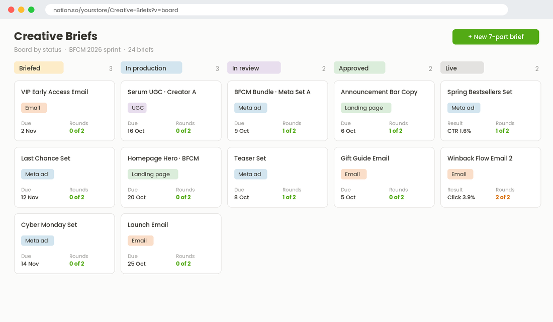
- Add these properties: Asset Type (select: Meta ad, UGC, Email, Landing page, Agency), Status (select: Draft, Briefed, In production, In review, Approved, Live), Owner (person), Due (date), Revision Rounds (number), Result Metric (text) and Result (text).
- Open the database’s template menu and create a new template called 7-Part Brief, with a heading for each of the seven parts. Set it as the default template so every new row starts with the structure.
- Add a Board view grouped by Status so you and your team can see everything in flight.
Step 2: Load Your Brand Kit in Canva
- In Canva, open Brand from the left menu and create a Brand Kit named after your store.
- Upload your logos (PNG and SVG), add your brand colours as HEX codes and set your heading and body fonts.
- Add your voice guide as a brand guideline, and upload approved product photography to the Brand Kit’s photos.
- If contractors design in your Canva team, turn on brand controls so they can only use your colours and fonts. You can check the current steps in Canva’s Brand Kit help guide.
Step 3: Close the Loop
When the creative goes live, fill in the Result field on the brief a week later. After a month you’ll have something most brands never have: a record of which briefs produced winners, and which ones needed four rounds of revisions.
Sort by Revision Rounds and the pattern jumps out. Usually it’s one asset type, or one missing part of the brief.
How to Give Feedback Without Starting Over
Half of all revision pain comes from how feedback is given, not what’s in the brief. Use these four rules:
- Feed back against the brief, not your taste. “Part three says the message is reorders, and the headline talks about ingredients” is fixable. “I don’t love it” isn’t.
- One person, one consolidated list. Collect everyone’s notes, remove the contradictions, then send one list. Never forward five separate opinions.
- Separate must-fix from nice-to-have. Label every note. Designers can then fix the must-fixes fast and push back on the rest.
- If round two is still wrong, check the brief. Two rounds that miss usually means the brief was unclear. Fix the brief, not just the asset, so it doesn’t happen again next month.
A useful habit: after each job, ask your designer or creator to score the brief out of five for clarity. Low scores on a type of brief tell you exactly where to improve. It takes ten seconds and it’s the fastest feedback loop you’ll ever build with your creative team.
The BFCM Brief Sprint: Get Every Brief Written by Mid-October
This is where the playbook pays for itself. Every BFCM, founders find out in the second week of November that half their creative isn’t ready, because the briefs went out late or went out vague.
Run a brief sprint instead. In one or two focused sessions in early October, brief everything your peak campaign needs:
- Paid social: a teaser set, a main offer set with at least three hooks per angle, a last-chance set and a Cyber Monday set.
- Email and SMS: early access for VIPs, launch, reminder, last chance, extension (if you’ll run one) and post-sale thank you.
- Site: homepage hero, announcement bar copy, collection banners and any landing page for bundles.
- UGC: briefs out to creators by early October so the content lands, gets edited and is live before the peak.
Batch-briefing forces you to decide your offer, your message and your mandatories once, which means everything ships consistent. It also gives your designer and creators a clear queue, so they can plan their own November (they’re busy with every other brand too).
A Filled-In Brief: One Aussie Brand’s BFCM Meta Ad
A template only helps if you can picture it filled in. Imagine you run a Gold Coast swimwear label going into BFCM. Here is the brief for your main offer ads, written in about 25 minutes.
- 1. Job and metric: win first purchases from cold audiences during BFCM week. Target a cost per acquisition under $45 at a $110 average order value.
- 2. Customer and moment: women aged 28 to 45 who have browsed but worry about fit. They are scrolling Instagram at night in mid-November with summer holidays coming. Main objection, in their words: “I never know if it will stay put.”
- 3. Single-minded message: “The swimsuit that stays put, now 25% off.”
- 4. Proof and mandatories: 4.8 stars from 2,100 reviews, free 30-day returns, offer terms “25% off sitewide 27 November to 1 December, excludes gift cards”. Was and now prices must be genuine, because the ACCC watches BFCM pricing closely.
- 5. Format and specs: three 9:16 Reels of 15 to 20 seconds and three 4:5 statics. Keep key text clear of the top and bottom of the frame, where the Reels interface sits.
- 6. Voice and no-go zone: warm, confident, sun-on-skin. No “bikini body” language and no before and after body shots.
- 7. Deliverables, deadline, rounds and owner: six assets by 7 November, two revision rounds, the founder as the single feedback owner.
Notice what this brief does not say. It never asks for “something fun” or “make it pop”.
Every line gives the designer a decision already made, which is why work like this usually comes back right on round one or two. Pair it with a clear offer from your BFCM offer architecture and the brief almost writes itself.
Briefing AI Tools With the Same Seven Parts
More of your first drafts now come from AI tools. Canva Magic Studio, ChatGPT and Meta’s Advantage+ creative options can all produce usable variations in minutes. The catch is the same as with a human designer: vague input gives you generic output, only faster.
Use your brief as the prompt. Paste in parts 2, 3, 4 and 6 (customer, message, proof and voice) before you ask for anything, and you will get copy and concepts that sound far more like your brand. Keep two jobs human every time:
- The voice check. Read every AI draft against your no-go zone before it goes near an ad account.
- The claims check. AI tools will happily invent review counts, discounts and benefits. Every number in the final asset must match the proof section of your brief.
Run AI variations through the same testing rhythm as everything else. Our Meta ads creative testing guide shows how to compare them fairly against human-made creative, so you keep what wins and drop what does not.
How It All Compounds
Each part of this system is small on its own. Together, they change how your whole creative operation runs.
A clear single-minded message means your ads test one idea at a time, so you actually learn what works. The voice page means new creators sound like you from their first job.
The brief database gives you a record of what won, so next month’s briefs start from evidence, not memory. Fewer revision rounds free up hours, and those hours go into making more creative, which is exactly how you find the 5% of ads that carry your account.
Better briefs lead to fewer revisions, which lead to more tests, which lead to more winners, which give you better briefs. That’s the loop. Most brands never start it because they think briefing is admin. It’s actually the cheapest performance lever you’ve got.
Your One-Page Brief Checklist
Before any brief leaves your hands, run it against this list:
- The job is one sentence, with one metric and a target number.
- The customer, their awareness stage and their main objection are named, in their words.
- The single-minded message passes the pub, swap and customer tests.
- Proof points and mandatories (including offer terms and compliance lines) are listed.
- Every size, placement, length and file format is spelled out.
- The voice page is linked, with three feel words and the no-go zone.
- Deliverables, due date, two included revision rounds and one named feedback owner are set.
- The brief fits on one page.
Tick all eight and you’ll be ahead of most of the brands you’re competing with in November.
Where to Start This Week
Pick the next piece of creative you need, probably something for BFCM, and write it using the seven parts before you send it. Time yourself.
The first brief takes 30 minutes. By the fifth, it takes ten, and you’ll feel the difference the first time an asset comes back right on round one.
Inside eCommerce Circle, building a team that does great work without you in every detail is one of the core pillars we work on with every member. If you want to see exactly where your store is being capped, take the free More Orders Scorecard.
It takes two minutes and shows you which of the 10 P’s to fix first. And if you’d rather talk it through with us, let’s talk.