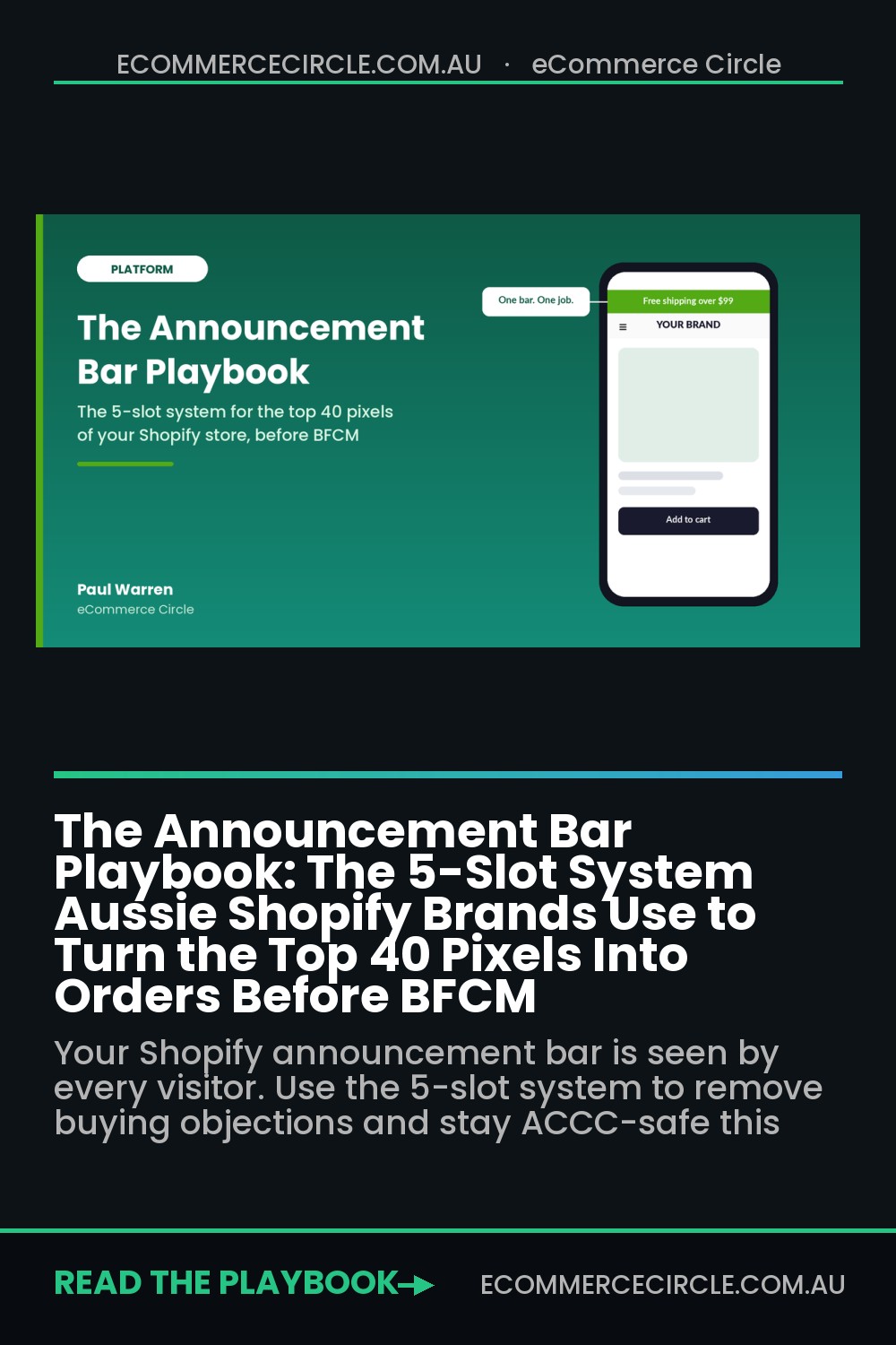
Scroll to the very top of your Shopify store on your phone. What does the thin strip above your logo say right now?
What’s in This Article
For most Aussie stores we audit, it is one of three things: a message left over from the last sale, five announcements rotating so fast nobody can read them, or a “Follow us on Instagram” line that sends buyers off your site. The announcement bar is the only element that appears on every single page, for every single visitor, and most founders treat it like a sticky note on the fridge.
The brands that get it right treat those top 40 pixels as a conversion tool with one job at a time. They use it to kill the objection that stops people buying, they change it on a calendar, and they never let it say anything that is not true. With Black Friday landing on Friday 27 November 2026 and the ACCC fining retailers this week over countdown timers, there has never been a better time to fix it. This playbook gives you the 5-slot system we use with members: the job, the words, the motion, the audience and the calendar.
Why the Top 40 Pixels Matter More in Peak Season
Your homepage hero gets seen by homepage visitors. Your product page trust badges get seen on product pages. Your announcement bar gets seen by everyone, including the paid social visitor who lands deep on a product page and never touches your homepage at all.
That makes it the cheapest place on your store to answer the questions that kill orders. Baymard Institute’s research puts the average documented cart abandonment rate at 70.22%. When you strip out people who were just browsing, the top fixable reasons look like this:
- 40% abandoned because extra costs (shipping, tax, fees) were too high.
- 20% abandoned because delivery was too slow.
- 19% did not trust the site with their card details.
- 13% were put off by the returns policy.
Every one of those objections can be answered in under 40 characters, before a shopper has scrolled an inch. Shipping cost is the big one in Australia. The Australia Post 2026 eCommerce Report found 56% of Australian shoppers rank free shipping as their top delivery preference. If you offer it and it is not in your bar, you are hiding your best argument.
Peak season raises the stakes. From late October to early January your bar has to carry Halloween drops, early access sign-ups, a Black Friday offer, Christmas delivery cut-offs and Boxing Day, often on a store running higher traffic than any other time of year. Brands that wing it end up with stale, wrong or non-compliant messages at exactly the moment the most people are looking.
Slot 1: The Job (One Objection Per Window)
The first rule is simple and most stores break it. Your announcement bar has one job at a time, and that job is to remove a reason not to buy. Not to grow your Instagram. Not to announce a new collection (that is what your hero banner is for). Not to say “Welcome to our store”.
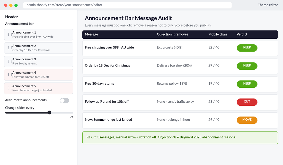
Run every message you currently have through this hierarchy and keep the highest one that is true for your store:
- Cost certainty. “Free shipping over $99 · AU wide” or “Flat $9.95 shipping Australia wide”. This answers the 40% objection.
- Speed and deadlines. “Order by 18 Dec for Christmas delivery” or “Ships same day from Melbourne before 2pm”. This answers the 20% objection, and it becomes the number one message from early December.
- Risk reversal. “Free 30-day returns” or “Free exchanges on sizing”. This answers the 13% returns objection and is the strongest message for apparel and footwear.
- A live, genuine offer. “Black Friday: up to 30% off · ends Mon 30 Nov”. Only while the offer is actually running.
- Proof. “4.8 stars from 3,200+ Aussie reviews”. Useful for newer brands where trust is the real problem.
Notice what is missing: social follows, newsletter pitches, generic welcome lines and new arrivals. If a message does not map to a buying objection, cut it or move it somewhere else on the site.
One more test before you publish: the link must prove the claim. A shipping message should link to your shipping page with the threshold and zones spelled out. A returns message should link to the returns policy. If you are still working out your threshold number, our free shipping threshold playbook walks through the maths so the bar message does not quietly eat your margin.
Slot 2: The Words (Write for a 375px Screen)
Most announcement bars are written on a laptop and read on a phone. On a standard 375px-wide mobile screen at a readable font size, you have roughly 35 to 40 characters before the line wraps or truncates. Wrapped bars push your logo and hero down, and truncated bars cut off the one word that mattered.
Use this formula: [Benefit] + [Condition] + [Scope or Deadline]. Lead with the thing the shopper gets, then the condition, then the boundary.
- Weak: “We are excited to offer complimentary shipping on all orders over $99 within Australia!” (85 characters)
- Strong: “Free shipping over $99 · AU wide” (32 characters)
- Weak: “Don’t forget Christmas is coming, make sure you get your orders in early!” (73 characters)
- Strong: “Order by 18 Dec for Christmas” (29 characters)
A few more rules we use with every member store:
- Use numbers, not adjectives. “$99” and “30 days” are scannable. “Generous” and “fast” are not.
- Use real dates, not vague urgency. “Ends Mon 30 Nov” beats “Ending soon”, and as you will see in Slot 5, it also keeps you on the right side of the ACCC.
- Drop the exclamation marks. They read as shouting in a space this small and add a character you cannot spare.
- Check contrast. Text against the bar colour should hit at least a 4.5:1 contrast ratio. Pale green text on a mid-green bar might match your brand guide, but half your mobile visitors in bright sunlight will not be able to read it.
Here is a quick exercise. Open your store on your phone, screenshot the top of the page, and send it to someone who has never seen your brand. Ask them what the bar said. If they cannot tell you within three seconds, rewrite it.
Slot 3: The Motion (Why Rotation Is Costing You)
Shopify’s free themes let you add multiple announcements and auto-rotate them. It feels efficient: why say one thing when you can say five? In practice, rotation is where good bars go to die.
The best-known data on rotating content comes from Erik Runyon at the University of Notre Dame, who published interaction data from the university’s homepage carousel. Only about 1% of visitors clicked it, and the large majority of those clicks went to the first slide. Every message after the first was close to invisible. Announcement bars behave the same way: shoppers glance once, register whatever is showing, and move on.
There is an accessibility problem too. Under WCAG 2.2.2 (Pause, Stop, Hide), any content that moves or updates automatically, lasts more than five seconds and sits alongside other content must give users a way to pause, stop or hide it. A bar that auto-rotates forever with no pause control fails that test, and it is distracting for people with attention difficulties or vestibular disorders. Our Shopify accessibility playbook covers the rest of the checks worth running before peak.
Our recommendation for most stores:
- Default to one message. Pick the highest-ranking objection from Slot 1 for the current window.
- If you must run more than one, cap it at three, turn auto-rotate off, and let shoppers use the arrows. Put your most important message first, because that is the one most people will see.
- If you keep auto-rotate on, slow it down to 6 to 8 seconds per message and make sure your theme exposes a pause control.
- Never use a scrolling marquee for critical information. A ticker that never stops is the worst of both worlds: hard to read and hard to ignore.
Motion also affects speed. Bars injected by apps after the page loads push everything below them down the screen, which shows up as layout shift. Google’s Core Web Vitals guidance is to keep Cumulative Layout Shift at 0.1 or less at the 75th percentile of page loads. Use your theme’s native bar (it renders with the page), or reserve the bar’s height in CSS so nothing jumps when it appears.
Slot 4: The Audience (Show the Right Bar to the Right Shopper)
One bar for every visitor is fine when every visitor has the same objection. The moment you sell into more than one market, or run a members-only offer, a single message starts lying to some of your shoppers.
The classic Aussie example is New Zealand. Your “Free shipping over $99 · AU wide” bar is accurate for Sydney and wrong for Auckland. A Kiwi who adds to cart expecting free shipping, then sees international rates at checkout, is exactly the 40% extra-costs abandoner from Baymard’s data, created by your own bar.
If you use Shopify Markets, you can swap the message by country with a Custom Liquid block in your header area. Something like this:
{% if localization.country.iso_code == 'NZ' %}
  Free shipping to NZ over $150 NZD
{% else %}
  Free shipping over $99 · AU wide
{% endif %}
Swap the numbers for your own thresholds, and have your developer style the block to match your bar. Other audience splits worth considering:
- Logged-in customers: show a loyalty or VIP early-access message using
{% if customer %}, and keep the acquisition message for everyone else. - Cart and checkout: once someone is in the cart, the free shipping progress bar inside your cart drawer does a better job than the top bar. Do not repeat the same message twice.
- Wholesale or B2B visitors: hide retail offers from trade customers so you are not training them to wait for a sale.
If you would rather not touch code, apps such as Hextom’s Free Shipping Bar let you target bars by country, device and page, and show a dynamic “You are $23 away from free shipping” message. Just check the app’s impact on speed and layout shift before peak, using the QA steps later in this article.
Slot 5: The Calendar (Plan Every Swap Before November)
The worst announcement bars are not badly written. They are out of date. A “Black Friday ends tonight” message still running on Wednesday. A Christmas delivery promise still showing after the cut-off has passed. These are not just sloppy, they are now an enforcement priority.
On 30 September 2026, the ACCC confirmed that James Lane paid a $19,800 penalty and Vuly paid $39,600 after its sweep of last year’s Black Friday advertising. James Lane advertised a sale ending 3 December, then kept the discount running for another week. Vuly ran a countdown timer that reset to a new end date the moment the sale finished. ACCC deputy chair Catriona Lowe was blunt: “Businesses must ensure any sale end dates, countdown timers or limited-time discount claims are genuine.”
That followed the Federal Court ordering Emma Sleep to pay $15 million in penalties earlier this year, a case that included a countdown timer the ACCC said reset itself and created a false sense of urgency. The announcement bar is where a lot of these timers and “ends soon” claims live. Treat it as advertising, because legally it is.
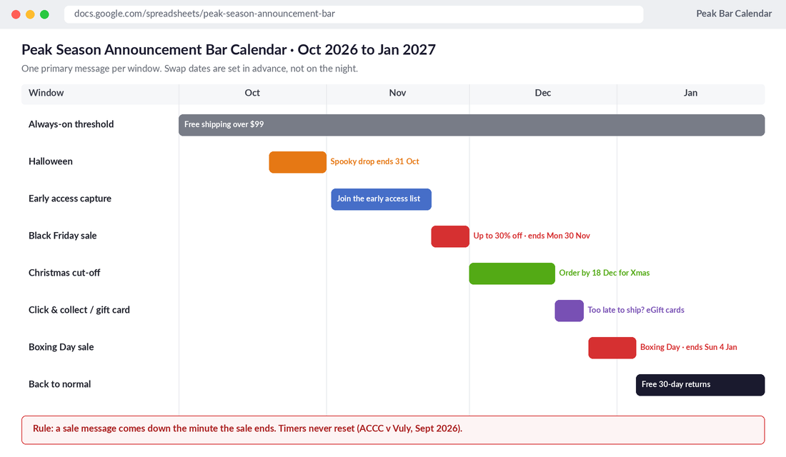
So build a bar calendar now, while it is still October. For each window, write down the message, the start date and time, the end date and time, and the person responsible for the swap. A typical Aussie peak calendar looks like this:
- Always on: your cost certainty message (free shipping threshold or flat rate) as the fallback whenever nothing else is scheduled.
- Late October: Halloween drop or limited edition, ending on 31 October if that is when it actually ends.
- Early to mid November: early access list capture for your Black Friday offer.
- Black Friday to Cyber Monday (27 to 30 November): the offer with a real end date. Swap the moment it ends.
- December 1 to your last shipping date: the Christmas delivery cut-off. This is the single highest-converting message of the year for gift categories. Use the dates from our Christmas cut-off playbook, set by carrier and zone.
- After the cut-off: switch to click and collect, express-only or digital gift cards. Never leave a delivery promise up after you can no longer keep it.
- Boxing Day: the offer with a real end date.
- January: back to cost certainty or risk reversal (free returns works well for post-Christmas gift exchanges).
Our rule for countdown timers is strict. If the end time is not the real end time, there is no timer. If the sale is extended, the timer comes down and a new, honest message goes up, and you can say “Extended to Wed 2 Dec” plainly. For a full sweep of other urgency tactics that could get you in trouble, run our dark patterns audit before November.
How to Set It Up in Shopify Today
You do not need an app to get 90% of this right. Shopify’s free themes (Dawn, Horizon and most premium themes) have a native announcement bar inside the header group. Here is the setup in about 15 minutes:
- In your Shopify admin, go to Online Store > Themes and click Customize on your live theme. Better still, duplicate the theme first and make changes on the copy.
- In the left sidebar, find Announcement bar (either as its own section or inside Header).
- Delete every announcement that fails the Slot 1 test. Keep one, or a maximum of three.
- Rewrite the remaining messages using the Slot 2 formula, and add a link to the page that proves each claim.
- Untick Auto-rotate announcements, or if you leave it on, set Change slides every to at least 6 seconds.
- Pick a colour scheme with strong contrast. Brand green with white text usually works. Check it on your phone outdoors.
- If you sell into more than one country, add a Custom Liquid block with the market-specific logic from Slot 4.
- Preview on mobile in the theme editor, then on a real phone, then publish.
Then open a shared Google Sheet called “Peak Bar Calendar” with five columns: window, message, start, end, owner. Fill it in for October to January today. If you want swaps to happen on time without someone staying up until midnight, Shopify Plus stores can schedule theme changes with Launchpad, and everyone else can prepare duplicate themes in advance and publish them on the day.
How to Know If Your Bar Is Working
Here is where most founders measure the wrong thing. Announcement bar click-through rate is a vanity metric. Most shoppers never click the bar, and that is fine, because the job is to answer the question in their head, not to get a click.
Measure these instead:
- Sitewide conversion rate in the two weeks before and after a message change, comparing the same days of the week. In Shopify Analytics, use the Sessions and Conversion rate reports with a comparison period.
- Average order value after you add or change a free shipping threshold message. A good threshold message should nudge AOV towards the threshold.
- Checkout drop-off at the shipping step. If more people reach checkout but drop at shipping, your bar is making a promise your rates are not keeping.
- Customer service tickets asking “When will my order arrive for Christmas?” or “Do you ship to NZ?”. A good bar answers these before they are asked.
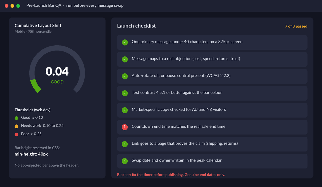
- Cumulative Layout Shift on mobile in PageSpeed Insights or Search Console’s Core Web Vitals report. Keep it at 0.1 or less.
If you want a cleaner read, run a simple split test with a tool like Shoplift or Intelligems on stores with enough traffic (as a rough guide, at least a few hundred orders a month), testing one message against another. For smaller stores, a before-and-after comparison over two full weeks is good enough to stop a bad message from running all season.
Before every swap, run the launch checklist: one message, under 40 characters on mobile, maps to a real objection, rotation off or pausable, contrast checked, market copy checked, link proves the claim, and any countdown matches the real end time. If any of those fail, it does not go live.
The Compound Effect: Why a Thin Strip Moves Real Revenue
None of these five slots looks dramatic on its own. A rewritten shipping line. A rotation turned off. A Liquid block for New Zealand. A calendar in a Google Sheet. But stack them and look at what happens to a peak-season shopper.
She lands on a product page from a Meta ad on a Tuesday night in early December. Before she has even seen the product, she knows shipping is free over $99 and that ordering by 18 December gets it there for Christmas. The cost and speed objections, which account for most fixable abandonment, are gone before she scrolls. Her cart total at checkout matches what the bar promised. Nothing on the page jumps when it loads. And when the cut-off passes, she sees an honest message pointing her to gift cards rather than a delivery promise you cannot keep.
Now multiply that by every visitor across eight peak weeks. The announcement bar does not replace a good product page, strong ads or a solid offer. What it does is stop the easy, avoidable losses on every page at once, which is why it belongs in your Platform checks rather than being left to whoever last edited the theme.
Your Announcement Bar Brief (Copy This)
Paste this into your team’s peak planning doc and fill it in for each window:
| Field | What to write | Example |
|---|---|---|
| 1. Job | Which objection does this window’s message remove? | Delivery speed |
| 2. Words | Benefit + condition + scope or deadline, under 40 characters | Order by 18 Dec for Christmas |
| 3. Motion | Single message, or up to three with rotation off | Single message |
| 4. Audience | Which markets, customers or pages see it? | AU visitors only; NZ sees 11 Dec cut-off |
| 5. Calendar | Exact start and end, plus the owner of the swap | 1 Dec 6am to 18 Dec 11:59pm · Sam |
| Proof link | The page that backs up the claim | /pages/christmas-shipping |
| Compliance check | Any timer or end date is genuine and comes down on time | No timer, end date shown in text |
If you do one thing today, open your store on your phone, read your bar, and ask: “Does this remove a reason not to buy, and is it still true?” If the answer is no, you have just found the easiest fix on your store before Black Friday.
Inside eCommerce Circle, the Platform pillar, including the small details like your announcement bar, is one of the core areas we work on with every member before peak season. If you want to see exactly where your store is being capped, take the free More Orders Scorecard. It takes two minutes and shows you which of the 10 P’s to fix first.