Most Aussie DTC founders only find out a customer has churned when the data finally proves it. The order that never came back. The Klaviyo list that quietly stopped opening. The cohort report that, ninety days too late, shows a retention dip you cannot reverse.
What’s in This Article
By that point the customer is gone. You are not winning them back. You are competing against every other brand in their inbox, and the warm trust you spent $68 to $318 in CAC building has cooled to nothing.
The brands that compound past $1m do something different. They predict churn before it happens. They score every customer on a churn health index, watch the score drift, and intervene at the first warning signal, not the funeral. Companies running predictive churn analytics report 15 to 25% lower churn and 20 to 30% higher CLV. That is the gap between a 4x LTV-to-CAC ratio and a 1.8x one. That is the difference between a business that scales and a business that stalls.
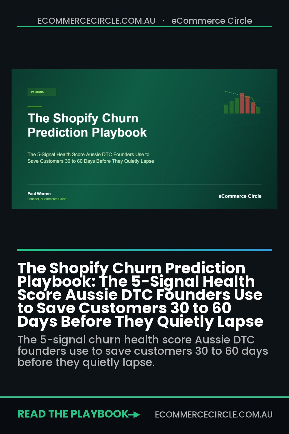
This is the Churn Prediction Playbook. The 5-signal health score we run with every member inside eCommerce Circle. By the end of this article, you will have a scoring rubric, a tiered intervention map, and a Klaviyo flow stack that catches customers 30 to 60 days before the spreadsheet does.
Why Retroactive Retention Is Killing Your Margin
The average Shopify store has a repeat purchase rate of 28.2%. Annual ecommerce churn sits between 70 and 75%. That means roughly seven out of every ten customers you acquired last year are not buying from you this year. Most founders accept this as gravity. The top operators treat it as a solvable problem.
Here is the math that should disturb you. Acquiring a new customer costs 5 to 7x more than retaining an existing one. A 5% lift in retention can boost profit by up to 95% because every retained order skips the CAC line. If your blended CAC is $90 and your first-order contribution margin is $30, you are losing money on order one and counting on order two to recover. When order two never lands, the entire P&L unwinds.
The standard win-back flow triggers when a customer has not ordered in 60, 90, or 120 days. That is too late. By day 60 you are competing with three or four other brands the customer has tried. By day 90 the relationship is functionally dead. The customer has either replaced you or quietly decided you were not worth coming back to.
What you actually need is a leading indicator. A score that flags a customer at day 20 or day 25, while the relationship is still warm and the cost to rescue is a $5 incentive, not a $25 reactivation discount. The 5 signals below are the leading indicators that work for Aussie DTC brands across beauty, supplements, apparel, pet, and food and beverage.
Signal 1: Recency Drift (The Inter-Purchase Gap)
Every customer has a personal rhythm. A coffee subscriber repurchases every 28 days. A skincare buyer every 52. A wholesale apparel customer every 84. The cohort average lies to you. The individual rhythm is the truth, and it is what you score against.
Pull the last three order dates for every customer who has placed two or more orders. Calculate the average gap. Klaviyo automatically calculates an “Expected Date of Next Order” property for every customer profile based on their ordering pattern. If a customer is 25% past their expected next order date with no purchase, they are in Recency Drift. If they are 50% past, they are in serious trouble.
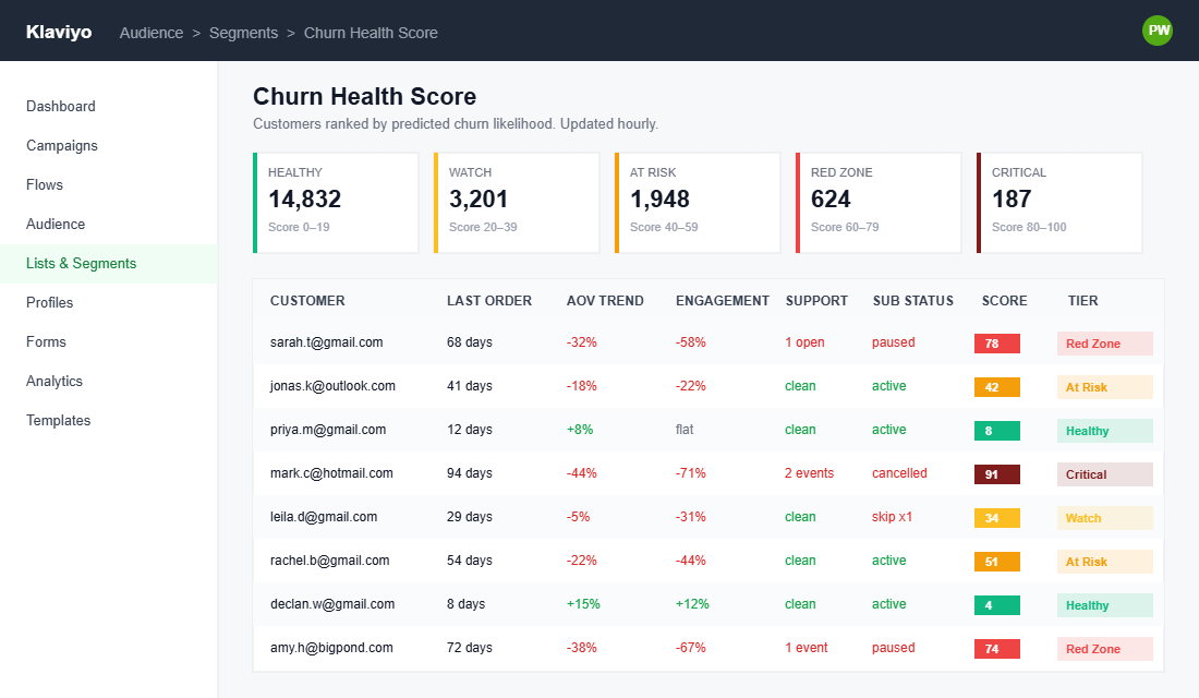
The reason this works better than blanket 60-day windows: a coffee buyer at day 40 is already deep into someone else’s funnel, while a furniture buyer at day 40 is still browsing. A single fixed lapse window punishes the coffee brand (too late) and panics the furniture brand (too early). Personalised recency drift gets both right.
Score this signal 0 to 25 points. 0 means on time. 10 means 25% past expected. 18 means 50% past. 25 means 100% past, which means the customer has already mentally churned. The earlier you act, the cheaper the rescue.
Signal 2: Engagement Decay
Order behaviour lags. Engagement behaviour leads. A customer who stops opening your emails today is a customer who will stop buying in 45 to 60 days. By the time the order data catches up, you have already lost.
Track three engagement inputs on a rolling 30-day window:
- Email open rate. A customer who used to open 60% of your emails and is now opening 20% is decaying. Klaviyo’s engagement segments flag this automatically.
- Site visit cadence. Use Shopify Web Pixel or a tool like Lifetimely to track logged-in visits. A 50% drop versus the customer’s 90-day baseline is a warning.
- SMS reply or click behaviour. If you have permission-based SMS, a customer who used to click and now ignores is decaying twice as fast as an email-only lapser.
The trap most operators fall into: treating engagement decay as a list hygiene problem. They suppress the customer, the engagement score recovers (because they removed the data point), and the customer churns silently in the background. Wrong move. Engagement decay is a behavioural warning to intervene, not a reason to stop talking to the person.
Score this signal 0 to 20 points. 0 means engagement is at or above their personal 90-day baseline. 10 means a 25 to 50% drop. 20 means a 50%+ drop with no replies, no clicks, no site visits in 30 days.
Signal 3: AOV Compression
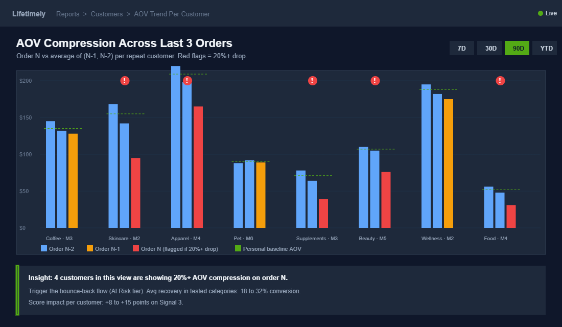
The customer about to leave often tells you in the dollar amount of their last orders. When a customer’s last three orders compress from $120, $90, $58, something has changed. The pattern is they are testing whether you still earn the spend. If the answer is no, the next order is zero.
Run an AOV trend per customer over their last three orders. Compare order N to the average of N-1 and N-2. A 20%+ drop on the most recent order is a soft signal. A 40%+ drop is loud. If the drop coincides with switching from premium SKUs to entry-level SKUs, the signal is louder still.
This signal is especially powerful in beauty, supplements, and food and beverage where the customer is essentially asking “is this still worth my money?” with their basket size. It is less reliable in apparel and furniture where order values swing naturally by season and category.
Score 0 to 15 points. 0 means flat or rising AOV trend. 8 means a 20 to 39% compression. 15 means 40%+ compression with a downgrade in SKU tier. Combine this with Signal 1 and you have a customer who is buying less and buying later. That is a customer 60 to 90 days from gone.
Signal 4: Support Friction
Research consistently shows 85% of customer churn stems from service and experience failures the brand could have fixed. That makes support friction one of the highest-impact signals on the scoreboard, and it is the one most operators ignore because the data lives in Gorgias or Zendesk, not in Shopify or Klaviyo.
Pipe these three support events into the customer’s profile:
- Return rate over rolling 6 months. A customer who returned 2 of their last 3 orders is signalling fit problems or buyer’s remorse. Both predict exit.
- Open or recently resolved complaint. Especially shipping delays, damaged product, or a refund that took longer than 5 business days. Any of these triggers a “watch” flag on the profile for 30 days.
- NPS or post-purchase survey score of 6 or below. Detractors churn at 3x the rate of promoters. If you are running a post-purchase survey, the score is a leading indicator, not a vanity metric.
Score 0 to 20 points. 0 means clean record. 10 means one open friction event. 20 means multiple friction events, a low NPS, or an unresolved complaint older than 14 days. The customers in the 20 bucket are not at risk. They are actively writing your eulogy in their head.
Signal 5: Subscription or Replenishment Disruption
If you run subscriptions (Recharge, Skio, Loop Subscriptions, or Shopify’s native subscription rails), the disruption signal is gold. The ‘churn cliff’ in the Australian subscription market typically hits at month three. The brands that survive month three retain 70 to 80% out to month twelve. The brands that ignore month three lose 40 to 60% before they understand what happened.
Track these specific events:
- First skip. A first skip is a 4 to 6x churn risk indicator. Most brands ignore it because the skip looks like a normal product event.
- Frequency change. Customer pushes their cadence from 30 days to 45 days. They are not loving it, they are slowing it. Treat this as a “watch” event.
- Pause requested. Pauses convert to cancellations 45 to 55% of the time if you do nothing. With a save offer, that number drops to 20 to 30%.
- SKU swap to a smaller pack size. Same logic as AOV compression but inside the subscription rail.
Score 0 to 20 points. 0 means active and on cadence. 10 means a single skip or frequency reduction. 20 means a pause or active cancel request. Treat 20-point subscription disruptions as P1 incidents inside your retention dashboard. The customer has told you they are leaving. Your only job is to give them a reason to stay.
Building the Aggregate Churn Health Score
Add the five signals. The maximum score is 100. The lower the number, the healthier the customer. Use these tiers, which we calibrate inside RFM Segmentation for Shopify for every member running this system:
- 0 to 19 (Healthy). On rhythm, engaged, no friction. Do not interrupt. Nurture with brand and product content, save offers for the right tier.
- 20 to 39 (Watch). Mild drift across one or two signals. Send value-led content, not discounts. A “you might love this new drop” email outperforms a 10% off here.
- 40 to 59 (At Risk). Multi-signal warning. Begin a 14-day intervention sequence. Offer a small bounce-back ($5 to $10 off, free upgrade, free sample) tied to a specific product they have browsed.
- 60 to 79 (Red Zone). Customer is days from churn. Founder-led email or SMS, personalised, no template feel. The save offer here needs to be 20% off or a meaningful upgrade. Cost of rescue is still less than CAC for a new customer.
- 80 to 100 (Critical). Last-touch sequence. If you do not act, they are gone within 30 days. Lean on your VIP framework, your founder voice, and a real reason for them to come back. Reference our Win-Back Playbook for the exact sequence we use here.
The scoring weights are not gospel. They are a starting point. After 90 days of running the score, look at which signals best predicted churn in your data, and re-weight accordingly. Beauty brands tend to over-index on engagement decay. Food and beverage on recency drift. Furniture and apparel on AOV compression. Tune the model to your category.
The Intervention Playbook by Tier
Scoring without intervention is a dashboard. Scoring with intervention is a retention engine. Here is the exact intervention map we run with members.
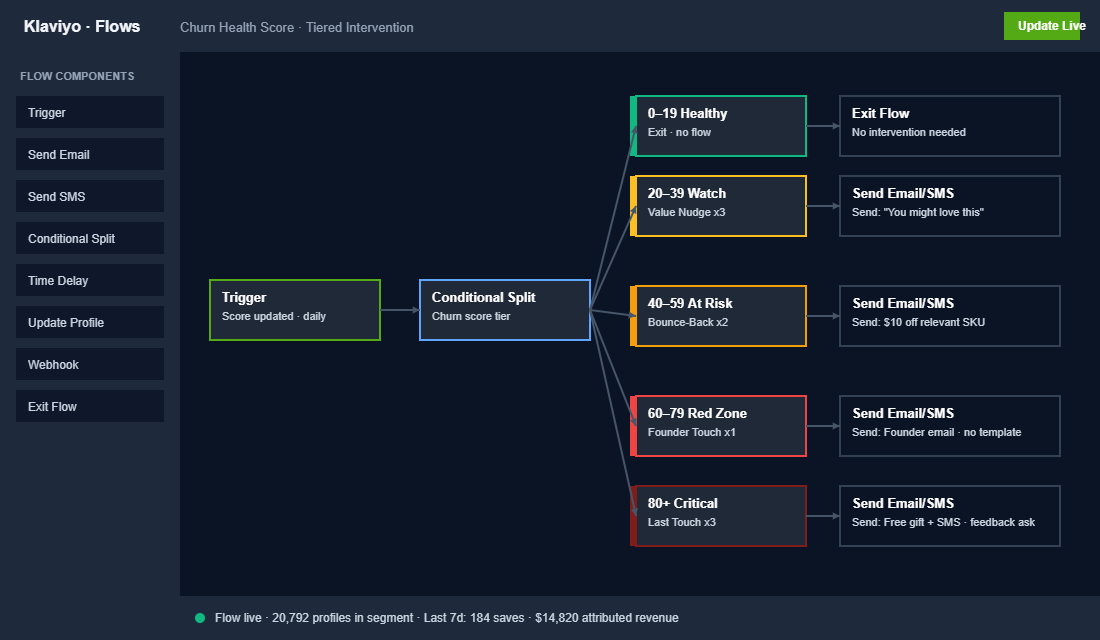
Watch tier (20 to 39): Value Nudges. Three-message sequence over 10 days. Email 1 is a “did you know” content piece tied to their last purchase category. Email 2 is a customer story or UGC piece, no offer. Email 3 is a soft cross-sell to a complementary product, no discount. The goal is to re-engage attention, not to spend margin.
At Risk tier (40 to 59): Bounce-Back Offer. Two-message sequence over 7 days. Email 1 is a personalised “we noticed it has been a while” with a tightly-scoped $5 to $10 offer on a single relevant product. Email 2 is a 5-day reminder if the offer is unredeemed. Average uplift in tests we have run: 18 to 32% conversion on offer email 1, 8 to 12% on the reminder.
Red Zone tier (60 to 79): Founder Touch. One personal email from the founder, no template branding, no offer code. “Hi [first name], I noticed it has been a while and wanted to check in. If something was not right, would you tell me?” Klaviyo’s founder-tone “We Miss You” sequences proportional to customer LTV (as demonstrated by US brand Every Man Jack) routinely outperform discount-led win-backs by 2 to 3x.
Critical tier (80 to 100): Last Touch. Three-message sequence over 14 days, mixing email and SMS where opted in. Message 1 is the founder touch from the red zone above. Message 2 is a meaningful upgrade offer: free gift, free shipping for life, double loyalty points. Message 3 is a “no hard feelings” exit message that asks for one piece of feedback. The feedback alone is worth the touch. It is qualitative data on why customers in this segment are leaving you.
Tooling: How to Wire This Into Klaviyo Today
You do not need a data warehouse, Hex, or a custom ML model to run this. Klaviyo gives you 80% of what you need out of the box. Here is the build sequence for a typical Aussie Shopify Plus store, start to finish, in about a week of work for a single ops or marketing operator.
- Step 1: Confirm Klaviyo’s predictive analytics is on. Klaviyo automatically calculates “Expected Date of Next Order”, “Average Time Between Orders”, “Predicted CLV”, and “Churn Risk Prediction” (High, Medium, Low) for any profile with 3+ orders. These powers Signals 1 and 2 for free.
- Step 2: Create custom profile properties for the remaining signals. Use Shopify Flow or a tool like Alloy to write back AOV trend (Signal 3), support friction count (Signal 4), and subscription status events (Signal 5) into Klaviyo as custom properties.
- Step 3: Build a segment per tier. Healthy, Watch, At Risk, Red Zone, Critical. Use Klaviyo’s segment builder with the custom properties as filters.
- Step 4: Build the four intervention flows. Each flow triggers on entry to its tier segment. Use a 90-day suppression window so you do not double-intervene.
- Step 5: Add a “Churn Health” Klaviyo dashboard tile. Customer count by tier, week over week. Watch it like you watch revenue.
For brands without Klaviyo, the same architecture runs on Omnisend, Drip, or Sendlane. The signals do not change. The implementation does.
The Compound Effect on Retention Economics
Run the numbers on what a 5-signal churn score does to a typical Aussie DTC business at $1.5m revenue, 30% repeat rate, $90 CAC, $120 AOV.
- Baseline annual churn: 70%. You retain 30% of customers year over year. Your LTV math relies almost entirely on order 1.
- After 90 days of scoring + intervention: Recency drift catches 35% of pre-lapse customers and saves half. Engagement decay flags 25% more and saves a third. AOV compression rescues another 12%. Support friction interventions claw back 8 to 10% of detractor customers. Subscription save offers retain 25 to 30% of would-be pausers.
- Net effect: A 5 to 8 percentage point lift in annual retention. From 30% to 35 or 38%. On the surface that sounds small. On the profit line it is worth 30 to 50% more annual profit because every retained customer skips the next CAC outlay.
That is the compound point most founders miss. Retention is not the warm-fuzzy half of the funnel. Retention is the maths that decides whether your paid acquisition is sustainable. Without retention, every CAC dollar is a hope. With predictive retention, every CAC dollar is an investment.
The brands inside eCommerce Circle running this score religiously also tend to run a parallel Cohort Analysis Playbook on a 30-day cadence. The score tells you who is about to leave. The cohort report tells you whether your interventions are actually moving the curve. Both are required. Neither alone is enough.
Your 14-Day Implementation Checklist
This is the exact 14-day plan we hand members on day one. Print it. Tape it next to your monitor. Tick the boxes:
- Day 1. Audit your current win-back flow. What is the trigger? What is the open rate? What is the conversion to a second order?
- Day 2 to 3. Turn on Klaviyo predictive analytics if not already on. Export a list of every profile with the Churn Risk Prediction property populated.
- Day 4. Build the AOV compression custom property via Shopify Flow. Calculate the percentage delta between last order and the average of the previous two.
- Day 5 to 6. Sync support data from Gorgias or Zendesk into Klaviyo. Tag profiles with the friction count.
- Day 7. Subscription event sync. Make sure Recharge, Skio, or your subscription app is firing skip, pause, and cancel events back to Klaviyo.
- Day 8. Build the five tier segments. Test them by exporting customer counts. Sanity check: Healthy should be 50 to 65% of your active list. Critical should be under 5%.
- Day 9 to 11. Write the four intervention sequences. Use the founder’s actual voice for the Red Zone and Critical sequences. Generic copy here is a leak.
- Day 12. QA the flows. Send test sends to your own profile in each tier. Confirm the right offer fires for the right tier.
- Day 13. Turn the flows live. Set up a Klaviyo dashboard tile per tier so you can watch the score weekly.
- Day 14. Document the score. Hand off to your retention lead or VA. The system needs to run without you watching every customer move.
By day 30 you will have data. By day 60 you will have a measurable retention lift. By day 90 you will know which signals work hardest in your category and you will tune the weights accordingly.
Stop Waiting for the Order That Never Comes
The Aussie DTC operators who scale past $5m do not have better products than you. They do not have better ads than you. They have better retention systems than you, and the difference compounds every single month.
Predictive churn scoring is the unsexy work that separates the $1m founder reacting to last quarter’s losses from the $5m founder who sees customers about to leave and saves them three weeks before the spreadsheet would have noticed. The maths is not hard. The tools are already in your stack. The only thing missing is the discipline to run the score, watch the tiers, and intervene before the cohort report makes the loss permanent.
Inside eCommerce Circle, retention scoring is one of the core pillars we work on with every member. If you want a second opinion on yours, let’s talk.