Here’s an uncomfortable truth about most Shopify stores: the collection page — the single page where the majority of your browsing traffic lands — is an afterthought. It’s a grid of thumbnails with a generic title slapped on top. No context. No filters worth using. No reason for a shopper to stay.
What’s in This Article
And it’s silently killing your conversion rate.
Baymard Institute’s large-scale usability research uncovered more than 700 usability issues specifically related to product lists, filtering, and sorting across leading ecommerce sites. Their findings show that 75% of sites still don’t correctly implement product filters — and that site search users convert 2–3x higher than non-searchers, which tells you just how much revenue poor collection page design is leaving behind. The good news? Fixing your collection pages is one of the highest-ROI changes you can make to your Shopify store. Let’s break down exactly how to do it.
Why Your Collection Pages Deserve More Attention Than Your Homepage
Most store owners obsess over their homepage. They spend weeks tweaking hero banners, rearranging featured products, and testing headline copy. Meanwhile, their collection pages — the pages that do the actual heavy lifting of converting browsers into buyers — run on autopilot.
Think about how people actually shop online. They land on a collection page from a Google search, a Meta ad, or a navigation click. They’re past the “awareness” stage. They know roughly what they want. Your collection page needs to do one thing brilliantly: help them find the right product, fast.
The average Shopify conversion rate sits around 1.4%, but top-performing stores push past 3.2%. The gap between those numbers often isn’t product quality or pricing — it’s how easily a customer can navigate from “browsing” to “this is the one.” Your collection page is where that transition happens.
If your collection pages load slowly, lack useful filters, or show products in a random order with no context, you’re creating friction at the exact moment a shopper is ready to engage. And friction at this stage doesn’t just cost you one sale — it costs you every sale that customer would have made over their lifetime. For more on how speed affects conversions, check out our guide on Shopify site speed fixes that actually move the needle.
Collection Naming and Structure: Think Like Your Customer, Not Your Inventory System
The first mistake most Shopify stores make is naming collections the way their warehouse thinks, not the way their customer shops. If your navigation says “SKU Range A” or “2026 Spring Line” or even something vaguely internal like “Essentials Bundle,” you’ve already lost momentum.
Your collection names need to mirror the language your customers use when they’re searching. Instead of “Women’s Apparel,” try “Dresses,” “Tops,” “Activewear.” Instead of “Home & Living,” break it into “Candles,” “Throw Blankets,” “Wall Art.” Specific beats generic every time.
Here’s a structure that works for most Shopify stores:
- Primary collections by product type. These are your main navigation items — “Dresses,” “Skincare,” “Phone Mounts.” Keep them simple and search-friendly.
- Secondary collections by use case or occasion. “Date Night Outfits,” “Gifts Under $50,” “Best Sellers.” These help shoppers who know the context but not the product.
- Seasonal or promotional collections. “New Arrivals,” “Sale,” “Winter Edit.” Rotate these quarterly to keep the store feeling fresh.
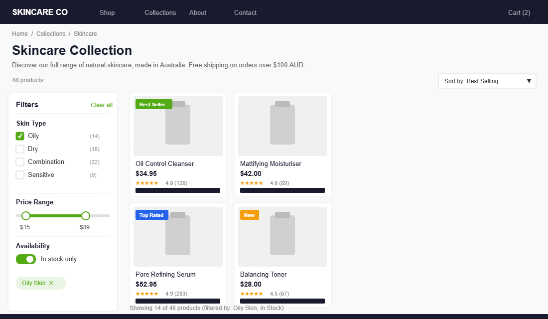
Australian skincare brand Frank Body nails this. Their collections aren’t organised by ingredient lists or product codes — they’re built around how their customers think: “Face,” “Body,” “Hair,” “Bundles.” Simple, intuitive, and scannable in under two seconds.
One more thing: your default sort order matters more than you think. Shopify defaults to “Manual” sorting, which means products appear in whatever order you added them unless you’ve deliberately rearranged them. Switch your default to “Best selling” for most collections. This puts your proven winners front and centre, which builds confidence with new visitors who might not know where to start.
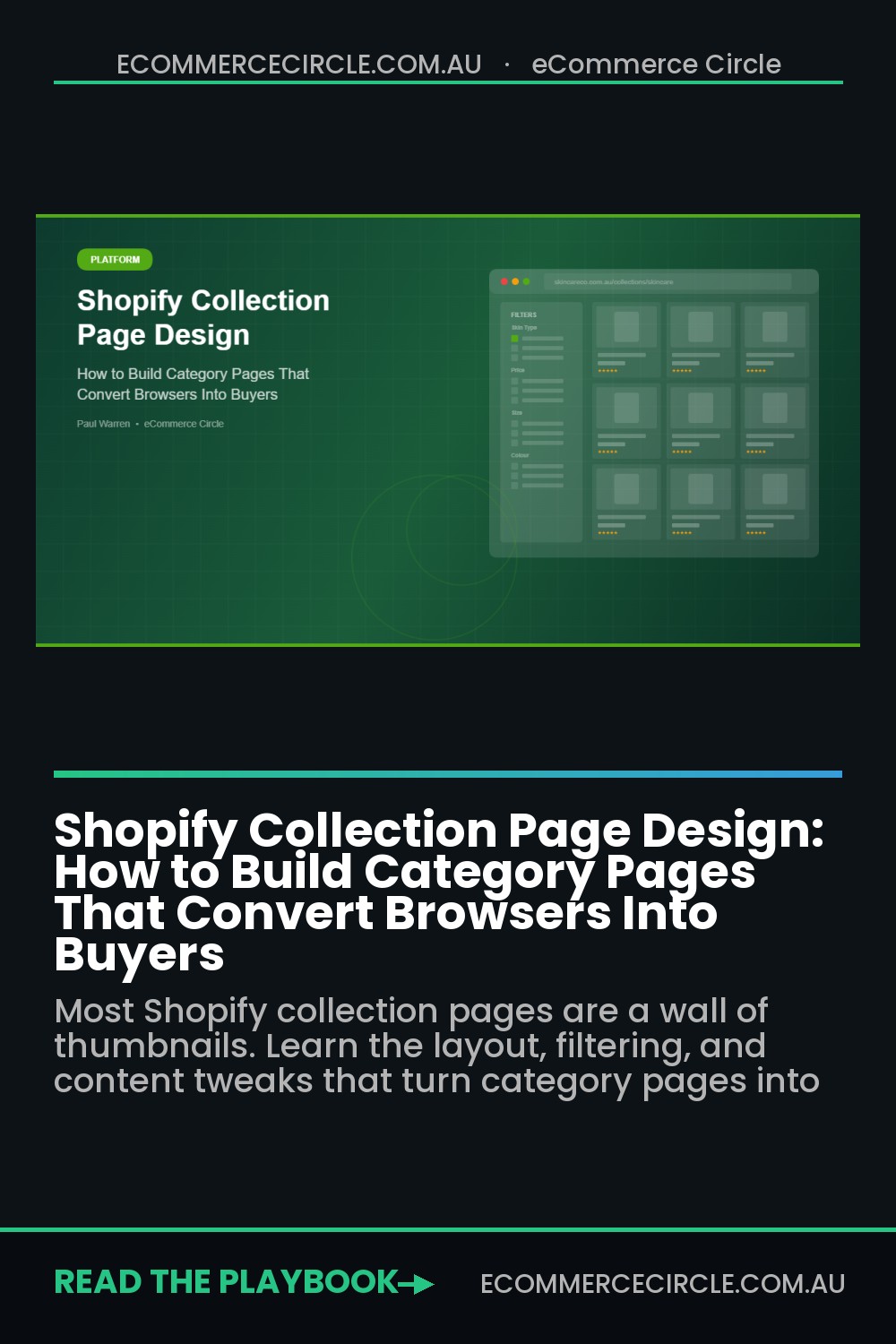
Product Grid Layout: The Visual Decisions That Shape Buying Behaviour
Your product grid is the core of your collection page. Every element — the number of columns, the image size, the information you show beneath each product — shapes how quickly a shopper can scan, compare, and decide.
Column count. For desktop, four columns is the sweet spot for most Shopify stores. It shows enough products to feel comprehensive without making individual items too small to evaluate. Three columns works well for stores with visually complex products (furniture, homewares) where you need larger images. On mobile, two columns is standard — one column can work for high-ticket items where you want each product to command attention.
Image quality and consistency. Every product image in your grid should have the same aspect ratio, the same background treatment, and similar lighting. Inconsistency — even subtle inconsistency — makes your store look unprofessional and erodes trust. Baymard’s research shows that over 70% of online shoppers abandon a purchase due to insufficient product visuals. If your collection page thumbnails are blurry, inconsistently cropped, or don’t show the product clearly, you’re fighting an uphill battle before the customer even clicks through.
Hover effects. Adding a secondary image on hover (showing the product from a different angle, or on a model vs. flat-lay) is one of the simplest upgrades you can make. It lets shoppers gather more information without clicking through, which speeds up the decision-making process. Most modern Shopify themes support this natively — you just need a second image uploaded to each product.
Information beneath each product. Show the product name, price (including any sale price with the original crossed out), and star rating if you have reviews. That’s it. Don’t clutter the grid with descriptions, variant selectors, or multiple CTAs. The goal of the collection page is to get the click — the product page handles the conversion. Quad Lock, another Aussie Shopify success story, keeps their collection grid clean: product image, name, price. No noise.
Filtering and Sorting: The Biggest Conversion Lever Most Stores Ignore
If there’s one section of this article that can directly move your revenue, it’s this one. Product filtering is the difference between a shopper browsing aimlessly through 200 products and a shopper narrowing to exactly the 8 products that match their needs in two clicks.
Despite this, most Shopify stores either have no filters at all, or they rely on the bare defaults that come with their theme. Baymard Institute found that 75% of ecommerce sites fail to correctly implement product filtering — and it’s one of the biggest reasons shoppers leave without buying.
The filters you should have (at minimum):
- Price range. Let shoppers set a minimum and maximum. A slider works best, but predefined ranges (“Under $50,” “$50–$100,” “$100+”) work fine too.
- Size. If you sell apparel, footwear, or anything with size variants, this is non-negotiable.
- Colour. Use visual swatches, not text labels. A shopper should be able to scan colours at a glance.
- Availability. Let people filter to “In stock” items only. Nothing kills trust faster than clicking into a product that’s sold out.
- Product type or category. Useful when a collection spans multiple product types (e.g., a “Sale” collection that includes both clothing and accessories).
How to set this up on Shopify:
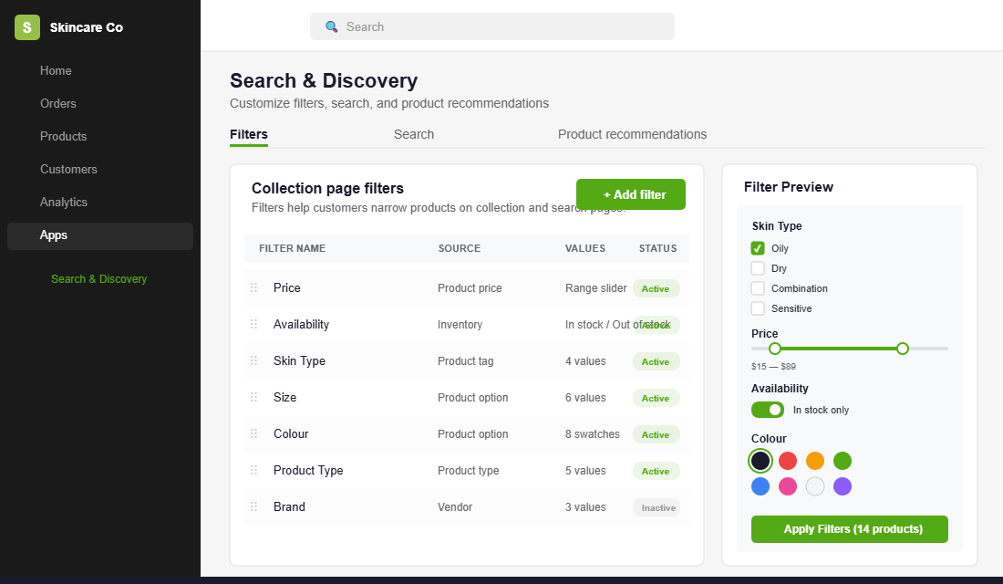
Shopify’s free Search & Discovery app is the best starting point. Install it from the Shopify App Store, then navigate to Apps > Search & Discovery > Filters. From there you can add filters based on product price, availability, tags, type, vendor, or metafield values. The app is smart enough to only display filters that are relevant to the products on each specific collection page — so if a collection doesn’t have colour variants, the colour filter won’t appear.
For stores with larger catalogues (100+ products), consider upgrading to a dedicated filtering app like Boost Product Filter & Search or Smart Product Filter & Search by Searchanise. These give you more granular control over filter logic, visual presentation, and analytics on which filters your customers actually use.
Critical UX detail: Make sure your filters persist when customers navigate back from a product page. There’s nothing more frustrating than spending 30 seconds configuring filters, clicking into a product, hitting “back,” and finding all your filters have reset. Most modern Shopify themes handle this correctly, but test it on your own store. If it doesn’t persist, it’s worth switching themes or adding custom code to fix it.
Above-the-Fold Content: The SEO and Conversion Power of a Strong Collection Header
Most collection pages jump straight into the product grid. No context, no introduction, no reason to trust that this collection has what the shopper needs. That’s a missed opportunity for both SEO and conversion.
A strong collection header includes two to four sentences of introductory text that does three things: confirms the shopper is in the right place, sets expectations for what they’ll find, and includes your target keywords naturally for search engines.
Example for a “Women’s Dresses” collection:
“From casual linens to evening maxis, our dress collection is designed for Australian women who want to look put-together without overthinking it. Every piece is made from breathable fabrics built for our climate. Free shipping on orders over $100 AUD.”
That’s 40 words. It takes three seconds to read. But it accomplishes a lot: it mentions the product type (dresses), the target audience (Australian women), a value proposition (breathable fabrics, easy styling), and a conversion trigger (free shipping threshold).
Don’t stop at the header. Add a short content block below the product grid as well — a paragraph or two about the collection, buying guides, or care tips. Search engines love this supplementary content, and it gives you more keyword surface area without cluttering the shopping experience above the fold.
You can also add a banner image at the top of key collections. This is especially effective for seasonal or lifestyle collections where a strong visual sets the mood. Keep it under 400px tall on desktop so it doesn’t push your product grid too far down the page.
Mobile Collection Page Optimisation: Where More Than Half Your Traffic Shops
Over 60% of ecommerce traffic now comes from mobile devices. If your collection pages aren’t optimised for smaller screens, you’re delivering a broken experience to the majority of your visitors.

Mobile-specific fixes that matter:
- Sticky filter and sort bars. On mobile, filters should be accessible via a sticky button that follows the shopper as they scroll — not buried at the top of the page where they have to scroll all the way back up. A bottom-sheet or modal overlay for filter selection works best.
- Touch-friendly filter controls. Buttons and checkboxes need to be at least 44×44 pixels (Apple’s minimum recommended tap target). If your filters require precision tapping on tiny checkboxes, mobile users will give up.
- Two-column grid. Resist the temptation to go single-column on mobile. Two columns shows more products per scroll and helps shoppers compare. One-column grids feel endless when a collection has more than 20 products.
- Lazy loading images. Don’t load all product images at once. Use lazy loading so images appear as the shopper scrolls. This dramatically improves initial page load time — and research shows pages loading in 2.4 seconds convert at 1.9%, while pages loading in 5.7+ seconds drop to just 0.6%.
- Infinite scroll or “Load more” button. Pagination (Page 1, 2, 3…) feels clunky on mobile. A “Load more” button is better for most stores — it gives the shopper control without the jarring page reload. Infinite scroll can work but can cause issues with footer accessibility, so test carefully.
Test your collection pages on a real phone, not just your browser’s responsive mode. Tap through filters, scroll through products, and time how long it takes to find a specific item. If it takes more than 10 seconds to filter and find a product in a 50-item collection, there’s work to do. For more on how speed impacts your bottom line, our Shopify site speed guide covers the technical fixes in detail.
Social Proof on Collection Pages: Small Additions, Big Impact
Most Shopify stores save their reviews for the product page. But showing star ratings directly on the collection page grid is one of the easiest wins in ecommerce UX.
When a shopper sees “4.8 stars (126 reviews)” beneath a product thumbnail, it does two things. First, it builds immediate trust — this product has been validated by real people. Second, it creates a shortcut for comparison. Instead of clicking into five different products to compare reviews, the shopper can scan the grid and immediately see which products have the strongest social proof.
Apps like Judge.me (free plan available) and Loox (photo reviews) both support displaying star ratings on collection pages. The setup takes about 10 minutes in most themes.
Beyond star ratings, consider adding collection-level social proof. A banner at the top that says “Over 5,000 happy customers across Australia” or “Rated 4.9/5 from 2,300+ reviews” sets the tone before the shopper even starts browsing individual products.
Quick-add buttons (an “Add to Cart” button directly on the collection page) are another high-impact addition for stores selling products that don’t require variant selection. If you sell single-SKU items like candles, supplements, or accessories, letting customers add to cart without leaving the collection page removes an entire step from the buying journey.
The Compound Effect: How These Changes Work as a System
Each of these optimisations delivers value on its own. But the real power comes when they work together.
Picture this: A shopper lands on your “Skincare” collection from a Google search. They see a clean header confirming they’re in the right place, with a note about free shipping over $100 AUD. The collection is sorted by best sellers, so the first products they see are your proven winners. They tap the “Skin Type” filter and select “Oily.” The grid instantly narrows from 80 products to 12. Each product shows a clean image, a hover shot, the price, and a 4.7-star rating. They tap into a product, check the reviews, hit back — and their filters are still intact. They add two products to cart without having to search, scroll, or guess.
That’s not a dream scenario. That’s what a well-built collection page delivers, every single time. And it’s the difference between a store that converts at 1.4% and one that pushes past 3%.
The beauty of collection page optimisation is that it compounds with every other improvement you make. Better product photography makes your grid more compelling. Running A/B tests on your sort order and filter placement tells you exactly what your customers prefer. Optimising your checkout means more of the shoppers who reach your collection page actually complete a purchase.
It’s a system. And the stores that treat it like one are the ones that scale.
Your Collection Page Optimisation Checklist
Use this as your implementation roadmap. Tackle the items in order — each builds on the one before it.
- Audit your collection names. Do they match how your customers search and think? Rename anything that’s internal jargon.
- Set default sort to “Best selling” on all collections unless you have a specific reason for manual sorting.
- Install Shopify Search & Discovery and configure at least three filters (price, size/type, availability).
- Standardise your product images. Same aspect ratio, same background, same lighting across every product.
- Add hover images. Upload a second image to each product showing an alternate angle.
- Enable star ratings on collection pages via Judge.me, Loox, or your review app of choice.
- Write a 2–4 sentence collection header for each of your top 10 collections. Include target keywords naturally.
- Test mobile. Pull out your phone, open each collection, and time how long it takes to filter and find a product.
- Enable lazy loading for product images if your theme doesn’t already do it.
- Check filter persistence. Navigate to a product and back — do your filters stick?
Most of these can be completed in a single afternoon. The impact on your conversion rate will show up within the first week.
Build a Store That Sells While You Sleep
Your collection pages are the workhorse of your Shopify store. They’re where browsers become buyers, where product discovery happens, and where the quality of your store experience either builds trust or breaks it.
Collection Page Speed: The Silent Conversion Killer
You can nail naming, layout, filtering and social proof and still lose the sale to a slow page. Collection pages are the heaviest templates on most Shopify stores because they load dozens of product images at once, and every extra second of load time costs you buyers who never even see your beautiful grid.
The numbers are blunt. Google’s data shows bounce probability rises around 32% as load time goes from one to three seconds, and on mobile (where more than half your collection traffic sits) the drop-off is steeper. A collection page that takes four seconds to become usable is quietly leaking double-digit percentages of revenue before the customer has clicked a single product.
- Lazy-load below the fold. Load the first row or two immediately and defer the rest. This alone can halve initial load on a long collection.
- Cap products per page. 24 to 36 products with “load more” beats infinite scroll, which keeps appending images and grinding the page to a crawl.
- Serve right-sized images. A 2000px image rendered at 400px is wasted weight. Let Shopify’s responsive image tags do their job.
- Audit your apps. Filtering and review apps often inject render-blocking scripts. Measure before and after with PageSpeed Insights.
Treat speed as part of collection page design, not a separate technical chore. Our guide to Shopify site speed covers the specific fixes that move conversion, and most of them take an afternoon, not a redesign.
Inside the eCommerce Circle, platform optimisation — including collection page design — is one of the core pillars we work on with every member. It’s part of the “Platform” P in our More Orders Operating System, because no amount of traffic or ad spend can compensate for a store that makes it hard to shop.
If you’d like hands-on help optimising your Shopify store’s collection pages and building a platform that converts, let’s talk.