Most Aussie Shopify founders test like teenagers gamble. A bold button colour change here. A new headline they read about in a Twitter thread there. A free shipping bar swap because a competitor just added one. Twelve months later they cannot tell you a single test that moved the number, because nothing was ever properly tracked, scored or stacked.
What’s in This Article
Here is the brutal benchmark. Optimizely studied 127,000 experiments across their platform and found that the average win rate is roughly 12%. That is the baseline for ad-hoc testing. Eighty-eight out of every hundred ideas you have today will either lose or be inconclusive. Without a system, you are paying for traffic, designer time and developer hours to learn almost nothing.
Mature testing programs flip those odds. Teams that follow a structured prioritisation framework lift their win rate to 22 to 30%, and an internal benchmark from CRO agency Conversion.com shows clients who score every hypothesis before they ship it see a 31% higher win rate than teams running tests by gut feel. That is the difference between a store that lifts conversion 25 to 40% over a year and one that lifts nothing at all.
This article gives you the system. It is called the PIE framework. We use it inside eCommerce Circle with members running $40k to $500k a month on Shopify, and it turns the noisy “what should we test next” debate into a single ranked list you can work through for the next twelve months.
Why Most Shopify A/B Tests Fail (the Hidden Tax of Random Testing)
The problem is not the tools. Shopify itself ships native A/B testing via Rollouts. Shoplift starts at $74 a month and plugs straight into the Theme Customiser. Intelligems runs price and shipping tests cleanly from $49. The barrier to running a test in 2026 is basically zero. Anyone can launch one this afternoon.
The problem is the queue feeding the tools. Every Aussie founder I work with has the same chaotic backlog: a Notion doc with 47 test ideas, a Slack thread of designer suggestions, three things their CRO agency proposed in 2024 that never shipped, and whatever their last podcast guest said worked for their store. There is no ranking. No scoring. No agreed standard for what gets tested first.
So tests get picked the wrong way. The flashy ones win the queue. The complex ones get parked. The tiny ones (a button colour, a font tweak) get shipped because they are easy, even though the lift is tiny and the page they live on gets ten thousand visits a month, not a hundred thousand. Twelve months in, the program has run 18 tests, three winners, and zero meaningful conversion lift on the store.
Here is the maths most founders never run. If your store does 50,000 sessions a month at a 2.81% conversion rate (the 2025 Shopify median) and an $85 AOV, you are at roughly $119k a month in revenue. A 25% lift in conversion adds $29,750 a month, which is $357,000 a year. Random testing leaves most of that on the table because the highest-impact tests never get prioritised correctly.
The fix is not more ideas. The fix is a way to rank the ones you already have.
The PIE Framework Explained (Potential, Importance, Ease)
PIE was developed by Canadian CRO agency WiderFunnel and it has held up for more than a decade because it forces three uncomfortable conversations in front of every test idea before a single line of code gets written.
You score each idea from 1 to 10 across three dimensions. Then you average the three scores. The highest scores go to the top of the test queue. The lowest get parked.
- P is for Potential. How much lift could this test realistically deliver if it wins? A homepage hero swap on a high-traffic store has different potential to a font change in the footer. Look at your funnel data: where is the leak, and what is the size of the prize?
- I is for Importance. How valuable is the audience and traffic source touching this element? A test on the PDP for your hero product, where 60% of paid traffic lands, is more important than a test on a long-tail collection page with 200 visits a month. Importance is about traffic weight and revenue exposure, not just page views.
- E is for Ease. How hard is it to implement, design and ship this test? A copy swap takes an hour. A custom-coded checkout extension takes three sprints. Ease is your effort score, and yes, it is allowed to be the tiebreaker.
The output is a single PIE score, calculated as (P + I + E) / 3. Tests scoring 8.0 or higher go into the next quarter. Tests scoring 6.0 to 7.9 go on the watchlist. Tests below 6.0 get parked or killed. That is it. You now have a defensible, repeatable ranking that does not depend on whoever is loudest in the Monday meeting.

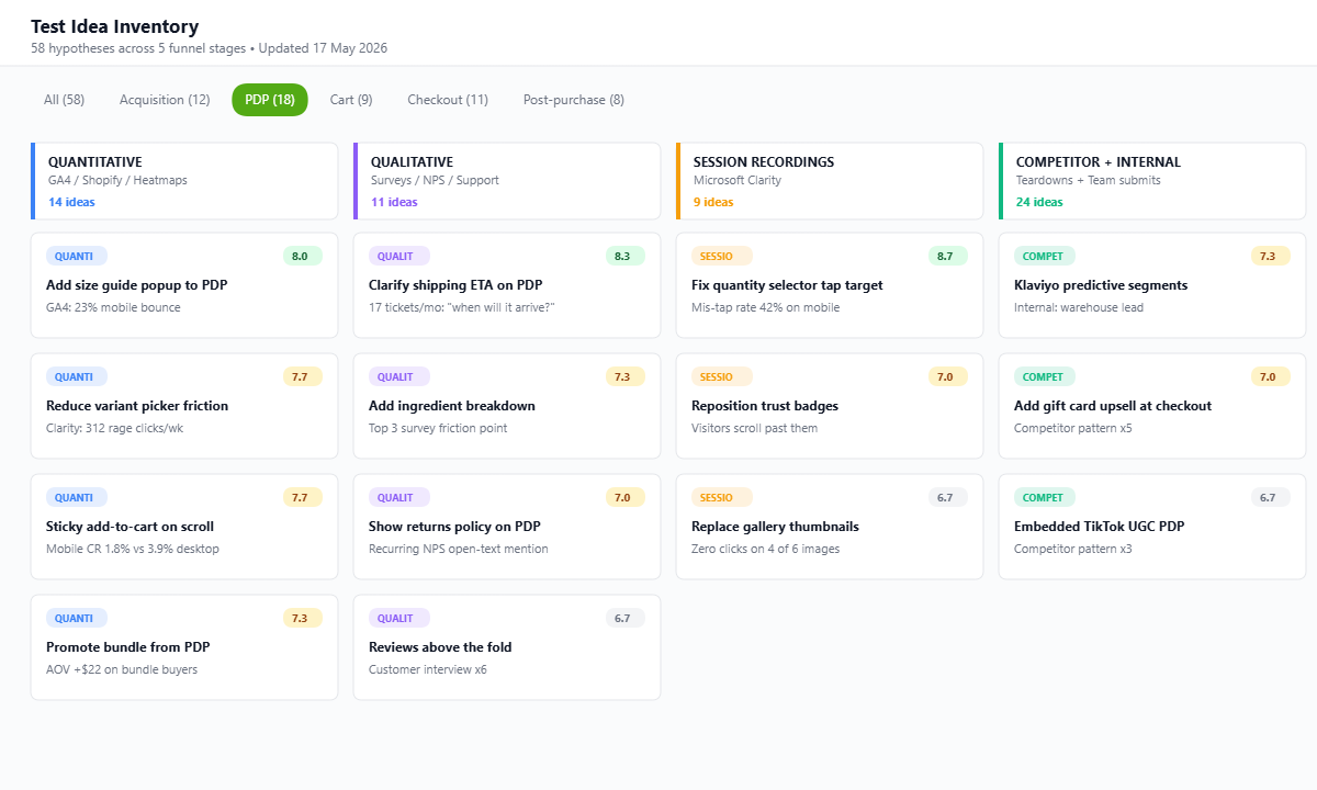
Building Your Test Idea Inventory (the 5 Sources)
Before you can rank ideas, you need ideas. Most stores starve themselves at this step because they only ever ideate from one source (usually whatever the founder noticed on a competitor site last week). A proper test backlog draws from five distinct inputs, and you should be adding to it every fortnight.
- Quantitative data. Your GA4 funnel report, Shopify Analytics, and any heatmap tool (Microsoft Clarity is free and excellent). Where are visitors dropping out? Mobile checkout conversion of 1.8% versus desktop’s 3.9% is a clue, not a benchmark to accept.
- Qualitative data. Customer surveys, exit-intent polls, post-purchase NPS, support tickets, live chat transcripts. The words customers use about friction become your test hypotheses. “I couldn’t find the size guide” is a test brief.
- Session recordings. Microsoft Clarity, Hotjar or Lucky Orange. Watch 20 sessions a week. You will see rage clicks, mis-taps, scroll patterns and form abandonment that no analytics dashboard surfaces.
- Competitor and category teardowns. Not “they have a sticky add-to-cart so we should too”. Document the patterns repeated across the top five players in your category, and treat any one missing from your store as a hypothesis to test (not to copy).
- Internal team and customer-facing staff. Your support team, your warehouse team, your retail staff if you have any. They hear the friction every day. Build a shared Notion form so anyone in the business can drop a hypothesis into the backlog with one click.
Aim for a backlog of at least 40 to 60 ideas before you start scoring. A small inventory is the first sign you will run out of pipeline by month three.
Scoring Tests with PIE: a Worked Example
Theory is cheap. Let us walk through three real test ideas from an Aussie skincare brand doing roughly $180k a month on Shopify and score them properly.
- Test A: Add a quiz funnel to the homepage. Potential is 9 (quiz funnels routinely lift conversion 30 to 50% and capture email at 15x the rate of static popups). Importance is 9 (the homepage takes 35% of all traffic). Ease is 4 (Octane AI build, three weeks of design, copywriting, photography). PIE score = (9 + 9 + 4) / 3 = 7.3.
- Test B: Replace generic product description with the 5-block PDP framework on the hero SKU. Potential is 8 (PDP copy rewrites lift conversion 25 to 40% routinely). Importance is 10 (60% of paid traffic lands on this PDP). Ease is 9 (a single Friday for copy, photography, and theme update). PIE score = (8 + 10 + 9) / 3 = 9.0.
- Test C: Switch the announcement bar from “Free shipping over $99” to “Free shipping over $80 today only”. Potential is 3 (small lift, mostly cannibalises higher AOV orders). Importance is 6 (visible on every page). Ease is 10 (ten minutes in the theme editor). PIE score = (3 + 6 + 10) / 3 = 6.3.
Without PIE, Test C ships first because it is easy. With PIE, Test B ships first because it has the highest expected return on effort. Test A goes second once the team has capacity. Test C either gets parked or runs as a quick optimisation while the bigger work is in flight. That single shift in sequencing is where the 31% win-rate uplift comes from.
A few scoring rules that keep the team honest. Score independently first (no one shows their numbers until everyone has scored). Then debate the gaps. If one person scored Potential at 9 and another at 4, that is the conversation worth having before you ship. Document the agreed score against the test card so you can audit later whether your team is consistently overestimating or underestimating any of the three dimensions.
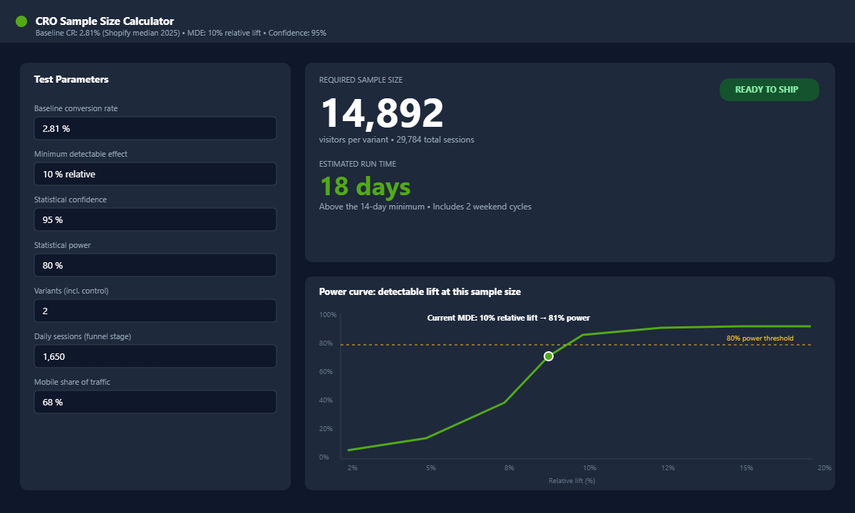
Sample Size, Traffic Minimums and the 14-Day Rule
This is where most Shopify CRO programs quietly die. A store with 12,000 monthly sessions cannot run the same test calendar as a store with 200,000. Pretending otherwise produces false winners, false losers, and a backlog of tests that “felt like they should have worked” but the data was never trustworthy.
The rules of thumb that keep your testing honest:
- Minimum 1,000 visitors per variant to detect anything close to a meaningful lift. For a basic A/B that means 2,000 sessions through the funnel stage you are testing, not your total site traffic.
- Most CRO agencies want 50,000 monthly sessions minimum on the store before reliable A/B testing kicks in. Below that, you should be running radical A/B tests with big creative swings rather than small button-colour tweaks, because small effects need huge samples to detect.
- Run every test for a minimum of 14 days, even if it hits significance earlier. Two weeks captures a full cycle of weekend versus weekday buyers, payday cycles, and traffic mix variation. A test that wins on day six and loses on day twelve was never a winner.
- Confidence at 95%, statistical power at 80%. Do not call winners at 90% unless you accept a one-in-ten chance you are wrong. Roll out at 95%+ confidence with a real sample size or do not roll out at all.
- Use the calculator before you start. Free tools from VWO, AB Tasty or Evan Miller let you punch in your baseline CR and minimum detectable effect and tell you how long the test will need to run. If the answer is six months on your current traffic, the test is too small for your store right now.
This last point is the most important and the most ignored. Smaller stores should not be running ten tests a quarter. They should be running three or four bigger swings that move the dial enough to be detectable. Founders running $40k to $80k a month who try to mimic the testing cadence of a $5m brand burn through their backlog without learning anything because every test runs underpowered.
Your 12-Test Annual Roadmap (the Template)
One test a month. That is the realistic cadence for most Aussie Shopify stores in the $80k to $500k a month range. Twelve tests a year, three of them winning at a 25% win rate (industry benchmark for a structured program), each delivering a 5 to 10% lift on the metric they target. That is your 25 to 40% annual conversion lift.
Here is the template we hand to members inside the eCommerce Circle workshop. Adapt the column headings to your tool of choice (Notion, Airtable, ClickUp, even a Google Sheet works fine).
- Test ID and name. Short, specific. “PDP-014: 5-Block PDP Copy on Hero SKU”, not “PDP test”.
- Hypothesis. Written in the format: “Because [data observation], we believe that [change] will result in [outcome], measured by [metric]”. One sentence, no fluff.
- Funnel stage targeted. Acquisition, PDP, Cart, Checkout, Post-purchase. This forces you to balance the roadmap rather than test ten things in the cart.
- P, I, E scores and total. Three columns plus the average. Sortable.
- Required sample size and run time. Calculated before the card moves to “in progress”.
- Tool. Shopify Rollouts, Shoplift, Intelligems, Convert, native code. Different tests need different tools.
- Owner. One name. CRO accountability falls apart when “the team” owns a test.
- Status. Backlog, Designed, Live, Analysing, Shipped, Killed.
- Result. Lift percentage, confidence, sample reached, decision. Filled in even for losers.
- Learning. One sentence on what you now know that you did not know before the test. This is the asset that compounds over years.
A balanced annual roadmap typically looks like 3 PDP tests, 2 collection or category tests, 2 cart and upsell tests, 2 checkout tests, 1 homepage test, 1 email or popup test, and 1 ad landing page test. Skew the mix toward whichever funnel stage your data says is leaking hardest. Our 5-stage conversion funnel audit is the fastest way to figure out where the biggest leak sits today.
The CRO Test Post-Mortem (Why You Must Document Losses, Not Just Wins)
Every test gets a one-page post-mortem. Every single one. Winner, loser or flat. Stores that skip this step lose 80% of the value of their testing program because the institutional learning evaporates the moment the next test starts.
A good post-mortem captures six things:
- The hypothesis as written. Word for word. You will be tempted to soften it. Do not.
- The actual result. Lift, confidence, sample, segment splits. Always report mobile and desktop separately. Many winners turn out to win on desktop and lose on mobile, and the blended number hides this.
- The “why we think it won (or lost)” theory. Backed by session recordings, heatmap data and customer feedback wherever possible. This is the qualitative bridge from “the number moved” to “we now understand our customer”.
- What we would test next. Every test is a parent to the next hypothesis. The losing-PDP-test that taught you customers hate the new photography becomes the brief for the next round of product shoots.
- The dollar impact at full rollout. If conversion lifts 6% on a store doing $180k a month, that is $10,800 a month of incremental revenue. Document it. CFOs and boards understand revenue, not “we increased conversion”.
- The PIE accuracy check. Did the test deliver the Potential you scored? Over a year you will find your team systematically overestimates some categories of test (homepage redesigns) and underestimates others (PDP copy). That insight tunes future scoring.
Loser tests are more valuable than most founders realise. A test that disproves a beloved assumption (“our customers want more discount messaging”) saves you years of building in the wrong direction. The discipline of documenting it is what stops the same wrong hypothesis getting re-pitched by someone new on the team eighteen months later.
The Compounding Effect: How 30% Win Rate Becomes 25 to 40% Annual Conversion Lift
Here is the simple maths that should keep you committed to the roadmap when month three feels slow and month six feels like nothing is moving. Twelve tests a year. At a structured 25 to 30% win rate, you ship three to four winners. Each winner lifts the metric it targets by 5 to 15% (the realistic range for well-prioritised Shopify tests). Lifts compound across the funnel.
A 10% PDP conversion lift plus a 7% cart conversion lift plus a 5% checkout completion lift does not give you 22% total. It gives you (1.10 x 1.07 x 1.05) – 1 = 23.6% net conversion lift. Combine that with a single AOV winner (say a bundle test that lifts AOV 8%) and your revenue-per-session is up 33% year on year, all from twelve well-scored tests.
That is the lift that comes free with the same ad spend. For a store doing $180k a month, a 33% lift in revenue-per-session is roughly $60k a month more revenue without spending another dollar on Meta or Google. Over twelve months that is $720k of incremental revenue from a CRO program that costs you tool subscriptions plus your time.
Real Aussie examples back this up. Furniture brand Factory to Home added a FAQ popup to their PDPs and lifted completed orders 18.1% from a single test. Aje rebuilt their mobile experience after recognising that more than 75% of traffic was mobile but the experience was hurting conversion. Incu added advanced filtering to their multi-brand catalogue and lifted conversion 15% in the first week. None of these are dramatic redesigns. They are well-scored, well-implemented tests that shipped because they cleared the prioritisation bar.
For a deeper read on how the individual metric lifts stack into store-level economics, our breakdown of the Profit-Per-Visitor framework shows the unit of measurement that ties testing back to the bottom line. And if you want the channel-level equivalent (testing whether ad channels actually drive incremental revenue, not just claim credit), our geo-holdout incrementality testing guide is the companion read.
The PIE Test Backlog Quickstart Checklist
Print this. Stick it next to your screen. It is the one-pager that makes the system real.
- Step 1. Open a Notion or Airtable board. Five columns minimum: Idea, P, I, E, Total. Score 40 to 60 ideas across the five sources (quant, qual, sessions, competitor teardowns, internal team).
- Step 2. Score independently with at least two people. Compare. Argue. Lock the agreed score.
- Step 3. Sort by total. Top three to four are your next quarter. The rest live in the backlog.
- Step 4. For every test card, run a sample-size calculator before it leaves backlog. If your traffic cannot deliver detectable significance in 4 to 6 weeks, the test is too small. Park it or rescope.
- Step 5. Set a minimum 14-day run. 95% confidence and 80% power. No exceptions for shipping early.
- Step 6. Document every result with a one-page post-mortem. Winners and losers both.
- Step 7. Quarterly review: which categories of test are over-delivering on Potential? Which are under-delivering? Adjust your scoring weights.
- Step 8. Repeat. Twelve tests in twelve months. Three to four winners. Revenue compounds.
You do not need a CRO agency to run this. You need discipline, a calendar, and the courage to kill the test ideas your team loves but the data says are 6.3 out of 10.
Inside eCommerce Circle, the test backlog is one of the core artefacts every member builds in their first 90 days. We work through it together, score live, and hold each other accountable to actually shipping the top-ranked test rather than the easiest one. If you want a second opinion on your current test queue, or you have not built one yet and are not sure where to start, let’s talk.