Most Aussie Shopify founders run their store on averages. Conversion rate sits at 1.8%. Cart abandonment is 70%. Mobile checkout completion is half desktop. The dashboard tells you what is happening, then leaves you to guess the why. So the team launches another hero banner test, swaps a CTA from green to orange, and waits for an uplift that never lands.
What’s in This Article
Session recordings flip that around. You stop guessing and start watching the actual humans on your store, frame by frame. You see the woman who tapped a product image four times in two seconds because it looked clickable but was not. You see the bloke who scrolled to your trust badges, paused, then quick-backed to the search bar. You see the iPhone session where the Add to Cart button rendered behind a sticky promo bar, hidden, until they gave up.
That is where 20 to 50% conversion lifts hide. Not in the next theme refresh. In the moments where shoppers wanted to buy but the store fought back. The Shopify stores converting at 4.7% and up are not running mystical tests. They are watching their customers, finding friction, and removing it on repeat. This playbook is the system. The 5 signals to look for, the free tool to do it with, and a 30 minute weekly ritual that pays for itself inside a fortnight.
Why Averages Lie and Recordings Tell the Truth
GA4 will tell you mobile converts at 1.5 to 2% while desktop sits at 3.5 to 4%. The gap is real. The reason is not. Mobile is not inherently worse. Mobile is the device your customer is on while standing on a Sydney train, while half watching the cricket, while waiting for school pick-up. The friction tolerance is lower. Every dead click, every laggy tap, every cookie banner that takes three tries to dismiss is a churn signal you cannot see from a metric.
The Shopify benchmark studies put the top 20% of stores above 3.2% conversion and the top 10% above 4.7%. On mobile, the top 10% manage above 3.9% while the average store sits at 1.2%. The delta is not creative or tech. It is friction. Top stores have systematically removed it. Most stores have never watched their site through customer eyes, so the friction stays in.
This is the case for session recordings as a permanent fixture in your operating rhythm. Quantitative data tells you what is happening. Qualitative recordings tell you why. You need both. Run your store on averages alone and you are flying blind from the cockpit. The instruments say 30,000 feet, the window says you are about to clip a mountain.
Signal 1: Rage Clicks (The Single Loudest Friction Indicator)
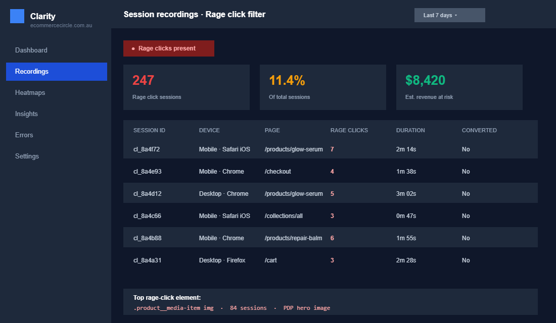
A rage click is when a shopper taps or clicks the same spot three or more times in under two seconds because the site is not responding the way they expect. It is a digital fist on the desk. Tools like Microsoft Clarity and Hotjar auto-detect them, tag them on the recording, and let you filter for sessions that include one.
Rage clicks cluster around predictable hotspots. A non-clickable product image. A discount code field that appears to accept input but does not until you tap it twice. A variant selector with a tap target smaller than 44 by 44 pixels. A mega menu that closes when you try to scroll within it. One Contentsquare case study found 37% of users on a single checkout page rage-clicked the promo code field before abandoning. That is not a copy issue. That is a UI that lied.
Where to look first on Shopify:
- Product page hero gallery. Customers tap zoom expecting it to enlarge. If you have lazy-loaded high-res images, the first tap does nothing while the file loads. Tap two, three, four follow. They rage out.
- Variant pickers. Colour swatches and size selectors with no visible feedback state get rage tapped constantly. Add an active state that animates in under 100ms.
- Cart drawer open and close. If the open animation is laggier than 300ms, customers tap the cart icon repeatedly thinking nothing happened.
- Checkout promo code field. The single most rage-clicked element on Shopify checkouts. Either make it work first tap, or remove it entirely for users without a code.
- Mobile menu hamburger. A hamburger with no haptic or visual click confirmation gets rage tapped within the first session.
One Aussie skincare brand we worked with had a 11.4% rate of dead clicks on their hero product image. Three thousand sessions a month tapping a static image expecting a lightbox. Fixing it took the dev team 40 minutes. Conversion on the page lifted from 2.1 to 2.8% inside two weeks. That is a single fix, found in a single recording, worth six figures a year on a store doing $2m.
Signal 2: Dead Clicks (The Invisible Revenue Drain)
A dead click is one click on something that looks interactive but is not. It is the cousin of the rage click. The difference is that a dead click only fires once. The customer accepts that the element does not work, sometimes shrugs, and moves on. Or leaves. You never get a complaint because they never raised one.
Dead clicks are harder to spot than rage clicks because there is no obvious signal of frustration. The customer just quietly assumes you do not care about details and exits. One e-commerce case study documented a single dead click costing €14,000 a month in lost conversions on one element. That is the silent killer. Not a broken cart. A single image on a category page that looked like a tile but was not linked.
The diagnostic in Clarity is dead simple. Filter recordings by Dead clicks present. Watch ten. You will spot the same three or four offending elements. Common Shopify culprits:
- Category page imagery without product links. If a customer can see five products on a collection page, every image should link to the PDP. Sounds obvious. We audit stores every month where the image is decorative and only the title is clickable.
- Press logos, awards, and certification badges. Customers tap them expecting context. Either link them to the relevant proof or remove them.
- Hero banner text. A headline that says “Shop the new arrivals” but is not linked. The button below it is. Customers tap the headline. Dead click.
- Inactive variant states. When a size is out of stock and renders as greyed-out text instead of a clearly disabled state, customers tap and nothing happens. Replace with a strikethrough state or a “Notify me” CTA.
- Star ratings on PDPs. Customers tap the stars expecting to jump to the reviews section. If you have not anchor-linked the rating to the reviews, that is a dead click on every PDP, every session.
Signal 3: Quick-Backs (The Page Lost the Sale in Under 4 Seconds)
A quick-back is when a shopper lands on a page, stays for fewer than three or four seconds, and hits back. It usually means three things in combination: the page did not match the promise of the click before it, the layout looks wrong on first paint, or the page loaded so slowly the customer thought it was broken.
Filter for sessions with very short page duration on a key entry page. PDPs, collection pages, and landing pages from paid ads are the priority. Watch the first 8 seconds. You are looking for three things specifically. First, what does the page look like before the hero image is fully loaded. Second, where does the customer’s eye go. Third, what makes them leave.
Most quick-back triggers fall into three buckets. Slow Largest Contentful Paint on the hero. Pop-ups that fire on entry and obscure the content. Mismatch between the ad creative and the landing page (you promised a specific product, you landed them on a generic homepage). The CRO test backlog playbook ranks fixes for this in order of impact, but you cannot prioritise what you cannot see. Recordings show it.
Signal 4: Scroll-Depth Abandonment (The Above-the-Fold Trap)
Scroll-depth abandonment is when a customer arrives, never scrolls past the hero, and leaves. Sometimes it is the right outcome. The above-the-fold content gave them what they needed and they bounced because they had no further reason to engage. More often, it is the opposite. They never saw what would have closed them.
Heatmaps make this signal visible at scale. A scroll heatmap on a product page that drops to 30% engagement before the reviews section is a problem. If your best social proof is below the fold and 70% of mobile users never see it, you are converting on price and product photography alone. That is hard mode.
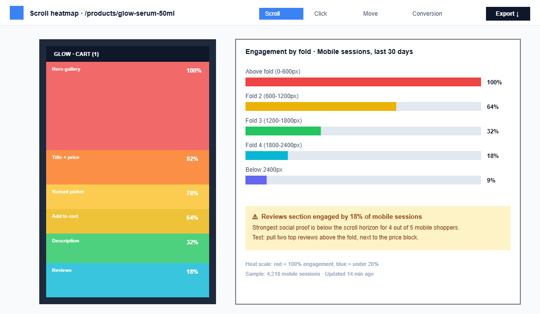
The fix is rarely “make the page shorter.” It is “make the first 600 pixels worth scrolling.” A specific test that lifts most stores: pull one to two of the strongest reviews above the fold, next to or just below the price block. Customers see proof immediately, scroll deeper to find more, and the rest of the PDP gets the engagement it was built for. Pair that with recordings of converted versus non-converted sessions on the same PDP and you will see the engagement difference in 60 seconds.
Signal 5: JavaScript Errors (The Bug You Cannot See on Your Browser)
This is the signal most founders miss because it does not show up on their device. You QA the site on your MacBook, on Chrome, on a fast connection, logged in. Everything works. Meanwhile, on an Android in Toowoomba on 4G, the Klaviyo pop-up script collides with your reviews app, and the Add to Cart button stops firing for the next 45 seconds of the session.
Microsoft Clarity captures JavaScript errors on every session and surfaces them in the dashboard. You see which errors happen, on which pages, and which sessions had them. Filter recordings by “sessions with JS error” and watch what the customer was doing when the error fired. Almost always, it is the moment they wanted to add to cart, apply a discount, or open a variant picker.
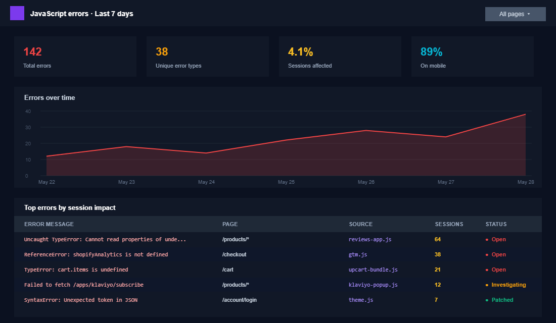
Common Shopify culprits are heavy third-party apps loading concurrently. The biggest offenders we audit: reviews apps that block render, upsell apps that wait on the cart object before initialising, and tag-manager containers stuffed with deprecated pixels. The fix is brutal but simple. Audit the app stack, identify what runs on every page versus what should run conditionally, and defer or remove what is not load-critical. Pair this work with a proper speed optimisation pass and the JS error rate drops by 60 to 80% within a week.
The Free Stack: Microsoft Clarity Setup in 12 Minutes
Hotjar is the legacy leader and still has the best feedback widget and funnel tooling. Pricing starts at around $32 USD a month and climbs north of $500 a month for full features at higher session volumes. For 80% of Shopify stores doing under $5m a year, Microsoft Clarity is the right pick. It is free. It is unlimited on sessions. It has rage click, dead click, quick-back, and scroll-depth detection built in. It connects to GA4. And it has an AI session-summary tool that can summarise up to 250 recordings at once, which makes the weekly review ritual five times faster than it was a year ago.
The Aussie Shopify setup, end to end:
- Create the project at clarity.microsoft.com. Sign in with a Microsoft, Google, or Facebook account. Name the project with your store name. Set the website URL to your live Shopify domain.
- Copy the tracking script. Clarity provides a small JS snippet. Do not paste it raw into theme.liquid. That is brittle. Instead, install via Google Tag Manager or use the Microsoft Clarity Shopify app from the Shopify App Store, which handles the script injection cleanly.
- Verify install. Open your live store in an incognito tab, browse three or four pages, then open the Clarity dashboard 5 minutes later. The first recording should appear. If it does not, the script did not fire. Check Tag Manager, check for conflicting consent banners blocking it, and confirm again.
- Set up conversion events. Inside Clarity, define “Add to cart” and “Purchase complete” as conversion events. Now you can filter recordings by converted versus non-converted shoppers. This is where the gold lives. Watch ten non-converters who added to cart and abandoned. You will spot the same friction signal in five of them.
- Connect GA4. Clarity has a native GA4 integration. Link the property. Now session recordings appear inline against your GA4 sessions, so when you spot a high-traffic page with a low conversion rate in GA4, you can jump straight into recordings of that page from the same dashboard.
- Build saved filters. Build four saved segments at minimum: Rage clicks present, Dead clicks present, JS error sessions, and Quick-backs under 4 seconds on PDPs. These are the views you will return to weekly.
One last note on privacy. Clarity automatically masks form-input data by default, so credit card numbers and email addresses are not captured. It also has a “strict masking” mode that masks all text on the page, which you want enabled if you serve any sensitive demographic information. Update your privacy policy to disclose that you use Clarity for behaviour analytics. This is a 30-second copy paste and Microsoft provides the template language in their docs.
The 30-Minute Weekly Diagnostic Ritual
Session recordings are only as valuable as the time you spend watching them. The mistake founders make is binge-watching for two hours one Sunday, finding eight problems, fixing none of them, then never opening the dashboard again. The fix is a 30-minute weekly ritual. Same time. Same day. Same checklist.
The ritual we run with members of eCommerce Circle:
- Minute 0 to 5: Read the AI summary. Open Clarity’s grouped session insights. Read the auto-generated summary for the last 7 days of sessions. Highlight any pattern flagged more than once.
- Minute 5 to 10: Review the Rage clicks segment. Sort by frequency. Identify the top one or two elements being rage-clicked. Click into any one recording per element. Watch it end to end.
- Minute 10 to 15: Review the Dead clicks segment. Same drill. Top two elements. One recording each.
- Minute 15 to 20: Review the JS error segment. Identify the specific error message. Note the apps or scripts involved. Add to dev backlog with the line number captured by Clarity.
- Minute 20 to 25: Review the Quick-back segment on PDPs. Watch two recordings of non-converted PDP sessions where the customer left in under 4 seconds. Look for layout issues, pop-up triggers, hero load lag.
- Minute 25 to 30: Log findings. Three rows in a spreadsheet or Notion table. Issue, where, suspected impact (S, M, L). Hand the list to the dev or design team. Re-prioritise the CRO test roadmap based on what you found.
Watching 25 session replays a week identifies up to 60% of UX issues that standard analytics miss. The 30 minute ritual is structured to cover those 25, hit each diagnostic segment, and end with a written record. That last bit matters. Without the log, the team forgets, and you watch the same broken element three weeks running with no fix shipped.
Turning Findings Into A/B Tests (and Quick Fixes)
Not every recording finding becomes an A/B test. Two thirds of what you spot are bugs, not optimisations. A dead click on a CTA is a bug. Fix it directly. A JS error in checkout is a bug. Patch it. Do not waste statistical power testing what is obviously broken.
The remaining third is testable. The classic candidates:
- Layout reordering. Moving reviews above the fold on PDPs. Putting the colour swatch above the size picker. Surfacing trust badges in the cart drawer rather than the footer.
- Copy changes. Tightening a hero headline that recordings show customers re-reading. Rewriting product titles where the search-to-PDP recordings show people searching for what is not in the title.
- Element changes. Replacing a long-form variant picker with chips. Swapping a generic “Add to cart” CTA with the product name included for share-link scenarios.
- Removal tests. Removing a promo code field that 30% of customers stall on. Removing a pop-up that fires on the same session as the cart drawer. Removing a sticky bar that obscures the Add to cart on mobile.
The disciplined operator runs a CRO test backlog where every test ties back to a recording observation, a hypothesis, and a target metric. Without that link, tests get prioritised on opinion. With it, every test starts with evidence and ends with a clear pass or fail. This is the same pattern we run in our conversion funnel audits with members.
The Compound Effect: Why This System Beats Everything Else
Most Shopify stores spend 80% of their growth budget on traffic and 20% on optimisation. That is backwards for any brand that has hit $50k a month. Doubling traffic when your conversion rate is broken just doubles the friction you exposed to customers. You scaled the leaks.
The session-recording habit compounds. Every week, you remove one to two friction points. Each removal lifts conversion 1 to 3% on the page it sat on. Over a quarter, that is twelve to twenty four small wins. They stack. The store that started at 1.8% conversion enters the quarter at 1.8 and exits at 2.7 with no traffic increase, no creative overhaul, no new technology. The same shoppers convert at a higher rate because the friction they used to hit is gone.
And here is the bonus. Customers who do not get rage clicked, dead clicked, or quick-backed out develop trust faster. That trust translates to longer LTV. Studies put satisfied users at 67% higher spend over time. So the 1% conversion lift today becomes a 5% retention lift next year, which becomes a 15% LTV lift the year after.
Pair this work with a hard look at your conversion rate benchmarks for 2026, your CRO test backlog priorities, and your post-purchase survey signals, and you have a closed loop. Quant tells you what is broken. Qual tells you why. The weekly ritual turns the why into shipped fixes. The fixes compound.
The 5-Signal Diagnostic Checklist (Steal This)
Print this. Stick it next to your monitor. Run it weekly.
- Rage clicks. Filter recordings by rage click present. Identify top 2 elements being attacked. One recording each. Log fix.
- Dead clicks. Filter recordings by dead click present. Identify top 2 non-interactive elements customers expect to click. One recording each. Log fix.
- Quick-backs. Filter PDP and landing-page sessions under 4 seconds. Watch 2 of them. Note creative-to-page mismatches, slow hero loads, intrusive pop-ups. Log fix.
- Scroll-depth abandonment. Open a scroll heatmap on your top 3 PDPs. If engagement drops below 40% before the reviews section, log a content-reordering test.
- JS errors. Open Clarity Errors dashboard. Identify top 3 errors by session volume. Add to dev backlog with the page and trigger element noted.
That is the framework. Five signals, one weekly ritual, one free tool. The Shopify operators who run this are the ones whose conversion rate goes up while everyone else is blaming the ad platform, the season, or the economy.
Inside eCommerce Circle, session recording reviews are one of the core diagnostics we run with every member at least once a quarter. The findings change. The framework does not. If you want a second pair of eyes on what your customers are actually doing on your store, let’s talk.