You spent months building your Shopify store. You dialled in the product pages, nailed the photography, and finally started driving real traffic. But here’s the gut punch: around 70% of the people who add something to their cart will never complete the purchase.
What’s in This Article
That’s not a traffic problem. That’s a checkout problem. And most Shopify store owners are leaving tens of thousands of dollars on the table every single month because of fixable friction in their checkout flow.
The brands that consistently convert at 3-5% (and higher) aren’t doing anything magical. They’ve simply removed the barriers that cause buyers to hesitate, second-guess, or bounce at the last moment. Shopify’s checkout already outperforms competitors by an average of 15%, but the default setup still leaves significant room for improvement. Here are the seven fixes that make the biggest difference.
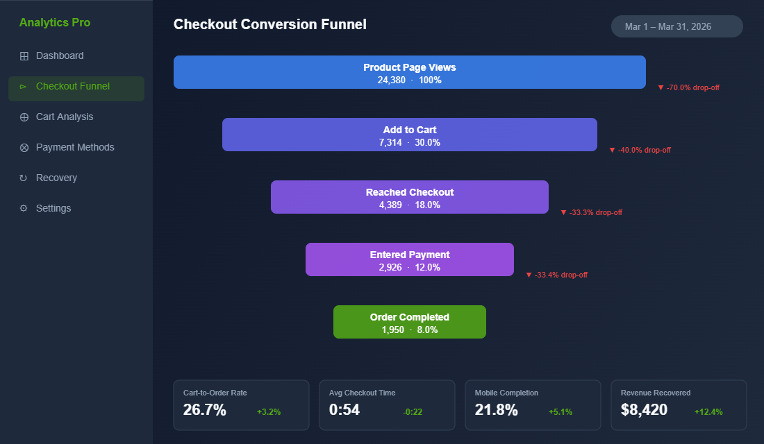
1. Switch to One-Page Checkout (And Watch Completion Rates Climb)
If your Shopify store is still running the old multi-step checkout, you’re adding unnecessary friction at the worst possible moment. Every additional page load is another opportunity for your customer to get distracted, reconsider, or simply give up.
Shopify’s one-page checkout consolidates shipping details, payment information, and order summary into a single view. Stores that have made the switch consistently report a 7-10% improvement in checkout completion rates. Some see even bigger gains on mobile, where reduced page loads have an outsized impact.
The numbers tell the story. Average checkout completion time drops from around one minute forty seconds down to under sixty seconds with one-page checkout. That might sound like a small difference, but in ecommerce, every second of friction compounds into lost revenue.
How to enable it: If you’re on Shopify Plus, one-page checkout is available through the checkout editor in your admin. For standard Shopify plans, the updated checkout experience rolled out progressively through 2025. Head to Settings → Checkout in your Shopify admin and confirm you’re running the latest checkout version. If you haven’t migrated yet, Shopify will prompt you to upgrade.
2. Enable Shop Pay (Your Highest-Converting Payment Option)
If you only implement one thing from this article, make it this. Shop Pay is Shopify’s accelerated checkout, and the conversion data behind it is staggering.
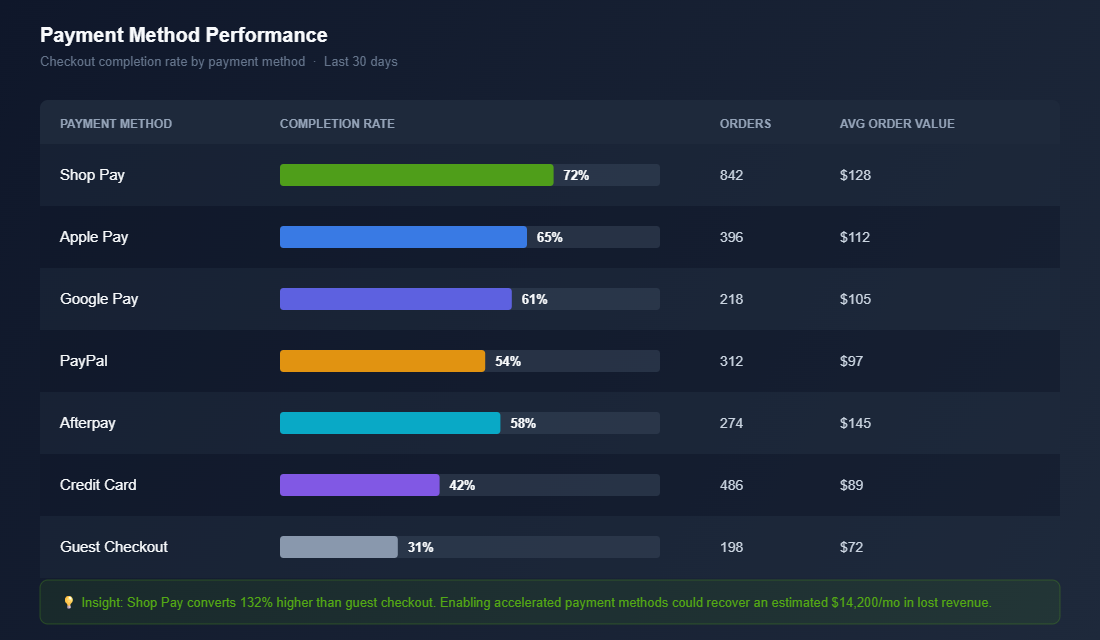
Shop Pay delivers up to a 50% higher conversion rate compared to guest checkout. It outperforms other accelerated checkout options like Apple Pay and Google Pay by at least 10%. On mobile, where the majority of your traffic likely comes from, Shop Pay converts 91% higher than standard checkout flows.
Here’s what makes it powerful: Shop Pay remembers your customer’s shipping address, email, and payment details. Returning customers can complete their entire purchase with a single tap. No typing.
No form-filling. No friction.
Even if a customer doesn’t use Shop Pay directly, having it enabled provides a 5% lift in lower-funnel conversion just from its presence. It signals trust and speed, two things that matter enormously at checkout.
How to enable it: Go to Settings → Payments in your Shopify admin. Under Shopify Payments, enable Shop Pay. Make sure it appears as the first accelerated checkout option. Then check your checkout preview to confirm the Shop Pay button is prominent and above the fold.
3. Kill the Surprise Costs (The Number One Reason People Abandon)
Forty-eight percent of checkout abandonments happen because of unexpected extra costs. Shipping fees, taxes, handling charges, anything that inflates the total beyond what the customer expected when they hit “Add to Cart.”
This is the single biggest conversion killer at checkout, and it’s entirely within your control.
The fix isn’t necessarily offering free shipping on everything (though that helps if your margins support it). The fix is transparency. Your customer should never be surprised by the final number.
Tactical fixes that work:
- Show shipping estimates on product pages. Use Shopify’s built-in shipping calculator or an app like Shipping Rates Calculator Plus to display estimated costs before the customer even reaches checkout.
- Display a free shipping threshold in your announcement bar. Something like “Free shipping on orders over $99 AUD” sets expectations early and encourages larger orders. Australian shoppers respond particularly well to this: domestic shipping costs are a known pain point.
- Include GST in displayed prices. This is standard practice for Australian B2C stores, but double-check your Shopify tax settings are configured to show tax-inclusive pricing. Go to Settings → Taxes and duties and ensure “All prices include tax” is enabled for your Australian market.
- Add an order summary that updates in real time. One-page checkout handles this natively, but make sure the running total is always visible as customers fill in their details.
When your customers know exactly what they’re paying before they enter their card details, abandonment from “sticker shock” drops dramatically. It’s one of those fixes that seems obvious but most stores still get wrong.
4. Add Trust Signals Where Hesitation Happens
Nineteen percent of shoppers abandon checkout because they don’t trust the site with their credit card information. That’s nearly one in five potential customers walking away not because of price, not because of shipping, but because your checkout didn’t feel safe enough.
Trust is built through small, strategic signals placed exactly where doubt creeps in. And the moment of entering payment details is the peak anxiety point in any online purchase.
Trust elements that move the needle:
- Security badges near the payment form. SSL certificate badges, “Secure Checkout” text, and payment provider logos (Visa, Mastercard, Amex, PayPal) all reduce perceived risk. Shopify’s checkout is already PCI-compliant and SSL-secured, so make sure your customers know it.
- Money-back guarantee near the order button. Even a simple line like “100% satisfaction guaranteed or your money back” can reduce checkout anxiety significantly.
- Star ratings or review count near the product summary. A quick reminder that 2,000+ customers have purchased and loved this product reinforces the buying decision at the critical moment.
- Clear return and exchange policy link. Don’t hide it. Link to your returns policy directly from the checkout. Customers who know they can return a product are more likely to complete the purchase.
If you’re on Shopify Plus, you can add these elements directly to your checkout using Checkout Extensibility. Apps like Checkout Extensions Pro or Wiz: Checkout Upsell & Rules let you place trust badges, custom banners, and shipping messaging right inside the checkout flow, no developer required.
For standard Shopify plans, focus on the elements you can control: your logo in the checkout header, a clean and professional design, and clear contact information in the footer.
5. Offer the Payment Methods Your Customers Actually Want
Here’s a simple rule: every payment method you don’t offer is a segment of customers you’re turning away. Different people trust different payment platforms, and Australian shoppers in particular have strong preferences.
At minimum, your Shopify checkout should offer:
- Shop Pay: For returning Shopify customers (covered above)
- Apple Pay and Google Pay: One-tap checkout for mobile users. These are critical given that mobile accounts for 65-70% of ecommerce traffic in Australia
- PayPal: Still preferred by a significant segment of Australian shoppers, particularly older demographics who are wary of entering card details on unfamiliar sites
- Afterpay or Klarna: Buy-now-pay-later is huge in Australia. Afterpay alone has over 3.6 million active Australian users. Not offering BNPL at checkout means losing sales to competitors who do
- Credit and debit cards: The baseline. Make sure you accept Visa, Mastercard, and American Express through Shopify Payments
The key is making these options visible and easy to select. Accelerated checkout buttons (Shop Pay, Apple Pay, Google Pay) should appear at the top of your checkout, before the manual form. This gives returning customers and digital wallet users the fastest path to purchase.
Pro tip: Check your Shopify analytics to see which payment methods your customers actually use. If 40% of your completed orders come through PayPal, that tells you PayPal buyers are a significant segment. If you’re not offering Afterpay and your competitor is, you might be losing the price-sensitive segment entirely.
6. Optimise for Mobile (Where Most of Your Checkout Happens)
Mobile cart abandonment sits at 80% compared to 66% on desktop. That’s a 14-percentage-point gap, and it exists because most checkout experiences still aren’t truly optimised for smaller screens.
Your customers are buying from their phones on the bus, in bed at night, or during their lunch break. They have short attention spans and zero tolerance for fiddly forms. If your mobile checkout requires pinching, zooming, or excessive scrolling, you’re losing sales.
Mobile checkout fixes that matter:
- Enable autofill everywhere. Make sure your checkout form fields are properly labelled with autocomplete attributes so browsers can auto-populate name, address, email, and card details. Shopify handles this by default, but if you’ve customised your checkout, verify autofill still works correctly.
- Use the right keyboard types. Email fields should trigger the email keyboard (with the @ symbol visible). Phone fields should trigger the numeric keypad. Card number fields should show numbers only. Small details, big impact.
- Keep the CTA button fixed and visible. The “Complete Order” button should always be visible without scrolling on mobile. If customers have to hunt for the button, you’ll lose them.
- Minimise form fields. Every field you remove increases completion rates. Do you really need a “Company Name” field? A separate “Address Line 2”? Strip your checkout down to the essentials and watch mobile conversion improve.
- Test on real devices. Open your store on your own phone, go through the entire checkout flow, and time yourself. If anything feels clunky or slow, fix it. Then test on at least two or three different devices. Your site speed matters just as much here, every extra second on mobile costs you conversions.
Shopify’s one-page checkout is already responsive and mobile-optimised, which is another strong reason to migrate if you haven’t already. But even with the latest checkout, test the full mobile experience end-to-end at least once a month.
7. Recover the Carts You Do Lose (Because You’ll Never Hit 100%)
Even with a perfectly optimised checkout, some customers will abandon. Life happens: their phone rings, the baby cries, they need to check with their partner first. The difference between average stores and high-performing ones is what happens next.
Abandoned cart recovery is where you reclaim revenue that would otherwise vanish. And if you’re not running automated recovery flows, you’re leaving the easiest money in ecommerce on the table.
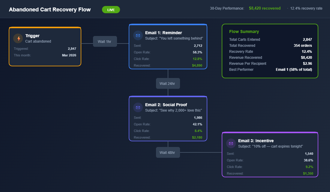
A high-converting recovery sequence looks like this:
- Email 1 (sent 1 hour after abandonment): A gentle reminder with the product image and a direct link back to checkout. No discount. Subject line: “You left something behind.” Recovery rate: 5-10% of abandoned carts.
- Email 2 (sent 24 hours later): Address the most common objections: shipping info, return policy, customer reviews. Build confidence. Recovery rate: 3-5% additional.
- Email 3 (sent 48-72 hours later): Now consider a small incentive. Free shipping, 10% off, or a bonus gift. Create gentle urgency: “Your cart expires soon.” Recovery rate: 2-4% additional.
A well-built three-email sequence typically recovers 10-15% of abandoned carts. For a store doing $50K per month with a 70% abandonment rate, that’s an extra $5,000-$7,500 in recovered revenue every single month, on autopilot.
Tools to set this up: Klaviyo is the gold standard for Shopify email automation. Its abandoned cart flow is one of the highest-ROI automations you can build. Omnisend is a strong alternative if you’re after a simpler setup with SMS built in. Either way, this should be running within your first week of trading. Check out our guide on building post-purchase sequences that keep customers coming back after recovery.
How to Find Your Biggest Checkout Leak in 30 Minutes
Seven fixes is a lot to tackle at once. The smarter move is to find the one step where you are losing the most people, fix that first, and then work down the list.
Open Shopify Analytics and pull the Conversion funnel for the last 30 days. You want four numbers: sessions, add to cart, reached checkout, and completed orders. Healthy Aussie DTC benchmarks sit roughly here:
- Add to cart rate: 6-10% of sessions. Below 5% is a product page problem, not a checkout problem.
- Reached checkout: 45-60% of carts. Below 40% usually means a shipping cost shock in the cart drawer.
- Checkout completion: 45-55% of checkouts started. Below 40% points to payment options, trust or form friction.
- Overall conversion rate: 1.5-3% for most Shopify stores, with mobile typically running 30-50% lower than desktop.
Now split the same report by device. If desktop completes at 55% and mobile at 32%, fix number six (mobile) is your priority. If both devices drop off hard at checkout, look at shipping (fix three) and payment methods (fix five) before anything else.
Then watch real sessions. Install Microsoft Clarity (free) or Hotjar and filter recordings to sessions that reached checkout but did not purchase. Twenty recordings is usually enough to spot the pattern: a discount code field that sends people hunting for coupons, an address form that errors on unit numbers, or a delivery estimate that says 7-10 business days when your competitor says 2-4.
A Worked Example: What One Fix Is Worth in Real Dollars
Imagine you run a Sydney activewear brand doing $85K a month. You get 40,000 sessions, 3,200 add to carts, 1,600 checkouts started and 720 orders at a $118 average order value. Your checkout completion rate is 45%.
Your Clarity recordings show that 1 in 5 abandoners stall on the shipping step, because the $12.95 flat rate only appears at checkout. You move the shipping cost into the cart drawer, add a free shipping threshold at $150, and switch on Afterpay messaging on the product page.
Completion lifts from 45% to 51%. That is 96 extra orders a month, or roughly $11,300 in extra monthly revenue, without spending another dollar on ads. At a 55% contribution margin, that is over $6,200 a month in profit, or about $74K a year from one afternoon of work.
This is why checkout is usually the first place we look. Small percentage lifts at the bottom of the funnel multiply everything above it. If you want to go deeper on the cart recovery side, our abandoned cart recovery playbook covers the email and SMS flows in detail, and the BNPL playbook walks through whether Afterpay or Klarna actually pays for itself on your margins.
The Compound Effect: How These Fixes Stack
Here’s where it gets exciting. Each of these seven fixes delivers a measurable lift on its own. But when you stack them together, the compound effect is dramatic.
Say your store currently converts at 1.4% (the Shopify average). One-page checkout gives you a 7-10% lift. Shop Pay adds another 5-9% lift.
Removing surprise costs reduces your biggest abandonment trigger. Trust signals capture the 19% who would have bounced on security concerns. Better payment options capture the segments you were missing.
Mobile optimisation closes the desktop-mobile gap. And cart recovery picks up 10-15% of everyone who still dropped off.
Stack all seven, and you’re not tweaking your conversion rate. You’re transforming it. A store that moves from 1.4% to 2.5% on the same traffic has nearly doubled its revenue without spending an extra dollar on ads. That’s the power of checkout optimisation done properly.
Baymard Institute estimates that $260 billion in lost revenue across the US and EU alone is recoverable through better checkout design. Your share of that number depends entirely on how seriously you take these fixes.
Your Checkout Optimisation Action Plan
Don’t try to tackle everything at once. Here’s the priority order based on impact and ease of implementation:
This week:
- Enable Shop Pay if it’s not already active
- Confirm you’re on Shopify’s latest one-page checkout
- Check your tax settings show GST-inclusive pricing
- Set up a free shipping threshold in your announcement bar
Next week:
- Add Afterpay/Klarna if you haven’t already
- Review and enable Apple Pay and Google Pay
- Add trust badges and security messaging near your payment form
- Test your full checkout flow on three different mobile devices
Within 30 days:
- Build a three-email abandoned cart recovery sequence in Klaviyo or Omnisend
- Audit your checkout for unnecessary form fields and remove them
- Set a monthly calendar reminder to test your checkout flow end-to-end
Bookmark this page and work through it systematically. Each fix builds on the last, and the cumulative impact on your bottom line will be significant. If you want to see how other common Shopify conversion killers might be holding your store back, that’s worth a read too.
Ready to Fix Your Checkout?
Inside the eCommerce Circle, checkout optimisation is one of the core pillars we work on with every member. It’s part of the Platform module in our More Orders Operating System, and it’s usually one of the fastest wins we see when brands join the program.
If you’re an ecommerce brand doing $20K+ per month and you know your checkout is leaving money on the table, we should talk. Let’s Talk →