Most Aussie Shopify founders we work with are convinced they have a traffic problem. They pour another $10K into Meta, swap creative every fortnight, and watch ROAS drift sideways while the store quietly leaks revenue at every step in between.
What’s in This Article
The traffic is rarely the issue. The issue is that nobody has actually mapped where the money disappears. The average ecommerce cart abandonment rate is 70.22% according to Baymard Institute, and on Shopify the typical mobile conversion rate sits around 1.4 to 2.0% while desktop runs 3.2 to 4.1%. That is a 2.5x gap, on the device that drives the majority of your sessions.
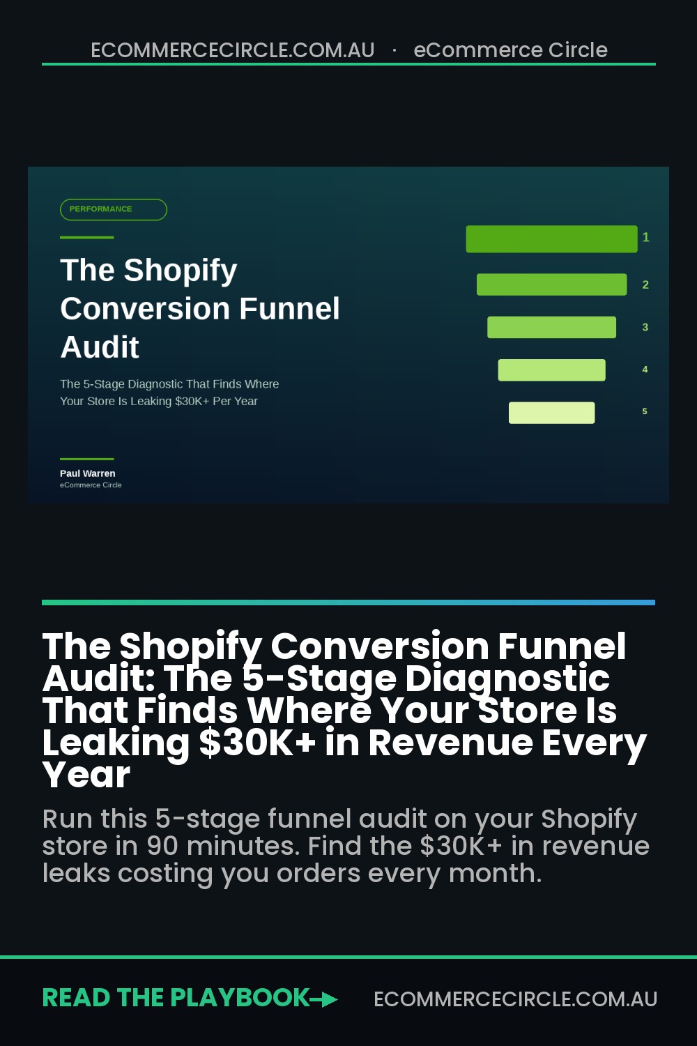
A proper funnel audit is what closes that gap. Not a vanity dashboard. Not a quarterly Looker review that nobody reads. A live, five-stage diagnostic that you can run in an afternoon and that points at the specific page, prompt, or product where revenue is actively walking out the door. Done well, it surfaces $30K to $80K a year in recoverable revenue inside a $1M store, without spending a cent more on ads.
This article walks you through the exact funnel audit we use inside eCommerce Circle with every member who joins on a sub-$2M store. It is built for founders who can read a GA4 report but do not have a dedicated analytics hire. Block out 90 minutes, open your store in a private window on your phone, and follow along.
Why a Funnel Audit Beats a Conversion Sprint Every Time
The conversion rate optimisation industry has trained founders to think in single-page sprints. “A/B test the hero.” “Try a new button colour.” “Add a sticky add-to-cart.” These tests can produce a 2 to 5% lift in isolation. They will not fix a funnel that is haemorrhaging visitors at three different stages.
The funnel is a system. When you change a homepage hero, you do not just affect homepage bounce. You affect collection page entries, PDP impressions, add-to-cart rate, checkout starts, and ultimately repeat purchase. A test that lifts homepage CTR by 8% but drops PDP add-to-cart by 6% is a net negative, and you would never know unless you watched the entire path.
Here is what changes when you audit the funnel as a system instead of a page:
- You stop optimising the wrong things. The home page hero is rarely the biggest leak. Mobile PDP, checkout, and post-purchase usually are.
- You see compounding effects. A 0.3% lift in add-to-cart compounded across a checkout fix and a post-purchase flow can turn into 18 to 22% total revenue lift.
- You make tradeoffs visible. Sometimes a homepage test costs you 3% on PDP but recovers it on cart. Knowing that matters.
- You stop firefighting and start prioritising. A funnel audit gives you a ranked list of what to fix this quarter, not a pile of opinions from your team Slack.

The 5 Stages of the Shopify Funnel Audit
Every Shopify store on the planet, from a $20K/month skincare brand to a $5M/year tools retailer, has the same five stages in its funnel. The job of the audit is to score each one against a known benchmark, find the gap, and rank fixes by revenue impact divided by effort.
The five stages we run inside the More Orders Operating System are:
- Arrival. Session entry, bounce rate, source quality, mobile experience in the first 5 seconds.
- Discovery. Collection page engagement, PDP CTR, search use, browse depth.
- Decision. PDP scroll depth, add-to-cart rate, variant friction, social proof exposure.
- Conversion. Cart drawer interaction, checkout entry, checkout completion, payment friction.
- Retention. Order confirmation experience, first repeat purchase, 60-day repeat rate, email flow conversion.
You score each stage red, amber, or green against the benchmark below. Two or more reds and you almost certainly have $30K+ of annual revenue stuck somewhere fixable. The rest of this guide breaks down each stage with the metrics to pull, the questions to ask, and the fixes that move the needle.
Stage 1: Arrival (The First 5 Seconds Decide Half the Funnel)
The arrival stage covers everything that happens between a visitor clicking your ad and the page becoming usable. It is the most ignored part of the funnel because most founders measure it with vanity metrics like “sessions” and “bounce rate” instead of decision-grade metrics like LCP, time to first interaction, and source-segmented engagement rate.
This stage matters more than you think. A 1-second delay in mobile page load time is worth roughly 7% in lost conversions, and U.S. retail sites take an average of 6.3 seconds to load on mobile. Most Aussie Shopify stores we audit are sitting at 4.5 to 7 seconds on a real 4G connection. That alone is bleeding 15 to 25% of paid traffic before the visitor ever sees a product.
What to measure
- Largest Contentful Paint (LCP) on mobile. Pull it from PageSpeed Insights for your homepage, top collection, and top PDP. Target under 2.5 seconds. Anything over 3.5 is red.
- Engaged session rate by source. In GA4, segment engaged sessions by source (Meta, Google, organic, direct, email). If Meta traffic engages at half the rate of direct, you have a creative-to-landing mismatch.
- Mobile bounce on the landing page. Pull bounce rate filtered to mobile only. Over 60% on a paid landing page is a flag.
- Pop-up timing. If your email capture fires under 3 seconds, you are interrupting visitors before they can orient.
The most common arrival leaks
- Heavy hero video on mobile. Founders love a cinematic hero. Mobile data plans do not. Replace with a static image, or auto-play only on desktop.
- Slow-loading review apps. A single misconfigured review widget can add 1.5 seconds to LCP. Audit your apps with PageSpeed and remove or async-load anything render-blocking.
- Mismatched ad-to-landing-page promise. If your Meta creative shows a “70% off” hook and the landing page leads with a $89 hero product at full price, your engagement rate craters.
- Cookie banner blocking content. Aussie privacy law lets you use a smaller, less intrusive banner. Many themes still ship with a full-screen modal that destroys mobile bounce.
Fix priority: kill any hero element that blocks the page from rendering for more than 2 seconds on mobile, then fix the ad-to-page promise on your top 3 spending campaigns. That is usually a 10 to 15% lift in landing page engagement on its own.
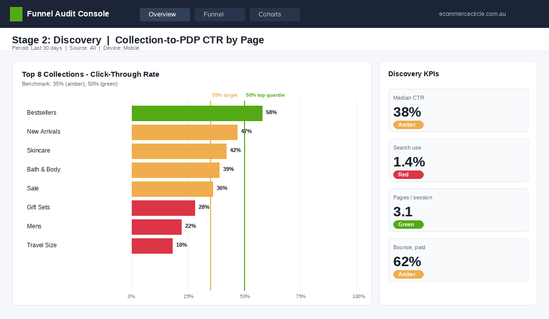
Stage 2: Discovery (Where 60% of Sessions Quietly Die)
Discovery is what happens after arrival. The visitor scrolls the homepage, clicks a collection, browses a category, taps into a PDP. This is where most founders stop paying attention. It is also where the largest unseen leak usually lives. Across the Shopify stores we have audited in the last 12 months, the median discovery-to-PDP rate is roughly 38%. The top 20% of stores hit 55%+.
That gap of 15 to 17 percentage points is pure design and merchandising. It is not a creative or product issue. It is a layout, hierarchy, and filtering issue, and it is fixable inside a 2-week sprint.
What to measure
- Homepage to collection rate. Of visitors who land on the homepage, what % click into a collection or product within 60 seconds? Target 45%+. Pull this from a GA4 path exploration.
- Collection to PDP CTR. Of collection page visitors, what % click into a PDP? Target 35 to 50% depending on niche.
- Search usage rate. What % of sessions use site search? If it is over 8%, your nav is too dense. Under 2%, your search bar is hidden or visitors do not trust it.
- Pages per session by source. Direct should be the highest, paid social the lowest. If paid social has higher pages/session, your top-of-funnel is bringing window shoppers.
The most common discovery leaks
- No clear primary action on the homepage. If your hero has three competing CTAs (Shop New, Shop Bestsellers, Take the Quiz), visitors freeze. Pick one primary, demote the others.
- Collection pages with 80+ products and no filters. Mobile users will not scroll 12 screens of jewellery. Add filters for price, type, colour, and size. Implement instant-apply, not “Apply” buttons.
- Generic product card design. Same image, same font, same layout for every card. Add visual differentiators: best-seller flag, low-stock note, swatch options, hover preview.
- Buried bestsellers. Your top 5 SKUs by revenue should appear in the first viewport on the homepage and as the first row of the most-trafficked collection. Most stores have them on page 3.
If you only fix one thing in discovery: rebuild your top collection page with proper filters and put your hero products in the first 8 tiles. We have seen that one move alone lift collection-to-PDP CTR by 22% in 30 days.
Stage 3: Decision (The PDP Is Where Doubt Becomes Action or Exit)
The product detail page is the most valuable page on your store. It is where the buying decision is actually made. Add-to-cart rate is your single best diagnostic here. The average Shopify ATC rate sits around 7.5%, and the top quartile hits 11 to 14%. If you are under 6% on your hero product PDP, you have a decision-stage problem, and it is almost never the product.
It is the page. The hierarchy is wrong, the social proof is buried, the variant picker is confusing, the shipping promise is missing above the fold. We have a full breakdown of every PDP element in our 7-Layer PDP Anatomy article, but for the audit you only need three diagnostics.
What to measure
- Add-to-cart rate on your top 5 PDPs. Pull this from Shopify Analytics under “Online store conversion over time” filtered to product. Anything under 6% is amber. Under 4% is red.
- PDP scroll depth. Use Microsoft Clarity (free) or Hotjar to see what % of mobile users scroll past the buy box. Target 60%+. If only 30% scroll past the price, your buy box is the entire experience for two-thirds of visitors.
- Variant abandonment. If you have multi-variant products, segment ATC rate by whether variants were selected. If 40% of visitors who tap “size” do not add to cart after, your variant picker is creating friction.
The most common decision leaks
- Reviews below the fold on mobile. Move the star rating and review count to the buy box. Full reviews can stay further down, but the trust anchor needs to sit next to the price.
- No shipping or return policy above the fold. A simple “Free shipping over $80. Easy 30-day returns.” line under the add-to-cart button can lift ATC 8 to 12%.
- Vague product descriptions. Lead with benefits, not features. “Holds 1.2L of cold-brew for 24 hours” beats “Premium glass construction”.
- Hidden out-of-stock variants. If your size dropdown shows “S, M, L” but two are actually sold out, visitors tap, see “Sold Out”, and bounce. Show stock status inline.
Dermalogica is a useful Aussie-relevant benchmark here. After rebuilding their PDP foundation on Shopify they saw a 9% conversion lift, plus a 40% reduction in dev time for future changes. The lesson is that PDP architecture is rarely a copy or design problem in isolation. It is usually a templating problem that holds back every test you would otherwise want to run.
Stage 4: Conversion (The Cart and Checkout Are Where Carts Go to Die)
This is the bloodiest stage. If cart abandonment averages 70.22% across the industry, and the top Shopify stores still see 55 to 65% cart abandonment, then for every 100 add-to-carts your store generates, between 55 and 80 are walking away. The Baymard data also tells us that better checkout design alone can recover an average 35.26% conversion lift on a large ecommerce site. That is the single biggest fixable lever on most Shopify stores.
The audit splits this stage into two: the cart drawer (where they see what they have), and the checkout proper (where they pay). Both leak. Both are fixable with the tools you already have inside Shopify.
What to measure
- Cart-to-checkout rate. Of all add-to-carts, what % initiate checkout? Target 60%+. Under 45% is a cart drawer issue.
- Checkout completion rate. Of all checkouts initiated, what % complete? Target 70%+ on Shopify’s native checkout, higher with Shop Pay enabled.
- Payment method distribution. If less than 30% of checkouts use Shop Pay or Apple Pay on mobile, you are missing express-checkout-driven lift.
- Average steps in checkout. If you are using a customised checkout, count the form fields. Baymard found the average US checkout shows 23.48 form elements. Aim for under 18.

The most common conversion leaks
- Surprise shipping costs. Baymard ranks unexpected extra costs as the #1 reason for cart abandonment at 39%. If you cannot reduce shipping, show the threshold (“$12 more for free shipping”) in the cart drawer. Aussie stores that surface their free shipping threshold in-cart see 8 to 14% lifts in AOV.
- Forced account creation. The second-biggest abandonment driver at 24%. Shopify checkout already does this well by default, but custom checkouts often break it. Verify guest checkout is one tap.
- Slow checkout step transitions. If the form takes more than 1.5 seconds to advance, mobile users will hit back. Run Lighthouse on your checkout URL while logged in.
- Missing local payment options. For Aussie buyers, Afterpay and Zip drive 12 to 22% of checkouts in the under-$200 category. If they are not enabled or are buried below credit card, you are leaving revenue on the floor.
We covered the checkout in detail in our Shopify Checkout 7-Point Audit. Run it back to back with this funnel audit on the same store and you will usually find 4 to 7 specific fixes that combine to lift checkout completion by 8 to 15%.
Stage 5: Retention (The Funnel Does Not End At Confirmation)
Most founders treat the funnel as a one-way trip ending at the order confirmation page. That is the single biggest strategic error inside the More Orders Operating System. The retention stage is where contribution margin is actually made. Acquiring a new customer costs 5 to 7x more than retaining one, and the second purchase is the most predictive metric of long-term LTV.
If your 60-day repeat purchase rate is under 18%, you have a retention leak. The top 10% of Shopify stores in their second year hit 32 to 38% on this metric. Good Ranchers, after migrating to Shopify, saw a 10% lift in subscription adoption alongside 48% year-over-year growth. The migration opened up the post-purchase machinery, not just the storefront.
What to measure
- 30-day and 60-day repeat purchase rate. Pull this from Shopify Analytics under “Returning customer rate”. 30-day target 8 to 12%, 60-day target 18 to 22%.
- Post-purchase email flow open rate. If your welcome and thank-you sequences are under 40% open rate, the subject lines are weak. If they are not even running, that is a retention emergency.
- Review submission rate. Of customers who received a review request 14 days post-delivery, what % submitted? Target 8 to 12%.
- Cross-sell email click rate. Your “customers who bought this also bought” email should click at 4 to 8%.
The most common retention leaks
- Generic order confirmation page. The default Shopify thank-you page is wasted real estate. Add a referral incentive, a complementary product cross-sell, and a hook for SMS opt-in.
- No 7-day or 14-day check-in email. A simple “How is the [product] going?” email at day 7 drives a flood of UGC and triggers second-purchase intent.
- Missing replenishment logic. If you sell consumables (skincare, coffee, supplements, pet food), and you do not predict reorder dates, you are donating customers to Amazon.
- No customer tier or rewards visibility. Even if you have a loyalty programme, if customers cannot see their points balance and next reward inside the order confirmation, retention barely moves.
If you only do one retention upgrade after this audit, build a proper post-purchase email sequence. We mapped the full 7-email flow in our Post-Purchase Email Sequence guide. A working sequence routinely adds 15 to 25% to lifetime value with zero ad spend.
The 5 Most Common Funnel Leaks Ranked by ROI
After running this audit on roughly 200 Aussie Shopify stores in the past 18 months, the same five leaks show up at the top of the priority list almost every time. If you only have one quarter and want to grow revenue 15 to 25% without spending more on ads, this is the order to attack:
- Mobile LCP over 3.5 seconds. Fixing this is usually a 2-week project with a Shopify dev. Median outcome: 8 to 12% lift in mobile add-to-cart rate. Highest ROI fix in the audit, full stop.
- Cart drawer with no free-shipping progress bar and no upsell. A 1 to 2-day implementation with apps like Upcart, Rebuy, or Slide Cart. Median AOV lift: 12 to 18%. Median cart-to-checkout lift: 6 to 10%.
- PDP buy box missing reviews, shipping promise, or social proof. A theme template fix with a Shopify dev or a competent designer. Median ATC rate lift: 10 to 20%.
- No post-purchase email sequence. A Klaviyo build of 5 to 7 emails. Median 60-day repeat purchase lift: 5 to 9 percentage points.
- Custom checkout with extra fields, no Shop Pay, no Apple Pay. The easiest fix on the list. Strip it back to Shopify’s native checkout with express payments enabled. Median checkout completion lift: 6 to 12%.
Most stores will find three to four of these on their first audit. Knock them out in order and you will be looking at a compounded revenue lift of 18 to 30% by quarter end, without touching ad spend, product line, or pricing.
How to Actually Run the Audit (90-Minute Workflow)
Reading this article does not fix your store. Running the audit does. Here is the exact 90-minute workflow we hand to founders inside the workshop. Block out the time, close Slack, and treat it like a real diagnostic.
- Minutes 0 to 15: Pull the numbers. Open Shopify Analytics, GA4, and PageSpeed Insights. Pull the metrics listed in each stage above. Drop them into a single sheet titled “Funnel Audit [date]”. Score each stage red, amber, or green against the benchmarks.
- Minutes 15 to 35: Walk your store like a buyer. Open your store on your phone in a private browser. Do not use Wi-Fi, use 4G if you can. Click your top Meta ad, land, browse, add a hero product, go through checkout. Take a screenshot at every friction point.
- Minutes 35 to 55: Map your leaks. For every amber and red, write down the specific leak in plain English. “Cart drawer does not show free shipping threshold.” Not “Cart needs work.”
- Minutes 55 to 75: Rank by revenue impact. Use the priority list above. Plot each leak on a 2×2: impact (high/low) by effort (high/low). Anything in the top-left (high impact, low effort) is the next 2 weeks of work.
- Minutes 75 to 90: Build the fix queue. Open whatever your team uses for tasks (Asana, Notion, ClickUp). Create one ticket per leak, assigned to a name, with a 2-week or 30-day deadline. No ticket, no fix.
Re-run the full audit every 90 days. It takes the same 90 minutes the second time and gives you a clean before-and-after on every leak you fixed. Most founders we work with run it on the same Friday afternoon each quarter, a habit that compounds into 40 to 70% annual revenue growth from the same traffic.
The Compound Effect: Why This Beats Spending More on Ads
Stack the wins. A 9% lift on mobile arrival from a faster LCP. A 14% AOV lift from a smarter cart drawer. A 12% ATC lift from a fixed PDP. A 7-point lift in 60-day repeat purchase from a real post-purchase sequence. None of these are revolutionary in isolation. Together, they multiply.
Run the math on a $1M store with a 1.8% conversion rate and a $90 AOV. Fix three stages with the leaks above and you are looking at $1.25 to $1.4M in trailing 12-month revenue, with no change to ad spend. That is the difference between adding a new founder salary or spending another $30K on Meta hoping ROAS improves.
The reason funnel work compounds and ad work does not is simple. Ad performance regresses to the platform’s mean within 60 to 90 days. Funnel improvements compound every visitor for every future month. A checkout fix you ship in May 2026 is still earning you money in May 2027 and beyond. A Meta ad you ship in May 2026 is dead by August.
This is the discipline behind the brands we see scaling cleanly past $5M in Australia right now. They run their funnel like a system, not a series of campaigns. Audit, rank, fix, re-audit. Every quarter. Forever.
Inside eCommerce Circle, the funnel audit is one of the first diagnostics we run with every new member. If you want a second set of eyes on yours, let’s talk.
��