Your navigation menu is the most-used element on your Shopify store. It is also the most neglected. The average visitor interacts with it within 8 seconds of landing on your homepage, and if they cannot decode it inside three glances, they bounce. Most Aussie founders spend months obsessing over hero imagery, PDP copy, and ad creative while the menu sitting above all of it leaks 30 to 50% of their potential traffic into the void.
What’s in This Article
The data is brutal. The average ecommerce bounce rate sits between 40 and 60%, and anything over 70% is a red flag. Baymard Institute tested 19 of the world’s leading ecommerce sites and recorded over 900 navigation usability issues. The most common pattern they saw was simple: shoppers repeatedly abandoned sites because they could not find what they were looking for, even when the product existed. Navigation was the bottleneck, not catalogue depth.
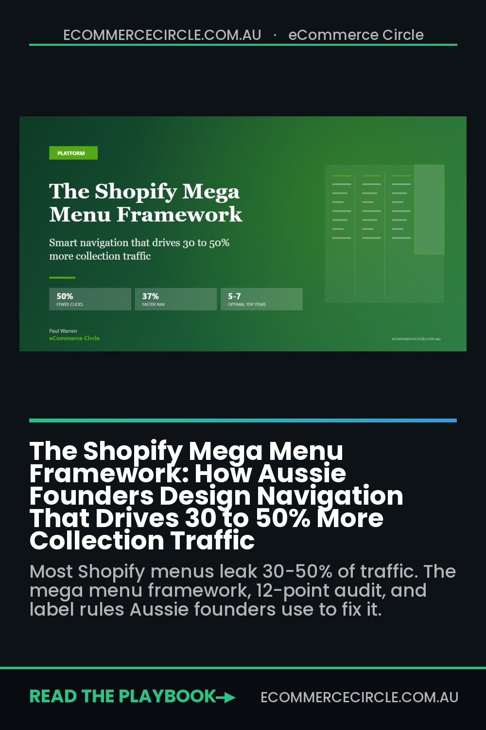
Inside eCommerce Circle, we audit navigation as the first move in any conversion review. Not because it is glamorous, but because the lift is bigger than almost anything else. A Nielsen Norman Group study found mega menus reduce navigation clicks by up to 50% and cut navigation time by 37% on sites with 30 or more pages. Done well, a mega menu can lift conversion rate by up to 30% on its own. This is the framework we use with members to rebuild their nav from the header bar down to the mobile drawer.
Why Navigation Is the Most Overlooked Conversion Lever in Shopify
When a founder asks us why their conversion rate is stuck, we look at four things before we touch their ads or PDPs: their homepage layout, their site search, their cart drawer, and their navigation. Of those four, navigation is the one founders are most reluctant to rebuild. It feels permanent. It is connected to a dozen pages. The thought of editing it in Shopify’s menu editor at 11pm on a Sunday makes anyone reach for the wine.
But navigation does three things no other element on your site does. It signals what you sell within seconds. It distributes traffic across your catalogue. And it tells Google how your site is structured, which feeds straight back into organic rankings. Get it wrong and you bleed in all three directions: first-time visitors bounce because they cannot orient, returning customers cannot find new arrivals, and your collection pages drop out of search.
Here is the stat that should worry every Shopify founder reading this: 44% of customers spend more than three minutes searching for a product before they convert, and only 24% describe their product search as quick. Three minutes of friction at the front door, before they even reach the PDP. That is your navigation costing you money in real time.
The 5 to 7 Item Rule (And Why More Means Less)
Open your Shopify store in an incognito window right now and count the items in your top navigation. If you have more than seven, you have a problem. If you have more than nine, you have a serious problem. The optimal top-level menu has five to seven items, full stop. This is not a stylistic preference. It is a cognitive load constraint backed by decades of user research.
The reasoning is simple. The human eye scans horizontal menus from left to right, and after the fifth or sixth item, attention falls off a cliff. Click-through rates on individual items drop by 50% or more once you cross seven. Adding a tenth item does not give that tenth category more visibility. It quietly reduces the visibility of every other item, including the ones doing all your sales.
The fix is ruthless prioritisation. Your top-level menu should answer one question for a first-time visitor: what kind of store is this? Not every collection you sell. Not every campaign you run. Just the five to seven categories that define your business. Everything else belongs in a sub-menu, a mega menu panel, or the footer. Here is the structure we recommend for most Shopify brands selling between $40k and $500k a month:
- Items 1 to 4: Core product categories. Your top-selling lines, in order of revenue contribution. If “Women’s” outsells “Men’s” 3 to 1, “Women’s” goes first.
- Item 5: New Arrivals or Best Sellers. A traffic-distribution item. Returning customers click here first, so it earns a dedicated slot.
- Item 6: Sale or Outlet. If you run permanent sale, this drives 15 to 25% of clicks. If you do not, replace with a brand-led item like “The Edit” or “Our Story”.
- Item 7: About or Journal. Trust-building real estate. Skip if you are crammed for space, but it lifts conversion on first-time visitors who need brand context.
If you sell across genders or use-cases (men’s, women’s, kids’, accessories, gifting), those four take up most of the bar. If you sell in one vertical with a deep catalogue (skincare only, supplements only, jewellery only), break by product type or use-case. The mistake to avoid is mixing structures. Pick one taxonomy and apply it consistently.
Mega Menu vs Dropdown vs Simple Menu: When Each One Wins
Not every Shopify store needs a mega menu. We see founders bolt one on because Witchery has one, then watch their conversion rate drop because the cognitive load on a 12-product store is now ridiculous. The right pattern depends entirely on your catalogue depth. Here is the decision tree we use:
- Simple flat menu (no dropdowns). Use this if you have fewer than 15 SKUs across two or three collections. Adding a dropdown just makes shoppers wait for nothing. Bondi Sands does this beautifully on certain campaign pages.
- Dropdown menus. Use these if you have 15 to 75 SKUs across four to six collections. A simple text list of 4 to 8 sub-categories per top-level item is fast, clean, and easy to maintain.
- Mega menu. Use these once you cross four sub-categories per top-level item, or once your catalogue exceeds 75 SKUs. Mega menus let you show visual hierarchy, featured products, and category images at the same time.
The 30-link rule matters here. Once a single mega menu panel contains more than 30 links, the cognitive load tips into “choice overload” territory. Users spend more time scanning than clicking. If you genuinely have more than 30 sub-categories, the answer is not to cram them all in. The answer is better information architecture above the menu (broader top-level categories that absorb more children).
There is also a 3-second scan test. Open your mega menu and start a stopwatch. Can a stranger find a specific sub-category in under three seconds? If not, your structure is wrong. Either you have too many items, your labels are unclear, or your visual hierarchy is flat (everything looks equally important, so nothing is).
The Anatomy of a High-Performing Shopify Mega Menu
When we build a mega menu for a Shopify Plus client, it has six elements. Each one earns its place. If you cannot defend why an element is there, it should not be there.
- Element 1: Category columns (3 to 4 max). Sub-categories grouped logically. For a fashion brand: “Shop by Type”, “Shop by Occasion”, “Shop by Collection”. Three to four columns is the sweet spot. More than four causes choice overload.
- Element 2: Featured product or campaign tile. A visual block on the right showing your hero product, a new drop, or the current campaign. This converts at 2 to 4x the rate of text links because it gives shoppers somewhere to land if they cannot decide.
- Element 3: “Shop All” link at the top. One click to the broadest version of this category, for shoppers who want to browse without filtering first. Surprisingly underused.
- Element 4: Best Sellers or Trending shortcut. A single text link inside the menu that takes them to the top-selling subset. This earns disproportionate clicks from returning customers.
- Element 5: Badges and labels. “New”, “Limited”, “Restocked”, “Sold Out”, “Last Chance”. Small visual cues that draw the eye to high-priority items. Use sparingly, three max per menu panel.
- Element 6: A clear hover affordance. A small arrow or chevron next to the top-level label so users know a sub-menu is coming. Removing this is a common Shopify theme oversight. It hurts discoverability by 10 to 15%.

Mobile Navigation: The Drawer Pattern That Beats Everything Else
Around 70% of Shopify traffic in Australia is on mobile, and your beautiful desktop mega menu means nothing if the mobile experience is broken. The single biggest mobile nav mistake we see is treating mobile as a compressed desktop. It is not. Mobile navigation is a different pattern entirely.
The pattern that works is a hamburger icon on the left, a logo in the middle, and persistent search and cart icons on the right. Tapping the hamburger should open a full-screen drawer (not a half-screen overlay) with the same top-level categories the desktop menu uses. Tap targets need to be at least 48 pixels tall, with 8 to 12 pixels of spacing between items.
Sub-categories should expand inline (an accordion) rather than slide to a second screen. Sliding to a second screen feels app-like but adds a step. Inline expansion lets shoppers see the whole structure on one screen, which beats every other pattern in usability testing. For a deeper dive on this whole layer, see our guide on mobile UX for Shopify.
Three other mobile-specific rules worth burning into your theme:
- Persistent search. Never bury search inside the drawer. The search icon should sit in the top bar at all times. Mobile searchers convert at 2 to 3x the rate of mobile browsers.
- Persistent cart. Same rule. Cart icon stays visible even when the drawer is open. Otherwise shoppers cannot complete checkout without re-finding it.
- Close affordance. A clear X icon at the top-right of the drawer. Aussies expect to close drawers by tapping outside them, but that does not always work on mobile, and the X is universal.
Featured Slots: Selling Through the Menu (Without Looking Like You Are Selling)
The most underused real estate in a Shopify mega menu is the featured slot. This is the panel on the right of the menu (desktop) or the top of an expanded category (mobile) that shows a curated tile: a product, a campaign, a story, an editorial piece. Most stores leave this empty or fill it with a generic banner. That is a wasted asset.
Treated correctly, the featured slot becomes a merchandising layer that sits over every collection page on your site. Whatever you push here gets a click-through rate 3 to 5x higher than the equivalent block on your homepage. Why? Because the shopper is already in browse mode. They have committed to looking at this category. A featured tile gives them a shortcut.
Here is what we rotate through featured slots for members:
- New drops. The latest collection or product launch. Refresh every two to four weeks. Drives discovery for returning customers.
- Campaign tiles. Major campaigns like EOFY, Black Friday, Mother’s Day. Replaces the new drop for the campaign window only.
- Bundle promotions. “Build a Set” or “3 for $99” promos that benefit from being inside the navigation flow.
- Editorial features. A journal article or a “How to Style” page. Useful when you need to slow shoppers down on first visit.
- Restock alerts. “Back in Stock” tiles for hero products that sold out. Recovers demand without forcing a back-in-stock email check.
Treat the featured slot like the hero of your homepage. Same care, same image quality, same merchandising thinking. The difference is most founders update their homepage hero monthly. The featured slot can be updated weekly without anyone noticing the rest of the site has not changed.
Label Discipline: The 1-Word, 2-Word, Or Real Word Rule
Menu labels make or break the whole system. The rule is short, scannable, and grounded in how real customers describe what you sell. Three patterns to enforce:
- One or two words max. “Best Sellers” beats “Our Top Sellers and Trending Items”. “Sale” beats “End of Season Clearance”. Every extra word costs 20% scan speed.
- Real customer language. Survey your customers or read review language. If everyone says “T-shirts” but your menu says “Tees”, switch. SEO benefits too.
- No clever labels. “The Vault” might feel branded, but if a first-time visitor cannot guess what is behind it, they will not click. Save the clever names for footer links or campaign landing pages.
A test we run with every audit: print your menu on a piece of paper. Hand it to someone who has never seen your store. Give them 10 seconds. Ask them to tell you what each label means. If they hesitate on more than one item, your labels are too clever or too vague. This works across pricing tiers and verticals. We have done it with $300k/yr stores and Shopify Plus clients turning over $20m. The answer is always the same: simpler labels win.

The 12-Point Navigation Audit (Run This on Your Store Today)
Here is the checklist we use with members. Each item is binary: yes or no. Score honestly. If you score below 8 out of 12, your navigation is costing you measurable revenue.
- 1. Top-level items: 5 to 7. Open your menu, count. More than 7? Cut.
- 2. Hover affordance on every dropdown. Small arrow or chevron next to each parent item.
- 3. “Shop All” link at the top of each mega menu panel. One click to the unfiltered collection.
- 4. Three to four columns in mega menu panels. Not five. Not two with everything stuffed in.
- 5. Featured tile in every mega menu panel. Image, headline, link. Not empty space.
- 6. Real-word labels. No “Vault”, “Edit”, “Curio” unless you sell luxury and your customer expects it.
- 7. Mobile drawer is full-screen. Not a tiny overlay. Not a 60% panel.
- 8. Mobile tap targets 48px+. Test with one finger on a small phone.
- 9. Persistent search and cart icons on mobile. Visible even when the drawer is open.
- 10. Inline accordion sub-categories on mobile. Not slide-to-second-screen.
- 11. Sale or New Arrivals item earns its slot. If it does not, replace it with something that does.
- 12. No more than 30 links inside any single mega menu panel. Count them.
Score yourself, then prioritise the lowest-scoring fixes first. Most stores get the biggest lift from items 1, 7, and 8. Trimming the top-level menu from 10 items to 6 is a one-hour fix that can lift category page traffic by 20 to 40% within a month.
The Compound Effect: How Navigation Lifts Every Other Metric
Here is what most founders miss. Navigation is not a standalone lever. It is the multiplier that sits above everything else. Fix your menu and you get knock-on lifts across at least five metrics at once.
Bounce rate drops first. Shoppers who can orient within 8 seconds stay. We typically see bounce drop by 5 to 12 percentage points after a navigation rebuild. Time on site lifts in lockstep. Pages per session goes up by 30 to 50% as shoppers discover collections they did not know existed. Collection page traffic distribution rebalances. Categories that were dying because they sat in slot 9 start performing once they get into slot 3.
Search rankings follow. Google reads your menu structure as a signal of your site architecture. A clean, hierarchical menu with semantic labels boosts how Google understands and crawls your category pages. Internal link equity flows where you tell it to flow. Pair this with optimised collection page design and the compound effect on SEO is real.
Conversion rate lifts last and largest. Mega menus with the elements we covered above can lift conversion rate by up to 30% on their own. Not because shoppers are clicking the menu more, but because shoppers who do click it are landing in the right place faster. Less friction in the discovery layer means more shoppers reach the PDP with intent intact.
Common Mistakes (And the Fixes We Run With Members)
The same five mistakes show up in nine out of ten Shopify nav audits we run. Worth knowing what to watch for.
- Mistake 1: Too many top-level items. Usually 9 to 12. Fix: prioritise by revenue contribution, push everything else into mega menu sub-categories or the footer.
- Mistake 2: Empty mega menu panels. Three columns of links and a giant empty space on the right. Fix: add a featured tile, every time. Even a static category image with a “Shop the Collection” button beats nothing.
- Mistake 3: Mobile menu is a tiny overlay. Half the screen is the menu, half is the page behind it. Fix: full-screen drawer, every time. The page behind it is not helping anyone.
- Mistake 4: Search icon hidden in the drawer. Shoppers who want to search have to tap twice and scroll. Fix: persistent search icon in the top bar, opens a search overlay.
- Mistake 5: Labels that need explaining. “Discover”, “Shop the Edit”, “The Curio”. Fix: rename to what a customer would type into Google. “New Arrivals”, “Best Sellers”, “Sale”.
None of these fixes need a developer. They are all in the Shopify menu editor and the theme customiser. The hardest part is the rewrite of the labels and the curation discipline of deciding what stays in the top bar. That part is mostly emotional. Founders get attached to old menu items the way they get attached to old SKUs. Cut anyway.
How to Roll This Out Without Breaking Your Store
Do not redo your navigation at 11pm on a Sunday. The risk of breaking a collection link or hiding a product line is real. Run the rebuild as a structured project. Three phases, two weeks total, no rushed launches.
- Phase 1 (Week 1): Audit and design. Run the 12-point audit. Sketch the new structure on paper. Confirm category names match real customer language. Map every existing menu link to a new home (or to the footer).
- Phase 2 (Week 2, Days 1 to 3): Build on a duplicate theme. Never edit your live theme directly. Duplicate, rename “Navigation Rebuild”, make changes, preview.
- Phase 3 (Week 2, Days 4 to 7): Test, soft launch, monitor. Publish the new theme on a Tuesday morning, never a Friday. Monitor Google Search Console, Shopify analytics, and your heatmap tool (Lucky Orange, Microsoft Clarity, or Hotjar) for one full week. Bounce rate and pages per session should move within 48 to 72 hours.
Keep an emergency rollback. If anything looks wrong (a collection 404s, mobile menu refuses to open, search bar disappears), un-publish in one click and revert to the old theme. Then fix in the duplicate, re-publish. Most rebuilds need one or two micro-fixes in the first 48 hours. That is normal.
If you have any major paid traffic running, pause campaigns that point to deep collection pages for the first 24 hours of the new menu. Once you have confirmed the new URLs resolve and the menu paths work, turn ads back on. This costs you one day of spend. It is cheaper than burning $5k on broken landing pages.
Pair Navigation With the Rest of Your Discovery Layer
Navigation is the front door. But it is one of three discovery layers Shopify operators need to get right. The others are homepage layout and on-site search. When all three are working together, your store starts compounding. Bounce drops, pages per session lifts, conversion rate climbs, and your ads work harder because they land into a store that converts at 3% instead of 1.5%.
If you fix only the menu and leave the homepage and search broken, you cap the upside. If you fix all three over a quarter, you typically see a 30 to 60% lift in revenue per visitor. Not because traffic changed. Because the same traffic suddenly knew where to go.
How to Measure Navigation Performance in GA4 (The 15-Minute Setup)
Everything in this framework is testable, but only if you wire up the measurement before you change the menu. Here is the minimum viable tracking stack, and it takes about 15 minutes.
- Menu click events. Fire a custom GA4 event (menu_click) with the link label and menu level as parameters. On most Shopify themes this is a small snippet in the header section, or you can configure it without code in Google Tag Manager using a click trigger scoped to the nav element.
- Collection landing share. In GA4, build a comparison of sessions landing on collection pages that arrived from the homepage. If your menu rework is doing its job, homepage-to-collection click-through should sit above 40% of homepage sessions within two weeks.
- Search-after-navigation rate. Watch how many visitors use site search within 10 seconds of opening the menu. A rate above 15% means the menu failed them: they looked, could not decode it, and bailed to search. Hotjar or Microsoft Clarity session recordings will show you exactly where their cursor stalled.
- Menu exit rate. Track sessions that open the mega menu and then leave the site without clicking anything. Above 8% on desktop is a structural problem, usually too many choices or vague labels.
Review these four numbers weekly for the first month after any navigation change, then monthly. The brands that win at navigation are not the ones with the prettiest menus. They are the ones who noticed, three weeks in, that “Shop All” was outperforming every curated label and rebuilt around what buyers actually click.
The Bottom Line
Your Shopify navigation is one of the highest-impact assets on your site. Five to seven top-level items. Three to four columns in every mega menu panel. A featured tile in every panel. Real-word labels. A full-screen mobile drawer with persistent search and cart. Twelve points to audit, most of them fixable in a weekend.
The brands that crack this do not necessarily have bigger budgets or better products. They have done the structural work most founders skip. They have decided that the front door of their store deserves the same attention as their PDP, their checkout, and their ad creative. That is the difference between a Shopify store at 1.8% conversion and one at 3.2% conversion. Same traffic. Same products. Different navigation.
Inside eCommerce Circle, navigation architecture is one of the core pillars we work on with every member. It is unglamorous, structural work, and the lift is bigger than almost anything else we do. If you want a second opinion on yours, let’s talk.
��