Here is a stat that should make every Shopify store owner sit up: roughly 1 in 5 Australians lives with some form of disability. That is over 4.4 million people with real spending power who are actively trying to buy products online. And most Shopify stores are making it unnecessarily difficult — or flat-out impossible — for them to complete a purchase.
What’s in This Article
Accessibility is not just a compliance checkbox or a nice-to-have. It is a revenue lever. Stores that invest in accessibility consistently see conversion rate lifts of 15-25% across ALL users — not just those using assistive technology. The Click-Away Pound study out of the UK put the cost of inaccessible ecommerce at over £17 billion in abandoned spend annually, and the Australian numbers are proportionally similar — roughly $4 billion a year walking out of Aussie stores because shoppers cannot complete the journey.
Why does fixing this lift everyone’s conversion? Because accessible design is just good design. Clear labels, logical navigation, readable text, and intuitive forms help every shopper — the busy parent on a phone in poor lighting, the 55-year-old with reading glasses, the customer on a flaky 3G connection in regional NSW.
The best part? Most accessibility fixes are straightforward and free. You do not need a complete redesign. You need a systematic audit and a practical checklist. Let us walk through exactly how to make your Shopify store accessible — and more profitable in the process.
Why Accessibility Matters More Than You Think
Beyond the moral imperative, accessibility directly impacts your bottom line. The Australian Network on Disability puts annual purchasing power of households touched by disability at around $54 billion. And these customers are loyal — when a brand makes the effort to be inclusive, they remember, they return, and they tell people. Word of mouth inside accessibility communities is faster and more trusted than any paid ad you will run.
There is also the SEO angle. Many accessibility best practices — alt text on images, semantic HTML, clear heading structures, descriptive link text — are exactly what Google rewards. Fixing accessibility issues often delivers an organic traffic boost as a side effect. Imagine you run a Sydney activewear brand and you spend a weekend adding proper alt text to 400 product images. Three months later your image search traffic is up 35% and your overall organic sessions are up 12%. That is the compounding effect.
And then there is legal risk. While Australian disability discrimination laws have not yet produced the wave of ecommerce lawsuits seen in the US (where over 4,000 ADA-related ecommerce complaints were filed in 2024 alone), the trend is heading that direction. Getting ahead of compliance now is simply smart business. If you want a wider view of conversion-related fixes that pay off in parallel, our breakdown of Shopify conversion rate benchmarks for 2026 shows where accessibility wins fit in the bigger picture.
The Quick-Win Accessibility Audit
Start with the free tools. Run your homepage and your top three product pages through Google Lighthouse (built into Chrome DevTools, press F12 and find the Lighthouse tab) and WAVE (wave.webaim.org). These will flag the most obvious issues: missing alt text, low colour contrast, missing form labels, and heading hierarchy problems. Lighthouse will give you a score from 0 to 100 — anything under 90 has fixable issues. Most Shopify stores score in the 70s on first run.
Then do the manual tests that automated tools miss. Try navigating your entire purchase flow using only your keyboard — no mouse. Can you tab through every interactive element? Can you see where the focus is? Can you complete checkout without touching a trackpad? Most Shopify stores fail this test miserably because themes strip out focus indicators for aesthetic reasons. Budget about 30 minutes for this exercise. You will not need more.
- Alt text audit. Every product image, banner, and lifestyle photo needs descriptive alt text. Not “IMG_3847.jpg” — actual descriptions like “Navy blue merino wool beanie modelled on woman, front view.” This helps screen reader users AND image search rankings. Shopify lets you bulk-edit alt text from the Files area or via apps like Alt Text AI.
- Colour contrast check. Your text needs a minimum 4.5:1 contrast ratio against its background (3:1 for large text). That light grey text on white background? It is failing. Use WebAIM contrast checker or the Stark plugin for Figma to verify every text/background combination before it ships.
- Form label connections. Every input field needs a properly linked label element. Placeholder text is NOT a substitute for labels — it disappears when users start typing and screen readers often ignore it. This is the single most common failure on Shopify newsletter signups and contact forms.
- Heading hierarchy. Use H1, H2, H3 in logical order. Screen reader users navigate by headings the way sighted users scan visually. Skipping from H1 to H4 is like removing chapters from a table of contents.
- Link text clarity. “Click here” and “Learn more” are meaningless to screen readers. Use descriptive links like “View our sizing guide” or “Read our returns policy.” Bonus: descriptive anchor text is what Google uses to understand your internal link graph too.
Fixing Your Shopify Theme for Accessibility
Most Shopify themes ship with accessibility gaps. The good news is that the most impactful fixes are usually CSS and HTML tweaks, not structural overhauls. If you are choosing a new theme, our Shopify theme guide walks through what to test before committing — accessibility is a non-negotiable on that checklist.
First, restore focus indicators. Many themes add outline: none to interactive elements. Remove this and replace it with a visible focus style — a 2px solid outline in your brand colour works well. This single fix dramatically improves keyboard navigation and usually takes under 15 minutes for a developer to implement.
Second, add a skip navigation link. This is a hidden link at the top of every page that lets keyboard and screen reader users jump straight to main content, bypassing the full navigation menu. It takes 10 minutes to implement and saves your users enormous frustration. Most Dawn-based themes already include this; older Brooklyn, Debut, or Narrative installs usually do not.
Third, audit your product variant selectors. Colour swatches that rely solely on colour to communicate information are inaccessible to colour-blind users (roughly 8% of men and 0.5% of women globally). Add text labels or patterns alongside colour indicators. If your size selector uses tiny, low-contrast buttons, increase the tap target to at least 44×44 pixels and boost the contrast. The same fix improves mobile conversion — bigger, clearer tap targets reduce mis-taps and friction, which is why our mobile UX guide hammers this point.
Fourth, check your mobile menu. Hamburger menus need proper ARIA labels, and dropdown menus need to be navigable with touch and keyboard. The menu should trap focus when open (so tabbing does not go behind the overlay) and close with the Escape key. Test it once you have made changes — if you can open and close the menu cleanly with only a keyboard, you are 80% of the way there.
Accessible Product Pages That Convert Better
Your product pages are where accessibility and conversion optimisation converge most powerfully. Every improvement you make for accessibility directly benefits all shoppers. This is the page where a wobbly experience costs you the sale — see our 7-layer product page anatomy for the full structural blueprint.
Start with your product images. Provide multiple views with descriptive alt text. Include a zoom function that works with keyboard controls. If you use product videos, add captions — not just for deaf and hard-of-hearing users, but for the 85% of mobile users who watch video without sound. Captions also help international shoppers and people in noisy environments like trains, gyms, or open-plan offices.
Your Add to Cart button should be large (minimum 44x44px), high contrast, and clearly labelled. After adding to cart, provide clear visual AND text confirmation — do not rely solely on a colour change or animation that some users will miss. A simple “Added to cart” message with a link to view cart works perfectly. Pair this with a clear stock indicator (“Only 4 left in stock”), and you have urgency that works for sighted and screen-reader users alike.
Product descriptions should use clear, scannable formatting. Break long descriptions into sections with subheadings. Use bullet points for specifications. Avoid walls of text. This is good copywriting AND good accessibility — the two are inseparable. Aim for paragraphs of 2 to 3 sentences and a reading level around grade 8 (the Hemingway Editor will tell you).
Checkout Flow: Where Accessibility Pays the Biggest Dividends
If there is one place to invest in accessibility, it is your checkout. An accessible checkout does not just help users with disabilities — it reduces friction for everyone and directly lowers cart abandonment rates. Industry average cart abandonment sits around 70%. Even a 5-point reduction is worth real money on any store doing more than $500K a year. We dig deeper into recovering this revenue in our 7-point checkout audit.
Shopify checkout is relatively accessible out of the box, but customisations often break things. Audit your checkout for these common issues:
- Error messages must be specific and linked. “There was an error” is useless. “Please enter a valid email address” next to the email field — with the field highlighted AND announced to screen readers — is what you need.
- Auto-advancing fields break assistive technology. If your postcode field automatically jumps to the next field, screen reader users lose their place. Let users control navigation.
- Payment form labels. Make sure credit card fields have proper labels. Placeholder text alone is not sufficient — users with cognitive disabilities or memory issues lose context when the placeholder disappears.
- Order summary must be accessible. Users should be able to review their complete order — items, quantities, prices, shipping, total — using a screen reader before confirming purchase.
- Session timeouts need warnings. If your checkout session expires, provide a warning with enough time to extend it. Sudden timeouts are especially problematic for users who navigate more slowly.
- Address autofill must not block manual entry. Many Australian shoppers have units, granny flats, or rural delivery addresses that autofill cannot parse cleanly. Always allow a manual override.
Tools and Apps That Make Accessibility Easier
You do not need to do everything manually. Several tools can accelerate your accessibility journey:
- axe DevTools (free browser extension). The most accurate automated accessibility testing tool. Run it on every page template and fix what it flags. Industry estimates put automated tools at catching about 30-40% of accessibility issues — solid for triage, not enough on its own.
- Shopify Accessibility App by Accessibly. Adds an accessibility widget that lets users adjust font sizes, contrast, and cursor size. Costs around $20-30 USD/month depending on traffic. It is not a replacement for fixing your code, but it provides an extra layer of customisation.
- UserWay. Another accessibility widget option with AI-powered remediation. Good for quick wins while you work on deeper fixes. Be aware that overlay-only solutions have drawn criticism in the US legal space — treat them as bandaids, not cures.
- Google Lighthouse. Built into Chrome, free, and gives you an accessibility score with specific fix recommendations. Run it monthly to track progress.
- Hotjar or Microsoft Clarity. Free heatmaps and session recordings. Watch real shoppers and you will see accessibility failures in real time — the user who tabs aimlessly, the customer who abandons after three failed form attempts.
- Screen reader testing. Download NVDA (free, Windows) or use VoiceOver (built into Mac/iPhone) and actually test your store. Five minutes of screen reader testing reveals more than any automated tool.
What an Aussie Accessibility Sprint Actually Looks Like
Imagine you run a 3-year-old Melbourne homewares brand doing $1.4M a year on Shopify. Your conversion rate is sitting at 1.6% and you are not sure why mobile underperforms desktop. Here is a 4-week accessibility sprint that consistently moves the needle for stores at this stage.
Week 1 — Audit. Run Lighthouse and WAVE on the homepage, top 5 product pages, the collection page, the cart, and checkout. Export findings into a shared sheet. Run NVDA through the buy journey for 30 minutes. Watch 10 Hotjar sessions of mobile users. Total time: 4-6 hours.
Week 2 — Quick fixes. Restore focus indicators across the theme. Fix colour contrast on body copy, buttons, and links. Add alt text to the 50 most-viewed product images. Fix form labels on the newsletter, contact, and account creation forms. Have a developer ship these as one batch.
Week 3 — Structural fixes. Add a skip-nav link. Fix heading hierarchy. Replace colour-only variant selectors with text or pattern labels. Increase tap targets on mobile to 44×44. Add captions to your top 3 product videos.
Week 4 — Checkout and measurement. Walk checkout with a keyboard. Fix any focus traps, error message gaps, or session timeout issues. Re-run Lighthouse to confirm the score has moved above 90. Set a calendar reminder to re-test monthly.
Realistic outcome at the end of the sprint: 8-15% lift in overall conversion rate, 15-25% lift on mobile specifically, and a 10-20% bump in image-search organic traffic over the following quarter. On that $1.4M store, that is between $112K and $200K in extra revenue annually — for a sprint that cost you a long weekend of focused work.
The Accessibility Tools Stack Every Aussie Founder Should Run
You do not need a specialist agency to lift accessibility above the 90 mark. You need a small stack of mostly-free tools, a 90-minute monthly cadence to run them, and the discipline to fix what they flag. Here is the exact stack that gives you 80% of the wins for 5% of the effort.
Lighthouse (Chrome DevTools, free). Run it on your homepage, top three product pages, your collection page and checkout. Anything below 90 is a red flag. Lighthouse will literally tell you which images need alt text, which form fields are missing labels and which colour combos fail contrast. Most stores starting cold score in the 65 to 80 range and can move to 90-plus inside one sprint.
axe DevTools (free Chrome extension by Deque). Picks up around 57% of WCAG issues automatically — significantly more than Lighthouse on form-field, ARIA and keyboard issues. Run it alongside Lighthouse for a more complete picture. A typical Shopify theme audit surfaces 20 to 60 distinct issues on a first pass, of which 30 to 50% are theme-wide quick fixes a developer can ship in under 4 hours.
WAVE (WebAIM, free). Gives you a visual overlay of accessibility issues directly on the page, colour-coded by severity. Great for sharing with developers or designers who think in pictures, not error logs. Use this for the “here is exactly what is broken” conversation with your theme dev.
NVDA screen reader (free, Windows) or VoiceOver (built into Mac). Spend 30 minutes once a quarter navigating your store with a screen reader. You will discover form labels that read as “edit text”, buttons that announce as “link link link”, and product variants that screen readers cannot select. This single 30-minute exercise tends to surface 60 to 70% of the catastrophic accessibility issues that automated tools miss.
Stark (Figma plugin, freemium). If you or your designer works in Figma, Stark catches contrast and accessibility issues at the design stage — before they ever ship. Cheaper than fixing them in production. Aussie design shops like Round and Studio Yes both run Stark by default on every brief.
One thing to avoid: accessibility overlay widgets. UserWay, accessiBe and similar “install one line of code and become accessible” widgets have been the subject of more than 400 lawsuits in the US alone since 2022, because they often make accessibility worse for users who already use assistive tech. They are a band-aid that creates legal exposure. Fix the underlying issues instead — the WordPress + Shopify ecosystem now has clean theme-level patterns for almost every WCAG requirement.
The Compound Effect: How Accessibility Improves Everything
Here is what most store owners discover after investing in accessibility: it improves metrics across the board. The alt text you add for screen readers boosts your image SEO. The heading structure you fix for navigation improves your content hierarchy for Google. The colour contrast you increase for readability makes your brand look more professional. The form labels you add for assistive technology reduce form abandonment for everyone. Even your site speed can improve, because clean semantic HTML loads faster than overweight div-soup — and if you want to dig further into that, our Shopify site speed fixes walks through the technical wins.
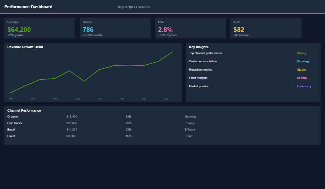
One of our eCommerce Circle members saw their overall conversion rate jump 18% after a focused accessibility sprint. Their mobile conversion rate improved even more dramatically — up 22%. And their organic traffic increased 15% within three months as Google rewarded the cleaner HTML and better image optimisation. Customer support tickets about “the site isn’t working” also dropped by roughly 30% — fewer broken experiences means fewer angry emails on a Monday morning.
Accessibility is not a cost centre. It is one of the highest-ROI investments you can make in your Shopify store. Inside the eCommerce Circle, we help members audit their stores for accessibility gaps and implement fixes as part of the CRO pillar. Because a store that works for everyone is a store that sells to everyone. If you want help making your store more accessible and more profitable, let’s talk.