Here is a number that should bother you. Roughly 69% of shoppers use navigation or on-site search as their main way to find a product. That means for most of your visitors, your menu is not a nice-to-have. It is the road. And most Aussie Shopify stores have paved that road badly.
What’s in This Article
Walk into your own store as a first-time buyer. Tap the menu. Nine times out of ten it mirrors your Shopify backend: a flat list of collections in the order you happened to build them. That is your filing system, not a shopping experience. Shoppers do not think in “collections”. They think “I want a linen shirt under a hundred bucks” or “show me what is new”.
The brands quietly winning treat the menu like a product discovery engine. When one team reorganised navigation to match how shoppers actually think instead of internal taxonomy, they logged a 16% sitewide lift in conversion rate. This playbook is the five-part system we use with eCommerce Circle members to get that kind of result on your store.
Your Menu Is the Most Under-Optimised Asset in Your Store
Founders pour money into ads to buy the click, then hand that hard-won visitor a menu they would not use themselves. It is the single biggest gap between traffic spend and revenue we see on audits.
Product discovery is where the market is moving. A 2025 global survey of more than 200 retailers found 88% plan to increase their investment in product discovery, and the leaders are 62% more likely to treat it as a core strategy rather than an afterthought. Navigation is the front door of that discovery, and it is free. You already own it.
The upside is not marginal either. Adding visual navigation loops between related products, so a shopper is always one tap from the next relevant thing, has been shown to lift overall conversions by 29%. You are not tuning a button colour here. You are changing how many products each visitor ever sees.
Start With How Shoppers Think, Not How Your Backend Is Built
The first move is to throw out your internal category logic and rebuild the menu around shopper intent. Your buyers arrive with a job to be done, not a knowledge of your SKU structure.
Sit down with your top 20 search queries and your best-selling collections. Those two lists tell you the language and the priorities your customers actually have. If “gifts under $50” is a top search but lives four clicks deep, your menu is fighting your customer.
Group your navigation around the three ways people shop: by type (what the product is), by edit (occasion, season, price, “new in”, “best sellers”), and by audience (women, men, kids, gifting). Most stores only offer the first. The winners offer all three, because different shoppers walk in with different questions.
- Lead with intent, not inventory. “New In” and “Sale” earn their spot at the front because that is what returning buyers look for first.
- Cap the top level at five to seven items. More than that and you have moved the decision paralysis from the page to the menu.
- Name things in customer language. “Knitwear” beats “AW26 Collection 3”. Match the words people already type into your search bar.
- Kill the dead weight. If a category drives under 2% of clicks and near-zero revenue, it does not deserve a permanent slot. Fold it into a parent.
This is also where your site search data becomes gold. Your search bar is a live feed of exactly what shoppers want and cannot find. Read it weekly and let it reshape the menu.
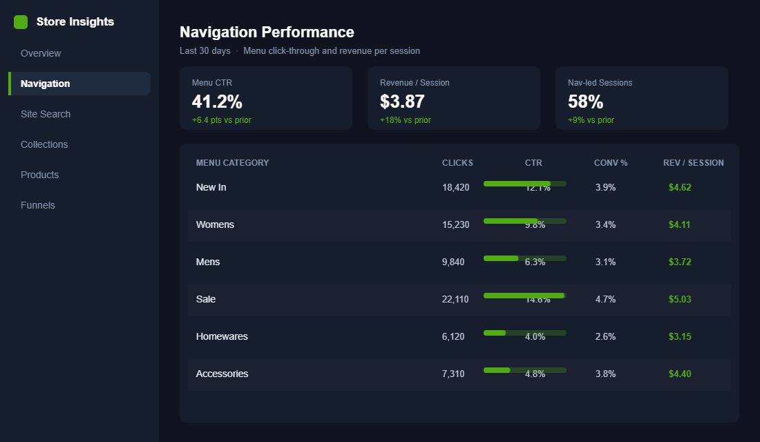
The Mega Menu Decision: When a Simple Dropdown Stops Working
A single-column dropdown is fine when you have a handful of collections. Once you cross roughly five main categories or 25-plus products, that dropdown becomes a scroll of despair and shoppers bail. That is the point to move to a mega menu.
A mega menu is a wide, multi-column panel that shows several groups of links, and ideally a few product images, in one clean view. Done well, it turns the menu itself into a mini landing page. Done badly, it is a wall of 60 links that overwhelms the exact person you were trying to help.
Crockett & Jones is a clean example of structure: their footwear mega menu breaks down by collection, then adds a “Guides” column (sole guides, style guides, care guides) so browsers and researchers are both served in the same panel. Our Place uses a full-width layout that stays effortless to scan even on a smaller screen.
- Use columns to group, not to dump. Three to four labelled columns (Shop by Type, Shop by Edit, Collections) beat one long list every time.
- Add two or three featured product tiles. An image of your hero product in the menu is a discovery loop. It gives a wandering shopper something concrete to click.
- Include one merchandising slot. A “Shop all” button or a seasonal banner at the base of the panel gives the indecisive a clear next step.
- Do not nest more than two levels deep. If a shopper needs three taps to reach a product from the menu, the menu has failed.
Where does the menu send people? Straight into your collection pages, so make sure those pages are ready to convert the interest your menu just created.
Win Mobile or Lose the Sale
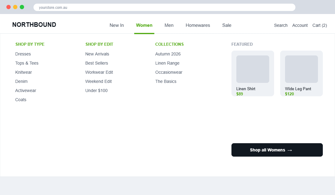
This is the part most stores get catastrophically wrong. Mobile now drives close to 80% of retail visits and 66% of orders, yet 58% of shoppers say mobile menus are harder to use than desktop. Your biggest audience is using your worst-tested experience.
The data backs the frustration. Baymard Institute’s 2025 mobile UX benchmark found 69% of stores rate “mediocre or worse” on mobile main navigation, and not one site tested scored “good” or “perfect”. Mobile navigation is a genuine competitive edge precisely because almost nobody has nailed it.
The classic mistake is burying everything behind a hamburger icon and calling it done. Research from Nielsen Norman Group, Luke Wroblewski and Baymard all point the same way: anything hidden inside a hamburger gets discovered and used far less than something in plain sight. So make the important things visible.
- Expose a bottom tab bar. Put your three to five core sections (Shop, Search, Account, Cart) in a persistent bar so they never disappear.
- Make the menu full-screen and tappable. Big touch targets, one category per row, a clear chevron for “there is more inside”.
- Put search where the thumb is. On mobile, search often out-converts browsing, so give it a permanent, obvious home.
- Test category depth on a real phone. Not Chrome dev tools. An actual thumb on an actual device, counting the taps to a product.
Merchandise the Menu Like It Is a Homepage
Your menu is not a “set it and forget it” asset. The best operators treat it as living merchandising space and edit it on a schedule, the same way they would rotate a homepage banner.
The Iconic, one of Australia’s sharpest operators, regularly audits its menu: pulling slow-moving categories and promoting whatever is trending or in season. That discipline is why their navigation always feels current rather than cluttered.
Small merchandising moves inside the menu pay off fast. One Australian apparel brand added direct links to accessories from within its main clothing categories and lifted upsells by 20%. That is a menu doing the work of a cross-sell app, for free.
The mindset shift is simple. Stop thinking of your menu as a directory and start thinking of it as prime shelf space. In a physical shop you would never leave the same tired display up for a year while your best stock sat in the back. Your menu is the digital equivalent of the front table, and it deserves the same weekly eye.
- Feature the season. Swap “New In” contents and featured tiles monthly so returning customers always see something fresh.
- Give sale a home during promos. During a campaign, a prominent Sale entry with a countdown or banner drives urgency without a single pop-up.
- Cross-link on purpose. Put accessories inside apparel, candles inside homewares. Guide the basket, do not just list departments.
- Let some apps add-to-cart from the menu. Tools like Buddha Mega Menu allow add-to-cart directly from the panel, shortening the path for known repeat buys.
The Tool: Setting Up Meteor Mega Menu in an Afternoon
You do not need a developer or a custom theme to ship most of this. Meteor Mega Menu & Navigation (4.7 stars on the Shopify App Store) is the one we most often point members to, because it reads your existing Shopify navigation instead of making you rebuild it from scratch.
Here is the setup we run, start to finish in an afternoon:
- Step 1. Install Meteor from the Shopify App Store and grant theme access. It plugs into your current Online Store 2.0 theme.
- Step 2. Rebuild your menu structure first in Shopify under Online Store, then Navigation. Meteor inherits it, so get the intent-based grouping right here.
- Step 3. Pick one of the eight templates, then use the visual editor to add columns, product images and a featured tile to your two or three biggest categories.
- Step 4. Configure the mobile view separately. Set your full-screen menu and confirm every top category is one tap from a product.
- Step 5. Preview against a real phone and desktop, then publish. Watch menu click-through for two weeks before you tweak again.
Buddha Mega Menu and Globo are solid alternatives if you want in-menu add-to-cart or richer promo banners. The tool matters less than the structure. A great menu on a basic app beats a lazy menu on a premium one.
Measure the Menu: The Numbers That Prove It Worked
If you cannot measure it, you cannot defend the time you spent on it. Navigation has its own scorecard, and most founders never look at it.
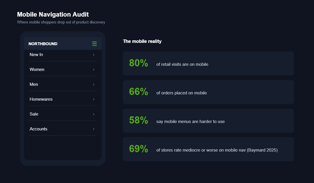
Track these four numbers before and after every change. In Shopify analytics and GA4, you can see menu interactions as events and tie them to revenue.
- Menu click-through rate. What share of sessions engage the menu at all. If it is low, your labels or placement are wrong.
- Revenue per session from nav-led journeys. The real prize. Are menu users worth more than the site average?
- Category conversion rate. Which menu paths convert and which just collect clicks. Promote the winners.
- Search versus navigation split. If search dominates, your menu is not answering the question and you have a structure problem to fix.
Feed those numbers back into your product page and collection work. Navigation, collections and product pages are one connected journey, not three separate projects.
Five Navigation Mistakes That Quietly Bleed Revenue
Before you rebuild, it helps to know what you are rebuilding away from. These are the five patterns we flag on almost every audit. None of them throws an error or shows up in a bug report, which is exactly why they survive for years while slowly costing you sales.
- The mirror menu. Your navigation is a carbon copy of your Shopify collections list, in the order you built them. It reflects your admin, not your customer. Fix the order first: lead with what sells and what is new.
- The everything drawer. Forty links crammed under one “Shop” tab. Choice overload is real, and a menu with too many equal-weight options makes shoppers pick nothing. Group ruthlessly and hide the long tail one level down.
- The label nobody searches. Internal names like “SS26 Drop 2” or “Range A” mean nothing to a buyer. If the word is not one a customer would type, it does not belong in the menu.
- The mobile afterthought. A desktop menu that was never redesigned for a thumb. Tiny targets, endless nested lists, search buried three taps deep. This is the one that hurts most, because mobile is your majority.
- The frozen menu. Built once at launch, never touched again. Meanwhile your best sellers changed, your seasons changed, and your menu is still pointing at last winter’s hero. A stale menu is a slow leak.
Notice that four of these five are free to fix. They are not budget problems or theme limitations. They are decisions, and you can change a decision this afternoon. The gap between a mediocre menu and a great one is usually attention, not money.
Don’t Sleep on the Footer: Your Second Navigation System
Shoppers who scroll to your footer are not lost. They are looking for something specific, usually reassurance. Footer visitors convert at 2 to 3x the site average on many Shopify stores because reaching the footer signals genuine buying intent: they are hunting for shipping details, returns, sizing or contact info before committing.
Treat the footer as a second navigation system with its own job. The header menu sells the catalogue. The footer sells confidence. That means four link groups, in this order:
- Shop links. Your top 4 to 6 collections, mirrored from the header. Repetition is fine; footer links also give search engines a consistent crawl path to your money pages.
- Trust links. Shipping policy, returns, size guides, warranty. These are the pages a hesitant buyer opens in a new tab at 9pm. If your returns policy is buried, expect more abandoned carts and more “where is my order” tickets later.
- Contact and proof. A real phone number or email, your ABN if you sell considered purchases, and a physical location if you have one. Aussie shoppers still check whether a store is actually Australian before buying.
- Email capture. The footer signup quietly collects 15 to 25% of total email opt-ins on most stores. Give it a reason (“Get the drop alerts”) rather than a generic “subscribe to our newsletter”.
Run the same measurement discipline on the footer as the header: in GA4, compare conversion rate for sessions that clicked a footer trust link against your site average. If those sessions convert well but the links get few clicks, your trust content is good and your visibility is the problem. Surface the same info higher on the page, especially on your product pages, where the buying decision actually happens.
The Compound Effect: A Menu That Sells While You Sleep
Here is where the pieces click together. Rebuild around intent and more shoppers find what they came for. Add a mega menu with product tiles and each visitor sees more of your range. Nail mobile and you stop taxing 80% of your traffic. Merchandise it weekly and the menu starts actively selling. Measure it and you know exactly what to double down on.
None of these is a huge project on its own. Together they compound. A shopper who finds the right category faster, sees a featured product they did not know existed, and taps through on a phone that finally feels easy is a shopper who buys more per visit. That lift shows up on every session, from every channel, forever. You fixed the road once and every future visitor drives on it.
That is the quiet power of navigation. It is the rare optimisation that costs almost nothing, touches every visitor, and keeps paying out long after you have moved on to the next thing.
If you only change one thing on your store this quarter, make it this. Ads get more expensive every year and your competitors can copy your offers overnight. But a menu tuned to exactly how your customers shop is quiet, compounding advantage they cannot see and will not easily match.
The 6-Point Navigation Audit
Run this on your store this week. Score each point yes or no. Every “no” is money left on the table.
- Intent test. Does the menu match your top 20 searches and best sellers, not your backend collection order?
- The five-item rule. Is your top level capped at five to seven clear, customer-language items?
- Mega menu trigger. If you have 25-plus products or five-plus categories, are you using a structured, multi-column menu with product tiles?
- Mobile thumb test. On a real phone, is every top category one tap from a product, with core actions always visible?
- Merchandising cadence. Is someone editing the menu at least monthly to feature season, sale and trending lines?
- The scorecard. Are you tracking menu click-through and revenue per session, before and after each change?
Inside eCommerce Circle, navigation and product discovery are core pillars we work on with every member, because they touch every dollar of traffic you already pay for. If you want a second opinion on yours, let’s talk.