Right now there is a good chance you are paying somewhere between USD 219 and USD 720 a month for a dashboard that tells you what your store did yesterday. Triple Whale’s paid tiers start around USD 219 a month. Polar Analytics starts around USD 300 a month and climbs to USD 720 for the tier most brands end up on. Meanwhile there is a query editor sitting inside your Shopify admin that most founders have never opened once.
What’s in This Article
The reflex, when reporting gets hard, is to buy something. That reflex is expensive. The average Shopify merchant spends roughly USD 120 a month on apps in total, and only 1.82% of tracked Shopify stores spend more than USD 100 a month on apps at all. A single analytics subscription can double or triple your entire app bill before it has answered a single question you could not have answered yourself.
Here is what I see across hundreds of Aussie Shopify founders: the brands that read their numbers fastest are not the ones with the most dashboards. They are the ones with six or seven saved reports they actually open. Australians spent $82.6 billion online in 2025, up 14% year on year, and 24% of all retail spend is now made online.
The demand is there. The question is whether you can see what is happening inside your own store within sixty seconds of logging in.
What Changed in Shopify Analytics (And Why Most Founders Missed It)
For years, Shopify reporting was a locked list. You picked from a menu, you got what you got, and anything custom meant a reporting app. That is no longer true, and the change happened quietly enough that most operators never noticed.
Go to Analytics in your admin and click New exploration. What opens is a three-part workspace: a query pane where you write ShopifyQL, a set of controls that write the query for you as you click, and a live results panel that redraws as you type. Shopify validates the query in real time and flags errors before you run anything.
Behind it sit queryable schemas covering sales, orders, customers, marketing, inventory and payments. Each schema exposes its own metrics and dimensions, so the question you are asking maps to a dataset rather than to whatever a report template happened to include.
A few things landed in 2026 that make this genuinely usable rather than a developer toy:
- Sidekick writes the query for you. Ask “gross sales by month for the last year” in plain English and Sidekick drafts the ShopifyQL, runs it, and shows you the query it produced. Reading that query is the fastest way to learn the syntax.
- More chart types. Bubble, sunburst, scatter and radar joined the existing options, and cumulative running-total views were added for time-series metrics.
- Physical storefront filtering. If you run retail alongside online, you can now split reports by location.
- Insights on the Analytics dashboard. Shopify surfaces trending signals automatically instead of waiting for you to go looking.
One honest caveat before you build your whole reporting rhythm on this. Every plan can view the core report categories, but the ability to save filtered and custom reports permanently sits on the higher plans, Advanced and Plus at the time of writing. Check your plan in Settings before you invest an afternoon. If you are on Basic, you can still run explorations, you just cannot pin them.
Ten Minutes of Syntax Is All You Actually Need
ShopifyQL is SQL-like. If you have ever written a spreadsheet formula with a few conditions in it, you already have enough pattern recognition to read this. Every query has the same shape, and there are only about eight clauses worth memorising.
- FROM picks the schema: sales, orders, customers, inventory, payments.
- SHOW lists the metrics you want back, like
total_sales,orders,average_order_value. - GROUP BY splits those metrics by a dimension, like
sales_channelorproduct_title. - TIMESERIES turns a single total into a series by day, week or month.
- SINCE and UNTIL set the window (
-30d,today), or use DURING with a named period likelast_month. - WHERE filters rows. ORDER BY ranks them. LIMIT caps the list.
- COMPARE TO
previous_periodputs the prior window beside the current one. - VISUALIZE sets the chart type, and ANNOTATE marks events like a launch or a sale on the timeline.
Here is a complete query that answers a real question: which ten products drove the most revenue through the online store last month.
FROM sales
  SHOW total_sales
  WHERE sales_channel = 'Online Store'
  GROUP BY product_title
  DURING last_month
  ORDER BY total_sales DESC
  LIMIT 10
VISUALIZE total_sales TYPE horizontal_bar
The fastest way to learn is to build the first two or three reports with the clicky controls, then read the ShopifyQL the editor generated. After about twenty minutes of that you will be typing queries faster than you can click them.
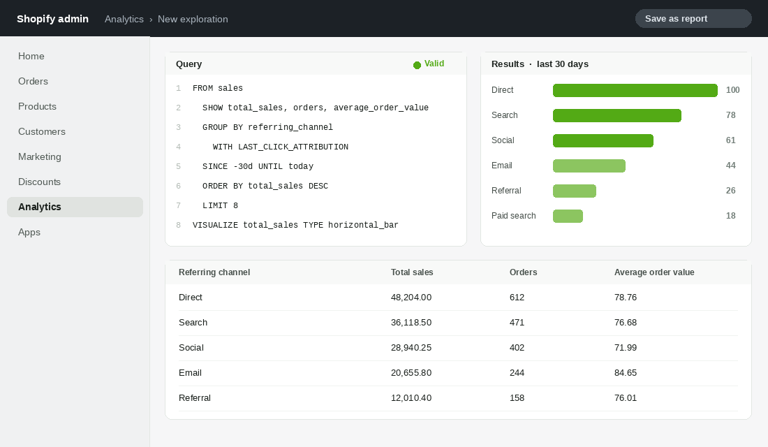
Report 1: The Daily Trading Board
This is the one you open with your coffee. Sales, orders and average order value by day for the last fourteen days, with the previous fourteen days sitting behind it for context. No app required, no data lag, no attribution argument.
FROM sales
  SHOW total_sales, orders, average_order_value
  TIMESERIES day
  SINCE -14d UNTIL today
  COMPARE TO previous_period
VISUALIZE total_sales TYPE bar, orders TYPE line
Save it, name it “Daily Trading Board”, and set it to email to you each morning. The point is not the numbers themselves. The point is that you build a mental baseline for what a normal Tuesday looks like, so an abnormal Tuesday registers as a signal instead of a shrug.
Two rules for reading it. First, never react to a single day. Second, when average order value moves more than 5% while orders stay flat, go straight to your discount report, because something is stacking that should not be.
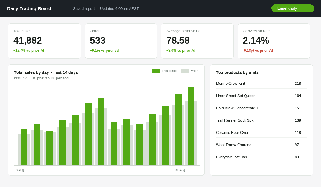
Report 2: Where the Orders Actually Came From
Most founders read channel performance inside the ad platforms, which is a bit like asking each of your salespeople to score their own performance. Shopify’s own last-click view is a useful counterweight, and it is one line of syntax.
FROM sales
  SHOW total_sales, orders
  GROUP BY referring_channel WITH LAST_CLICK_ATTRIBUTION
  SINCE -30d UNTIL today
  ORDER BY total_sales__last_click DESC
Be honest with yourself about what this is. Last click undercredits everything that happens early in the journey, and it will make your direct and branded search look like heroes while your top-of-funnel spend looks like a waste. That is a known distortion, not a verdict.
Use it as a cross-check. When Meta claims 400 conversions and this report shows social contributing 6% of last-clicked revenue, you have not proven Meta is lying. You have found a gap worth investigating with a proper holdout test. If you want the blended view that sits above all of this, read our breakdown of the marketing efficiency ratio framework.
Report 3: Product Velocity Heading Into Peak
It is early September. Black Friday is roughly twelve weeks out and your last inbound container before peak has either shipped or it has not. This report tells you which SKUs are earning their shelf space.
FROM sales
  SHOW ordered_product_quantity, total_sales
  GROUP BY product_title
  SINCE -28d UNTIL today
  ORDER BY ordered_product_quantity DESC
  LIMIT 25
VISUALIZE ordered_product_quantity TYPE horizontal_bar
Export it, drop it next to your current on-hand quantities, and divide stock by weekly velocity to get weeks of cover. Anything with fewer than fourteen weeks of cover and a rising trend is a reorder conversation this week, not in October.
Run the same query with SINCE -365d and TIMESERIES month on your top ten SKUs, and you will see last year’s peak shape for each product. That is your demand curve, and it is free. Pair it with our BFCM inventory planning playbook before you commit the purchase order.
Report 4: The Discount Leakage Report
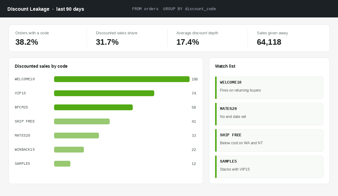
This is the report that pays for the afternoon you spend building all seven. Most brands have no idea how much revenue their discount stack is quietly consuming, because the codes were set up at different times by different people and nobody ever went back.
FROM orders
  SHOW orders, total_sales, discounts
  GROUP BY discount_code
  SINCE -90d UNTIL today
  ORDER BY discounts DESC
  LIMIT 20
What you are hunting for is not the biggest number. It is the codes that should not be firing at all. The welcome code redeemed by customers who have ordered four times.
The influencer code from an eighteen-month-old collaboration with no end date. The free shipping threshold that loses money on every WA and NT delivery.
Eight in ten Australian shoppers hunt for the best deal online, so discounting is not going away. But there is a difference between a discount you chose and a discount that is happening to you. Build a watch list of every code above 2% of discounted revenue, put an end date on all of them, and review it monthly.
Report 5: New Versus Returning Revenue
Almost every growth decision you make is really a bet on one of two engines: acquiring more people, or getting more from the people you already have. If you cannot see the split by month, you are guessing.
FROM sales
  SHOW total_sales, orders
  GROUP BY customer_type
  TIMESERIES month
  SINCE -12m UNTIL today
VISUALIZE total_sales TYPE bar
A healthy Australian DTC brand past its first two years usually lands somewhere between 25% and 40% of revenue from returning customers. Below 20% and you are running an acquisition treadmill that gets more expensive every quarter. Above 55% and your new customer engine has probably stalled, which feels comfortable right up until it does not.
Watch the trend line rather than the absolute number. A returning-revenue share that is climbing while total revenue is flat means you are not replacing customers fast enough, and that is a very different problem from the one it looks like on the surface.
Report 6: The Geography and Delivery Read
Australia punishes flat-rate thinking. A parcel from a Melbourne warehouse to Broome costs a multiple of the same parcel to Geelong, and if your shipping is a single national rate you are cross-subsidising without knowing the size of it.
FROM sales
  SHOW total_sales, orders, average_order_value
  GROUP BY billing_region
  SINCE -90d UNTIL today
  ORDER BY total_sales DESC
Put your average freight cost per state next to this and the picture usually gets uncomfortable fast. The common pattern for Aussie brands is that WA, NT and regional QLD orders carry a delivery cost 40% to 90% above the east coast average while converting at a lower average order value.
You have three levers once you can see it: a regional shipping rate, a higher free shipping threshold outside the metro zones, or a second fulfilment node. Pick one deliberately instead of absorbing the cost by default.
Report 7: The Year-on-Year Pre-Peak Comparison
September through November is where peak season is won or lost, and the only useful benchmark is your own store twelve months ago. Not the industry average, not what a mate told you at a meetup.
FROM sales
  SHOW total_sales, orders, average_order_value
  TIMESERIES week
  SINCE -18m UNTIL today
  COMPARE TO previous_year
VISUALIZE total_sales TYPE line
Add an ANNOTATE clause to mark last year’s sale windows on the chart so you are comparing like with like. A 30% lift in the week of a sale you ran last year but not this year is not growth, it is a calendar artefact.
The number that matters here is the gap between your current weekly run rate and the same week last year. If you are tracking at plus 8% and your plan assumes plus 25% for peak, you have roughly ten weeks to close a 17-point gap, and that is a media and offer decision you want to be making now rather than in the second week of November.
Where Paid Dashboards Still Earn Their Keep
I am not going to pretend the native layer does everything, because it does not, and pretending otherwise would cost you money in the other direction.
- Blended ad spend. Shopify does not know what you spent in Meta, Google and TikTok yesterday. If you want blended ROAS or MER on one screen without a spreadsheet, a paid tool genuinely saves you time.
- Creative-level reporting. Which ad, which hook, which thumbnail. That data lives in the ad platforms and Shopify has no view of it.
- First-party pixel attribution. Post-purchase survey data and server-side click tracking stitched together is real work, and the better tools do it well.
- Predictive LTV cohorts. Modelled forward-looking customer value is a genuine analytics product, not a saved report.
Here is the test I would apply. Build all seven reports above first. Use them for a full month.
Then write down the questions you still could not answer. If that list has four or more real, decision-changing questions on it, buy the tool with confidence.
If it has one, you just saved yourself USD 2,600 to USD 8,600 a year. Healthy app spend sits between 0.5% and 2% of monthly revenue, and a dashboard you open twice a month is not defending its share of that.
Four Mistakes That Make Your ShopifyQL Reports Mislead You
A report you trust is only useful if the numbers are right. These four issues trip up most founders in the first month, and each one can swing a decision the wrong way.
- Mixing gross and net sales.
gross_salesignores discounts and returns.net_salessubtracts them.total_salesadds shipping and tax back in. Pick one for each report and label it, otherwise a 20% off weekend will look far better than it was. - Ignoring refunds in the period. Refunds land in the period they are processed, not when the order was placed. After a big sale, last week can look soft because returns from the sale are hitting it. Compare net sales with orders before you panic.
- Counting bot sessions. If your session count jumps 30% with no change in orders, conversion rate drops for no real reason. Our bot traffic audit shows how to spot and filter it before it distorts your sessions-based reports.
- Comparing the wrong windows.
COMPARE TO previous_periodagainst a 30-day window that includes Click Frenzy or EOFY will mislead you. For trading decisions, compare to the same period last year instead.
Once your numbers are clean, the new versus returning report becomes far more useful. Pair it with our cohort analysis playbook to see whether the returning revenue is coming from recent customers or from a shrinking base of long-term regulars. That distinction often decides whether you spend next month on acquisition or retention.
A practical test: rebuild one existing report from your dashboard app in ShopifyQL, and check the totals match within 1-2%. If they do, you can trust the rest. If they do not, the gap almost always traces back to one of the four issues above.
The Compound Effect of Reports You Actually Open
Seven reports is not the win. The win is what happens when reporting stops being a monthly archaeology project and becomes a five-minute habit.
Report 1 gives you a baseline, so anomalies surface in days instead of weeks. Report 4 stops slow margin bleed that would otherwise run for a quarter. Reports 3 and 7 make your peak season buy an evidence-based decision instead of a nervous guess.
Report 5 tells you which growth engine to fund next quarter. Individually each one is worth an hour. Together they change the speed at which you make decisions, and decision speed is the actual competitive advantage in a market where 9.8 million Australian households shopped online last year and 41% of them shop at least fortnightly.
Brands like Who Gives A Crap and July, both featured in Shopify’s Australian Retail Report, did not get where they are by having more data than everyone else. They built the discipline of looking at the same few numbers, on the same cadence, and acting on them. Bed Threads and Who Gives A Crap have both turned their own customer data into public-facing campaigns, which only works when the internal reporting habit is already solid.
If you want the wider operating rhythm that these reports plug into, our weekly scorecard playbook covers how to run the meeting itself.
Your Build Checklist for This Week
Do not try to build all seven in one sitting. Spread it across four short blocks and you will finish with reports you trust rather than reports you abandoned halfway.
- Block 1 (20 minutes). Open Analytics, click New exploration, and run the sample query from this article. Change one clause. Change it back. Get comfortable.
- Block 2 (40 minutes). Build and save Reports 1 and 2. Set Report 1 to email daily. Name them plainly so future you knows what they are.
- Block 3 (40 minutes). Build Reports 3 and 4. Export Report 4 and write your discount code watch list into a shared doc with an owner and a review date.
- Block 4 (40 minutes). Build Reports 5, 6 and 7. Add annotations to Report 7 for last year’s sale windows.
- The following Monday. Open all seven in order before you open your inbox. Write down the one decision each report changed. If a report changed nothing three weeks running, delete it.
That last rule is the important one. A report that does not change a decision is a screensaver. Before you add another tool to the stack, it is worth running a proper app stack audit and finding out what you are already paying for.
Inside eCommerce Circle, getting a founder to the point where they can read their own numbers without a subscription is one of the first things we work on with every member. If you want a second opinion on your reporting setup before peak, let’s talk.