Here is the moment that quietly drains most Aussie Shopify stores. A stranger taps your Meta ad, lands on a product page, sees a price and an Add to Cart button, and bounces in under eight seconds. You paid for that click. You got nothing back.
What’s in This Article
The instinct is to blame the ad, or the price, or the algorithm. The real problem is almost always the destination. Cold traffic from Meta and TikTok converts at roughly 0.5 to 1.2 percent when you drop it straight onto a product page. Warm traffic, the people who already know you, converts at 3 to 5 percent. You are sending people who have never heard of you to a page that was built for people who already trust you.
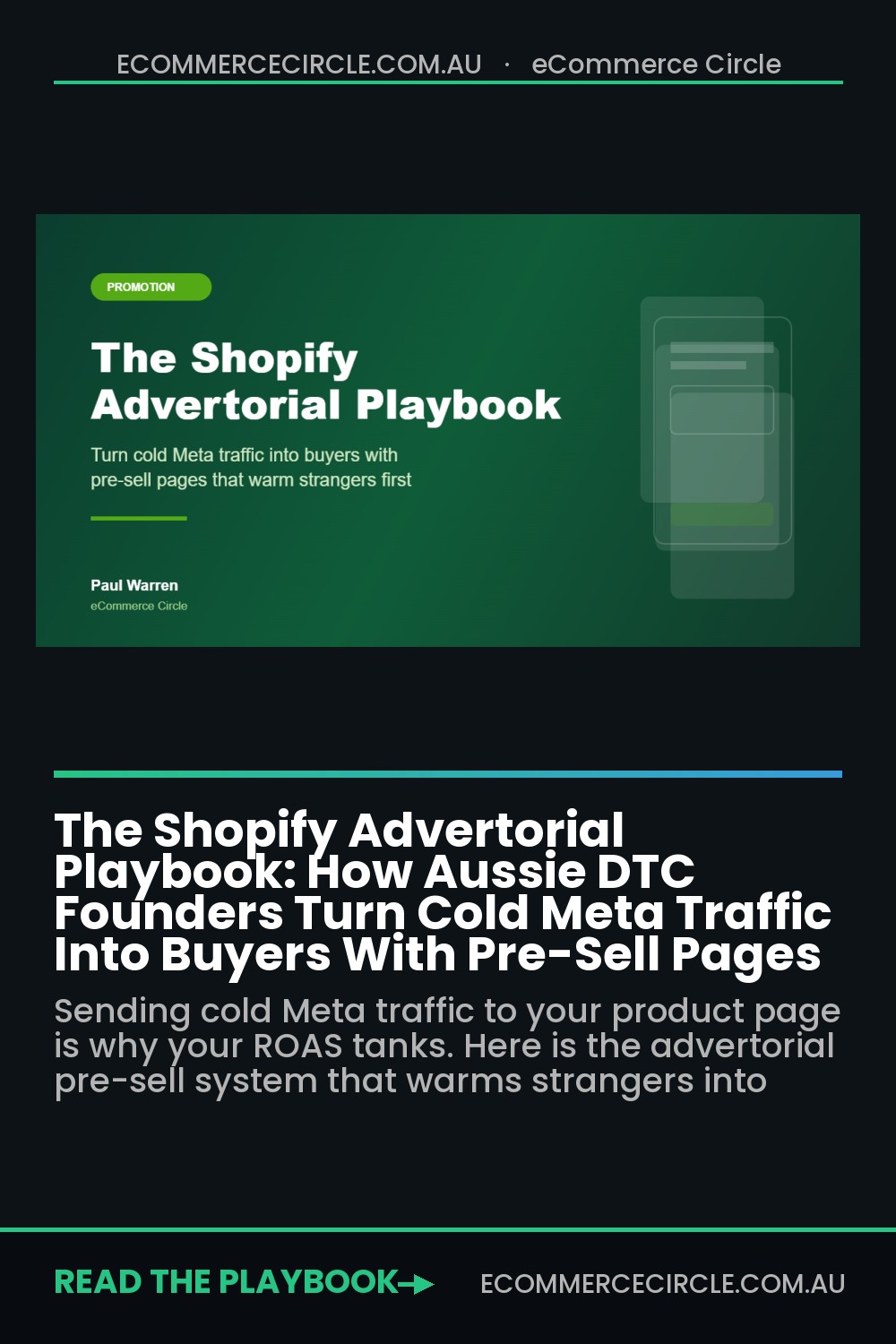
An advertorial fixes that mismatch. It is a pre-sell page that does the warming up your product page cannot do. Brands that match the right page to cold traffic see 3 to 5 times higher conversion on paid social, and the format helped grow Hint Water from a kitchen experiment into a business worth more than 100 million dollars. This playbook breaks down exactly how to build one for your store, the five blocks every advertorial needs, and the mistakes that get them shut down.
What An Advertorial Actually Is (And What It Is Not)
An advertorial is a page that reads like an article, not an ad. It looks like editorial content: a headline, a story, a few photos, some proof, and a soft transition into your offer. The reader feels like they are learning something useful, not being sold to. That feeling is the whole point.
Its job is narrow and specific. Take a problem-aware stranger, the person who knows they sleep badly but has never heard of your magnesium supplement, and turn them into someone who is product-aware and trusting before they ever see a buy button. The product page asks for the sale. The advertorial earns the right to ask.
Three things an advertorial is not. It is not a product page with extra paragraphs bolted on top. It is not a generic landing page with a hero banner and three benefit icons. And it is not a blog post, because a blog post informs and stops, while an advertorial informs and then moves the reader toward a decision. If your page does not build belief and then point somewhere, it is not doing the job.
This format works hardest in categories where the buyer needs to understand a mechanism or believe a claim before they part with money. Supplements, skincare, sleep, pet health, homewares, anything with a “why is this different” story. If your product sells on impulse and a single photo, you may not need one. If it needs a moment of education, an advertorial is the highest impact page you can build.
The 5-Part Advertorial Structure
Every advertorial that converts follows the same skeleton. Change the words, keep the bones. Here is the structure we use with eCommerce Circle members when we map a pre-sell page, and the order matters because each part sets up the next.
Part 1: The Hook
The headline names the reader’s problem and pulls them in rather than pushing your product out. “Why Aussie shift workers swear by this 4pm ritual” beats “Buy our magnesium supplement” every time. The opening two sentences should make the reader feel seen, referencing a frustration or situation they already live with. If they do not feel “that is me” in the first paragraph, the rest of the page never gets read.
Part 2: The Problem Agitation
Now make the cost of the status quo real. Walk through what the problem is actually doing to them: the foggy mornings, the second coffee that does not work, the money already wasted on products that did nothing. Specifics build trust here. Vague pain (“poor sleep is bad for you”) gets skimmed. Sharp pain (“you wake at 3am, check the clock, and do the maths on how little sleep is left”) gets believed.
Part 3: The Mechanism Or Story
This is the turn. Introduce the insight that makes your product different, the reason it works when others failed. It can be a mechanism (most magnesium uses a cheap oxide form the body barely absorbs, yours uses glycinate) or a story (the founder’s own struggle and the thing that finally worked). This is where the reader goes from sceptical to curious. Without a credible “why”, every claim that follows sounds like marketing.
Part 4: The Proof
Curiosity is not belief. Stack the evidence: verified reviews, before and after results, customer photos, press mentions, real numbers. Genuine social proof is the single biggest lever on a cold page, because the reader trusts other buyers far more than they trust you. Quote real customers by name and city. “Sarah from Geelong” lands harder than a five-star graphic with no source.
Part 5: The Offer And CTA
Only now do you transition to the product. Restate the promise, present the offer cleanly, and remove the risk with a guarantee or easy returns. Place soft calls to action throughout the page, not just at the bottom, because some readers are sold by paragraph three and should not have to scroll to act. Every CTA points to the same place: your product page or cart, with the discount already applied.
The balance to protect: too much selling destroys the trust the page was built to create, and too much information buries the decision. The best advertorials feel 80 percent helpful and 20 percent persuasive. Get that ratio wrong and you either have a brochure nobody believes or a blog post nobody buys from.
Match The Page To The Temperature
The advertorial is not your only landing page. It is the right page for one specific audience: cold, problem-aware prospecting traffic. Sending the wrong temperature of visitor to the wrong page is one of the most common and expensive mistakes we see when we run a conversion funnel audit on a store.
- Cold and problem-aware. Broad Meta and TikTok prospecting. Send to an advertorial. They need education and trust before price.
- Warm and product-aware. Retargeting visitors who already saw your product. Send to the product page or a focused collection. They do not need the story again.
- Hot and ready. Email and SMS subscribers responding to an offer. Send straight to cart or a dedicated offer page. Friction is the enemy here.
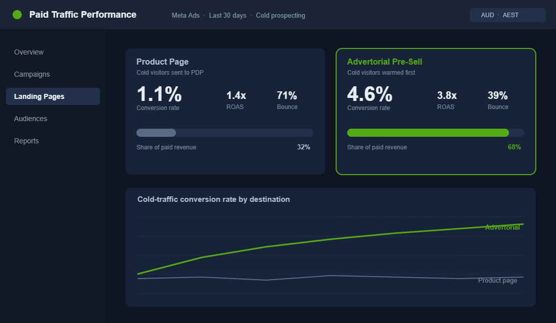
The numbers back this up. Product pages convert paid traffic at roughly 1.8 to 2.5 percent, while dedicated landing pages built for the campaign convert the same products at 3.5 to 5.2 percent, close to double. But running an advertorial on warm retargeting traffic wastes the warmth you already paid to build. The rule is simple: the colder the visitor, the more selling the page has to do before it asks for the sale.
Build Your First Advertorial In Replo
You do not need a developer to ship an advertorial. A landing page builder that sits on top of Shopify will get you live in an afternoon. Replo is the one most paid-ads brands reach for, because it is fast, gives pixel-level control, and integrates with Klaviyo so your captured emails flow straight into your sequences. GemPages and Shogun are solid alternatives, and GemPages in particular has advertorial templates built in.
Here is the setup, start to finish:
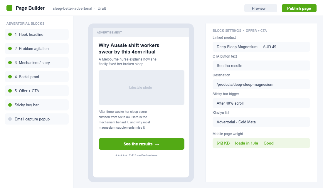
- Install and connect. Add Replo from the Shopify App Store. It links to your store and pulls in your products, fonts and brand colours automatically.
- Start from an advertorial template. Create a new page and pick an editorial or listicle layout rather than a product template. This gives you the article structure instead of a storefront grid.
- Drop in the five blocks. Build in order: hook headline, problem section, mechanism or story, proof block, offer and CTA. Keep paragraphs short and break up text with real photos.
- Add a sticky buy bar. Set a bar that appears after about 40 percent scroll, so the CTA is always within thumb reach on mobile without crowding the opening.
- Link the product and CTAs. Point every button to your product page or cart with the campaign discount pre-applied. Consistency stops readers losing momentum at the handoff.
- Connect email capture. Add an exit-intent or timed popup wired to a dedicated Klaviyo list (for example “Advertorial – Cold Meta”) so non-buyers are not lost.
- Check page weight and speed. Compress images and keep the mobile page under about 1 megabyte. Cold traffic is mostly on mobile, and a slow page bleeds the conversion you just built.
- Publish to a clean URL. Use a readable path like /pages/sleep-better, then send your Meta ad traffic there instead of the product page.
The 4 Advertorial Angles That Work
The structure stays the same, but the angle, the narrative wrapper you choose, changes how the page feels. Pick the one that fits your product and your proof, and test a second angle once the first is winning. These are the four that consistently pull for Aussie DTC brands.
- The transformation story. One person, one problem, one before-and-after. “A Melbourne nurse finally fixed her broken sleep.” Best when you have a strong customer or founder narrative and emotional proof.
- The listicle. “5 reasons Aussie dog owners are switching to fresh food.” Easy to skim, easy to write, and it lets you stack multiple benefits and proof points fast. US brands like Native and Hims built much of their cold acquisition on this format.
- The editorial or news angle. Written like a journalist covering a trend. “Why magnesium glycinate is quietly replacing sleeping pills.” Best when there is a real shift or insight in your category you can credibly report on.
- The comparison. “We tested 6 magnesium supplements. Here is what we found.” Best when your product genuinely wins on a fair comparison and your buyer is in research mode.
Whichever angle you run, the creative on the ad and the headline on the page have to match. A reader who taps an ad about “fixing 3am wake-ups” should see those exact words at the top of the advertorial. That continuity is also where most stores leak, which is why we treat it as a core check inside Meta ads creative testing: the ad and the page are one funnel, not two separate assets.
Stay On The Right Side Of The ACCC And Meta
Advertorials live close to a line, and crossing it gets your ad account restricted or your brand in front of the regulator. Two sets of rules matter for Australian stores, and both are easy to comply with if you are honest.
Australian Consumer Law. The ACCC treats advertorials as advertising, full stop. Your page must not mislead or deceive, every testimonial must be genuine and from a real customer, and any claim (especially health or results claims) must be substantiated. Disguising an ad as independent editorial without making its commercial nature clear is exactly the kind of conduct the ACCC pursues. Label the page so a reasonable reader understands it is an advertisement.
Meta advertising policies. Your landing page has to match the ad that points to it, the page cannot make prohibited or sensational claims, and if you used AI tools to generate or substantially alter any image, Meta now requires an AI-generated label. A clear “Advertisement” or “Sponsored” notice near the top, unblocked by popups, keeps you compliant on both fronts.
None of this weakens the page. Honest advertorials outperform deceptive ones over time, because trust is the thing you are actually selling. Make the claims real, label the page clearly, and you get the conversion lift without the risk.
The Compound Effect: One Page, A Full Funnel
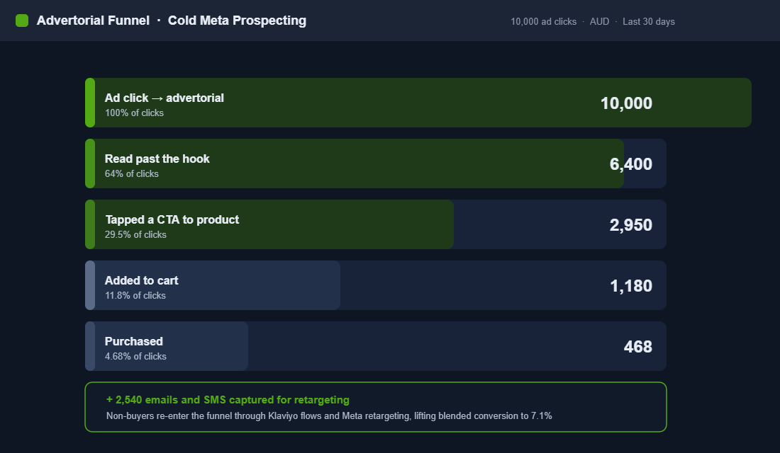
A product page is a single shot. A visitor converts or they are gone, and with cold traffic that means losing 98 or 99 out of every 100 clicks you paid for. An advertorial turns that single shot into a system, because it does three jobs at once.
It converts more buyers on the first visit by warming them properly. It captures emails and phone numbers from the people who are interested but not ready, feeding them into your landing page and email architecture. And it gives your retargeting something to chase, because a visitor who read 60 percent of your story is a far warmer retargeting audience than someone who bounced off a product page in five seconds.
Stack those together and the maths changes completely. A cold page converting at 1 percent with no capture is a dead end. The same traffic on an advertorial converting at 4.6 percent, capturing 25 percent of non-buyers for email and SMS, and feeding warm retargeting audiences, can push blended conversion past 7 percent once the follow-up flows do their work. That is the difference between Meta being a cost and Meta being a profit engine.
Three Mistakes That Quietly Kill Advertorials
Most advertorials that fail do not fail because the idea is wrong. They fail on execution, and the same three mistakes show up again and again when we audit a store’s paid traffic.
- Selling too early. The page pitches the product in the first scroll, before any belief is built. The reader smells the ad, decides it is just marketing, and leaves. Earn the read before you ask for the click.
- Fake or generic proof. Stock-photo “customers”, star ratings with no source, and claims with no substantiation read as untrustworthy and breach Australian Consumer Law. Real names, real cities and real photos convert. Invented ones do the opposite.
- A jarring handoff. The advertorial feels warm and editorial, then dumps the reader onto a cold product page with a different look, a different headline and no discount applied. Momentum dies at the seam. Keep the language, the offer and the design consistent from ad to page to cart.
Fix these three and you are ahead of most stores running paid traffic in Australia right now. The brands that win on Meta are rarely the ones with the cleverest ad. They are the ones whose page does the quiet work of turning a stranger into a believer before the price ever appears.
Your Advertorial Build Checklist
Before you push traffic to any pre-sell page, run it against this list. If you cannot tick every box, the page is not ready for paid spend.
- Headline names the reader’s problem and matches the ad creative word for word
- Opening two sentences make the reader feel personally seen
- Problem section uses specific, concrete pain, not vague statements
- A clear mechanism or story explains why your product is different
- Proof block uses genuine reviews, real names and cities, and customer photos
- At least three soft CTAs spread through the page, all pointing to the same destination
- Sticky buy bar appears on mobile after the reader is engaged
- Email or SMS capture wired to a dedicated list for non-buyers
- “Advertisement” label visible near the top, claims substantiated, testimonials real
- Mobile page under 1 megabyte and loading in under 2 seconds
- Discount pre-applied at the handoff so momentum is not lost
- Page sent only to cold prospecting traffic, not warm retargeting
Inside eCommerce Circle, matching the right page to the right traffic is one of the core pillars we work on with every member, because it is often the fastest way to make Meta profitable without touching the ad account. If you want a second opinion on where your cold traffic is landing, let’s talk.