Open your Shopify admin and sort customers by total spend. The names at the top look like your best customers. You send them VIP codes, early access and a handwritten note at Christmas. Some of them are costing you money on every single order.
What’s in This Article
Revenue is the easiest number in your business to measure and the least useful one for deciding who to keep. Two customers can both spend $2,400 a year with you. One lives in Brunswick, orders four times, never returns anything and has never opened a support ticket. The other lives outside Broome, orders eight times, returns three of those orders, and emails you twice per order asking where the parcel is. The first one funds your business. The second one is a very expensive hobby.
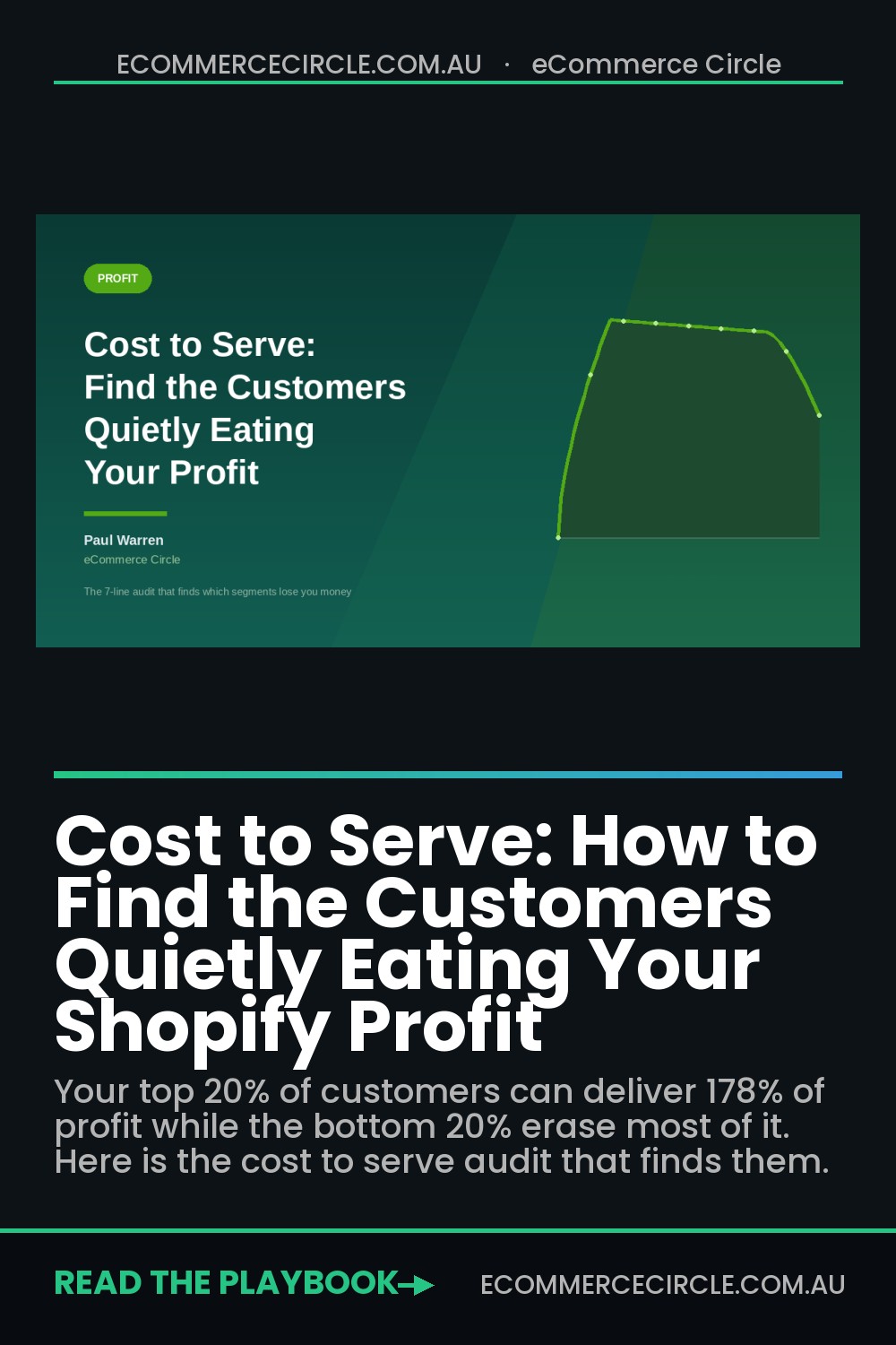
Kaplan and Narayanan mapped this properly back in 2001 and the shape has not changed. When you rank customers by actual profitability and plot the running total, the top 20% deliver somewhere between 150% and 300% of total profits. The middle 60% roughly break even. The bottom 20% destroy 50% to 80% of what the top group made. Most Aussie Shopify founders have never plotted that curve for their own store, which means they are spending acquisition budget cloning the wrong people.
Why Your Best Customer Report Is Lying to You
Shopify’s native customer reports show you revenue, order count and average order value. Every one of those sits on the income side of the ledger. None of them carry the cost of actually delivering the goods to that specific person.
Cost to serve is the total cost of having a particular customer, measured across their whole relationship with you rather than per order. It includes the obvious lines like cost of goods and freight. It also includes the lines that sit in your profit and loss as a lump sum and never get attributed back to anyone: return processing labour, support time, payment surcharges, replacement shipments, packaging for split deliveries, and the discount you gave to get the order over the line.
Those costs are not evenly spread. That is the whole point. If they were evenly spread you could ignore them and just work off gross margin. They cluster hard into specific segments, and until you attribute them you will keep treating a loss-making cohort as a growth opportunity.
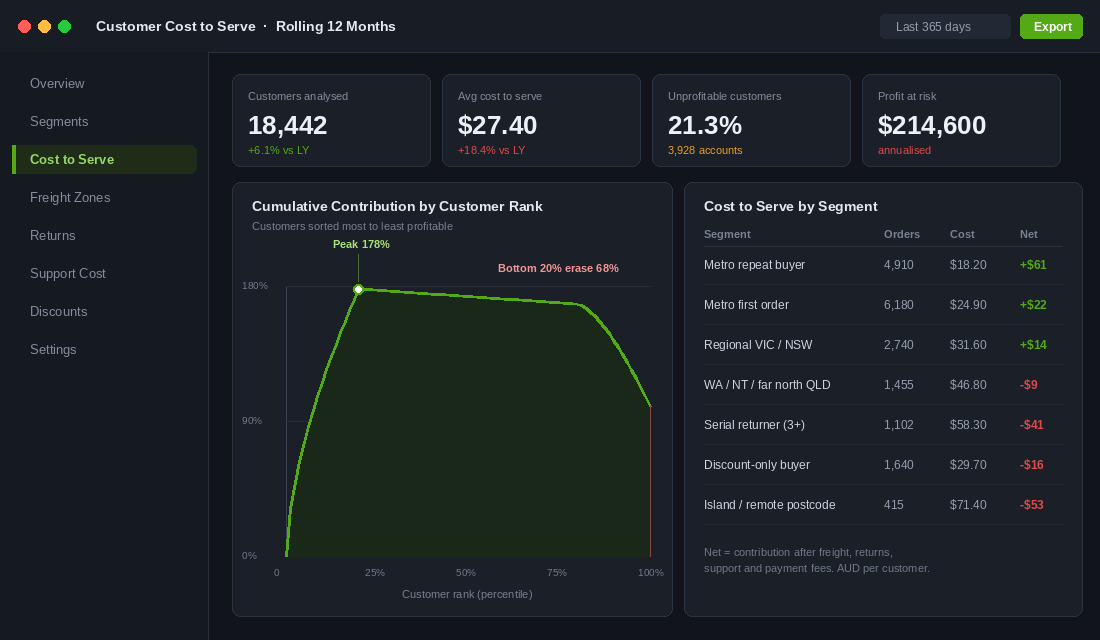
If you have already run our contribution margin audit, you have the product side of this solved. Cost to serve is the other half. Contribution margin tells you which products earn their shelf space. Cost to serve tells you which customers earn their place on your list.
The Seven Cost Lines That Never Reach the Customer Record
Before you build anything, get clear on what you are actually looking for. These are the seven lines that separate a profitable customer from an expensive one, and almost none of them appear in a standard Shopify export.
- Outbound freight actually paid. Not what you charged the customer. What the carrier invoiced you, including fuel surcharge and any remote area loading.
- Return freight and processing. Industry data puts the cost of handling a single returned item between $10 and $65 once you include inbound postage, inspection, repackaging and restocking.
- Support contacts. Human-handled ecommerce contacts run roughly $6 to $13 each, and a live phone call is $10 to $20.
- Payment costs by method. Buy now pay later, PayPal and international cards all carry different rates. A customer who always pays with a 6% BNPL provider is a different animal to one who taps Shop Pay.
- Discount depth. The average percentage off across that customer’s lifetime, not just their last order.
- Split shipments. Every backorder that ships separately doubles your pick, pack and freight on the same order.
- Replacements and goodwill credits. The refunds and reships you issue to keep someone happy, which almost never get coded back to that person.
Write those seven down. They become the columns of your audit.
Build the Cost to Serve Record in One Afternoon
You do not need a data warehouse for the first version. You need a spreadsheet and about three hours. Here is the sequence.
- Export 12 months of orders. Shopify admin, Orders, Export, all orders in the period, plus line items. Include customer email, shipping postcode, discount code, discount amount and payment gateway.
- Export your refunds separately. Shopify’s refund export gives you the return volume per order. Join it back on order ID.
- Pull your carrier invoices. Twelve months of Australia Post or StarTrack invoices, matched to consignment number. This is the step most founders skip and it is the one that changes the answer.
- Export your helpdesk tickets. Gorgias, Zendesk or Re:amaze all export by requester email. Count tickets per email address.
- Aggregate to the customer, not the order. One row per email address. Sum revenue, sum COGS, sum actual freight, count returns, count tickets, average the discount percentage.
- Apply flat rates to the soft costs. Use $28 per return processed and $9 per human support contact until you have measured your own. Those are defensible middle-of-range figures.
- Sort descending by net contribution and plot the running total. That is your curve.
Set a rule before you look at the output: you are not allowed to change any of the assumptions after you see the result. Founders have a strong instinct to protect the customers they like. Run the numbers cold first, then argue.
Freight Zones: The Quiet Tax on Your National Customers
This is where Australian stores get hit harder than almost anywhere else, and 2026 has made it worse. On 1 July 2026 Australia Post lifted parcel prices by an average of 18.4%. In June the domestic parcel and StarTrack Courier fuel surcharge for contract customers moved from 12% to 19.5%, with StarTrack Express going from 22.7% to 30.2%. Local and regional services now carry a $1.30 charge per additional kilometre beyond the first 15km.
If you set your shipping rules in 2024 and have not touched them since, you are subsidising every regional order on your store with money you no longer have.
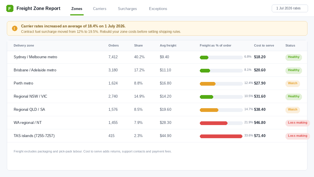
Build a zone table with six or seven buckets: capital city metro, Perth metro, regional east coast, regional QLD and SA, WA regional and NT, and remote or island postcodes. For each bucket, work out average actual freight paid, average order value, and freight as a percentage of order value. Anything over 20% is structurally loss making unless your gross margin is unusually fat.
Who Gives A Crap is the clearest Australian example of a brand that has done this maths and acted on it. They ship free on most orders over $30, but Northern Territory customers pay $8 flat and only a defined list of postcodes is served at all: Darwin, Katherine, Tennant Creek and Alice Springs. Cape Barron Island, Flinders Island and King Island, postcodes 7255 to 7257, are not serviced, because the freight forwarding cost makes those orders impossible. That is not poor customer service. That is a brand that knows its cost to serve by postcode and has drawn a line.
You have three levers once you can see the table. Raise the free shipping threshold for the expensive zones, charge a genuine regional rate that recovers most of the gap, or restrict service to postcodes where the economics work. Doing nothing is also a decision, it just costs you money quietly. If your threshold is the lever you want to pull, our free shipping threshold playbook walks through setting it without gutting conversion.
The Return Rate Multiplier Nobody Budgets For
The average ecommerce return rate sits around 20.8% in 2026, roughly two to three times the 8.7% you see in bricks and mortar. Category matters enormously: apparel averages about 25%, home goods 19%, beauty 12%, electronics 11%, supplements 7%.
The category average is not your problem though. Your problem is the distribution inside it. In most stores we look at, a small group of customers accounts for a wildly disproportionate share of returns. A 25% blended return rate often hides one cohort returning 4% and another returning 60%.
Run this calculation on your own data:
- Return rate by customer, not by order. Count returned units divided by units purchased across their lifetime.
- Flag anyone above 40%. These are your serial returners. Count them and count their share of your total return processing cost.
- Multiply by your real per-return cost. Use $28 as a starting point. Two returns a year from 1,100 customers is $61,600 of cost sitting inside a line item you probably call “shipping and handling”.
- Check whether they are still net positive. Some high returners buy so much that they remain profitable. Most do not.
Showpo, the Sydney fashion brand, handles this the way most mature Australian retailers now do. Change of mind returns carry an $11.35 flat fee for the prepaid Australia Post label, deducted from the refund. Faulty items are always covered with postage paid, because Australian Consumer Law requires it. That split is important. You are allowed to recover the cost of somebody changing their mind. You are not allowed to charge them for your mistake.
Charging a return label fee is the blunt lever. The smarter one is reducing the return in the first place with better sizing data, more honest photography and clearer dimensions. Our returns reduction playbook covers that side in detail. Do both. Reduce the rate first, then price the residual.
Contact Rate: The Cost of Every Question You Did Not Answer
Support cost per customer is the line founders resist attributing, usually because the team is salaried and it feels like a fixed cost. It is not fixed. It is a variable cost wearing a fixed cost disguise, because the size of your team is set by your ticket volume.
Where is my order enquiries make up 30% to 40% of total support volume for most ecommerce stores, and each one costs $5 to $22 when a human handles it. Blended cost per contact across all channels lands around $2.70 to $5.60. Stores that layer self service and automated responses in front of the queue report the average interaction cost falling from about $4.50 to $2.10, a 53% reduction.
Calculate contacts per order for each segment. The number tells you two different things depending on where the contacts sit.
- Pre-purchase contacts mean your product page is not answering the question. That is a fixable content problem and the segment gets cheaper the moment you fix it.
- Post-dispatch contacts mean your tracking communication is failing. Proactive shipping notifications and an accurate delivery estimate remove most of these.
- Post-delivery contacts mean the product did not match the expectation you set. That one usually shows up as a return a week later.
A store doing 2,000 orders a month with a 35% WISMO rate is fielding 700 avoidable tickets. At $9 each that is $6,300 a month, or $75,600 a year, spent telling people something a decent tracking page would have told them for free. Our support deflection playbook is the fastest payback project on this list.
Discount Dependency and the Buyer Who Never Pays Full Price
The discount-only buyer is the segment founders defend hardest, because the revenue looks real and the order count looks healthy. Work out the average discount percentage across each customer’s lifetime and the picture changes fast.
Sort your customers into four bands: never discounted, under 10% average, 10% to 25% average, and above 25% average. Then compare net contribution across the bands. In most Aussie stores we audit, the top band has a negative or near zero net contribution once freight and returns are attributed, and it is often 8% to 15% of the customer file.
The fix is rarely to cut them off. It is to stop paying to reacquire them. If a cohort only converts at 30% off, they should not be receiving your full-price welcome flow, they should not be in your prospecting audiences, and you certainly should not be bidding to acquire more people who look exactly like them. Suppress that segment from paid social lookalikes and watch your blended acquisition cost improve without touching a single ad.
Set Up Lifetimely to Track This Without a Spreadsheet
The spreadsheet gets you the first answer. It will not survive as a monthly habit. Lifetimely is the app most of the Aussie stores we work with land on, because it pulls COGS, shipping cost, transaction fees, ad spend and operating expenses into a single net profit view and then lets you slice it by cohort. Merchants using its LTV tooling report an average 12% lift in customer lifetime value from making better retention and acquisition calls.
Setup takes one to two focused hours. Do it in this order:
- Install from the Shopify App Store and let it backfill. It will pull your full order history. Give it an hour before you look at anything.
- Load real COGS per variant. This is the step that determines whether every number after it is true. Landed cost, not supplier invoice cost. Include inbound freight and duty.
- Configure payment gateway fees per method. Enter your actual Shopify Payments rate, PayPal rate and BNPL rate separately. Do not use a blended average, because payment mix varies by segment and that variance is part of what you are hunting.
- Enter your real shipping cost, not your charged rate. If you can only enter one figure, use your actual average cost per parcel from last quarter’s carrier invoices, adjusted up for the July 2026 increases.
- Add operating expenses. Rent, software, wages. Without these your net profit view is really a contribution view.
- Connect your ad accounts. Meta and Google at minimum, so the Marketing P&L can show profitability by channel and cohort.
- Build your cohorts. Segment by first product purchased, acquisition channel and geography. Those three cuts surface most of the cost to serve story on their own.
One caveat. Lifetimely will not natively track return processing labour or support contact cost. Keep those two in a small monthly spreadsheet and add them to the picture manually. They are usually the two biggest surprises.
The Four Moves for Each Segment
Once you can see cost to serve, plot each segment against two axes: return rate on the horizontal, support contacts per order on the vertical. Four quadrants, four different responses. This is the part where the audit turns into money.
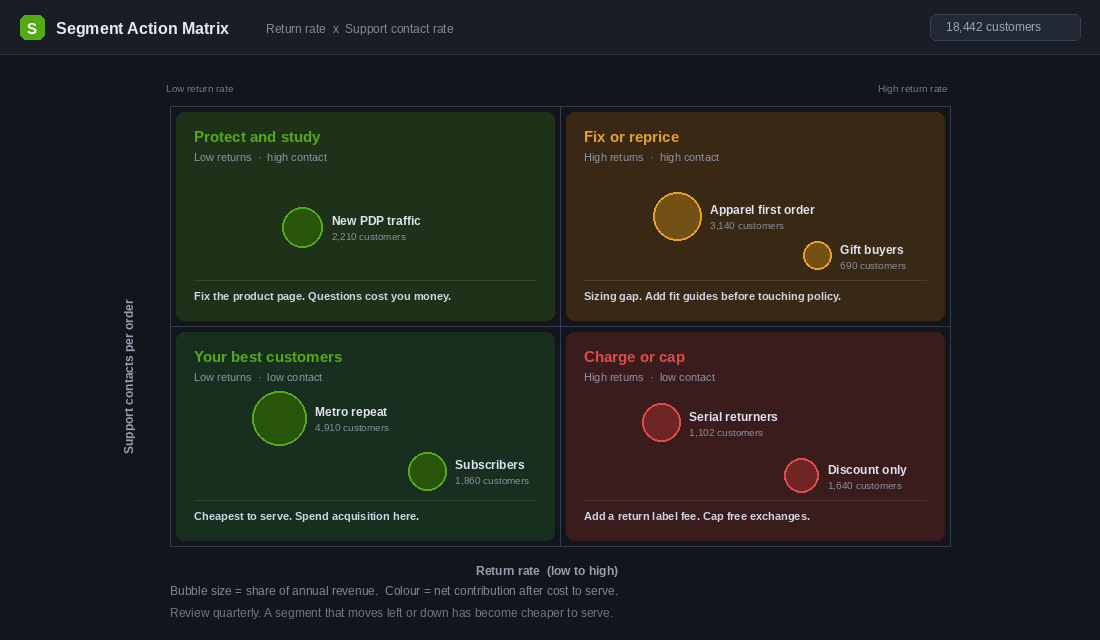
- Low returns, low contacts. Your cheapest customers to serve and almost always your most profitable. Point your acquisition budget at cloning them. Build your lookalike audiences from this list rather than from all purchasers.
- Low returns, high contacts. These people want your product but your site is not answering their questions. Fix the product detail page, add a proper size or spec table, and this segment converts to the quadrant above without you spending a cent on acquisition.
- High returns, high contacts. An expectation gap. Something in your photography, copy or sizing is promising a different product to the one that arrives. Fix the promise before you touch the returns policy, because a fee here just moves the anger.
- High returns, low contacts. Silent serial returners who have learned to treat your store as a fitting room. This is where a return label fee and a cap on free exchanges is the right and fair answer.
Layer this over your RFM segmentation and you get something genuinely useful: a champion segment that is also cheap to serve, and a champion segment that is expensive. Those two groups deserve completely different treatment, and RFM on its own will never tell them apart.
Why This Compounds Faster Than a Conversion Test
Here is what makes cost to serve different to almost every other optimisation project on your list.
A conversion rate test lifts revenue and drags every one of your variable costs up with it. If you convert 15% more visitors, you also pay 15% more in freight, 15% more in returns and 15% more in support. The gross number moves, the net number moves less than you expected, and you spend the next quarter wondering why the P&L did not follow the dashboard.
Cost to serve work does the opposite. Every dollar you take out of a loss-making segment lands straight on the bottom line, and it lands again next month without any further effort. Then the pieces start reinforcing each other.
Fixing the product page to cut pre-purchase questions also cuts the return rate, because the expectation gap narrows. Cutting the return rate cuts return freight and processing labour. Repricing your remote zones stops you subsidising the orders that were dragging the average down, which raises your true blended contribution, which means you can afford a higher acquisition cost on the segments that actually work. Suppressing the discount-dependent cohort from your lookalikes then quietly improves the quality of every new customer entering the system.
Run the whale curve on a store doing $3m a year with a typical distribution and the bottom quintile is usually erasing somewhere between $150,000 and $250,000 of contribution. You are not going to recover all of it. Recovering half of it is a bigger result than most founders get from a full year of conversion testing, and it does not require a single extra visitor.
Your 30-Day Cost to Serve Checklist
Work through this in order. Each week builds on the last.
- Week 1: Get the raw data. Export 12 months of orders, refunds and helpdesk tickets. Pull 12 months of carrier invoices. Aggregate everything to one row per customer email.
- Week 2: Build the curve and the zone table. Rank customers by net contribution, plot the running total, and break freight out into six or seven delivery zones. Identify every zone where freight exceeds 20% of order value.
- Week 3: Segment and decide. Plot return rate against contacts per order. Assign each segment to one of the four quadrants. Write down one specific action per quadrant with an owner and a date.
- Week 4: Ship the changes and install the tracking. Update your shipping rules for the loss-making zones. Set your return policy for the serial returner cohort. Suppress the discount-dependent segment from your lookalike audiences. Configure Lifetimely so this becomes a monthly number rather than an annual project.
- Ongoing: Review quarterly. A segment that moves left or down on the matrix has become cheaper to serve. That movement is the metric, not the absolute cost.
The uncomfortable part of this audit is that you will find customers you like sitting in the wrong quadrant. Someone who emails you regularly, tells their friends about you, and returns half of what they buy. The answer is almost never to fire them. It is to change the terms so the relationship works for both of you, which usually means a return fee, a shipping charge that reflects reality, or simply not spending money chasing more people exactly like them.
You cannot make that call until you can see the number. Right now, for most stores, the number does not exist anywhere.
Inside eCommerce Circle, cost to serve is one of the core pillars we work on with every member, because it is the fastest route to profit that does not depend on finding more traffic. If you want a second opinion on yours, let’s talk.