Your Net Promoter Score came back at 58. The team put it in the Monday deck with a green arrow. Everyone felt good about it.
What’s in This Article
Then you opened the cohort report and saw that only 19% of last quarter’s first-time buyers came back. Same customers. Same store. Two numbers telling completely different stories.
Here is the uncomfortable part. NPS asks people how they feel about you in the abstract. It does not ask whether dealing with you was hard. And the research says hardness is what actually predicts whether they buy again. In the CEB and Gartner study behind The Effortless Experience, which surveyed more than 75,000 customers, 94% of customers who had a low-effort experience said they would repurchase. Among customers who had a high-effort experience, that number collapsed to 4%. Ninety-six per cent of high-effort customers came away more disloyal than they started.
That gap is the whole argument for Customer Effort Score. It is one question, it takes an afternoon to set up on Shopify, and it points directly at the things quietly costing you the second order.
Why Your NPS Looks Fine and Your Repeat Rate Does Not
NPS measures sentiment. Customer Effort Score measures friction. Those are not the same thing, and only one of them shows up in your Shopify repeat purchase rate.
A customer can genuinely like your brand, rate you a 9, and still never order again because the returns form asked for an order number they could not find. Liking you is cheap. Coming back costs them time, and time is what they are actually protecting.
The other problem with NPS in a DTC context is timing. Most stores fire it 14 or 30 days post-purchase, by which point the customer has forgotten the specific moment that annoyed them. They just have a vague feeling. CES is measured at the touchpoint, within days of the interaction, while the detail is still fresh enough to be useful.
None of this means you bin NPS. It is still the better number for tracking brand advocacy and referral potential, and we cover how to run it properly in the Shopify NPS Playbook. Run both. NPS tells you whether people would recommend you. CES tells you why they might not get the chance to.
What Customer Effort Score Actually Measures
CES asks one question about one task: how easy was it to get that thing done? The modern version uses a 7-point scale where 1 is very difficult and 7 is very easy, and your score is the average of every response.
The wording matters more than founders expect. These two questions produce different data:
- Weak. “How was your experience with us?” That is a satisfaction question wearing a CES costume. You will get polite fives.
- Strong. “How easy was it to get your order sorted?” That is task-specific. It gives the customer permission to say the task was annoying even though they like you.
Keep the question about the task, never the brand. One touchpoint per survey. And always pair it with an open text follow-up: “What made it that score?” The number tells you where to look. The comment tells you what to fix.
The scale is a 7-point agreement or difficulty scale. Do not invent a 5-point or 10-point version, because you will lose the ability to compare yourself to published benchmarks, and those benchmarks are half the value of running this at all.
The Four Effort Moments That Decide Your Second Order
You do not need to survey everything. In a Shopify store there are four moments where effort spikes, and those four explain the overwhelming majority of lost repeat revenue.
1. Deciding (Product Page to Cart)
Effort here looks like a missing size guide, a delivery estimate that only appears at the payment step, or specs buried in a collapsed accordion three taps deep. The customer is doing research work that your product page should have done for them.
Measure this with an on-site exit survey rather than email: “How easy was it to find what you needed on this page?” Trigger it after 45 seconds on a product page for visitors who have not added to cart.
2. Waiting (Order Placed to Delivered)
This is the biggest effort sink in Australian ecommerce and the one founders most consistently underestimate. Where is my order queries, the WISMO tickets, run at roughly 20 to 40% of total support volume for most stores and climb past 50% during peak.
Every one of those tickets is a customer doing your job for you. They are hunting for information you already have. The Australia Post eCommerce Report 2026 found 69% of shoppers want a range of delivery options at checkout and 44% will abandon a purchase outright if delivery takes more than two days. Waiting is not passive. It is work, and it is scored.
If your delivery updates score under 5.0, the fix is almost always upstream of support. We break the whole system down in the Shopify Order Tracking Page Playbook.
3. Resolving (Contacting Support)
Channel switching is the single most reliable effort multiplier. The customer emails, gets an auto-reply, gets pushed to a chat widget, then gets asked to repeat everything they already typed. Each handoff is a fresh cost to them.
Fire a CES survey on ticket resolution, not on ticket creation, and ask about the resolution specifically: “How easy was it to get your issue sorted?”
4. Returning (Change of Mind or Fault)
Returns are where most Aussie stores post their worst effort scores, and it is the moment with the biggest influence on whether a second purchase ever happens. Australia Post found 82% of Australian shoppers rank free, easy returns as a top priority, and 92% say they are more likely to shop with a brand again when returns are simple.
Read that second number again. A returns experience is not a cost centre. It is a repeat purchase mechanism that you are currently charging your customer to use. The Shopify Returns Playbook goes deeper on turning refunds into exchanges without giving away your margin.
Setting Up CES on Shopify in an Afternoon
A quick note before you shop for a tool. Delighted, which was the default recommendation for years, closed to customers on 30 June 2026. If an old blog post sent you there, that door is shut. For Shopify stores the practical pick now is Zigpoll, because it triggers off native Shopify events rather than requiring you to bolt on a separate ESP workflow.
Here is the exact build for the delivery touchpoint, which is where I would start:
- Install and connect. Add Zigpoll from the Shopify App Store and authorise order and fulfilment scopes. Takes about two minutes.
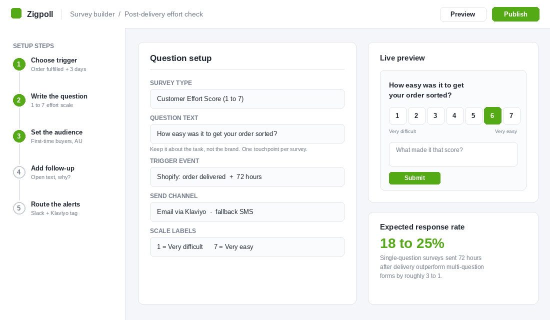
- Create a post-purchase survey. Choose the numeric scale type and set it to 1 to 7. Label the anchors “Very difficult” and “Very easy”. Do not use emoji faces, they skew positive.
- Write one question. “How easy was it to get your order sorted?” Nothing else on the first screen.
- Add the follow-up. An optional open text field: “What made it that score?” Make it optional or your completion rate drops by half.
- Set the trigger. Order fulfilled, plus 72 hours. Not on order placement, and not two weeks later. Three days after fulfilment is when the delivery experience is fresh and the parcel has usually landed.
- Segment the send. Start with first-time Australian buyers only. Mixing repeat customers into your first read will flatter your average, because the people still buying are the ones who never hit the friction.
- Route the alerts. Any response of 3 or below pings a Slack channel and applies a Klaviyo tag such as
high_effort_flag. That tag does two jobs: it triggers a human follow-up, and it holds those customers out of your next full-price campaign.
If you are already deep in Klaviyo and do not want another app, you can approximate this with a flow email containing seven linked rating buttons that write back to a custom profile property. It works. It is just fiddlier to segment and you lose the on-site survey option entirely.
For the support touchpoint, most helpdesks including Gorgias and Zendesk can fire a satisfaction survey on ticket close. Change the default question wording from satisfaction to effort and you have your second data stream for free.
Expect a response rate somewhere between 18 and 25% on a single-question post-delivery survey. If you are under 10%, your subject line is asking for a favour instead of promising brevity. “One question about your order” outperforms “We value your feedback” every time.
Benchmarks Worth Holding Yourself To
A score on its own is meaningless. Here is where the published data sits so you know whether 5.2 is a win or a warning.
- Cross-industry average: 5.0 to 5.8 on the 7-point scale, with top-quartile performers at 6.2 or better.
- Ecommerce and retail average: 5.0 to 5.5. Strong online retailers clear 5.8.
- Category variance: fashion sits around 5.4, while electronics averages closer to 5.1 because the products and the support questions are more complex.
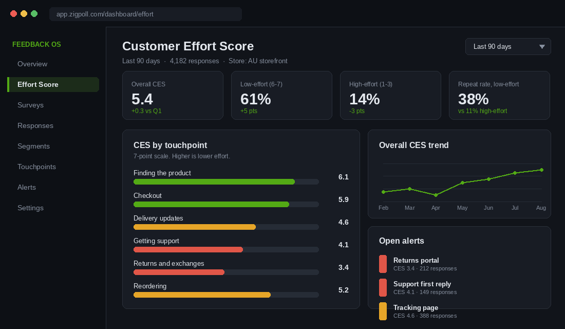
- The danger line: anything below 4.5 signals friction that is actively driving churn, not just mild irritation.
Two rules for reading your own numbers. First, never average across touchpoints and report one company-wide CES. A 5.4 blended score can easily hide a 3.4 returns experience, and the 3.4 is the number that is costing you money.
Second, watch the distribution, not just the mean. The percentage of responses scoring 1 to 3 is your real risk metric. If 14% of customers are in that band, and high-effort customers repurchase at 4%, you can model the revenue you are handing to a competitor this quarter.
The Effort Ledger: Turning Scores Into a Fix Queue
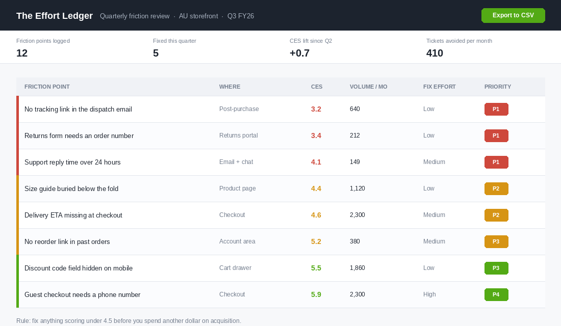
Data that does not change a decision is a hobby. The Effort Ledger is the simple artefact that turns CES responses into work your team actually ships. Build it as a spreadsheet with six columns:
- Friction point. Written as the customer would describe it, not as an internal system name. “Returns form needs an order number”, not “RMA validation logic”.
- Where. The touchpoint. Product page, checkout, post-purchase, support, returns, account area.
- CES. The average score for that specific complaint theme.
- Volume per month. How many customers hit it. Pull this from ticket tags, session recordings, or raw survey counts.
- Fix effort. Low, medium or high, judged by your dev or ops reality, not by wishful thinking.
- Priority. P1 through P4, calculated rather than argued about.
The priority rule is deliberately blunt. Anything scoring below 4.5 with a low fix effort is P1 and goes into this fortnight’s sprint, no debate. Below 4.5 with a high fix effort is P2 and goes into the quarter. Above 5.5 sits at P3 or P4 and waits, no matter how loudly someone in the team wants to rebuild it.
Review the ledger once a month for 30 minutes. Close out what shipped, re-score those items after 60 days of fresh responses, and add whatever new themes appeared in the open text field. That single recurring meeting is the whole operating rhythm.
Twelve Friction Points That Quietly Cost Aussie Stores the Second Order
Before you have a single survey response, you can audit against the list below. These are the themes that turn up again and again in the open text field on Australian Shopify stores. Walk your own store as a customer, on a phone, on mobile data, and honestly score each one.
- No delivery estimate until checkout. The customer has to commit before they learn when it arrives.
- Tracking link missing from the dispatch email. The most expensive omission in ecommerce, measured in tickets.
- Returns portal that demands an order number. They deleted the email six weeks ago. Let them look up by email address.
- Size guide behind a modal behind an accordion. Every extra tap on mobile leaks intent.
- Support hours that do not match Australian time zones. An overseas team answering at 3am AEST reads as neglect.
- Forced account creation at checkout. Guest checkout with a post-purchase account invite converts and scores better.
- Password reset loops. Test yours today. A surprising number of themes break this after an app update.
- No reorder button in the customer account area. For consumables this is free repeat revenue you are declining.
- Discount code field hidden or broken on mobile. Nothing raises effort like a code that will not apply.
- Stock status that only reveals itself in the cart. The customer has already made a decision you then reverse.
- Exchanges that require a refund first. You have converted a kept sale into a lost one plus a second decision.
- Automated replies with no ticket reference. The customer cannot follow up without starting again.
Fix the ones you can this fortnight. Most are configuration, not development. When we do this exercise with members, the first pass usually surfaces three items that cost under two hours each and move the delivery or support score by half a point.
What Low-Effort Australian Brands Do Differently
Look at the Australian brands that have built genuinely durable repeat purchase behaviour and you will notice they compete on effort long before they compete on price.
Koala built its early reputation on removing the two hardest parts of buying a mattress. The delivery promise is stated up front rather than discovered at checkout, and the 120-night trial removes the decision risk that normally sends a shopper off to read reviews on three other sites. That is not a marketing message. It is effort engineering, and it is why the brand became shorthand for easy furniture buying in Australia.
July does the same thing with luggage. A 100-day trial and a returns policy stated in plain language on the product page mean the customer never has to go hunting through a terms page to work out what happens if the case is wrong. The friction is removed at the exact moment the doubt appears, which is the whole game.
Who Gives A Crap solved effort in the place most subscription brands create it. Skipping, delaying and changing an order is self-service and obvious. Compare that to the subscription brands that make you email support to pause, and then wonder why churn spikes in month three. Making the exit easy is what makes people stay.
The pattern across all three is the same. Each one identified the specific moment where the customer would otherwise have to do work, and absorbed that work into the business. That is what a low-effort brand is. Not a friendlier one. A brand that does more of the work itself.
The Compound Effect of Removing Effort
Any one of these fixes looks small on its own. A tracking link. A returns lookup by email. A reorder button. None of them will make your Monday deck exciting.
Run them as a system and three things start compounding at once.
Support volume falls. If WISMO is 30% of your tickets and a proper tracking experience removes two thirds of it, you have just handed your support team back a fifth of their week. That capacity goes into the conversations that actually retain customers instead of the ones that read out a tracking number.
Repeat rate lifts. This is the mechanism that matters. Moving customers out of the high-effort band and into the low-effort band shifts them between two very different repurchase populations, 4% versus 94% in the Gartner data. You do not need the full swing to change your economics. Moving 10% of your buyers across that line rewrites your customer lifetime value model.
Paid acquisition gets cheaper in real terms. Not because your cost per acquisition drops, but because each acquired customer is now worth more orders. In a market where Australian online spend hit 82.6 billion dollars in 2025, up 14% year on year and now 24% of all retail, the growth is coming from purchase frequency rather than bigger baskets. Frequency is an effort problem.
Here is the sequence if you want to start on Monday. Install the survey on the delivery touchpoint. Let it run for three weeks until you have 200 or more responses. Build the Effort Ledger from the open text themes. Ship every P1 item that costs under two hours. Re-score after 60 days.
That is one quarter of work for a number that predicts repeat purchase better than anything else you are currently tracking. Most stores never do it, which is precisely why doing it puts distance between you and the store your customer would otherwise switch to.
Inside eCommerce Circle, reducing customer effort is one of the core pillars we work on with every member, because it moves retention faster than almost anything else on the list. If you want a second opinion on where your store is making customers work, let’s talk.