Your homepage gets about 50 milliseconds to make a first impression. That is not a typo. Research from Google and the original Lindgaard study found that visitors form a visual judgement of a site in less than a tenth of a second, before they have even read a word.
What’s in This Article
Most Aussie Shopify homepages waste those 50 milliseconds. They open with a stock-photo carousel that nobody clicks. They hide the value proposition behind a navigation menu. They show eight different products and promotions before the visitor knows what the brand actually sells. The result is a bounce rate sitting between 40 and 55%, with mobile shoppers leaving 10 to 15% faster than desktop.
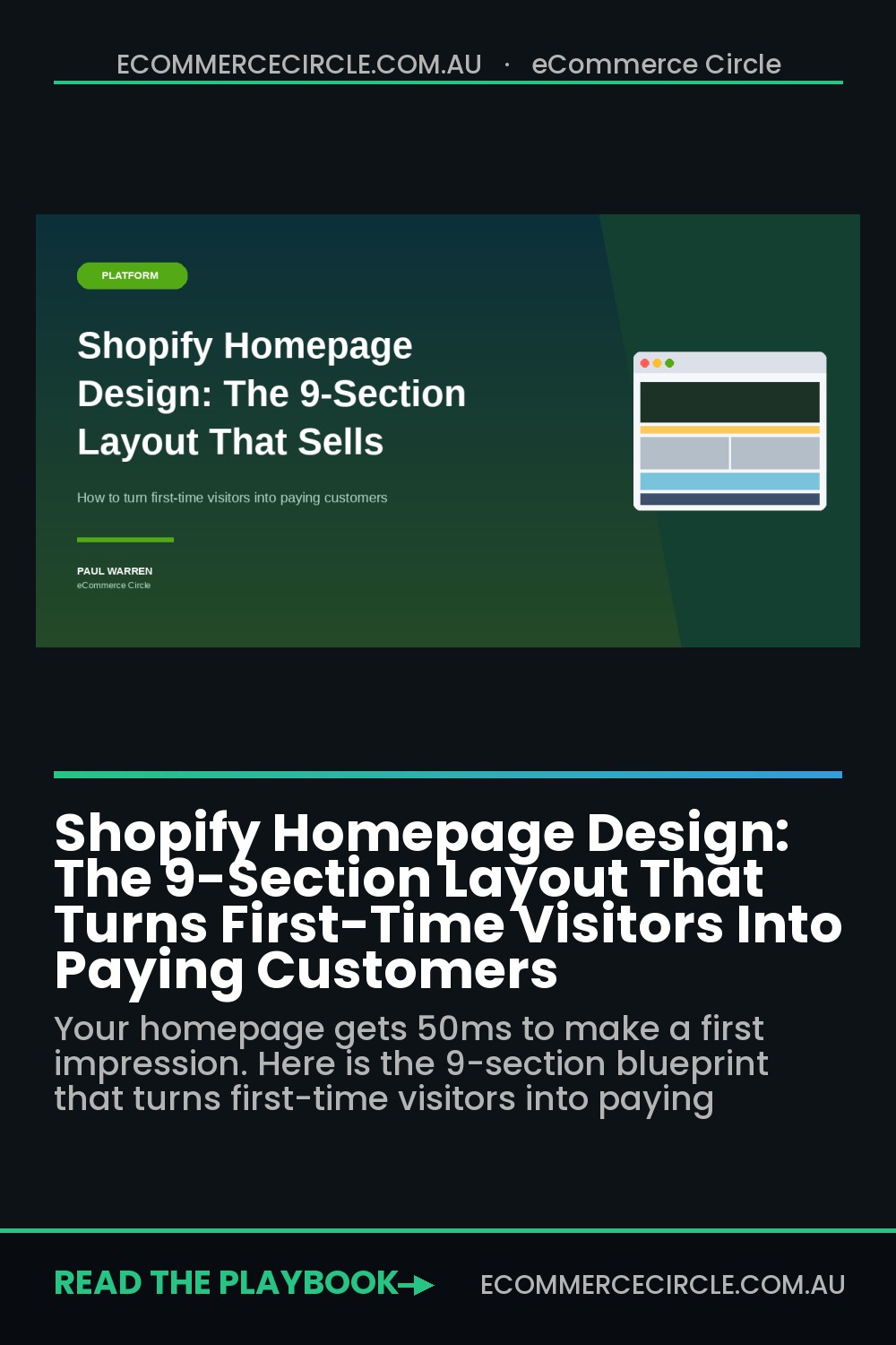
The brands that turn that first impression into a purchase are not running magic ads or selling magic products. They are running a homepage that follows a deliberate, 9-section architecture. Each section answers one question the visitor is silently asking. Each section moves them one step closer to add-to-cart. This article is the full blueprint, with the mobile considerations, the Aussie examples, and the exact section-by-section logic we use with brands inside eCommerce Circle.
Why Most Shopify Homepages Quietly Leak Revenue
Before we get to the blueprint, we need to name the three mistakes that are costing most stores their first 30 seconds of attention. If your homepage is doing any of these, the rest of your funnel is fighting an uphill battle.
Mistake one: the rotating hero carousel. A 5-slide carousel does not give visitors more options. It paralyses them. Eye-tracking studies show that only the first slide gets meaningful engagement, and conversion rates on rotating heroes are consistently lower than on a single, static hero. You are essentially burning 80% of your above-the-fold real estate to show messages nobody will read.
Mistake two: vague headlines that describe the brand, not the offer. “Premium quality, sustainably made.” That tells the visitor nothing. They cannot work out what you sell, who it is for, or why they should care. A headline like “Plant-based skincare made in Byron Bay. Free shipping over $60” beats “Refined. Considered. Yours” every single time, because clarity outsells cleverness on a homepage.
Mistake three: forgetting that mobile is 84.4% of traffic. Designers build the homepage on a 27-inch monitor, then ship it. On a phone, the hero image is cropped, the headline overflows two lines, the CTA falls below the fold, and the trust bar is invisible. If the homepage is not designed mobile-first, you are designing for the 15% of visitors who matter least.
Now we can build the architecture that fixes all three.
Section 1: The Hero (Your Promise in 7 Seconds)
The hero is the most expensive piece of real estate on your store. It does one job: tell the visitor exactly what you sell, who it is for, and why it is worth their next click. Three elements have to be present, and they have to be readable in under 7 seconds on a phone.
- Headline. Specific to your category and customer. “The natural deodorant that actually works for 24 hours” beats “Welcome to our store” by a country mile.
- Subhead or value bar. One sentence that adds proof or removes friction. Something like “Free shipping on orders over $80, 60-day money-back guarantee, made in Melbourne”.
- One primary CTA. Singular. Not “Shop Now and Learn More and Subscribe”. Something like “Shop the Range” or “Find Your Match” with a clear destination.
Use a single, high-quality static image or a short looping video. No carousel. No five rotating offers. The hero image should show the product in use, not a flat lay on a marble bench. Visitors connect emotionally with people using your product, not with the product sitting on a shelf.
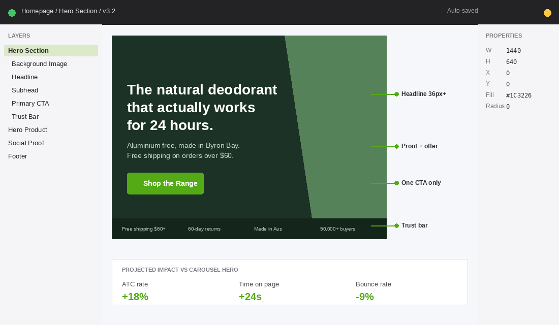
Section 2: The Trust Bar (Lower the Risk, Right Now)
Directly below the hero, before the visitor scrolls, sits a thin trust bar. Three to four icons with one-line claims. This is not decoration. It is a friction-removal device that makes the visitor feel safe enough to keep reading.
Pick the four claims that matter most for your category. For an Aussie skincare brand it might be “Free shipping over $80”, “60-day returns”, “Cruelty-free, made in Australia”, and “Trusted by 50,000+ customers”. For a homewares brand it might be “Free Australia-wide shipping”, “Afterpay available”, “Designed in Sydney”, and “Lifetime guarantee”.
The trust bar carries disproportionate weight on mobile, because it is the first thing visitors see after the hero, before any product appears. Brands that add a clean trust bar typically lift add-to-cart rate by 5 to 10% within the first month, because the visitor has already decided “this is a real brand” before they meet your products.
Section 3: The Hero Product Spotlight (One Winner, Not a Catalogue)
Here is where most Shopify homepages go wrong. They show 12 featured products, all in a row, all the same size, all competing for attention. The visitor’s eye glazes over and the entire grid blurs into “stuff for sale”.
Instead, give one product the spotlight. Your hero product. The one that converts best, has the most reviews, and represents the brand promise. A full-width section with a beautiful lifestyle image on one side, the product story on the other, the price, the rating, and an “Add to Cart” or “Shop Now” button. This single product can do 50 to 70% of total store revenue if it is positioned correctly.
If you have not yet identified your hero product, run the analysis from our Hero Product Playbook. The 80/20 rule is brutal but accurate. Most stores have one or two products carrying the entire P&L, and the homepage should reflect that.
Section 4: Social Proof (The 17,000-Review Wall)
Visitors trust other customers more than they trust your copy. By section four, they have read your headline and seen your hero product. Now they need to see that other people, ideally people like them, are buying and loving it.
This section can take three forms. Pick whichever fits your brand:
- Review wall. Three to five real reviews pulled from your review platform. Five-star rating, customer name, customer photo if possible, two or three sentences. Bondi Sands surfaces over 17,000 five-star reviews on their store, and the volume itself becomes the credibility play.
- UGC grid. A 6 to 9 image grid pulled from real customer Instagram posts. Frank Body built their brand on this. The visitor sees real Aussie women using the product, not staged studio shots.
- Press logos. If you have been featured in Vogue, news.com.au, The Design Files, or any recognised Aussie publication, a clean “As Seen In” strip works. This is borrowed credibility and it works fast.
Whatever format you pick, real photos beat stock photos by an order of magnitude. The whole point of social proof is to make the visitor think “if she loves it, I will too”. Stock models do not produce that response.

Section 5: The Story Strip (Why You Exist)
By now the visitor knows what you sell, has seen the hero product, and has read a few reviews. They are warming up. This is the moment to remind them you are a brand, not a marketplace listing. A short story strip handles this in under 10 seconds of scrolling.
Format: a strong photo on one side. A founder, a workshop, the Aussie origin. On the other side, three short paragraphs. Why the brand exists. The problem you saw. What you do differently. End with a small CTA to the full About page for visitors who want to dig deeper.
Who Gives a Crap built a global business on this single section. Their homepage tells you in three sentences that they make eco-friendly toilet paper, donate 50% of profits to building toilets in developing countries, and ship to your door so you never run out. The story does the selling. The product almost feels secondary.
Section 6: Featured Collections (The “Show Me More” Block)
Now and only now do we show the rest of the catalogue. After the hero, the trust bar, the hero product, the social proof, and the story. The visitor is no longer scanning. They are shopping.
Show three to four collection tiles, not the whole product feed. Each tile leads to a curated collection page. Best Sellers. New Arrivals. By Skin Type. By Room. The point is to give shoppers a clean entry into the catalogue without overwhelming them with a 50-product wall.
If you are running ads, this section is also where you can drop campaign-specific tiles. “EOFY Sale”, “Mother’s Day Edit”, “Father’s Day Bundles”. The collection tile becomes a conversion-focused secondary CTA. Make sure each collection page is built with the same level of care as the homepage. A messy collection page wastes the click. Read our Collection Page Design guide for the full breakdown.
Section 7: The Editorial Block (Lifestyle Over Catalogue)
This is the section most Shopify homepages skip, and it is the one that separates a transactional store from a brand. The editorial block is a single content tile that links to a blog post, a how-to video, a routine guide, or a customer story. Something that gives value before asking for the sale.
Format: a magazine-style layout with a strong photo, a short headline, two lines of body copy, and a small “Read More” link. Examples: “How to Build a 3-Step Skincare Routine”, “Inside Our Workshop in Brunswick”, “The Customer Who Started a Cult Following”.
This block does two jobs. It signals depth, that the brand has a point of view beyond the products. And it gives Google more pages to index, which compounds organic traffic over time. Brands that publish weekly content typically see 18 to 35% of homepage traffic flow into editorial pages, and a meaningful percentage of those visitors return within 30 days.
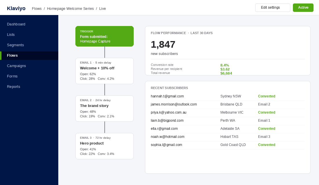
Section 8: The Email and SMS Capture
Most stores let visitors leave without ever capturing them. The visitor came, browsed, did not buy, and disappeared. That is a lost cookie and a lost opportunity. Section eight on the homepage is the deliberate capture moment.
A clean, single-row form. Email or phone, plus first name. The hook is a simple value exchange. “Get 10% off your first order.” Or “Be first to hear about new drops.” Or “Join 25,000 Aussies getting our weekly tips.”
Connect this directly to Klaviyo for email and to Postscript or Klaviyo SMS for text. The setup is straightforward. In Klaviyo, create a “Welcome Series” flow triggered by the form. Email one delivers the discount within 5 minutes. Email two arrives 24 hours later with the brand story. Email three at 72 hours surfaces the hero product. Brands running this flow consistently see 5 to 10% of new subscribers convert within 14 days.
Section 9: The Footer (Quiet Trust Reinforcement)
The footer is not a throwaway. It is the last thing the visitor sees before bouncing or buying, and it carries the trust signals that close the deal. Pack it with intent.
- Contact details. A real Australian phone number, an email, and a physical address if you have one. Visitors check the footer to verify you are a real business.
- Shipping and returns links. Make these easy to find. Hidden returns policies are a conversion killer.
- Trust badges. Afterpay, Zip, Apple Pay, Google Pay, Visa, Mastercard. Payment-method logos are quiet credibility cues.
- Social handles. Instagram, TikTok, Pinterest. Visitors who research before buying often check the brand’s Instagram first.
- Secondary navigation. Privacy, Terms, FAQ, Wholesale, Affiliate program if you run one.
Keep it clean. A footer with 30 links overwhelms. A footer with 12 well-organised links closes the loop and signals professionalism.
The Mobile-First Reality (84.4% of Your Traffic)
Every section above has to be designed for the phone first, then adapted for desktop. That is the reverse of how most agencies build, and it is why so many homepages feel cramped or empty on mobile.
Three mobile non-negotiables:
- Hero text in 36px or larger. Anything smaller disappears on a phone. The headline should occupy roughly 40 to 60% of the visible screen.
- One CTA at a time. Mobile thumbs hit one button. Two CTAs side by side guarantee a misclick.
- Tap targets at 44 by 44 pixels minimum. Apple’s accessibility guideline. Anything smaller frustrates and bounces.
Page speed matters even more on mobile. Research consistently shows that as load time goes from 1 second to 3 seconds, the probability of a bounce increases by 32%. At 4 seconds, 63% of visitors leave before the page finishes rendering. If your hero image is 4MB, you have already lost most of your traffic. Compress to under 200KB, lazy-load below-the-fold sections, and audit third-party app scripts. Our full Shopify Site Speed guide walks through every fix.
The Aussie Brands Doing It Right
Theory is fine, but seeing it work in the wild is better. Three Aussie brands worth studying for their homepage architecture:
Frank Body. Melbourne-born skincare brand built on Instagram-style UGC. Their homepage opens with a punchy hero, drops the trust bar, then loads a wall of real customer photos. The brand voice is consistent across every section. Their loyalty community sits at over 1 million members and the homepage feels like a magazine, not a catalogue.
Bondi Sands. A textbook example of social proof done at scale. Over 17,000 five-star reviews surfaced across the site, integrated through Yotpo. The homepage uses high-quality lifestyle imagery, a clear hero CTA, and a constant drumbeat of credibility cues. Their hero product, the Self Tanning Foam, sits in pride of place on the homepage and does most of the revenue.
Who Gives a Crap. The benchmark for story-led homepages. The hero communicates the offer, the subscription model, and the social mission in three lines. The story strip and editorial block do almost as much heavy lifting as the product spotlight. Visitors leave the homepage knowing exactly what the brand stands for, even if they do not buy on the first visit.
The Compound Effect: How These 9 Sections Work as a System
Each section on its own is a 1 to 2% lift. The compound effect is what matters. When all nine sections work together, you are not running a homepage. You are running a 90-second sales journey, optimised for the way visitors actually scan, scroll, and decide.
Run the maths. The Shopify platform average sits around 1.4% conversion. The top 10% of stores sit at 4.7% or higher. The gap between average and top 10% is almost entirely a function of homepage and product page architecture. A store doing $40k a month at 1.4% becomes a store doing $135k a month at 4.7%, on the same traffic, with the same products, with no extra ad spend.
That is the prize. Not a prettier homepage. A better business.
The Homepage Audit Checklist
Open your homepage on a phone. Set a timer for 7 seconds. Hand the phone to someone who has never seen your store. Then ask them three questions:
- What does this brand sell?
- Who is it for?
- Why should I buy from them instead of a competitor?
If they cannot answer all three, the hero is failing. Then run through this 9-point checklist with your team:
- Hero. Single static image or video. One headline. One CTA. Readable on mobile.
- Trust bar. Three to four icons with one-line claims directly under the hero.
- Hero product. One product, full-width, with story, price, rating, and CTA.
- Social proof. Reviews, UGC grid, or press logos. Real photos only.
- Story strip. A short founder or origin story, with a link to the full About page.
- Featured collections. Three to four curated collection tiles. Not the full feed.
- Editorial block. One content tile linking to a blog post, video, or guide.
- Email and SMS capture. Single-row form, value exchange, connected to a 3-email Klaviyo welcome series.
- Footer. Contact, shipping, returns, payment badges, social, secondary nav.
Score yourself out of 9. Anything below 7 is leaving money on the table. Most stores we audit score between 4 and 6 on the first pass. The fixes are usually under a week of work, and the lift compounds over every visitor for the next 12 months.
Where to Go From Here
Once the homepage is sorted, the next two pages to fix are the product page and the cart. Use our 7-Layer Product Page Anatomy for the PDP, and check our Mobile UX guide for cart and checkout flow.
Inside eCommerce Circle, homepage architecture is one of the core pillars we work on with every member. We map the 9 sections, redesign the hero, rebuild the social proof block, and connect the capture form to a working welcome flow. If you want a second opinion on yours, let’s talk.