Most Aussie Shopify founders spend twelve months refining their hero product, four weeks rewriting the PDP copy, and ten minutes building the variant matrix. Then they wonder why mobile conversion stalls at 1.8% and why the bestseller suddenly stopped growing.
What’s in This Article
Variants are the quietest conversion lever in Shopify. The reader has decided they want the product. They are now trying to tell you which one they want. If that handshake fumbles, you lose the order at the last metre. Baymard Institute’s 2025 PDP benchmark found that 17 to 19% of mobile shoppers abandon a product page when they cannot tell which variant is in stock, and visual swatch selectors outperform dropdowns by 17 to 20% in task completion. That gap is sitting on most Aussie Shopify stores right now, unmeasured and untested.
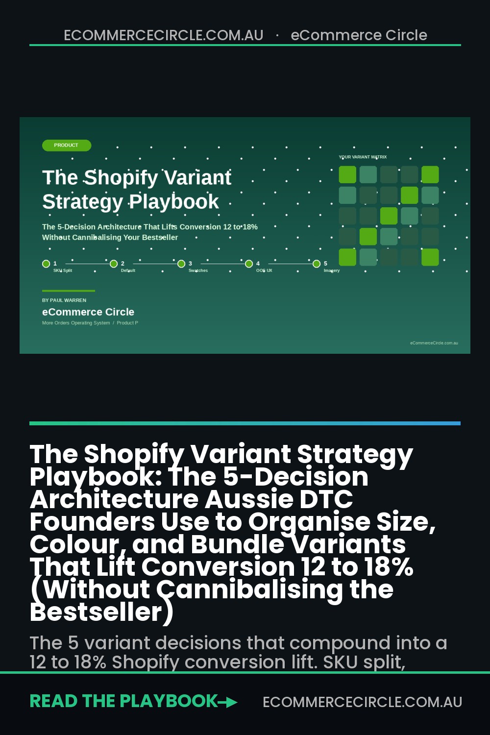
This is the framework we work through with hundreds of Aussie Shopify founders inside eCommerce Circle: the five decisions that turn a variant matrix from a checkout-killer into a 12 to 18% conversion lift. Each decision compounds. Get them all right and the same traffic, the same ads, the same emails ship 15 to 25% more orders. The math is brutal at scale.
Why Variants Are Quietly Capping Your Growth
Variant decisions look like Shopify admin housekeeping. They are actually product strategy decisions, merchandising decisions, and UX decisions stacked on top of each other. The default tooling does not force you to make the choice deliberately. You add a size, you add a colour, Shopify generates the matrix, and the front-end inherits whatever your theme decided to do with the option pickers.
The problem shows up in three places. First, mobile conversion. Variant pickers are the most fiddly element on a 6-inch screen and most themes still ship dropdowns when the user wants taps. Second, inventory misalignment. The bestseller variant is out of stock for nine days but the PDP still defaults to it, sending qualified buyers to a “sold out” wall. Third, catalogue bloat. The store hits the old 100-variant cap, the merchandiser splits the product into four duplicate listings, the bestseller cannibalises itself, and Google starts ranking the wrong URL.
Shopify lifted the variant ceiling to 2,048 per product in the Summer 2024 Editions release, so the technical excuse is gone. The strategic decisions are not. Let us walk through the five that matter.
Decision 1: Variant or Separate Product (the SKU Split Test)
The first decision is structural. Should this be one product with variants, or two separate products with their own PDPs? Get this wrong and everything else compounds the mistake.
The rule we use inside the Circle: if a shopper would compare the options side by side on the same page, they are variants. If a shopper would search, browse, or arrive at them as distinct products, they are separate listings. Same hero T-shirt in five colours = variants. Different hero T-shirts in different styles = separate products, even if the shape is similar.
Three diagnostic questions force the decision:
- Does the option change the buying decision? Colour rarely does, scent often does, formulation almost always does. If it changes the decision, it deserves its own PDP, its own copy, its own reviews, its own paid landing page.
- Will the variant have its own paid traffic? If you are running a “Bondi Sands self-tan dark vs medium” Meta test, those are separate products. Variants share an ad URL, separate products do not.
- Does the variant need its own SEO target? “Linen midi dress in black” gets searched. “Linen midi dress in size 12” does not. Colour gets its own URL slug. Size does not.
The pattern Aussie brands like MCoBeauty and Bondi Sands use: hero formulation gets its own product, shade or strength is the variant. The Iconic does the inverse for fashion: style gets its own product, size and colour are variants. Both work because the decision was made deliberately.
Decision 2: Option Order (and Why the Default Variant Matters More Than You Think)
The second decision is what the user sees first. Shopify gives you up to three option types per product (and unlimited via metaobjects). The order you put them in, and the variant the PDP loads on by default, drives a measurable share of your conversion rate.
Two rules we drill into every founder inside the Circle:
- Lead with the option that narrows the decision fastest. Colour first if the colour drives the click from the collection page. Size first if the user already chose colour from the collection thumbnail. Format (60ml vs 120ml) first when the gap is price-driven. Match the option order to the path that brought the user in.
- Default to the bestseller, not the first SKU created. Shopify defaults to the first variant in the matrix, which is usually the smallest size and a random colour. That choice was made by your merchandiser at 9pm on launch night. Set the default to the variant that sells the most. We have seen this single change lift PDP-to-AtC by 5 to 9% on the same traffic.
How to set the default in Shopify: the first variant in the variant list is what loads. Drag the bestseller variant to position 1 inside the product editor. If you use metafields for sort, surface a “default variant” boolean and read it in your PDP section. Theme code lives in main-product.liquid; the variant pre-selection block usually sits inside variant-picker.liquid.
Bonus: when the user lands from a paid ad targeting a specific colour (“shop the burgundy”), pass the variant ID in the URL (?variant=12345) and have the PDP pre-select it. Showpo and Cotton On both do this on their Meta retargeting. It cuts the “find my variant” friction to zero.
Decision 3: Swatches Over Dropdowns (and Tap Targets Over Pixel-Hunts)
The third decision is how the variant picker renders. This is the highest-impact lever for mobile conversion and the one most Aussie themes get wrong out of the box.
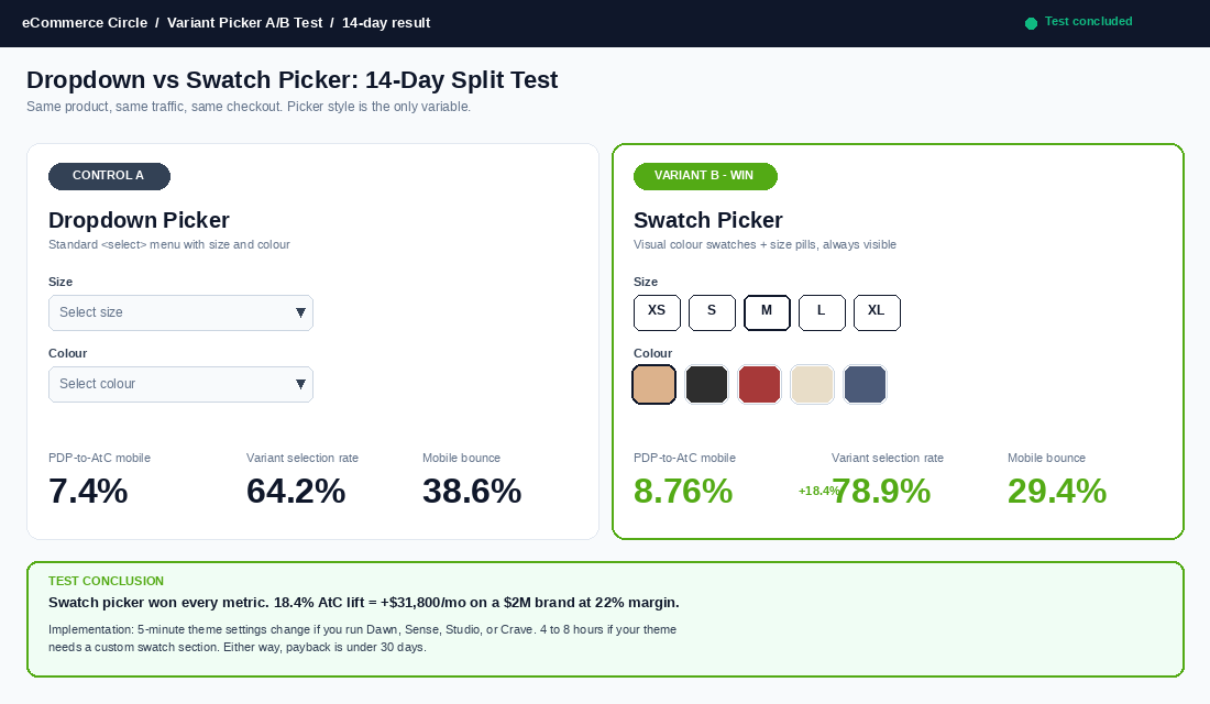
Baymard Institute’s 2025 mobile commerce study tracked 1,243 shoppers across 78 PDPs. The headline finding: visual swatch selectors (colour squares, size pills) outperformed dropdown menus by 17 to 20% in completed variant selection. Dropdowns force two taps (open, choose), hide the options behind a click, and break on iOS Safari when the keyboard pops up. Swatches are one tap, options visible, no keyboard.
The Aussie default we recommend:
- Colour: visual swatches (24 to 36px squares on mobile). Show the actual colour, not a label. If you sell six colours, the user wants to see all six at once.
- Size: pill buttons in a single row. Greyed out for out-of-stock, struck through for end-of-life. Minimum 44px tap target (Apple’s HIG floor). Show all sizes at once, do not hide behind a “select size” dropdown.
- Format or strength: labelled pills with price delta. “60ml $35” and “120ml $59” lets the user compare value without opening a second screen.
- Bundle pack size: stack vertically with savings badge. “1 pack $35”, “3 pack $89 (save $16)”, “6 pack $159 (save $51)”. The pack-size variant is also your AOV lever, treat it like one.
Most Online Store 2.0 themes (Dawn, Sense, Studio, Crave) ship native swatch sections but default to dropdowns. The switch is a five-minute settings change in the theme editor: Customize, then Variant picker block, then Picker type = Swatches.
If your theme does not support native swatches, the tool stack we recommend:
- Shopify Search & Discovery (free) for colour swatch metafields tied to the product.
- Swatch King ($14.99/mo AUD) for colour, image, and pattern swatches that work across collection and PDP.
- Globo Variant Image ($9.99/mo AUD) if you need image-per-variant on themes that do not natively support it.
- Variant Description King ($9.99/mo AUD) when each variant needs its own short copy block (scent notes, ingredient swap, gift-with-purchase).
Decision 4: Out-of-Stock UX (the Silent Cart Killer)
The fourth decision is what happens when a variant is sold out. This is the leak that costs Aussie founders the most invisible revenue, because the shopper hits the wall and bounces without ever showing up in your funnel reports.
Three rules to enforce on every PDP:
- Never hide out-of-stock variants. Show them, grey them, label them. A user who came looking for “size 12” needs to know “size 12 is sold out, back in 14 May”. Hiding the option makes them think you do not stock it and they leave for a competitor who does.
- Capture the email on stock-out, not just hide the button. “Notify me when back in stock” converts 12 to 18% of disappointed shoppers into eventual orders. Klaviyo’s back-in-stock flow is free with the platform. Bondi Sands, MCoBeauty, and Aje all run this on every variant.
- Default the PDP to an in-stock variant, not the bestseller, when the bestseller is out. Dynamic default. Shopify’s
{% if variant.available %}liquid logic lets you do this in 10 lines of theme code. The bestseller still gets first position; the load just skips to the next available SKU so the user sees a green AtC button on arrival.
The math: Baymard’s 2025 cart-abandonment study attributed 4 to 7% of mobile cart abandonment specifically to “selected variant out of stock without clear next step”. On a $2M store with 2.1% conversion that is roughly $84,000 to $147,000 in annualised revenue you can win back with a back-in-stock flow and a dynamic default. The work is half a day. The tool is free.
Decision 5: Variant-Level Imagery and the Collection Swatch
The fifth decision is image strategy. Every variant should have an image. The PDP should swap the gallery when the variant changes. The collection page should expose the swatches so the user can pre-select before they click in.
Three image rules that compound:
- One hero image per variant minimum. Front shot, on-model or on-white, consistent crop. The user needs to see what they are buying after they tap the swatch.
- Three to five images per variant for hero products. Front, back, detail, on-model, lifestyle. Same shot list across every colour. Inconsistency kills trust.
- Variant swatches surfaced on the collection card. When a shopper sees the linen dress in four colours from the collection page, they pre-select. They land on the PDP with intent. PDP-to-AtC lifts 8 to 12% just from this single change.
The Shopify-native way: assign images to variants inside the product editor (Media, then drag onto the variant), then enable “Show variant images on collection cards” inside the theme editor under Collection card > Variant swatches. The Iconic, Princess Polly, and Showpo all do this. It is the single most copied collection-page pattern in Aussie DTC.
For brands that want to push further, see the deeper image and layout breakdown in our 7-layer PDP anatomy framework, which sits alongside this variant work in the Product P of the More Orders Operating System.
The Compound Effect: What the Math Looks Like
None of these five decisions is a 30% conversion lift on its own. The power is in the stack. Here is the math we walk founders through on a typical $2M Aussie Shopify brand with 2.1% mobile conversion and a $95 AOV:
- Decision 1 (split SKU strategy): +1 to 3% conversion (cleaner intent, no duplicate cannibalisation).
- Decision 2 (default to bestseller, smart option order): +5 to 9% PDP-to-AtC on the bestseller.
- Decision 3 (swatches over dropdowns): +17 to 20% variant selection completion on mobile.
- Decision 4 (out-of-stock UX + back-in-stock flow): +4 to 7% recovered conversion from stock-out abandonment.
- Decision 5 (variant images + collection swatches): +8 to 12% PDP-to-AtC from pre-intent shoppers.
Stacked, not all independent, the realistic compound lift is 12 to 18% on conversion rate. On the $2M brand that is $240K to $360K in annualised revenue. At a typical 22% contribution margin, that is $53K to $79K in net contribution. From two weeks of work in the theme editor and the variant matrix.
That math is why we put variant strategy in the same priority bucket as PDP copy and reviews. The conversion lift compounds with every other Product-pillar improvement you ship. Better copy gets read by more people because more people stay on the page. Better reviews get seen because the variant decision did not bounce them. Better photos get tapped because the swatches told them which photo to expect.
The 30-Day Variant Audit Template
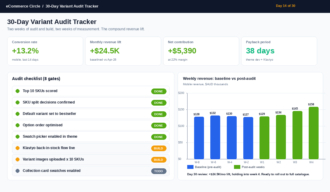
Here is the rollout we run with founders inside the Circle. Two weeks of audit, two weeks of build, measure for 30 days, then iterate. Block the calendar now and run it on your top 10 SKUs before BFCM lands.
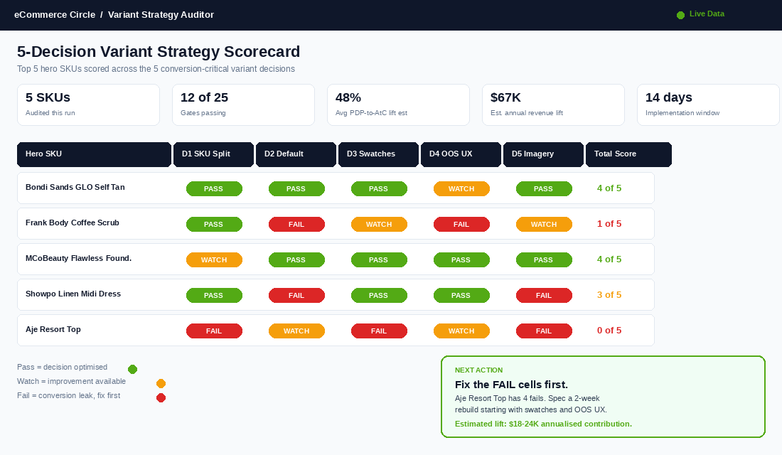
- Week 1, Days 1 to 3: Audit top 10 SKUs. Score each across the five decisions. Pass, watch, or fail. Use the scorecard at the top of this article. Note the worst-performing variant on each.
- Week 1, Days 4 to 7: Pick the two biggest leaks. Usually swatches and the out-of-stock UX. Spec the change. Get theme dev quotes if needed (most are 4 to 8 hours of work).
- Week 2, Days 8 to 10: Set up Klaviyo back-in-stock flow. Three-email sequence: trigger on restock, 24-hour reminder, 72-hour last-call. Average revenue per recipient $4.20 to $6.80 AUD.
- Week 2, Days 11 to 14: Ship the swatch and default variant changes. Test on staging, push to live. Baseline the analytics: Shopify Analytics > Products > Variant performance.
- Weeks 3 and 4: Measure. Compare PDP-to-AtC, variant-level conversion, mobile vs desktop. Expect to see the lift within the first 7 days if traffic is steady.
- Day 30: Roll out to the rest of the catalogue. Bestseller variant audit becomes a quarterly process. Add to the SOP library.
The bestseller variant audit pairs naturally with the work we cover in our 5-block PDP copy system and the 5-stage reviews engine. Run all three on the top 10 SKUs once and the PDP work is done for the year.
Three Mistakes That Quietly Eat the Gains
Three failure modes we see repeatedly when founders try this on their own:
- Splitting one product into eight to escape the old variant cap. Shopify lifted the limit to 2,048 in mid-2024. If you are still maintaining duplicate listings to dodge a cap that no longer exists, consolidate. You will recover lost SEO equity, kill duplicate-content penalties, and simplify your merchandising.
- Adding swatches but leaving the default variant set to “size XXS”. The picker is now visual but the user lands on a size nobody buys. Fix the default in the variant order. The cost is zero, the lift is real.
- Treating bundle packs as a separate product instead of a variant. 6-pack, 3-pack, and single should be one product with a pack-size variant. Subscription pricing, “save 14%” badges, and the up-sell math all live in the same PDP. Splitting them into three URLs kills the AOV lift.
The Three Reports That Tell You Which Variant Decisions to Fix First
Before you change a single swatch, pull three reports. They take 20 minutes total and they stop you optimising the wrong thing.
First: sales by variant in Shopify. Go to Analytics, then Reports, and run sales by product variant SKU for the last 90 days. In most stores the pattern is brutal: the top 20% of variants drive 75 to 85% of revenue, and the bottom third barely moves. That bottom third is where your dead stock, your stale size runs and your “we should probably kill this colour” conversations live.
Second: variant-level conversion in GA4. Set up item_variant tracking in your ecommerce events and compare view-to-purchase rates across options. If your Navy variant converts at 3.1% and your Olive converts at 0.8% on the same traffic, that is not a demand problem you can fix with ads. It is usually imagery, the default variant choice, or an out-of-stock loop quietly eating sessions.
Third: search and filter data. If you run a search app like Boost or Searchanise, export the filter usage report. When 40% of shoppers filter by size before anything else, size should be your first option in the picker, not the second. Your customers are literally telling you the option order they think in.
Run these three reports once a quarter and the five decisions in this playbook stop being opinions. They become a ranked to-do list with dollar figures attached, and you will usually find one fix worth a 2 to 4% conversion lift sitting in plain sight.
Run the Audit This Week
Variant strategy is not glamorous work. It is not a new channel, a new ad creative, or a new product launch. It is the conversion lever that sits under everything else, the one that pays back in the same week, and the one most Aussie founders walk past because the admin screen looks like housekeeping.
Pick your top 10 SKUs. Score them across the five decisions. Fix the two biggest leaks. Ship before EOFY. Compare conversion before and after. The next time you spend $50K on a Meta scale-up, that 12 to 18% extra revenue compounds with every dollar.
Inside eCommerce Circle, variant strategy is one of the core pillars we work on with every member inside the Product P of the More Orders Operating System. If you want a second opinion on yours, let’s talk.